To resolve common mobile layout issues in Elementor, users should utilize the responsive mode to adjust column direction, toggle element visibility, and scale typography. Key fixes include using the “Direction: Column Reversed” icon for stacking and the “Regenerate Files & Data” tool for CSS synchronization. This ensures your Elementor site displays correctly on all devices.
Want to learn faster? Book a 1-on-1 expert session today.
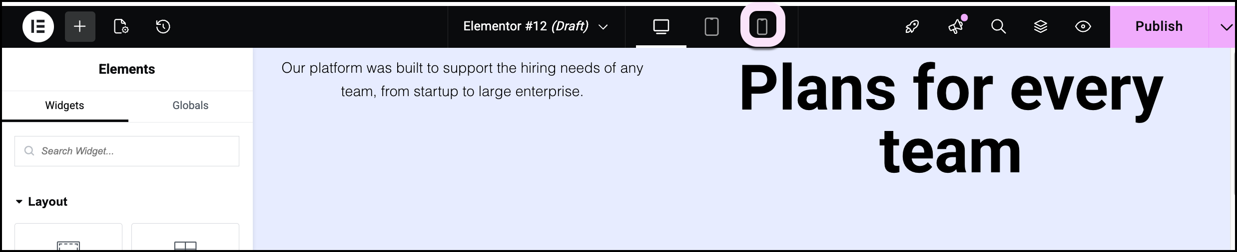
How do I access responsive mode in Elementor?
- Check out Responsive editing for mobile and tablets to learn how to access and use responsive editing.
How do I reverse the column stacking order on mobile?
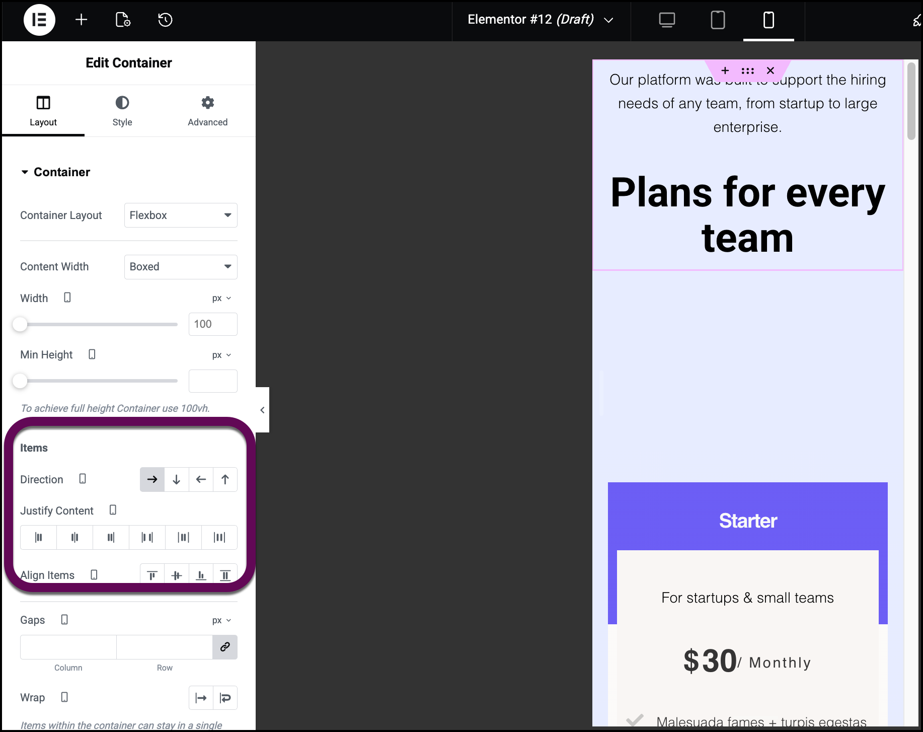
When using two-column layouts, the Elementor Flexbox Container stacks elements vertically by default. To change the visual order so the right-side element appears on top on mobile devices:
- Enter responsive mode.
- Click the container handle of the parent container.

- Navigate to the Layout tab.
- Locate the Items section.
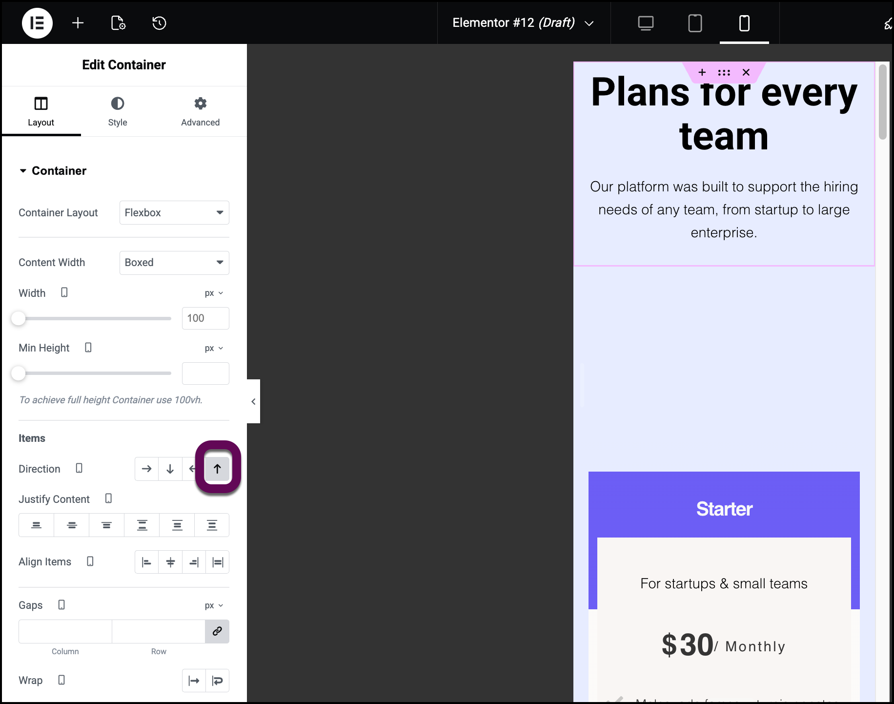
- Click the column reversed icon (the upward-pointing arrow).
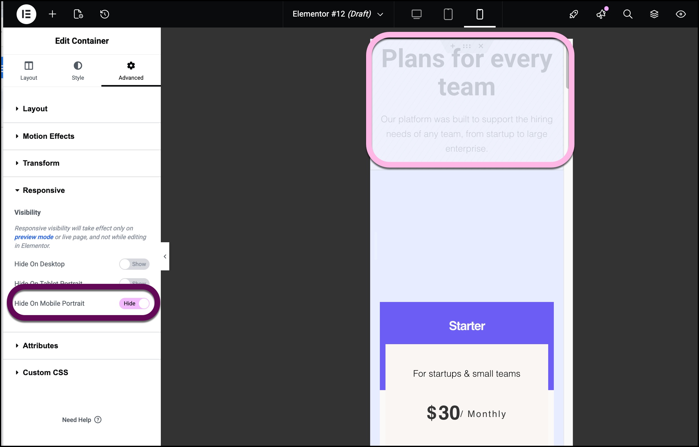
Can I hide specific elements on mobile devices?
If a complex widget clutters the mobile experience, you can hide it specifically for smaller viewports while keeping it visible on desktop.
- Select the specific widget or, container.
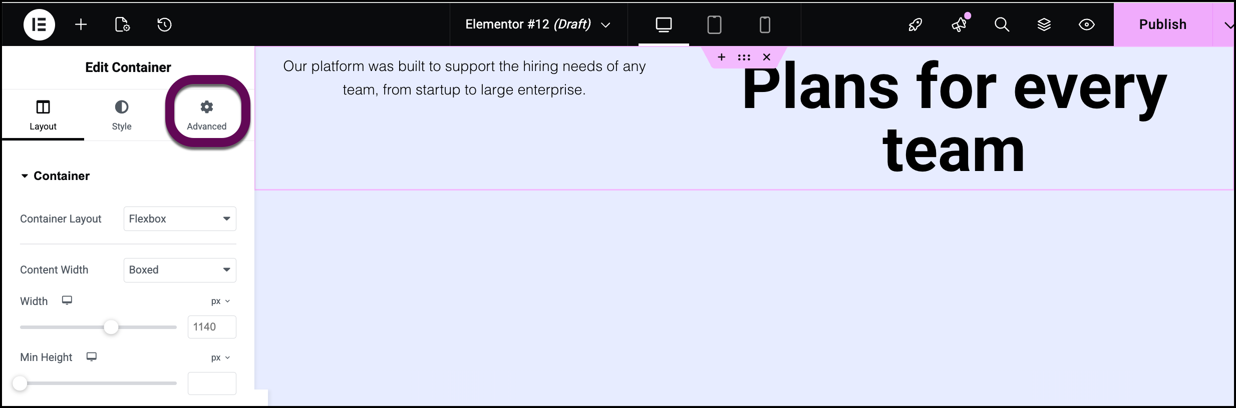
- Open the Advanced tab in the settings panel.
- Open the the Responsive section.
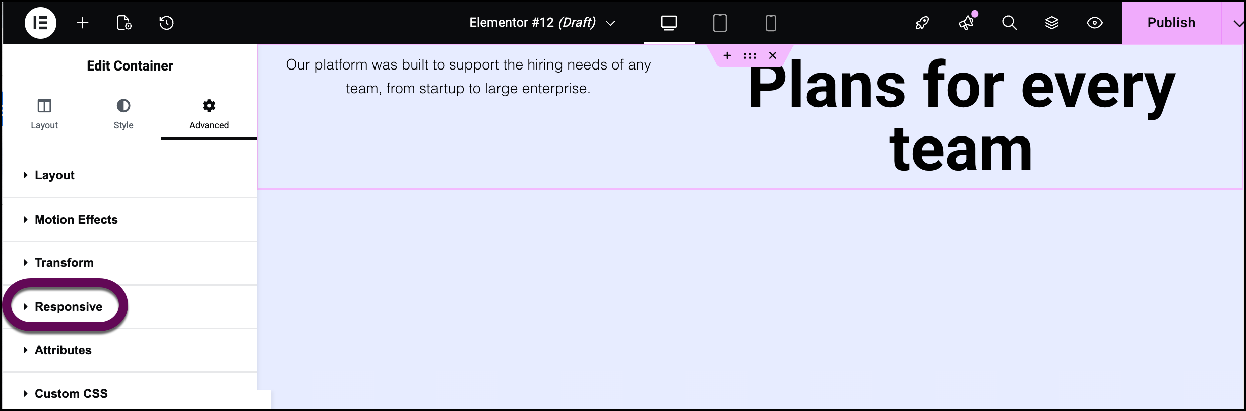
- Toggle any modes you want hidden to Hide.
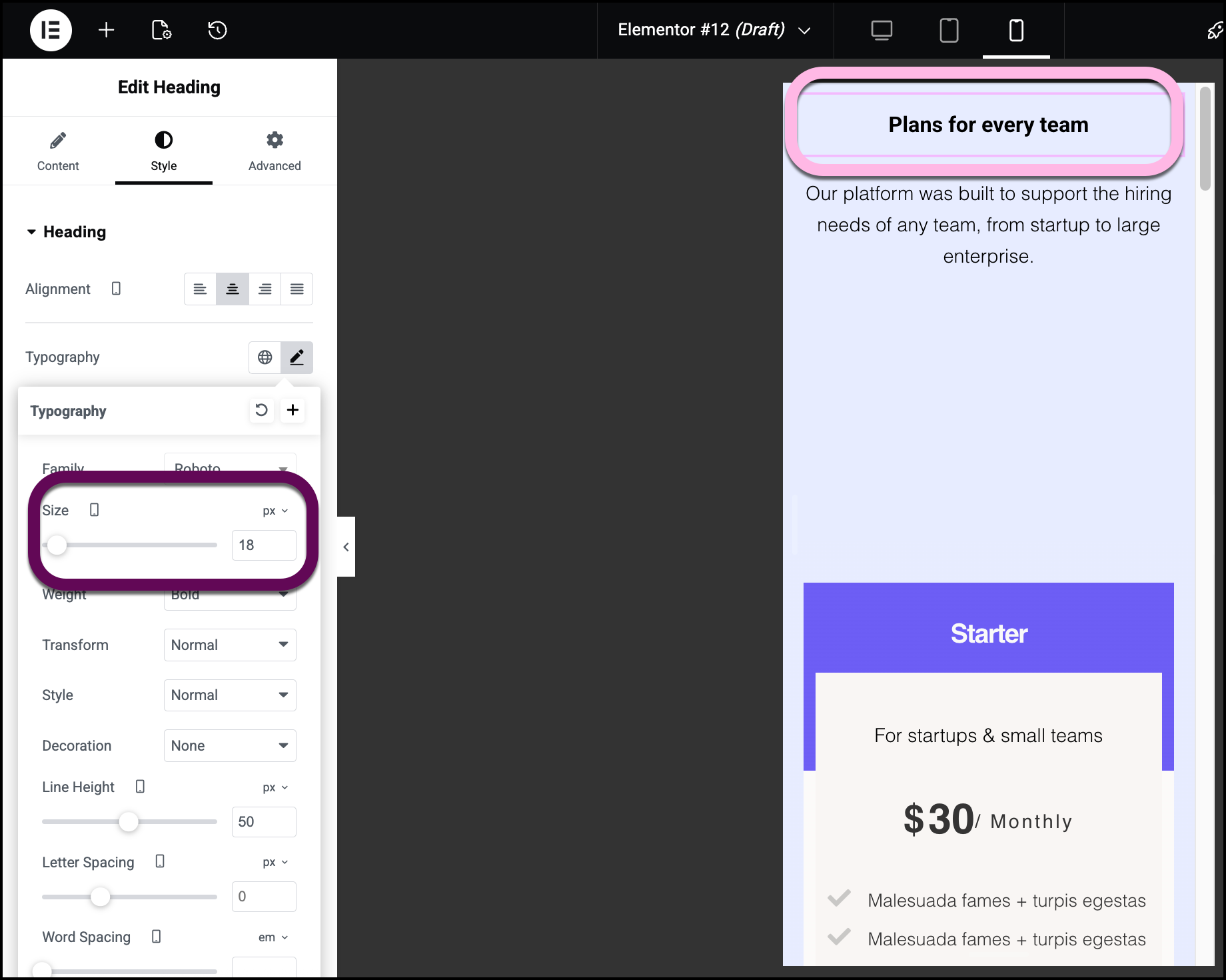
How do I adjust text size and spacing for mobile viewports?
Elementor allows for device-specific styling for typography and spacing without affecting the desktop layout.
- Responsive Typography: Adjust font sizes specifically for phone screens.
- Mobile Padding: Set custom spacing to ensure text does not touch the edges of the screen.
- Margin Control: Define vertical gaps between stacked widgets.
- Click the responsive icon next to a setting with a responsive option: these settings have a responsive icon next to them.
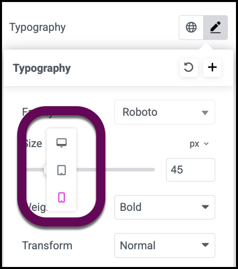
- Input the desired value for the mobile viewport.
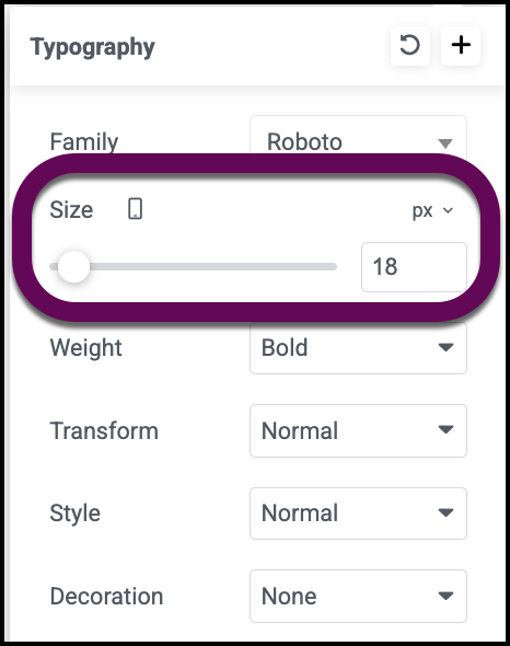
- Observe the live change in the editor.
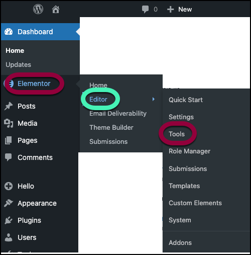
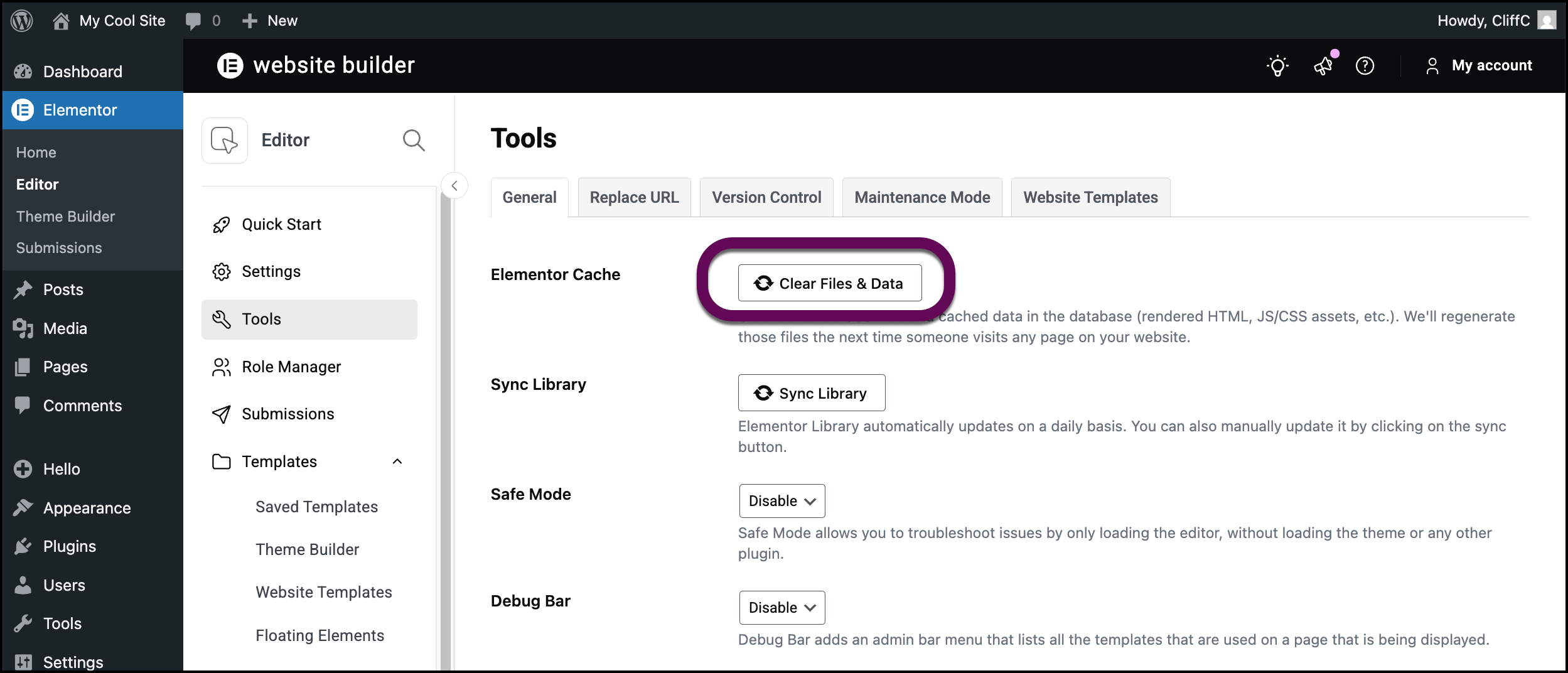
What should I do if mobile changes are not appearing?
If your mobile optimizations are not reflecting on live mobile browsers, follow these troubleshooting steps to clear the system cache:
- Go to WP Admin and navigate to Elementor>Tools.
- Click Clear files & data.
- Access your My Elementor dashboard and use Object caching to clear the cache. For details, see Object caching.