The Elementor Cookie Consent plugin helps you create a customizable cookie banner for your WordPress website, ensuring compliance with privacy regulations like GDPR and CCPA. With Elementor Pro, you can leverage the full Elementor visual editor to design your banner, preferences dialog, and revisit button with pixel-perfect control.
Want to learn faster? Book a 1-on-1 expert session today.
How to design the Cookie Consent banner with Elementor Pro
Building your Cookie Consent banner lets you build a banner that perfectly aligns with your site design.
Build your banner with Elementor Pro:
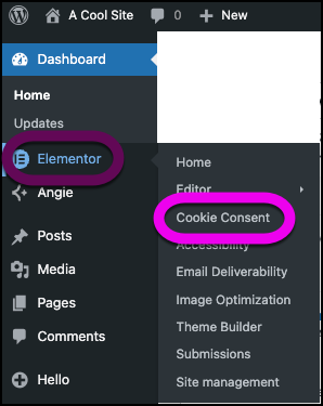
- From WP Admin, navigate to Elementor>Cookie Consent.
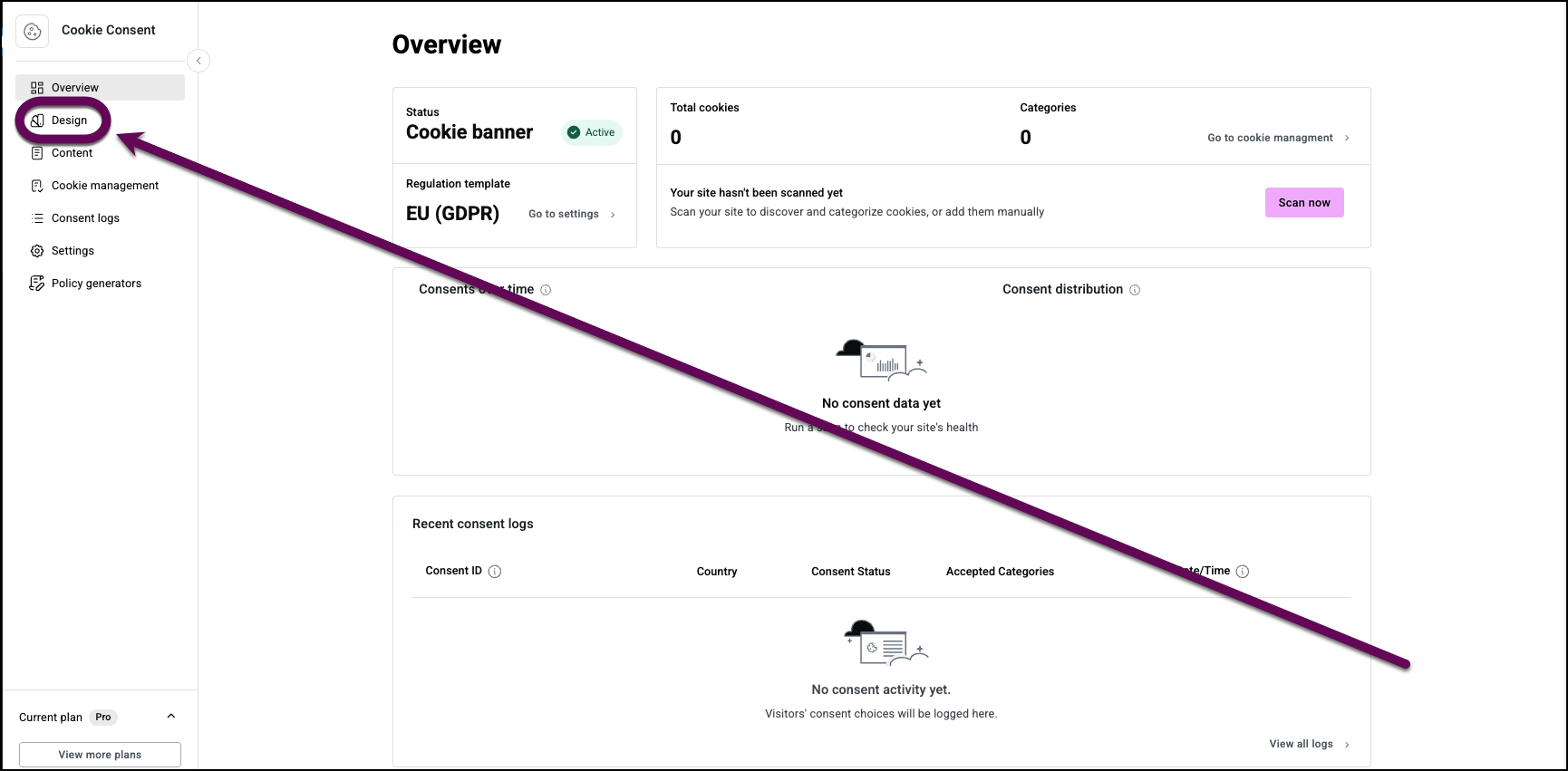
- In the panel, click the Design tab.
- Click Design with Elementor.
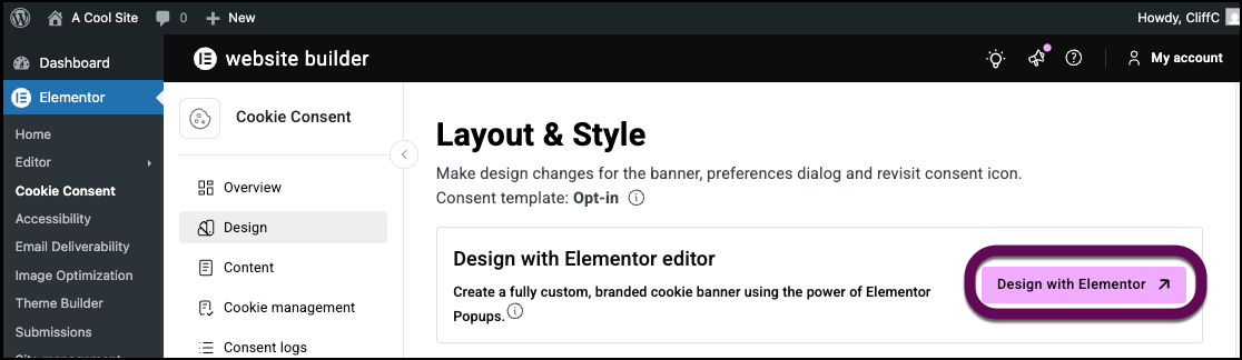
The Cookie Consent banner opens in the Elementor Editor.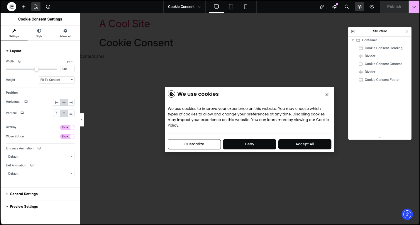
The panel displays the controls for the Cookie Consent banner. See below for a detailed list of the controls and their effects, see below.
After you design your first popup with Elementor, Edit with Elementor will be replaced with Manage with Elementor.
Edit the Cookie Consent banner
In the Elementor Editor, you can change the style of the banner to match your website’s style and you can use other Elementor widgets to add your own flair to the banner.
In the example below, we’ll change the typography used in the cookie to match the website.
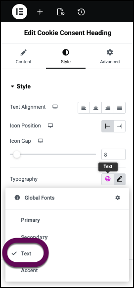
- Click the Cookie Consent Heading to select it.
Notice that the panel changes to show the Heading controls.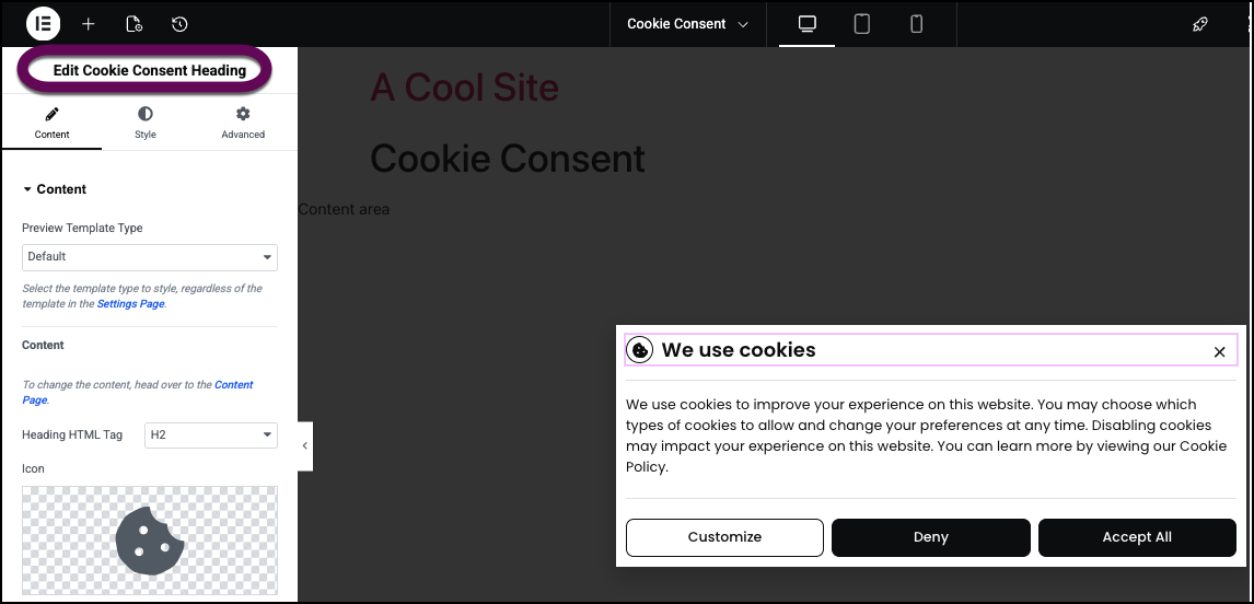 TipTo select the Cookie Consent banner, click any blank area on the canvas.
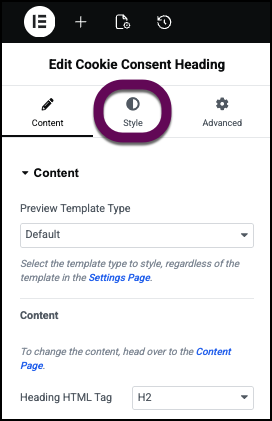
 - Click the Style tab.
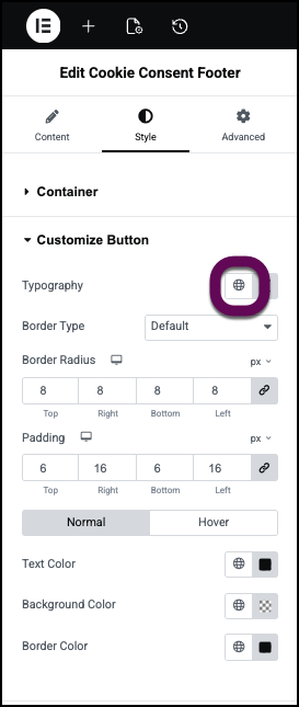
- Click the globe icon by the Typography setting. This brings up the list of global fonts.
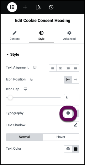
Learn more about Global fonts and colors. - Select the Text typography so it matches the other text on the site.
- Click the Cookie Consent Content section to select it.
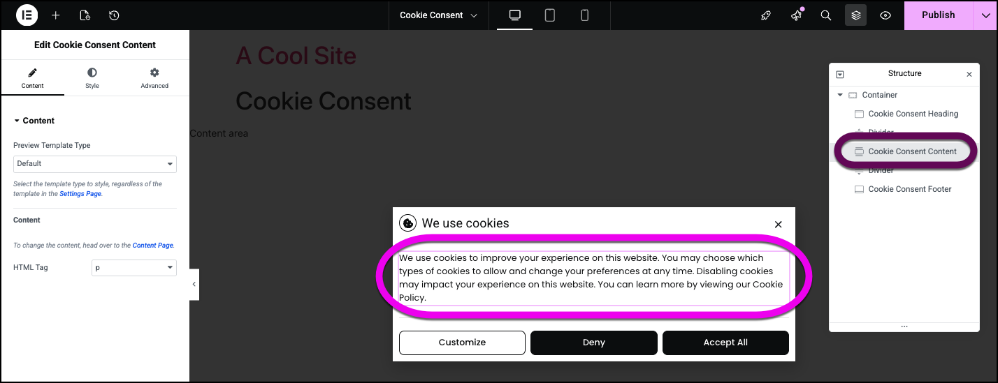
- Click the Style tab and change the Typography to the global text typography as described above.
- Click the Cookie Consent Footer section to select it.
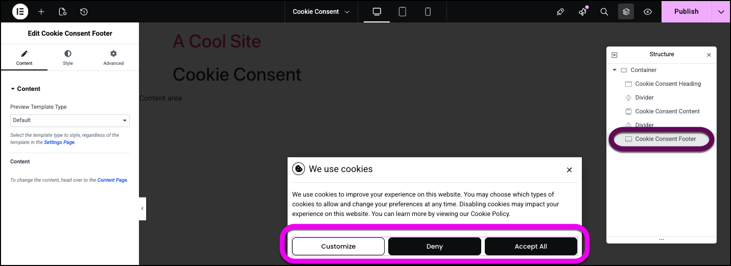
- In the panel, click the Style tab.
- Open the Customize button field.
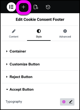
- Change the Typography to the Global Text typography as described above.
- Do the same to the other two buttons.
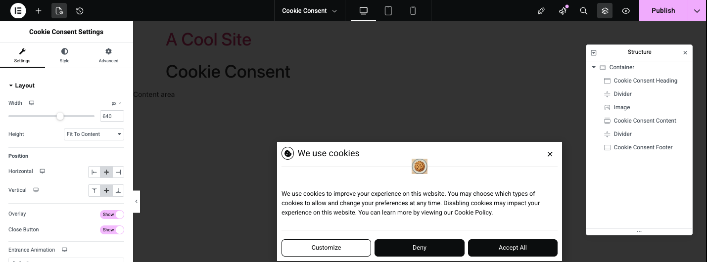
Now let’s spice things up by adding a fun image to the banner. - Click the “+” sign in the top bar.
This opens the widget panel - Drag an Image widget to the Cookie Consent banner.
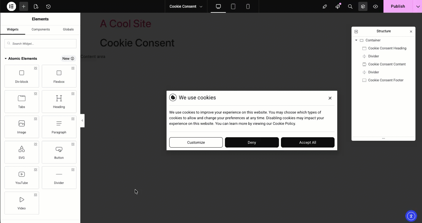
- Add an image and style it so it fits in the banner.
- Save your design by clicking Publish.

- By default, the Cookie Consent banner will appear on all pages, if you want to limit the banner to certain pages, you’ll need to edit the banner’s conditions. For details, see Manage Cookie Consent banners below.
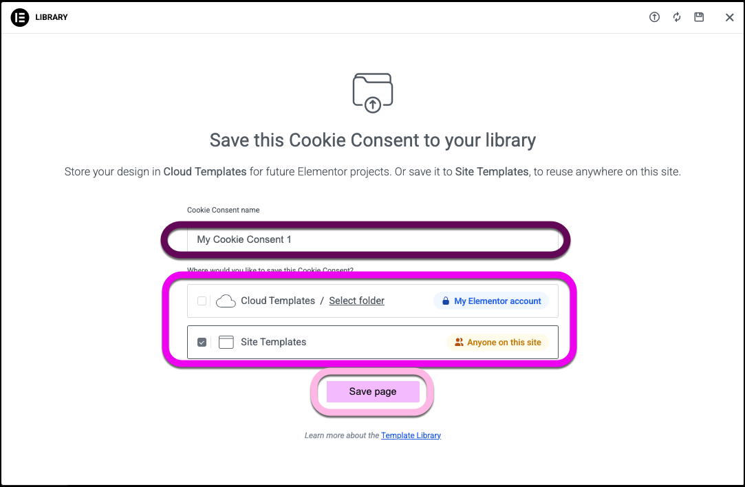
If you want to create multiple Cookie Consent banners: - When saving the banner, click the arrow next to the Publish button and select Save As Template.
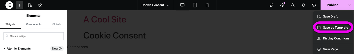
- Name the template.
- Choose to save the template to this site or to your cloud library. The difference between site templates and cloud templates.
- Click Save page.
- Design a second Cookie Consent banner and save it as a template.
To select the page or group of pages where the banner will appear:
- Click the arrow next to the Publish button and select Display Conditions. For details, see Conditions, triggers, and advanced rules.
Manage Cookie Consent banners
After you design a banner, it is saved as a template and the Edit with Elementor button in the Cookie Consent dashboard becomes a Manage with Elementor button.
To Manage Cookie consent banners:
- From WP Admin, navigate to Elementor>Cookie Consent.
- In the panel, click the Design tab.
- Click Manage with Elementor.
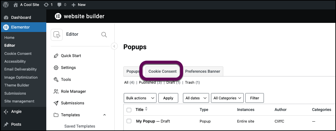
If you have more than one Cookie Consent design, the Popup Library opens to the Cookie Consent banner page. - Hover over the template name and select:
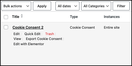
- Trash: Delete the banner design.
- View: See how the banner appears to visitors.
- Export Cookie Consent: Create a json file with this banner design.
- Edit with Elementor: Edit the banner with the Elementor Editor.
- Click Edit with Elementor to edit the banner.
- Click Edit conditions to change where this banner will appear on the site.
You have a choice of where this banner will appear. For this example will choose sitewide so it appears on all pages. For details, see Conditions, triggers, and advanced rules.
You can also access the Cookie Consent templates through WP Admin.
- From WP Admin, select Elementor>Editor.
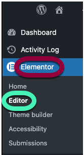
- In the panel, click Popups.
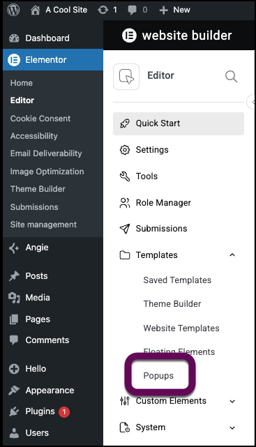
- Click the Cookie Consent tab.
Cookie Consent banner options
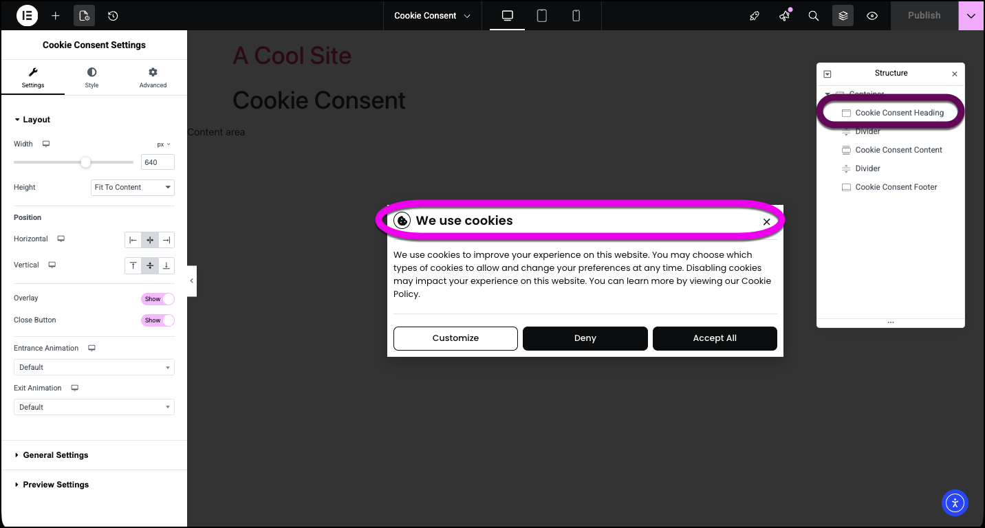
These options are available for the Cookie Consent banner.
Settings
Layout
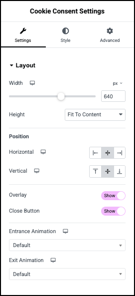
Width and Height: Set the size of the banner.
Position
Horizontal, Vertical: Set the banner to the left right or center of the screen.
Overlay: Toggle to Hide to get rid of the overlay surrounding the banner.
Close Button: Toggle to Hide to get rid of the icon closing the banner.
Entrance and Exit Animation: Add motion to your banner. For details about the available options, see Add entrance animations to your page.
Animation Duration: Appears if you add an animation. Determine how long the animation takes to complete.
General Settings
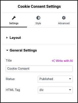
Title: Give your banner a name.
Status: Use the dropdown to see if the banner is:
- Published: The banner is live on your site.
- Draft: The banner is unpublished and still being worked on.
- Pending review: The banner is finished and has been submitted for a quality check by an Editor or Administrator before it can be published.
- Private: The banner is only visible to logged-in Editors and Administrators.
HTML tag: Choose the HTML tag for your Flexbox. Choices include Div, Main, Header, Section, Article, Aside, and Footer.
Preview Settings
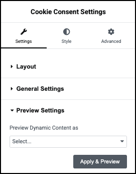
Preview Dynamic Content as: Use to add dynamic content to your banner. For details, see Dynamic tags.
Style
Popup
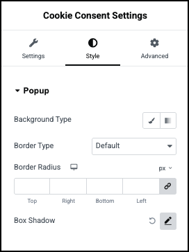
Background type: Add a background to the banner. For details, see Create a Background.
Color: Set a color for the banner background. For details, see Choose a color or Use global fonts and colors.
Image: Use an image for the banner background.
Border Type: For details, see Border type.
Border Radius: For details, see Border radius tools.
Box Shadow: Add depth to your banner with shadows. For details, see What is Shadow, Text Shadow and Boxed Shadow?
Overlay
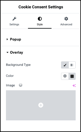
The Overlay is the area around the banner. If the Overlay is set to Show, this controls its appearance.
Background type: Add a background to the banner. For details, see Create a Background.
Color: Set a color for the overlay. For details, see Choose a color or Use global fonts and colors.
Image: Use an image for the overlay
Image resolution: If you use an image, set the quality of the image.
Position, Attachment, Repeat, Display Size: If you use an image for the overlay, these controls affect how the image appears. For details, see Positioning background images.
Close Button
Controls the style of the icon which closes the banner, even if the visitor does not make a choice.
Position: Use the dropdown menu to place the icon either Inside the banner or Outside the banner.
Vertical and Horizontal position: Use the sliders to place the icon exactly where you want it.
Normal/Hover –
- Normal: Determine how the icon appears by default.
- Hover: Determine how the icon appears when moused over.
Color: Set the color of the close icon. For details, see Choose a color or Use global fonts and colors.
Size: Set the size of the close icon.
Advanced
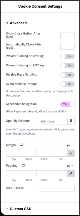
Show Close Button After: Delay the appearance of the close icon.
Automatically Close After: Set a time to close the banner.
Prevent Closing on Overlay: Toggle on to prevent visitors from closing the banner by clicking on the overlay.
Prevent Closing on ESC Key: Toggle on to prevent visitors from closing the banner by pressing the ESC key.
Disable Page Scrolling: Toggle on to prevent users from scrolling if they haven’t made a selection.
Avoid Multiple Popups: Toggle on to prevent other popups from appearing while the banner is on screen.
Accessible navigation: Toggle off to prevent users from navigating the banner with their keyboard.
Open By Selector: Use a selector to open the banner. For details, see CSS selectors in Elementor.
Margin and Padding: see Padding and margins.
CSS Classes: Add an anchor to the banner.
Custom CSS: Add your own CSS to the banner.
Cookie Consent Heading options
Content
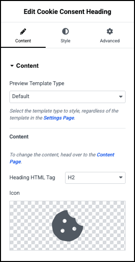
Preview Template Type: Use the dropdown many to use an Opt-In or Opt-Out style cookie banner. Leave the Default setting to use the style set in the Cookie Consent dashboard.
Content: The Header content is set in the Cookie Consent dashboard.
Heading HTML tag: Choose the HTML tag for your heading. Choices include H1 to H6, Div, Span, or Paragraph.
Icon: Select an icon to appear in the heading or delete the icon if you don’t want to use an icon. Learn more about icons.
Style
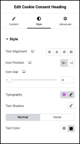
Style
Text Alignment: Choose to have the heading text line up:
- To the left.
- Centered.
- To the right.
- Justified – aligned evenly along both the left and right margins, creating a clean and uniform block appearance.
Icon position: Determine whether the icon will appear before or after the heading text.
Icon gap: Set the amount of space between the icon and the heading text.
Typography: Set the font type and size. For details, see Typography.
Text Shadow: Add depth to your text with shadows. For details, see What is Shadow, Text Shadow and Boxed Shadow?
Normal/Hover –
- Normal: Determine how the heading appears by default.
- Hover: Determine how the heading appears when moused over.
Text color: Set the text color. For details, see Choose a color or Use global fonts and colors.
Icon
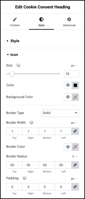
Border Type: If you want a border around the icon, set the type of border. For details, see Border type.
Border Width: If you have a border around the icon, set the width of the icon’s border.
Border Color: If you have a border around the icon, set the color. of the icon’s border. For details, see Choose a color or Use global fonts and colors.
Border Radius: Adjust the border around the icon if you have one. For details, see Border radius tools.
Padding: For details, see Padding and margins.
Advanced
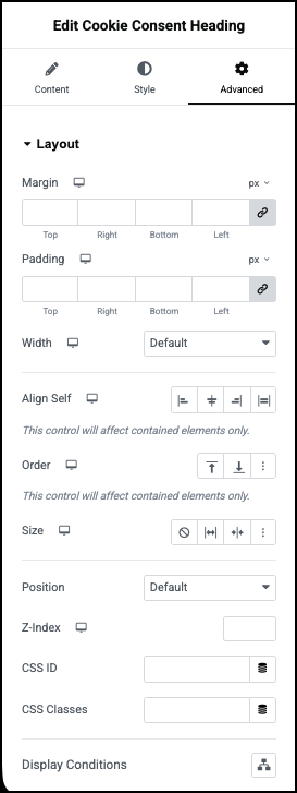
See Advanced tab.
Cookie Consent Footer options
Content
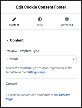
Preview Template Type: Use the dropdown many to use an Opt-In or Opt-Out style cookie banner. Leave the Default setting to use the style set in the Cookie Consent dashboard.
Content: The Header content is set in the Cookie Consent dashboard.
Style
Container
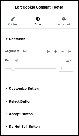
Alignment: Choose to have the footer’s content appear:
- At the start of the container.
- In the center of the container.
- At the end of the container.
Gap: Determine the amount of space between the buttons.
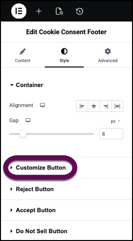
Customize Button
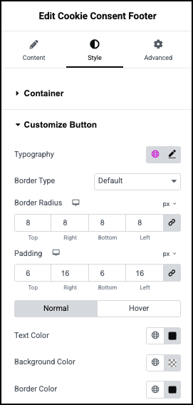
Typography: Set the font type and size of the button text. For details, see Typography.
Border Type: If you want a border around the button, set the type of border. For details, see Border type.
Border Width:If you have a border around the icon, set the width of the icon’s border.
Border Color: If you have a border around the icon, set its color. For details, see Choose a color or Use global fonts and colors.
Border Radius: Adjust the border around the icon if you have one. For details, see Border radius tools.
Padding: For details, see Padding and margins.
Normal/Hover –
- Normal: Determine how the button appears by default.
- Hover: Determine how the button appears when moused over.
Text Color: Set the color of button text. For details, see Choose a color or Use global fonts and colors.
Background Color: Set background color for the button. For details, see Choose a color or Use global fonts and colors.
Border color: If you have a border around the button, set its color. For details, see Choose a color or Use global fonts and colors.
Reject Button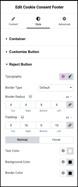
Typography: Set the font type and size of the button text. For details, see Typography.
Border Type: If you want a border around the button, set the type of border. For details, see Border type.
Border Width:If you have a border around the icon, set the width of the icon’s border.
Border Color: If you have a border around the icon, set its color. For details, see Choose a color or Use global fonts and colors.
Border Radius: Adjust the border around the icon if you have one. For details, see Border radius tools.
Padding: For details, see Padding and margins.
Normal/Hover –
- Normal: Determine how the button appears by default.
- Hover: Determine how the button appears when moused over.
Text Color: Set the color of button text. For details, see Choose a color or Use global fonts and colors.
Background Color: Set background color for the button. For details, see Choose a color or Use global fonts and colors.
Border color: If you have a border around the button, set its color. For details, see Choose a color or Use global fonts and colors.
Accept Button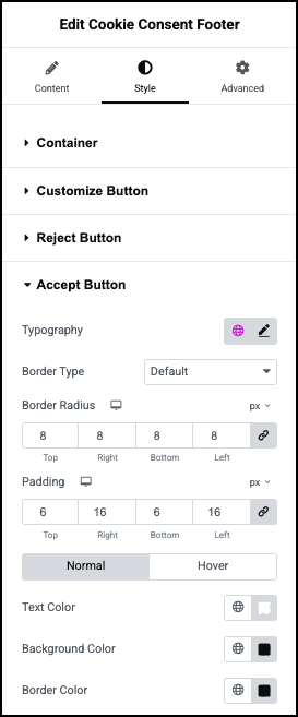
Typography: Set the font type and size of the button text. For details, see Typography.
Border Type: If you want a border around the button, set the type of border. For details, see Border type.
Border Width:If you have a border around the icon, set the width of the icon’s border.
Border Color: If you have a border around the icon, set its color. For details, see Choose a color or Use global fonts and colors.
Border Radius: Adjust the border around the icon if you have one. For details, see Border radius tools.
Padding: For details, see Padding and margins.
Normal/Hover –
- Normal: Determine how the button appears by default.
- Hover: Determine how the button appears when moused over.
Text Color: Set the color of button text. For details, see Choose a color or Use global fonts and colors.
Background Color: Set background color for the button. For details, see Choose a color or Use global fonts and colors.
Border color: If you have a border around the button, set its color. For details, see Choose a color or Use global fonts and colors.
Do Not Sell Button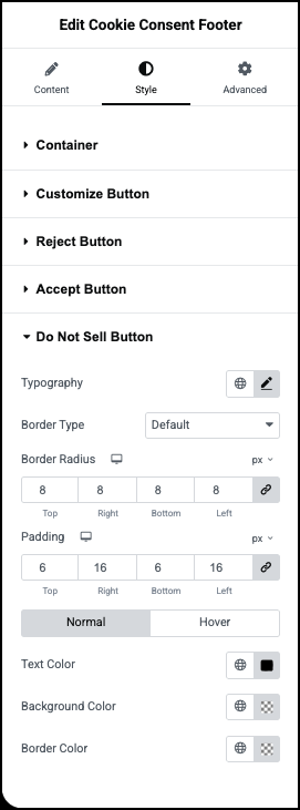
Typography: Set the font type and size of the button text. For details, see Typography.
Border Type: If you want a border around the button, set the type of border. For details, see Border type.
Border Width:If you have a border around the icon, set the width of the icon’s border.
Border Color: If you have a border around the icon, set its color. For details, see Choose a color or Use global fonts and colors.
Border Radius: Adjust the border around the icon if you have one. For details, see Border radius tools.
Padding: For details, see Padding and margins.
Normal/Hover –
- Normal: Determine how the button appears by default.
- Hover: Determine how the button appears when moused over.
Text Color: Set the color of button text. For details, see Choose a color or Use global fonts and colors.
Background Color: Set background color for the button. For details, see Choose a color or Use global fonts and colors.
Border color: If you have a border around the button, set its color. For details, see Choose a color or Use global fonts and colors.
Advanced
See Advanced tab.