Table of Contents
Step aside and welcome our April 2021 Showcase, which applauds 10 design agencies from all around the globe. Representing the UK, the Netherlands, Canada, Spain, Australia, Italy, Israel, and Germany…this diverse collection of websites accounts for the Elementor web creation talent that you’ll find in every corner of the earth.
Diversity is a pillar of what we stand for at Elementor — made possible by our thriving global community of web creators. There’s no better way to fine-tune your web creation skills than from learning from design professionals and getting a behind-the-scenes look at what their websites are all about. Original ways to use shortcodes, out-of-the-box Lottie animations, revolutionary design systems, and the most stylish web design motifs all come to life in this month’s web design agency showcase.
10
BART-Design: Design Collaboration in Motion
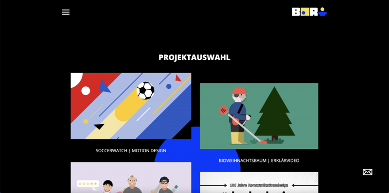
BART-Design is a German design agency founded in early 2021. The agency specializes in designing moving images and illustrations for multiple business verticals, such as the finance, software, logistics, and insurance sectors. Agency founders Bartosz and Frederik describe the objective of their Elementor site as “making their design collaboration visible to the outside world” through a slim as possible, functional, and clean website with an optimal user experience.”
These website objectives are met with style by showcasing BART-Design’s projects and services, along with their blog content, discussing their professional design processes, VR, video making, and illustration. There’s much to be loved about BART-Design’s site, between the full-screen popup menu, color-changing hover effects, animated logo, and engaging blog layout, there’s clearly a lot that this video and illustration agency has to offer.
Theme: Hello
Plugins: Yoast, Autoptimize, WP Fastest Cache, Page Speed Optimization, Jetpack
Design & Development: Bartosz Dronka & Frederik Reder
09
El Alce Web: A 1980s Comeback
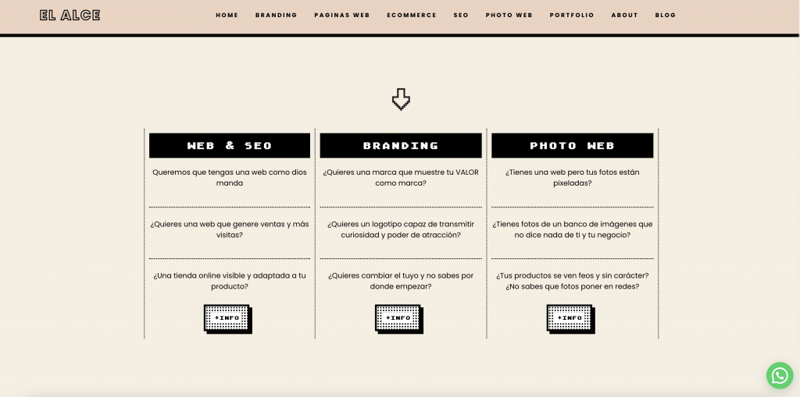
El Alce Web is a Spain-based design studio offering web design, branding, SEO, and ecommerce website services. Four years after building their original website, El Alce decided to rebuild it with Elementor.
After their website redesign, El Alce saw promising results with their new website:
- Improved functionality
- Better internal architecture
- Higher SEO results
- Better user experience
- A more modern design, including customized animations
El Alce’s website and its design system take us back to the 1980s when Mac OS System was first introduced to mankind. The studio’s site resembles “System 1.0”: the first operating system GUI developed for the Macintosh computer. From the outlined white cursor to the chunky pixelated font, the site’s design system resonates with visitors as a masterpiece of the computer industry — built by its most legendary, innovative experts. Ironically, the old-fashioned user interface of the site positions the studio as an authentic, seasoned organization that understands the core fundamentals of user interface design since its inception.
Theme: Hello
Plugins: Rank Math, WP Rocket
Design & Development: Ester Cano & Juan Saiz
08
Graffette: Mixed Media Gone Wild
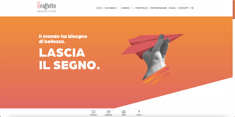
Graffette is a web agency in Reggio Emilia, Italy — specializing in graphic and website design, brand communication strategies, and copywriting for both freelancers and SMBs. Graffette’s clients range from consumer products to hotels, e-commerce sites, and more.
When scrolling through the homepage, one of the first terms that come to mind is “relationships of contrast” — which exist between many of the design elements and components:
- Mixed-Media Elements
The black and white photographs coupled with high-definition 3D illustrations is a thought-provoking, exciting concept that sets the tone for a creative, “think outside the box” design team.
- Static and Moving Images
Triggered by elegant scrolling effects, the user’s vertical journey is accompanied by a flying paper airplane, children on a park swing, high divers, and a floating hot air balloon. But this is all orchestrated without overwhelming the user, thanks to the subtle design elements that balance out the moving images, tying all the visual variations together.
- Font-Pairing
There’s no better way to get your message across than combining fonts whose typography styles visualize your brand personality. The traditional serif typeface represents the world of print, complemented by a modern, clean sans-serif font — mirroring a web creator’s timeless understanding of both old-fashioned and contemporary design motifs.
Theme: Hello
Plugins: Dynamic Content for Elementor
Design & Development: Gaia Nasi & Michele Grimaldi
07
Arktis: A Brand Storytelling Special
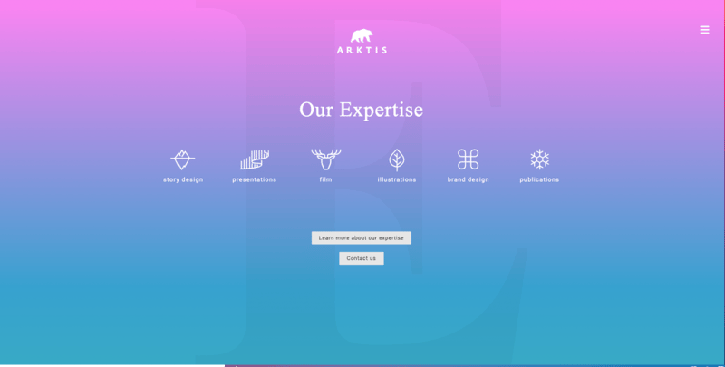
Arktis is a Switzerland-based design agency that specializes in “brand storytelling through images and illustrations”. Arktis’s team strives to focus on their clients’ design and messaging — to then generate a narrative that achieves the organization’s strategic objectives.
Arktis’s website embraces the worlds of gradient background effects, background overlays to show capitalized letters (and other elements) behind the background colors, and Lottie animations to represent their service types. Altogether, these create a dynamic, eclectic atmosphere that encourages visitors to keep scrolling.
Simple to achieve yet dazzling with prestige, gradient backgrounds are one of Elementor’s most easily creatable background types. All this requires is selecting “Gradient” for “Background Type”, choosing the two colors you want to combine, the effect’s location on the page, the desired angle…and it’s all there.
Theme: Hello
Plugins: Extras for Elementor, The Plus Addons for Elementor, Elementor Header Blocks
Design & Development: Sampo Lenzi
06
Modernaweb Studio: Perform Like a Boss
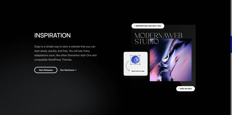
Modernaweb Studio is a creative, UI/UX-focused agency hailing from London, UK. Building most of their client websites with WordPress, Modernaweb’s services place a strong emphasis on website optimization and performance, as is evident in their high-performing, speedy website. Using the Icon Box Widget, for example, minimizes the number of widgets needed, a technique you may recognize from our recent tutorial and course: “Layout Optimization Best Practices”.
As demonstrated in the tutorial, the Icon Box Widget allows you to show an icon, a heading, and a short description — all within one widget, rather than in three separate widgets (Image, Heading, and Text Editor). Modernaweb utilizes this nicely on their “What We Do” page, and adds plentiful margins between the Icon Box’s inner elements, fostering visual harmony and legibility for every user.
Theme: Underscores
Plugins: Black Widgets, Honeypot for Contact Form 7, Modernaweb Plugin, WP ULike, MouseWheel Smooth Scroll
Design & Development: Shahin Kalantar
05
Kadabra: Designing in the Moonlight
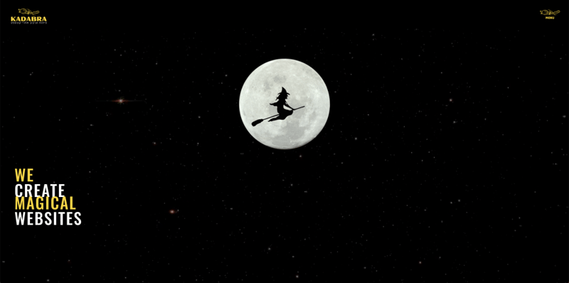
Kadabra is a WordPress design and development agency located in Israel. Kadabra’s website maps out the agency’s thorough design process that they conduct with each client: detailed, strategic research, concept creation, development, comprehensive QA testing, and finally, website launch.
The starry night-themed video background appears on every page on Kadabra’s website, creating a consistent, exciting, yet mysterious ambiance for the visitor. Simplicity is bliss when it comes to the visual effect of the starry sky, as all it takes is subtle shining stars to make a solid black background come to life.
What immediately caught our attention in Kadabra’s website navigation is the contact form. Rather than opening an additional page, the nav menu is built as a popup which then leads to an additional popup: the contact form. In terms of mastering web form design best practices, Kadabra hits the nail on the head — with a visually pleasing, easy-to-navigate form.
Plugins: Yoast, WP Rocket
Design & Development: Kadabra
04
IDEA Marketing: Creativity at Scale
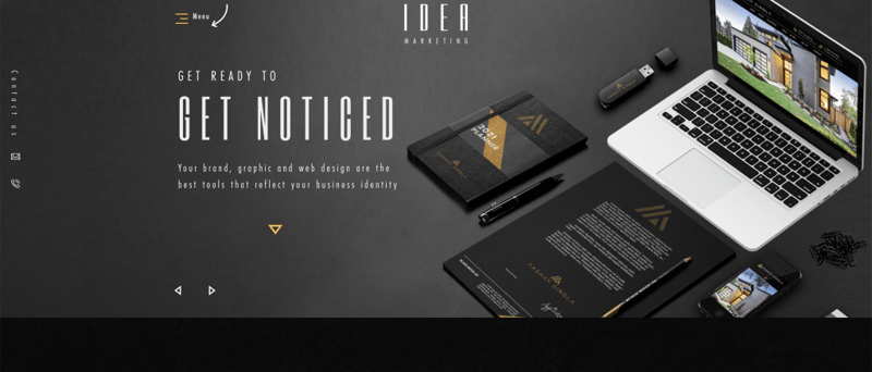
IDEA Marketing is a Vancouver-based creative design and development agency that offers web design services, branding, and graphic design, SEO, real estate website design and marketing. The agency’s “raison d’être” is “to craft a unique digital experience that highlights their clients’ brand while providing great user experience and interface that helps them grow their businesses”.
Building an Elementor site was the first step in IDEA Marketing’s objective to “create an attractive and modern look with minimalist elements”. These design concepts were accomplished by using several techniques:
- Large negative spacing
- Large titles
- Mirroring the agency branding by using the logo font (Six Caps) paired with Futura PT Condensed.
The smallest design details can go a long way — as is prevalent throughout IDEA Marketing’s site. One counterintuitive, yet effective application of minimalist design is the abundant spacing between the homepage’s hero text letters. Perfectly consistent with the agency’s logo, this layout catches the visitors’ attention through its atypical typographic styling and visual language. On the homepage, the isometric-style mockups take a spin on the conventional way of looking at work samples — an approach that puts creativity at the forefront.
Theme: Hello
Plugins: Essential Addons for Elementor, JetMenu, Premium Addons for Elementor, Simple Custom CSS and JS, Slider Revolution, Unlimited Elements for Elementor
Design & Development: Lucia Siplakova
03
Brandpunt Media: Communication Gone Trendy
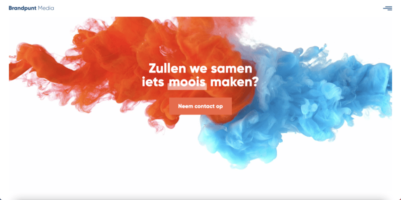
Brandpunt Media is a small design studio in the Netherlands that offers design, web design, and video production services. As a professional agency, Brandpunt Media prides itself on keeping up with constantly developing communication trends and techniques.
The recurring interactive effects and animations weaved throughout Brandpunt’s site speak well of the agency’s knack for video production and up-to-date communication. Agency owner Pieter Goorden shared with us that the parallax effect background videos are the foundation of the website’s design scheme, used to grab visitors’ attention by adding color and vibrance to the site.
Not to be missed is the homepage background video above the footer, which synchronizes with the white header text so that the white lettering only becomes visible when the lava moves behind it. Precision is key and well-represented in the site’s crisp sans-serif (Gilroy Sans) typeface, harmonious color contrast, among many other details.
Theme: Hello
Plugins: Make Column Clickable Elementor, PageLoader by Bonfire, Popup Trigger URL for Elementor Pro, Really Simple SSL, Safe SVG, Yoast Duplicate Post, Wordfence Security
Design & Development: Pieter Goorden
02
BALZAC: Uniform Creativity
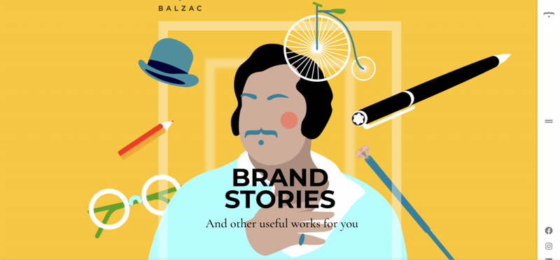
Balzac is an Italian branding agency specializing in brand storytelling, design, social media, and web and mobile apps for companies of all sizes.
The unique design motifs on Balzac’s site are plentiful: the mouse track effects used in their homepage hero section, flat design styling, subtle entrance animations, and a unique sticky sidebar menu that triggers an overlay over the page content when expanded.
The complementary color scheme is applied consistently throughout, and the pages which portray each of the studio owners are of particular uniqueness. Another example of mixed media design, Gaetano’s personal page presents his headshot (the same photograph) using multiple image filters: the hero image version with “Gradient” Blend Mode, followed by the second version: a colored photograph that uses the “Transparency” Scrolling Effect to change its opacity in correlation to the visitor’s scroll.
With brownie points for creativity and uniformity throughout their diverse design motifs, there’s a lot to learn from the delicate, interactive experience which tells Balzac’s very own brand story.
Theme: Astra
Plugins: Yoast SEO, WP Rocket, CookieYes, Slider Revolution
Design & Development: Gaetano Sorangelo
01
Kysha Creative: Trending in Authenticity
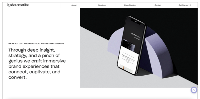
Kysha Creative is a WordPress web design and development studio based in Melbourne, Australia. The studio’s mission statement in their client services is to “work with those ready to share their brand with the world for the first time, but also for those who feel misaligned in their current website and/or branding and are ready for a refresh…”.
Throughout the entire website, Kysha Creative uses a transparent, sincere tone of voice when speaking to website visitors, authentically empathizing with pain points that can come up in website creation. The refreshing candidness used in Kysha Creative’s site is also true for its black and white color palette — mirroring the straightforwardness of what the organization not only believes in but provides.
Wherever you look, the latest web design trends can be found, such as serif fonts, black outline motifs, and playful typography effects. One of the most exciting ways that Kysha Creative’s site uses playful typography effects is with Elementor’s brand new Text Path Widget, embracing the opportunity to add a unique text design that grabs visitors’ attention in a subtle, sophisticated way. It’s no coincidence that this decorative feature was used for the words “How We Help”, as it emphasizes the studio’s most prevalent mantra: helping clients fortify their brands.
All in all, Kysha Creative’s customer-centric approach not only teaches us how important it is to create an earnest dialogue with clients but shows how web creators can visualize their businesses’ value systems and choose design schemes that represent them accordingly.
Theme: Hello
Plugins: Yoast, Ionicons, WP Rocket
Design & Development: Sharnae Newey
Think your Elementor-based website or landing page should be featured in our next Top 10 Websites column? Give it a shot!
Looking for fresh content?
By entering your email, you agree to receive Elementor emails, including marketing emails,
and agree to our Terms & Conditions and Privacy Policy.


