Table of Contents
Website performance optimization is one of the most important aspects of its user experience. A slow loading website can frustrate any user, often resulting in a high bounce rate that can damage our business success.
Website performance can be affected by many factors, for example: large image sizes, server configurations, too many plugins, bloated themes, among other factors.
Website performance is one of our strongest values as web creators. This is why we’ve created this 5-part course: Performance Optimization in Elementor.
Now, you can learn how to create page and post layouts using optimal techniques. This knowledge will ensure that your websites won’t include redundant sections, columns, or widgets that simply aren’t needed. We’ll also explore some built-in widget functionality for improved loading times.
By the end of this tutorial, you’ll be fully prepared to optimize the performance of every Elementor website you build, and reap the rewards right away.
The complete 5-part course comprises five video lessons:
- Lesson 1: Layout Optimization Best Practices
- Lesson 2: Optimizing Your Images
- Lesson 3: Additional Performance Boosts
- Lesson 4: Choosing a Suitable Web Host
- Lesson 5: Optimizations With Third-Party Tools
Table Of Contents
Lesson 1: Layout Optimization Best Practices
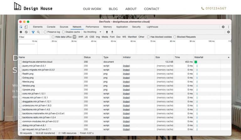
In our first lesson, we will cover the most efficient way to create your pages and posts in the Elementor Editor. We often see the usage of far too many sections, columns, inner sections and widgets, when the same layout could have been achieved using significantly fewer elements.
Using excessive amounts of elements slows down the performance of your website, so let’s dive in and learn how to build websites with Elementor in the most efficient way.
We’ll cover the following topics:
- A closer look at the correct page structure
- Viewing and testing your website’s performance
- Optimizing your header, footer, and page content
- Examples of good and bad practice website layouts
- Correct use of widgets, positioning, and global styles
- Tips to prevent load shift, improve SEO and increase loading time
- Optimizing Accessibility
- Minimizing the amount of DOM Elements
- And much more!
To better understand optimal layouts in Elementor, we’ll explore an Elementor template which presents some common section, column & widget misuses. By the end of this lesson, we will have completely rebuilt this entire page by reducing the number of columns and widgets. Our initial page is made up of nine sections, 31 columns, five inner sections, and 44 widgets.
At the end of the tutorial, our optimized page will be minimized to six sections, seven columns, and 16 widgets.
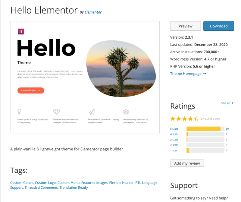
We’ll be using the free, lightweight Hello theme and we’ll recreate each section of the template, and improve the overall website performance by using best practice techniques.
Testing the Bad Practices
Before we dig into optimizing the website layout, we’ll run a test on our page to fully understand what is going on when somebody visits our website. Once all of our optimizations have been made, we’ll repeat the test and compare the results.
Step 1: Check Your Site in an Incognito Window
- Open a new window in “Incognito Mode” and type the URL of the webpage you are testing.
Step 2: Verify That You’re Using the Direct URL Path
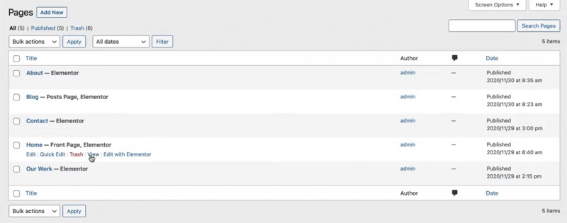
If you’re not sure what your page link is, you can easily find it by navigating to your WP Dashboard:
- Click on “Pages” to see all your website’s pages.
- Hover your cursor over your page and click the “View” option. This will take you directly to your page.
- Copy and paste this URL into the incognito window and once the site loads, you are ready to test it!
Testing & Viewing Performance Results
Step 1: Test the Performance Results
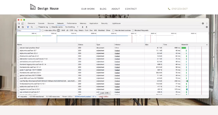
You may have used Chrome Developer Tools in the past.
If not, in order to inspect and view the HTML & CSS content of your page:
- Right-click anywhere on your page and click select “Inspect”.
You will see several tabs where you can read your HTML and CSS, find errors, get SEO results, and perform various tests.
- Select the Network Tab and hit the cmd or ctrl + R buttons to load the results.
As you can see, our current page layout is taking 2.88 seconds to load and is running 81 requests.
Step 2: View the Performance Results
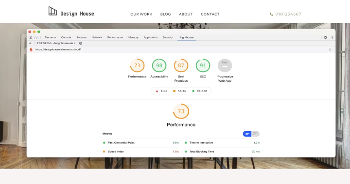
- Switch over to the Lighthouse tab, where we can run an audit report on our page.
This will give us more insight into the page’s current performance.
- Select ‘Generate Report’. After a few moments, your report will appear.
We’re currently receiving a Performance score of 73/100, which we can certainly work on.
Ideally, we’d like all of these numbers to be green. Now let’s get to work on optimizing our page and improving our stats.
Keep in mind that after every optimization step we do, we can derive certain best practices from the changes, and keep them in mind for future websites we build.
Optimizing the Page Elements
Step 1: Optimize the Header
Let’s begin with the Header.
As you can see in this design, the header was made with three columns.
In the first column, our logo consists of two widgets:
- An Image Widget that displays a .png image file of our logo
- A Heading Widget.
In the second column, the header menu consists of our Nav Menu Widget.
The third column has:
- An Inner Section Widget (that controls the position of the Icon Widget).
- A Heading for our contact information.
Let’s see how we can minimize the number of sections and widgets and sections here.
Step 2: Create the New Header
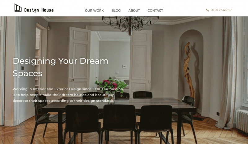
Column 1:
- Create 1 section with 1 column only.
- Add the Site Logo Widget and drag it into the section.
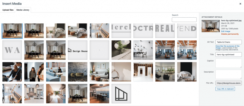
- Give every image file on your site a relevant title and Alt Text inside the Media Library.
This will improve your page accessibility and your search engine rankings. In the logo we originally used, the title isn’t relevant to the actual image, and there’s no Alt Text.
- Set image dimensions inside the widget.
This allows the page to be laid out with the appropriate space before the images have loaded — avoiding layout shift (a factor measured by browsers.)
In the example we’re working on together, address this issue by going to the Style tab and setting the image width to 200px.
Column 2
Back in the widgets panel:
- Drag and drop the Nav Menu Widget underneath the logo
- Set the pointer to “None”
- Go to the “Style” tab and add the font of your preference (so that it will match our previous design)
Best Practices for Global Styling:
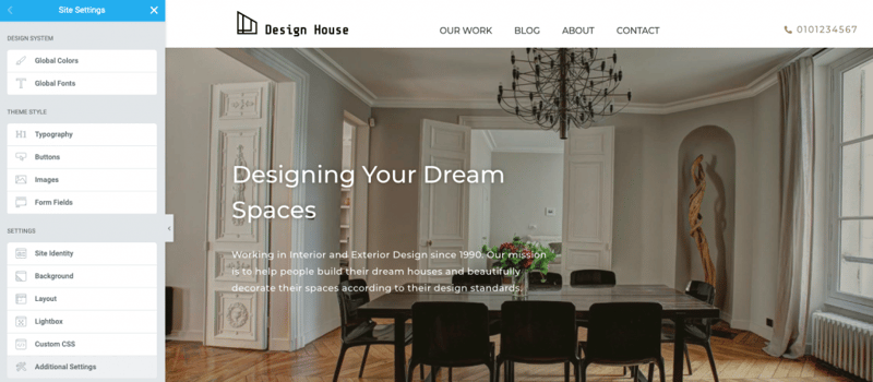
- Avoid using more than 2 different fonts that include multiple weights (Global Fonts).
- Avoid selecting different colors for each element with the color picker (Global Colors).
- Improve your website loading speed by generating fewer requests (Global Fonts).
- Repeat unnecessary code twice (Global Colors).
- Maintain consistency and control over your template (Global Styling).
Global Fonts:
This can be done using the Global Fonts feature:
- Go to the “Style” tab and add the font of your preference (so that it will match our previous design) by selecting one, do a small change, and hover over the plus icon
- Click the plus icon and select the font family that you need
- Save the styles you will be using across the template as Global Fonts
You can then use this style on every widget you create.
Global Colors:
The same method can be used for your Global Colors:
- Click on “Global”
- Hover over Color Picker and click on it
- Select a color and hover over the plus icon
- Click “Global” >> Select “Primary”
Once you’ve done this, the color will be saved to your template’s color palette, so you can select it from your Global Colors list whenever you need it for any element or widget.
Before we continue with our header, let’s set the vertical padding to zero.
Step 3: Edit the Header
Column 3
- Go the “Widgets” panel
- Drag the Icon List Widget to underneath the Nav Menu.
- Delete the extra list items
- Add your text
- Choose the icon of your choice
- Go to the “Style” tab
- Set the Global Colors and Fonts of your choice
We now need to fix one more thing — the three elements in the header are currently stacked and not in line with each other. We can solve this by changing each element’s width to its actual size, so it won’t take up the whole space of the column.
To fix this:
- Select the Site Logo Widget >> “Advanced” tab
- Select “Positioning” and set its Width to “Inline”
Repeat this exact step for both the Nav Menu Widget and for the Icon List Widget.
Now that all of the Header elements fit inline, all that’s left is to position them properly.
Setting the Column’s Positioning with Inline Elements
- Select your Column >> Go to the “Layout” tab
- In “Vertical Align”, choose “Bottom”
- “In Horizontal Align” choose “Space Between”
Choose the “Space Between” alignment positions the first and last widget at both ends, giving equal spacing between all the other widgets.
However, the first and last widgets have different widths, so the equal space might not always center our inner widget.
We can fix this by adjusting the margins:
- Select the Nav Menu Widget >> “Advanced” tab
- Unlink the margin, and remove the spacing with a negative value
Step 4: Make the Header Responsive
Now, let’s find out how the current version of our website looks on mobile devices.
Best Practices for Mobile Responsiveness:
- Simplify your design and think of ways to make the same sections responsive, to avoid using twice the amount of code which will affect your page speed.
Just like you see in this header — It’s common to see the same section redesigned specifically for tablet and mobile devices. This is what we see here: two versions of the design were created: one version for desktop and one for mobile.
Instead, when your design and code are responsive, your page speed will improve since it will be using less code.
Let’s see how we can achieve this, using the “Custom Width” setting for our widgets and elements.
Setting Custom Width for Tablet
- Click on “Nav Menu” >> “Advanced” tab
- Select “Positioning” >> Set the Width to “Custom”.
- Select “%” >> Give the Widget the same Width (in percentage) of the empty space around it.
- Click on the “Content” tab >> “Toggle Align” >> Select “Right”.
This lets you align the toggled menu anywhere within the widget’s width.
Now, let’s finish styling the toggled menu.
- “Content” >> Click on the “Full Width” toggle and set it to “Yes”.
- “Style” >> Remove the background by dragging the “Color Picker” bar all the way to the left.
Now let’s check how things look on a mobile screen.
Setting Custom Width for Mobile
In this scenario, we’ll keep all three of the header’s widgets inside the viewport. But keep in mind that for some sites, it might make more sense to omit some of the header’s elements when it’s viewed on mobile or tablet.
In this case, what happens to our Header when viewed on mobile is that the Nav Menu and Logo widgets can’t fit together inside one line.
To fix this:
Nav Menu Positioning
- Click on “Nav Menu” >> “Advanced” tab
- Select “Positioning” >> Set the Width to “Custom”
- Select “%” >> Give the Widget a 30% width, so it will fit next to our logo
Icon List Positioning
- Click on “Icon List” >> “Advanced” tab
- Select “Padding” >> Unlink the values
- Add 12px padding to “TOP”
Can you believe it?
Originally, our Header used 2 sections, 12 widgets, and 10 columns.
Now, our Header uses 1 section, 3 widgets, and 1 column.
And the result looks the same!
Step 5: Optimize the Hero Section
Let’s proceed to the next section of our website: the hero section.
Best Practices for Hero Sections:
- Make sure your hero text is easily visible, especially when it has a background image.
Controlling the Widget’s Position in a Column
A common mistake that we see made in the Elementor Editor is using extra columns and spaces to control the positioning of a widget.
In our template example, our hero image consists of a section with a background image. The Heading and Text are positioning horizontally, using two columns. There is also a spacer inside the section to space the items vertically.
Let’s see how we can create the same design yet with only one section:
- Delete the extra column on the right of the text.
- Delete the spacer.
Instead, to position our hero text where we want to, we will use the column alignment options:
- Select the column.
- Set the “Vertical Align” to “Middle”.
- Go to the “Advanced” tab.
- Select “Padding” >> Unlink the values
- Set Right Padding to 50%.
- Select the section.
- Select “Minimum Height” >> Set it to 80.
Fixing the Contrast Between Texts and Backgrounds
It’s important for every website to have good contrast between the text and background. Non-readable information affects your website scores and can also drive visitors away. No matter what, the text must always be clearly readable.
There are several ways to improve the clarity of a section whose background is a colorful image (like we see in this template):
- Click on your Heading.
- Go to the “Style” tab >> Select “Text Shadow”.
This will improve the readability of the text by making it stand out from its background image.
Another way to make your text more clear is by using overlays.
- Select the Section >> “Style” tab >> “Background Overlay”
- Select one of your Global Colors and play around with the opacity until you get your desired result
Step 6: Optimize the Section With Icon Boxes
Now let’s proceed to our next section, where we currently have an inner section with four columns. At the moment, each column includes three widgets: Image Widget, Heading Widget, and Text Editor Widget.
Let’s see how we can simplify this section to improve its performance.
Icon Box Content
- Select the “Icon Box Widget” from the widget menu and drag it into the column
- Select “Icon Box”
- Hover over the icon image
- Select “Upload SVG”**
- Insert your Custom Icon
** Please note: The badges are SVG files. If you haven’t done so, go to the WordPress dashboard and then Elementor >> Settings. You’ll have to turn on Enable Unfiltered File Uploads.
- Type in your “Title”
- Type in your “Description”
- Select “Style”>> Choose a Global Color
- Select “Size” and drag the bar to your size of choice
- Select “Padding” and drag the bar to your number of choice
Step 8: Optimize the "Services" Section
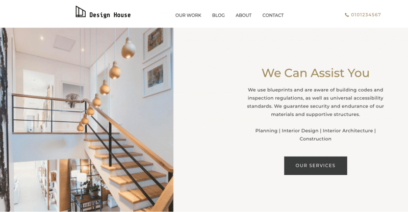
We’re now going to rebuild the “Services” section, which currently uses two columns, two images, Heading Widget, and Text Editor Widget.
Let’s create the same design in a new section, but with one column only.
- Create a new section with one column
- In “Layout” >> Set “Content Width” to “Full Width”
- Select the “Image Box Widget” from the widget panel and drag it into the column
(We’ll be able to fit all of the section’s assets into this widget)
- Type in the heading
- Type in the description
For the image, we’ll maintain the current design we’ve used for our images.
- Insert the same image from the Media Library
- Go to “Content” tab >> Set “Image Position” to “Right”
- Go to “Style” tab
- Increase the “Spacing” between the elements
- Increase the “Width” of the image
- Expand the “Content” section
- Choose “Center” Alignment
- Set “Vertical Alignment” to “Middle”
- Set the Global Colors and Fonts of your choice
- Go to “Advanced” tab
- Add 10% padding to the widget
Now, the Services section has the same design, but with fewer assets.
Step 9: Optimize the Call to Action Section
Best Practices for CTA links:
- Make sure all of your links and social media links work correctly, and that the button contains the link.
- When adding a link to a different website, include this attribute: “rel|noopener”
(You can do this by clicking on the gear icon and typing the attribute into “Custom Attributes”). This will open the link in a new browser tab and boost your performance score.
The next section presents a call to action for our services.
The section currently includes two columns, which contain:
- A background image with a spacer
- Two headings, one inner section, one text editor, and one button
Let’s create the same design in a new section, but with one column only.
- Go to “Layout” tab >> Set “Content Width” to “Full Width”
- Go to “Advanced” tab >> Delete any extra padding
- Select the “Call To Action Widget” from the widget panel and drag it into the column
- Set “Image Position” to “Left”
- Select your image from the Media Library
- Expand the “Content” section
- Type in the heading
- Type in the description
- Type in the button text
- Go to “Style” tab
- Add “Padding” between the elements
- Adjust the Image Width
- Expand the “Content” section
- Select the Global Font for your Title
- Increase the space between the Description and the Button
- Choose the right Global Colors for each asset
- Expand the “Button” section
- Set its Size to “Large”
- Customize it to your requirements, such as Background Color and Border Radius
Until now, this was a 2-column section with 6 widgets. Now, it’s one 1-column section with 1 widget only!
Step 10: Optimize the Image Carousel
The current design of our Image Carousel section has a common error with how it displays multiple images.
This design consists of 5 columns, a practice which many users tend to do to control their image sizes.
Let’s explore an easier way which will also optimize your site performance.
- Create a new section with 1 column
- Go to “Layout” tab >> Set “Content Width” to “Full Width”
- Select the “Image Carousel Widget” from the widget panel and drag it into the column
- Add the images of your choice from the Media Library
- Go to “Content” tab
- Set “Image Size” to “Medium – 300 x 300”
- Adjust “Slides to Show”,“Slides to Scroll”, and “Navigation” according to your preferences
- Go to “Style” tab
- Set “Vertical Align” to “Center”
- Customize the “Spacing”
- Go to “Advanced” tab
- Add necessary padding
What was once a 5-column section is now 1 column only.
Let’s move on to the next section, where we can optimize the videos on our site.
Step 11: Optimize the Video Section
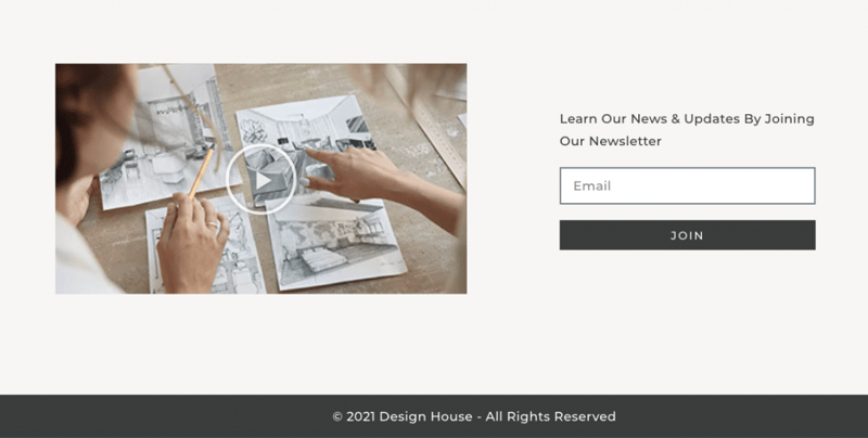
Video Content Best Practices:
- Use Lazy Load whenever possible, so you can improve your websites’ loading time.
What happens when we apply the “Lazy Load” option?
Technically speaking, the video embed code is replaced with a static image. This way, the video is only loaded when the user clicks on the image — which really helps with our page loading times.
You can find this option in a variety of other widgets like Lottie Widget and Gallery Widget (Pro).
What we’ll do now is modify how we use the Video Widget, so that it doesn’t delay our page speed or site performance.
- Select the “Video Widget”
- Go to “Style” tab
- Select “Lazy Load”
Step 12: Optimize the Footer and Keep It Updated

A common mistake seen on many websites is that their footer uses multiple headings for the date and description, as well as an icon for the copyright symbol.
Let’s see how to optimize the footer and make sure it always stays up to date.
We’ll set up this continuous update process by using Dynamic Tags. That way, we won’t need to change the Header content every year, since the Dynamic Tags will automatically update to the current year.
We’ll do this by taking the following steps:
- Delete the extra widgets, leaving only the Heading Widget
- Select the Heading Widget
- Click the “Dynamic Tags” symbol on the right of the “Title” field (otherwise known as the “Parent button”
- In the dropdown menu, select the “Current Date Time” menu item
- Click on the wrench parent icon
- Click on “Date Format” tab and select the “Custom” menu item
- Delete what’s currently in the “Custom Format” field, except for the “Y”
- Select the “Advanced” tab
- Select the “Before” field and hold the “option” and “G” keys simultaneously (or “control”,“alt”, and “C” simultaneously) to type the “©” symbol.
- Add a space for after the “©”
- Select the “After” field
- Type in a space, and write the text that you want to appear after the year — such as “All Rights Reserved”
You may notice that in this tutorial’s sample site, each widget has its own section. We did this to make the tutorial clearer and easy to follow.
Ideally, the less sections you have, the less extra HTML you’ll have.
You can merge certain widgets into the same section by dragging and dropping them into the section above, and then deleting the empty section.
And that’s all, your layout is optimized!
Retesting the Site Performance
We’ll check the results in the DevTools window (Inspector):
- Select the “Network” tab:
There are some nice, positive changes here:
- The website now takes 568 milliseconds to load
- We’ve gone from 81 requests to 46
- Select the “Lighthouse” tab, where you’ll see that our performance score has gone from 73 to 98
Keep in mind that we’ve optimized our performance without using any third party plugins. All it took was some simple adjustments and better practices.
Step 13: Test the Results With Motion Effects
We want to make our site more interactive and playful, but how will this affect our performance scores? Let’s see what we can do.
Make the header a “fixed” element:
- Select the Header
- Go to the “Advanced” tab
- Expand the “Motion Effects” tab
- Set the “Sticky” option to “Top”
Make the hero section a “fixed” element:
- Select the hero section
- Go to the “Style” tab
- Select the “Attachment” dropdown and select “Fixed”
Use an Entrance Animation for the hero text (heading):
- Select the Heading Widget
- Go to the “Advanced” tab
- Expand the “Motion Effects” tab
- Select the “Entrance Animation” and set it to “Fade In”
Use an Entrance Animation for the hero text description (Text Editor Widget):
- Select the Text Editor Widget
- Go to the “Advanced” tab
- Expand the “Motion Effects” tab
- Select the “Entrance Animation” and set it to “Fade In”
Do the same for the widgets that come after, for subtle effects when the page loads.
Now, let’s run the performance test again, to see how the motion effects have affected our score:
- Go back to the ‘Inspector’ window
- Select the “Lighthouse” tab
- Click “Generate report”
Now, we see that our performance score has been reduced to 97 — this is certainly not a big difference and it makes the website more interesting and playful.
Can You Believe Our New Performance Score?
We’re excited for you that you’re now fully equipped to raise your performance score of every Elementor website you build. This will make a big difference to your website creation goals and business success.
We suggest bookmarking this tutorial for future reference, so that you can review your website pages for performance and apply best practices to optimize your layout.
And this is only the beginning — the next part of this course addresses image optimization. In the tutorial, we’ll go over each image in the example site and learn how to improve them for even more efficient loading times.
Happy learning (and performing)!
Looking for fresh content?
By entering your email, you agree to receive Elementor emails, including marketing emails,
and agree to our Terms & Conditions and Privacy Policy.
