Table of Contents
About the author: Alina Khazanova, Product Designer @ Elementor
Alina is a product designer at Elementor. Her passion is to bring valuable and satisfying product experience to the users.
According to the World Health Organization, over 5% of the world’s population has disabling hearing loss, and at least 1 billion people suffer from vision impairment or blindness. To avoid unintentionally excluding anyone from accessing your website or apps, it’s important to make web accessibility a priority.
This requires you to implement digital accessibility as a core part of your projects, rather than as an afterthought. You’ll be able to create a better User Experience (UX) that your audience will appreciate, and avoid legal issues that might arise due to non-conformance with international accessibility standards.
In this article, we’ll discuss web accessibility in depth — what it is, why it’s vital, some standards guiding conformance, principles to aid you when implementing it, and finally, how to test and improve your website’s accessibility. Let’s dive in!
What Is Web Accessibility?
From a broad perspective, an accessible website is one that is readily available and comprehensible to any user regardless of their device, situation, or ability. Web accessibility encompasses any tool or technology used to access the internet and digital products.
Although internet technology was designed to remove many barriers and obstacles to communicating and interacting with the world, certain issues can get in the way of this ideal. For example, people with disabilities such as blindness or hearing loss can have some trouble interacting with a site if there aren’t adequate enhancements built-in.
Like everyone else, these people have a basic right to interact with and contribute to the web, as well as to perceive information through a variety of digital devices. Therefore, accessibility is considered an essential part of any site or application.
Why Design for Web Accessibility?
Designing for accessibility can benefit people who have disabilities that affect access to the web. These impairments can be auditory, cognitive, neurological, physical, speech-based, or visual. As digital designers, we are responsible for making our creations inclusive and accessible to people with diverse abilities and in many contexts:

It is important to note that accessibility can benefit even those without disabilities. For example, older people tend to have difficulty reading small fonts. You may also have users with small screens, slow internet connections, or ‘temporary disabilities’ such as lost glasses. You’ll also need to account for ‘situational limitations’ like a noisy environment.
If that’s not enough, there are plenty of other arguments for making your website accessible. Not only is it a good practice, ethically speaking, but it’s also essential to meet many international standards and minimize legal risks. In other words, failure to conform to these standards can leave you open to lawsuits.
For example, the Americans with Disabilities Act (ADA) is a law in the USA that prohibits discrimination against individuals with disabilities. According to UsableNet’s report for 2020, ADA-based web and app lawsuits were filed even during the coronavirus lockdown, and they quickly reached their 2019 rates as early as May.
It is important to research the accessibility guidelines for your industry, to ensure that your site is fully compliant. For example, government websites in the public sector are required to adhere to stricter guidelines than in other industries. Regardless of your reason for ensuring compliance, it will be time and effort well-spent.
Finally, there is also a business case for accessibility. Accessible websites often rank higher in search results and have faster loading times. Running a highly-accessible site is also a perfect way to strengthen brand presence, attract more visitors, and improve the overall customer experience.
An Introduction to Web Accessibility Standards
While you can find several resources online about how to make your website accessible, a widely agreed-upon standard is useful for ensuring consistency. This is the role filled by the Web Content Accessibility Guidelines (WCAG), an international standard developed by the W3C Web Accessibility Initiative (WAI).
WAI is a project by the World Wide Web Consortium (W3C), which is the main international standards organization for the web. It provides technical specifications, guidelines, techniques, and supporting resources for accessibility. The WCAG is regularly updated, and the latest edition is WCAG 2.1.
The 4 Main Web Accessibility Principles
Exploring the WCAG guidelines on your own can be overwhelming, so we’ve put together a brief overview of the most important points that will help you implement accessibility in your projects. Here are the four main principles you’ll want to keep in mind.
1. Your Content Should Be Perceivable
The internet is a huge trove of information, and all of that content needs to be perceived somehow. By using the sense of sight, one can read the text, make sense of page layout, and understand the meanings of words and colors in different contexts.
However, when your users cannot rely on sight, there need to be alternative ways for them to engage with your application. You’ll want to provide captions and other substitutes for multimedia elements.
Assistive technologies can be very handy in this respect. For example, screen readers can take care of converting your text to audio. However, you’ll first need to ensure that your site is designed with accessibility in mind. Only then can you fully take advantage of the extra functionality these assistive products offer.
2. Your User Interface (UI) Should Be Operable
Whether or not users can interact with your site using physical devices such as a keyboard or mouse, or have a personal preference for alternative methods, you’ll want to accommodate as many needs as possible. It’s smart to ensure that your users are able to navigate and engage with your website and its content efficiently.
For example, supporting keyboard navigation also makes your content accessible by devices that emulate keyboards. You’ll also want to allow your users enough time to complete tasks. For example, they should be given adequate time for reading confirmation messages before the page is reloaded.
Key features you can provide in this area include site search, site maps, and “skip navigation” links. Additionally, you’ll also want to ensure that your content structure is easily perceivable, by making ample use of semantic elements and spacing.
Although there may be security concerns over features such as extended time limits in certain applications, such as online banking or school tests, you’ll want to do your best to keep things secure while still ensuring that disabled users aren’t excluded. For example, in the case of tests, you can create custom time limits for different students.
3. Make Your Content Understandable
Humans communicate mainly via verbal or written language, and the best way to ensure that your material is understandable is by using appropriate font sizes and color contrasts. Users should also be provided with straightforward feedback so they can avoid and correct mistakes. It’s also important for your navigation to be clear, consistent, and predictable.
Factors such as educational background, culture, and familiarity with the subject matter can affect one’s ability to understand a given piece of content. Therefore, you’ll want to make sure to use simple words, explaining any background information required to sufficiently assimilate a piece of content. Also consider making supplements to text available, such as audio files, videos, illustrations, and more. It’s also smart to include summaries of lengthy material.
4. Your Website or Web App Should Be Robust
Technologies keep evolving, and it’s important that your application keeps up. You’ll also have users accessing your site with many different operating systems and browsers, even outdated ones. Your website still has to work for everyone (or as many users as possible), and visitors will want to be able to choose or customize their technologies to meet their needs.
One way to achieve robustness is to build your website or application using modern tools and techniques. This requires clarity and careful planning during the development stage. For example, you’ll want to use the correct markup for content and include appropriate names, roles, and values for components.
To accommodate as many users as possible, consider setting baseline requirements for using your site. For example, you might choose to support older browser versions up to a certain limit. You should also consider validating your site against technical standards — such as by using the W3C markup validator or the CSS equivalent — as compliant code is more likely than not to work across browsers and with different assistive technologies.
How to Understand Web Accessibility Success Rates
Each of the four accessibility principles listed above can be measured using a success criteria level. This can be:
- A: The minimum requirement for accessibility
- AA: A medium or good level of accessibility
- AAA: The gold standard of accessibility
Ensuring the lowest level of accessibility by removing the most significant obstacles fulfills the minimum requirement. However, satisfying the next two levels after that increasingly enhances User Experience (UX) for those with and without disabilities.
Is your website accessible? Find out and fix issues fast with Ally.
Website Accessibility Checklist: 11 Key Points
Now that you are familiar with both the international standards and key principles for accessibility, let’s review some best practices for implementing them into your projects. Although designing with accessibility in mind can seem difficult at first glance, these eleven tips can make it easier for visitors to use your website.
1. Ensure Enough Color Contrast
Color contrast is a measure of the perceived difference in brightness between two colors. This difference is expressed as a ratio, and it ranges from 1:1 to 21:1. For example, pure green has a ratio of 1.4:1.
The WCAG guidelines provide three success criteria for ensuring adequate color contrast. However, it can be overwhelming to ensure conformance manually. Fortunately, there are many tools to help you check contrast ratios for the different elements on your website:

One such tool is the Color Contrast Analyzer, a Sketch plugin that calculates the color contrast of two layers and evaluates it against the WCAG. Another example is ColorShark, a simple online tool that tells you whether or not your colors pass the contrast guidelines. It can even simulate how people with visual disabilities will perceive those colors:

Additionally, tools such as Pa11y or Accessible color palette builder can help you test color combinations and build accessible palettes online. Button Contrast Checker scans your website and provides information about button contrast. Finally, Google’s Color Tool helps you choose accessible color combinations using the Material Design palette.
2. Don’t Rely on Color Alone When Providing Important Information
Although it is important to ensure adequate contrast in your web content, color can be perceived differently by people with disabilities. Therefore, it should not be the only clue used for presenting important information.When designing forms, you’ll want to identify required fields and error states using symbols or supporting captions, in addition to contrasting colors:

To highlight interactive elements such as links within text, consider adding visual cues like font weights or an underline text style.
3. Make Interactive Elements Stand Out
You’ll want to accommodate users who access your site in multiple ways, such as by using a mouse, keyboard, or screen reader. One way to achieve this is by using distinct styles for interactive elements such as links and buttons. These should be easy to identify, and your users should be able to understand at a glance which elements are in focus or clickable:

Therefore, you’ll want to consider using multiple styles for different states. For instance, hover and focus states should be distinct for user actions such as mouse hover, keyboard focus, and touchscreen or click activation.
For keyboard focus in particular, you might use a border or other kind of highlight to indicate the currently-focused element as the user tabs through any given page.
4. Include Textual Labels for Inputs and Form Elements
Next, you want to ensure that form fields and elements have clear textual labels associated with and positioned adjacent to them:

The exact positioning will depend on the writing direction of the language. For left-to-right languages, the form field labels are usually placed on the left or above the input. The exception to this is checkboxes and radio buttons, where the label is placed on the right.
5. Provide Consistent Options for Website Navigation
Your website’s navigation can also play a key role in its accessibility. You’ll want to ensure that it stays consistent in terms of naming, layout, and styling. Each navigation item should be easy to reach and interact with. It’s also important to provide alternative features such as site search or a site map.
You may also consider providing cues to orientate the user to their current location. This can be achieved using breadcrumbs or clear headings. Consistent navigation can also significantly improve the UX of your site for anyone with cognitive difficulties.
6. Give Clear and Informative Feedback
It is important that your users receive clear feedback from their interactions. For example, you’ll want to show confirmation messages for key actions, such as when a form is completed or a payment is processed. Additionally, alerts can be helpful for informing users about an error in the system:
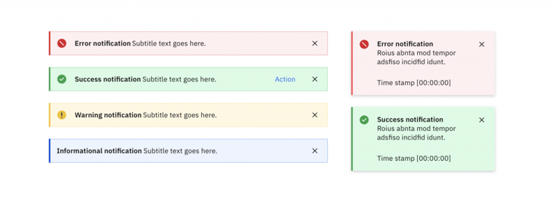
Notifications can also be used to provide information about a particular process or update. No matter what it’s for, all feedback should be clearly identifiable using a combination of text, icons, and background colors. Finally, it’s important to go beyond just displaying feedback, and also provide straightforward explanations and instructions on how to recover from errors.
7. Organize Content Visually With Relevant Headings and Spacing
Another way to improve the UX of your websites and web apps is to create scannable content. This can make your site easier to understand, reducing cognitive overload. White space and headings can also be used to organize content into relevant groups.
Additionally, white space is useful for creating clear relationships between headings and paragraphs:
8. Make Your Design Responsive
These days, responsive design is not an option — it’s a necessity, and a crucial part of any site’s accessibility that shouldn’t be overlooked. Your website should work well and look good on many different screen sizes and devices, including desktops, tablets, and mobile phones.
Some tips for achieving this include ensuring that properties such as text size and line-height are adequate, as this can improve readability. You can also create different layouts for the most popular screen sizes.
On larger displays, you can use small text, multiple columns for your main content, and navigation options that are always visible. In contrast, smaller screens might benefit from larger text, single columns for the primary content, and navigation options that stay hidden until they’re triggered open by a feature such as the hamburger icon.
If possible, consider gathering real data about the most popular screen sizes among your users, making sure to provide compelling designs for all of them. One handy resource for checking viewport sizes and pixel densities on a wide range of popular devices is Screen Sizes.
9. Include Textual Alternatives for Images and Other Media
Images and multimedia content should have alternative ways for users to perceive. Examples of this are using textual captions for images, and including a transcript for audio or video content.
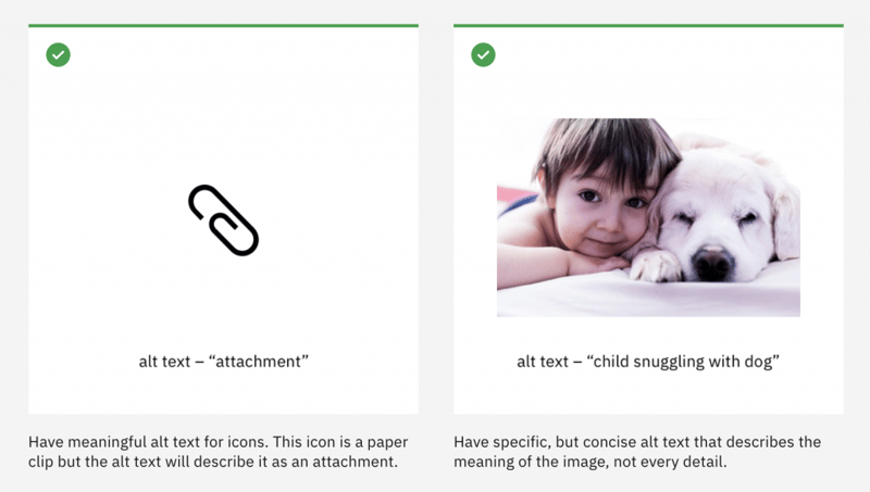
You can also provide audio versions of video content for your blind users, as well as captions and descriptions for tables and graphs.
10. Provide Controls for Auto-Playing Content
If your website includes auto-playing content such as videos, audio files, or media galleries, you’ll want to make sure to include visible controls. This can enable your users to play, stop, or switch between different items manually.
A common example of auto-playing content is the carousel, also known as a slideshow or image slider. For this type of feature, you might consider including left and right arrows, and making sure they are operable using a keyboard. This ensures that keyboards, screen readers and voice input software can be used to navigate your slideshows easily.
11. Support Keyboard Navigation
The last item on our list is supporting keyboard navigation on your site. This is a crucial part of web accessibility, because many users who are unable to use a mouse will depend on their keyboards to navigate your content. Those with motor or visual disabilities who rely on screen readers, as well as power users, will also expect your website to support keyboard navigation:
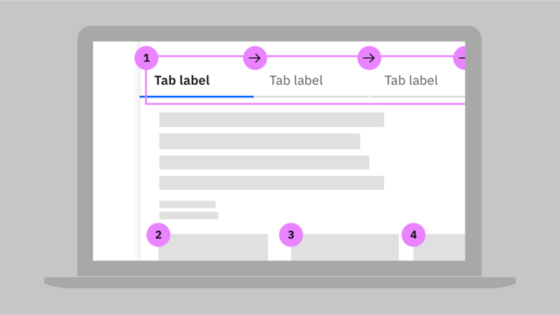
For those power users, you might also consider creating accelerators, or keyboard shortcuts, for your application. This can ensure that both newer and more advanced users (who might want faster ways to complete tasks) are accommodated.
How To Test and Improve Your Website’s Accessibility
At this point, we’ve reviewed some useful techniques for implementing web accessibility when working on a new project. However, it’s also important to regularly test and improve your existing website, and here are some ways to do that.
Conduct an Accessibility Audit
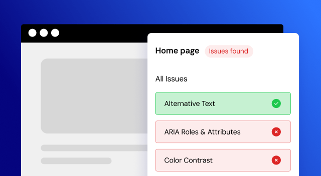
An accessibility audit is an evaluation of your website based on recognized metrics and standards. It can be conducted at different stages of a project’s development. For example, issues such as non-semantic markup or missing alt text can be discovered pre-launch, or long after a site has been up and running.
During accessibility audits, experts run automated and/or manual checks on different pages of the website, to ensure that it meets the WCAG’s AA standards. Firms and private consultants provide these audit services for businesses.

However, enlisting the help of audit services is an expensive solution that suits larger companies looking to ensure compliance with accessibility laws and legislations. For more on this, web accessibility consultant Kris Rivenburgh has written an article on the cost and process of a manual audit.
Note that if there are not enough resources to hire an external supplier, it’s also possible to conduct an accessibility audit internally.
Employ Useful Tools for Testing and Improving Accessibility
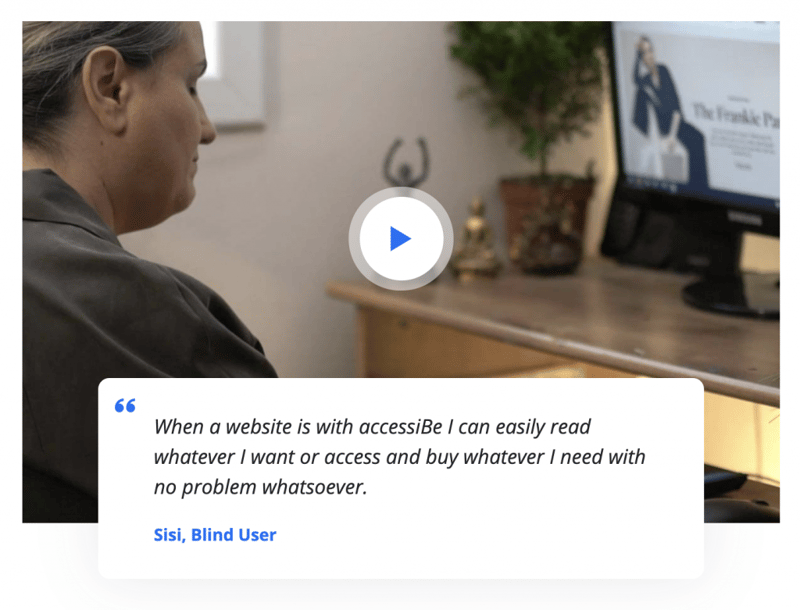
An alternative to conducting a time-consuming audit is using available tools and solutions to help you test and improve your website’s accessibility. For example, AccessiBe is a startup company that has created an automatic solution for accessibility checks and adjustments, using machine learning and computer vision technologies:
Additionally, there are some browser extensions and WordPress accessibility plugins that can enable you to carry out accessibility testing for your website.
Make Your Website Accessible With Elementor
If you’re a WordPress user, you’re in luck. There are plenty of default WordPress features that can help you improve your website’s accessibility. What’s more, Elementor can bolster your site’s accessibility quickly and easily.
For example, Elementor makes it straightforward to include alt attributes and ARIA labels, create accessible forms, ensure sufficient color contrast, and more. We’ve previously covered the process of creating an accessible website in Elementor, so getting started is simple.
Design for Web Accessibility
Web accessibility is crucial for modern websites. An accessible site or web app can attract more customers and improve the public perception of your brand. You’re also better placed to avoid legal problems for your business or clients, which can result from non-conformance to industry standards.
Adherence to accessibility standards such as the WCAG can be a great starting point. Additionally, there are a number of well-proven steps for making your website accessible. We’ve discussed eleven of the most important techniques in this article, such as ensuring adequate color contrast, not relying on just color when providing important information, including textual alternatives for images and similar media, and more.
We invite you to dig into some of the resources we’ve collected below, to help deepen your knowledge of web accessibility:
- Web Accessibility Initiative (WAI)’s website: This site is the official resource for accessibility standards and techniques.
- WCAG 2.1 at a Glance: This set of WAI’s resources will help you become familiar with WCAG 2.1 accessibility standards.
- Digital Ally’s list of tools: For checking color contrast accessibility.
- Digital Ally’s list of browser extensions: For accessibility testing.
- Google’s Accessibility Products and Features: A set of accessibility resources, products, and features.
- IBM’s Equal Access Toolkit: A number of well-crafted accessibility guidelines and best practices.
Which accessibility tips are you most excited to apply in your website design projects? Share them with us in the comments section below!
Looking for fresh content?
By entering your email, you agree to receive Elementor emails, including marketing emails,
and agree to our Terms & Conditions and Privacy Policy.


