Table of Contents
Whether you’ve only just started your web design business or you’ve been working as a designer for years, you’ve likely noticed how much the face of the web changes from year to year.
Some web design trends are fairly subtle, like a shift from using solid color backgrounds to gradients. Others, however, signal a massive change in the way we design websites.
One of the most recognizable examples of this took place in the earlier part of the 2010s, as websites moved from skeuomorphism (when objects are designed to resemble their real-world counterparts) to flat design, and flat-design inspired material design.
Flat design, in particular, has proven itself useful not only in web design but in graphic design. It is a highly effective way to design engaging interfaces and branding and, as a result, leads to higher rates of engagement and conversions.
Let’s start with understanding what flat design is, exactly.
Table of Contents
What Is Flat Design?
Flat design is a user-interface modern design style known for the following traits:
- A modern and digital-friendly aesthetic
- Minimalist styling
- Ample white space
- Symmetrical grid-based layouts
- 2D elements
- Bright, high-contrast colors
- Bold, readable typography
- Symbolic icons
- Simplicity (so no gradients, textures, abstract forms)
Because of its focus on cleanliness and order, flat design creates very functional websites, where the user journey is clearly laid out and the interface provides little to no distractions or friction.
The History of Flat Design
Flat design was created in direct response to skeuomorphism’s age of realism.
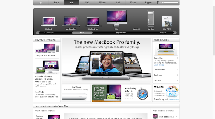
Here’s an example from the Apple website in 2010, with its overabundance of skeuomorphic images and icons:
Clearly, something needed to be done to create a more attractive, intuitive, and user-friendly interface. The Apple website in 2020 is the perfect example of how to do this:
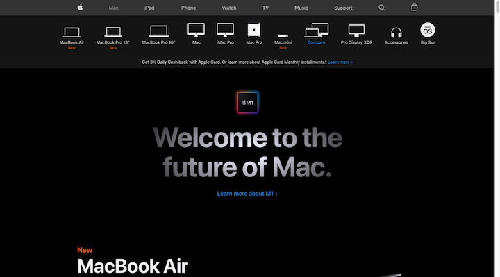
Notice how the device navigation at the top is similar to the one from ten years prior. But the realism is gone and replaced by flat symbols.
Not only is the flat design more attractive, but it’s more space-conscious as well.
Swiss Style
Now, while it’s true that consumers got burned out on skeuomorphic design, flat design wasn’t just created to be the exact opposite of its predecessor. It was actually inspired by Swiss Style.
Also known as International Typographic Style, Swiss Style was a type of graphic design that became popular in the mid-twentieth century. It was known for:
- Minimalism
- Grid-based layouts
- Asymmetrical layouts
- Legibility
- The widespread use of sans-serif typography
- Storytelling with a combination of photography and text
- Functionalism
The 1950s type specimen book for Neue Haas Grotesk (or Helvetica, as we know it today) is an example of Swiss Style:
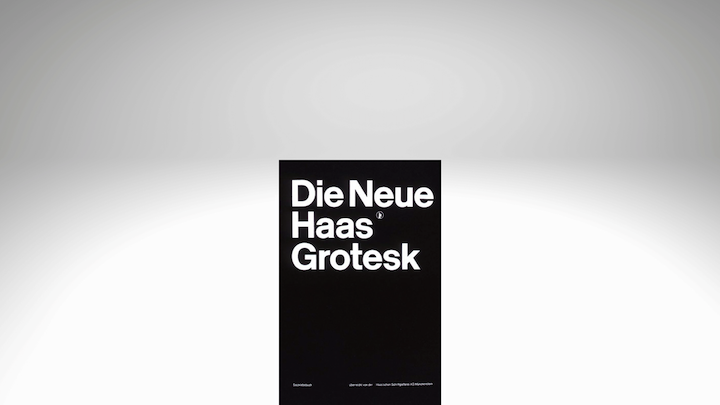
As you can see, a lot of what we now use in modern (flat) design was clearly inspired by the sharp contrasting color palettes, flat and safe typography choices, and grid-based layouts of Swiss Style.
Microsoft and Flat Design
The company that’s given credit for bringing flat design to the modern digital era is Microsoft.
It was in the early 2010s when Microsoft began to transition its products’ interfaces over to a completely flat and more intuitive UI. Apple eventually adopted the trend in 2013. And flat design blew up shortly after that.
Flat design became the “it” trend for all kinds of digital experiences:
- Websites
- Apps
- Software interfaces
- Illustrations
- Ads
- Logos
- And more
That said, flat design as we knew it then has undergone a subtle facelift in recent years to account for some usability issues.
Flat design 2.0
According to the Nielsen Norman Group, this is the biggest issue with flat design:
“We’ve noticed that long-term exposure to these flat yet clickable elements has been slowly reducing user efficiency by complicating their understanding of what’s clickable and what isn’t.”
Although a flat design interface was cleaner and easier to navigate, it removed the key signifiers that created click confidence in users. For instance:
- Raised buttons
- Underlined and colorful hyperlinks
- Actionable text alongside icons or buttons
Initially, Material Design was created to fix this problem. But even that wasn’t a perfect solution and needed fixing of its own.
That’s why, today, flat design 2.0 (or semi-flat design) is the design style we see a lot more of. It takes a best-of-both-worlds approach, combining flat design and Material Design to look something like this:
Simple yet bold sans-serifs, sharply-contrasting colors, and tons of white space continue to dominate flat design UIs. However, we’ve brought back some of the shading and layering in order to improve usability.
Evolution of Flat Design in Modern Times
As we move into 2025, flat design continues to evolve, incorporating elements from other design styles to enhance user experience. The integration of subtle animations and micro-interactions has become more prevalent, adding a dynamic layer to flat interfaces without compromising their simplicity. Moreover, the use of AI-generated graphics and illustrations is on the rise, allowing for more personalized and unique visual elements within flat design frameworks. This blend of modern technologies with traditional flat design principles ensures that websites remain visually appealing and engaging while maintaining their ease of use.
The Benefits of Flat Design
Here are some of the reasons why websites that use flat design principles perform so well with their audiences:
- Flat design’s grid-based layout is inherently responsive.
- It has real staying power, which enables designers to create more future-proof websites.
- You can use flat design regardless of which design niche you’re in.
- The tendency towards flat, neutral typography and abundant space leads to greater readability and legibility.
- Simply designed elements are easier and quicker to comprehend than super-detailed graphics.
- Recognizable icons efficiently guide visitors through the UI while conserving space.
- Distraction-free, intuitive interfaces improve website navigability.
- The strategic use of color, contrast, and hierarchy leads to better visitor engagement and conversion.
- Many of its properties (e.g. minimal UI, simple font styling, high-contrast colors) are useful in designing accessible interfaces.
- Minimally designed websites tend to decrease the load put upon the server, thereby improving loading speeds.
Bottom line: Flat design doesn’t just look modern and clean, it helps websites perform better, too.
Future-Proofing Flat Design
In addition to its existing benefits, flat design is well-positioned to adapt to emerging trends in web design, such as accessibility and sustainability. The minimalist approach of flat design inherently supports faster page loading times, which is crucial for reducing carbon emissions associated with digital infrastructure. Furthermore, the emphasis on clear typography and high contrast colors in flat design aligns with accessibility guidelines, making it easier for users with visual impairments to navigate websites. As designers continue to prioritize these aspects, flat design will remain a cornerstone of modern web design, offering a balance between aesthetics, functionality, and environmental responsibility.
The Criticisms of Flat Design
In addition to the criticisms mentioned regarding flat design 2.0 above, flat design has also been accused of “over-minimalism” i.e. its emphasis on simplicity makes it difficult to distinguish between graphics and visual cues.
This graphic shared by Killed by Google on Twitter is a great example:
Google recently redesigned all of the logos for its suite of products. Rather than allow them to be uniquely designed (and still on-brand), they now use the same color palette and geometric shapes.
This is a form of minimalism taken to the extreme and it’s no good.
You’re already sacrificing a lot of the fine details in a graphic or icon when you flatten it out. If you don’t find a unique way to distinguish between graphics that have different meanings and purposes, you’ll create huge issues for your visitors.
The original flat design can be hard enough to decipher without visual cues that visitors need to know when to take action. The last thing you want is for the cognitive overload to get worse because everything looks the same.
When Should You Use Flat Design?
As we’ve seen already, there is a universal appeal to flat design. But it’s not just a matter of what kind of website to use it in. You can use flat design when creating the following:
- Icon sets
- Custom typography
- Mobile navigation elements (like in hamburger menus or sticky bars)
- UI interactions
- Illustrations
- Mascots
- Animated explainer videos
- Logos
- Infographics
- Social media graphics
- Digital ads
You can also use the principles of flat design in the strategy and implementation phases of your projects. Specifically, flat design is useful in creating website wireframes as well as web design style guides.
How To Enhance Your Flat Design
First things first, make sure you use flat design 2.0 instead of flat design. While a completely flat interface may be okay for some of your visitors, the overall usability of the site will improve if you add some depth and context to areas of the page you want visitors to interact with.
Another thing to keep in mind is that flat design does not mean boring or lifeless. You can still use animations — big or small — to provide feedback, keep visitors entertained while loading, or simply add some extra personality and life to the experience.
Be careful with color selection. Although bold colors are part of the flat design formula, they might not make sense for your brand’s style. Instead, make sure you choose a color palette with strong contrast. That’s all you really need to make certain elements of your UI pop more than others.
Flat design isn’t just for illustrated websites or logos. Usually, when we see examples of flat design in action, we’re looking at icons, illustrations, and other graphic design elements. However, flat design and photography are not mutually exclusive. You can use both on a website, so long as you commit to one kind of imagery (e.g. illustrations vs. photography).
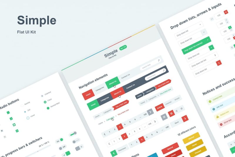
Flat UI Kit
UI Kits can be a valuable design tool when working with flat design and Envato has some great examples for inspiration, like this one from DeoThemes:
5 Inspiring Examples of Flat Design
There are too many examples of flat design around the web. So, what I’d like to do below is show you five particularly stellar examples of companies that have played up the strengths of flat design for their websites and branding:
Tripadvisor
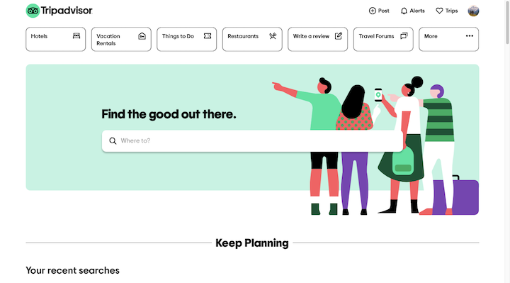
With a website like Tripadvisor, there’s always a risk that the sheer amount of content available will overload the design. However, a glance at the homepage just shows you how effective flat design is at directing visitors through a complex array of content.
Aside from the logo, the only part of the above-the-fold that has any color is the hero image. And it’s the sharp contrast between the colorful image (bright, but not overwhelming) and the minimally designed site that allows visitors to focus on the primary action.
Netflix
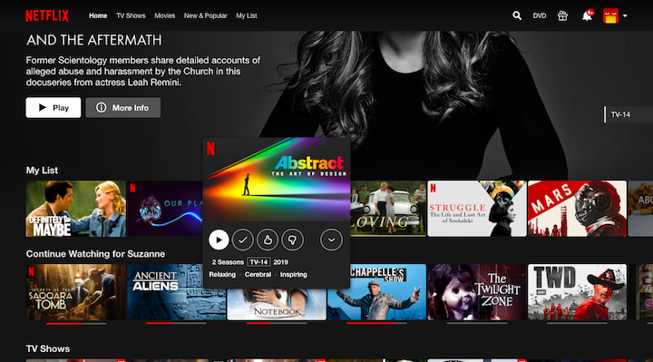
The Netflix website is a great example of flat icons at work.
For starters, the “Play” and “More Info” are accompanied by icons. This isn’t just small attention to detail, these visual cues are meant to expedite the process of finding something to watch.
Let’s not ignore the colors of the “Play” CTA button either. The stark white button against the rest of the dark theme stands out clear as day. This goes for the button next to the recommended pick (at the top) as well as the one that appears upon hover (like Abstract: The Art of Design in the screenshot above).
Anne Klein
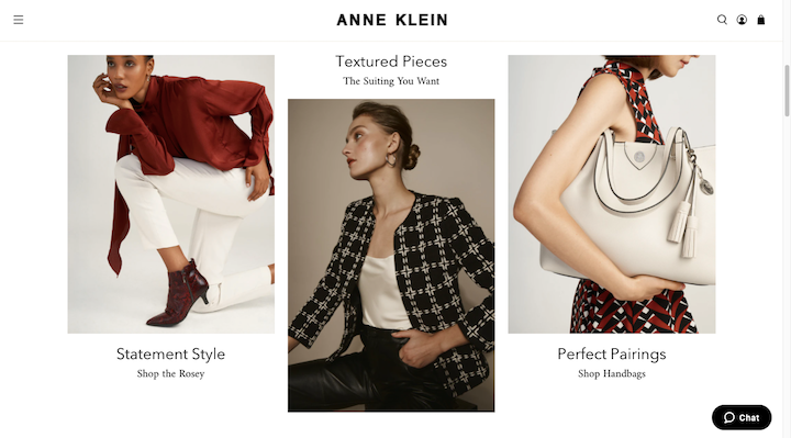
The e-commerce site for Anne Klein does a beautiful job of using the grid, white space, and symmetry to create an easily navigable store.
There’s also a lot to be said for the clean design choices — from the elegant typography to the all-white background — that really allow the colorful images to pop.
Creative Dreams
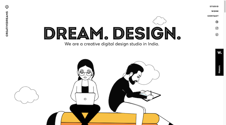
If you want to see an example of how to use flat design in animation, then check out the website for Creative Dreams.
The screenshot we see above is proof enough of how successfully this studio has used flat design. The single pop of yellow for the pencil. The attention to detail in the animated duo. The large, readable fonts. There’s a lot here to marvel at.
Visit Québec City
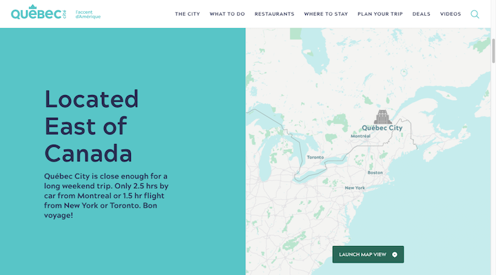
This is a snippet from the homepage of the Québec City tourism website. Everything on this website screams flat design 2.0.
You have strong contrasting colors, but they’re not too bright.
The buttons exist on the same 2D layer as everything else but have visual cues (like the icon in the screenshot or animated arrows in other parts of the site) that let visitors know they’re clickable.
And although every part of the page lives on a strict and predictable grid, the beautiful mashup between images and text tells a captivating story.
Enhance Your Website With Flat Design
Flat design may have its roots in a design style from nearly 70 years ago, but it’s proven to have some real staying power in the digital age.
That’s because flat design focuses on really good design choices that benefit our users:
- Clean, open spaces for easy visibility
- Bright colorful markers for a clear pathway to conversion
- Simplistic fonts balanced with beautiful photos for more efficient and engaging storytelling
- Two-dimensional interfaces that provide a friction-free journey through your content
- And on and on they go
If your goal is to up the engagement and conversion rate on your website, the universally friendly Flat Design is a great way to accomplish it.
Looking for fresh content?
By entering your email, you agree to receive Elementor emails, including marketing emails,
and agree to our Terms & Conditions and Privacy Policy.


