Table of Contents
As a web designer, you have a lot of big decisions to make for each website you build. Color palettes, UI interactions, navigation layout, choosing the best font for your website, and much, much more.
One area of web design that you might not be spending enough time thinking about, however, is font combinations.
Choosing one great-looking font is one thing. Once you have a good sense of the voice and style of the brand, it becomes much easier to identify fonts that convey a similar vibe.
Table of Contents
- What Are Font Combinations?
- Why Do You Need Font Combinations?
- What to Consider When Pairing Fonts
- 4 Rules for Pairing Fonts in Web Design
- Rule #1: Use No More Than Three Fonts on Your Site
- Rule #2: Concord and Contrast Are Good; Conflict Is Bad
- Rule #3: Don’t Be Afraid of Pairing Within Font Superfamilies
- Rule #4: Make Sure Your Fonts Are Properly Sized and Shaped
- The 30 Best Font Combinations for Web Design
What Are Font Combinations?
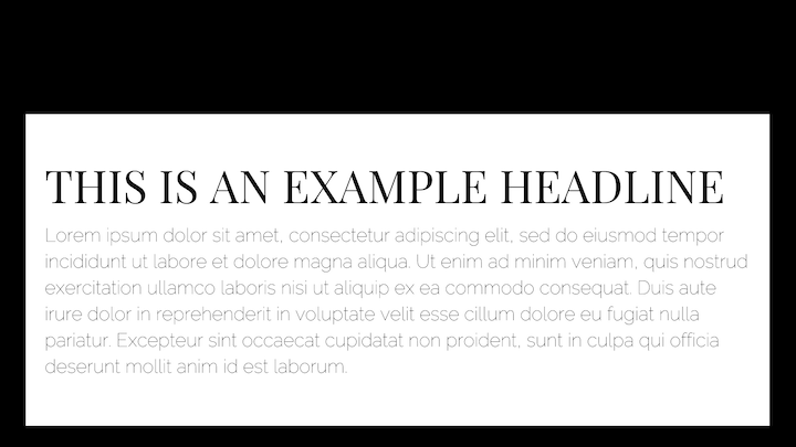
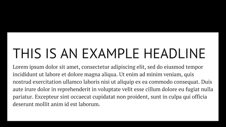
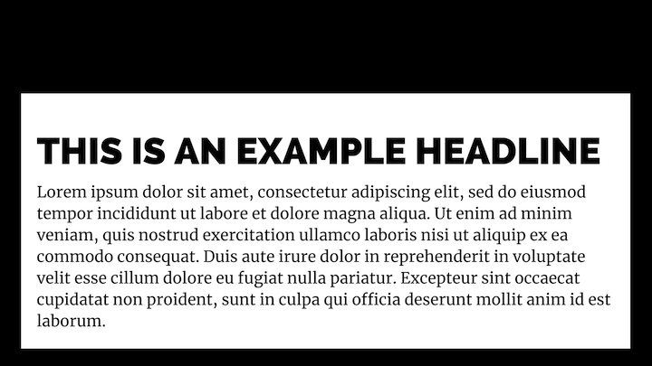
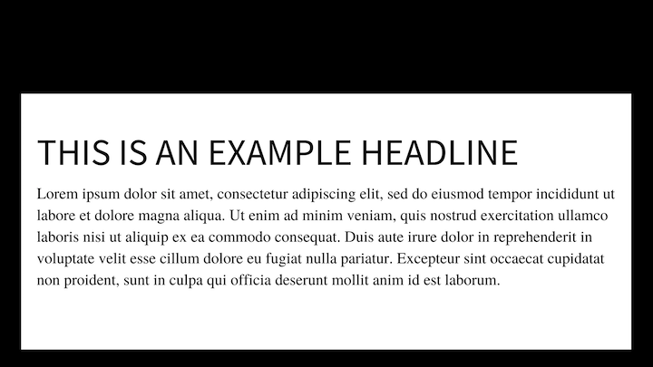
Font combinations (also known as font pairings) are two different web fonts that compliment or balance each other.
Font combinations can be cohesive, or they can use contrast to accent the make certain elements of your typographic theme stand out
Why Do You Need Font Combinations?
Websites need more than one font — to establish hierarchy, to keep visitors engaged with lots of text, and to subliminally tell visitors more about the brand’s personality and approach.
When you add this extra layer of complexity to the mix, things can get tricky. Not only are you pairing fonts with each other; you’re pairing them with your web design, too.
I’m sure you’ve encountered scenarios like these in your journeys around the web:
- Two boring fonts make a lengthy blog post very difficult to read and you end up skimming through the headers to see if you can piece the story together that way.
- A fun and unique cursive font introduces visitors to the business, only for a too-small and super-simple body font to contradict that first impression.
- The website claims that the company takes a youthful and innovative approach to business, which is why the retro fonts seem so out of place.
There’s just too much that can go wrong in font pairing if you don’t take the time to understand how fonts fit together.
What to Consider When Pairing Fonts
In our guide to the best fonts for websites, we summarized the key characteristics to look for:
1. Legibility
One of the reasons why serifs are heavily preferred in literature and newspapers is because of legibility. The serifs (feet) at the tops and bottoms of the characters make it easier for readers to distinguish between similar-looking characters like the uppercase “I” and lowercase “l”, so there’s no slowing down due to comprehension issues.
If you’re designing a page with over 600 words, it wouldn’t be a bad idea to use a serif in the body text for this very reason.
That said, if you find a sans serif with distinct letterforms (even without the serifs), don’t be afraid to experiment. We have some examples of how to use sans serifs in both body and header placements below.
2. Readability
One of the reasons why san serifs were long thought to be a better choice than serifs for online text was because of their high readability. However, studies have shown that there’s little difference in how quickly or easily people can read serif vs. san serif texts — at least at smaller sizes.
As screen resolutions have vastly improved over the years, typographers have been able to create font faces in both styles that are equally as readable. As the NNG explains:
“The old usability guideline for online typography was simple: stick to sans-serif typefaces. Because computer screens were too lousy to render serifs properly, attempting serif type at body-text sizes resulted in blurry letter shapes.”
While other font types — like overly decorative ones — may be too difficult to read outside of large header text, designers have a lot of options in terms of how they style the text on a page with serif and san serifs.
What you should be more cognizant of, then, is the sizing and spacing of your characters instead as that does have an effect on readability and legibility.
3. Comfort
There are some web designers who are reluctant to use typefaces like Helvetica or Times New Roman because of how overused they are. However, font selection and pairing aren’t about how you feel about your website’s typography, it’s about how comfortable your visitors are in reading it.
So, there’s no shame in choosing classics if they get the job done.
4. Style
Select font types and fonts with styles that align well with your brand. For example, serif fonts come off feeling more traditional and serious as opposed to cursive fonts which tend to be more quirky and fun.
You can tell visitors a lot about your brand just by choosing the right kinds of fonts to begin with.
Don’t lose sight of these rules as you move onto the next step of designing with typography:
4 Rules for Pairing Fonts in Web Design
Once you have a good sense of which fonts are the best to use, you have to come up with a killer combination.
Here are some rules to live by when pairing fonts:
Rule #1: Use No More Than Three Fonts on Your Site
You’re going to need a font for your header text that looks great in a bigger size and does a good job of grabbing attention. And you’re going to need a font for your body text that’s both legible and readable.
Start by selecting these two and only add another if you absolutely need to. We’ll show you some examples below where that would be the case.
Rule #2: Concord and Contrast Are Good; Conflict Is Bad
Your font pairing must have balance.
First things first, they have to complement one another. This means that, even if they look dissimilar, they present a united front to visitors and readers.
A good way to do this is to pair a serif with a sans serif font, though it’s not the only way to achieve harmony in your typography.
Another thing you can do is use a header or display font with a ton of personality and then balance it out with neutrally designed body text.
Just make sure the styles don’t conflict. A rugged gothic serif font, for instance, wouldn’t work well with an uber-feminine cursive font.
Rule #3: Don’t Be Afraid of Pairing Within Font Superfamilies
There’s nothing wrong with using font pairs that come from the same font family so long as the styles don’t look too similar. They can blend well, but they shouldn’t be hard to distinguish from one another.
You’ll find some neat pairing options within superfamilies that have a couple of dozen different styles (at least) to play with. Thin vs. thick. Condensed vs. extended. Serif vs. sans serif.
It’s also important to consider how different sizes and different weights create contrast between styles within the same family. That may be enough to create an attractive pair of fonts.
Rule #4: Make Sure Your Fonts Are Properly Sized and Shaped for Their Role
One of the reasons why we need font pairs in the first place is to establish a hierarchy on web pages. But increasing your font’s size by 10 pixels isn’t necessarily going to establish hierarchy.
That’s why we need different fonts to play different roles.
For instance, you might want to use a tall, condensed style of a sans serif font to give your header a quick and powerful punch. Your body text could then use a serif with rounder and more spacious characters that give your readers some room to breathe as they soak up the message.
The 30 Best Font Combinations for Web Design
When it came time to put together the best font combinations, we wanted to make sure we had a good mix of pairings and use cases to apply them to. So, you’re not just going to see common sans serif/serif fonts that go well together.
We’ve pulled fonts from a variety of sources — Google Fonts, Adobe Fonts, font repositories like Fonts.com as well as independent font foundries — which gives us (and you) more flexibility in terms of how you mix-and-match them.
Let’s take a closer look:
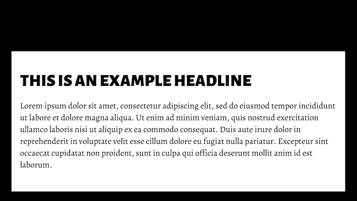
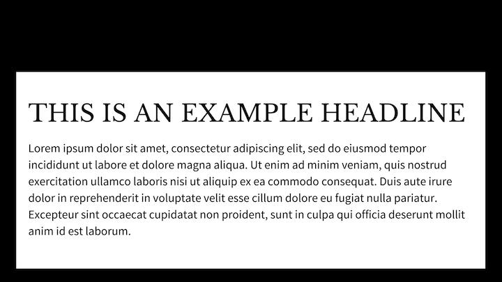
1. Abril Fatface & Lato

You have a potent combination here of classical and modern advertising typography. Abril Fatface was designed to resemble advertising headlines from the U.K. and France in the 1800s. Lato was more recently designed to be a proprietary font for a corporation.
Put the two together and you have a sharp combination of fonts that would look great on marketing and digital agency websites.
Get the fonts:
2. Alegreya Sans Black & Alegreya
This is the first of our font superfamily examples. You wouldn’t necessarily know it by looking at this example either.
Originally designed for literature, the combination of Alegreya Sans Black and Alegreya is a great choice for blogs — for personal and professional purposes. The bold headline isn’t too overpowering and plays well against the carefully designed serif body.
Get the fonts:
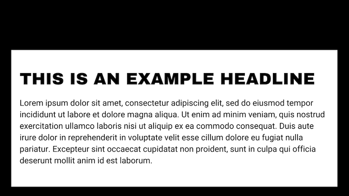
3. Aqua Grotesque & Roboto Slab Thin

The pairing of Aqua Grotesque and Roboto Slab Thin is a good choice for websites or brands focused on taking customers in the future. Software companies, for sure, would be a great choice for this futuristic pairing. Companies that build machinery or vehicles, work on energy initiatives and so on would also benefit from this pairing.
Because of the lightness of the body text, this would be best used on a homepage or internal pages with short sections of text.
Get the fonts:
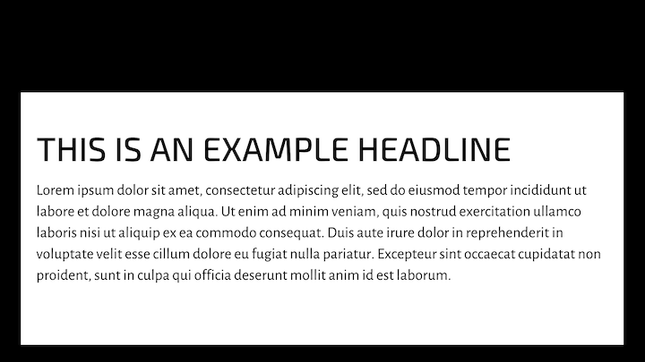
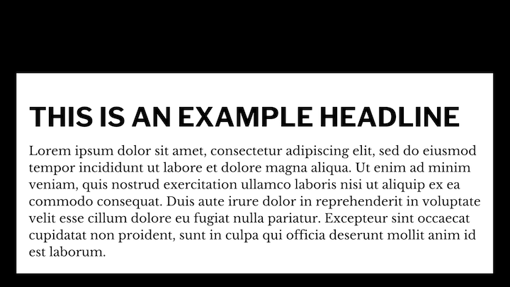
4. Archivo Black & Roboto
Here we have a pairing of two sans serif fonts. Archivo Black is a grotesque sans serif, which makes it feel slightly imperfect compared to the neo-grotesque and geometric styling of Roboto.
This is a great example of how to use fonts in concord with one another. Yes, they’re two sans serifs, but the imperfect/perfect pairing of their character sets creates a good balance. This would work really well in giving an ecommerce site a youthful and trustworthy vibe.
Get the fonts:
5. Bebas Neue & Old Standard TT

Bebas Neue is a beautifully designed display font with a condensed, all-caps character set. Because of its narrower letters, you can size it much larger than wider fonts and create a more impactful headline as it stands over the old-world style of Old Standard TT.
This would look good on a reviews site — for movies, books, Broadway plays, etc.
Get the fonts:
6. Cooper Hewitt Heavy & Cooper Hewitt Thin

When Cooper Hewitt, the Smithsonian Design Museum, decided to reinvent its branding for the twenty-first century, this font was just one part of its rebirth. Although it’s not a superfamily of fonts, there’s enough versatility in its styles that you can pair different weights together for a striking contrast.
This artistic font would look great splashed against the walls of websites for designers, photographers, and other creators. Since images do much of the talking for you anyway, the lighter body text won’t be a problem since there won’t be a whole lot of text to apply it to.
Get the fonts:
7. Exo 2 & Alegreya Sans
This is an eye-catching pair. At first glance, it’s the Exo 2’s futuristic-looking header that catches our attention. Upon further expectation, we also notice that Alegreya’s humanist sans serif doesn’t feel as neutral or plain as, say, a geometric sans serif would.
This pairing works really well on blogs for companies in tech, defense, and aerospace — where reading is important, but you still want to preserve the unique tone of the subject matter.
Get the fonts:
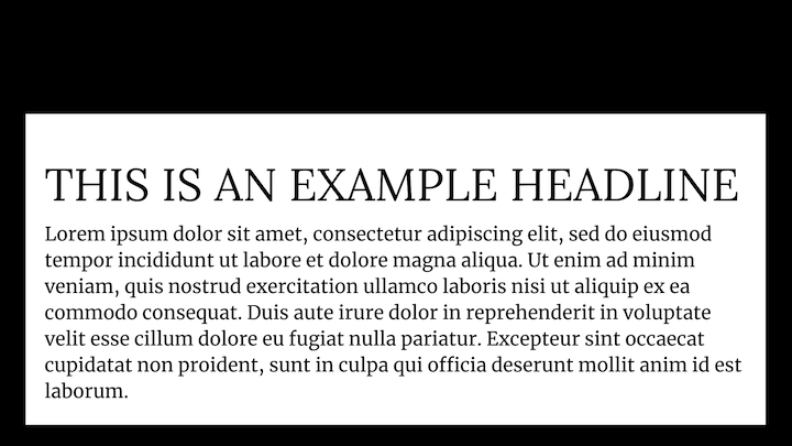
8. Fira Sans Black & PT Serif

Both Fira Sans and PT Serif are designed for great readability and legibility.
While we could realistically use this duo anywhere on any website or blog with a large readership, the tone feels similar to the one we get from newspaper covers screaming out the top headlines of the day. As such, this pair would serve you well on news sites — especially in the sports or entertainment arena.
Get the fonts:
9. Josefin Sans Bold & Josefin Slab Semi-Bold
Josefin Sans and Josefin (Slab) are Google fonts. Although they’re not a superfamily, they are sister families that pair nicely together.
As for usage, these vintage fonts were designed to be used as larger fonts, so they belong on the homepage of your site. And because they’re styled after the 1920s (Sans) and 1930s (Slab) geometric typefaces, you’d do well to place them on websites with similar retro leanings. Like restaurants, bars, barbershops, etc.
Get the fonts:
10. Karla Bold & Spectral Light

Karla and Spectral both have their quirks (Karla’s kerning is slightly off and Spectral’s curves aren’t as pronounced as other serifs), which makes them a lovable pair.
This duo would appeal well to younger consumers. It feels honest, friendly, and relatable — something that Millennials and Gen Zers crave from brands. So, if you’re building a website or blog targeted at a younger base of consumers, this is a good pair to use.
Get the fonts:
11. Lato & Merriweather

Both Lato and Merriweather have a strong and sturdy appearance, which makes them extremely readable. Not only that, but they feel more welcoming — as if the page is a journey worth undertaking and not just a reading chore that one needs to slog through.
Since neither of these fonts really has a “bookish” quality, feel free to use this pairing on startup and small business websites. They’ll make a strong positive first impression with prospects.
Get the fonts:
12. Lato & Roboto
Here we see Lato paired with Roboto. This pair gives off a sharp and professional look.
The differences between the pairing of Lato with Merriweather and Lato with Roboto are subtle enough. However, the smaller, more controlled feel of Roboto makes this pairing a better choice for larger corporate sites in fields like pharma, biotech, or healthcare where technology and science play an important role in building trust with customers.
Get the fonts:
13. League Gothic & PT Serif
There’s a great contrast between these fonts. League Gothic stands tall over the well-proportioned and rounded PT Serif. The pair make the text feel serious without being totally off-putting.
This combo would work well on websites for fintech or financial services. The design is smart and doesn’t feel wasteful.
Get the fonts:
14. League Spartan & Libre Baskerville
When we think of Sparta, we think of power, strength, intelligence, and loyalty — which is similar to the vibes we get from the League Spartan font. It’s a strong font with sharp edges and it takes up a lot of room. When combined with Libre Baskerville’s rounded characters, there’s no denying what the tone is here.
Use this potent duo when designing websites for entrepreneurs, speakers, consultants, and anyone else whose thoughts and voices need to be heard.
Get the fonts:
15. Libre Baskerville & Source Sans Pro
Here’s what happens when you give Baskerville the front seat. It changes the vibe altogether, especially considering the serif is in the lead position (usually, we see it the other way around).
When you turn the formula on its head like this — especially when using modern styles from the twentieth century — it sends the message that “We respect what’s come before us, but we’re not afraid to challenge the norms.” As such, this font pair would look really cool on websites owned by underrepresented entrepreneurs (e.g. women, persons of color, etc.).
Get the fonts:
16. Libre Franklin & Libre Baskerville
This is a fun combination to play with. Both Libres are based on classic typefaces from literature. However, Franklin as the header really changes the whole vibe of the site. And because Franklin comes in 18 different styles, from light to bold, you can play around with how direct you want your header text to feel.
This pair works well for blogs where there’s a ton of content to read but you want it to feel fun and friendly: personal blogs, travel blogs, food blogs, etc.
Get the fonts:
17. Lobster & Roboto Condensed
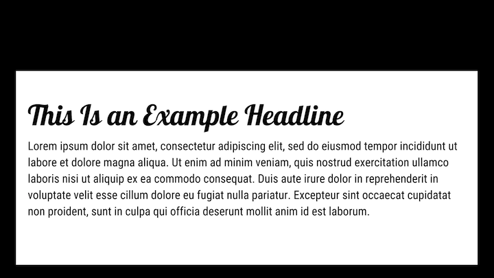
Lobster is the only cursive font we included in this font pairing list. While you can use cursive fonts to style text on the homepage, they’re not always easy to read in smaller header tags.
Lobster is a good exception to the rule as it feels more like a font with extra flavor rather than a handwriting font. When paired with the more neutral vibes of Roboto, you could use these fonts to inject some fun into a hospitality or travel website.
Get the fonts:
18. Lora & Merriweather
This duo uses two very popular serif fonts, each bringing a unique style to the table. Lora has brush-like strokes that give the header a warm and creative vibe while Merriweather feels more stable and predictable.
This would be a nice combination to use on websites for creators, like web designers, developers, copywriters, marketers, and so on. And, more specifically, for creator websites that contain lengthy blogs, portfolio pages, and sales funnels.
Get the fonts:
19. Merriweather Sans Bold & Merriweather
Merriweather was designed to improve readability on screens. Not only that, the sans serif and serif versions of the font were designed to harmonize with one another.
Because of the beautifully compatible construction of this pair, you could really use it anywhere. However, because these fonts work well on screens — even at smaller sizes — try using them on ecommerce sites. Your mobile shoppers will appreciate the excellent readability of your product pages.
Get the fonts:
20. Montserrat & Droid Serif
Here’s a great example of using fonts exactly where they were meant to be. Montserrat’s design comes from Brazilian signage while Droid Serif was designed for comfortable reading experiences on Android devices.
You can use this font pair for news and entertainment sites with heavy mobile readership (i.e. younger readers). Montserrat will call their attention to the headlines while the readable body text will keep them engaged with the content, even as they have to keep scrolling.
Get the fonts:
21. Neue Helvetica & EB Garamond Medium
Neue Helvetica has a ton of flexibility in terms of what you do with it (it has over 120 typeface styles). This digitized reimagining of the old Helvetica does well when paired with something classical like EB Garamond.
The example above shows how this pair might be useful for, say, a gossip magazine that needs its headlines to instantly grab visitors. But you could also use this pairing (with other, tamer variations of Neue Helvetica) on websites for service-based companies where modern solutions meet old school business values.
Get the fonts:
22. Nexa Bold & Crimson Pro
With Nexa’s clean and simple design and Crimson Pro’s buttoned-up and studious look, you’ll want to use these fonts to introduce readers to intellectual endeavors. Podcast episodes. Proprietary research reports. Blogs with infographics or other graphics-heavy content.
This duo’s subdued tone allows your eye-opening visual or audio content to make a bigger splash with your audience.
Get the fonts:
23. Noir Pro & Playfair Display
Playfair Display is, as its name suggests, a display font, so it’s meant to be presented in bigger sizes. As such, you’d want to use the Noir/Playfair Display duo for headlines and subheadlines (on the home page, at the top of blog posts, etc.). This pairing is a great way to add some drama to your page without making the whole thing feel over the top.
Obviously, you’ll need a third font to use for your body text. In this case, a popular serif like Times New Roman or Georgia would balance these two out nicely.
Get the fonts:
24. Open Sans & Source Sans
Both Open Sans and Source Sans Pro have a neutral yet friendly appearance, which is really useful if you have a website targeting global consumers. You won’t have to worry about time or location-specific style appealing to only a segment of your audience.
What’s more, both fonts come with extended character sets, so they work really well on multilingual websites translated into Latin, Cyrillic, and Greek alphabets.
Get the fonts:
25. Oswald & Montserrat Extra Light
There’s a showman-type feel with these two fonts paired together. You have the tall and trim Oswald header looming over the lighter Montserrat text below it. It feels like someone stepping onto a stage to make an announcement while a hush comes over the crowd below.
This font pairing works really well on websites that promote events, conferences, webinars, and so on. Just make sure you use Montserrat Extra Light for smaller segments of text (like subheadlines or short paragraphs) so it doesn’t become a challenge to read.
Get the fonts:
26. Oswald & Old Standard TT
In this pairing, we have Oswald coupled up with Old Standard TT. Oswald still takes on a dominant role, though in this case, it feels more authoritative than demanding. And it needs to be with Old Standard’s small textbook-style font.
This duo would work well on websites for healthcare companies as well as educational institutions that need to be seen as well-respected authorities in their space.
Get the fonts:
27. Playfair Display & Raleway Thin
The combination of Playfair Display and Raleway display fonts would be useful for designing eye-catching homepage hero images or introductory banners on the tops of internal or category pages.
Because both of these fonts have a delicate yet strong feel (at least, Raleway does in its “Thin” style), you could use the above combination to design fashion websites or those for local retailers.
Get the fonts:
28. PT Sans & PT Serif
PT Sans and PT Serif are one of those sister fonts that were meant to be paired together.
There isn’t a whole lot of character to these fonts. They’re clean, simple, and uniform in design, which makes them versatile in use. However, because of their toned-down vibe, they’d do really well with websites that have big flashy images that do most of the work to sell its products. Like sites for cars, robotics, smart devices, etc.
Get the fonts:
29. Raleway & Merriweather
We’ve seen these fonts before on this list — and your visitors likely have seen them on the web, too. There’s a good reason for that. They’re both big, bold, and beautifully designed.
When you pair these two popular and familiar fonts together, you get something that feels very honest, very user-first. This pairing would be a great choice for websites for professional service providers like lawyers, agents, writers, consultants, and so on.
Get the fonts:
30. Source Sans Pro & Times New Roman
Times New Roman is often dismissed because of how overused it is. But when used alongside a Source Sans Pro header, it strikes a good balance.
Source Sans Pro is basic enough in design that it doesn’t feel too overwhelming or techy. And Times New Roman is familiar enough that it automatically conveys a sense of honesty and reliability. If you’re building a website that sells tech or digital products, this font pair would work nicely.
Get the fonts:
Pair Fonts Easily With Elementor's Extensive Font Library
Font pairings are a lot like human relationships: Some are meant to be while others just do not work well.
That doesn’t mean you have to be scared when it comes time to mix-and-match fonts. It just means being mindful of how much friction exists within your font pairing as well as how much friction they can cause a site.
As we’ve seen in the font pairing guide above, what you want to look for are fonts that balance each other out, establish a sense of hierarchy and present a united front in terms of tone. And, of course, don’t forget about selecting the right fonts in the first place.
If you need a refresher on which are the best fonts for websites, check out our guide.
Looking for fresh content?
By entering your email, you agree to receive Elementor emails, including marketing emails,
and agree to our Terms & Conditions and Privacy Policy.


