Table of Contents
Some of the first brainstorming questions we ask ourselves as web creators are: what is my brand identity? What “style” suits my content and its messaging best? Does it make sense to use a minimalistic, white and black color scheme, or a more neutral color palette with different shades of beige and brown? Should my site’s brand imagery use uniform or varied sizing?
There are a lot of visual design boxes to tick throughout this decision-making process. Many of these processes will touch upon how our design elements relate to one another. Even if subconsciously, deciding between image gallery formats, how many font families to use, how your foreground content will relate to its background — all of these visual design choices touch upon contrast.
Contrast in web and interface design is considered one of the five essential visual design principles. The common ground between these principles is that they represent how design elements work together to form a visual entity that users perceive and interact with.
So, of these five principles, what makes contrast so significant to visual design?
Table of Contents
The Importance of Using Contrast in Web Design
What Is Contrast?
Contrast is the relationship between two or more design elements whose dramatic differences are emphasized when both elements are shown together. The degree of contrast between these elements is disproportionate to their level of similarity: the less similar two items are, the greater the contrast between them.
Light blue or any other pastel color, for example, wouldn’t be particularly prominent on an interface with other pastels of similar shades. But, if pastel elements were juxtaposed with darker, bold elements such as a deep eggplant color, the difference between the dark and light colors would be pronounced.
Why Use Contrast in Web Design?
One key virtue of contrast in web design lies in its impact on visual hierarchy. As we mentioned, contrast can be created by a variation in sizing, shape, color, or other features. Emphasizing a dichotomy of importance between two design elements doesn’t depend on the type of contrast that exists — rather on the degree of polarity between them.
The most effective way to use contrast in web design is by familiarizing yourself with the many types of contrast that can exist. Once you’ve covered this baseline, you can intuitively apply sophisticated forms of contrast to your designs.
6 Types of Contrast in Web Design
1. Color
Color contrasts are the most famous type of contrast in design. One of color contrast’s biggest claims to fame is that it’s one the most basic ways to make screen content accessible. The most basic reason for this is that text readability relies on there being a significant contrast with its background. Accessible color schemes negate the discrepancies between how people with visual impairments or color vision deficiencies interact with digital interfaces.
But how can web creators create color contrasts throughout their websites in a classy, elegant way?
Control Color Contrast With Image Overlays
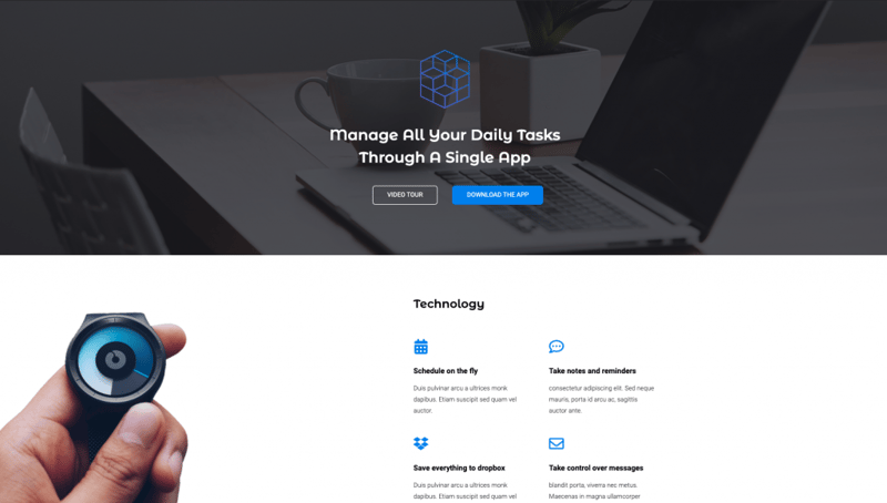
Background image overlays (as well as solid color or patterned overlays) can facilitate a clear contrast between the background and a heading placed directly in front of it. This technique is widely used for hero sections, as a way to dramatize the hero text or content.
The semi-transparent black background overlay applied to the hero image in the Elementor Template (shown above) creates a subtle contrast and visual balance between the image and the white heading. The shade of black is transparent enough that the actual photograph and its details are still readable and easy on the eye.
Create Your Own Contrast Scheme With Filter Effects
Filter effects are another delicate way to add contrast within an image or design element itself. Elementor’s filter effects are enabled by CSS Filters that let you apply graphic effects like blur or color shifting to images. These filter effects include blur, brightness, contrast, or saturation filters. Each of these techniques provides a great way to single out a design element when the user is engaging with it.
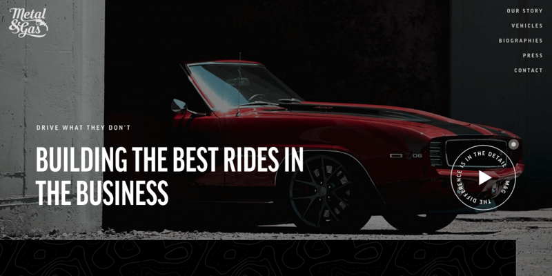
The grayscale filter example that we see above on Metal and Gas’s site creates a way for the bold, white logo and hero text to show up in its entirety despite having a photograph image as its background. Reducing the brightness and darkening the tones of the photograph accentuates the contrast within it and the white font color balances the reading experience.
Tip: Make sure the filter effect you choose matches the colors of your overall website. Consider your filter choice as a natural part of your color scheme and brand imagery.
2. Size
Contrast in sizing applies to almost any design element on a page: texts, images, buttons, and so on. The implications of how big or small you decide to size each element can make or break your website. If the relationships between your design components aren’t clear — visitors won’t follow the logic of your design and its content.
Base Text Sizes on Their Significance
Using contrasting sizes in your website design can significantly impact its information architecture. This is true for your typography scheme (headings, buttons, body paragraphs, etc.) as well as for your visual content (image collections, vector graphics, buttons, menu elements, etc.).
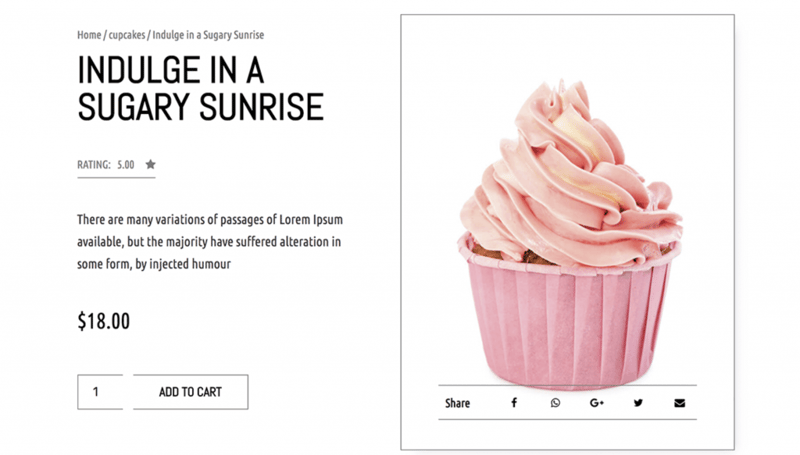
Visitors are most likely to read your title first when its profoundly bigger than its surrounding subtitles and body texts. This is why the title on this particular product page is the key indicator of the product’s added value. It tells the user what the benefit and experience of eating that cupcake will be, encouraging him to indulge in the comfort food you can provide.
Size Columns According To Visual Hierarchy
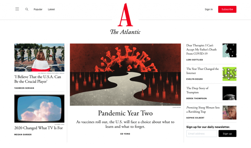
The size and layout contrast on The Atlantic homepage indicates the information hierarchy between the featured and secondary articles. This three-column grid is what’s known as an asymmetric grid, as the columns vary in width. The center, widest column is clearly the most significant, followed by two narrower columns on each side. Each article thumbnail inside the left column is taller than those in the right, another subtle use of contrast which conveys that the shorter thumbnails constitute the least significant column.
Tip: Make sure your variation in size is definitive and recognizable, rather than subtle. The more obvious the difference, the better.
3. Space
Spacing for the purpose of contrast is mostly achieved in web design by using negative space around or between elements. The emptiness around an element — whether created by white space or any other type of visual spacing, highlights the contrast between the element’s background and the design details surrounding it.
Use Spacing To Highlight Detail
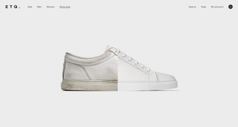
ETQ is a Dutch sneaker company specializing in high quality, essential sneakers with a minimalistic design. ETQ has a brick and mortar store in central Amsterdam, as well as a comprehensive online store. The image shown above is found on their “Shoe care” page, promoting the supplier they work with to provide eco-friendly cleaning formulas for their shoe products.
There are two forms of contrast found on the Shoe care page. Half of the sneaker is displayed in its “dirty state”, and the other half is shown in its crystal clean state: a color contrast technique showing a before and after effects of the cleaning solution.
The plentiful space around the sneaker (in all directions), centers the single image as sole focus of the page body. This is what captivates the visitor into the experience of how effective ETQ’s shoe care solution is.
Use Padding and Margins To Increase Spacing
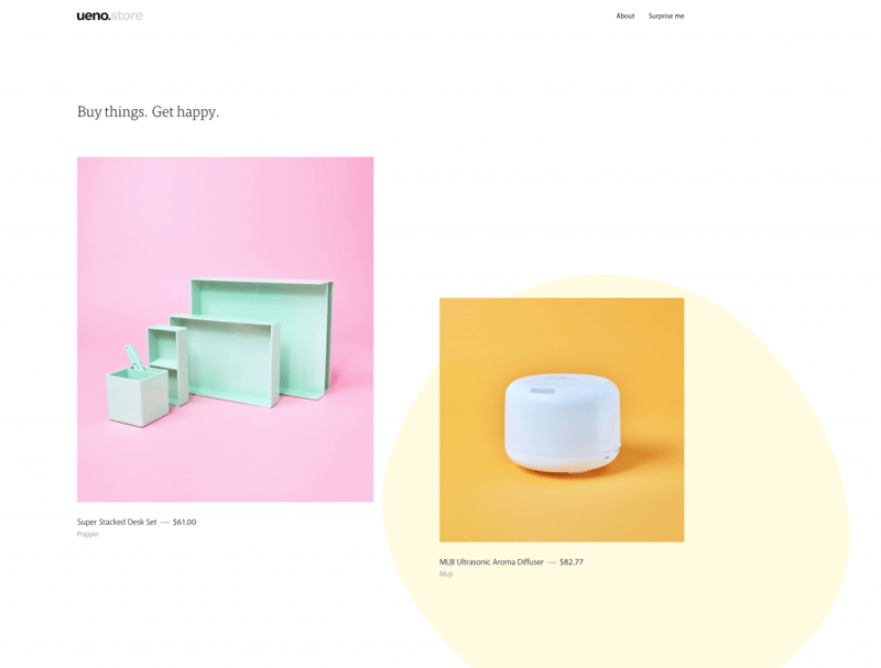
The product archive page on the ueno.store website displays detailed, professional photographs of their products, each one placed on a colored square shape. These squares provide consistency between the different product images, allowing each angle and detail of the object to shine through.
Every square uses a background color that contrasts with the item inside it, each engulfed by paddings and margins for space between the squares. The space around each square emphasize their respective differences, allowing visitors to appreciate the individual color, detail, shape, and structure of each object.
Tip: Be mindful of responsive design. Each screen size will be affected differently by units of space, so this should always be a factor in the amount of space you use or don’t use.
4. Foreground and Background
Any digital or physical interface, even a minuscule dot of ink on a paper, automatically has an element of foreground and background. What’s unique to web design is not only the vast options of background-types, but also the fact that a background can change dynamically as the site visitor interacts with it. The same is true for the foreground. Any such element can choose to be static or interactive — changing dynamically on its own or triggered by user interaction.
Use Parallax to Create Contrast Between Background and Foreground
NASA Prospect is a collaborative web design and development project created by design students at the University of South Dakota and the Humans in Space Art program. The website uses scrollytelling to visualize a short story about a Prospector in Space.
The astronaut accompanies the visitor down the page throughout his entire vertical scroll, maintaining his appearance (with subtle changes throughout his travels) while flying through various reappearing and disappearing background patterns and elements in outer space along the way.
Not to mention that the astronaut illustration is created using flat design, fixed in the same position on the gradient color background page throughout the extensive scrolling experience.
Rejuvenate Your Page Background With Vivid Imagery
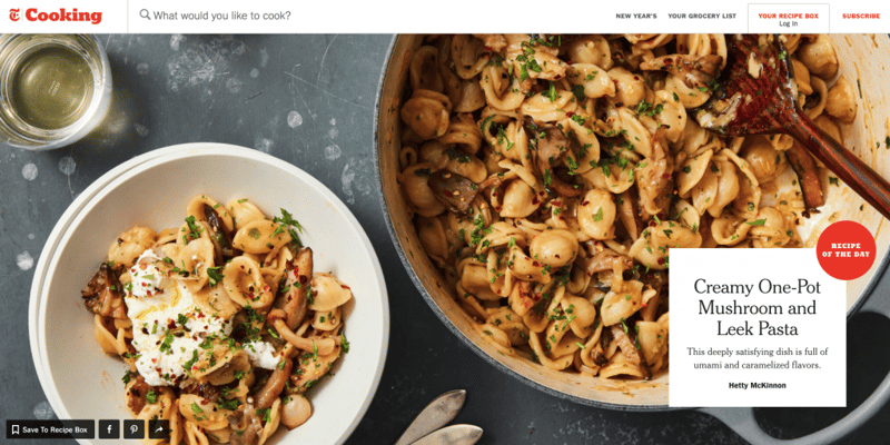
The homepage on the NYT Cooking digital cookbook site aptly represents the rich variety of comfort foods presented in the online cookbook, giving a detailed perspective of the ingredients and textures of the featured dishes.
The site pairs a dark-tone photograph on a slate grey background with the few text elements in the hero section. What we see here is a rich, detailed photograph contrasted with simple, readable black and white texts, tied together with balancing solid color background shapes.
Tip: Don’t neglect factors like performance and speed when choosing your background-types. Videos or images that take too long to load may defeat the purpose of an engaging user experience.
5. Element Types
Web creators in all disciplines know how many choices exist for media-types that you can upload or embed onto your site. Deciding which type best fits your content and website goals can actually be more complex than it sounds. Sometimes photographs are more relevant, sometimes illustrations, or even hand-drawn sketches.
The difficulty of this selection process can easily be solved by mixing different element-types within one page or area. This level of contrast boasts creativity, skill, and a knack for storytelling.
Combine Graphics With Photographs To Dramatize Storytelling
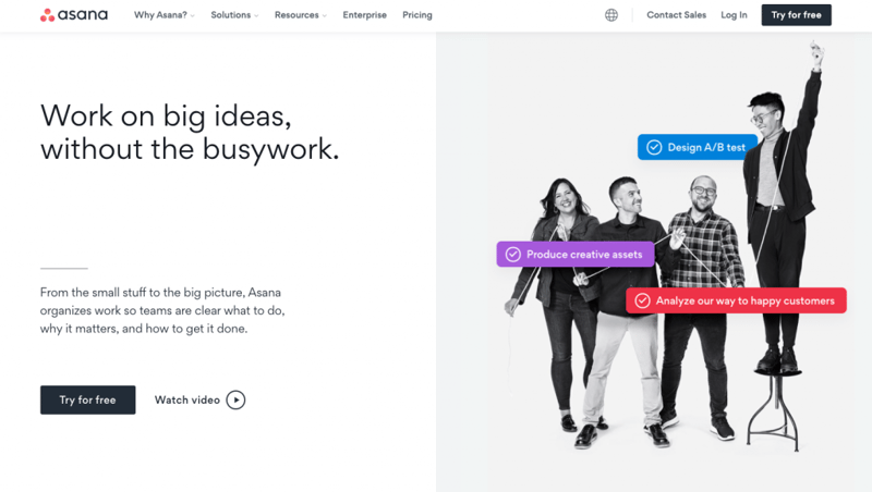
Asana’s online project management tool is a digital interface used by colleagues and team members for workflow and task collaboration. One reasonable dilemma that then comes up is: should their website emphasize its digital qualities or should it depict the human factor, too?
This is where the art of contrast proves its ability to captivate all aspects of a story, rather than one. Asana’s hero image shows both the real people using its SaaS, and snippets from its digital interface. The added value of the tool that is materialized in a digital interface, yet experienced by humans in real life — is communicated through unique visual contrast.
Visualize Complexity With Varied Element-Types
Illo is a small, eclectic design studio based in Turin, Italy. Their About Us page combines many contrasting elements and media-types: illustrations, wide photographs, rows of texts, square portraits with colored backgrounds, and an all-encompassing combination of rounded black text on a solid white background.
What caught our eye among the rich variety of page content is the body of text at the very top, which includes a short paragraph of three sentences. Three contrasting relationship exist within six lines alone, the most unique being the animated word “diverse”. These letters are in color, as opposed to the rest of the black text. Not only are the color-changing letters animated (juxtaposed with static text), but there is a contrast between the letter colors themselves.
The choice of which word to highlight within the paragraph is also no coincidence, as the color-changing effect happening within the word illustrates the diversity of colors, akin to the studio’s diverse team.
Tip: Identify your target audience. Which types of media or elements will they be most comfortable with? Will your message be better conveyed through modern illustrations, or are real photographs the most effective route?
6. Shapes
Choosing the shapes of your design elements is one of the most foundational segments in your web design process — ideally coming to play when you create your wireframes. Every web creator strives for maximum, over-the-top engagement, which you can easily achievable by using visual variety in your design. The disparity between shapes also gives you the opportunity to create visual hierarchy, or to convey a profound distinction between message two elements.
Differentiate Between Story Elements
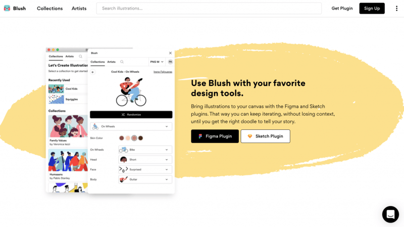
Blush is a Sketch and Figma plugin that incorporates an illustration-creator tool directly inside the editor’s interface. Blush’s website uses a minimalistic black on white color scheme and revitalizes it with multi-colored, graphic-style, and brushstroke-themed shapes.
Blush’s homepage leverages shapes to distinguish each section on the page from one another. This is recognizable right away: between the blue triangular shape behind the hero section, followed by the three rounded rectangles, the free-form illustrations, the yellow oval behind the UI snippet, texts and buttons, and so on. This segmentation achieves a two-fold goal: elongating the visitor’s browsing session by guiding him to the very end, while simultaneously directing his attention to each individual section of content.
Add Variety To the Simplest Environments
Digital agency Outsmart Labs finds a unique way to integrate asymmetrical circular shapes throughout their entire site, which consists mostly of symmetrical, horizontal texts and buttons — all sharing a black and white color scheme.
The scattered, spontaneous distribution of circles that weave through the website add refreshing, gradient colors to what would otherwise be a completely monochrome color scheme.
Thanks to the use of one shape-type alone, blocks of texts are enhanced by uplifting design details, yet the website scheme maintains cohesiveness and an encompassing fluid presence.
Tip: Explore different design styles and effects when choosing your images, such as: 3D, shadow effects, hand-drawn sketches, outlined shapes, and more.
Design Was Born To Stand Out
What’s more important to web creators: to build websites that stand out or to differentiate themselves as a designer who stands out among their competition? You may not have realized, but your mindset as a web professional is already headed in the direction of contrast.
When you use contrasting elements in your design work, you are not only highlighting your ability to stand out as a professional. You’re proving your ability to create two different design entities and enable them to work together in unusual, yet complementary ways.
Looking for fresh content?
By entering your email, you agree to receive Elementor emails, including marketing emails,
and agree to our Terms & Conditions and Privacy Policy.


