Table of Contents
As you piece together the elements of a website, it has to go beyond the aesthetic preferences of your client.
Of course, clients want a website that’s “attractive”. But will their predilection for cursive typography or a rainbow-like color palette be well-received by their visitors and prospective customers?
It’s your job to figure out how to create a website that looks good to your client and to their audience – but also tells an effective story about the brand.
This is why web designers do a lot of work when choosing brand imagery for their clients’ websites.
Brand imagery isn’t about liking or hating the way an element looks on a page. It’s about going deeper into the history, mission, and personality of a company and then choosing visuals that convey those to visitors without the need for words. Moreover, it has to be done in all the right places, including something as little as a favicon.
In the following guide, we’re going to explore what brand imagery is and how to choose the right brand imagery for your business.
Table of Contents
What Is Brand Imagery?
Brand imagery is the visual representation of your brand’s core messaging. It’s the result of all the elements that consumers associate with your brand. These can be communicated in various forms, such as simple visuals, an experience, a feeling, or a taste.
The purpose of brand imagery is to communicate the right messages with your target audience so that they develop strong emotions when they encounter your brand.
Brand imagery can be unique to each customer, for example – how does Coca-Cola taste? What does Pizza Hut smell like? What color is Head & Shoulders? How does NBC sound? What does a new North Face jacket feel like? These can be either tangible or intangible experiences that come to represent your brand in the mind of the consumer.
What's the Difference Between Brand Imagery and Brand Image?
Although the terms sound similar, brand imagery is different from brand image, which can also be described as brand identity.
Brand identity has to do with how the company is perceived by the public. In McDonald’s case, it’s known as a fast-food company that delivers an affordable and reliable product.
While the brand imagery you choose for a company can affect how it’s perceived, brand identity is a bigger matter than can be affected by a variety of factors — like how the company treats its staff, philanthropic initiatives it pursues, as well as bad press it’s received.
Types of Brand Imagery
Look at any brand style guide and you’ll find examples of the brand imagery you might need to define for your website:
- Logos
- Photography
- Illustration
- Iconography
- Typography
- Video
- Animation
- Color palettes
- Composition rules
- Filters
- Backgrounds
- UI components
Some of these brand imagery elements are essential for all websites, like a color palette, logo usage rules, and photos. However, others are dependent on the visual style you want to develop for your brand, like filters and illustrations.
Let’s use a well-known brand like McDonald’s as an example. This is the homepage of its website:
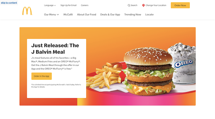
All the visual markers of McDonald’s brand are present:
- Its signature “yellow arches” logo
- The yellow in its “Order Now” and “Order in the App” buttons
- The red and reddish shades in the hero image
- The perfectly coiffed french fry and burger photos
You don’t even need to see the name “McDonald’s” to know that this is a website for the company. That’s what brand imagery is supposed to do.
Why Is Brand Imagery Important?
Brand imagery is a lot like a celebrity’s visual style. Take someone like Diane Keaton:
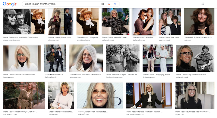
From the beginning, she’s portrayed the same brand imagery to her audience. She has a penchant for:
- Pantsuits
- Turtlenecks or button-down collared shirts
- Hats
- Black, white and neutral color palettes
- Long, straight hair
- Tinted glasses
Diane Keaton uses her visual style to tell the world and the people trying to hire her who she is (someone who marches to the beat of her own drummer) and what she’s capable of (someone who can play serious but with a quirky edge).
We use brand imagery in web design for similar reasons: to make an accurate first impression and to set the tone for our future interactions with consumers.
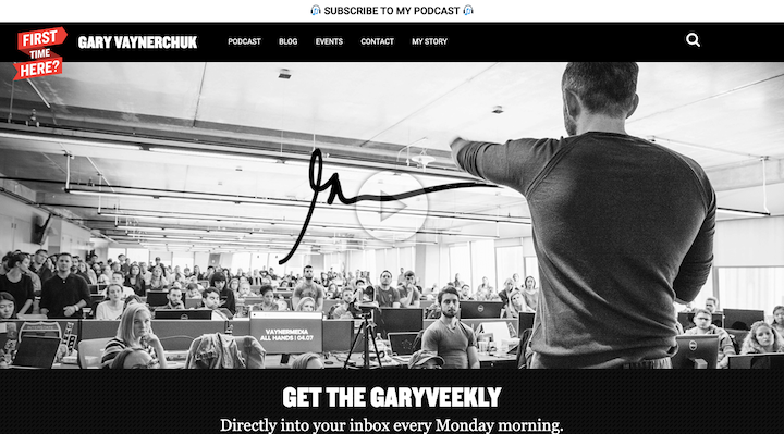
Gary Vaynerchuk, for example, uses a stark color palette (mostly black, white, and red), minimal design, and video-heavy pages to send the message that he’s a serious entrepreneur with a lot to say:
Here are some of the benefits we can expect when we take the time to properly define our brand imagery:
- Our visuals become just as recognizable as the company name or logo.
- The unique style sets our brand apart from the competition.
- We leave prospects with a memorable impression every time they interact with us.
- We can tell our story without having to use words.
- Our design choices bring up nostalgia and other positive feelings within our audience.
- Relatable visuals give prospects even more reason to connect to the brand.
Having well-defined brand imagery can certainly help a business go far. Just remember that it needs to be authentic and not some formula that has worked for others.
How To Choose the Right Brand Imagery for Your Business Website
There’s no exact science to choosing brand imagery, though there are certain questions you can ask your clients in order to help you piece everything together. Look for common trends in the answers to come up with a style and vibe you can start from:
1. “How would you describe your business?”
In just a few sentences, have them sum up their 30-second pitch. What does the company do, who does it serve and why is this unique in their space?
These are actually the first few questions you should be asking web design clients during your onboarding. This will give you a good baseline in terms of understanding what they do and what sort of general aesthetic will work for their niche or area of expertise.
2. “Which three words would you use to describe the personality of your company?”
For this one, use the answers your client gives you (e.g. friendly, youthful, innovative), but then do some research of your own. Because, while the client might see their business in a certain light, the history of the company might tell a different story.
Spend some time getting to know more about this brand as well as anyone who serves as the spokesperson for the company. Use insights from others — employees as well as customer reviews — to get a good sense of the brand’s personality and identity.
3. “What are your company’s top values?”
It would be a good idea to learn more about your client’s company values and philanthropy. It’ll reveal quite a bit about their priorities.
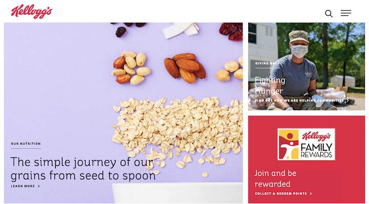
For example, Kellogg’s answer to this question probably leaned heavily on its initiative to become a “plant-based wellbeing company”. And that’s why the website’s imagery focuses on the good, clean ingredients in the company’s products:
4. “Which websites do you love the look of and why?”
You’re not looking for websites or brand imagery to copy in this step. All you want to do is to get a sense of the kind of visual style that resonates with your client. You and your clients might be surprised to learn that they have a penchant for illustrated websites over ones with photos, for instance.
5. “What reaction do you want to elicit from your audience?”
You need to be very careful with the brand imagery you create for clients. Certain visual choices can lead visitors to feel negatively towards a brand.
Take, for instance, health and wellness companies. Your client might decide that they really like the color red and want to infuse their website with swatches of the color wherever possible.
But this all depends on the type of health and wellness company, doesn’t it? Because the color red might work really well for a company that accepts blood donations (something that’s urgently in need), but perhaps not for a company that offers meditation services (that help people slow down).
This is where understanding the connection between emotions and color (and design choices, in general) comes in handy.
6. “Does your brand have a connection to a time or place?”
Time and place can play a role in branding in a couple of ways.
One way is to leverage a style from a certain time period through the use of elements like typography and filters. So, a company that wants to give off a laid back California vibe, might use a font like Pacifico to do so.
Another way to use time and place is to play into the history of a company.
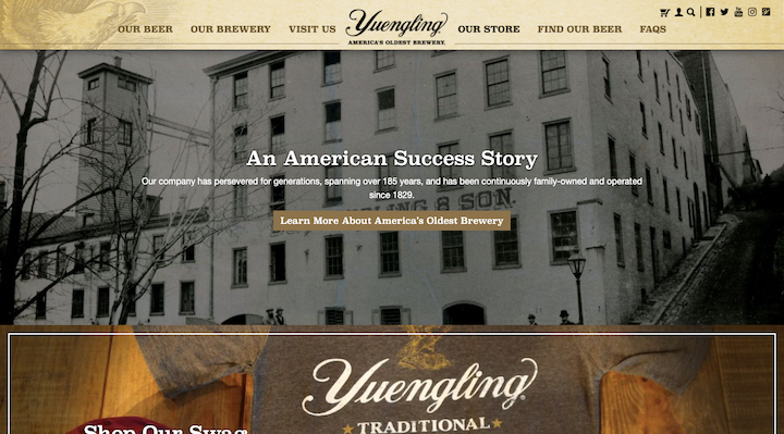
When designing for older brands, you can use brand imagery to inspire feelings of nostalgia, as Yuengling does:
If time and place aren’t relevant factors you can experiment with, then make sure you’re up on the latest web design trends. This’ll ensure you use imagery that speaks to modern consumers.
Some More Examples of Effective Brand Imagery
We’ve already seen some great examples of brand imagery on the web. As we wrap up here, though, let’s look at how some others have set the right visual tone for their brand:
The New York Times
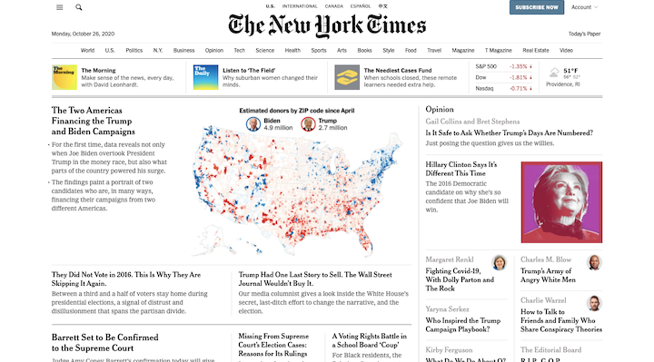
This is the front page of The New York Times in 2020. This is the perfect example of a brand with so much longevity and trust behind it that it’s nearly impossible to move away from its recognizable brand imagery.
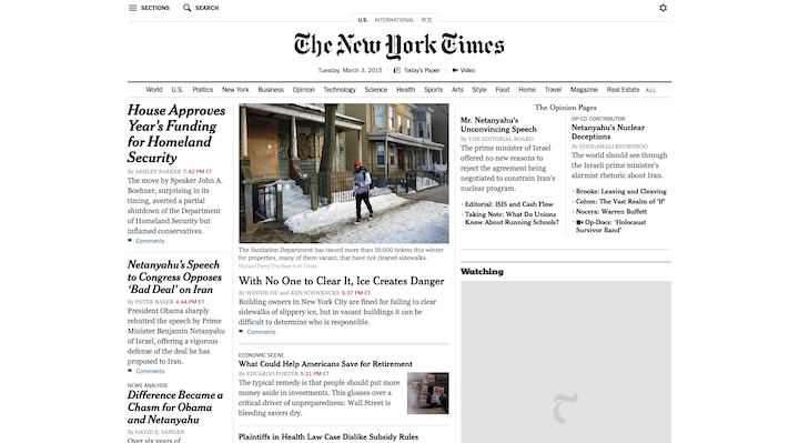
Although the layout of its site has changed over the years, its overall visual image has not. Here’s what it looked like back in 2015:
And even further back in 2010:
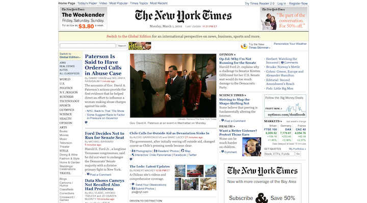
This is a true classic.
Jeep
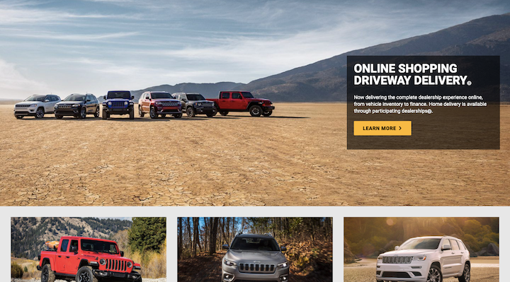
Not only does the Jeep website show off attractive photos of its fleet of vehicles, but it places them in rugged settings. It also uses neutral sans serif fonts and innocuous colors that lend themselves to the no-nonsense approach of this brand.
Reuben’s Brews
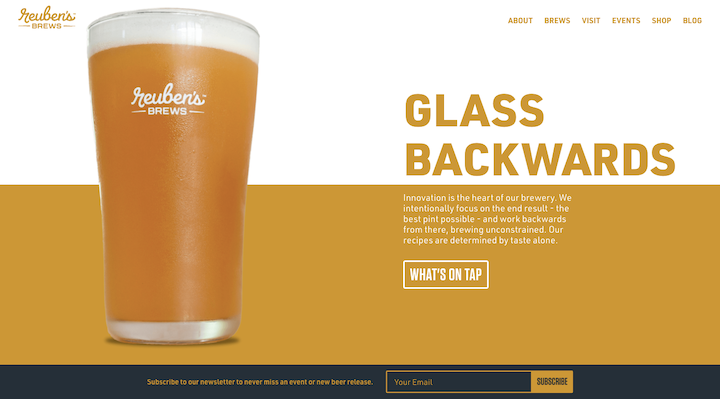
This is one of the banners on the homepage for Reuben’s Brews, a Seattle-based brewery. This is a neat example of branding because it’s a super-modern site with large swatches of eye-catching yet neutral colors along with minimally-designed sans serif typography.
However, the logo itself hints at something else:
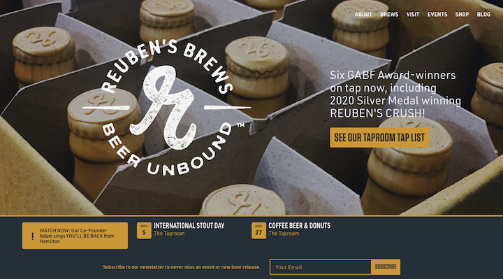
This just goes to show you how young brands can design imagery that appeals to a modern audience while simultaneously using subtle touches (like a rustic logo) that imbue their brand with a sense that there’s more age and experience behind it all.
MeUndies
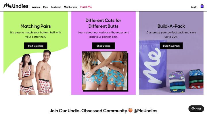
The MeUndies website uses an expansive color palette that rivals its equally expansive underwear line. With unpredictable shapes, layouts, and even emoji used along the way, this imagery sets a clear tone for this fun and youthful brand.
Stripe
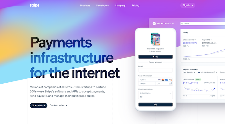
Since the beginning, Stripe has maintained a simple enough visual strategy. Its logo is sans frills as is its choice of typography. And it has long since used a gradient color palette (usually subtle) to color its site.
What’s interesting to note, however, is how it changes its hero banner and subsequent imagery to align with the latest trends. In the latest iteration of the site, its gradient banner is more colorful and animated. In the past, however, it’s used static banners and more illustrative designs for its products.
If you want to know what’s hot in SaaS website design at the moment, this is the brand to watch.
Fry Reglet
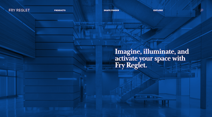
As an architectural design company, it’s no surprise that Fry Reglet’s visual story is mostly told by photos of its work. The blue filter is used a lot on this site — not as intensely as in the screenshot above, but it’s a prevalent color throughout. As blue is a sign of stability, it’s a really important one for an architectural company to include in its branding.
Nudie Jeans
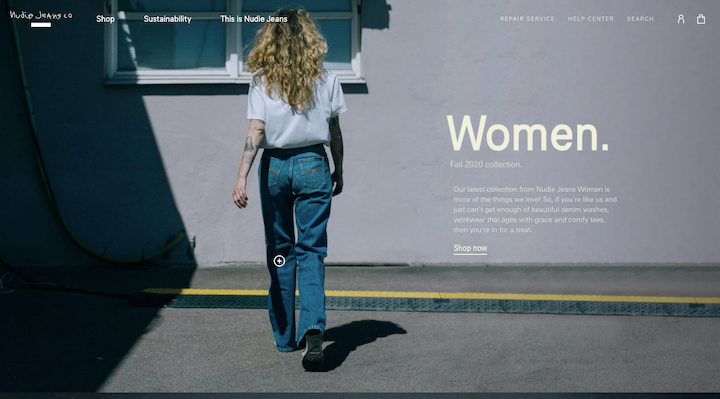
Nudie Jeans is a good example of how to design a website that uses the basic principles of good design (simple typography, predictable layouts, bite-sized text, etc.) while using filters and photos that give it a retro or vintage vibe. This way, the content itself isn’t compromised by overly-vintage touches (like cursive lettering or a brutalist design) while still taking visitors back to a simpler or happier time period.
Sanvello
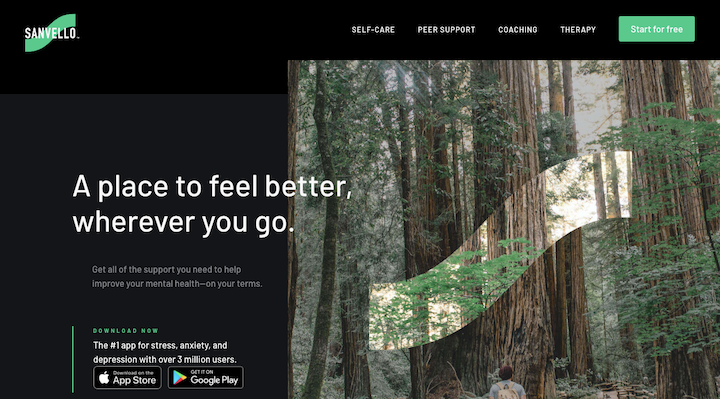
There are lots of mental health and self-help companies out there, most of which have created very unique styles for themselves (like Calm’s blue waters and Headspace’s pastel illustrations). Sanvello has taken a risk here with the dark mode-like color palette. But thanks to the nature visuals and softness of the branded green, the site and app send the right message to its audience.
One Last Note
Once you’ve chosen the right brand imagery for your business, save your choices to a style guide. This will enable you to consistently apply them to any of your branded platforms online (your website, social media, newsletter, etc.).
Use this web design style guide template to get yourself started.
Create a Unique and Memorable Brand for Yourself
You have a story to tell your website visitors, business prospects, and existing customers. But before you ever get a chance to speak to them (with your voice or through your writing), you should appeal to them with your brand imagery.
But what kind of visual story do you want to tell?
It’s a big question to ask, but it’s one you need to get clear on so you can effectively steer your story in the right direction. By asking yourself the six questions above and getting inspired by what successful brands have done with their imagery, you’ll be able to put together a unique, powerful, and memorable brand for yourself.
Looking for fresh content?
By entering your email, you agree to receive Elementor emails, including marketing emails,
and agree to our Terms & Conditions and Privacy Policy.


