Our community of web creators is raising its level year on year. Looking back to a decade and a half ago, our mission has changed so much from simply eliminating the mess of overcrowded unessential website elements.
As time went on we began to visualize and design websites with a more user-centric focus. The users were our clients. We based our UX understanding in line with their needs. Websites now needed to be more accessible, easy to navigate and flow seamlessly.
With this in mind, designers today feel more in their zone, and more secure with their designs even amidst a highly competitive landscape. This creates an atmosphere of freedom allowing them to test the boundaries of convention.
As society spends more of its time online, our job as web creators is to engage users on an emotional level, carrying human sentiment within an artificial reality. We have stories to tell and conversations to spark while bringing joy to every interaction.
Therefore, it is imperative for us to constantly evolve our techniques in our ever-changing world. Join us as we study the top web design trends set to dominate the world of web creation in 2022.
Table of Contents
10 Web Design Trends To Expect in 2022
1. Inclusive Design Mania

“Inclusivity” is unfortunately viewed as a political buzzword that gets easily thrown around, yet at its core, it is an ideology that speaks to every designer — making every effort be inclusive where inclusion did not previously exist. In today’s personalized global market, it is an idea that is actually far from foreign.
Inclusive design affects every step of a website design process, from strategic decision making regarding the website target audience, to its tone of voice, and personalization, as well as defining the graphic language of your brand to accommodate all genders, viewpoints, experiences, and situations.
For example, images and illustrations of functional purposes have begun appearing more frequently in a non-gender front, offering playful diversity.
Furthermore, under the influence of the gaming world, this next year is bound to see the internet flooded with a growing number of avatars, illustrations, and characters, of non-human identities as the internet offers alternative realities — questioning the very core of what is real.
The model Ranboo Fashion displays in their video is somewhat gender-fluid, hiding the face so that the viewer isn’t sure of the identity of the model.
2. Scrollytelling

Scrollytelling is an increasingly popular way to leverage a digital interface and convey an intricate story.
These visual effects strive to captivate audiences, serving them engaging content on a silver platter. Scrollytelling is also referred to as “narrative visualization” — a series of visual elements sequenced together, organized chronologically to convey a specific message to visitors.
Just like the possibility of reading a book at your own pace, websites now allow you to navigate and control their flow in a personalized way by understanding that each user is different and presenting messaging in intriguing ways.
Infrared Mind Body from Texas, US, displays large images and texts that appear via various animations that accentuate their value proposition. Large close-ups, dim-lit images, large-scale typography, as well as soft and smooth transitions, create a sauna vibe in a clean sophisticated way.
3. Horizontal Scrolling

In contrast to familiar and intuitive vertical navigation, a side scroll layout can lead to surprising interactions between texts and images.
This is especially true for portfolio websites, catalogs, maps, and the like. Discovering projects, exploring cities, and visiting online galleries is far more engaging with sideways navigation. When done right, horizontal scrolling can make a website more appealing, fun, and memorable, as the websites on our list beautifully illustrate.
SIRUP is a website created for the sole purpose of listening to a playlist. Realizing this, the designer created a horizontal scrolling experience incorporating the playlist and the visuals as part of the scroll movement. The fluid motion of different design elements creates a sense of progression even when static, driving the user to keep scrolling.
4. Brutalist Typography
If you are the type (pun fully intended) to be down with something bolder, you should consider this trend with its ruggedness and dominance that make a website pop out even when using a limited assortment of elements.
Brutalist Typography can be viewed as a reaction to the lightness, optimism, and minimalism of today’s web design. An unapologetic rugged style that sits in contrast to the more polished modern convention.
Using typography to construct a dynamic grid, letters as building blocks for segments, sections, headers, and paragraphs, or just a way to go wild on an entire website — Brutalist Typography gives a website a metropolitan vibe.
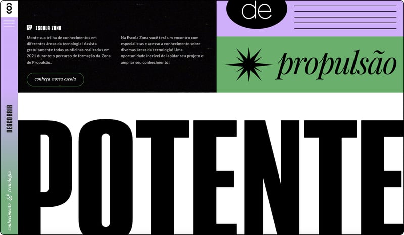
Zona de Propulsão is a one-pager for a technology innovation hub. The gigantic type is definitely the starting point of this identity, establishing an urban-like festival atmosphere. The designer wanted to create information that’s available for everyone and present tech knowledge in a more accessible way.
5. Typography Animation / Kinetic Typography
A beautiful addition to the previous trend is Kinetic Typography that is rapidly evolving with new techniques in hand. Nowadays, this practice is widely used by web designers in a variety of forms. Once the first go-to for telling a story was animating characters, but now typography is an entirely new ball game.
Moving text can capture attention, establish a tone, highlight important segments, and guide the user’s eyes through a page. This is a trend that has in reality been around since the 1960s when feature films started using animated opening titles instead of static text.
On the website of Dilinger, a Film Production company based in Paris, the entire website is itself a menu, with the help of dynamic fonts which change accordingly when an option on the menu is selected. The transition of the typography helps navigate the website and creates a different grid each time.
In the coming years, we will see more kinetic typography exploration that serves as a function rather than decoration only.
6. Nostalgia
Some trends in recent years have surrounded the idea of nostalgia — people wishing to remember and reminisce about the past. A whole two years after the COVID-19 pandemic first struck and amid increasing uncertainty, people (amongst them web creators) are looking for more comforting experiences and forms of escapism.
This approach calls for slowing things down, giving a more analog feel through typography and imagery, using classic image filters, retro fonts, blurriness, grain, textures, soft lighting, and pastel color palettes. All of which are merely a few examples of practices designers are using to create relatable experiences.
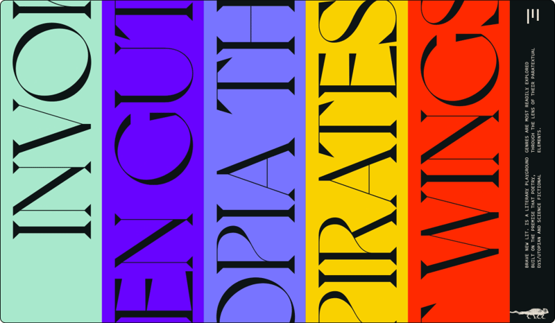
Bravenewlitis a literary playground. The romantic and curvy typeface, as well as the flat, earthy pastel tones with soft grainy images, create a sense of familiarity and closeness. To make this interactive magazine relatable, the designer chose to give it a tangible look such as scanned images of texts with footnotes, and a post-it note look and feel as though the user is a part of the writing process.
7. Contrast Colors
his one is for the millennials in the house, kids of the ’80s and ’90s. It’s hard to stay indifferent to a neon collared website. Color is a basic tool that helps you get the user’s focus and also helps stimulate emotion.
Usually targeted to a specific audience, this style has developed into a vibrant, popping web design aesthetic, filled with underground acid shapes, neon on black, bright contrast, and gradients.
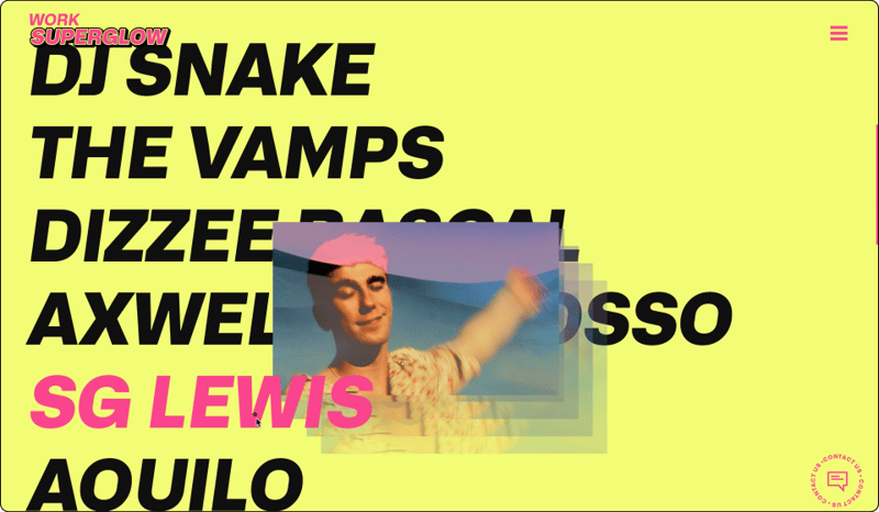
Superglow is a music and lifestyle design studio. Their website’s second section combines large black titles on a solid yellow background. This menu list on hover changes to fuchsia. The overall look includes saturated photos with a fade-out mouse animation that appear on hover and reveal a hint of the project within the internal link.
8. Off the Grid
A grid is one of the most important tools for a designer to have. It gives our work shape and structure. Moving off-center to emphasize a segment can make your website stand out and be memorable among a myriad of time-consuming rivals.
Going off the grid certainly isn’t a novel idea, yet it hasn’t been widely explored. Today, web designers no longer need intermediates, or developers to actualize their vision. It’s becoming increasingly easier to translate even the craziest layout you dreamed up in the middle of the night to simply go and build it using a web builder. Best of all, it’s already coded which simplifies the entire process.
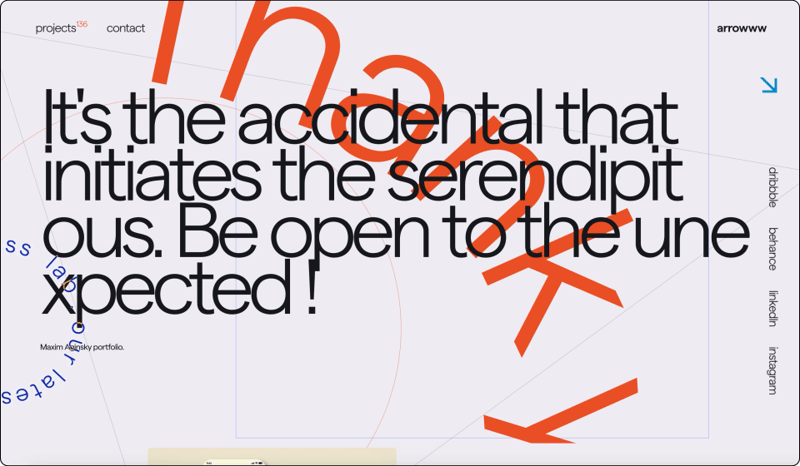
Arrowww Space, Maxim Aginsky’s portfolio, uses a quote from his design mantra in the page hero, demonstrating his vision of embracing accidents with overlapping text-on-path and linear structure background.
Infrared Mind Body from Texas, US, displays large images and texts that appear via various animations that accentuate their value proposition. Large close-ups, dim-lit images, large-scale typography, as well as soft and smooth transitions create a sauna vibe in a clean sophisticated way.
These basic shapes may also have text written on them and are often reminiscent of stickers-design from the 80s or 90s. These shapes may also be used as buttons (either static or animated), or as a sticker that informs us about a limited time promotion. No matter what these stickers look like or entail, their common goal is to draw the attention of the website visitor.
9. Imagery Multilayers
In recent years, during the design process, there’s been a heavy focus on clean, pixel-perfect, and minimalist designs. So much so, that many designers are discouraged from approaching more visually-complex designs.
Multilayers of content are a way to challenge conventional components that our eyes are used to — like photo galleries and typographical elements that create an immersive experience for telling the website story. This leads to users spending more time exploring a website.
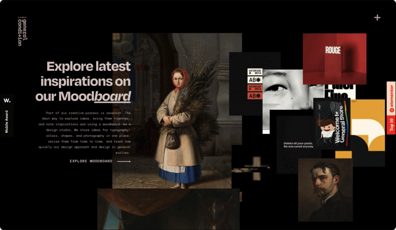
Using the example of General Condition, the common theme of the photos, elegant animation, and black background helps tie everything together, delivering a visually cohesive experience.
Another benefit of this technique is that it makes it easier to put plenty of content in a single section or limited space such as on mobile screens.
10. Delight
Delights have become a staple of good user experience, with today’s users coming to expect it in one of its two forms — surface delights and deep delights.
Surface delights include animations, tactile transitions or gestures, microcopy, images, and sounds. Deep delights meanwhile look to ensure all user needs are met, including functionality, reliability, usability, and pleasure. The likelihood of satisfied return users recommending the product or service increases if users experience a deep delight.
While surface delights are great and effective, web design has reached a point where it is not enough on its own. With our current understanding of user needs and habits, a true deep delight is one that is wholesome throughout the entire website. It doesn’t only spark momentary pleasure but adds to the usability, reliability, and function of the site.
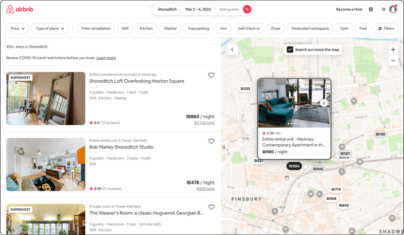
Airbnb is a great example of a website that offers delightful experiences throughout the entire user journey. Features such as marking the map tags the user has already looked through are not only pleasing but also functional and help the user move faster through the often vast number of options appearing on their screen at once.
But that’s only one example. The strict property guidelines Airbnb holds their hosts to (such as the images they post, cleaning standards, and payments and fees) promise a high standard for the user and a delightful, calming sense of security and trust along every step of the way.
The Future Is in Our Hands
We came across a big mix of websites and touched upon a variety of trends — from brutalist typography to soft muted color palettes, creating nostalgia and utilizing high contrast color themes.
With the inevitable Metaverse that will dominate headlines in 2022, web design finds itself on the brink of a new era.
Implementing the technologies of Virtual Reality, Augmented Reality, and Artificial Intelligence will soon become essential considerations for web designers.
For now, these technologies find themselves making steady headway on mobile applications, yet their foray into the world of websites is only a matter of “when” not “if”.
It seems the industry is going through a chaotic process akin to the internet’s version of the big bang — a creative cosmos of pixelated energies. At times colliding polarizing design styles and philosophies.
While it’s important to remember to stay up to date in our evolving world, it’s equally vital to pay attention. After all, trends can be evasive choices to go by.
Eventually, if we want our designs to fit their purpose, we need to honestly critique our work, basing our choices on what resonates with our user personas and the type of websites we design.
Looking for fresh content?
By entering your email, you agree to our Terms of Service and Privacy Policy.

