Table of Contents
Consumers don’t just recognize brands by the products they sell, the services they provide, or the mottos they spout. Brand imagery — like a logo, for example, helps consumers easily recognize brands visually.
That said, a logo acts as more than just a visual landmark in the top-left corner of a website.
Favicons are miniaturized logos (or pieces of logos) that establish a brand’s identity outside of its website. They enable brands to maintain a consistent visual presence in places like:
- Browser tabs
- URL address bars
- Browser bookmarks
- Internet search histories
- RSS feeds
- Desktop and mobile home screens
- App icons
Unlike a featured image where Google, social media, or RSS aggregators might be able to guess which image to use, there’s no guessing with a favicon. If you don’t design and upload a favicon to your website, nothing will appear except a generic placeholder.
And that’s a huge missed opportunity for your brand. Sites that don’t have favicons will be sees as unprofessional, and, subsequently, be associated with low standards and lack of authority.
Table of Contents
Why Does Your Website Need a Favicon?
Short for “favorite icon”, the favicon was introduced by Internet Explorer in the late 1990s. Its purpose was to help internet users distinguish between websites and find them quickly in their browser tabs.
Here’s why favicons are still a valuable piece of a website and its branding:
Reinforce Company Branding
Websites that don’t favicons will display this icon in browser tabs, search histories, RSS feeds, and more:
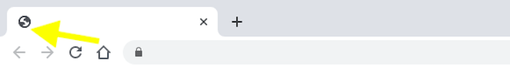
It’s a generic globe icon. And Internet users are familiar enough with the symbol to realize it’s a placeholder. They might not know the term “favicon”, but they’ll understand something’s missing if they see this.
Now, if you look in your browser tab above, you’ll see an example of Elementor’s favicon. It looks just like the Elementor brand logo:
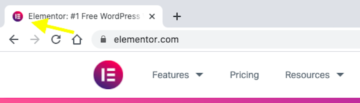
It might not seem like a big deal, but this level of attention to detail will be noticed by visitors, prospects, and customers.
Improve Internet Navigability
The above example shows the difference in how a standalone tab looks with or without a favicon. But it’s not just about branding a tab.
Here’s how internet users are able to quickly navigate back to a site thanks to having the visual cue of a favicon:
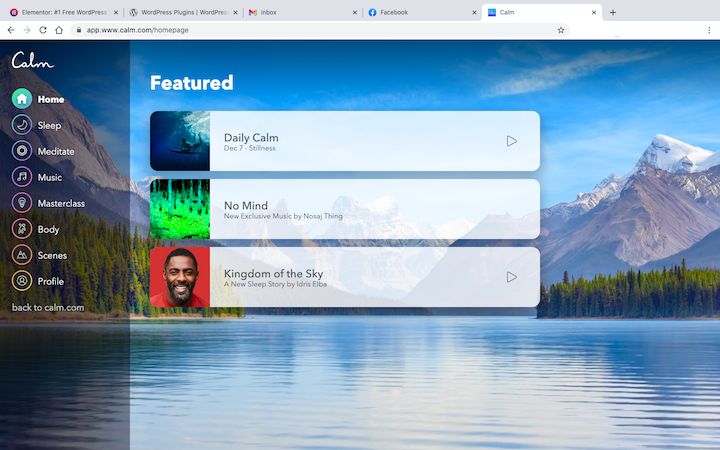
Let’s say this user opened their Calm dashboard in order to play some calming music while working. Their next step is an easy one to take because each of the open tabs — for Elementor, Facebook, Gmail, and WordPress — has a unique and easily recognizable favicon attached to it.
The favicon spares users from having to read through the meta titles in the browser tabs. Like other icons and logos we use on websites, the favicon visually tells users which website is which.
Increase Brand Recognition
If you design a favicon to appear as a stand-in for your website everywhere, you’ll strengthen brand recognition with your audience.
For example, Entrepreneur’s favicon is the capital “E” from its name:
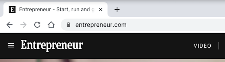
The favicon has a solid fill background (as opposed to a transparent one), so the white “E” on top of the black background is strikingly unique and attractive.
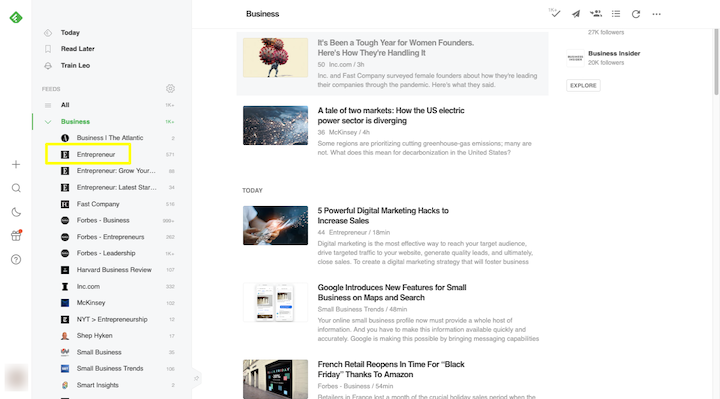
People familiar with the Entrepreneur brand will instantly recognize this favicon anywhere they encounter it. For instance, this is how it appears amongst a list of business resources in Feedly:
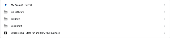
Users will also be able to quickly find it amongst their browser bookmarks, like this example in Chrome:
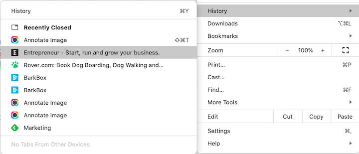
They’ll also find the same icon in their internet history:
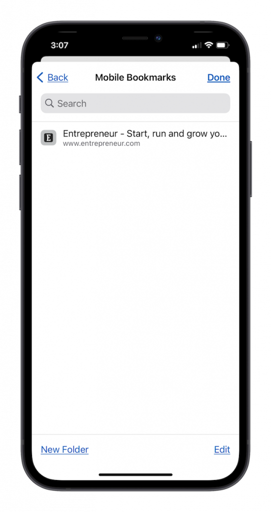
And it doesn’t stop on the desktop. The favicon is just as recognizable in a mobile bookmarks list:
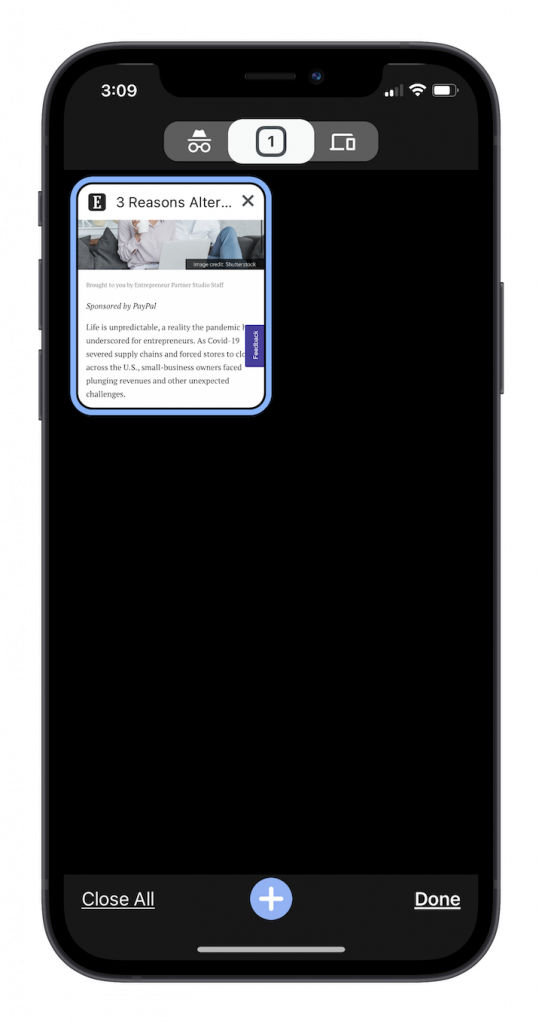
It also appears in mobile browser tabs, too:
Even if a user has only just been introduced to your brand, it won’t be long before they’re able to recognize your trademark favicon (and logo) on the web.
In addition, since May 2019, Google displays a favicon in the mobile search results page (SERP). By implementing a Favicon on your website, your mobile search results will be more visible on the page, which can result in a higher click-through-rate.
Tips for Designing the Perfect Favicon for Your Brand
While you might think it safe to assume that a resized version of your logo would work just fine for your favicon, there’s more to the process than that.
Here are some things to think about when you make a favicon for your brand:
1. Choose a recognizable element from your branding
For some brands, you’ll be able to use the logo design as is. Elementor is one example of this.
For brands that have a bigger logo (usually the ones that include the company name), you’ll have to pare it down or you’ll have to design something custom for the favicon.
Rover, for example, uses a paw print icon alongside the company name in its logo. Its favicon, however, is just the green paw print:
The name “Rover” doesn’t need to be squeezed into the favicon because the paw print design on its own is memorable enough.
BarkBox, on the other hand, doesn’t have an icon in its logo. So, its favicon has been designed using the “B” and the barking symbols that appear in the middle of the name:
Also, notice that the colors have been inverted. The favicon is white while the surrounding square is BarkBox’s brand blue. This makes it stand out from transparent background logos like Rover’s.
2. Use consistent but simplified branding
Obviously, you want your favicon to be recognized by those who are familiar with your brand. So, using fonts, icons, and colors from your brand identity is important.
That said, you don’t want to go overboard. Your favicon fits into a very tiny space, so you have to be careful with how much you put into the design.
Take Google’s 2020 logo and favicon redesign. Here’s what the logos for Gmail, Drive, Maps, Calendar, and Meet look like:

They all use the same color palette and similar geometric compositions.
Sure, they’re part of the same family of products, but they’re very difficult to distinguish from one another now. Previously, each of the logos had one unique solid color and shape.
This infusion of color and ambiguity in shape is not user-friendly at all. Make sure you prioritize the practical usability of the favicon over aesthetic-only considerations like this.
3. Know when to use a transparent background or solid fill
You’re going to see two types of favicon styles:
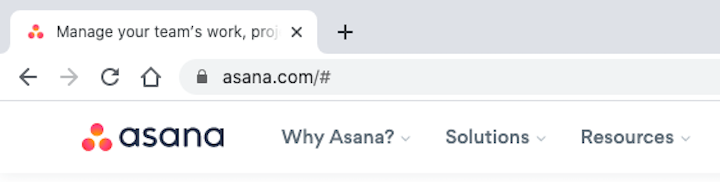
Transparent favicons are typically for icon-based designs like Asana’s:
One of the benefits of this is that the icon clearly stands out against whatever color its background is.
The example above is in Chrome. This example is from Safari:
If you had forgotten to save your favicon with a transparent background, there’d be an unsightly white box around it in this browser tab.
Solid fill favicons are best for letter-based favicons like Stripe’s:
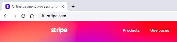
Unless you’ve used a unique font, the letter “s” on its own might not look very distinguished. With the white letter on the branded background color, however, it makes a stronger impression and may be easier to recognize as well.
4. Make sure the favicon is recognizable at any size
Favicons appear in a variety of sizes depending on the platform. They can be as small as 16×16 pixels and as large as 64×64 pixels.
If you know that users will save your website to their desktop (which browsers like Firefox and Edge support) or mobile home screen (like in the case of a progressive web app), you’ll need to design a favicon for larger sizes as well.
The average size for app or shortcut favicons is 152×152 pixels, but can go as large as 192×192 pixels if you want to size them exactly for Android tablets.
This is, yet, another reason why a simpler design is better. You never know how much your favicon will need to scale up or down.
5. Save it in the most browser-friendly file format
Although most popular browsers have begun to accept favicons in other formats besides ICO, they don’t all have universal support.
This chart from Wikipedia shows us which browsers support which favicon formats:
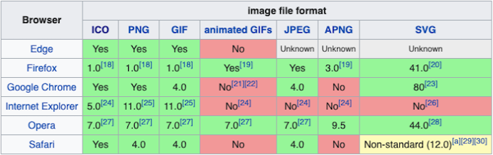
ICO and PNG enjoy universal support in the latest versions of each browser. While GIF does, too, it’s really not the ideal choice for a favicon.
Design principles teach us to design for the user first and to keep their experience free from distraction. An animated browser favicon won’t just distract them from enjoying their time on your site, it’ll distract them from looking at other open tabs.
While you might be thinking of using PNG since it’s a more common format, ICO is your best choice. That’s because you can save one or more images, at different sizes and different resolutions, within the single file.
So, it’s the easiest way to account for all favicon instances at once.
How To Add a Favicon To Your Website
With design best practices out of the way, let’s talk practical steps to get one on your website:
Step 1: Make the favicon
You or your graphic designer can create the favicon as an SVG vector image in Illustrator or Sketch. As vectors infinitely scale, this would enable your favicon to retain its clarity and recognizability regardless of where it appears.
If you don’t design it as a vector, that’s okay. The favicon will need to be exported as a PNG or ICO for all possible sizes you want to account for. As we’ll see shortly, you’ll want to save it in a much larger size than the favicon will ever appear at (260×260 is the recommendation).
If you want it to have a transparent background, remember to export it that way. Otherwise, design the solid fill favicon in the shape of a square.
Remember to save your favicon design in your web design style guide. That way, if you change your branding in the future, you’ll remember to update the favicon as well.
Here are some style guide examples you can use to create your own.
Step 2: Convert and resize your favicon design
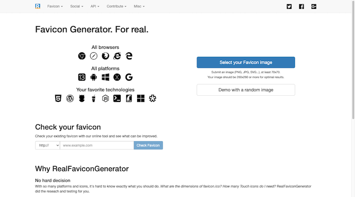
There are lots of free favicon generators that turn your favicons into ICOs. Real Favicon Generator is free, super easy to use, and helps you prepare your favicon for all channels:
Select the favicon file you created — in any format, just make sure it’s saved as 260×260 pixels for the best results — and upload it to the generator.
You’ll then be taken through the following prompt:
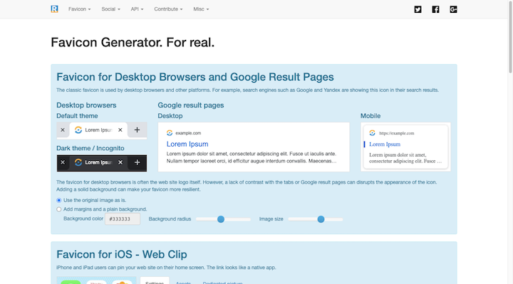
It will show you how your favicon appears in each browser and on each device.
If the generator makes a suggestion (like when it recommends inverting the colors for iOS home screen buttons), you should make it. You can also use this tool to make slight tweaks of your own.
Once you’ve reviewed your favicon designs, click the button at the bottom that says “Generate your Favicons and HTML code”. You’ll be taken here:
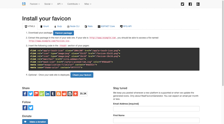
Click “Favicon package” to download your file. You’ll end up with a zipped folder containing the following file formats and sizes:
Now, this favicon generator provides instructions on how to install your favicon manually (with code). That’s not your only option though.
Step 3: Upload the favicon to the root of your website
You need to save your favicon to the root of your site so it lives at the following URL:
https://yourdomainname.com/favicon.ico
So, first things first, save your ICO as favicon.ico. (or favicon.png — just remember to update the HTML before you upload it to your site.)
Next, go to your web hosting control panel and find the FTP or file manager. Locate the root folder where your website lives. In cPanel, you’ll find it at public_html.
Here’s an example of what that would look like on SiteGround hosting:
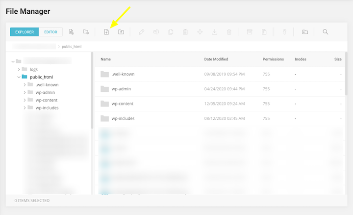
Click the button for “File Upload” and then upload your favicon.ico file to the top-level root folder. Save the changes and exit.
Step 4: Add HTML to the header
Before the favicon can appear, you’ll have to tell browsers and devices where to get the favicon from. They’ll find this information in your website’s header.
To inject this HTML code into your header, you have a couple of options.
One is to update your theme’s header.php file.
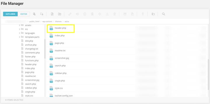
You’ll also find this file in WordPress. Go to Appearance > Theme Editor:
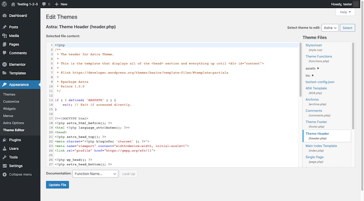
To add the favicon’s location to the header, place the following HTML between the <head> and </head> tags. Make sure to update it with your domain name and favicon file name:
<link rel=”favicon” type=”image/ico” href=”https://yourdomainname.com/favicon.ico” />
If you want to use all of the files generated by Real Favicon Generator, you can use the pre-written HTML provided by the generator. Here’s an example of what that might look like:
<link rel=”apple-touch-icon” sizes=”180×180″ href=”/apple-touch-icon.png”>
<link rel=”icon” type=”image/png” sizes=”32×32″ href=”/favicon-32×32.png”>
<link rel=”icon” type=”image/png” sizes=”16×16″ href=”/favicon-16×16.png”>
<link rel=”manifest” href=”/site.webmanifest”>
<meta name=”msapplication-TileColor” content=”#da532c”>
<meta name=”theme-color” content=”#ffffff”>
Just make sure you save each of these files to the root of your site and use the same names in the HTML if you renamed them.
A word of caution: Unless you have a child theme where you can safely update your header, you’re better off using a plugin to add the code. That’s because, if you add the favicon HTML to the header.php in your main theme, it will get replaced when you update your theme.
Use the Insert Headers and Footers plugin
The Insert Headers and Footers plugin from WP Beginner makes it easy to get your favicon code into the header of your site. And it’ll stay there no matter how many times you update your WordPress theme.
Go to Settings and locate Insert Headers and Footers. Add your code to the “Scripts in Header” section and save your changes:
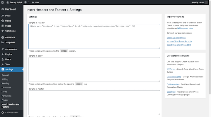
If you have multiple PNG and ICO files generated, add the code here. Otherwise, the HTML for your ICO will suffice.
Step 5: Confirm that the favicon works
Clear the cache in WordPress and open a new browser tab with your website. Do you see the favicon there? Good.
Do the same with other browsers as well as your smartphone and make sure the favicon looks exactly as you want it to. Then, try bookmarking your website. Again, make sure you’re happy with the results.
If the icon looks too blurry, it’s probably an issue with sizing. Review your files and make sure they’re properly designed. Reupload once you’ve fixed them and check again.
How To Add a Favicon in WordPress
There’s a quick and painless way to get the favicon saved to your website that doesn’t require accessing the control panel or working with code.
Note: If you decide to go this route, understand that you won’t have any control over how the favicon appears in non-browser areas (like on mobile home screens). If you’re okay with that, then here’s what you’ll do:
Log in to WordPress and go to Appearance > Customize. Navigate to the Header > Site Identity section.
You’ll find a section called “Site Icon”. Click on where it says “Select site icon”.
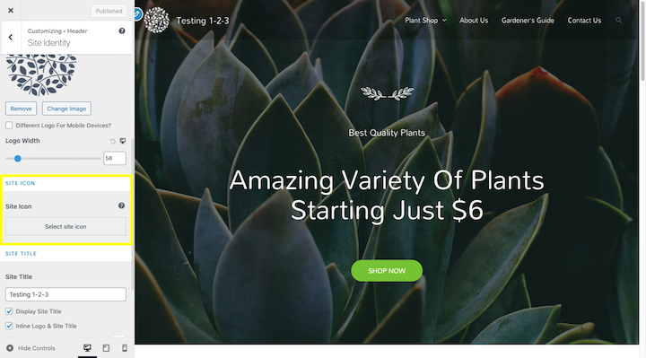
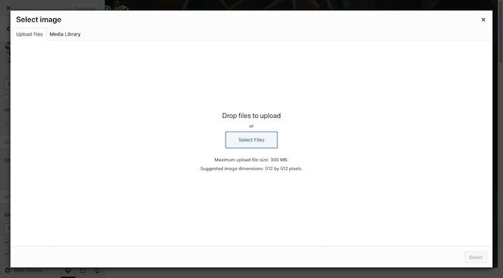
WordPress allows you to upload your favicon as a PNG or ICO here. Size recommendation is 512×512 pixels:
You’ll then get the chance to crop your favicon. There’s a preview of how it’ll appear in browser tabs on the right:
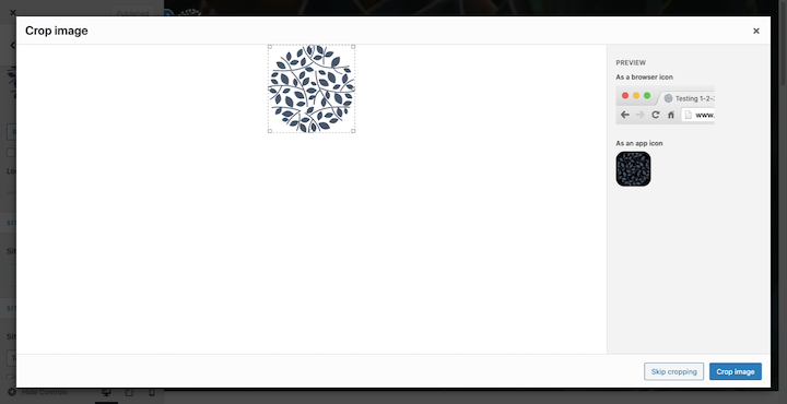
Click “Crop image” and then hit the “Publish” or “Update” website once you return to the Customizer and you’re done making all your changes.
You should see your new favicon in the current browser tab. (If not, clear your cache and check again.)
If you’re an Elementor Pro user, you can also do this using Global Settings. It works the same as the Customizer.
9 Inspiring Examples of Outstanding Favicons
Let’s take a look at how a strong color choice and abstract icon design can really make your favicon pop:
1. Adobe
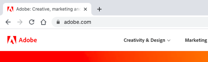
Adobe’s logo and favicon is a design the company has used since the early ‘90s.
Despite being a letter-based favicon, this one stands out because of the smart combination of bold red color and futuristic and abstract styling of the letter “A”.
2. CSS-Tricks
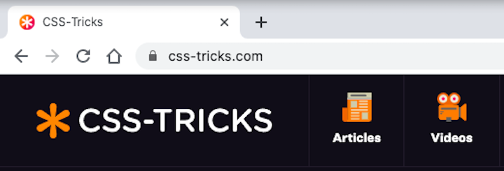
The asterisk is a powerful symbol in CSS coding. It’s a universal selector that instantly applies a style to all corresponding elements.
CSS-Tricks has wisely used this meaningful and useful symbol to represent its brand identity around the web.
3. Fandango
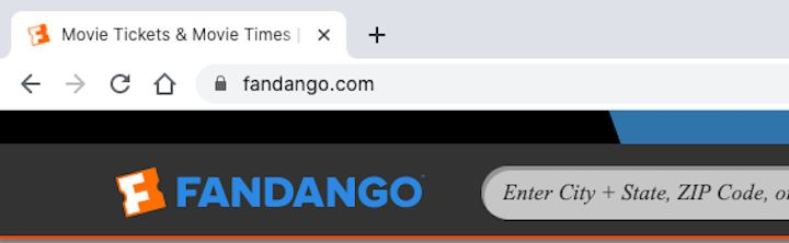
Here’s another example of a unique take on a letter-based favicon. Fandango’s logo is a capital “F” within an orange block. But it’s not a square like we commonly see with favicons.
This orange shape represents a movie ticket and it sits at an angle. These design traits help the letter “F” stand out more than other letter favicons.
4. Hotels.com
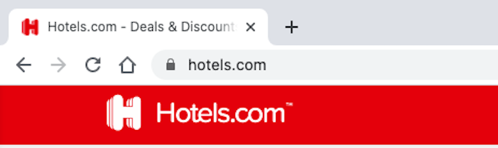
Hotels.com has a 3D logo and favicon design. That alone makes it stand out against the more common flat designs we see today. The designer’s also chosen not to place the letter “H” within box-like other letter favicons, which helps it stand out even further.
5. Kissmetrics
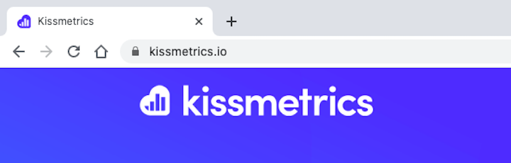
Thanks to the cloud shape around the bar graphic icon, Kissmetrics’s favicon design is both recognizable and descriptive.
Even if people don’t automatically remember the favicon, the graphic makes it perfectly pretty clear what they’ll find on this site: a cloud-based metrics tool.
6. Toast
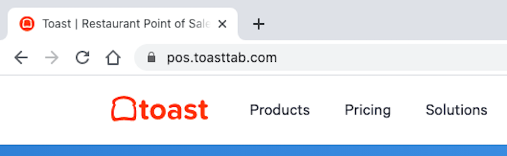
Sadly, not enough restaurants and companies that support these establishments take the time to utilize their greatest asset in favicon design: Food and drink. Toast does though.
This point-of-sale software provider has an instantly recognizable icon that matches the name of the company.
7. Turbotax
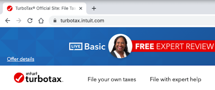
TurboTax’s favicon is designed simply enough. It’s a white checkmark within a red circle.
While this symbol might seem understated, it actually has a ton of significance for taxpayers. A checkmark refers to completed tasks (like uploading revenue) as well as completed steps (like receiving a tax refund).
8. Twitter
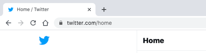
Twitter has one of the most well-known logos in the world, so of course, it’s going to use its Twitter bird to represent it everywhere else on the web.
It’s a cute design. The bird is small, doesn’t appear menacing (like a scavenging bird would) and it’s a very positive shade of blue.
9. Zillow
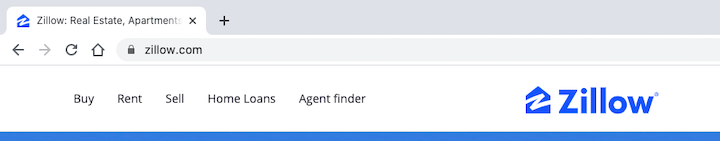
Zillow’s favicon is neat because it brings some life to the otherwise safe font choice used to spell out the company name. The letter “Z” looks hand-drawn and is encapsulated by a house graphic.
It’s a favicon that’s impossible to miss or to immediately know what it belongs to.
Create a Favicon To Make Your Website Stand Out in the Right Places
The favicon might seem like an insignificant thing in the grand scheme of designing a website.
But, if you think about it, a favicon gets more airplay than the website itself. And if that tiny icon is within users’ fields of vision in browser tabs, search histories, RSS feeds and more, you better make sure it makes a strong impression.
You can do that by designing it to look good and recognizable — at any size, at any resolution — and then saving it in file formats accepted by all browsers and devices.
Don’t forget to have a little fun with it, too. Bright colors, unique shapes, and hidden letters can make a good-looking favicon much more memorable.
Looking for fresh content?
By entering your email, you agree to receive Elementor emails, including marketing emails,
and agree to our Terms & Conditions and Privacy Policy.


