Table of Contents
What is CSS?
CSS (Cascading Style Sheets) is the cornerstone of web design. It transforms plain HTML structures into visually captivating websites. It’s a language that allows web developers and designers to dictate the appearance of HTML elements.
Think of HTML as the skeleton of a webpage, providing the basic content blocks. CSS is the stylish outfit, the makeup, and the overall aesthetic that brings the webpage to life. With CSS, you can control:
- Colors and Fonts: Change text color, size, and typeface.
- Layout: Build multi-column designs, position elements exactly where you want them, and create layouts that seamlessly adapt to any screen size.
- Backgrounds: Add background images or colors.
- Animations and Transitions: Create smooth visual effects to enhance user interaction.
- Add Interactive Touches: Incorporate subtle shadows, smooth transitions, and animations to engage and delight your visitors.
CSS makes websites visually appealing and user-friendly. Its key advantage lies in its separation of content (HTML) from presentation (CSS). This means you can update styles across an entire website with minimal changes to the code. This efficiency saves time and makes website maintenance a breeze.
In short, if HTML builds the house, CSS paints the walls, decorates the rooms, and makes it a place you want to spend time in.
Get Ready to Style!
Whether you’re a complete beginner or have some basic HTML knowledge, this guide will unlock the secrets of CSS and empower you to style websites with confidence.
CSS Fundamentals
CSS Syntax
CSS may look intimidating at first, but its underlying structure is quite straightforward. Let’s break down the key elements:
- Selectors: Selectors are like special instructions for your browser, telling it which specific HTML elements you want to style. Common types of selectors include Element selectors, Class selectors, and ID selectors.
- Properties: Think of properties as the different features you want to change about your elements-like color, font size, background image, and many more.
- Values: Values are the specific adjustments you want to make to a property. For instance, you could set the color property to red or the font-size property to 16px.
- Declarations: A declaration is a single instruction for your browser. It combines a property with its chosen value, separated by a colon and ending with a semicolon.
- Style Rules: A style rule groups all your declarations for a specific selector within curly brackets {}. It tells the browser which elements to style and how to style them.
Where to Put Your CSS
There are three main places to include CSS in your website:
- Inline Styles: You can add style attributes directly within your HTML tags, but this method is the least recommended as it makes your code harder to maintain.
- Internal Stylesheet: You can place <style> tags within the <head> section of your HTML document, defining styles specifically for that page.
- External Stylesheet: The most common and organized method is to create a separate file with a .css extension. Then, you link that file to your HTML using a <link> tag within the <head> section.
The Cascade and Specificity
Have you ever wondered how the browser decides which CSS style to apply when there are multiple conflicting rules for the same element? This is where the ‘Cascade’ and ‘Specificity’ come into play.
The Cascade
Think of the cascade as a waterfall of style rules. Browsers generally follow these principles:
- Order of Stylesheets: If rules in different stylesheets have the same specificity, the last one loaded takes precedence.
- Source Order within a Stylesheet: Within the same stylesheet, if multiple rules apply with equal specificity, the last one defined in the code wins.
- Inline Styles: Inline styles (defined directly in an element’s style attribute) have the highest priority, often overriding other styles.
Specificity
Specificity is like a scoring system that helps the browser determine which rule is most important. More specific selectors generally override less specific ones. Here’s a basic hierarchy:
- Inline styles (highest specificity)
- ID selectors
- Class selectors, attribute selectors, and pseudo-classes
- Element selectors (lowest specificity)
Important Note: You can use the !important declaration to override almost any other style rule, but use this sparingly, as it can make your CSS harder to manage.
Understanding Inheritance
Child elements inherit some CSS properties from their parent elements. For example, you set a font color on the <body> tag. In that case, all text elements within the body will generally inherit that color unless they have a different color explicitly defined. However, properties like margins, padding, and borders are not inherited.
The Box Model
Imagine every element on your website as a little box. The CSS Box Model describes the different layers that make up these boxes, which is crucial for understanding how they are sized and spaced on the page. Here’s the breakdown:
- Content: This is the core of your element-the actual text, image, or other media you want to display.
- Padding is the transparent area surrounding the content. Think of it as the cushioning inside the box. The padding adds breathing room between the content and the border.
- Border: This is the visible line (if you choose to have one) that goes around the padding and content. You can control the border’s style (solid, dotted, dashed, etc.), thickness, and color.
- Margin: The transparent space outside the border creates separation between your element and its neighbors. Margins are key to creating clean layouts and preventing elements from bumping up against each other.
Controlling Element Dimensions (Width and Height)
The width and height properties set the size of your box’s content area. Remember that padding, border, and margin will add to the element’s overall space on the page.
Box-Sizing: border-box
The default box-sizing behavior can be a bit counterintuitive. With content-box (the default), if you set a width of 200px, add 20px of padding, and a 5px border, the total width of your element becomes 250px.
The border-box value for the box-sizing property changes this behavior. With the border-box, the padding and border are included within the total width/height you set. This makes calculating dimensions much more intuitive and is often a preferred approach.
Elementor simplifies a lot of box model calculations and provides visual controls for setting padding and margins, making it easier to achieve the layout you envision.
Layout and Positioning
Display Properties
The display property is fundamental in controlling how elements are laid out on your website. Here are the most common values and what they do:
- Block: Block-level elements take up the full width available, always start on a new line, and can have height and width set. Examples: <div>, <h1> – <h6>, <p>, <header>, <footer>
- Inline: Inline elements only occupy the space needed for their content. They sit within a line of text, cannot have a width or height set, and are affected by line-height. Examples: <span>, <a>, <img>
- inline-block: This is a hybrid, allowing you to set the width and height of an element that still flows within a line of text. Think of images with captions aligned side-by-side.
- None: The element is completely hidden and removed from the page’s flow. It will only take up a little space.
Elementor provides visual controls to switch between different display types, simplifying the process of creating layouts.
Positioning
CSS lets you precisely control the position of elements, breaking them out of the normal document flow if needed. Here are the key positioning properties:
- Static: The default behavior. Elements are positioned according to their place in the HTML document.
- Relative: The element is positioned relative to its normal position in the flow. It acts as a reference point for any child elements you position with ‘absolute’ (more on that later).
- Absolute: The element is removed from the normal document flow and positioned in relation to its nearest positioned ancestor (or the browser window if none exists). Absolutely positioned elements can overlap other content.
- Fixed: The element is removed from the flow and stays in a fixed position on the screen, usually relative to the browser window. It doesn’t move even when you scroll. Great for elements like sticky headers.
- Sticky: A hybrid behavior. The element acts like it’s relatively positioned until it reaches a certain scroll position, then becomes fixed.
Z-index
When elements overlap, the z-index property determines the stacking order. Think of it like layers of paper-elements with a higher z-index appear on top of those with a lower z-index. This only applies to positioned elements (relative, absolute, fixed, or sticky).
Floats and Clearing
While less commonly used for primary layout these days, understanding floats is still valuable as you might encounter them on older websites or for specific use cases.
- The Float Property: The float property (with values like left, right, and none) removes an element from the normal document flow and pushes it to the specified side. Other content can then wrap around it.
- Clearing Floats: A floated element’s parent container often collapses in height because floats are removed from the flow. The clear property (with values like both left and right) is used on elements after a floated element to prevent this collapsing behavior and ensure the parent has the correct height. A common technique for clearing floats is the “clearfix”.
Why Floats Have Largely Been Replaced
Floats can be tricky to manage, especially for complex layouts. More modern CSS techniques like Flexbox and CSS Grid have emerged, offering greater flexibility and control for building robust layouts.
Flexbox
Flexbox (short for Flexible Box Layout) is a CSS module designed to simplify the creation of flexible, responsive layouts. It gives you extraordinary control over the distribution and alignment of elements, even if their content size is unknown or dynamic.
Key Concepts
- Flex Container: An element with display: flex becomes a flex container. Its direct children become flex items.
- Main Axis: The primary direction along which flex items are laid out. It’s set by flex-direction and can be: row (default), row-reverse column, or column-reverse.
- Cross Axis: The axis perpendicular to the main axis. Think of it as the opposite direction of the main axis.
- Flex Properties: These properties control how flex items behave within the container.
Elementor offers a visual interface and numerous controls for adjusting Flexbox properties, making it a breeze to create complex layouts without manually writing extensive CSS code.
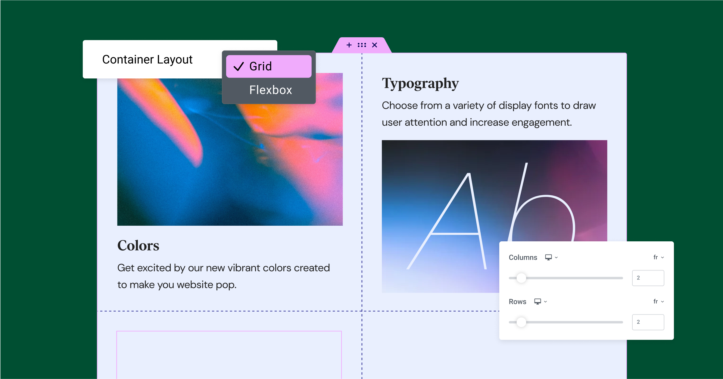
CSS Grid
CSS Grid is a two-dimensional layout system designed specifically for creating complex, grid-based structures. It gives you fine-grained control over both rows and columns, making it ideal for building magazine-style layouts, dashboards, and more.
Key Concepts
- Grid Container: An element with display: grid becomes a grid container, and its direct children become grid items.
- Grid Tracks: Grid lines define the structure of the grid. The spaces between grid lines are called tracks-these can be rows or columns.
Flexibility and Power
CSS Grid allows you to position grid items using line numbers or names precisely, span multiple rows or columns, and create responsive grids that adapt to various screen sizes. Its unique capabilities make it perfect for designs that break away from simple columnar structures.
While Elementor provides visual controls to design layouts with Grid, understanding core CSS Grid concepts will give you even more control and flexibility over your website designs.
Design and Visual Styling
Colors and Backgrounds
Colors can dramatically change the mood and atmosphere of your website. Let’s explore how CSS lets you work with them:
Color Formats
- Hexadecimal Values: 6-digit codes representing Red, Green, and Blue values (e.g., #FF0000 is pure red).
- RGB: Values for Red, Green, and Blue on a scale of 0-255 (e.g., rgb(255, 0, 0) is pure red).
- RGBA: Adds an alpha channel for transparency (e.g., rgba(255, 0, 0, 0.5) is a semi-transparent red).
- HSL: Hue, Saturation, and Lightness-a more intuitive way to define colors (e.g., hsl(0, 100%, 50%) is also pure red).
- Background Colors: Use the background-color property to add colors behind elements.
- Background Images: Use the background-image property to set backgrounds and customize how they’re positioned (background-position), repeated (background-repeat), and more.
- Gradients: Create smooth transitions between colors. CSS supports linear gradients (linear-gradient) and radial gradients (radial-gradient) for eye-catching effects.
Elementor simplifies color and background selection with visual color pickers and robust gradient controls, making your design exploration a joy.
Typography
Typography significantly influences your website’s readability and overall aesthetic. CSS gives you extensive control over your text styling:
Font Properties
- font-family: Specifies the font or a list of fallback fonts.
- font-size: Sets the size of your text.
- font-weight: Controls the boldness of your text (e.g., bold, normal, or numeric values like 400, 700).
- font-style: Makes text italic or oblique.
Line-height, Letter-spacing, and More:
- line-height: Controls the space between lines of text for better readability.
- letter-spacing: Adjusts spacing between letters.
- word-spacing: Adjusts spacing between words.
- text-align: Aligns your text (left, right, center, or justify).
- text-decoration: Adds underlines, overlines, strikethroughs, etc.
- text-transform: Controls capitalization (uppercase, lowercase, etc.).
Web Fonts
Go beyond basic system fonts! Web fonts services like Google Fonts provide a vast library of beautiful typefaces. You can easily integrate these into your website using CSS.
Elementor offers a rich selection of typography options, easy font selection, and the ability to integrate Google Fonts seamlessly.
Spacing, Sizing, and Overflow
Margins and Padding
Recall that margins create space outside an element’s border, while padding creates space inside the border. Use these properties to control the spacing between elements and create a visual hierarchy.
Units of Measurement
- Pixels (px): Fixed unit, offers precise control but might not scale well across different screens.
- em: Relative to the current font size, it is useful for creating scalable designs.
- rem: Relative to the root element (usually <html>) font size.
- Percentages (%): Sizes elements relative to their parent container. Great for responsive layouts.
- Viewport Units (vw, vh): Relative to the browser viewport size (e.g., 100vw means 100% of the viewport width).
Overflow
The overflow property controls what happens when the content exceeds an element’s dimensions. Possible values include:
- visible (default): Content spills outside the box.
- hidden: Content is clipped, and anything outside the box is hidden.
- Scroll: Adds scrollbars so users can view all the content.
- auto: Adds scrollbars only if content overflows.
Controlling Element Dimensions
Remember width and height properties set the dimensions of the content area. You can also use:
- max-width and min-width for setting size ranges
- max-height and min-height to set limits on height
Elementor offers visual controls for margins, padding, width, height, and more, making it easy to adjust spacing and size without extensive CSS coding.
Visual Effects
Box Shadows
- The box-shadow property adds realistic or stylized shadows to your elements. Customize the shadow’s offset, blur radius, spread, and color to achieve the desired effect.
Text Shadows
- Similar to box shadows, the text-shadow property adds a touch of dimensionality to your text. Control the offset, blur, and color for subtle or dramatic effects.
Filters
CSS filters offer a way to manipulate an element’s appearance visually. Common filters include:
- blur(): Adds a Gaussian blur.
- grayscale(): Converts the element to grayscale.
- sepia(): Applies a sepia tone for a vintage look.
- And many more!
Transitions and Animations
Want to make your website feel more interactive? Let’s touch on the basics of CSS transitions and animations:
Transitions:
- The transition property allows you to smoothly change property values over a specified duration. For example, you could create a hover effect in which an element’s background color gradually changes.
Animations:
- The animation property and @keyframes rule gives you more fine-grained control over creating custom animations. With CSS animations, you can move elements, change their scale, rotate them, and much more.
Elementor’s intuitive interface allows you to add transitions, animations, and various effects right within the editor, offering powerful ways to enhance your website’s visual appeal.
Responsive Design with CSS
The Importance of Responsiveness
With people browsing the web on smartphones, tablets, laptops, and large desktop monitors, it’s crucial that your website provides an optimal experience on all screen sizes. Responsive design ensures that your content is rearranged and resized gracefully to fit any device.
Media Queries
The heart of responsive design in CSS lies in media queries. Think of them as special rules that allow you to apply different styles depending on the screen size, orientation, and other features of the user’s device.
Basic Media Query Concepts
A media query typically specifies a minimum or maximum screen width (or a range between the two). If the device’s screen size matches the condition, CSS rules within that media query will be applied.
Breakpoints: Media queries often target common breakpoints-widths where the layout might need significant changes to look good. Some popular breakpoints roughly correspond to device categories (e.g., 768px for tablets and 1024px for laptops).
Key Strategies Using Media Queries
- Mobile-First: Start by designing your website for smaller screens, and then use media queries to add styles that enhance the layout for larger screens.
- Fluid Layouts: Use flexible units (like percentages) alongside techniques like Flexbox and Grid to create layouts that naturally adapt to different screen sizes.
- Responsive Images: Ensure your images scale well for different devices. This helps optimize page loading times, especially on smaller screens.
- Typography Adjustments: Use media queries to adjust font sizes and line heights to maintain readability across different devices.
- Navigation Adaptations: Consider how your navigation will change between a horizontal navigation bar on desktops and a “hamburger” menu on mobile screens.
Elementor offers a responsive editing mode. It lets you visually adjust your design for desktops, tablets, and mobile screens, ensuring your website looks great on all devices.
Thorough Testing
Always test your responsive design on a range of physical devices if possible. If you don’t have many devices, you can use device emulators in your browser’s developer tools to simulate different screen sizes.
Best Practices and Advanced Techniques
Preprocessors (Sass, Less)
Preprocessors add power and flexibility to your CSS code. Let’s briefly introduce the benefits of popular options like Sass and Less:
- Variables: Define reusable values for colors, fonts, etc.
- Nesting: Write CSS with a clearer hierarchy, improving organization.
- Mixins: Create reusable blocks of CSS code.
- Functions: Perform calculations within your stylesheets.
Elementor has a built-in Sass compiler, allowing you to leverage the benefits of this powerful preprocessor directly within your Elementor projects.
CSS Specificity Tips
Understanding specificity rules is essential when dealing with complex stylesheets. Here are some tips for managing those occasionally tricky situations:
- Avoid Overly Specific Selectors: Using long chains of selectors can make overriding styles harder.
- Strategic Use of !important: While generally used sparingly, the !important declaration can be helpful when you need to override styles in specific situations.
- Specificity Calculator: Online tools can help you calculate and compare selector specificity.
Browser Compatibility and Debugging
- Cross-Browser Testing: Test your website in different browsers (Chrome, Safari, Firefox, Edge) and their various versions, as they can have subtle rendering differences.
- Vendor Prefixes: While less common these days, occasionally, you may need to include vendor-specific prefixes (-webkit-, -moz-, etc.) for certain properties to support older browsers.
- Browser Developer Tools: Become best friends with your browser’s developer tools. They allow you to inspect elements, see which styles are applied, debug layouts, and much more.
Performance Optimization
- Minimize CSS File Size: Use minification tools to remove unnecessary whitespace and comments, reduce file size, and speed up loading times.
- Efficient Selectors: Aim for selectors that the browser can match quickly. Overly complex selectors can slow down rendering.
- Hardware Acceleration: Leverage CSS properties like transform and opacity for animations, as they can often be offloaded to the GPU for smoother performance.
Elementor is built with performance in mind, providing various optimizations behind the scenes.
Accessibility in CSS
Designing with accessibility in mind ensures your website is usable by everyone, including those with disabilities. Here are a few CSS considerations:
- Focus States: Provide clear visual indicators when using :focus for keyboard navigation.
- Color Contrast: Ensure sufficient contrast between text and backgrounds for readability.
- Semantic HTML: Use headings, lists, and other HTML tags appropriately for structure, as this aids screen readers.
- ARIA Attributes: Use ARIA attributes where necessary to provide additional context for assistive technologies.
Elementor and CSS: Building Beautiful Websites with Ease
Elementor Advantage
Elementor’s intuitive visual editor, combined with its robust theme builder, simplifies applying CSS styles and creating complex layouts without needing to hand-code everything. Here’s why Elementor is a game-changer:
- Drag-and-Drop Design: Build and customize every aspect of your website’s design through a visual interface. Add elements, adjust their spacing, change colors, fonts, and much more.
- Live Editing: See changes to your website reflected instantly in the editor, creating a seamless and highly satisfying design workflow.
- Extensive CSS Controls: While Elementor eliminates the need to write code constantly, it also offers fine-grained CSS controls. You can directly modify CSS properties for advanced customization when needed.
- Global Styling: Define site-wide styles for elements like headings, buttons, and more. Changes made in your global settings cascade throughout your website, ensuring consistency and saving time.
Elementor Hosting: Performance and Optimization
Elementor Hosting delivers a cloud hosting solution tailored for WordPress websites built with Elementor. It’s designed with speed, security, and scalability in mind, ensuring your website loads fast and delivers a great user experience. Key features include:
- Google Cloud Platform C2 Servers: Leverages powerful and efficient Google Cloud infrastructure for reliable performance and uptime
- Cloudflare Enterprise CDN: Accelerates content delivery around the world, ensuring your pages load quickly for users no matter their location.
- WordPress-Specific Optimizations: Elementor Hosting’s configuration and optimizations cater specifically to WordPress, providing additional speed gains.
When using Elementor and Elementor Hosting together, you benefit from a tightly integrated solution built around design ease and performance. This empowers you to create stunning websites without facing the complexities often associated with traditional web development.
Conclusion
Throughout this comprehensive guide, we’ve journeyed through the fundamentals of CSS, layout techniques, visual styling, responsive design, and best practices. Understanding CSS gives you the power to customize your website’s appearance precisely to your liking.
Looking for fresh content?
By entering your email, you agree to receive Elementor emails, including marketing emails,
and agree to our Terms & Conditions and Privacy Policy.


