Table of Contents
When used strategically, bolding adds emphasis, guides the reader’s eye, and creates a more dynamic web experience. Whether you’re highlighting a sale, pointing out important information, or simply making your headings pop, understanding how to make text bold in HTML is a web design superpower.
In this guide, we’ll cover everything you need to know about bolding text.
The Foundations of Bold Text in HTML
The <b> and <strong> Tags
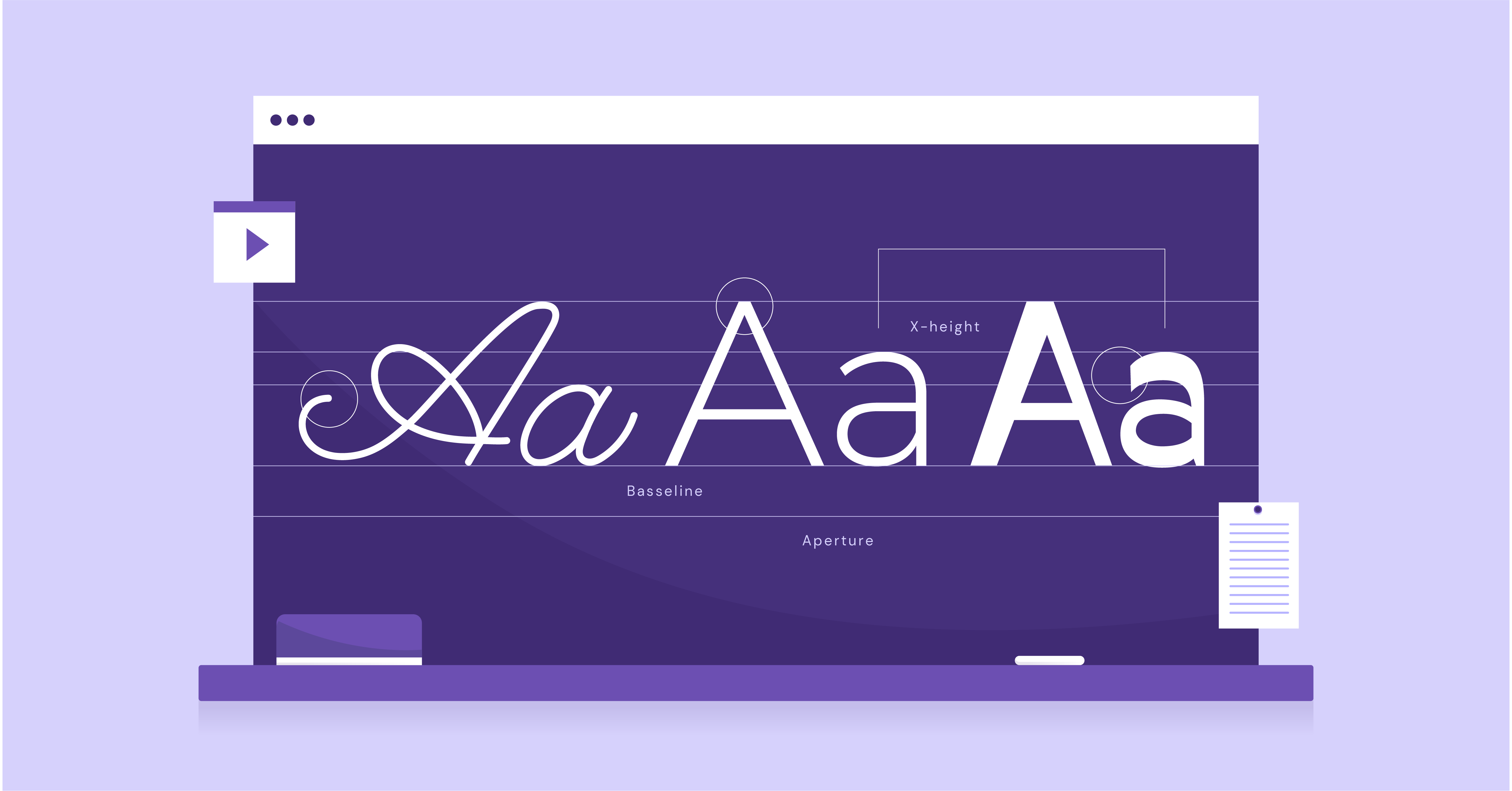
Let’s start at the core of HTML bolding: the <b> and <strong> tags. These simple tags are your go-to tools for making text visually bold on a web page.
Visual Boldness
The primary function of both <b> and <strong> is to make text appear thicker and heavier than regular text. This immediately draws attention to those specific words or phrases.
Semantic Differences
While both tags achieve the same visual effect, there’s a subtle difference in their meanings:
- <b>: Used for stylistic emphasis (making something stand out visually).
- <strong>: Emphasizes strong importance or seriousness.
Accessibility and Screen Readers
Screen readers (software for the visually impaired) often interpret <strong> with a slightly stronger emphasis than <b>. This helps convey the importance of specific content for those who need more visual boldness.
Using CSS for Bold Styling
HTML tags give you a quick and easy way to bold text, but for more control and flexibility, CSS (Cascading Style Sheets) is king. With CSS, you can apply bold styles to specific headings, individual paragraphs, buttons, or any other element on your website.
The key CSS property here is font-weight. To make text bold, you would set the font-weight property to bold.
CSS offers 3 main ways to add styles:
1. Inline CSS
How: Embedded directly into the HTML element using the style attribute.
Example:
<h1 style=”color: blue; text-align: center;”>Welcome!</h1>
Pros:
- Very specific-overrides other styles.
- Useful for one-time adjustments.
Cons:
- Pollutes HTML with styling information.
- Makes maintenance a nightmare, especially for large projects.
- Can’t be reused across elements.
2. External Stylesheets
How: Separate .css file containing style rules. This file is linked to an HTML document using the <link> tag in the <head>.
Example: (style.css)
CSS
body {
font-family: Arial, sans-serif;
}
h1 {
color: blue;
text-align: center;
}
Pros:
- Promotes separation of concerns (HTML for structure, CSS for presentation).
- Styles can easily be applied across the entire site.
- Improves maintainability.
Cons:
- An extra HTTP request is needed to load the stylesheet (can slightly impact performance).
3. Internal Stylesheets
How: Style rules are defined within a <style> block in the <head> of an HTML document.
Example:
HTML
<head>
<style>
body {
font-family: Arial, sans-serif;
}
h1 {
color: blue;
text-align: center;
}
</style>
</head>
Pros:
- Keeps styles bound to a specific HTML document.
- It avoids an extra HTTP request (like external stylesheets)
Cons:
- Less reusable than external stylesheets.
- Not ideal for site-wide style standardization.
Best Practices
In general, external stylesheets are the preferred method for most web projects because they offer the best separation of concerns, organization, and scalability. Inline styles should be reserved for quick, occasional overrides. Internal stylesheets are a middle ground, suitable for styles specific to a single page.
Best Practices for Bolding Text Effectively
Knowing how to use bold text is one thing, but using it strategically to enhance your website is another skill. Let’s explore some best practices to ensure your bold text is both impactful and visually pleasing.
Strategic Bold Usage
The key to effective bolding is emphasis. Highlight key phrases, calls to action, important headings, or navigational elements. Resist the urge to bold everything-too much bolding dilutes its impact and makes your text harder to read.
Bolding for Readability
Consider the following for optimal readability:
- Contrast: Ensure sufficient contrast between bold and regular text for easy visual distinction.
- Font Size and Spacing: Bold text may require slightly larger font sizes or extra spacing around it to maintain clarity.
- Accessibility: Be mindful of visually impaired users. Pair bonding with other visual cues (color, size) and use the <strong> tag for truly important content.
Strategic Bold Usage
Bold text is like a spotlight-use it wisely to guide the reader’s eye to the most important elements on your page. Here are areas where bolding adds significant value:
- Headings and Subheadings: Bolding headings creates a strong visual hierarchy, making your content easier to scan and understand.
- Key Phrases & Calls to Action: Draw attention to essential information or the actions you want visitors to take (e.g., “Sign Up Now”, “Limited Time Offer”).
- Navigation: Bolding active or selected items in your menus helps users understand where they are on your website.
- Product Highlights: In e-commerce, bold key features or specifications to make them stand out.
Bolding for Readability
Bold text can enhance readability, but it’s important to consider how it interacts with your overall design. Here are a few tips to keep in mind:
- Contrast is Crucial: Choose colors that provide a clear contrast between your regular and bolded text. Sufficient contrast is particularly important for users with low vision.
- Font Matters: Some fonts have thicker, bolder versions by design. Choose a font that is clear and legible, with a bold style that complements the overall look and feel of your website.
- Size and Spacing: Slightly increasing the font size or adding extra line spacing (leading) around bold text can improve its clarity.
- Don’t Neglect the Background: Ensure your bold text stands out against the background color or image. Avoid making it difficult to read.
- Accessibility Tools: Consider users with visual impairments. Use tools to check color contrasts, and always remember to use the <strong> tag to emphasize content critical for understanding.
Design Principles
Bolding isn’t just about making individual words stand out; it should work harmoniously with your website’s overall design aesthetic.
- Typography: Choose a typeface with a bold weight that complements your chosen fonts. Consider how bolding fits into the hierarchy of your headings (H1, H2, H3, etc.).
- Balance & Consistency: Use bolding consistently throughout your site. If you use bold headings, consider a similar treatment for important phrases within paragraphs. This creates visual harmony and improves the user experience.
- Color Palette: Bold text colors should align with your overall color scheme. Choose bold colors that are striking yet cohesive with your brand.
- Pairing Bold with Other Styles: Experiment with combining bold and italics or bold and underlining for special emphasis. Be mindful of overuse, too many styles can become visually overwhelming.
Troubleshooting and Common Mistakes
Even with the best intentions, bolding can sometimes take time. Here are some common pitfalls and how to avoid them:
- Overbolding: As we’ve emphasized, too much “bold” creates a messy, hard-to-read page. Be selective and intentional in your bolding choices.
- Bold Isn’t Always Best: Sometimes, other methods like italics, color, or size changes can be more effective for emphasis. Don’t feel that bold is your only tool!
- Browser Inconsistencies: Very rarely, different browsers might render bold text slightly differently. Test your website across popular browsers to spot any issues.
- Nested Tags: If you’re nesting <b> or <strong> tags within each other, it can lead to unexpected or overly bold results. Stick to a clean, simple structure.
Mastering Bold Text with the Elementor Website Builder
Now, let’s see how the Elementor website builder streamlines bolding and makes it effortless in the web design process.
Bolding Text with Elementor
Elementor’s intuitive visual interface takes the guesswork out of bolding text. With drag-and-drop editing and live previews, you can instantly see the results of your styling choices.
Elementor and Design Best Practices
Elementor doesn’t just make bolding easy; it encourages design practices that align with the principles we covered earlier. Here’s how:
- Pre-designed Templates: Elementor’s vast library of templates provides professionally designed layouts where bolding is used strategically and effectively. These serve as excellent starting points or inspiration for your own designs.
- Responsive Design: Elementor ensures your bold text looks great on all devices. Its mobile-specific controls let you adjust how bolding appears on smaller screens, maintaining readability across desktops, tablets, and phones.
- Typography Settings: Elementor offers fine-grained control over your site’s typography. With a few clicks, you can choose fonts with beautiful bold weights, set default heading styles, and ensure a perfect visual hierarchy.
Beyond the Basics: Advanced Bolding Techniques
If you’re ready to get more technical, let’s take a quick look at some ways to level up your bolding game.
CSS Customization
While Elementor provides ample styling options, you may want finer control over bolding. With CSS, you can:
- Target-Specific Elements: Use classes or IDs to apply bold styles exclusively to certain headings, buttons, or other specific elements on your website.
- Custom Font Weights: The `font-weight` property isn’t just limited to “bold”. You can experiment with numerical values (e.g., `font-weight: 600;` for slightly bolder, `font-weight: 300;` for lighter). Browsers will try to render a matching weight based on the available font.
JavaScript
Important: I’d only include this section if it fits naturally within the context of advanced techniques. JavaScript can get very technical very quickly.
JavaScript opens the door to dynamic bolding effects, such as:
- Highlighting text on hover: Adding bolding when a user moves over certain words.
- Contextual bolding: Automatically bolding specific keywords or phrases throughout your content.
Conclusion
Bold text, when used strategically, adds clarity and visual impact to your website. Remember to prioritize readability and design harmony, and let the Elementor website builder streamline the entire process. Pair Elementor’s intuitive tools with Elementor Hosting’s powerful infrastructure, and you’ll unlock a world of fast, impactful websites where your most important content shines through.
Looking for fresh content?
By entering your email, you agree to receive Elementor emails, including marketing emails,
and agree to our Terms & Conditions and Privacy Policy.


