Table of Contents
About the author: Alina Khazanova, Product Designer @ Elementor
Alina is a product designer at Elementor. Her passion is to bring valuable and satisfying product experience to the users.
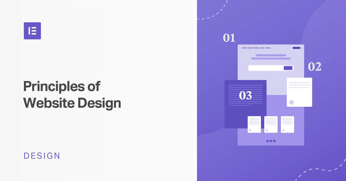
Following the principles of website design can make or break your site’s success. It’s the difference between users leaving almost as soon as they hit your homepage, or exploring your services and products and eventually converting.
Design is by no means an exact science. However, there are many useful principles and rules-of-thumb that can help make your projects better in terms of both usability and aesthetics when looking to build a professional website.
In this article, we’ll explain what design principles are and why you should know them. We’ll also discuss some of the most popular and effective guidelines to follow. Let’s get started!
Table of Contents
What Are Website Design Principles?
Design principles are based on contributions from professionals in industries as diverse as psychology and behavioral science, physics, ergonomics, and more. In general, these principles are flexible laws that guide designers towards producing effective final products. They affect which elements are chosen or discarded and how those features are organized.
Design principles make it easy to create an aesthetically pleasing and efficient User Experience (UX) and User Interface (UI). Implementing them correctly drives conversions. For example, Pipedrive increased signups by 300 percent after implementing a key best practice — simplicity.
Incorporating design principles into your projects will improve usability for your websites, influence how they’re perceived, and ultimately enable you to make the best decisions for both your users and your web design business.
20 Key Principles of Effective Website Design
There are many definitions of design principles available online, and different designers and other professionals will interpret them according to their needs. However, there are some best practices that apply regardless of context.
The following are some of the most popular website design principles as suggested by scientists and usability experts.
The 10 User Experience (UX) Laws
The UX laws are a collection of design principles by Jon Yablonski — senior product designer at General Motors — from his book “Laws of UX: Using Psychology to Design Better Products & Services”. These are solid guidelines that every designer should consider. Here are some of the most important principles Yablonski lists:
1. Make the Main Actionable Targets Easy to Reach (Fitts’ Law)
Fitts’ law originates from the psychologist Paul Fitts’ work while examining the human motor system. This law states that the distance and size of a target element directly impact the amount of time it takes for a user to navigate to and interact with it. This means you’ll want to make your main actionable targets easy to reach.
Additionally, if you have multiple targets, there should be enough space between them. For example, when designing for mobile, clickable icons need to be large enough to tap:

The extra spacing between buttons will ensure that users don’t click on the wrong icon accidentally. As a rule, the minimum clickable area for mobile designs should be 40 x 40 pixels.
2. Keep Users’ Choices to a Minimum (Hick’s Law)
If you’ve ever been so overwhelmed by the number of choices before you that you had trouble deciding between them, you’ll understand how too many options can be paralyzing for users. This is Hick’s law in a nutshell. The more choices available, and the more complex each of them is, the more time it’ll take for users to arrive at a decision.
Hick’s law, also the Hick-Hyman law, is named after William Edmund Hick and Ray Hyman, two psychologists who examined the correlation between the number of stimuli presented to an individual and their reaction time.
This principle effectively means you want to remove clutter and show your users only the most essential options they need. For example, most websites will give a clear choice between “Save” or “Cancel” and “Yes” or “No” when confirming some action:

Likewise, this law can also be applied to streamlining your navigation menu, displaying products or services, and other website design elements.
3. Place Related Elements in Common Areas (Law of Common Region)
The law of common region, one of several laws from the school of Gestalt psychology, simply states that if elements on a page are grouped together closely, they are perceived as connected to one another.
You can accomplish this with borders, backgrounds, or spacing. For example, navigation links are generally placed together to form a menu:

This principle is all about composition and spacing, and you’ll want to use it wisely. As another example, on the homepage of a blog where previews are displayed chronologically, the title, description, and image of each post should be visually grouped together.
4. Use Familiar Scenarios and Logic (Jakob’s Law)
Jakob’s law, coined by Jakob Nielsen, a co-founder of the Nielsen Norman Group, advocates the use of familiar scenarios and logic in UI development. Your users will generally expect — and prefer — that your site works the same way as others they’re already familiar with.
We each build up mental models around conventions surrounding websites. This enables your users to focus on what they want to achieve rather than learning their way around an unfamiliar UI.
This means you’ll want to stick with what they already know and not overwhelm them with unfamiliar scenarios. A “burger” icon, for example, will usually open some kind of menu:

If you use this icon in your design, it should behave the way your users will expect it to.
5. Use Simple Structures and Avoid Complex Shapes (Law of Prägnanz)
In 1910, Max Wertheimer, a psychologist, observed a series of lights flashing on and off at a railroad crossing. Although it appeared as though a single light moved around the marquee between bulbs, it was really a series of bulbs switching on and off.
This observation formed the basis for a set of principles regarding how we visually perceive objects. One of them is the law of Prägnanz, which recommends using simple structures and avoiding complex shapes.
Your users will interpret your design using the least cognitive effort possible. Complex images will be perceived in their simplest forms. Reducing cognitive overload should be an important part of your design goals.
You can apply this principle by grouping and aligning elements into relevant blocks, columns, and sections, instead of throwing them all over the page:

Simple structures and elements will make for easier interpretation.
6. Place Grouped Elements Close to Each Other (Law of Proximity)
The law of proximity, another principle attributed to Gestalt psychology, states that elements that are near each other will be perceived as a group. This also reduces cognitive overload for your users as they will more easily make sense of information.
Applying this principle is all about making wise use of spacing. The elements that make up a group should be closer together than those of different groups.
In many website headers, menu links are grouped together while Calls-to-Action (CTAs) are aligned to a side or somehow divided from the navigational elements:

This is a perfect illustration of the law of proximity. Since menu links and CTAs serve different functions, they’re visually separated.
7. Use Similarity to Unite Elements into Groups (Law of Similarity)
Another Gestalt law, the law of similarity, states that similar objects will be perceived as related regardless of how much separation exists between them. This is the basis behind styling feature sets with similar color schemes, icons, and text:

You’ll want to use this principle wisely to unite connected content into groups through similar and consistent styling.
8. Connect Design Elements to Show their Relation to Each Other (Law of Uniform Connectedness)
The law of uniform connectedness, also from Gestalt psychology, states that elements which are connected visually will be seen as being more related than elements not at all connected. One application of this law is using a progress stepper in your onboarding or checkout flows:

This creates a visual connection that shows all the steps are parts of the same process.
9. Divide Content into Small Chunks (Miller’s Law)
Miller’s law is named after cognitive psychologist George Miller, who asserted that an average person could keep just five to nine pieces of information in their working memory. This principle suggests separating content into chunks. For example, credit card numbers are usually broken into groups of four to help people parse them.
This law underscores the importance of proper design planning. As an application gets larger and acquires more features, it becomes harder to use. You should plan your interface with this in mind so that it can accommodate new features while remaining easy to operate.
Another way to apply this rule is by limiting the amount of content your user has to perceive at any given time. Divide content into chunks instead of showing it all in one block:

Additionally, design with the most popular screen sizes in mind and control how many elements users see at a glance.
Be critical about your design. If you think there’s too much content in a section, move it to another one and separate items logically.
10. Accent the First and Last Items in a Series (Serial Position Effect)
This law was coined by German psychologist Herman Ebbinghaus, who pioneered experimental methods for measuring memory. It states that users will remember the first and last items in a series best. You can use this tendency to highlight the most important areas of your webpages.

For example, key content such as CTAs, forms, or purchasing options are most effective at the top or bottom of the page.
The 10 Usability "Commandments" by Jakob Nielsen
Jakob Nielsen — the co-founder of the Nielsen Norman Group we briefly mentioned earlier — invented several usability methods, including the ten heuristic evaluation principles we are about to discuss. The Nielsen Norman Group is a renowned UX research and consulting firm that has significantly impacted the field of web and software design.
Nielsen originally developed these usability principles in 1990 but revised them for maximum clarity based on the analysis of 249 usability problems. Please take note that they aren’t laws or specific guidelines, but more general rules-of-thumb. It is for this reason they’re termed “heuristics.”
1. Keep Your Users Informed With Appropriate Feedback
Users need to trust your brand and feel grounded in using your application. This means your site needs to continually communicate what’s happening and let them know if their interactions are successful.
For example, an e-commerce store will let users know that they have added an item to their cart or saved it for later consideration. Feedback may use color changes, progress indicators, notifications, and alerts to visually inform the user.
2. Information Should Be Displayed in a Logical Order and Use Familiar Phrases and Concepts
Users shouldn’t need to reference a dictionary to understand the terms on your website. You’ll want to stick to convention. Stick with words they’re already familiar with in your interface text.
For example, the terms “undo” and “redo” have fairly universal meanings in application UIs. Changing them to unfamiliar terms such as “reverse” and “reprise” will be disorientating for users.
3. Enable Control and Freedom in the Way Users Interact With Your Website
Users often make mistakes and will need a way to undo or redo actions, such as by using buttons as we mentioned earlier. Similarly, you may consider providing an Edit option where relevant. For example, this feature is often useful for making changes to comments and messages in social media apps.
With such features available, users will feel more in control and be less tense when accidents happen.
4. Follow Conventions and Standards
Adhering to standards might seem similar to the second principle, and it may be considered an extension of it. Implement navigational structures users are familiar with. They should find it easy to understand your interface and access whatever elements they need to interact with your page.
A report on the usability of shopping cart terminology illustrates this. The design used the term “Shopping Sled” in a bid to stand out. However, 50 percent of users did not understand what it meant. The other half deduced its meaning only because it was in the same location a cart normally is on a website.
5. Prevent Errors When You Can and Warn Users Before They Take Irreversible Actions
It’s smart to display meaningful error messages so that it’s clear how to recover from problems and what caused them. However, it’s even more effective to remove error-prone situations or explicitly inform users of any known consequences of the actions they’re about to take.
For example, deleting a user account is often irreversible. Most applications will highlight this setting in red so it stands out. An “Are you sure you want to do this?” message is usually shown if users click on the Delete button, too.
6. Keep Important Information Visible
Users should not have to remember information from one step of a process — such as a checkout or technical setup — to another. You want your users to recognize, rather than recall, information.
An ecommerce store can apply this heuristic by making available a list of recently viewed items, so users don’t have to remember the names of products they’ve yet to complete purchases for.
7. Build Systems That Are Comfortable for Both Novices and Experts
You’ll want to make your website easy for new visitors, but also comfortable for those more familiar with the system who might need accelerators for frequent actions. Keyboard shortcuts, which you may provide or give users the ability to create and edit, are one example of this.
8. Make Your Designs Both Aesthetically Pleasant and Simple
You’ll want to keep your interface uncluttered instead of overwhelming your users with too many options. Unnecessary items compete for space and reduce the visibility of more important features.
9. Provide Error Messages That Are Easy to Understand
Clear, understandable error messages make it easy to pinpoint the sources of issues and quickly find possible solutions. You’ll want to make yours direct, polite (not blaming the user), and constructive, giving advice on how to recover from the problem.
10. Provide Searchable Help Documents
It may sometimes be necessary for users to reference extra help information. Your documentation should be easy to search so that they can quickly find relevant content to their situations and resolve their problems.
How to Apply Website Design Principles in Your Projects
Learning about so many principles and guidelines may feel overwhelming. Here are some tips for applying them:
1. Stay Familiar With Best Practices
You’ll want to keep learning and educating yourself on UX design best practices. Learn from existing solutions related to the web. Start your projects with a research or inspiration phase where you learn more about your users’ needs and collect quality references to learn from.
2. Choose Which Principles You Use Wisely
As every project is an individual case and will benefit from different design principles. You’ll need to prioritize which ones can help you the most for each website you create. Keep in mind the main functionality of the site, its primary user flows, and its corresponding business goals.
3. Regularly Test and Improve Your Designs
You’ll need to test your website as much as possible with real target users. If you are unable to do so, you can solicit help from and test with co-workers, clients, and even your co-designers to gather relevant input about your website’s usability.
At this stage, you’re not looking for perfection. Nothing is perfect from the start, so don’t be afraid to polish and improve your design according to feedback from usage data.
4. Practice
As you practice them, you’ll begin to apply design principles almost subconsciously. The more you design with usability principles in mind, the easier it will become for you to quickly generate effective solutions and avoid issues.
5. Form Your Unique Style — But Only After You Understand the Basics
Rules are designed to make processes easier but aren’t meant to be followed blindly. However, you’ll often only be able to break rules successfully when you fully understand their purpose.
These design principles form a core toolkit and foundational knowledge for you to experiment with and develop your own unique style. Once you’ve mastered them, you can produce extraordinarily successful design solutions by breaking them purposefully.
6. Use the Elementor Editor
Our Elementor Editor is founded on design principles and logic. By using our design feature and broad collection of widgets, you can organize your website’s content structure better and ensure you’re building a user-friendly digital product.
For example, Elementor’s sections and columns help you group content logically. Widgets provide an easy way to chunk content, employing the principles of similarity and visual connections to ease your users’ perception.
Overall, Elementor removes the hassle of organizing content from scratch. With our widgets and Templates Library, you have numerous solutions for implementing design principles in the best possible way.
Wrapping Up
To create professional, user-friendly websites, you need to be familiar with staple design principles and implement them wisely in your work. This will help you improve your designs by making them more appealing, easier to use, and best of all, more profitable.
We covered a lot of ground in this post, including ten UX laws compiled by Jon Yablonski, and ten usability principles developed by Jakob Nielsen. Additionally, we shared several ways you can implement these best practices in your work, including using our Elementor Editor.
Do you have any questions about applying design principles in your work? Let us know in the comments section below!
Looking for fresh content?
By entering your email, you agree to receive Elementor emails, including marketing emails,
and agree to our Terms & Conditions and Privacy Policy.


