Table of Contents
Table of Contents
What Is The Website Grid?
The website grid is a system for organizing the content on the page and creating alignment and order.
It forms the basic structure or skeleton of your user interface. Designers use website grids to make design decisions and create a good user experience.
Learning what web design grids are, including all different types of grids, and finally, how and when to use them – will sharpen our skill sets as website designers, impacting every website design we create from here onwards.
When you break down the standard website design process into stages, which will, in most cases, include low-fidelity wireframing and prototyping, you can actually realize that every web page is built of squares and rectangles.
Ultimately, regardless of any element’s individual shape, they are located within an encompassing grid layout, and in that, there are actually numerous types of grid layouts, which we will soon delve into and get to know better.
Understanding the Role of Grids in Web Design

In web design, grids are used to guide the designers with how and where to place elements on the page. These guidelines incorporate margins, spaces, and columns, collectively – providing an encompassing, consistent framework for the page’s content.
Whether or not grid lines are visible on the actual website itself, their underlying structure and framework help designers manage not only the entire layout of the page or screen, but also the ratios and proportions between each element.
Why Are Grids Important in Web Design?
In terms of how it’s used in the web design process, the grid system helps align page elements based on sequential columns and rows. Once we have this structured framework in place, we can place text, images, and really any design element in a consistent, orderly way within the interface.
When designing for web and mobile, the purpose of the pages or interfaces we design is to create various user flows. As user flows often contain multiple screens or windows that repeat similar design schemes and layouts, grids ease the process of developing wireframes, templates, or standardized layouts for similar pages.
Grids help split pages horizontally and vertically, using rows and columns. Grid systems serve as a systematic approach that allows designers to lay out elements in an organized manner, and provide a modular approach to designing components for multiple pages or layouts. Grids also define a consistent set of fixed units of measurement that dictate the sizing, spacing, and alignment that each design element must abide by.
The concept of grid layouts originates in print design when they were used in the context of typography with the goal of arranging handwriting on paper, especially books and newspapers. That being said, there are many areas of modern-day design that depend and thrive on a grid-based layout. This includes web design, interaction design, and especially responsive design.
Before we discover how and why the grid-based layout is such a valuable asset to our design process as web creators, let’s delve even deeper into the tangible components that make up a grid system.
Best Practices of Using Grids in Web Design

There are many terms and concepts to get familiar with and understand in the field of web design, but especially when it comes to the role of grids in web design. Between each of the many components that make up a grid structure, the large variety of grid-types, and the thought processes that go into choosing what grid type suits your content and design…there’s a lot to take in.
Let’s break down this topic piece by piece.
1. Know Your Grid Anatomy

All grids in website design, no matter how big or small, or how simple or complex, have common components that define them as a grid layout:
1. Columns
Columns are vertical sections that span the height of the content area and are considered to be the “building blocks” of grids. What’s unique about columns is that the more columns there are in a grid, the more flexible the grid. We’ll discuss this in greater depth soon. The widths of the columns are always up to the designer, but in terms of standard practices, the traditional number of columns to use is 12 on desktop, 8 on tablet, and 4 on mobile. Most grids have 60-80px column widths. Column width is a key influencer of the width your actual content will be.
2. Rows

As you may have guessed, rows are the horizontal sections of a grid. Funnily enough, web design often ignores the role of rows in a grid. However, this isn’t what we’d call a best practice. More about rows later, too.
3. Modules

Modules are the units of space created from the intersection of rows and columns. Modules, or content modules, as they are often referred to, are considered to be the building blocks of a page, as each design element fits (text, images, buttons, etc.) into the modules created by the rectangular patterns in a grid.
4. Gutters
Gutters are the lines between the columns and rows that separate each of these units. A fairly common gutter size is 20px. The role of gutters is to form negative space (no matter how big or small) between the columns and rows. In the plainest terms, gutters are the space between columns and the space between rows. Gutters are especially significant for masonry layout, where gutter width is one of most significant details of the layout.
5. Margins
Margins are the negative space between the format and the outer edge of the content, which you can also think of as “outside gutters”. Side margins are usually sized at 20-30px on mobile, and vary a lot between desktop and mobile.
You may recognize the word margin from HTML & CSS jargon, where margins are used as a property to create space around a design element or container. Keep in mind that the size of a margin doesn’t impact the size of the content next to it. It simply defines the amount of space around the element, which in the context of layout grids, refers specifically to the space between the format and the outer edge of the content.
2. Choose the Right Grid Layout
Although by definition, the term grid implies a strictly square-based structure, there are also many sub-types of grids, each with their unique use cases in web design. Without even knowing it, your design choices up until now, such as the placement or width of your website content, could have easily been following a grid-layout mindset without you even realizing it. As we review the different types of grids, we will explore grid design examples that represent the grid-types we’re discussing.
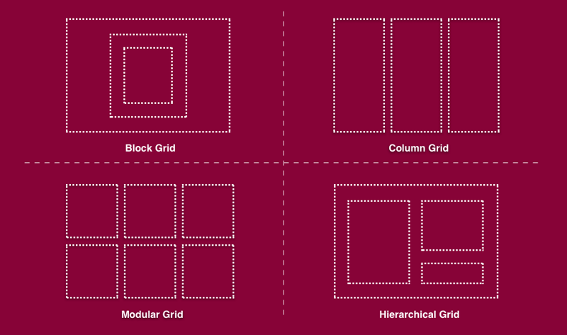
Block Grid: A Classic Option for Single Posts and Articles
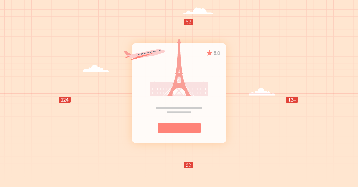
Block grids can also be referred to as single-column grids or manuscript grids, and are considered to be the simplest grid structure. Block grids consist of a single column and can either include one single element or multiple elements arranged vertically, surrounded by margins. Using the terminology we defined earlier (“Anatomy of a Grid”), block grids are essentially a large rectangular area taking up most of the space inside a format.
Block grids are often used for extensive or continuous blocks of text, and can often be found in blog pages or posts. Another instance where you may encounter block grids is large, full-width images, such as cover images or hero images.
One of the most common use-cases we’ve seen for block grid layout is single post pages, primarily for article or single blog posts, as shown in the image above. The Elementor single post template shown above finds a way to make a single-column page look just as varied and interesting as any other, applying multiple widths, fonts, along with classic visual elements such as hero images and shape dividers – all despite it being in “only” one column.
The way we see it, a key reason why block grids are such a perfect match for article pages and general single posts is because they embrace the linearity involved in reading a story. When your aim is for website visitors to relish in your website content or About Us page, the more you facilitate a vertical, focused reading experience, the more likely they are to embrace your content.
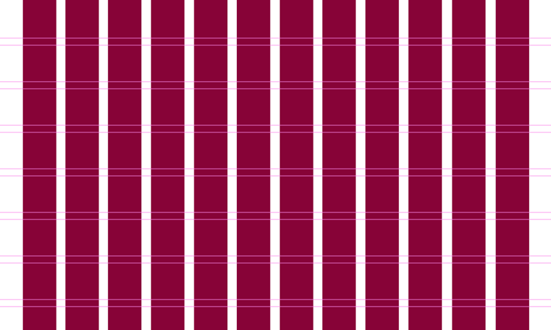
Column Grid: Divided Yet Equal

Column grids are composed of several columns, mostly used to organize multiple elements into columns. Column grids can have as little as two columns, with no real limit to how many there can be. That being said, the standard grid layouts in web design consist of six, nine, or 12 columns. But it’s really up to the designer to decide how many columns they find necessary.
Once placed inside a column grid, text and images follow the alignment of the columns’ vertical lines and flowlines. Design elements can be placed inside one column, or across two or more to create a variation of visual layouts. Spacing between columns (gutters) should be proportional and consistent throughout the entire page. A symmetric column grid has all columns the same width, while an asymmetric grid will have some columns proportionally thinner or wider than others.
The example above is an Elementor template for a pricing page. While pricing pages can be designed in an endless number of ways, it’s very common (especially for digital products) to see a three or four column table somewhere in the middle of the page that represents the product or service’s different subscription options.
Logically, these column-based tables are a direct result of consistent, grid-based infrastructure that caters to 3-4 clear, concise columns with a minimal amount of text. A column-based grid really is the most befitting choice here, as when it comes to writing a pricing page, you want to give each subscription or plan you’re representing as much clarity as possible. There should be no distractions, no interferences, nothing that takes the reader’s eye away from the essential information.
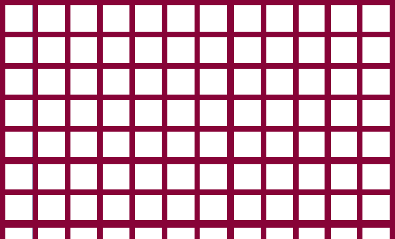
Modular Grid: Perfect Symmetry
Modular grids are composed of columns as well as rows. They’re often compared to or described as looking like a checkerboard, and can be very effective for presenting many things at once for easy access.
Typically, modular grids are used in web design when there are multiple elements to organize, and a column grid, which only focuses on vertical alignment/organization, won’t suffice. Modular grids get their name from having equally-sized modules (which we discussed earlier). Common use-cases for modular grids are mobile phone home screens that show the full collection of apps, or e-commerce websites that display collections of inventory in their category pages.
As shown above, modular grids are widely used for image galleries and card layouts, such as an image grid showcasing a wide variety of flooring options that a flooring company can offer. What’s unique about this particular image gallery is that it is built with the Elementor Pro Gallery widget, which works exclusively with grid-based design.
The gallery-type can either be a justified grid (completely modular), or a masonry grid, or a hierarchical grid, which we will soon discuss. In addition to the different grid layout options, the Pro Gallery feature has the option for a multiple gallery, which enables different gallery views. Website visitors can either view the entire image gallery at once, or filter it based on categories. Either way, the grid-based layout is set in stone.
Another option for a modular grid can be built with an Archive page that showcases thumbnails of blog posts (or articles). This is made possible with the Posts widget, which displays a card layout of thumbnail images, titles, excerpts, and dates.
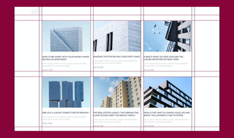
Keep in mind that even though the image squares themselves have several lines of text beneath them, this is still a modular grid because each card in its entirety (thumbnail image, title, description, and date) all fit into a uniformly sized rectangle.
Hierarchical Grid: Organized Yet Freestyle
Hierarchical grids, which can also be described as ”freestyle”, are grids whose elements are placed “spontaneously” among the grid’s columns and rows. This means that the column widths and row heights vary throughout the grid.
The example above of a fashion photographer’s portfolio site finds a perfect grid match for how to showcase his work: a freestyle grid which welcomes images of all heights. This way, there’s no need to compromise and crop images so that they’ll follow a uniform height. It also keeps things interesting as you scroll through the gallery, as the variety of shapes has an especially dynamic vibe and user flow. Not to mention that if there are certain images that the photographer wants to be more dominant than others in the gallery, he can choose to make those a bigger size than the others, encouraging users to pay more attention to the ones he likes best.
In this Elementor Template for an About Me page, the entire page uses a freestyle grid, which is an especially befitting name for the page layout since the multiple square and rectangle sizes are placed freely as you go down the page. What’s unique is that the top of the page (hero content) is completely freestyle, yet the following sections of the page split into an evenly divided three-column layout, and finally with an even two-column layout. Hierarchical grids are definitely the perfect way to keep things interesting.
3. Honor Responsive Design
When a page or site is designed responsively, it means that the page layout and content are adaptable to different devices and browser widths. In terms of grid layout, this means that as the screen size changes, so too the number of columns, and of course their width.
But there is also an inherent difference between regular design grids and responsive grids:
Design grids are fixed to a baseline grid, whereas responsive grids are fluid, which means that grid columns can scale and reorient according to the user’s viewport. With a fixed grid, shrinking screen sizes will bring you to the next breakpoint, and side margins will automatically shrink until the next breakpoint.
A responsive grid, or fluid grid as they’re also called, is what you see when you see elements changing dynamically as the browser/screen shrinks. Responsive grids will systematically align and arrange your content in a way that represents their information hierarchy in a logical way. This means that as the viewport shrinks, tiles and grid content scale accordingly.
4. Make Room for White Space

As web creators, we know how important a role white space plays in design details like readability, information hierarchy, scalability, and general breathing room around and between design elements.
Given its critical importance in layout design, it makes sense that white space is an innate part of website and layout grids. Essentially, grid layouts are defined not only by the size of their columns and rows but also by the width and height of white space in between, otherwise known as spacing.
For example, one grid-based design approach often used by web designers is called the 8pt Grid System, a concept introduced by Google’s Material Design guidelines.
The Material Design system uses a grid that’s composed of 8 x 8 pt squares. In practice, each element on the page will be in multiples of/divisible by eight.
The interesting part is that this doesn’t only apply to the elements on the grid such as images, buttons, or texts – it also applies to the units of white space, which need to be in multiple of eight.
So, when you think of how to space out your columns or rows, you also need to measure and define the amount of white space, in this instance, in terms of multiples of eight. This shows just how fundamental white space is in grid design, to the extent that its measurements and specifications are just as important to a grid as columns and rows are.
In the example above, the homepage of Elementor Experts represents just how effective white space can be, especially on a website homepage. Because the overarching goal of the homepage is to encourage users to take action and learn about the Experts platform, white space facilitates this process by taking a content-first approach.
This means that because the value proposition of the platform is given so much emphasis and “time to shine” on the homepage, it’s crystal clear to website visitors what the added value is that they’re about to encounter.
5. Respect the Golden Ratio
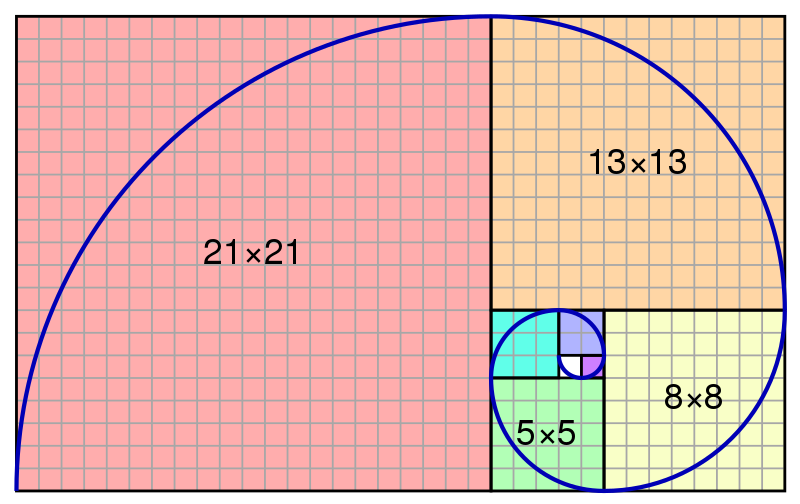
Many designers use a concept called the Golden Ratio when seeking to improve the sizing, balance, and layout of their grid design. In its essence, the Golden Ratio is a proportion that equals 1.6180. Based on the Golden Ratio is what’s known as the golden rectangle, a rectangle whose length is 1.6180 times the width.
This means that if width is 100px, length would be 161.80px. This is applicable to the width and length of images, objects or shapes placed next to each other, or for the formation of one shape or element itself. When using the Golden Ratio, designers can evaluate how to divide the horizontal space available to them on the page and how much space to allocate for and around each element, etc.
One scenario this can come up with is when designing the hero section of a website. If you’re choosing a full-width layout and dividing it into two vertical sections: hero image and hero text.
In this micro design workflow, you’ll also need to decide on the image size, the font size, and so on. But in order to do so, you have to decide what ratio to divide the columns into, which will then lead you to decide how large your image and font will each be, and which you want to emphasize more or less, or if you want to place equal emphasis on each one.
This is where the question of how you should decide how to divide the hero section in terms of which segment should be larger or more pronounced. This is where the Golden Ratio calculation comes into action.
In terms of the layout grid as a whole, the Golden Rectangle and the Golden Ratio each help guide web designers with choosing:
- How to divide the space on the page (both horizontally and vertically)
- How many columns to use
- How wide columns should be
- How much space to add between columns
- The proportions of modules and various layout grid elements
This guidance considers many factors, like the page width, the content size, as well as the number and sizing of the modules the content will require on a grid. In terms of accessibility, the Golden Ratio leads the users’ eye to specific points or areas on a screen, which is what designers want to be impacted once they define and apply the information hierarchy of their content and design scheme.
6. Obey the Rule of Thirds
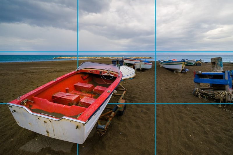
The Rule of Thirds is another web design technique that helps designers create visually balanced grid layouts and image placement. This technique places a grid overlay that divides the design space into thirds, both horizontally and vertically. This any image or page section/space to nine equal parts, formed by the line intersections. The Rule of Thirds states that placing “items of interest” on the “thirds” of an image will draw user attention to them in a more impactful, visually-appealing way.
In web design, designers most often use the Rule of Thirds in order to determine some of the most important grid and layout-related design decisions, such as:
- What type of grid to use
- What dimensions each grid element should have
- Where to place the most important elements
- What your image ratios should be
- How much negative space to add around and between elements
Time to Start Building
Now that you’re fully clued in on why grids are so important in web design and how you can build them for your website, it’s time to start measuring and aligning. Keep in mind that this applies to every design element: lining up widgets and components both horizontally and vertically, aligning text elements to a baseline, and centering every type of element well throughout the page. Your design workflow and your design results will only thank you, and we’re excited to see what you have in store.
Looking for fresh content?
By entering your email, you agree to receive Elementor emails, including marketing emails,
and agree to our Terms & Conditions and Privacy Policy.


