Table of Contents
Elementor v 2.5 introduced Flexible Layout, which offered new ways to position elements inside and outside the grid and layout of websites. This set of advanced website position capabilities makes it easier and faster to create custom layouts.
The new layout options include advanced flexbox column alignment settings, Inline and Custom Widget Width, as well as Absolute and Fixed positioning.
In this article, you’ll learn how to harness the power of Elementor’s new custom positioning to build amazing WordPress websites. It covers every aspect designers dream of, including Inline; Absolute & Fixed; Horizontal & Vertical positioning. We’ll also delve into best practices for the Column Alignment and Text Editor Columns features. Custom positioning offers increased flexibility and control when building your layout.
What is Flexible Layout?
- Widget Width
- Full width
- Inline Positioning
- Custom
- Column Alignment
- Vertical Alignment
- Horizontal Alignment
- Website Positioning
- Default
- Absolute Positioning
- Fixed Positioning
Ready to design faster and better than ever before? Grab a coffee and settle in for an extensive overview of all the exciting new features. Let’s dive in!
Widget Width
How you choose to define your widget width is related to your overall design concept and needs. Elementor offers three options: Full-Width, Inline, and Custom. Full-width is the default, so we will start off with Inline.
Inline Positioning
Inline positioning saves you loads of time and simplifies your workflow. Since it only takes up the minimum amount of size of a widget itself, Inline allows you to place several widgets inside the column, and design better layouts.
These are a few cool ways to apply this feature:
- align elements side-by-side in the same column
- control an element position
- and use custom width to align your inline elements
Want to place two buttons side by side in the same column? Now you can!

In the above pre-designed section, there are two buttons in the same column, let’s align them side-by-side. Click the button, and under Advanced > Custom Positioning, click the ‘width’ dropdown and choose ‘Inline’. Then do the same to the second button.
Here’s another useful way to use it:
Below you see 4 columns hosting 2 inline widgets – a heading widget and a text editor widget. With ‘vertical align’ you can control the position of our widgets to the center, start, and end.
‘End’ is perfect for this design, so just right click and copy-paste-style for the rest of the widgets.

Next, add a services features here, and just below the text, drag in an image box widget,
change the image, remove the title, and paste in your text.
Then, in the Style tab, change the image width to 40%, and under content – align it to the left.
In Advanced, custom positioning – change the width to custom and set it to 30% of the column width.

All that’s left to do is to right-click and duplicate twice and alter your images and text.
Watch the full tutorial video on Inline Positioning here (video link).
Column Alignment
Here we’ll go over all the new options for Vertical and Horizontal Alignment.
For vertical alignment, you’ll learn how to use Space Between, Space Around, and Space Evenly options. For horizontal alignment, we’ll check out Start, Center, End, as well as the Space Between, Space Around, and Space Evenly options.
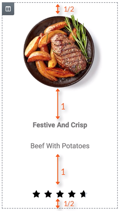
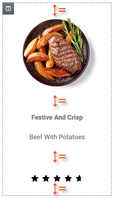
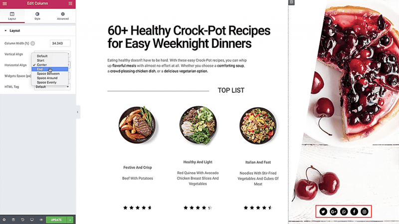
In this pre-made design below, each column contains an image, text editor, and star rating widget – but you can see that the content in the columns is not aligned correctly. The older settings in Layout > Vertical Align ‘top’, ‘middle’ and ‘bottom’ cannot fix this.

This is why we added three new Vertical options for easier and more precise customization:
Space Between, Space Around & Space Evenly.
Here’s how each of the three new Vertical Alignment functions works:
1. Space Between – places the icons at the start and end near the edge of the column, with equal space between them.
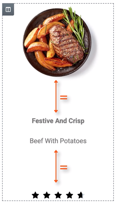
2. Space Around – here the Widgets are spaced equally, and the edges are half the size of the space between widgets.
3. Space Evenly – sets the Widgets to have equal space between, before, and after them.
Let’s move on to the updates in the Horizontal Alignment.
This feature extends the ability of the inline positioning and lets you horizontally align the inline widgets that are placed in the same row.
As you can see we have added 5 Icon Widgets to this column on the right. They are set to inline, making them appear next to each other all in the same column. We’ll set the columns vertical alignment to Bottom, so they are positioned next to the Top List ideas.

1. Start – aligns all of the icons to the left.

2. Center – to the middle of the column.
3. End positions it to the right.

Now you know how to use the vertical and horizontal alignment options inside columns in Elementor 2.5.
Watch the full video tutorial on column alignment here (video link).
Next up: Widget Width.
Website Positioning – Do’s & Don’ts
Designers just gotta love this one. Absolute Positioning provides the independence to design freehand in WordPress. Finally!
So, if you are looking for greater control and precision over the placement of your elements on the canvas, try out the absolute and fixed settings. Absolute positioning enables you to place elements without the restrictions of the column it is in, or the surrounding widgets.
Website Absolute Position
At first Absolute positioning can be kind of tricky, so here is an overview of the basics you will need to start using it.
To try it out, go to any widget, choose ‘Position: Absolute’, and drag the widget to any location on the page, regardless of the grid. Point anywhere on the screen, and simply drag the widget there.
An absolute object is relative to the column. Below the pink square box is our absolute object.
Go to Advanced, custom position, and choose position absolute. Change the position by clicking the horizontal and vertical orientation, the box is inside the column, and also by moving it around on the screen. (The square will be relative to the column.) You will notice the text jumps up and the cube appears above it. Why? It’s because the moment the cube is set to absolute, it’s removed from the flow of elements on the page.
Keep in mind that the default width of an absolute element is automatically inherited from the column it’s in.So be sure that you are in the right spot relative to the area that you want to position it, that it refers to the correct edges, especially for responsive.
Let’s put the square outside of the column. It seems like it is in the right bottom corner of the screen, but if you close the panel and scroll, you’ll see that the square moves with the column and keeps the exact position that was previously set. You can move it anywhere and it will stay at the same point relative to the column.
The thing is, Absolute position usually clashes with responsive design. Fortunately, Elementor enables you to set a separate custom position for mobile, tablet and desktop devices using percentage, VH, VW or pixel units.
With Absolute position, you run the risk of getting a horizontal scroll when the element exceeds the limits of the page. Luckily, we added an Overflow Hidden control, which condenses all of the section widgets inside and removes any unwanted scrolls.
Website Fixed Position
So, does this all also apply to Fixed position? Change the pink cube’s position from absolute to fixed and let’s check it out.
What happened? Did it disappear? Don’t panic. You can easily get it back by setting the offset to zero. It disappeared because the Horizontal and Vertical Orientation and offset settings are still the same as they were for absolute positioning. BUT, a fixed position element is positioned relative to the viewport, the browser window itself, and not relative to the column it is in. So in this case, the pink cube is just hiding 200 pixels below the viewport, due to the negative horizontal offset value. I’ll go ahead and bring it back into view with the slider. Remember, you can easily get the cube back by setting the offsets to zero.
When the cube’s orientations are set to the bottom and right and its offsets are both zero, the cube is positioned exactly on the bottom right corner of the viewport, this is its starting position.
Just as with the absolute position, the orientation settings determine this.
Let’s say we want the cube to be positioned near the bottom on the left, then set the Horizontal Orientation to the Left and the Vertical Orientation to Bottom.
As you can see, there are still some previously set offsets. We can drag it to the left bottom corner, but I want it to be positioned exactly on the edge. All I need to do is enter zero for both the horizontal and vertical offsets.
With the Fixed position, any content or column width changes as already demonstrated doesn’t affect the cube’s position because it is positioned relative to the viewport and not relative to the column it is in. This means that the default width of a fixed element is automatically inherited from the viewport.
TIP: Be aware that using the correct Vertical and Horizontal Orientation settings for absolute and fixed objects is vital for maintaining better responsive behavior. Designing your page with this in mind will save you a lot of time when making adjustments for mobile and tablet.
Watch the full video tutorial on Absolute & Fixed positioning here (video link).
Conclusion
The new Elementor Core 2.5 version gives web designers freehand design capabilities that were never before possible on WordPress. These options are extremely useful for both designers and marketers and expand your freedom to create beautiful layouts however you imagine them. Take advantage of the new flexible layout today. Flexible Layout is an amazing toolset that will completely revolutionize your design process.
Looking for fresh content?
By entering your email, you agree to receive Elementor emails, including marketing emails,
and agree to our Terms & Conditions and Privacy Policy.


