Table of Contents
The role website layouts play in impacting the quality of the design is clear to every professional designer. A website’s pattern and structure are the very first things we think about in the earliest stages of our design process. After identifying the goals of our site and the elements it should include, page layout design effectively begins the first stage of putting ideas on paper.
It is only once you decide upon the anatomy of your website and how to map out your content accordingly, that you can then build lo-fi wireframes and explore what works best for what you’re looking to achieve.
Is it a heavily-visual homepage that will work best for your content strategy, in the form of a full-screen media layout? Or does it make more sense to distribute the information hierarchy in a more even format, using a split-screen layout to display several sections of content with mutual significance?
This is exactly what we’re about to explore, by looking at our nine hand-picked examples of the website layout designs most frequently used by professional designers.
Evaluating these examples will help us understand the role each layout-type serves in building website content that actualizes our design goals. Ultimately, knowing when and how to leverage the right layout for our sites — will equip and empower us to build more robust design strategies and craft websites that are even more beautiful.
Table of Contents
- What Is a Website Layout?
- What Every Website Layout Must Include
- The 9 Most Effective Website Layouts
- 1. Single Column Layout: The World Famous iPad
- 2. Two Column Layout: Earmark
- 3. Three Boxes Layout: KatchMe
- 4. Split-screen Layout: Bose
- 5. Asymmetrical Layout: Underbelly
- 6. Fixed Sidebar: Arbor Restaurant
- 7. Full-screen Media Layout: Dutch National Opera & Ballet
- 8. Grid Layout: Malika Favre
- 9. Boxes Layout: TSX Broadway
- Ready, Set, Build
What Is a Website Layout?
A website layout is a framework that defines the structure of a website. The layout places the key elements of the website front and center, and it provides users with a clear path for navigation. The website layout is a critical element that determines whether the site will succeed or fail.
The goals of a website layout are to improve user engagement, make web pages visually appealing, and organize the site’s content so that it fits together in a clear sequence
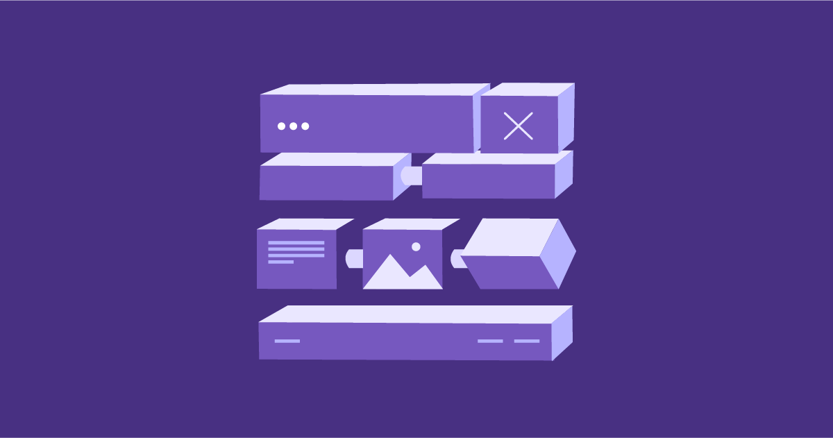
What Every Website Layout Must Include
While we certainly see the beauty in how many layouts there are to choose from in professional web design, there are also essential components that each layout type must include, even if included in a non-conventional way. As we know from Jakob’s law, one of the most fundamental principles in web design, is that interface layouts and navigation flows should bear engaging uniqueness, yet balanced with familiarity that’s logical and intuitive to users.
Essentially, what we must never forget when planning our page layout is to include:
- The website header, which should always capture the most simplistic navigation elements that convey the basic structure of your website and how to find what you’re looking for
- The page body, meaning the core section of your web page, such as your visual content, main messaging, and so on.
- The navigation menu, whether it’s in the form of a sidebar, hamburger menu, sub-header, mega menu, scroll-triggered, a sticky or fixed menu, and perhaps others.
- The website footer, no matter how short or tall, footers generally contain social channel links, copyright notices and privacy policy links, and other optional items, such as a duplicate of your header’s menu content, call to actions, such as “subscribe”, “contact us”, or even a submission form.
And now, for the web design inspiration we’ve been waiting for, some of our favorite examples of the most commonly used website layouts.
The 9 Most Effective Website Layouts
For web designers, an understanding of the wide spectrum of layout types becomes a bedrock of their design workflow and path to success. By looking at top-tier examples of website layout designs, we can go home with a brand new toolbox that will help us solidify our understanding and skills of what makes a website look its absolute best.
1. Single Column Layout: The World Famous iPad

As you can see on Apple’s iPad product page, single column layouts present the main content in a single, vertical column. Surrounded by plentiful white space, the scrolling experience is smooth sailing, and the large-sized images are crisp and clear. This innovative usage of white space is what makes the page’s main content look so detailed and comprehensive — without being overwhelming to the eye.
What we can infer from here is that when emphasizing distinct details is what you’re looking to do, single columns and white space are the perfect option. When used appropriately, single column layouts tick the boxes of both the user experience and the user interface, making it not only comfortable for users to visit your site (regardless of their device), but notably visually-pleasing as well.
When To Use Single Column Layout
- Textual stories in a personal blog or an article.
- Minimalist design.
- Mobile-friendly design.
2. Two Column Layout: Earmark

A two column layout describes a page that is divided into two vertical sections/columns, splitting the screen into two vertical sections (the sections can be of equal width but can also be split unevenly). Two column layouts are recommended for pages that have two main pieces of content that share a mutual level of importance.
As shown above, Earmark is a financial management platform that helps users track their finances across multiple bank accounts — all on one dashboard. The purpose of this web page is to provide visitors with a sneak peek of what this new product will entail and what its benefits will be. Ultimately, this one-page website is focused on communicating the product’s value proposition in a brief yet comprehensive way.
In this context, the virtue of a two-column layout is that it takes advantage of the page width, and makes room for rich, detailed visuals — alongside explanatory texts that find the minimal number of words they need in order to tell their story. The sentences are concise, the call to actions are clear and easily identifiable, and the images accurately visualize the verbal content.
When To Use Two Column Layout
- Showcasing visuals and text elements of mutual importance.
- A highly engaging, or even interactive experience.
Overall, when you’re looking to avoid tedious visual monotony, two column layouts are a great solution.
3. Three Boxes Layout: KatchMe

KatchMe is a recruitment agency based in Paris that specializes in recruiting professionals for IT and digital roles. Their website uses the three boxes layout to present a combination of video, text elements, animations, accents, and more.
As you can see once you scroll below the hero section, the “three boxes” website layout describes a web page that features one main graphic content area followed by two smaller boxes or sections beneath it. Each of these individual sections can contain content of any kind — graphics, text or a combination. That being said, the three boxes layout is very often used for pages looking to present several large photos in an organized, hierarchical manner.
What’s unique about using the three boxes layout is that it allows the designer to take advantage leverage both a full-screen width as well as a “sectional” or “divided” space. Given that individual design elements often thrive on having their own unique widths and overall dimensions, the three boxes layout is a fine choice for accommodating multiple content types in a case-specific format that complements their appearance best.
When To Use Three Boxes Layout
- Combining video content. and static image content
- Portfolio page of a few sample graphics or visuals.
- Visual hierarchy between multiple images on a page.
- E-commerce sites with a featured product image and related products.
4. Split-screen Layout: Bose

A split-screen layout exists when a page’s main content area is divided into two or more vertical parts. When the division is done in a logical, organized way, split-screen layouts can offer a one-of-a-kind viewing experience for your users.
This example from Bose’s website is highly unique, as a five column screen is a lot less common than typical split screen websites that feature two or three columns. Using a particularly creative divided layout, the world-famous audio equipment manufacturer shows an out of the box way to revolutionize the split-screen layout look.
In this particular setting, Bose’s use case of a five column website works well for three reasons (among others):
- All page content is above the fold.
- Each column has one picture of a similar object type, allowing consistency between the images and columns.
- The analogous color scheme in place fits together nicely, and they are each similar shades — bold and bright but not too much of either.
When To Use Split-Screen Layout
- Two (or more) distinct options for users to choose.
- Highlighting a vertical image.
- Layout directly corresponds exactly to the visual flow.
- Static image juxtaposed with a video or animation.
- Contrast between two or more content types or areas.
- Side-by-side style landing page.
5. Asymmetrical Layout: Underbelly

Underbelly is a digital design and development agency based in Salt Lake City, Utah. They provide an array of services for brands and businesses, including interactive projects, development, brand and marketing, and content creation. As you scroll down their homepage, you’ll notice some big brand names, such as Facebook, Citi Bike and XBOX.
Underbelly’s homepage is an asymmetrical layout in all of its glory, as it perfectly represents the most basic definition of what an asymmetrical layout is: distributing content of different sizes unevenly throughout the page — with no symmetry at all between them.
In line with the motif of asymmetry, Underbelly also applies a theme of diversity in its choice of types of visual content. This includes full-sized photographs, photographs with filters, simple squares with a solid background and a centered text element. And, of course, the full-width video background slideshow is diverse within itself, as it combines different media-types: both illustrated videos as well as real footage.
When To Use Asymmetrical Layout
- Visual balance is top priority.
- Wide variety of visual-elements and content-types.
- Advanced image gallery.
- Balance between contrasting colors.
- Interactive dynamic with visitors.
6. Fixed Sidebar: Arbor Restaurant

Arbor is a Michelin-plate, AA Rosette gourmet restaurant, bar and event space located in Bournemouth, England. The unique homepage layout found consists of a full-screen image background slideshow with a sticky sidebar pinned to the left edge of the page.
In web design, the sticky sidebar is universally defined as a fixed navigation menu on a web page that stays in the same position as a user browses and scrolls down the page, remaining visible the entire time.
Arbor Restaurant finds several unique ways to incorporate the sticky sidebar technique into each page of their website, proving themselves to be a champion of creative website layouts.
When To Use Fixed Sidebar Layout
- Easy access to core functionalities.
- Advantages in usability.
- Large number of category pages or single pages.
7. Full-screen Media Layout: Dutch National Opera & Ballet

As the name suggests, the Dutch National Opera & Ballet is the Netherlands’ national ballet company, housed in the Amsterdam town hall and theater. The company is one of the country’s largest cultural institutions, and operates on both a national and an international level.
The Dutch National Ballet’s website uses a full-screen media layout for their homepage design, which essentially means using a background video as their hero image. Full-screen media layouts are a win-win in web design for a bunch of reasons:
- They provide a rich user experience.
- They’re great for responsive design.
- It’s an impactful yet simple design choice.
- They’re easy to develop.
- They increase visitors’ curiosity to scroll down and find out more.
This particular usage of a full-screen media layout when it contains a video (or multiple videos) is a unique work of design inspiration. It not only gives the website visitor a truly authentic focal point of what the brand or product represents and offers — it does more than that, too. Videos, especially, present a real-life, interactive perspective of the content. Because of the authenticity of full-screen, this type of media layout helps establish user trust when visitors first enter your website.
When To Use Full-screen Media Layout
- Conversion rates are a top priority.
- Quick user decision-making.
- Emphasizing the use-case of your product.
- Strong branding.
8. Grid Layout: Malika Favre

Grid layouts, as you can see from this website created by Malika Favre, a London-based French artist, can be a profound opportunity to showcase many visuals and works of art in one interface. Always a balancing act in web design, the challenge of juggling different color contrasts between multiple illustrations is alleviated by the color block style of the overall grid.
Starting out as a modular grid and then dabbling in the hierarchical grid layout about halfway down the page, this design choice lets visitors know which projects may be more dominant within the design portfolio.
Another unique design technique in this example is the choice of no gaps between the images, what’s known in web design jargon as gutters (or alleys). When constructed carefully, symmetrical grids (and especially grid-shaped image galleries) can enhance the look and feel of website content with a unique, eye-pleasing presence.
When To Use Grid Layout
- Organized-looking archive pages and media galleries.
- Images with text overlays.
- Blog with a clean layout.
9. Boxes Layout: TSX Broadway

Next comes (what’s widely popular among web designers) — boxes layout. This layout-type refers to webpages (very often the homepage) whose hero section is a large full-width box (often, but not always, a full-width image or video), followed by smaller boxes directly underneath. Ideally, the number of these small boxes should range from at least two, to no more than five.
TSX Broadway is an outdoor stage in the middle of Times Square, which includes an 18,000-square-foot podium and an outdoor terrace — where live streaming, broadcasting, performances, and the liking take place.
TSX’s site uses the boxes layout to create a visual representation of the experience you get when standing at their venue, seeing the scenic, bird’s-eye view of Times Square. Once you take that all in, you proceed down the homepage to the various columns and squares, each element guiding the website visitor to the concrete details and explanations needed to understand what the TSX experience is all about.
When To Use
- Pages with several media-types of multiple sizes.
- Provide a visual, wide-lens perspective.
- Responsive visual layouts.
- Evergreen website layouts.
Ready, Set, Build
The value of understanding the rich variety of website layout options and how to incorporate this knowledge into your web design processes is absolutely priceless. Professional layouts are every web creator’s entry point to a web design workflow that boasts organization, efficiency, logical structure, and of course, high-caliber, engaging websites.
Looking for fresh content?
By entering your email, you agree to receive Elementor emails, including marketing emails,
and agree to our Terms & Conditions and Privacy Policy.


