
Table of Contents
About the author: Roy Eyal, Elementorist @ Elementor
Roy Eyal is an expert Elementorist at Elementor and a WordPress web developer that loves design and working with designers.
Want to get access to more vertical space on your WordPress website and create an immersive scrolling experience? A sticky sidebar menu might be just the key.
With this type of header, you can vertically stick your menu and navigation on the sidebar of your WordPress website, rather than using a traditional horizontal menu:
In this post, we’ll show you step-by-step how to create this sticky sidebar navigation menu using Elementor and Elementor Pro. Let’s dig in!
What Is a Sticky Sidebar Menu?
Unlike a traditional or shrinking sticky header that sticks horizontally at the top of your site, a sticky sidebar header occupies vertical space on either the left or the right of your site.
It’s always there, but it takes up very little space in its default minimized state. If a visitor wants to expand the full menu, they can click the icon to make the full navigation menu “slide out”.
Here’s what the sticky sidebar menu looks like by default:

And here’s how it looks if a visitor clicks to expand the full menu:

One thing to keep in mind is that this effect really only works for desktop and tablet visitors — it’s not a viable option for mobile visitors. For that reason, you’ll still want to have a regular fallback header that loads for mobile visitors. We’ll help you set up this fallback mobile header in the tutorial.
What Are the Benefits of a Sticky Sidebar Menu?
The main benefit is that this type of header leaves more vertical space for your content because there’s no header taking up space at the top. You can use 100% of the vertical space — all you need to do is sacrifice a little space on the side.
This also creates an immersive scrolling experience for your visitors while still giving them access to your navigation at any time.
What You Need to Create a Sticky Sidebar Menu With Elementor
To create your sticky sidebar menu, you’ll need to combine a few different templates/features. Here’s what you’ll need:
- Regular header – this will be the fallback header that your site uses for mobile visitors. You’ll hide this header for desktop and tablet visitors so that you can use your sidebar header instead.
- Section template – you’ll create a separate section template for your minimized sidebar header (the default state).
- Popup menu – this is the full sidebar navigation that appears when a visitor clicks on the minimized sidebar menu. In the example above, the popup is what contains the actual menu links for “Homepage”, “About”, etc.
- Page template – this is what lets you tell Elementor to display your sidebar header alongside your regular content.
Because you’ll need to work with popups and theme templates, you need Elementor Pro to follow this tutorial. If you don’t already have it, you can purchase your copy here.
How to Create a Sticky Sidebar Menu
1. Hide Your Header on Desktop and Tablet View
To get started, you need to make sure that your existing header only displays to mobile visitors (and footer if your site has one).
To do that, open your header template using Elementor Theme Builder (Templates → Theme Builder → Header. Then, find your header’s name and click Edit with Elementor).

Or, if you haven’t created your initial header template yet, you can create a new header template to serve as your mobile header (you can also create a blank header template for desktop only). Elementor Pro includes a number of pre-built templates that you can start from. Or, you can always build your mobile header from scratch. For reference, we’re using the header template from the Digital Agency template kit.
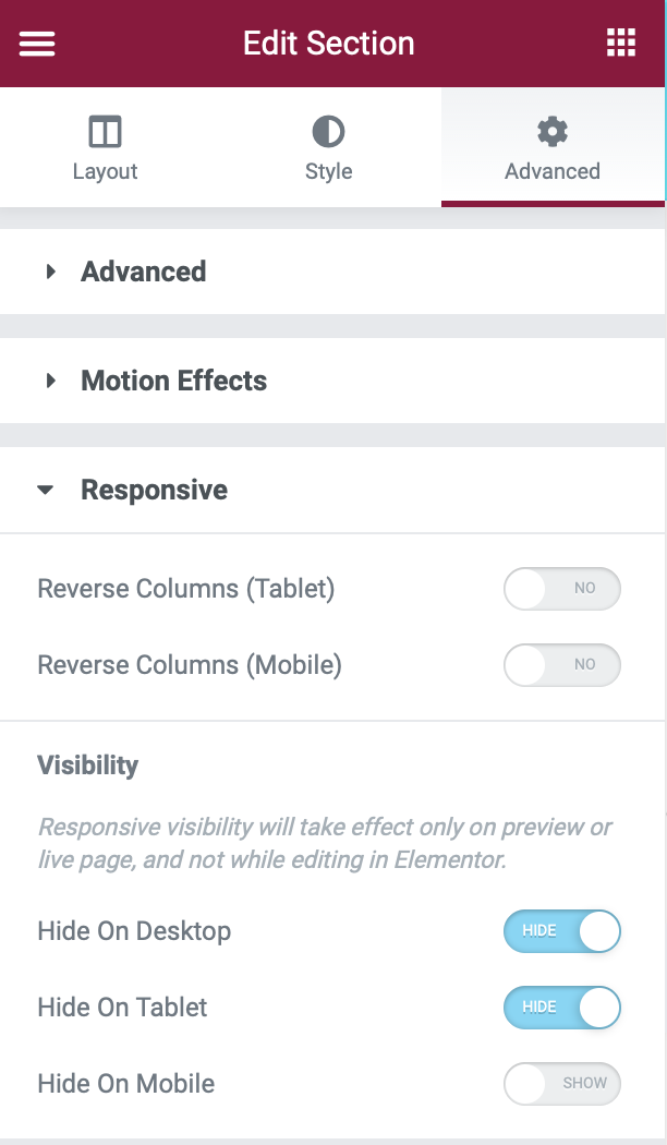
Once you’ve opened the Elementor interface, open the settings for the section that contains your header:
- Go to the Advanced tab.
- Find the Responsive settings.
- Use the toggle to enable Hide On Desktop and Hide on Tablet in the Visibility settings.
2. Create a New Template for Your Sidebar Navigation
Now, it’s time to create the section template that will act as your sidebar navigation.
Note – at first, everything in your template will look very large – much too large to work as a sidebar navigation menu. Don’t panic! You’re not doing anything wrong – later on, you’re going to fix this with some CSS that we provide.
To create your template, go to the Templates area in your dashboard:
- Go to the Section tab.
- Click Add New.
- Name it Sticky Side-Nav Header.
Note #2 – you’re creating a regular “Section” template – not a “Header” template with Theme Builder (even though you’re going to use this template as your sticky side-nav header).
Configure Section Settings
First, create a new section with one column. Under the Layout settings, configure the section like so:
- Content Width: Full Width
- Columns Gap: No Gap
- Height → Min Height: 100vh (this configures your sidebar header to take up 100% of the vertical height)
- Column Position: Stretch
- HTML Tag: header (this is optional, but it’s good for SEO to configure it this way)
Once you’ve configured the layout, you can go to the Style tab to configure the background of your side-nav. You’ll want to choose a color or gradient that matches the rest of your site.
Configure Column Settings
Next, open the settings for the single column inside your section:
- In the Layout tab, set the Vertical Align drop-down equal to Space Between.
- In the Advanced tab, add a 50px padding to the bottom of the column.
Add Widgets
Now, you can add the widgets to display on your sidebar menu. For our example, we’ve added:
- A logo
- An icon to open the full menu
- Social follow icons
Note – remember that you’ll be using a popup to contain your actual navigation menu items — you don’t need to worry about adding a navigation menu quite yet. All you need to do is add the icon that visitors will click to open the full menu.
Site Logo:
Add your logo image using an Image widget.
Icon:
Add the toggle icon using an Icon widget. For our example, we used the Bars icon. However, you can use any icon, or even an image or Lottie file. Just make sure that visitors will be able to clearly understand that they can open the full menu by clicking this.
You should also choose a color and hover color that matches your theme.
Social Icons:
You can add as many social networks as you want using the Social Icons widget. You can also configure the shapes and colors to match your theme.
To make sure your social icons are aligned vertically in a single column, you should select 1 as the number of columns.
And that’s it! Make sure to Publish/Update your section template and then go back to the WordPress dashboard.
3. Create a New Single Page Template That Includes Your Sidebar Navigation
Next, you need to use Elementor Theme Builder to create a new Single Page template that includes both your site’s content and your sticky side-nav header.
To do this, go to Templates → Theme Builder:
- Go to the Single Page tab
- Click Add New
- Make sure Single Page is selected as the template type
- Name it Page with Fixed Side-Nav

In the Elementor editor, create a section with two columns:
- Left column – this will hold the sticky sidebar
- Right column – this will contain your site’s regular content
Configure Right Column (Content)
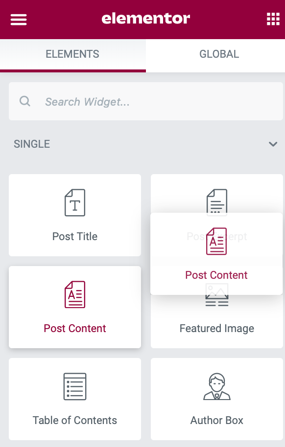
To add your regular content to the right column, add the Post Content widget.
Configure Left Column (Sidebar Header)
To add your side-nav header to the left menu, add a Template widget. Then, select the Sticky Sidebar Header template that you created in the previous step.
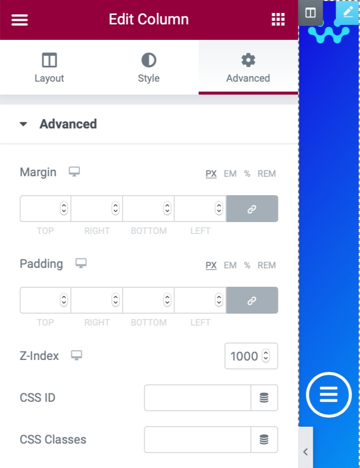
Additionally, go to the Advanced settings for this column and set the Z-index value to 10000 (ten thousand) and set the Responsive controls to enable Hide on Mobile. This ensures that only desktop and tablet visitors see your sticky side-nav header.
Configure Column Spacing/Layout
Right now, your side-nav takes up 50% of the page. To fix that, select the left column (with your side-nav) and set its Column Width equal to 5% in the Layout tab. This should automatically make the right column equal to 95%.
Setting the z-index value makes sure that the full navigation popup that you’ll create in the next step slides underneath the side-nav.
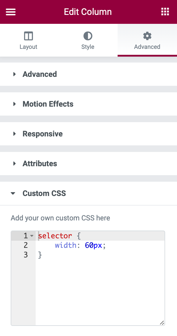
					selector {
    width: 60px;
}
This CSS makes sure the side-nav always stays narrow by setting the width equal to 60 pixels. Feel free to adjust this number according to your preferences, just don’t deviate too much from 60px.
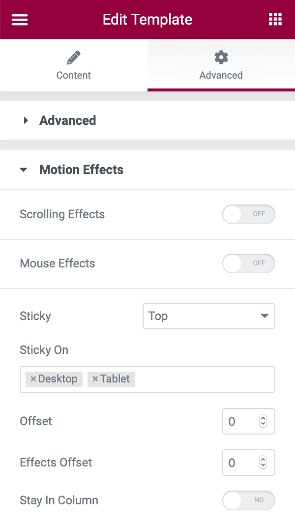
Configure Motion Effects
Now we want to ensure the side-nav stays fixed on the screen at all times.
To do this, click the template on the right column:
- Go to the Advanced tab.
- Click Motion Effects.
- Set Sticky to Top.
- Set Sticky On to Desktop and Tablet.
Now, Publish your Single Page template and use the Display Conditions to control where it appears. If you want to use your sticky side-nav on every single page, set it to display on All Pages.
If you’re adding this to a site where you already have some existing page templates, make sure to change all those existing templates to “Draft” status to disable them and avoid potential conflicts.
4. Create the Popup Navigation Menu
Next, you need to create the popup that displays the full navigation menu when a visitor clicks on the icon in your side-nav header. The popup will slide underneath the side-nav to create a really neat effect.
For the tutorial steps below, we’ll keep things simple. However, you can experiment as much as you want here to create something really awesome. If you want to learn more about creating menus with Elementor Popup Builder, check out our full guide on that topic.
To get started, go to Templates → Popups → Add New and give your popup a name to help you remember it, like Sliding Nav.
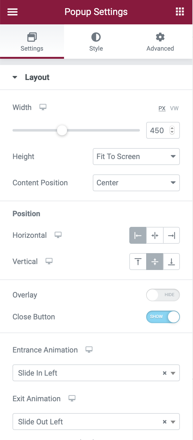
Configure Popup Settings
Open the Popup Settings by clicking the gear icon in the bottom-left corner and configure them like so:
- Width: 450px
- Height: Fit to Screen
- Horizontal Position: Left
- Overlay: Hide (turned off)
- Entrance Animation: Slide In Left
- Exit Animation: Slide Out Left
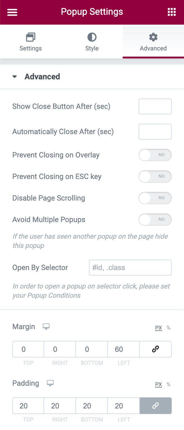
To make sure your popup appears to the right of the existing side-nav when it slides out, you need to add a margin:
- Go to the Advanced tab.
- Find the Margin settings.
- Add 60 pixels to the left (or the right if you chose to display the sticky side-nav on the other side).
- Add 20 pixels under Padding.
Add Your Navigation Menu
Next, use widgets to add your navigation menu to the body of the popup. In my example, I used four Heading widgets. You could also use the Nav Menu widget to quickly add one of your existing navigation menus – just make sure to set the Layout equal to Vertical. You also might want to Align it to center.
Again, for a deeper look, check out our full guide.
Once you’re finished, make sure to Publish your popup. You don’t need to configure any display conditions, triggers, or advanced rules – you’ll handle triggering your popup in the next step.
5. Configure Side-Nav Icon to Trigger Full Nav Menu Popup
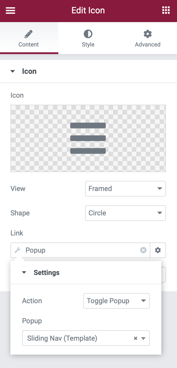
To finish things out, you need to set it up so that your navigation menu popup slides out when a visitor clicks on the icon in your side-nav section template.
To do this, go to Templates → Saved Templates and edit your existing Sticky Side-Nav Header section template.
Open the settings for the navigation icon. Then:
- Click on the Dynamic Tags option for the Link.
- Choose Popup under Actions in the list of dynamic tag options.
Once you’ve set the link equal to Popup:
- Click the Wrench icon to choose the specific popup.
- Set the Action equal to Toggle Popup.
- Use the Popup search field to search for and select the Sliding Nav popup that you created in the previous step.
Then, update your section template.
6. Test and Enjoy
At this point, you should be all finished! Open up a page on your site and make sure that your new sticky side-nav header is working as expected.
If you’re having any issues, try temporarily switching over to the Hello theme to make sure there’s no conflict with your theme.
While this tutorial should work with any WordPress theme, there’s always the chance of unexpected issues. If your sticky side-nav header works in Hello but not in your theme, you might want to reach out to your theme’s developer for help.
Create Your Sticky Sidbar Menu Today
Using a sticky side-nav header helps you create more vertical space on your site with an immersive scrolling experience.
With Elementor Pro and this tutorial, you can easily set up a side-nav header on your WordPress site. Give it a try today!
Still have any questions about setting up this header? Used it on your site already and want to share? Let us know in the comments!
Looking for fresh content?
By entering your email, you agree to receive Elementor emails, including marketing emails,
and agree to our Terms & Conditions and Privacy Policy.


