Table of Contents
One of the great advantages of our new Popup Builder is that you can apply any Elementor widget that you like inside the popup, and create unique functionalities. This is exactly what this tutorial will demonstrate – creating a menu that triggers popups!
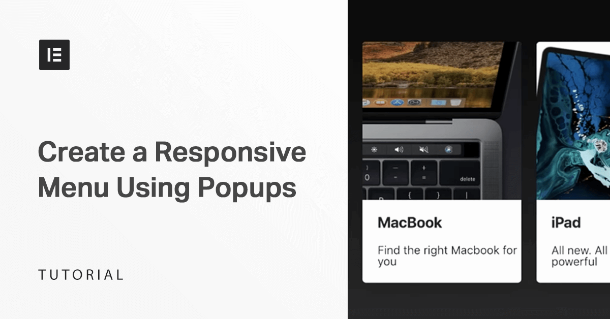
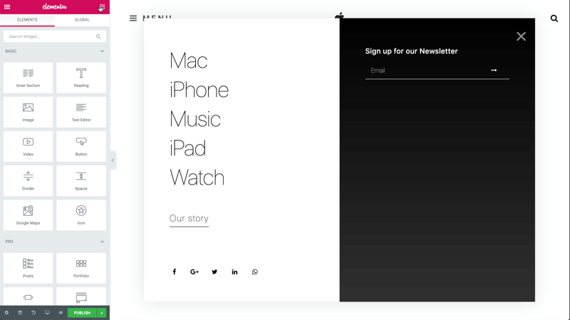
Here you can see the Apple-inspired popup mega-menu we will create in this tutorial:
The menu is triggered when the user clicks on the hamburger icon. This tutorial is just the tip of the iceberg in terms of what can be accomplished following the same steps: menus with forms, images, sliders and more.
Alright, let’s see how the magic is done.
Step 1: Add a Popup Template
In the dashboard, click on Templates > Add New and choose Popup.
Name it and click Create Template.
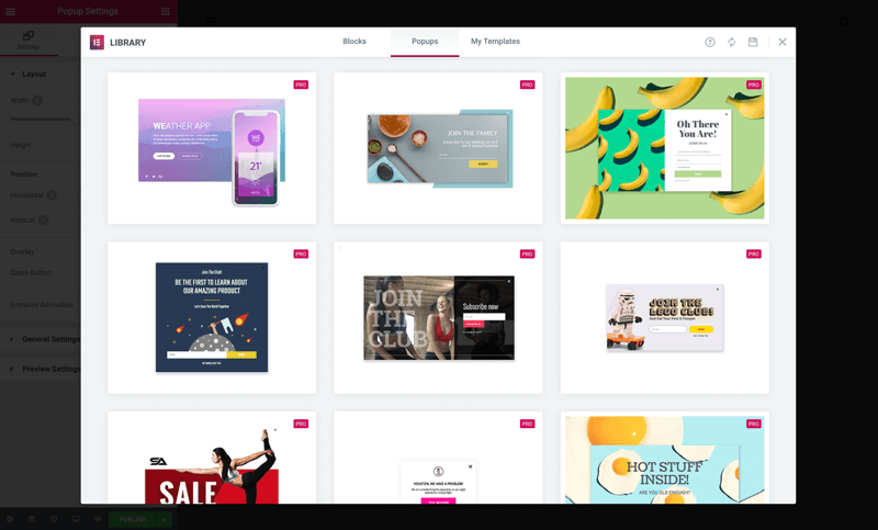
Then you’ll get the view of our library (with more than a 100 popups to choose from), but close it so you can create it from scratch.
Step 2: Adjust the Settings
In the Popup Settings, change the width of the popup.
Switch Overlay to Hide, and under Entrance Animation choose Fade In. Set its duration to 2 seconds.
Under Style you can design the Box Shadow settings.
Under Close Button set the vertical position, and change the color & size.
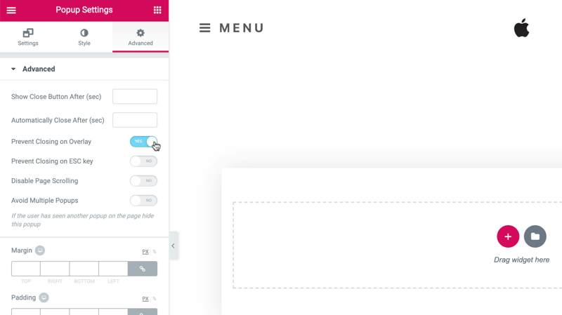
In the Advanced tab, choose Prevent Closing on Overlay. This sets where you can close the popup – Either on any part of the screen or only on the X or the button.
Step 3: Designing the Left Column
Add a section with 2 columns. Under Columns Gap choose No Gap.
Inside the left column, drag in an Inner Section widget and add some padding.
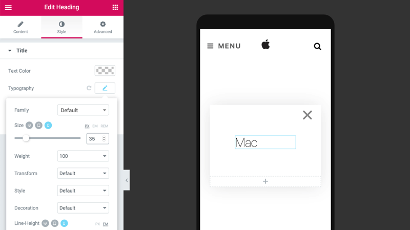
Drop in a Title widget and adjust your typography & size.
This time start off with mobile, so that later you can duplicate it, and it will already be all set.
Duplicate the title.
Note: Here we are not using the Nav Menu, just the Title to create the menu.
Add a button widget, and edit the button’s text and style, color, border, etc.
Next, add a margin on the top, also in mobile. Tweak the text size, bottom padding, etc.
Now, add another Inner Section and add some padding. Then, inside the Inner section add and design the share buttons – Alignment, size, custom color.
Step 4: Designing the Right Column
Let’s design the other side:
In the right column, the color is changed, but it is only visible once content is added.
Add an inner section, and adjust the padding & margin.
Drag in a Title widget and design it.
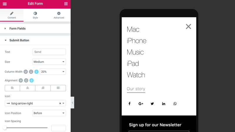
Now, add a Form widget for users to sign up for the newsletter.
We just need their email, so let’s delete all the other fields, and fine-tune the size, icon, color, etc.
Step 5: Displaying Products
To display 3 products add another Inner Section widget, add padding, but here, slide Hide for mobile to make it visible only on desktop & tablet.
Here, a minus margin will shift your column to the left, making it stand out more.
Copy the title and paste it. Change the column color to white, border radius & box shadow, also on hover. Drag in an image and there you go.
Now, go back to the text and change its weight, margin and duplicate it.
Edit the text. Then, duplicate the column three times and change each individual margin, to create a space between the columns.
Add a photo. Notice you can use video, gifs or regular images. Polish your text and set the margins. Use the Preview mode to check how it looks.
Step 6: Edit on Mobile
Now, design all your items for mobile, adjust the padding.
In Settings, under Width, increase the VH size to 100, so that the popup fits the entire screen.
Step 7: Set the Conditions
Click Publish and the conditions window will open.
This time, no changes are needed to the Conditions, Triggers, and Advanced Rules – This only applies to popups that are triggered by buttons. Then save and close.
Step 8: Define a Manual Trigger
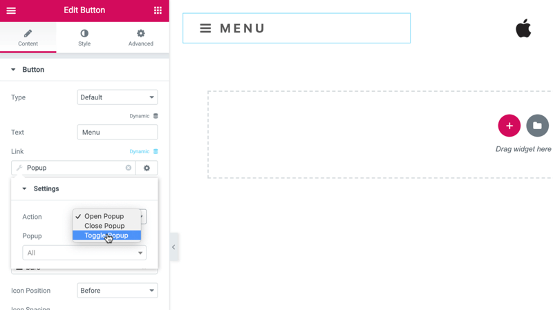
Now, let’s define how to open your popup by going to your site’s Header.
Press the button Menu and in Content > Link > Dynamic choose Popup.
Click again on Popup and under action choose Toggle Popup to make the button to both open and close the popup. In Popup, choose your popup and save.
You can test it on your live page by clicking on the button to open & close the popup, and that’s it!
Step 9: Add Entrance Animation
Here’s a chance to learn another trick – Add some entrance animation to add some spice.
Copy these settings to paste the style for each one.
Back to the live page. Click the button menu.
Summary
As this tutorial demonstrates, you can open popups from any kind of button on your page. This option enables you to be creative and explore new popup applications. Go ahead, give it a spin!
Looking for fresh content?
By entering your email, you agree to receive Elementor emails, including marketing emails,
and agree to our Terms & Conditions and Privacy Policy.


