Table of Contents
Interested in creating a shrinking header on your WordPress site? That is, a header that “shrinks” as a visitor starts scrolling down the page?
Beyond just plain looking cool, this effect gives you more space for the rest of your content, so it’s worth considering if it would be a useful addition to your website.
In this post, we’ll show you step-by-step how to use Elementor Pro to create a shrinking header on your WordPress site. While you will need to use some custom CSS to get the job done, we’ll walk you through how to modify it according to your needs.
Here’s an example of what you’ll be able to create by following this tutorial:
What is a Shrinking Header?
As you saw in the short animation above, a shrinking header does pretty much exactly what the name suggests.
It starts with a regular top header. Then, as a user starts scrolling down the page, the header “shrinks” to become a bit smaller – you can control the degree to which it shrinks and also change how transparent it becomes.
The key thing to note is that the header is still visible even as a user scrolls down the page – it’s just smaller. This is different from some other approaches, like completely hiding the header as a user scrolls down and only displaying it when a user scrolls up.
What are the Benefits Of a Shrinking Header on Scroll?
The biggest benefit of a shrinking header is that you get more space for your main content. It also puts some more emphasis on your main content because you don’t have your site’s full header competing for a visitor’s attention.
At the same time, though, you’re still able to give users access to your full navigation menu at all times, which you wouldn’t be able to do if you completely hide the header when a user scrolls down.
In a way, you kind of get the best of both worlds — more space for your content while still being able to offer your full navigation menu.
Finally, this effect also just generally looks cool and offers some nice eye candy for your visitors as they interact with your website.
What You'll Need to Follow This Tutorial
For this tutorial, we’ll assume that you’ve already created your “normal” header using Elementor Theme Builder (which is available in Elementor Pro).
Basically, you’ll want to have already created the header that visitors will see when they first land on your page (before they start scrolling down). Then, we’ll show you how to make it shrink!
We’ll also assume that your header already has a logo and some navigation items.
Check out this help article if you’re not sure how to create your header with Elementor Theme Builder. You can also use one of Elementor Pro’s pre-built header templates, which is what we’re going to do for this tutorial. Specifically, we’re going to use the header from the Digital Agency template kit.
How to Create a Shrinking Header With Elementor
Once you have your regular header ready to go, this section will cover how to make it shrink.
To create this effect, you’ll rely heavily on some custom CSS. However, we’ll give you the exact code that you need and walk you through customizing it to match your site.
1. Edit Your Header Template in Elementor
To get started, use Elementor Theme Builder to edit the template for your header.
In your WordPress dashboard, go to Templates → Theme Builder and click Edit With Elementor for your header template.
2. Perform Some Basic CSS Housekeeping
To make sure your header works with the CSS code that you’ll use in the next sections, you’ll want to perform a little housekeeping.
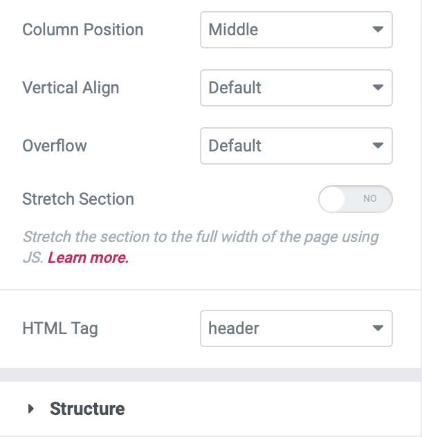
First, open the settings for the section that contains your header.
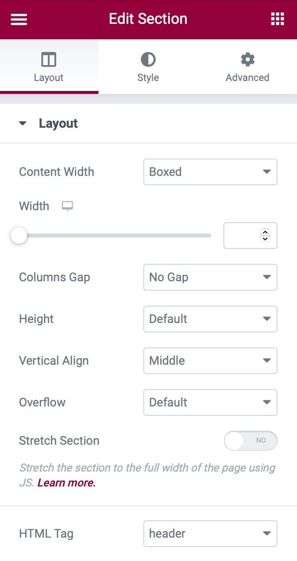
In the Layout tab, set the HTML Tag drop-down equal to header:
Also in the Layout tab, make sure there’s no Minimum Height set, set the Vertical Align to Middle, and then set Columns Gap to No Gap to avoid unnecessary padding. Tip: Avoid using top/bottom padding under Advanced.
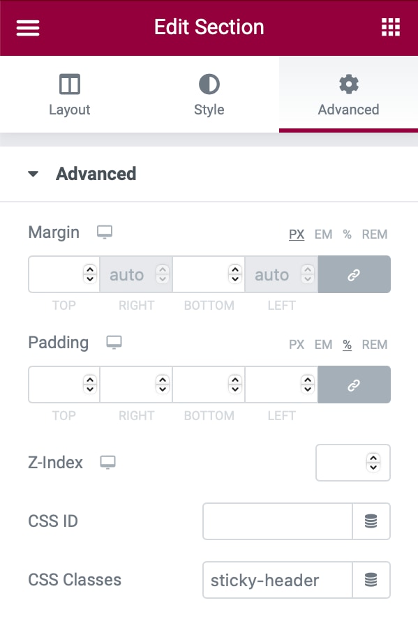
Then, go to the Advanced tab and set the header section’s CSS Classes equal to sticky-header:
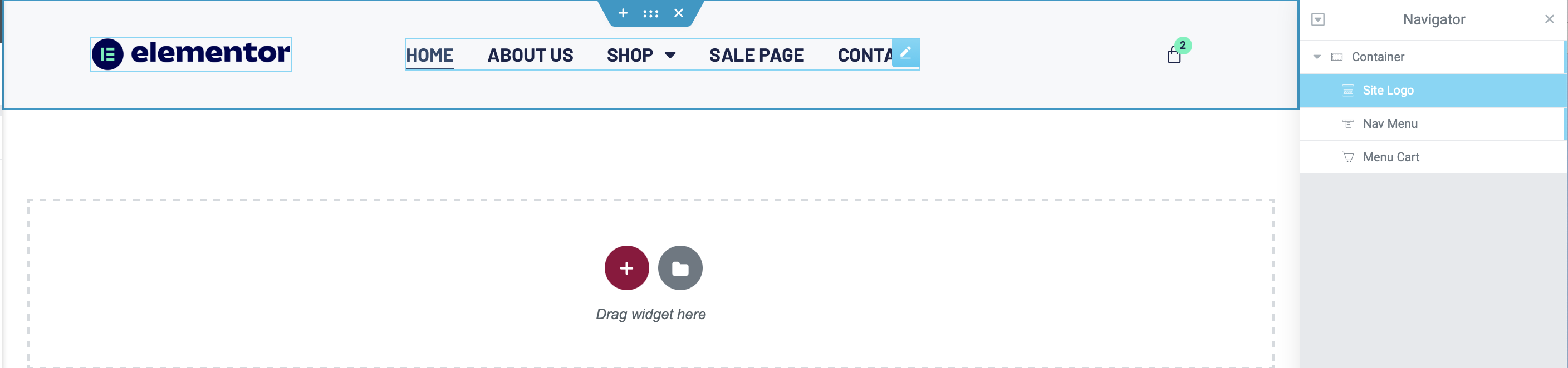
Finally, open the image widget that contains your logo and go to the Advanced tab. Then, set your logo image’s CSS Classes field equal to logo:
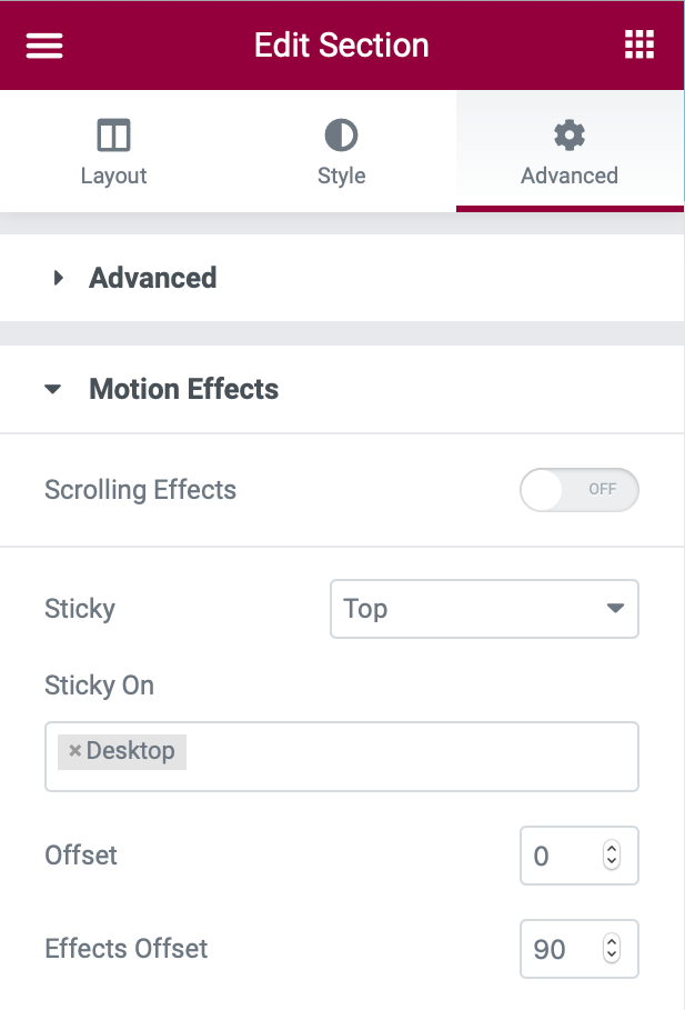
3. Set Up Motion Effects to Make Your Header Stick
To make sure your header sticks to the top as users start scrolling, you can use Elementor’s Motion Effects feature.
Open the settings for the section that contains your header. Then, go to the Advanced tab and open the Motion Effects settings:
- Set the Sticky drop-down equal to Top.
- Make sure that the Sticky On box only includes Desktop – you’ll need to delete the other devices.
- Set the Effects Offset equal to 90 (to your header’s height).
4. Add Custom CSS
With that housekeeping out of the way, you’re ready to add the custom CSS code.
Here’s the basic code that you’ll use — in the next sections, we’ll walk you through customizing it to match your needs:
If you’re using Elementor 2.9 and above, you can add this CSS via Global Style rules:
- Click the hamburger menu icon in the top-left corner of the Elementor interface
- Choose Theme Style under the Global Style section
- Select Custom CSS (once the Theme Style interface has opened – it will be blue instead of the “normal” Elementor red)
- Add the CSS code
					/***
* class: .sticky-header
*/
header.sticky-header {
	--header-height: 100px;
	--shrink-header-to: 0.6;
	--transition: .45s cubic-bezier(.4, 0, .2, 1);
	background-color: rgba(244, 245, 248, 1);
	transition: background-color var(--transition),
				backdrop-filter var(--transition),
				box-shadow var(--transition);
}

/***
* Sticky header activated
*/
header.sticky-header.elementor-sticky--effects {
	background-color: rgba(244, 245, 248, .8);
	box-shadow: 0px 4px 33px 1px rgba(0, 0, 0, .07);
	-webkit-backdrop-filter: saturate(180%) blur(20px);
	backdrop-filter: saturate(180%) blur(20px);
}
header.sticky-header > .elementor-container {
	min-height: var(--header-height);
	transition: min-height var(--transition);
}
header.sticky-header.elementor-sticky--effects > .elementor-container {
	min-height: calc( var(--header-height) * var(--shrink-header-to) );
}

/***
* Shorter header on mobile (70px instead of 100px)
*/
@media only screen and (max-width: 767px) {
	header.sticky-header {
		--header-height: 70px;
	}
}

/***
* class: .logo
*/
header.sticky-header .logo img {
	transition: transform var(--transition);
}
header.sticky-header.elementor-sticky--effects .logo img {
	transform: scale(.8);
}
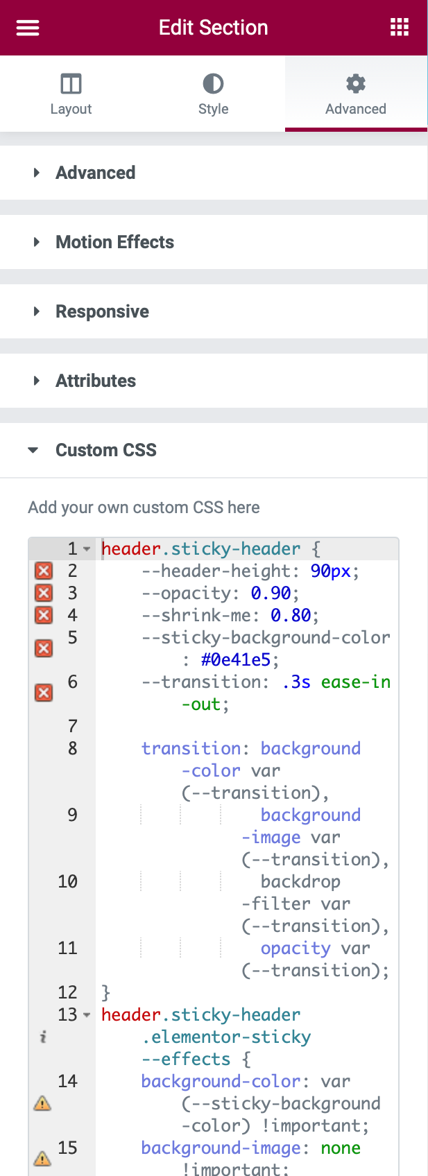
If you’re not using Elementor 2.9 yet, you can open the settings for the header section and go to Advanced → Custom CSS.
Also, feel free to ignore the warning icons on the code as of now. It’ll work fine:
If there is a Menu Cart Widget in the Header, add this custom CSS:
					.elementor-menu-cart__container {
    min-height: 100vh;
}
5. Customize CSS
Now, let’s go through how to customize this CSS to match your needs. While you can edit the CSS directly in the Elementor interface, we’d recommend using a proper code editor such as Visual Studio Code or Atom. Both editors are free and work on Windows, macOS, and Linux.
We’ll be using CSS Custom Properties (or CSS Variables). You can use these to customize the effects of your shrinking header. Once you edit the custom property one time, it will automatically update the entire CSS code to match.
In total, there are five variables that you can customize. You also don’t have to customize them — it’s totally fine to leave them as the defaults if you already like how things work!
Here are the five CSS variables, as well as the default values in our example code:
--header-height: 90px;
--opacity: 0.90;
--shrink-header-to: 0.80;
--sticky-background-color: #0e41e5;
--transition: 300ms ease-in-out;
You’ll see these listed at the top of our example code – the custom properties are the items that come after the double dash “–“. All you need to do is update the value that comes after the colon and before the semi-colon.
For example, if you want to change the header height to 100px, here’s how it would look before and after:
- Before:
--header-height: 90px;
- After:
--header-height: 100px;
Let’s go through your options for the five variables:
Sticky Background Color (--sticky-background-color)
Values accepted: Color names (i.e. black) or hex values (i.e. #000000).
The Sticky Background Color property controls the background color of the “shrunken” header that appears as visitors scroll down. You can customize it to use any color that you want — it doesn’t need to match the original color of your header if you don’t want it to.
For example, in the Digital Agency template, our header background initially starts with a gradient. However, as visitors scroll down and the header shrinks, it changes to use a solid blue background (you can see this in the example video from the beginning).
Header Height (--header-height)
The Header Height property dictates the height of your header – it needs to exactly match the height of your header section in Elementor’s settings. Earlier in the tutorial, we had you set this to 90px, which is a good starting value.
You can change the height if you want, just make sure to change the height for both the CSS property and the header section’s settings.
However, we recommend not exceeding 100px for the header height as larger headers can cause problems with the shrink effect.
Opacity (--opacity)
Values accepted: 0 to 1.
The Opacity property controls the degree to which your shrinking header is transparent:
- 0 – the header will be completely transparent
- 1 – the header will be opaque (no transparency)
In our example code, we’ve set the opacity equal to 0.9, which makes it almost completely opaque. You can adjust this value to meet your needs. To make it more transparent, just lower the number towards 0.
Shrink Header To (--shrink-header-to)
Values accepted: 0 to 1.
The Shrink Me property controls the degree to which your header and logo shrink when a visitor starts scrolling down. For example, with the default value of 0.80, your header and logo will shrink to 80% of their initial size.
While you can adjust this value, we recommend leaving this value as the default.
Transition (--transition)
Values accepted: 100ms to 1000ms.
The Transition property controls how long it takes for the header to shrink from its original size to the “shrunken” size.
As with the Shrink Me property, we recommend leaving this as the default, though you can edit it if desired.
Some Other Technical Notes
In addition to the five CSS custom properties that we detailed above, here are a few other technical notes.
First off, we’re using another CSS property called backdrop-filter that creates a cool glass-like effect. You can also customize this if you want. Or, if you don’t like the effect, you can completely remove this property.
Second, the navigation menu in our example uses an underline pointer effect with Drop Out animation. The CSS code that we used takes care of this as well. If you know your way around CSS, you can also customize these to meet your needs.
And that’s it — you just created a shrinking sticky header with Elementor!
Help! The CSS Isn't Working — What's Wrong?
If you’re having issues with the CSS from our tutorial, here are a few troubleshooting suggestions.
First off, the header won’t shrink if its content is too big. For example, if the logo is too tall, the header won’t be able to shrink beyond the height of the logo.
Second, while this code should work for all WordPress themes, your specific theme might be causing issues. For reference, we’re using the free Hello theme for our example.
You can try switching to the Hello theme to see if your shrinking header works with Hello. If it does, that probably means there’s an issue with your theme — you can try reaching out to your theme’s developer for help.
Create Your Shrinking Header Today
A shrinking header provides an eye-catching way to give your main content more space while still offering a navigation menu.
Give it a try today, and don’t be afraid to customize the CSS to meet your needs, especially the background color.
If you haven’t already, purchase Elementor Pro so that you can create your own header templates and use this neat effect.
Still have any questions about creating a shrinking header? Ask us in the comments! And if you’ve already used this effect on your site, share the link in the comments so that we can check it out.
Edit: Updated Shrinking Sticky Header CSS with support for the Container
Following is an updated code for the shrinking sticky header code to address some questions I got from the comments, and also to take into account new widgets such as the Menu Cart widget that was added in Elementor Pro 3.4.
The previous code still works fine, but the updated code should be simpler to implement.
Also added is a version of the code that supports Elementor’s new container experiment that harnesses flexbox for the header layout.
What’s New
- Code for the new container experiment
- Set your own background color using Elementor if you don’t need the background color to change on scroll.
- I’ve dropped the use of the opacity variable so now it’s easier now to set a header background color on scroll.
- Optional: Shadow on scroll
- Optional: Shrinking Menu Cart widget
- Optional: Shorter header on mobile
- Optional: Change text color on scroll
- Optional: Hide Widgets on Scroll
- Optional: Transparent Widgets on Scroll
- Optional: Change menu font size on Scroll
Changing Background Color on Scroll is Now Optional
You can now set your own background color in Elementor. This means the color won’t change on scroll, but some people just need the shrinking part. If you set your color using the Elementor website builder it will ignore the color part of the code.
Transparency
In the code I’ve used the background color with an RGBa value instead of hex. This is optional as well. I used RGBa as it’s a way to display color with an alpha channel, which set opacity between 0 (transparent) and 1 (opaque). You can search for “HEX to RGBa” and convert your color to RGBa format with the opacity set from 0 to 1.
Please note that I use opaque color for the header and it’s updated to a value of 0.8 to add some transparency.
Shadow on Scroll
The box-shadow line is optional. It adds a shadow under the header on scroll. You can either delete the line or change the value to none.
The backdrop-filter lines are also optional. These add a “glass-like” effect on scroll. The “glass” effect works only if you add opacity with an RGBa color value to line 16. If needed, you can convert your preferred color to an RGBa value with some transparency (0.80 in our example).
Updated CSS for the Shrinking Sticky Header, no container edition
					/***
* Shrinking Sticky header, no container edition
* class: .sticky-header
* Uses the built-in .elementor-container class for shrinking the header in non-container installs
*/
header.sticky-header {
	--header-height: 100px; /* Set your own header height */
	--shrink-header-to: 0.6; /* Shrinks to 60%, values: 0.1 to 1 */
	--transition-timing: .45s cubic-bezier(.4, 0, .2, 1); /* values: .1s to 0.5s (or more), replace "cubic-bezier(.4, 0, .2, 1)" with "ease" if you need a simpler transition */
	background-color: rgba(244, 245, 248, 1); /* Set your own background color */
	transition: background-color var(--transition-timing),
				backdrop-filter var(--transition-timing),
				box-shadow var(--transition-timing);
}
header.sticky-header.elementor-sticky--effects {
	background-color: rgba(244, 245, 248, .8); /* Set your own background color on scroll */
	box-shadow: 0px 4px 33px 1px rgba(0, 0, 0, .07); /* Delete this line if you don't want shadow on scroll */
	-webkit-backdrop-filter: saturate(180%) blur(20px); /* Delete this line if you don't use transparency on scroll */
	backdrop-filter: saturate(180%) blur(20px); /* Delete this line if you don't use transparency on scroll */
}
header.sticky-header > .elementor-container {
	min-height: var(--header-height);
	transition: min-height var(--transition-timing);
}
header.sticky-header.elementor-sticky--effects > .elementor-container {
	min-height: calc( var(--header-height) * var(--shrink-header-to) );
}
CSS for the Shrinking Sticky Header, new container edition
The Elementor container is still an experiment at this stage. Use the following code instead, but only if you’re using the Container. Please note that there no are columns in the container, and the widgets are inline by default.
I used these settings for the container:
- Direction: Row
- Align items: Center
- Justify Content: Space Evenly
- Elements Gap: 36px
- Wrap: No Wrap
					/***
* Shrinking Sticky header, Elementor Container edition
* class: .sticky-header
* This will only work with the Elementor container section
* the header uses additional 3 classes to gain higher CSS specificity and to avoid adding !important
*/
header.sticky-header.e-container.elementor-element {
	--header-height: 100px; /* Set your own header height */
	--shrink-header-to: 0.6; /* Shrinks to 60%, values: 0.1 to 1 */
	--transition-timing: .45s cubic-bezier(.4, 0, .2, 1); /* values: .1s to 0.5s (or more), replace "cubic-bezier(.4, 0, .2, 1)" with "ease" if you need a simpler transition */
	background-color: rgba(244, 245, 248, 1); /* Set your own background color */
	--min-height: var(--header-height);
	--transition: background-color var(--transition-timing),
					backdrop-filter var(--transition-timing),
					box-shadow var(--transition-timing),
					min-height var(--transition-timing);
}
header.sticky-header.e-container.elementor-element.elementor-sticky--effects {
	background-color: rgba(244, 245, 248, .8); /* Set your own background color on scroll */
	box-shadow: 0px 4px 33px 1px rgba(0, 0, 0, .07); /* Delete this line if you don't want shadow on scroll */
	-webkit-backdrop-filter: saturate(180%) blur(20px); /* Delete this line if you don't use transparency on scroll */
	backdrop-filter: saturate(180%) blur(20px); /* Delete this line if you don't use transparency on scroll */
	--min-height: calc( var(--header-height) * var(--shrink-header-to) );
}
Optional: Shrink logo on Scroll
This code uses 2 variables:
-
--logo-height: 32px;
Replace 32px with the logo height before being shrunk on scroll -
--logo-shrink-to: 0.80;
The percentage (%) the logo shrinks to. Replace 0.80 with the value that works best for you from 0.10 to 1.00
					/***
* class: .logo
* Add the class "logo" to your logo to scale your logo to 80% on scroll
*/
header.sticky-header .logo img,
header.sticky-header .logo.elementor-widget-theme-site-logo img,
header.sticky-header .logo .elementor-icon svg {
	--logo-height: 32px; /* This should be the original logo height _before_ being shrunk */
	--logo-shrink-to: 0.80; /* Shrinks logo to 80%, values: 0.10 to 1.00, where 1.00, as in 100%, won't shrink the logo */
	height: var(--logo-height);
	transition: height var(--transition-timing);
}
header.sticky-header.elementor-sticky--effects .logo img,
header.sticky-header.elementor-sticky--effects .logo.elementor-widget-theme-site-logo img,
header.sticky-header.elementor-sticky--effects .logo .elementor-icon svg {
	height: calc(var(--logo-height) * var(--logo-shrink-to));
}
header.sticky-header .logo .elementor-icon svg {
	width: auto;
}
Optional: Shorter Header Height on Mobile
Add this code in addition so that the height of the header on mobile will be 70px instead of 100px.
This code will work on both container and non-container layouts.
					/***
* Optional: Shorter header on mobile
*/
@media only screen and (max-width: 767px) {
	header.sticky-header,
	header.sticky-header.e-container.elementor-element {
		--header-height: 70px;
	}
}
Optional: Shrink the Menu Cart Widget
					/***
* Optional: Shrink Menu Cart on scroll
*/
header.sticky-header .elementor-menu-cart__toggle .elementor-button {
	transition: padding var(--transition-timing),
				font-size var(--transition-timing);
}
header.sticky-header.elementor-sticky--effects .elementor-menu-cart__toggle .elementor-button {
	padding: var(--toggle-icon-padding, 8px 16px);
	font-size: 12px; /* Set your own font size on scroll */
}
header.sticky-header .elementor-menu-cart__main {
	min-height: 100vh;
}
header.sticky-header .elementor-menu-cart__container {
	overflow: visible;
}
Optional: Change Nav Menu Text Color on Scroll
This will change the color of the nav menu on scroll. In this example, I’ve used black, but you use your own color to suit your needs. Also, note I’ve added a mouse hover color for the nav menu on scroll.
					/***
* Optional: Change nav menu text color on scroll
*/
header.sticky-header.elementor-sticky--effects .elementor-item {
	color: black !important; /* Set your own nav menu font color on scroll */
}
header.sticky-header.elementor-sticky--effects .elementor-item:hover {
	color: pink !important; /* This will be the mouse hover color for the menu on scroll */
}
Optional: Hide Widgets on Scroll
With this code, every widget that has the class hide-me will be hidden on scroll.
Note: This will remove the widgets with no animation, and the display property has no animation capabilities, unlike opacity, for example.
					/***
* Optional: Hide Widgets on Scroll
* class: .hide-me
* Usage: Add class "hide-me" to any widget you wish to hide on scroll
*/
header.sticky-header.elementor-sticky–effects .hide-me {
  display: none;
}
Optional: Hide Widgets on Scroll with Transparency
Use the class transparent-on-scroll on any widgets that you want to become transparent on scroll.
Note: Those widgets will still take space, as they are only transparent.
					/***
* Optional: Transparent Widgets on Scroll
* class: .transparent-on-scroll
* Usage: Add class "hide-me" to any widget you wish to become transparent on scroll
*/
header.sticky-header .transparent-on-scroll {
  opacity: 1;
  transition: opacity var(--transition-timing);
}
header.sticky-header.elementor-sticky--effects .transparent-on-scroll {
  opacity: 0;
}
Optional: Change font size on scroll
Make sure to add your own value for the font size.
					/***
* Optional: Change menu font size on Scroll
*/
header.sticky-header.elementor-sticky--effects .elementor-nav-menu .elementor-item {
  font-size: 13px !important;
}
And that’s it!
Send me links in the comments with your sticky shrinking headers.
Best,
Roy.
Looking for fresh content?
By entering your email, you agree to receive Elementor emails, including marketing emails,
and agree to our Terms & Conditions and Privacy Policy.


