Table of Contents
When you visit a website for the first, second, or even tenth time, what’s the first thing you see? For many of us, it’s the header.
One of the reasons why is because our eyes are naturally drawn to the very top part of the page. It’s like watching a movie or reading a newspaper article. You want to start at the very beginning of the story, not in the middle of it.
And, let’s be honest, as designers and as consumers, there’s a lot you can tell about a website from its header. You’ll find its branding there. You’ll get a high-level overview of its content. You might also find a call-to-action and additional company info, among other things.
Even though the header takes up a small amount of real estate, it’s one of the most important parts of the site and, as such, is probably going to get more engagement than most content on the site.
So, how do you design it to maximize that engagement?
For starters, you don’t want to use the basic header design provided by your WordPress theme or template. It’s a good starting point, but there’s so much more to think about when it comes to what to include, how to lay it out and how to design it for ultimate usability.
Throughout the post, you’ll find some awesome examples of website headers and tips for creating them, too. So whether you’re here for design inspiration or help with building the perfect website header, you’ll have plenty of visual examples to check out.
Table Of Contents
What Is a Website Header?
The website header is the top portion of a website where the logo, navigation and sometimes other information, links and buttons are located.
For example, this is the header on the Elementor website:
The header is a valuable part of every website as it:
- Serves as the home for the brand’s logo (and might be the only place where visitors encounter it)
- Offers visitors a first impression of the website
- Works as a table of contents for the site
- Makes it easy to explore the site with one click or search query
- Includes quick-action buttons for people who are ready to take the next step
- Offers additional info related to the company, how to contact it and more
Although the header serves a similar purpose from site to site, there are different types of headers you can create. It all depends on the type of website you create, the brand’s style and how much information you want to store there.
Types of Website Headers
1. Single-Line Header With Left-Aligned Logo
This header on The Dog Bar website is the most common website header design:

The logo is on the far-left side of the screen and the navigation menu, ecommerce icon and CTA are on the far-right.
2. Mobile-Optimized Header With Hamburger Menu
HubSpot shows us what the typical mobile website header looks like:
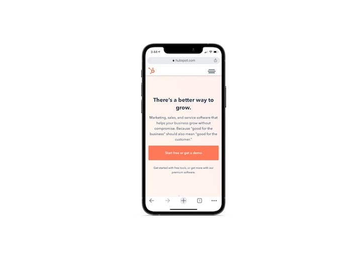
Again, the logo is on the far-left. In this case, though, the navigation and other links are tucked beneath a hamburger icon.
3. Desktop/Mobile Hybrid Header
As the lines blur between mobile and desktop, it’s no surprise to see websites adopt a hybrid header design like YOTEL:
It looks like the typical single-line header. However, a hamburger menu icon holds additional navigation links for desktop visitors.
4. Header With Mega Menu
Websites with a ton of content can’t always afford to pick and choose which categories or pages make it to the header. That’s why you get a mega menu like the one on the Digital Agency Network’s website:
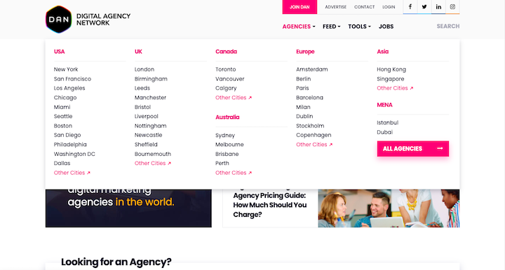
Under the “Agencies” top-level menu, we see a list of agency locations organized by location and, most likely, popularity or size.
When you look under the “Feed” top-level menu, we see a similar though not identical mega menu structure:
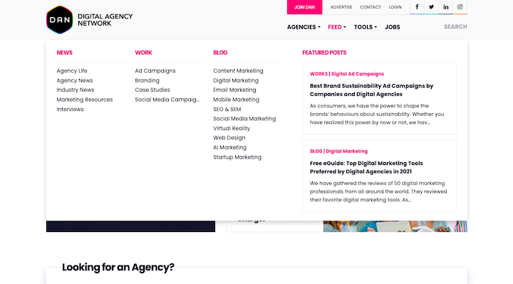
The feed is broken up into news, case studies, and blog categories. In addition, this menu includes a couple of eye-catching “Featured Posts” on the right.
By the way, if you need to build one of these, you can easily do so with Elementor and JetMenu.
5. Left-Aligned Vertical Header
Michelin-starred restaurant The Inn at Little Washington uses a left-aligned sidebar to store its header:
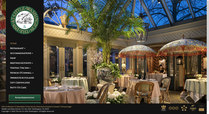
This vertical header design tends to be a popular choice on websites for hospitality and other service-based businesses.
6. Header With a Utility Bar
Some websites may affix a utility bar to the top of the header as Subway does:

This is useful for companies that want to provide location, contact, accessibility, social media and other company info or links that don’t easily fit into the main menu.
7. Header With a Notification Bar
Some websites may attach a promotional or notification bar to the header. This Urban Outfitters example shows us how to include both a promotional and utility bar:
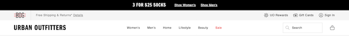
While promotional bars can appear below the header, it’s more common to place them above and make them dismissible with an “X” in the right corner.
8. Header With Multi-Site Navigation
Websites that are a part of a family of sites — which is common in retail — can add an additional bar above the header with quick-links to their other stores as Gap does:

Rather than create a separate bar for the multi-site navigation, these links appear inside Gap’s utility bar.
What Should a Website Header Include?
Let’s take a look at what exactly belongs in your website header design.
Logo
Want to build brand recognition? Then the logo should be the very first thing visitors see on a website.
Cosmopolitan is a good example to follow:
The logo design stands out beautifully from the rest of the header with its bright color and tall characters. And because the logo is properly sized for the space, it doesn’t overwhelm the other elements or force the header to take on an excess of white space.
Learn how to design a great-looking and memorable logo here.
Navigation Links
The navigation should improve your visitors’ understanding of what’s on the site as well as how each page relates to one another. If they can easily get a bird’s-eye view of what’s going on, they’ll feel more confident as they explore what’s there.
Depending on the size of your website, you’ll have to decide how many and what types of navigations you need. There’s the primary navigation, like the one you see here in Dollar Shave Club’s header:

But notice that DSC also has a hamburger menu on the left. Here’s what visitors find under this secondary navigation:
The links above the line are more or less the same as what’s in the primary navigation, but this time they include second-level links.
The links below the line allow DSC to make all of the other pages accessible from the navigation without cluttering it up. What’s more, by placing them under the hamburger icon, users don’t have to scroll to the footer to find useful pages like Contact Us, Careers and FAQ.
CTA
Every website has one action or goal that it’s driving visitors towards. While the website will include eye-catching calls-to-action throughout its pages, it’s a good idea to keep the CTA top-of-mind with visitors by putting it in the header, too.
Massage Envy does that here:
The CTA should be designed just as it is on the site. If you use Elementor’s Global Site Settings to define your global button design, it’ll apply here as well.
Your CTA should also be placed on the right end of the header. Not only will this eye-catching link bring visual balance to the header, it works as a helpful shortcut to conversion.
This is explained by the Serial Position Effect design principle, which says that people remember the first and last items in a series more than the others. So, when they’re ready to convert, they won’t have to hunt down the CTA within the content of the site. They’ll know they can go directly to the header to do so.
Search Bar
Websites with massive archives of content or inventories of products would greatly benefit from having a search bar in the header.
Mashable is one such digital publication that does this:
There are a couple of things to note here.
The first is that the search bar isn’t just represented by a magnifying glass. It’s paired with the word “Search”. While it might be a recognizable enough icon for many, it’s best not to assume that everyone knows what it is. It may also be too small on its own for people to easily find it.
Also, notice how Mashable doesn’t push users over to a new page to do their search. The search bar auto-populates results based on the query, which can lead to a better user experience.
Ecommerce
Websites with ecommerce functionality should always have ecommerce elements in either the main header or its utility bar. Here’s how Sephora does it:

There are three ecommerce elements in the far-right corner:
- Sign in/Account (persona icon)
- Wishlist (heart icon)
- Cart (shopping bag icon)
Many times, these ecommerce links are represented only by icons. However, if you’re unsure if the icons you’ve designed are easily recognizable or if they’d benefit from being paired with a label, A/B test them.
Best Practices for Website Header Design
The header is a trusted piece of a website. While you want to give it a custom spin, you don’t want to deviate too far from the established norms.
Here are some tips for striking the right balance:
1. Use White Space Wisely
We often focus on how to use white space to improve the design and content on the page. But white space is also a valuable asset in website header design.
Let’s look at how white space has impacted the BBC header:
For starters, there’s substantial space between the sign-in button and the navigation. This gives the logo room to shine while encouraging visitors to optimize their experience by signing in.
Next, you have the navigation with nine links equally spaced out and with fine dividing lines between them. There may be a lot of categories to select from, but the spacing will help visitors focus on each one-by-one.
Then you have the space built into the search bar. This is useful for practical purposes. By designing a wide search bar, it’s going to be easier for users to find and use it.
This design choice is also a smart one as it draws visitors’ attention to the big white block at the end of the black bar. In essence, the search bar plays the role of the CTA.
You can take control of the spacing by building a custom header with Elementor:
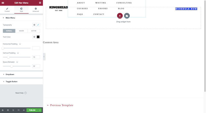
You can edit the margins and padding around each of the elements in your header as well as the padding around each element within the block (like in the navigation example above).
2. Create a Custom Header Design for Mobile
Generally, Google suggests that the mobile and desktop version of a website contain the same content. I’m not arguing with that. The header on desktop should have the same logo, links and info as the one on mobile.
That said, the way they’re designed should be different.
Let’s use Chick-fil-A as our example. Here is what the desktop header looks like when the Menu sub-navigation has been opened:
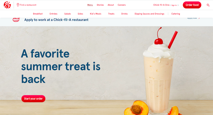
There are four top-level navigation links. When one of them is opened, a sub-navigation appears as a horizontal row beneath them.
It doesn’t matter if it’s 4 links or 14. That navigation won’t fit into the header of a mobile site. So, that’s why the mobile site does this:
The hamburger icon in the left corner opens to reveal a full-sized vertical header. The search bar, navigation links, Chick-fil-A One member area and the CTA live here.
It’s all the same header content from desktop, just with a more mobile-friendly presentation.
You can use the Elementor custom header builder to do this:
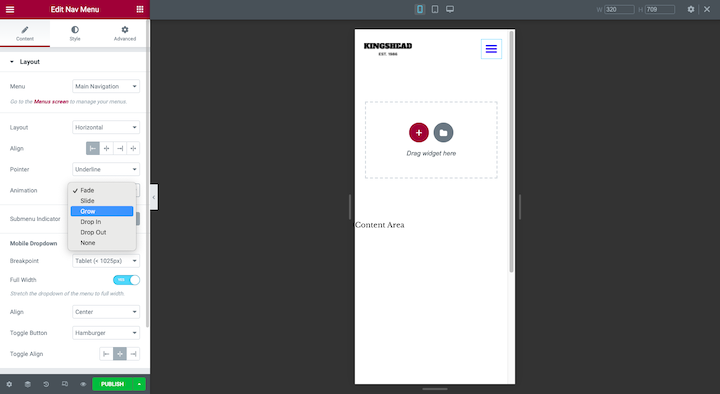
Just switch your Responsive Mode to the smartphone or tablet view and customize the layout, alignment, animation and anything else you need to for these smaller screens.
3. Keep the Header Well-Organized and Well-Structured
There are a number of reasons why someone would use the header on a website. Rather than make them pause and consider their options when they do organize the header so it’s easy to find exactly what they’re looking for — and quickly, too.
Let’s take a look at how Asana does this:
The Asana logo sits in the far-left corner of the header. Directly beside it is the navigation. The equidistant spacing between the logo and all of the navigation links suggests that the logo (i.e. Home link) and navigation should be considered one whole. This is based on the design principle called the law of common region.
Over on the right, we have the language switcher icon, “Contact Sales”, “Log In” as well as the “Try for free” CTA. It’s a hodgepodge of options, but it makes sense that they’d be relegated to the other end of the header.
This isn’t the only way Asana does a good job of organizing its header content. This is what the “Why Asana?” sub-navigation looks like:
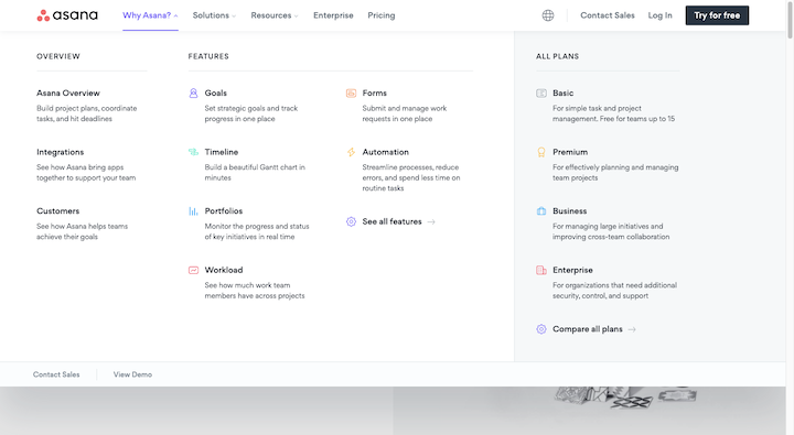
The mega-menu is formatted much in the way you’d format a web page. The structure looks like this:
- H2 tag: Why Asana?
- H3 tags: OVERVIEW, FEATURES, ALL PLANS
- H4 tags: Bolded headers under the H3s
The colorful icons aren’t really needed here. The navigation structure and the way it’s laid out in the drop-down make it incredibly easy to peruse the header content.
By the way, you can also apply this idea of order and hierarchy when designing additional bars to go along with the header. Here’s a good example from the East Bay Inn site:
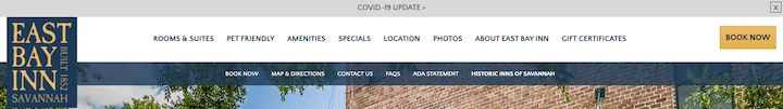
The main header bar is the largest and brightest of the bunch. The fonts are also thicker and larger in size than the others. By designing it this way, the main focus will go to the header and then visitors can refer to the other banners for additional information as needed.
4. Pick Simple Fonts That Are Easy To Read
The header is not the place to get creative with your font choices. Except for the logo, of course.
Take Dribbble, for example:
The handwritten font is a great choice for the logo. It’s unique, memorable and tells you a lot about the handcrafted nature of the work found on the website.
However, a handwritten font — or any highly stylized font, to be honest — is going to be tough to read in a space as small as the header. So, it’s best to choose a serif or sans serif web font for your text links and info.
Two other things to keep in mind:
When it comes to size, aim for a minimum of 16 pixels — this goes for the main header as well as any bars attached to it.
As for color, be careful with color contrast. There should be a ratio of 4.5:1 at the very least between your fonts and the background. Again, this goes for the header as well as any secondary information included around it.
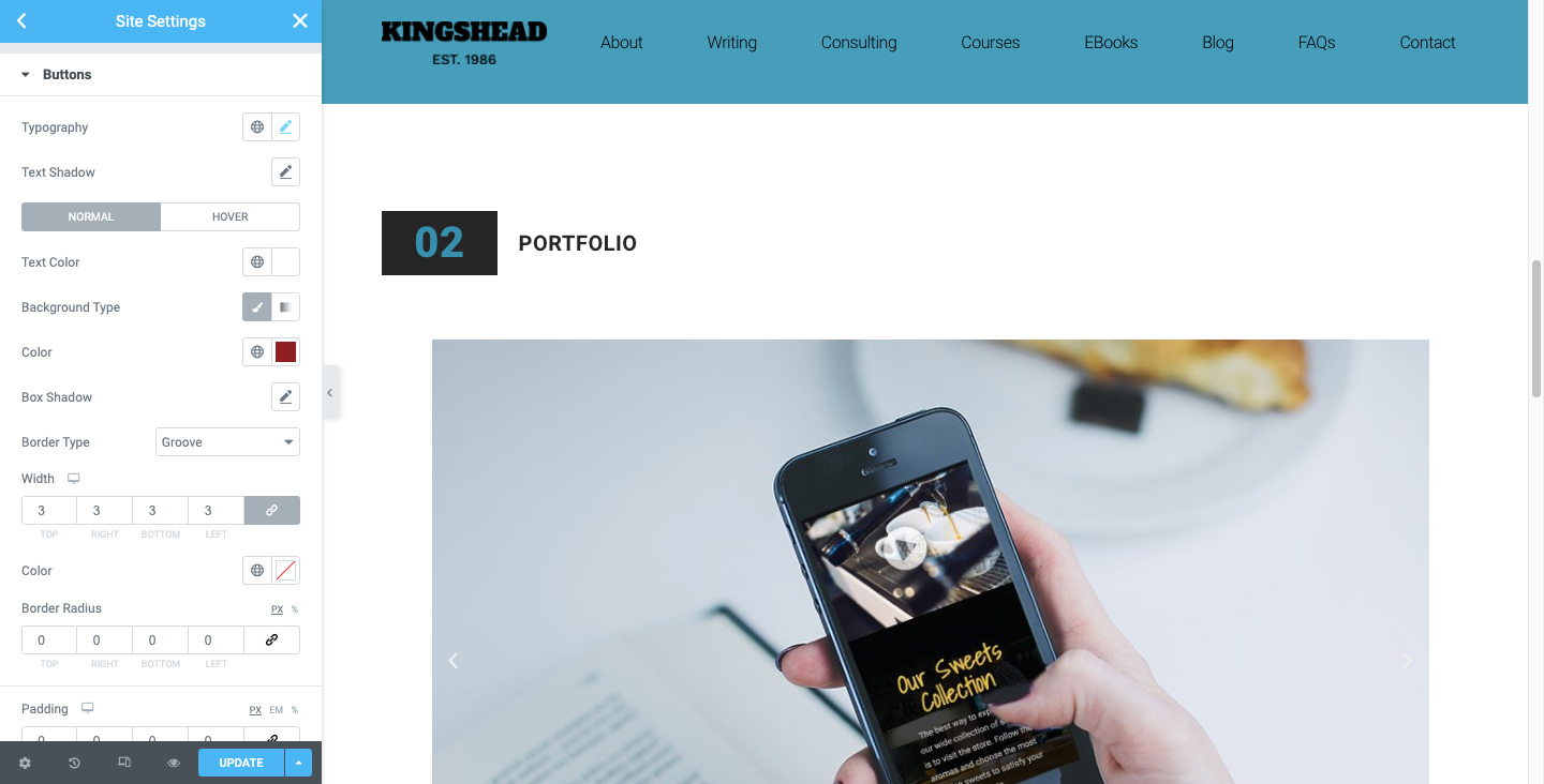
If you’re building a completely custom header, you can set these fonts under the Style editor in Elementor. If you want to simply adopt the typography and colors from the rest of your site, just make sure your Global Settings have them defined exactly as you need them to be:
5. Use Visual Elements Sparingly
When it comes to using visual elements like icons, images and videos in the navigation, you should have a good reason for doing so.
As we’ve seen in a few examples above, icons can be useful for website header elements like the search bar, shopping cart, location finder, language switcher and so on. Just be careful about using icons that are uncommon or have ambiguous interpretations.
As for images and videos, you might be better off without these bulky elements. If you’re already struggling to keep your website loading at top speed, adding image files to your header (aside from the logo, of course) probably isn’t the best idea.
That said, there are a few use cases where images may actually improve how quickly a visitor can get what they need from the header and, specifically, from the navigation.
Here’s a really great example from MINI USA:
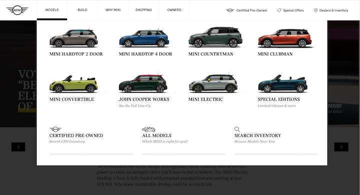
Sure, MINI could’ve just listed out the names of each of its models. However, the accompanying visuals are going to make selecting one from the bunch much easier.
Some other good use cases for imagery in the navigation are mega-menus and blogs or news sites.
The one thing to avoid would be videos. Videos are meant to be watched and the header just isn’t the ideal location for lengthy engagements (even if it’s only 30 seconds long).
6. Add Animation to the Navigation Only
Animations don’t always have to be over-the-top to be effective. Small animations applied to the navigation, for instance, can actually improve focus and engagement if done the right way.
Let’s look at some examples.
This is from the Florida Aquarium website:
When a visitor hovers over one of the main navigation links, the rest of them fade out. That’s the first animation effect that helps users focus on the available content.
Then, when they hover over the secondary or tertiary level of links, the hovered page turns a different color than the rest.
Target is another website that uses animation to bring focus to its navigation:
With this one, we get a smooth gliding animation as the second-level navigation slides open. We also get a fading effect. However, this one applies to the page and not to the navigation.
You can easily apply animation to your navigation whether you’re designing a custom header template or inserting a Nav Menu into the page from your Elementor page builder:
You’ll find these animations under Layout. While there are Motion Effects also available under Advanced, they’ll animate the entire navigation menu at once. It’s best to use animation in small doses to bring the selected page to life.
7. Make it stick
Unless you’re designing web pages with a very little amount of content, adding a sticky header to your website is probably a good idea. Long single-page websites, as well as websites with long feeds (like news and ecommerce sites), would definitely benefit from one. This way, visitors will always have the header within arm’s reach, no matter how far down the page they go.
NNG has a few useful tips on how to design sticky headers so they don’t get in your visitors’ way or hurt their experience:
- Shrink them up when the visitor starts to scroll.
- Create a strong contrast between the header and content so visitors know where one ends and the other begins.
- Keep animation small.
The Champion website follows these rules and you can see how it might help improve the shopping experience:
If you want to give this sticky effect a try, you’ll need to be comfortable with editing your code (just a little bit).
8. Consider the Header-to-Content Ratio When Using a Vertical Navigation
NNG had some really great things to say about vertical navigations:
- You can add as many links as you need without them crowding the header.
- You can easily scale your website’s pages and not seriously impact the website header design.
- They’re easier to scan as visitors are accustomed to looking down the left rail of the website.
- Users are well-acquainted with vertical navigation from all the time they spend on social media and in web apps.
- A vertical navigation will create a consistent experience between desktop and mobile.
But there’s the space issue to think about.
The horizontal header is usually designed to be thin. Regardless, many sticky headers will shrink as visitors scroll down the page, so they don’t end up taking up much real estate.
Sidebar-style navigations don’t really have that luxury unless they’re designed to pop into view only when someone clicks on the hamburger menu icon. Like this one for The Alfond Inn:
That said, if you can make your sticky sidebar menu compact enough, you can keep it from becoming a disruption to the user experience. Here’s a good example of how to do that from the Delaney Hotel:
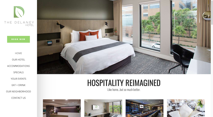
The sidebar is only 250 px wide compared to the 1200 px on the site.
9. Make the Header Transparent Only When It Makes Sense To
Transparent headers are ones where the elements are still there — the logo, navigation, CTA and so on — but there’s no solid background behind them. As you can imagine, this can be a tricky design choice to pull off with some sites.
One of the big reasons why is because text can be very difficult to read if it appears in front of a busy background or one with a low color contrast. So, unless the header completely disappears from sight as the visitor scrolls, you run the risk of the navigation and other text in it becoming unreadable when they scroll over certain parts.
That said, there are some websites where this design choice works.
Here’s how the Conti di San Bonifacio solves that problem:
The header only consists of a white logo in the left corner and a white hamburger menu icon in the right. At the top of every page is a video or image that’s rich in color that contrasts well with the white. And since the site is so heavy in visuals, it’s very rare the header’s visibility is compromised.
If you like this minimal website header design style and your theme doesn’t automatically provide you with a transparent background, learn how to set one up on your own with this Elementor tutorial.
Grab Attention and Increase Engagement With Custom Header Design
The header is one of the most important elements of your website, as the ratio between the space it takes and the benefits it gives is unparalleled.
Headers serve several purposes. They provide an overview of the whole website and easy navigation via links, well-designed mega menus, and the search bar. They are also a great place to promote your brand with company logos and the right typography and color schemes. Lastly, they can maximize engagement via CTAs, quick access to ecommerce, and animations that highlight these elements.
We’ve discussed the different types of headers, and the best practices for creating a custom header and we provided examples. So, follow this guide and create your own, unique header for better engagements and brand awareness.
Looking for fresh content?
By entering your email, you agree to receive Elementor emails, including marketing emails,
and agree to our Terms & Conditions and Privacy Policy.


