Table of Contents
When it comes to creating good website UI, the navigation menu is one of the most important parts of the design. Without an easy-to-use menu that seamlessly directs visitors through your website, people will struggle to get around. Once they get frustrated, that’s all it takes to make them leave.
A boring navigation menu can also significantly detract from your site, even if it works well enough. This is where even expert UI designers struggle in creating menus that are not just beautiful and interesting, but also simple and intuitive.
If you want to design a good-looking menu for your site, you have a few options. The first is by using WordPress’ default menu editor — simple but gets the job done — or by designing a highly customizable menu with Elementor’s Nav Menu widget.
In the following post, we will go over step-by-step instructions on two ways of creating a menu in WordPress, one in the default editor, and the other with Elementor. Just follow these instructions and you’ll have your own beautiful menu in no time.
See here to learn how to build a Mega Menu with Elementor
(Note that you’ll need to have a default WordPress menu created to use the Nav Menu widget, so make sure to follow this tutorial in full even if you only want to use Elementor.)
Creating a Navigation Menu in WordPress
By default, you don’t need to install anything to create a simple menu for your WordPress site. It might not be the most elegant way or the one with the most customization options. But WordPress menus work well enough to clearly direct visitors through your site, and they look okay with a default theme.
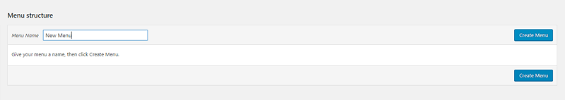
1. Create a Menu
Let’s first make a simple menu from the WordPress dashboard. Log into your backend and head to Appearance > Menus, located on the sidebar. Look for Menu Name and type in the title of your new navigation menu, then click the big blue button to create it.
2. Add and Customize Navigation Menu Items
Your menu won’t do much unless you specify what’s in it. On the side of the page, you should now see dropdowns with pages, posts, custom links, and categories to choose from.
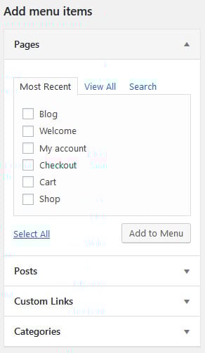
Just click the checkbox next to any page you want to add and click Add to Menu. Make sure to click use the View All tab, or the search function if you have too many pages.
Once you’ve added a few items, you’ll need to include some info by clicking the arrow next to each element under Menu Structure.
- Navigation Label – The title of the link, displayed within your menu. Example: “Store”, “Gallery”, and “About”.
- Title Attribute – Text that appears on mouse hover over that menu item.
- Open Link in New Window – Generally, leave this off unless linking to a third-party site.
- CSS Classes – Add a little padding, bold the text, and so on using CSS.
- Link Relationship– If linking to a third-party related site, specify if this is a site from your colleague, family member, or even another of your own websites.
- Description – A short description of the menu item that displays if your theme supports it.
3. Change the Nav Menu Structure
When you’ve fleshed out all your menu items, your job isn’t quite done. For one, WordPress supports submenus. That means you can create parent and child menu items. If you do, visitors will be able to hover over the parent item on your site to reveal its child pages.
Drag and drop the items into the order you want them to appear. If you want to make a submenu, drop it underneath the item you want to be its parent, then drag it to the right.
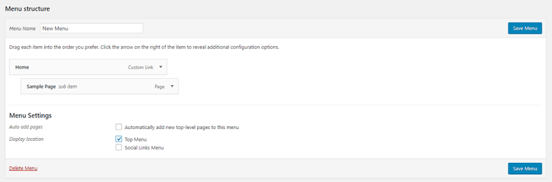
You can use the same method to change the order of your menu items to your desired sequence.
4. Publish Your Menu
In the menu editor screen, go to the Manage Locations tab and click the checkbox where you want to add your new menu. The available options depend on your theme, but generally, you’ll want to tick Primary Menu or Top Menu.
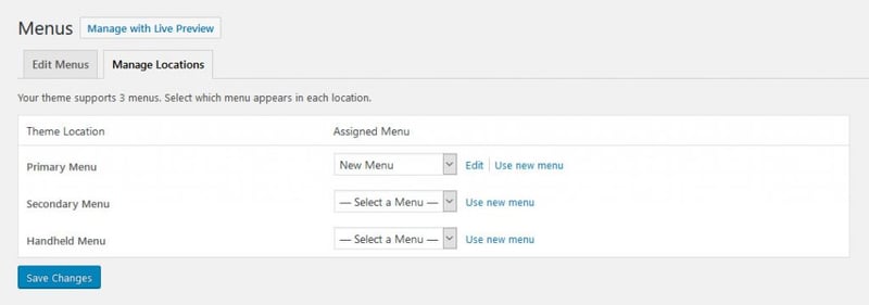
You can find the same settings at the bottom of the main menu screen in the form of checkboxes.
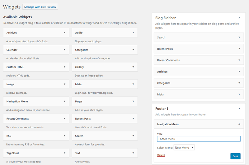
If this doesn’t work for you, try going to Appearance > Widgets and dropping the new Custom Menu or Navigation Menu item where you want it.
If you can’t use either of these options, you may need to switch themes or see if your theme has its own menu editor.
And there you have it: a simple, if not particularly flexible, WordPress menu. Styling it any further will require CSS knowledge.
Is that not good enough for you? Want more customization and control? Read on and we’ll show you how to create a customizable menu with Elementor.
Elementor Pro’s Nav Menu Widget
In order to use the Nav Menu widget, you’ll need to have any version of Elementor Pro installed. If you’re using the free version, you’ll have to stick with the default WordPress menu or use a third-party.
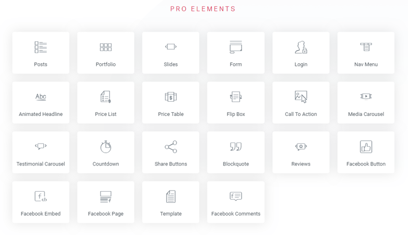
With Pro you’ll also get access to 300+ templates, a builder for Themes, WooCommerce sites, and marketing Popups, more animations for your site, and extra widgets just for WooCommerce users.
And don’t forget the other pro widgets like a Posts List, Call-to-Action button, Reviews, Countdown, and various Facebook Blocks alongside the Nav Menu.
The Nav Menu widget itself comes with extensive features:
- Place Nav Menus anywhere you want, not just in the header or at the top of your page. Go wild and place your menus anywhere you like, even within posts.
- Add as many menus on a site or page as you like.
- Easily add elegant hover animations.
- Mobile responsiveness and the ability to customize how your menu looks on computers, tablets, and phones.
- Tweak typography, color, and other design elements.
- Pixel-perfect precision with padding, spacing, and align options.
Now we’re going to show you how to use all of these with the Nav Menu widget.
How to Make a Nav Menu in Elementor
As mentioned above, to get started, you’re going to need to have a default WordPress menu already created. Make sure to follow the tips above to learn how.
If your WordPress menu is done, it’s time to add it to your site using the Nav Menu widget. For that, create or edit whichever template you want your menu to appear in (e.g. a header). Here, look for the Nav Menu widget and add it to your desired location.
Once finished, your WordPress menu is now editable in Elementor — time to get customizing!
1. Layout and Animations
On the left-hand sidebar, you should see three tabs: Content, Style, and Advanced. The first thing you should do, if it’s not already done, is to go to Content and change Menu to the one you want to display. This allows you to see it in the preview screen.
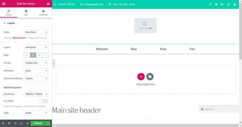
Under Layout, you can set the menu to be horizontal, vertical, or even a hidden dropdown accordion. Try it out, you will immediately see how it looks in different styles. Align lets you change the alignment of your menu items.
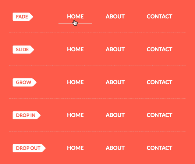
You also have quite a few options when it comes to animations. These include under-, over-, and double-line animations as well as framed, background, and subtle text animations.
Click the Pointer dropdown to select the type you want. Then click on Animation to see the individual options. There are some examples in action here.
The Submenu Indicator changes how submenus’ arrow icons are displayed. To customize submenus a little more, go to the Style tab and uncollapse Dropdown. Change how they act on normal and hover states, customize typography, add a border, shadow, or divider, and of course tweak the padding.
2. Colors and Spacing
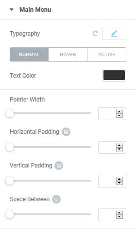
Once you have your menu layout how you like it, it’s time to customize it a little more with color and padding tweaks. Go to the Style tab and uncollapse Main Menu. Here, you control everything about the design of your menu items.
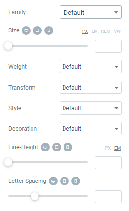
Switch on Typography to edit the text size, font, weight, set it to all upper/lowercase, and tweak the styling — with individual choices for each type of device. Make your text larger on mobile, a different color entirely on desktop, anything you like.
Use the Text Color and Pointer options to customize the color of your menu links while normal, hovered, and when it’s the active page. Use the Hover and Active buttons to edit the different states.
Customizing spacing with pixel-perfect precision is also easy; everything from text padding, letter spacing, and line-height is available. Set a number or drag the bars to change it.
- Line-Height – This changes the height of the line, the padding above and below text, similar to vertical padding
- Letter Spacing – Higher values mean more spacing between each letter.
- Pointer Width – The thickness of the lines that appear on hover and when a menu item is active.
- Horizontal Padding – This is the space between each menu item, or between the menu items and the column edges if you’re using vertical layout.
- Vertical Padding – Conversely, this is the space between the top and bottom of the column, or the menu items if you’re using vertical layout.
- Space Between – Use this value to put more space between each menu item.
- Border Radius – This adds rounded corners if you have a background color.
You can set a different value for desktop and tablet mode if you set your breakpoint to be on mobile devices. Otherwise, you need to edit the mobile options.
And finally, the Advanced tab allows you to set CSS classes, change the margin and padding, add a background image to the menu, change responsive settings, and more. But be careful editing these as you could break your site for mobile users.
3. Configuring Your Mobile Menu
The Nav Menu widget also comes with some mobile options under the Layout tab, to optimize your menu on smaller devices. Here’s the list of options explained:
- Breakpoint – When does your menu layout change to better suit smaller devices? At tablet or mobile resolution?
- Full Width – Turn this on, and the mobile menu will stretch across the screen rather than just across the column width of your nav menu.
- Align – Center the mobile menu links, or have them appear to the side.
- Toggle – Keep the hamburger menu (three lines) indicator, or turn it off entirely for mobile.
- Toggle Align – Align the hamburger icon center, left, or right.
Under the Style tab, you’ll find options to change the appearance of the mobile menu toggle as well (Toggle Button), customize the color, background, change the size, and add a border.
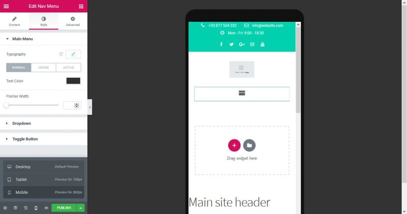
Remember there is an option for Responsive Mode at the bottom of the Elementor sidebar. It lets you see a preview of how the mobile menu will look on both tablet and mobile screens.
Final Thoughts: Custom Nav Menus in Elementor
There are several ways to create a custom nav menu in WordPress. As you’ve seen, the default settings of the platform do its job and are easy to use.
However, if you feel like your menu is missing something, or it isn’t quite as flexible as you need it to be, the Elementor Nav Menu widget might be the better choice for you.
It makes creating and customizing menus a simple task, is flexible, and full of potential. In short, it doesn’t just do the job — it finishes it.
Looking for fresh content?
By entering your email, you agree to receive Elementor emails, including marketing emails,
and agree to our Terms & Conditions and Privacy Policy.


