Table of Contents
Designing and customizing menus is a huge pain, and we are now introducing a whole new way to make it easy and fun.
We are thrilled to be introducing the much expected Nav Menu widget.
This widget is extremely flexible. In fact, you can find NO OTHER WordPress theme or plugin with as much menu design flexibility.
It enables you to create an infinite number of pixel-perfect menu designs, all customizable down to the very last pixel (It’s the Elementor way, as you know).
There’s a lot more I want to let you know about this exciting new feature, but I’m too eager to show you all the possibilities it entails, so here goes.
See here for a how-to guide on building a Mega Menu with Elementor
Get Nav Menu in Elementor Pro
Horizontal, Vertical & Dropdown Layouts
Once you choose the menu from the previously created WordPress menus, you can start customizing the layout of the menu.

Horizontal – The menu will be spread out horizontally from left to right or vice versa.
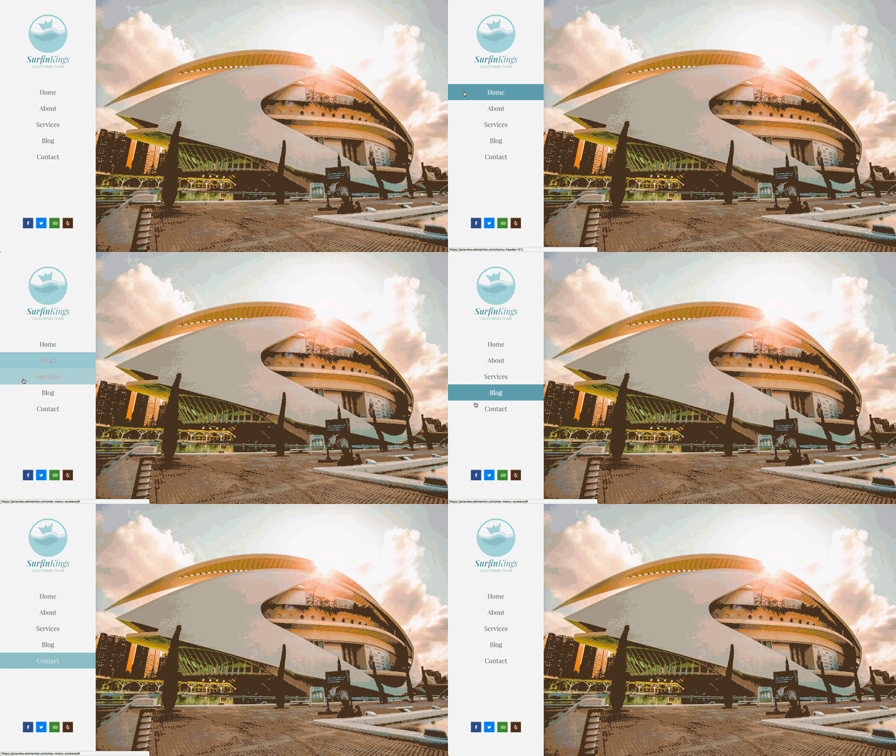
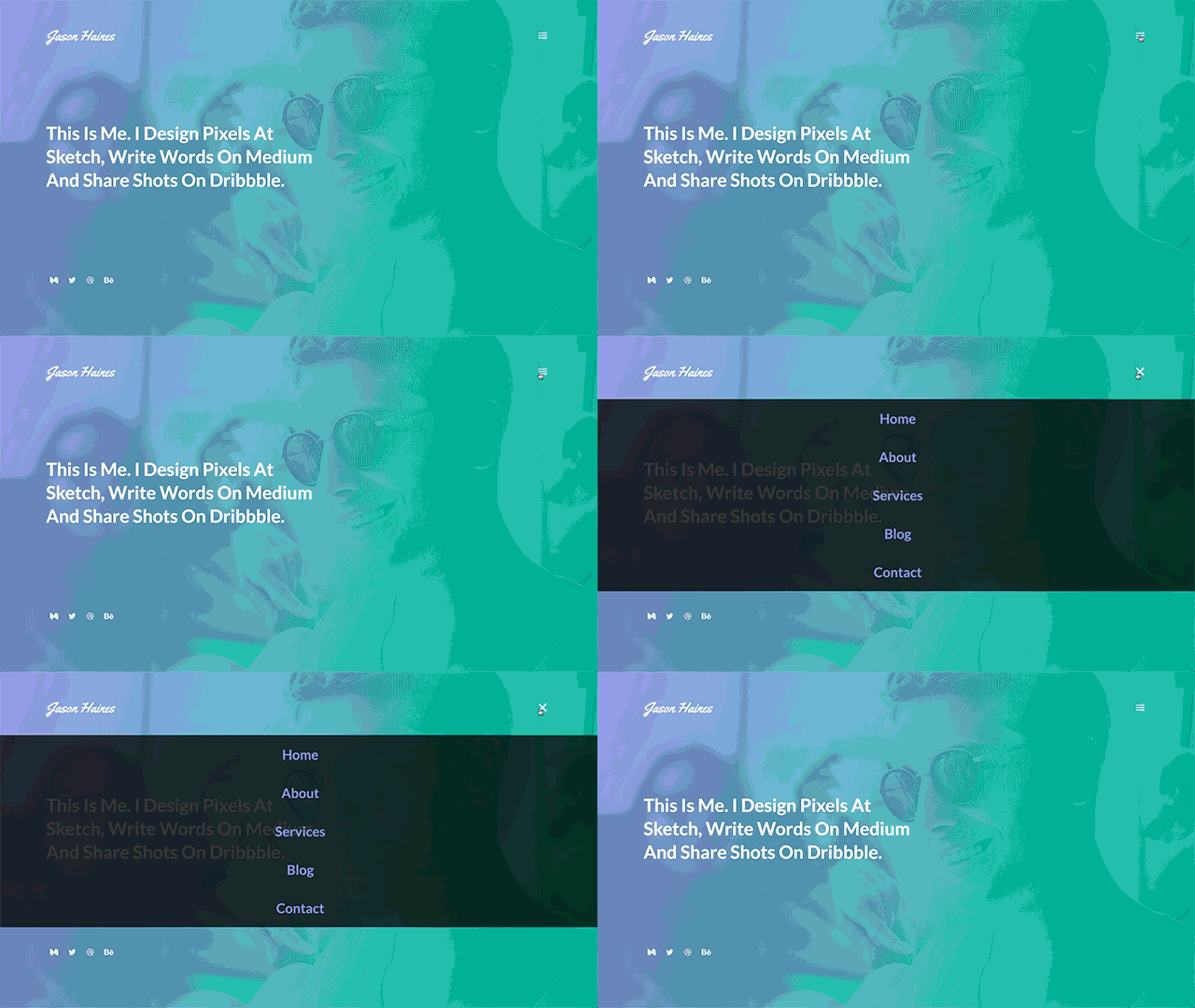
Dropdown – Another vertical layout where the submenu drops down like an accordion
Pointers & Animations
By picking a pointer and an animation for the menu, you are able to create over 50 different effects for your hover and active menu items.
Just look at these beauties:
Underline Animations
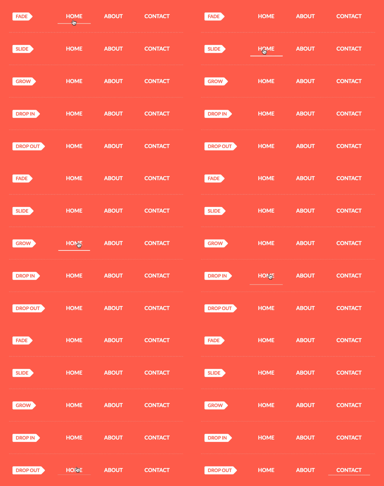
The underline pointer features 5 animations: Fade, Slide, Grow, Drop in and Drop out.
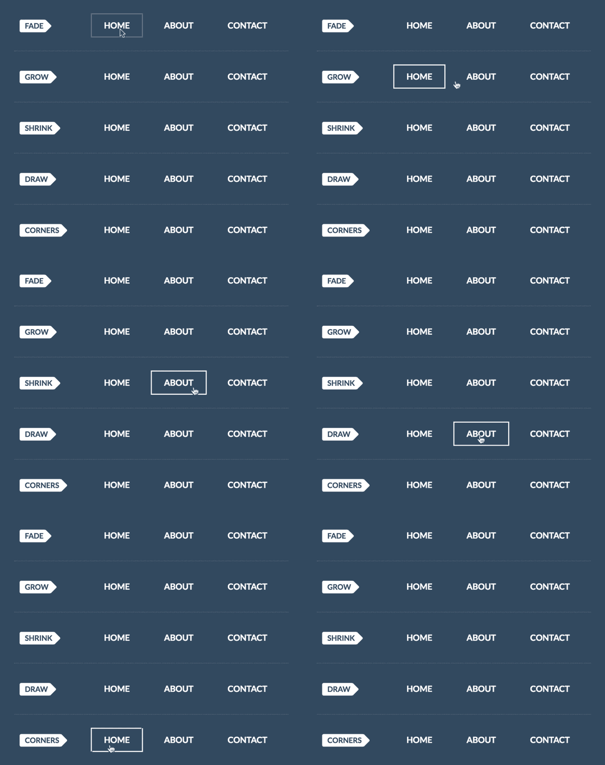
Framed Animations
The framed pointer include 5 animations: Fade, Grow, Shrink, Draw and Corners.
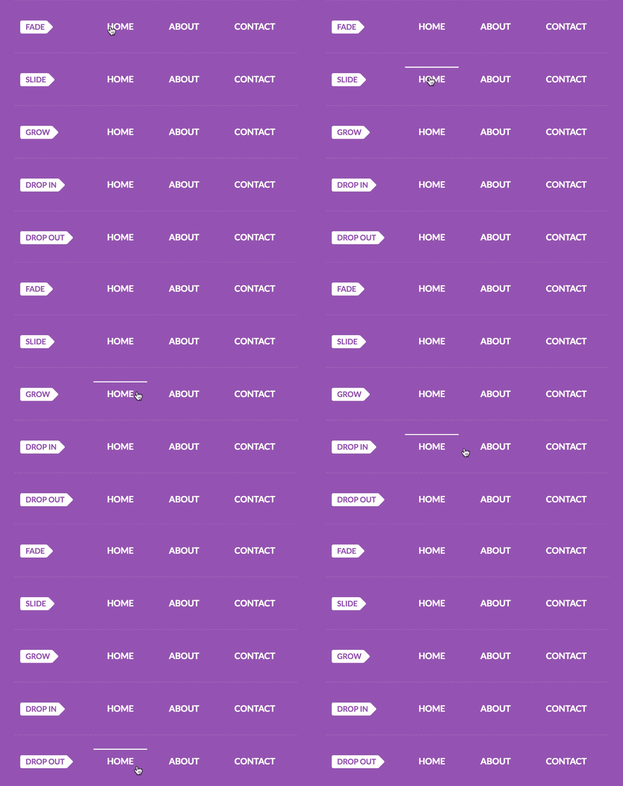
Overline Animations
Overline includes the same set of 5 animations as the Underline: Fade, Slide, Grow, Drop in and Drop out.
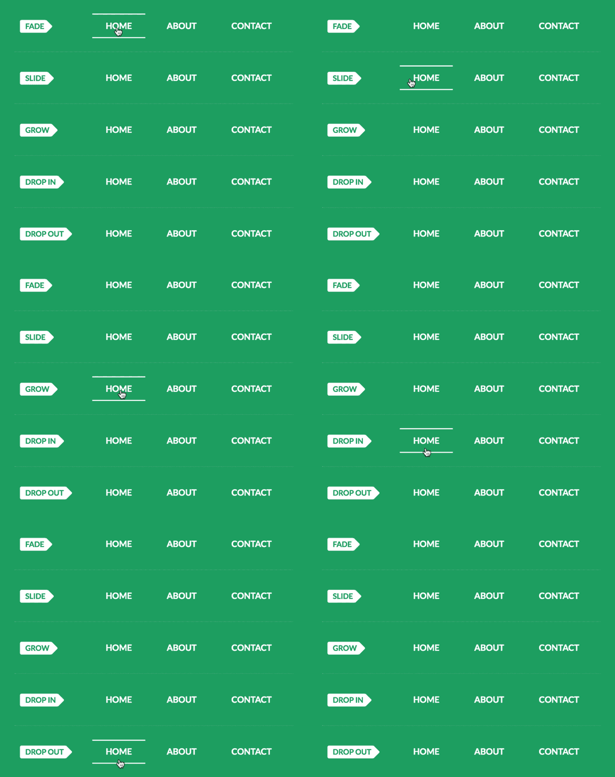
Double Line Animations
Here again, for the double line pointer, we find 5 animations: Fade, Slide, Grow, Drop in and Drop out.
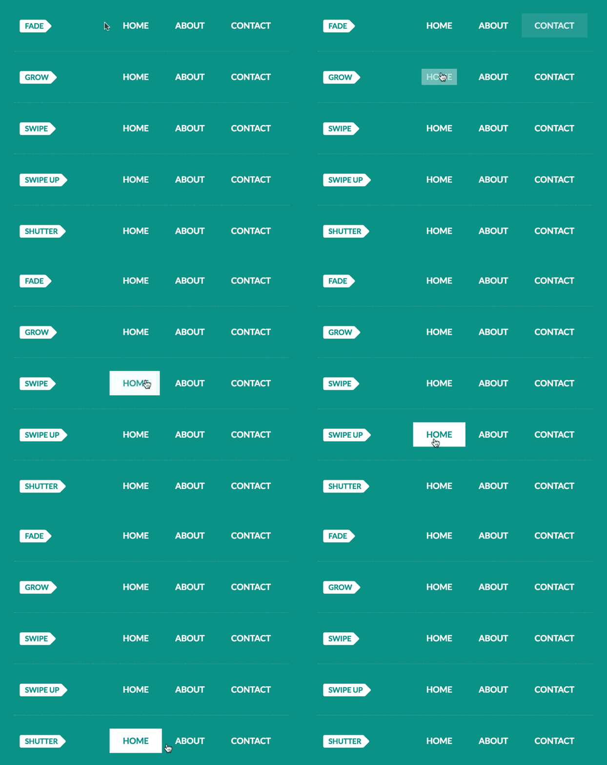
Background Animations
The Background pointer has the most animations. They create a button-like style on active. The Gif below shows the top 5 animations, but 11 animations are available for this pointer: Fade, Grow, Shrink, Sweep left / right / up / down and Shutter in vertical / out vertical / in horizontal / out horizontal.
Text Animations
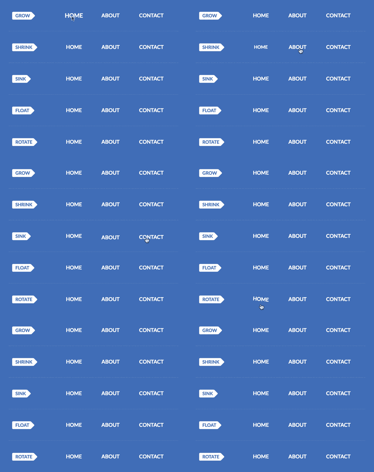
The Text pointer only has a text animation effect, great for the minimalistic menu. It includes: Grow, Shrink, Sink, Float, Skew and Rotate.
Unprecedented Menu Customization
This widget took us months of hard work to complete.
It was well worth the effort, as you will be able to see when you delve deeper into the customization option the widget offers.
Spacing, colors, fonts. Each design parameter has been translated into the visual UI you know and love in Elementor.
Menu Spacing & Alignment
Any web designer knows that setting spacing is one of the biggest pains when it comes to menu design.
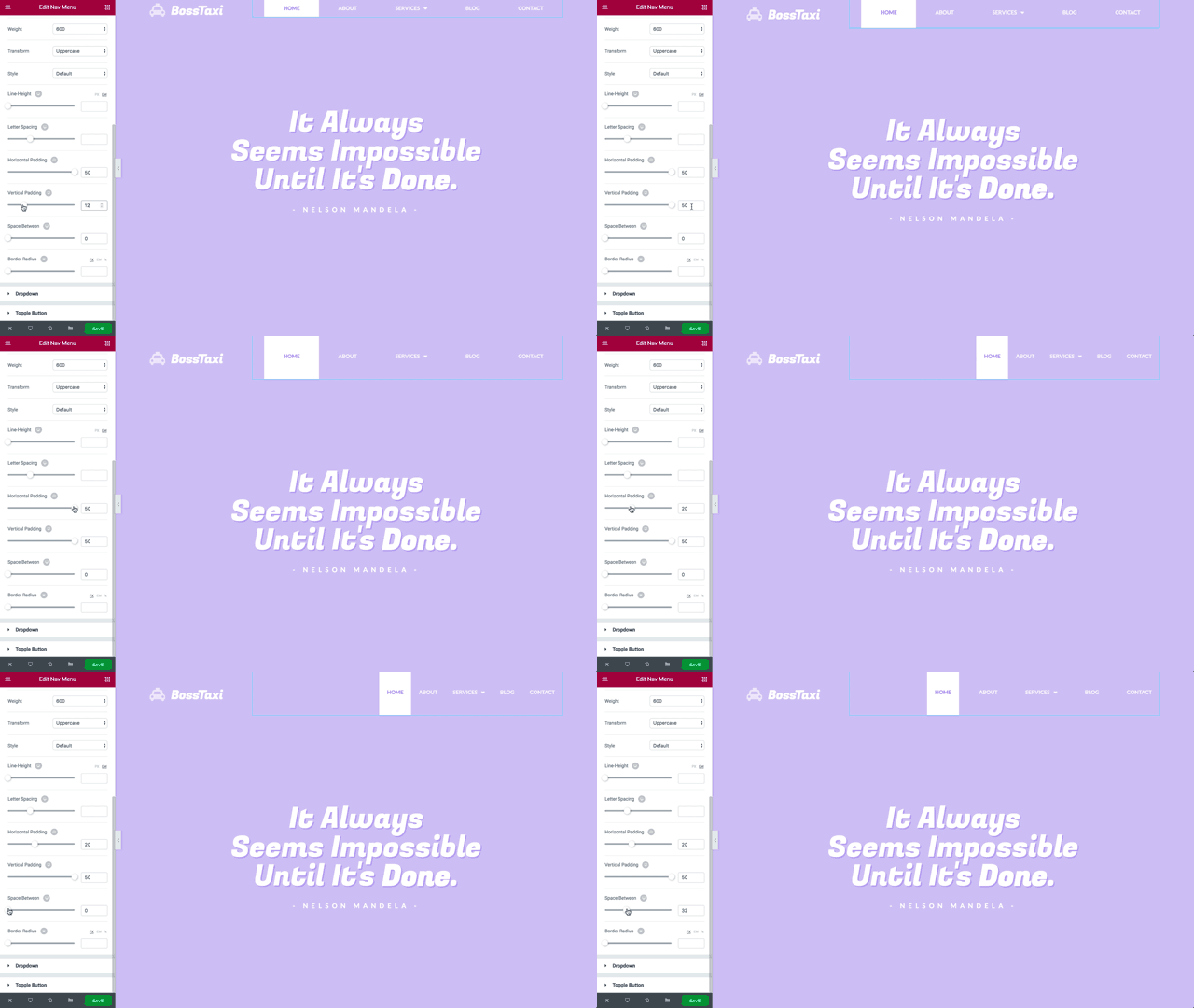
Put simply, moving menu elements around used to involve painstaking code, and now it is done with a few handy draggable controls.
Some of our menu spacing controls include:
- Horizontal padding for every element of the menu and submenu
- Vertical padding for every element of the menu and submenu
- Space between the menu items
- Right, left, center and justified alignment
Color, Background & Typography
By customizing the color and typography of the menu elements, you are able to create a wide array of menus. From transparent to semi-transparent menus, full width, minimalistic, light, dark… The sky is the limit with regards to the types of menu bar designs you can reach.
Moreover, you get the same broad design options for the submenu as well.
Submenu
The dropdown submenu has gotten the same careful care as the menu did.
The dropdown icon can be set to be a classic rectangle, chevron, angle, none or plus.
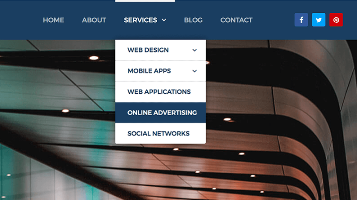
You can set every aspect of the submenu dropdown design, including text and background colors, typography, horizontal and vertical padding, border, box shadow, divider and distance.
Mobile Responsive Menu
Elementor’s Menu offers a Complete solution for mobile menus on WordPress. The mobile menu is controlled by a separate set of settings, giving you the ability to easily customize each menu to the right device.
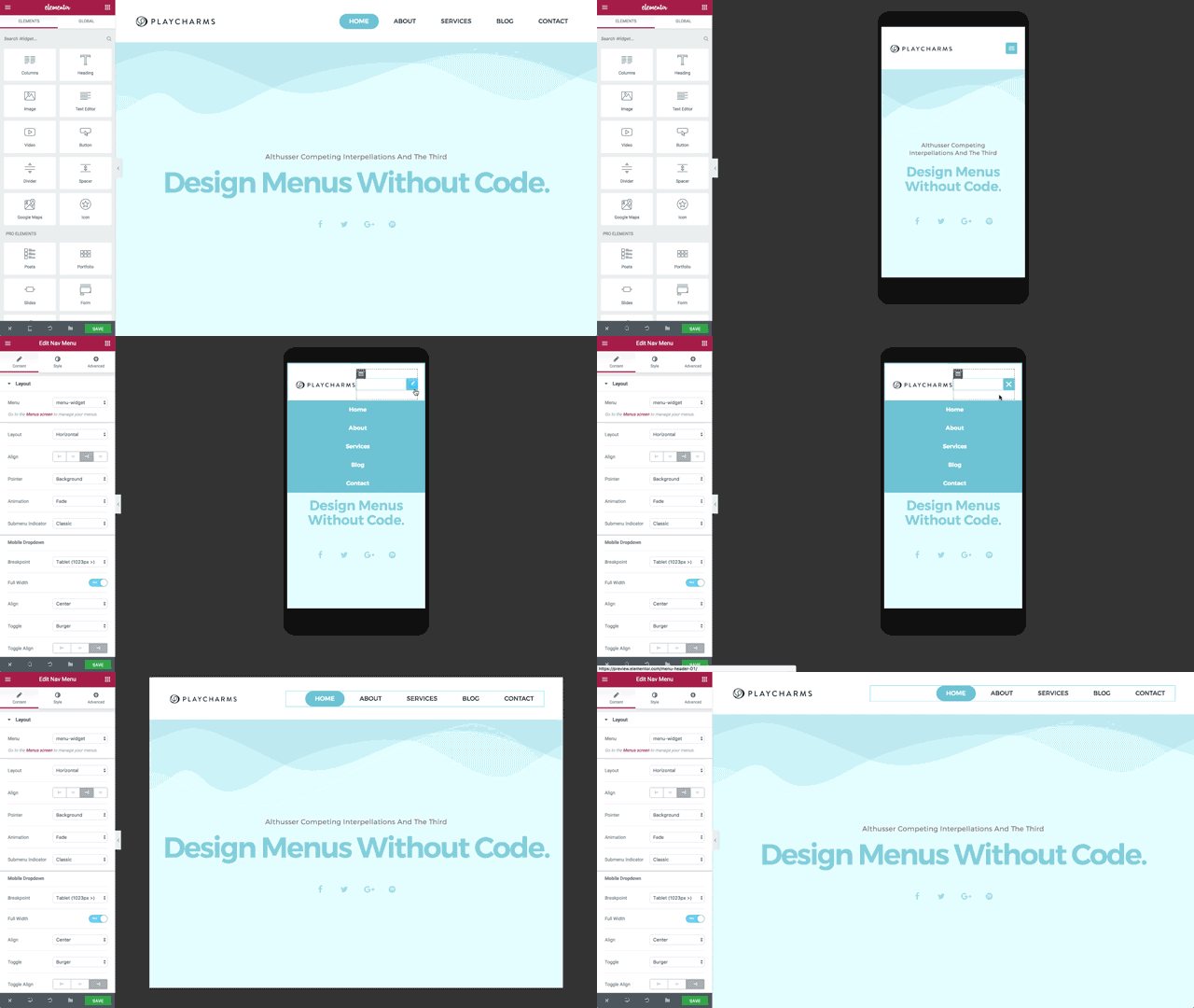
Elementor’s mobile menu features include:
Mobile & tablet breakpoints. Using the breakpoint setting, you can decide if the mobile menu will be displayed for tablet and mobile (1023px and below) or only for mobile (767px and below).
Full width on mobile. By setting the mobile menu to full width, you can have the mobile menu display in a limited width when closed (when only the hamburger icon is shown), but spread to full width when opened.
Hamburger or text mobile menu (Vertical & Accordion Menus). You can choose to display a collapsible hamburger icon or a fully-visible vertical menu.
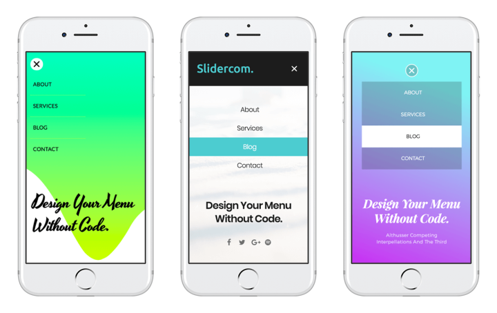
Aside / Center alignment. Choose if the mobile menu is aligned to the side or to the center.
Toggle align. The closed hamburger icon can be aligned to the left, center or right.
Design the toggle button. Style your toggle button by color, background color, size, border width, border radius and normal and hover states.
Design the dropdown items. Set color, typography, spacing, divider and box shadow of the dropdown menu for both normal and hover states.
Responsive Navigation. Your menu will look good on any device, with the proper adjustment according to the width of the device.
Get Nav Menu in Elementor Pro
Menu is the First Step
We’ve been working on this feature for a really long time. The reason for that is that we see the menu as one of the most important elements of every website, navigating the visitors through the site’s variety of pages and content.
The Menu widget is even more important, considering our plans to incorporate it when extending Elementor’s capabilities to design the entire website, including the header and footer.
For now, you can already use the menu widget to customize your landing page, home, or any other page’s menu. If you are a coder at heart, you can also use the embed feature of Elementor to implement the menu bar across the header of your site, no matter which theme you are using.
You can also use one of the sticky menu plugins to make the Elementor Nav Menu widget sticky to the header / sidebar.
How will the new Nav Menu improve your design workflow? We’d love to get your thoughts on the new widgets in the comments.
Looking for fresh content?
By entering your email, you agree to receive Elementor emails, including marketing emails,
and agree to our Terms & Conditions and Privacy Policy.
