Table of Contents
Email signups are an essential part of building your brand. Even in 2021, they rank high for most businesses in driving sales and are a fantastic marketing opportunity. According to HubSpot, the ROI for email marketing sits at 4200%.
However, getting website visitors to fill in forms can seem impossible at times.
To help out, we will go over how to increase conversions on your landing page. We’ll cover the elements of your landing page to focus on, and how to make those changes.
We’ll also go over some examples of the best landing pages that put these practices to good use. They each employ different techniques depending on their target audience, proving that one size does not fit all for landing page conversion rates.
Table Of Contents
Elements of a Landing Page That Convert
To maximize your landing page’s conversion rate, you’ll need to include different elements on your landing pages to encourage visitors to give you their email, click on the CTA. Some are likely to work better depending on your audience, landing page design, and intent, but you can use more than one of these elements at a time.
They are the following:
Email Forms
A mainstay for decades, the humble email form remains a staple in conversions. An embedded email form is crucial to collecting addresses.
Keep the form simple, asking only for an email address and possibly your guest’s name. Don’t ask for a phone number. Remember that most people will be typing this on their mobile device, and every additional field they have to enter increases the chance they will abandon the form.
Call-to-Actions (CTAs)
The most important part of your landing page, the CTA button should be eye-catching and stand out. Good CTAs use bold text, outlines, hover animation, and contrasting colors.
The text in these should be limited, so using phrases like “free,” “limited time offer,” or “sign up” are often used depending on the action desired. Your landing page conversion rate depends on a strong CTA, so don’t treat it as an afterthought.
Copy
The text you use on your landing page can convince someone to click subscribe or ignore it. You want to give users good information, such as how often you send emails and what kind of information a subscriber can expect to receive.
Less copy in bold text may sometimes work better than paragraphs explaining your product in detail. After all, The Washington Post reported that almost 70% of readers shared stories on social media without reading past the headline.
Word choice should also be exciting, not salesy, and testing different variations is a good idea to see what resonates with your visitors.
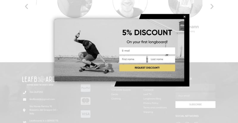
Popups
A necessary evil of digital marketing. While we tend to dislike these as consumers, there’s no denying that popups work. The current conversion rate for popups hovers around 3% but increases with a good design and marketing strategy.
Sleeknote found that timing a pop-up to appear after eight seconds yielded a conversion rate of 3.62% compared to only 1.61% when the popup appeared after 20 seconds.
Exit popups, including images, limited text fields, and copy, all affect the conversion of a popup, so experiment with different popups using A/B testing on your lead generation landing pages to find the best performer for your website.
Gated Content
Everyone loves free stuff. You can’t get anything for nothing, though, so handing over your email address for access to a webinar or template seems fair. It’s a common tactic to increase the landing page conversion rate.
WPForms found ebooks to be the most popular, with 27.7% of marketers offering them. Webinars and free tools are also popular choices; the key is to provide valuable content in exchange for your visitor’s email address.
Even better, the people who subscribe to you have indicated they like the content you create. If you offer more than one type of gated content, segmenting your email lists is a good idea to track performance and improve user experience.
How To Increase Landing Page Conversion Rate
To increase your landing page conversion rate for email signups, you need clear CTAs with appealing visuals, an easy-to-navigate structure, and a fast, responsive design that anticipates the reader’s actions.
Here are seven ways to put this into action:
1. Short and Direct Copy
Include enough information to get your point across, but don’t overwhelm users. Unbounce reports landing pages with less than 100 words convert 50% better than pages with over 500 words.
Keep the copy interesting and in line with your brand.
2. Always Include an Embedded Sign Up Form
You can typically find an email sign-up form right at the center of the page or at the footer. It’s considered good design practice to include an email form at the footer of your website. Visitors who scroll that far know what they are looking for.
3. Include Visually Appealing CTAs
Test out multiple CTAs with different phrases such as “Subscribe,” “Submit,” or “Find Out More.” Contrasting colors, easy-to-read fonts, and uncluttered screens compel more users to take action. You can find dozens of pre-made popups and CTAs or design your own.
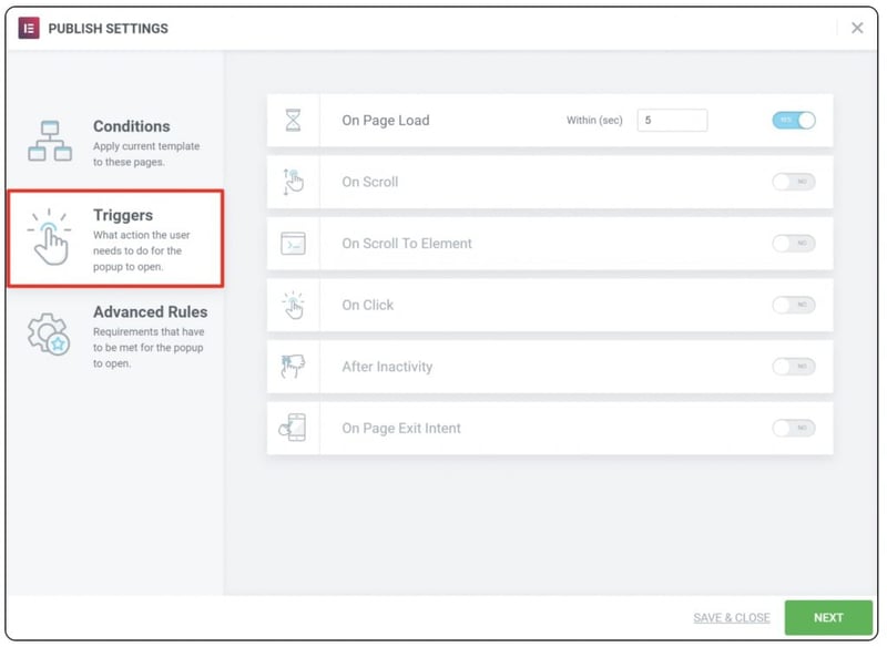
4. Popup Forms
Like we mentioned before, popups can be super effective if timed right. Add conditions and triggers to your popups to get the most out of them.
You can set it to load after a set time, at exit intent, or when a visitor reaches a specific area of your landing page.
You don’t need to limit yourself to one popup, either. If you run an ecommerce store, you might have a few different popups depending on whether a user has an account with your store, which page they are on, and if they are trying to exit a shopping cart page before buying.
5. Show Your Social Proof
63% of consumers say they prefer buying products online that have both reviews and ratings. The same can be said of offering sensitive data like their email. To increase your landing page conversion rate, you need to prove you’re worth it.
You can build trust between your visitors and your brand with testimonials, reviews, logos of companies you work with, or expert recommendations.
6. Fast and Mobile Responsive Forms Convert
Assume your ideal target is accessing your website on mobile and build around responsive design. MailChimp found that you can increase your CTR by 15% on mobile by switching to responsive email marketing.
Faster loading times reduce bounce rate and increase CTR.
7. Practice Good Design
It can be hard to strike the right balance between accessibility and visual appeal. You don’t want your landing page to be too cluttered, but you need to convey enough information to encourage visitors to enter their information.
Your landing page conversion rate can increase by improving the look of your landing page.
Include white space and animation in your design to draw eyes to your CTAs, add borders around your buttons to ensure they stand out from your webpage’s background, and create a logical order for users to follow.
Examples of High-Converting Landing Pages
Now you know what elements and general structure work, it’s time to see those landing page designs in action.
Below, you’ll find a selection of beautifully rendered landing pages with easy-to-find, effective CTAs. These websites have different target audiences and use various tactics to increase their landing page conversion rate.
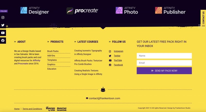
1. Frankentoon Studio
This design studio has a fast, responsive design to catch eyes and convert casual visitors. The studio lists all of the tools they work with and encourages users to check out their portfolios. They also offer a free brush pack for new email signups.
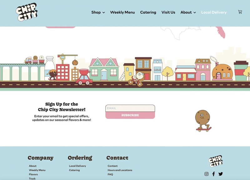
2. ChipCity
Cookies make everything better. This frozen cookie dough company has their email form below the pictures of delicious desserts. The cookie to the right skateboards closer to the form as you scroll, drawing your eye to the CTA that is easy-to-view pink over white.
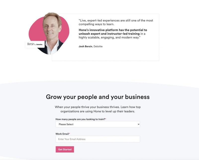
3. Hone
Leadership training has gone digital for the time being, but Hone isn’t letting that slow them down. They offer online leadership courses and show tons of social proof to build trust in their brand before sharing their email sign-up form.
They only require two entries, the number of employees and work email.
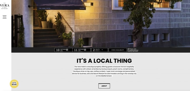
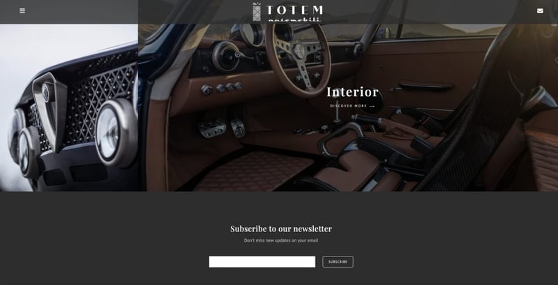
4. Totem Automobili
This landing page oozes luxury and elegance. The smooth animations and dynamic fields highlight the classic looks of this 100% electric car in a modern way that compliments the product.
Right at the bottom, you can find the email form in simple black and white with the FOMO-inducing “don’t miss new updates” just above the form. Great design meets a compelling call to action.
Final Thoughts
Getting more people to sign up to your email list will give you more independence in your marketing efforts and connect you with customers. There’s a reason why four out of five marketers said they’d rather give up social media than email marketing.
Landing pages are a great space to get these email addresses, but you should tweak their design, content, and copy to optimize them and encourage conversions.
Good design practices include high-quality graphics with easy-to-read text. Animations and video also draw eyes, but you want your landing page to be responsive and lightning-fast to prevent users from bouncing before signing up.
In addition, A/B tests play a role in almost every aspect of your landing page optimization process, from the amount of copy on your page to the number of form fields you decide is best.
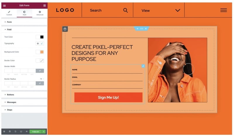
To facilitate testing, Elementor has over 25 landing page templates with form integration to help you try out new designs and make a new landing page or sign-up form for different audience segments. Try them out today.
Looking for fresh content?
By entering your email, you agree to receive Elementor emails, including marketing emails,
and agree to our Terms & Conditions and Privacy Policy.


