Table of Contents
It might surprise you but people don’t visit websites for the design. They visit websites for content. And it’s a designer’s job to present the content in the most intuitive and useful manner.
In this piece, we’ll explore how to:
- Make a certain section stand out (create a point of focus)
- Convey dual importance (present two main pieces of content that are equally important)
- Create an easy-to-scan layout of multiple related items.
1. Make The Section Stand Out
Making a certain section/element the most prominent thing on the page is quite a common task when designers craft:
Landing or promo page. Designers often try to make certain elements such as call-to-action buttons the most noticeable on the page.

Mailchimp’s landing page
Product details page for ecommerce website. Usually, the most noticeable element is a product image.

Adidas product page
How to achieve
Designers often rely on two techniques to make a certain section stand out:
- Whitespace. As Jan Tschichold said, “ Whitespace is to be regarded as an active element, not a passive background .” Using plenty of whitespace is great if you want to create a point of focus because the lack of other elements will only make existing elements stand out more. By removing distractions, you force users to focus only on what’s immediately visible.
- Size. This one is simple enough: people read bigger things first . Size is the easiest way to create a hierarchy between elements. Proper hierarchy clarifies for the visitors the order of importance of the elements, so they can distinguish what are the more important elements of the page.
Example 1: Creating a balanced symmetrical layout using whitespace
Using whitespace you draw visitors eyes onto certain page elements. The more white space around an object, the more the eye is drawn to it. But, as designers, we still need to create a balanced layout — a specific content should stand out without disrupting scanning flow. One possible way to achieve a balance is having the text on one side with images on the opposing side.
Let’s recreate a slightly modified Apple iPhone layout using Elementor.

- First, we need to create a new section. We’ll use a 2 column structure for this section.
- Next, we need to add a Heading widget for the first column and an Image widget for the second column.
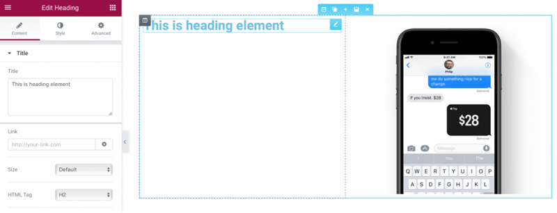
- For the Heading widget, we should change the font family (we’ll use Helvetica which is quite similar to Apple’s San Francisco font), text color (use #00000 ) as well as font size (select 48px). Also, we need to add more whitespace above and below the object. We also need another heading with a description below the title.
- If you compare our section with description to original Apple page you’ll notice that in our example text weight is too bold. We should change the Weight to 200.
- Another problem with our section — text in section looks too tight and this can have a negative impact on readability. To increase readability we need to adjust line-height for the section. As a general rule, line-height should be about 25 to 30 percent more than the character height for good readability. In our case, we can use 1.5 for line height.
- Finally, we need to add one last element — a link for more information. Once again, we’ll duplicate a widget and change its properties.
Example 2: Draw attention using size
As you saw in the previous example, symmetry creates harmony, but sometimes we want to place more focus on one particular element (either text or image). There’s one simple technique that can help us with that: size . People read bigger things first. Bigger element stands out against other surrounding elements.
We’ll use Curts special recipe as an example of asymmetrical layout. The layout uses different font sizing to create visual hierarchy. The first thing visitors notice in this layout is text section “Extraordinary Ingredients.”

- Add a new section and select a simple one column structure for it.
- Select a background image for the section. We can do it in Style tab ( Background property).
- Add a text overlays over the image. We’ll use 3 Heading widgets and one Text Editor widget for that. Let’s drag-n-drop them to the section

- Fill them with a text taken from the Curts special recipe homepage.
- As you can see, text sections require attention. The most obvious problem is the color — it should be contrasting to support readability. Let’s change the Text Color property in Style tab (we’ll use #ededee for each widget).
- Customize font size for each text section. Let’s select 36px for the first Heading widget, 112px for second and third, and 17px for the Text Editor widget.
- Most probably you’ve noticed that the body text in the last section is a way too long. Ideal line length for comfortable reading on desktop is around 60 characters per line. This means that we need to adjust the length of the last section.

- Limit the max-width for Text Editor section. For that we’ll go to Advanced tab and add a right padding equal to 538px
- Add more padding to the top and bottom for the widgets. We will also add a left padding.
2. Convey Dual Importance
In some cases, the goal is to present a variety of information as equally important. Equal importance to both elements allows the user to choose between them quickly. This required when:
You have two equally important messages to deliver or things to promote.

Peugeot website
In some cases, theYou have to place two completely different but equally important navigation options.

Dropbox website
How to achieve
Designers often rely on split screen technique to give two main pieces equal consideration. Basically, split screen is two vertical panels placed side by side. Each side features a separate contained element, such as a photo, text block, or illustration. This type of layout is particularly well suited to navigation on a large screen or on a tablet, but it can be also good for mobile devices: when it comes to smaller screens, the panels can be stacked.
Example: Creating two completely different but equally important navigation options
For our example, we’ll recreate a part of the 62models homepage visual design. As you can see, it features 2 different categories — products for women and men.

- Create a new 4 column section: 2 section with Image widgets, and 2 sections with Heading widget.
- To reduce the amount of work required, we’ll customize the properties of Heading and Image widgets and duplicate them.
- Let’s start with Heading widget. We need to change the Title to “Women” and customize color and typography properties in Style section — properties like font size, family and weight will be custom.
- Align the Heading widget to the center (change Alignment property in section Content ) and add a padding to it.

- That’s all for Heading. Now it’s time to change our Image widget properties. In this case, all we need to do is to select our image and make Image Size property equal to 100% (since we want our image to take the maximum available size).
- Now we can copy these two widgets and place them to empty spots.
- Let’s not forget that our images are interactive elements and we need to add a clear visual signifier of clickability for the visitors. We’ll use a hover animation for that. Let’s choose Grow in Style tab for both images. Now when user hovers the mouse over the image, it’ll grow and show that it’s clickable.
3. Create an Easy-to-Scan Layout Of Multiple Related Items
When we have a content-heavy page that requires displaying all primary items with equal hierarchy. A common example of such layouts is a gallery of objects, images or videos (Youtube, Flickr, Etsy)

How to achieve
One of the easiest ways to achieve an organized design is to apply a grid system. A grid system displays your content in two or more columns of cells arrayed in a vertical and horizontal layout. Grids are the invisible scaffolding that gives a design coherence.

Designers use a grid system to keep everything in balance:
A grid structure makes browsing easier. We use this column-based structure to place text, images, and functions in a consistent way throughout the design.
The grid is responsive. Thanks to grid system designers can provide a consistent experience across multiple devices with different screen sizes.
Elementor includes a semi-automatically generated grid system. By using sections, columns and the various spacing settings like column gap, padding and margin, you get a faster workflow, never worrying about placing each widget in the exact point. You drag and drop any widget, it clicks into place, and then you can make any needed adjustment by using the many spacing controls.
Using Elementor’s grid enables you to get a symmetrical and well-structured layout almost automatically and with the least amount of effort needed.
Example 1: Creating an easy-to-scan grid system
Grid provides users an interruptive scanning format, making it best suited for visual comprehension and differentiating between similar data types. User’s attention tends to be spread evenly between each grid cell: user can jump from one image to another without worrying about order or continuity.
Grids can vary in size, spacing, and the number of columns. For our example, we’ll use YouTube grid system.

In Elementor you can choose how each section divides into columns. Let’s add a new section and select a 4 column structure for it.

Now it’s time to fill the first spot with data. We’ll use a familiar for you Image Box widget. Simply drag-n-drop it from the widget panel and you’ll see the following layout.
First, we’ll adjust image size — let’s make it 100%
After that, we should adjust typography both for title and description. Enable Typography settings (use Typography switch to make it possible to adjust typography properties) and change color for the title (use #167ac6), font size (make it 13px) and font family (select Roboto from the list). We also need to adjust typography for description — we’ll make the font size equal to 11px and line height equal to 1.3 em (30 percent more than the character height).

Finally, you need to choose an image for the Image Box and fill the Title & Description with a relevant information.
We can duplicate the properties of our Image Box, and s imply adjust the image and title & description for each piece.
Example 2: Playing with column gaps
Finally, you need to choose an image for the Image Box and fill the Title & Description with a relevant information.
We can duplicate the properties of our Image Box, and s imply adjust the image and title & description for each piece.

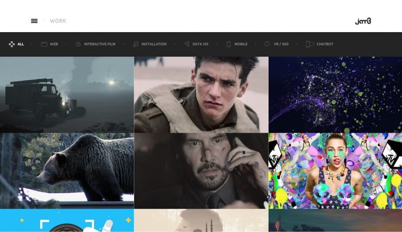
Pay attention to white space (or lack-there-of, as with Jam3 in example below) because it influences how users browse. Ample space is slower, but with more attention placed on each item.
In Elementor we can vary gaps using Columns Gap property. To demonstrate how it works we’ll create a simple 3×3 layout.
And fill it with images using Image widgets.

Select layout properties and click Column Gap properties. Choose No Gap option to get the images close together.
Example 3: Using Columns to create Multi-column Sections
Elementor includes a columns widget, the adds the ability to add another level of sub-columns. This widget makes the editor much more powerful, because you can create an intricate hierarchy and sub-division within the same section.
An example of this can be seen in the Chiropractic landing page template , which includes a sub division of 2 columns inside the right column of the services section:

How to achieve
- Start with creating 2 column layout: one for the image and the other one for content.
- The content area has a heading, for that we’ll use heading widget.
- Below it, we drag the Columns widget.
- We have 2 columns, inside which we place the Icon Box widget.
- Let’s start with the first one. Select an icon, give it a title and description and customize the color and typography.
- After completing the design for one icon box, we can duplicate the widget and get 2 icon boxes inside one column.
- Now let’s duplicate the entire column, so we get 4 icon boxes with the same design.
- Finally, all that’s left to do is choose a different icon for each box, as well as customize the title and description.
Conclusion
As I mentioned earlier, content is what provides value for most websites. Whether it’s a social feed, news site, web-based dashboard, it’s why people are there — for the content! That’s why it’s critical to consider how we present our content. The layout we create has a huge impact on an entire journey a user takes along the website, it’s one of the core aspects of what will be the user experience of your site.
But mastering creating layouts isn’t an easy task. As a designer, you have to make a lot of decisions about where you place text or how you integrate visual and interactive elements into the flow of your design. That’s why it’s essential to have a powerful, flexible, and an easy to use tool that makes it possible to create different types of layouts without too much effort.
We recommend you check out the two other in-depth fundamental Elementor tutorials we published up to now:
These series of articles are the basic tutorials that are most crucial to learn how to properly design in Elementor.
We want to know what you think about this tutorial. Let us know in the comments!
Looking for fresh content?
By entering your email, you agree to receive Elementor emails, including marketing emails,
and agree to our Terms & Conditions and Privacy Policy.


