Table of Contents
When users come to your page, they’ll have some kind of reaction. Whether it’s positive or negative, in large part, is determined by what they see. Since vision is the strongest human sense, images are one of the fastest ways to grab a user’s attention.
Images speak louder than words
Visual communication has the supreme power of directly connecting with a user in a flash: bold, graphic, and intentional imagery helps to engage the user.
In this article, we’ll walk you step-by-step through the process of adding, setting up and customizing images using 2 widgets available in Elementor: Image and Image Box. Also, in the final section, we’ll find out how to add a text overlay over the image.
Layout
For the purpose of this tutorial we’ll create a simple layout for a page which contains 5 images:
- 1 primary image located at the top
- 3 secondary images with descriptions and links to the site’s section
- 1 marketing image with a text overlay
The purpose of this page is to tell a story about augmented & virtual reality and prepare viewers for the next steps. The wireframe for our page will look like this:

The top area of the page is dedicated to the main image. The main image has a role of a powerful communication tool since it supposes to create a context. 3 supporting images add more details for the context created by the main image. Finally, marketing image located at the bottom of the page has call-to-action text.
1. Adding a Primary Image Using Image Widget
Without too much exaggeration, it’s worth saying that the Image widget is essential for your design. It’s hard to imagine a layout that does not include at least one image. That’s why this is a fundamental widget which you will most likely get to use a lot while designing your website.
To add a new image to your layout all you need to do is add a new section and drag the Image to from Elementor’s widget panel to the section.

Once you drag-n-drop widget on your layout, you’ll see the Content, Style and Advanced tabs. Click the Content section and choose the image from a set of available images in WordPress media library. We’ll choose the one that we need for our purposes.


That’s all! Now we are ready for the next steps.
Style Customizations
When designing page layout, small details really make a big difference in User Experience. These small details may include image size, opacity, or anything style related. Elementor provides fantastic possibilities for image properties modification — you’ll have a vast control over every detail of your image and thanks to the WYSIWYG editor, you will be able to immediately see the result of your adjustments.
While we won’t customize our primary image too much, it’s important to go through all important customization options in order to be ready to use them in your next project. Below you’ll see a few popular ways of customizing your images.
Image Size
This is one of the basic features that make it possible to change the size of the image. Size scale starts from 1% and 100% (full size image).

If we want the image to only span through part of the column and not all of it., we can play with it’s display percentage.In our case we want to make our image the most prominent element on the page (the first element users see when they enter the page), that’ why we’ll select 100% for it.
What’s great about Size feature in Elementor is that it makes it possible to check how your image looks on the different screens. Today visitors are coming to your site using many different types of devices and it’s important to make sure your images are appropriately sized for displays and across platforms. With just one click you can check how your image looks on a desktop, on a tablet and mobile and correct the size if required!

Making sure an image is in the correct format ratio will go a long way to enhancing usability.
Alignment
Alignment property is available in Content tab. This feature is important when you have a few elements and need to create a strong visual hierarchy in order to guide user attention on the screen (such as F-layout or Z-layout). Website’s visitors are more likely to quickly scan the screen than they are to read everything there. Therefore, if a visitor wants to find content or complete a task, they are going to scan until they find where they need to go. You can help them along by designing where they eyes should focus first, second, etc. by changing the alignment of the images.

Caption
It worth say it loud: accessibility matters! Image accessibility is crucial to making your website usable by the widest range of people possible. That’s why all images that contain important information should have a descriptive caption which conveys the same information as the image. Thanks to the Elementor, you can add a caption to each image that brings value to visitors.

Opacity
Using Elementor you can also customize opacity for your image. This style property is useful when you want to make the image less prominent. In our case, we’ll leave this setting in 1 (100%).

Hover Animation
If your image is an interactive element, it’s important to give your users a visual signifier of clickability. While it’s still possible to give the user a cue by changing a mouse pointer on-hover, we can achieve much better results using animation. Thanks to Elementor, you can create interactive hover effects using different types of animation. We’ll use this feature for our secondary images (in section 2).
In section Style you’ll have a setting Hover Animation which contains different types of animated effects.
Border
It’s known fact that rounded corners are easier on the eyes. Using Elementor’s Border feature you can make aesthetically pleasing rounded corners for your images. The feature makes it possible to customize the color of the border, as well as width and radius for it.

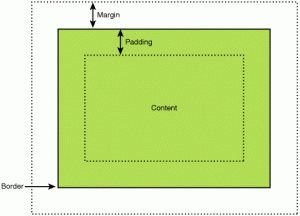
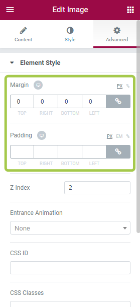
Margin and Padding
People often ask “What is the difference between padding and margins?” Thus, before we dive into details, it’s important to specify the difference:
- Margin moves items away from other items.
- Padding moves items inside the element away from the border of the element.
Placing elements with the right amount of spacing makes a tremendous difference in UX. There are two most popular ways of using margin and padding for your UI using Elementor:
- To create a vertical rhythm. This is especially important when you have a website with a lot of different elements and have to create a solid unifying vertical rhythm to make layout more pleasing to use.
- Align elements in a container. We’ll see how this works in practice during the customization of the marketing image (section 3).
Z-Index
I’m sure you’re familiar with 3D coordinate space. We have an x-axis which is typically used to represent the horizontal, a y-axis to represent the vertical, and a z-axis used to represent what happens into and out of the page, or the screen in our case.

We don’t literally see the z-axis, as the screen is a 2D plane. We see it in the form of perspective and of some elements appearing in front of or behind other elements when they share the same two-dimensional space.

Z-index makes it possible to show one widget on the top of other in a form of layers. For example, we can use the image as a background image and place an overlay element (such as a card in the example below) to create a layered layout.

Customize Visibility Options
Most of us probably familiar with a task of hiding certain elements for mobile devices. When we need to do it we usually use a custom CSS setting. This requires us to dive deep in coding. Using Elementor you can hide an element in just one click (literally!). Thanks to Responsive settings you can customize visibility settings for your elements based on the device type — you can show a certain image only on a wide desktop screen (such as desktop) and hide it on mobile where screen estate is limited.

2. Adding Secondary Images Using Image Box Widget
Now it’s time to add 3 images below the heading image. They will provide additional information about the topic. For this purpose, we’ll use Images Box widget. Using Image Box Widget you can display images on your page along with their titles and descriptions in neat layouts.
First, we’ll add a new section with a 3 column structure.
Next, we should drag-n-drop Image Box widget from Elementor’s widget panel to the first column.

You should have the following layout:

It’s time to customize our image boxes.
Style Customization
Since most properties of Image Box widget are the same as for Image widget, we’ll focus only on the properties that are important for our layout.
Image, Title & Description, Position
First, we need to define the most important settings for our Image Box widget — choose the image and add a title & description. This all can be done in one place — Content area.
Here is what we’ll have after adding a real data.

Link To and Hover Effect
The purpose of our secondary images isn’t only informative, they also navigation elements. Using Link to feature you can define a URL which will be used as a target destination when user click/tap on the image.

Since each of Image Box is an interactive element, we need to add a hover animation effect. Go to the Style section and choose the most appropriate one. I recommend choosing Grow animation since it’s the most familiar to the users.
Now when the hover on the image, it’ll grow and this way user will understand that it’s an interactive element.
Spacing
Properly using whitespace between elements can significantly increase comprehension of information. You can set the space between the image and the contents using Image Spacing.

Image Size
You can customize Image Size property for your images. It goes from 5 all the way to the full size of the image.
Elementor is a really flexible tool that makes it possible to select different image size for Desktop, Tablet and Mobile. In the example below the image has a size 70 for Desktop version (left), and 31 for mobile version (right).
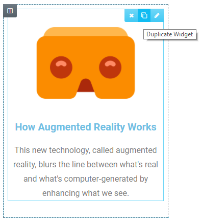
Duplicate Widget
As soon as you finish a customization of your widget, you can duplicate its properties. This will save you a lot of time. What you need to do is to choose an image and click “Duplicate Widget”
Now all you need to do is to select an appropriate image and text copy for each box.
3. Adding Marketing Image With Text Overlay
Finally, it’s time to add our marketing image with promotional information. We’ll add a new section down below the section with our image boxes.

Once the section will be added we need to change the background image. You can do it in section Style → Background → Classic.
We’ll choose an image from Media folder. After you choose an image you might be wondering that nothing happened. But don’t worry, that’s OK since we don’t have any elements in this section (except the selected image for a background). Once we add an element, you’ll see the image.
Adding a Text Overlay
Now it’s time to add your marketing copy for the section. For that we’ll go to the widget panel and select the Heading widget.
Simply drag-n-drop it to the section and you’ll see that the image that was selected in the previous step finally becomes visible.

Let’s change a default text copy to “Click here to learn about our services.”
Align Text
It’s time to align our text copy. For this purpose, we’ll use Padding. We’ll add 150px to the top and to the bottom of the image. The result of our work can be seen in the screenshot below. We’ll also set content position to column to Center.

While this text overlay might look good from the first glance, it has one serious problem — the white text copy “Click here to learn about our services” is barely readable on mobile.
Add color overlay
If the original image isn’t dark enough (like the one we have), you can overlay the whole thing with translucent black. For that you should go to the text section, select Background → Normal and choose the color back with 50% or more opacity. Here is what we have now:
Alternatively you can add an overlay over the image. For that you need to select the background image, and add a background using Background Overlay property in Style section.
In Conclusion: Preview The Results Of Your Work
So you successfully added all images and created a visual hierarchy according to the wireframe. Now it’s time to test how your layout looks in different screen sizes. You can use Page Preview feature for that.

Page preview feature
Make sure to test your layout to fit the different screens. Users should be able to see primary content including images without zooming or scrolling horizontally.
Looking for fresh content?
By entering your email, you agree to receive Elementor emails, including marketing emails,
and agree to our Terms & Conditions and Privacy Policy.


