Table of Contents
One of the factors that can make or break a website design has to do with how you setup your website background images.
Setting background image may seem simple:
1. You find an image from a free stock photo site
2. Upload it and you’re done, right?
Actually, there is a much more elaborate process for getting your website background images to fit your website perfectly.
This process includes several crucial steps:
- Getting the size of the image right
- Analyzing focal points
- Adding background overlay
- Making it mobile responsive and so on.
Luckily, with the many image background customization options available in Elementor, the process of customizing images for website backgrounds properly has become much easier.
In this post, I want to share with you 10 best practices you need to follow in order to work properly with background images in Elementor.
#1 - Design Website Background Images With Wireframes
Hopefully, you are not working off your head when setting background images, but instead, follow a certain wireframe for the website.
This is the first and perhaps most important tip for using Elementor.
What are wireframes?
A wireframe is a graphical model of your website or page.
Wireframes serve for planning the structure of websites, before actually building them.
You can create website wireframes with software like Photoshop, Axure, Sketch, and Mockplus.
In a wireframe mockup, you should get a description of all the background image positions and sizes, making it easy to recreate it in Elementor.
Wireframes keep you from making many design mistakes
Our own team of designers, here in Elementor, use Photoshop and Sketch to plan out our templates, so you can see from the high-quality result that it is a must-have step.
If you don’t plan to use any wireframe tool, not even a napkin sketch, then I strongly suggest you stick to our pre-designed templates and built upon them.
Even the most professional designers in the world use a wireframe. Don’t think you’re any different.
Even if you’re not a designer… In fact – especially if you are not a designer, you need structure to make sure your efforts don’t go to waste.
Planning out the page also helps organize the background images you will use.
This way, you will know what sizes each of the images should be. It will also help you make sure the background images don’t conflict with other page elements, and fit neatly in the website grid.
Recreating background images according to the wireframe
Elementor page layouts are made of Sections, Columns and Widgets.
Each of these can be seen as a layer, on which you can set a background image.
You also have a Columns widget, which can be used as another layer of background image.
When you are starting to work on recreating a part of the wireframe in Elementor, you need to first decide if you will place the background image of the wireframe in the section, column or widget level.
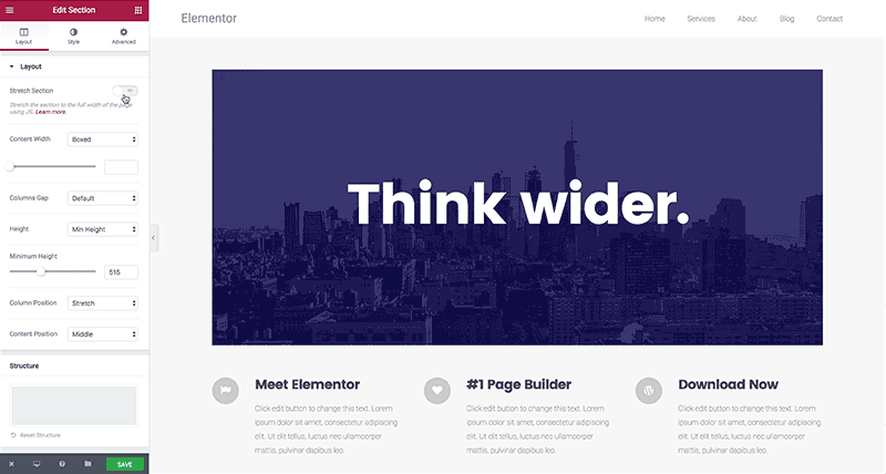
How to set the background image on the section level
When you first upload an image to a section background, you will only see a small part of the background image height.

This is because the section has a small default background height.
In order to display the image in full height, you have to increase the section height.
You can do that in one of two ways:
Go to Section > Layout > Height, and set a min height.
Or go to Section > Advanced, and add top and bottom padding.
Setting the background image on the column level
Some situations require you to set the background image on the column level.
This is true when you want the background to span only a part of the section, or when you want to add another layer on top of an existing background.
The problem is that by default the column background is not seen.
To display the column background image, you need to add a widget to the column. Widgets have a default height, so they make the section background visible.
If you don’t want to add a visible widget, you can simply add a Spacer widget.
#2 - Set the Proper Background Image Position

You can set the position of the image, so the image gets a focus on any one of 9 locations:
Top left, top center, top right, center left, center center, center right, bottom left, bottom center and bottom right.
Image position lets you choose which area of the image will get focused on, in cases where the image is larger in width or height than the section spacing.
#3 - Set the Website Background Size

In most cases, you will upload an image background that is larger than the actual background area.
This method of using larger images is recommended so as to ensure that the image remains fully seen and not cut off on its sides on larger screens.
There are three image size options: Auto, Cover and Contain.
Each displays the background image in a different way.
Auto image size
The image size, by default, is set to Auto.
What the Auto size means is that the background image will be displayed with its actual size.
Basically, Auto means no scaling.
If the size of the image is 1,000 pixels, and the section is only 800 pixels wide, then the image will be cropped to show only 800 pixels on the screen (the top left area by default).
Cover image size
If you set the image size to Cover, then the background image will be scaled to fit the width of the section without losing its proportions.
This means it will probably be cropped at its height. If you’ve used our templates, you may have noticed that in most cases we use the Cover image size. This is because it makes sure the image is displayed in the right size, without scaling it too much.
When using Elementor, Cover is your best choice for size in most cases. Auto runs the risk of showing an enlarged version of the image, and Contain runs the risk of showing a scaled image that is either too big or too small.
Cover shows the image with the proper size, and if there is a mismatch between the section and the background image sizes the sides of the image is cropped. If we make sure the background image still works with the sides cropped, we can use the Cover to properly display the background image on all devices, including mobile devices.
Contain image size
If you set the size to Contain, then the image will be scaled so both the height and width fit inside the section, keeping its original proportions.
This might mean leaving some white space on the left and right of the section or getting the image to repeat.
Bottom line – the most common use of background image sizes in Elementor is setting the background image to Cover, and setting the section / column / widget minimum height to the needed height.
#4 - Make Background Images Mobile Responsive

You can set the height of the background image by going to Section > Layout.
Next, you can manually set the height in pixels, getting an exact height to be displayed across devices.
You can also set the height as VH. VH stands for hundredths of the viewport height.
What this means in plain English –
The scale is adaptive to the height of the device it is seen on. Each VH is 1% of the total viewport, making the entire scale 100%.
If you set the VH to 100%, then the image will always take up the entire screen height, no matter what screen resolution we are talking about.
This is great for mobile responsiveness, because it makes sure the image always takes up the entire screen height.
In case the section content height exceeds the section size, Elementor will show the entire content, and the section will get an increase in height.
#5 - Choose Images for Boxed Or Full-Width Layouts
When creating background images for a website, there are three main layout types to consider:
1. Boxed websites – These are websites wherein both the content and the background are boxed inside a confined width.
Such a layout can be suited for websites where the content needs to reside inside a well-defined and fixed grid.
An example is one of the most popular WP related site – WPbeginner.com.
Another example is our own website – Elementor.com.

2. Full width background – The other type of website layout, which has become very trendy in the last few years, includes a grid with full width images, with boxed content.

3. Full width background + content – There are a few websites that are built with both the content and the background spanning the entire width of the page. This is less common, and is usually used for websites high on the visual side and with a short amount of content.
You can see an example of this layout in the Collage Crafting site. This kind of design is less common, so we won’t really elaborate on it further.
Full width or boxed templates
Most of Elementor’s templates use full-width image background, but they also fit perfectly well on boxed layouts.
The About – Startup template, for example, looks like this on full-width:

But can also be used as a contained boxed layout:

Figuring out if you’re dealing with a boxed or full-width layout is a must, in order to get the background image sizes right.
#6 - Resize Background Images for Better Speed
“What’s the proper width for my background images?”
This is a question we get asked about a lot.
When you first download an image from sites like Unsplash, its original size is usually at least 4MB.
The large size is useful in terms of resolution, but trust me – you don’t want to load this full size of images to your website.
It will slow it down like you can’t believe.
Instead, you should resize the image to your needs and maybe crop it for design purposes.
You also don’t want an image that is too small, making for a pixelated background.
Write down all the exact sizes of the images on your website. This will help you crop and resize all the images faster.
Setting the height is somewhat more complex. With height, there are no clear rules, but there are common sizes you can try to adhere to.
You also don’t want it to be too short, resulting in a thin layer for a background.
A common ratio is 16:9, which is also the ratio of wide-screen TVs. You can read more about image optimization in the comprehensive Kinsta guide on the subject.
#7 - Crop the Image to Improve Focus and Alignment
As mentioned, we recommend creating your layout (even a rough draft of it) in some graphic software like Photoshop or Sketch.
This is critical because it allows you to set the right balance between the background image and the other elements on your page like text, and icons etc.
This is the easiest way to crop the image so it aligns in the best way possible with the widgets.
If you want to work straight in the Elementor editor, you can do a rough estimate of the crop, and use a free tool like Pixlr to crop the image.
Here is how this is done:
First, upload the image to Pixlr:

Then, click on crop, and choose Aspect ratio:

Now, select the area you want to focus on:

After applying the crop, the result will be a more understandable and focused background:

Other than cropping, you might also like to straighten and rotate the image, so the elements in the image appear as parallel to the frame of the image.
You can also decide to edit out certain irrelevant elements that appear in the image with cropping.
While you are cropping, I would also suggest keeping in mind which widgets you plan to place on top of the image background, and make sure they don’t cover any important visual objects in the image you would want to keep visible.
Side note – You can use Pixlr’s three column grid and position the subjects in the meeting of the lines of the grid (This is called the ‘Rule of thirds’).
After cropping is done, you still need to get the image size right.
In Pixlr, you should go to Image > Image Size and enter the image size you need for your site.
Make sure the image size you entered is smaller than the base image, so your image doesn’t get expanded and pixelated.
#8 - Make Sure the Image Focal Point Doesn't Get Lost
The focal point refers to the single element in the photo that draws the attention of the viewer.
Dealing with an image background that includes a single focal point is somewhat complex because you want the image to be positioned correctly across all screens and devices.
This is not a simple task and requires some planning in advance.
Let’s take this image from Unsplash, which has been cropped and resized so the focal point is the person is situated on the left.

Because there is a clear focal point in this image, it will most likely not be consistently viewed across devices. In fact, when I switch to mobile view, the image of the person completely disappears:

To avoid such issues, there are three possible solutions:
1. Choose an image wherein the focal point just isn’t very important.
This way, if the focal point gets cut on mobile, the background image can still portray the experience and the atmosphere you want the user to receive.
2. Choose an image with a center focal point.
This way, the transition to mobile view will remove the sides of the image, and the center focal point will remain in tact.
In our Spa template example below, the centered image will be shown across all devices:


Notice that because the head is at the bottom, you have to set the minimum height as 100 VH, meaning the image will always be shown.
3. Separate the figure and the background.
Set a background with no focal point, and then add an image widget on top of it and place it at an adaptive position.
This is the method we’ve used in some of our templates, like in this Real estate template page. For this template, we used an office background image, on which we placed 2 columns. In one column we placed the contact form and in the other we placed the image of the businessman.

The businessman will stay at a relative distance to the form in both desktop and tablet views.

#9 - Learn to Work with Real Images and Not Just Stock Images
What you see in templates and in theme demo content are usually professional background images, taken from either free resources like Unsplash or paid ones like Shutterstock.
Given you are in charge of customizing the site you are working on to a real business, in most cases, you will need to eventually replace at least some of those background images with images from the actual business you are creating the site for.
This is actually a BIG problem.
Surprising enough, in my research writing this article I didn’t come across a single article dealing with this issue.
In Unsplash, you usually get images like this:

Most businesses don’t have a stock of studio quality images made by a professional photographer, showcasing their business.
Instead, they have a bunch of photos like this:

Quite a difference, right?
There is no clear way to bridge this gap.
Being aware of this gap of quality is in itself an important step towards trying to spruce up your images and improving their overall style.
One preferred solution for this problem is to go back to the business owner and ask them to hire a professional photographer and produce a set of nicer images to be used for backgrounds and content.
Another solution is to use the previous point of cropping, and crop unnecessarily less attractive elements of the image.
Preferably you will also do some adjustment of colors, balance, lighting and contrasts.

#10 - Add an Image Overlay to Get a More Consistent Design
Using Elementor’s image overlay, you can add color and gradient image overlays from inside the editor, resulting in some really nice effects.
These overlays are useful for a variety of goals:
1. Conceal poor quality images
If you are using a low-quality image, you can use overlays to mask the background out.
This way, even if the quality of the image is low, it will be less visible by the user.
2. Highlighting the headings or other text elements
With overlays, you can increase the contrast between the background and the heading.
This is often done for hero sections, to get the headline to stick out and be more emphasized.
For this use, you will most often use gray tones to darken the background image.
3. Adjusting the color of the image to fit your brand and website color palette
You can use one of the colors of our site’s main color palette, this way create a sort of filter to the entire section.
This method is used in the ‘Homepage Study‘ template:

The template features a purple color overlay.
If you choose to use an overlay for background images, my recommendation is to try to stay as consistent as possible.
Notice that for the template I just mentioned, we used the same overlay in the bottom section as well:

4. Filter images to get a more consistent color balance.
Another use of the overlay is to create a more solid and consistent look for images that display colors that are too varied in nature.
After uploading the image to Elementor, you go to Section > Style > Background Overlay.
From here, you can set a basic color overlay, and play with the opacity to increase or decrease its effect.
Don't Leave this Post without Taking Action...
I certainly hope this guide provides you with some actionable tips, which you can implement on website background images you’ve previously used.
Try to ask yourself if website background images you’ve used in the past adhere to each point we’ve made and if all the background images are optimally set.
Please send me your websites in the comments, including before and after pictures of how you improved your background images.
If you like this sort of in-depth design tutorial article, let me know about it as well in the comments. It’s always nice to hear our efforts are well received.
Looking for fresh content?
By entering your email, you agree to receive Elementor emails, including marketing emails,
and agree to our Terms & Conditions and Privacy Policy.


