It’s that time of the month, we’re truly excited to finally share our June 2020 Showcase.
We dedicated this month’s showcase to animated websites, many of which used our new Lottie widget to create or add their animations. This is an exciting chapter that we’ve begun along with our fellow user community and we’re excited to see how Elementor users of all backgrounds continue to use this widget. You’ll see that in many of the sites we discuss, we regularly point out which widgets are used to create the effects that we’re discussing.
Make sure not to miss any of the sites we’ve listed. Each respective site illustrates so many possibilities of how you can enhance your site, from the animation effects, to motion effects, portfolio presentation, and renowned color palettes.
For the next few months, take a look at your own sites and see if you’d like to submit them to be featured in an upcoming showcase. To do this, click the button at the bottom of the article to submit your masterpiece.
Now for the ten sites we’ve chosen for June 2020, it’s time to dive in and discuss.
10
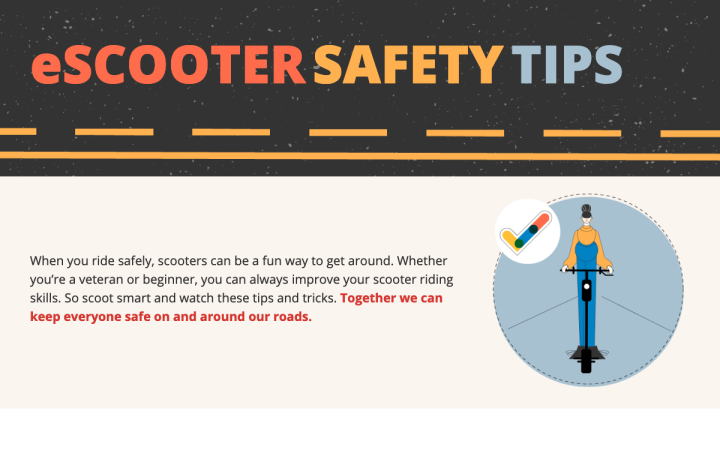
eScooter Safety Tips - Utah Department of Public Safety: A Colorful Safety Zone
This website was created by Penna Powers, a communications agency in Salt Lake City, Utah for the Utah Highway Safety Office and was part of an effort to help educate e-scooterists on safe riding practices. eSCOOTER’s website creator, Jon Manning, shared with us:
“This site seemed like the perfect opportunity to try out the Lottie Files widget. We were provided with the layered vector files from an educational video (which you can see on the page at the bottom)…Within the Lottie widget controls I set up the viewport triggers, looping limits, and the reverse looping to control each animation in different ways.”
As we can see as we scroll down the page, viewport triggers are a match made in heaven for website animations. The beauty of viewport-based interactions is that the design elements come to life based on the user’s journey down the page. Adding these triggers to each animation adds an additional layer of excitement and engagement to the effect that we as designers are looking to achieve when choosing to add a design animation to our content.
eSCOOTER also has a unique way of crafting what seems to be a simple complementary color scheme of blue and orange (various shades of each one), along with black and white. Yet, if anything, their color scheme and overall style looks as unique and upbeat as possible. The choice of color palette is based on the road sign animation which is dominated by the same shades of blue and orange used in other design elements on the site. The key to safety awareness is directing people’s attention to the rules of the road and making sure each scooter rider takes safety precautions and preparedness seriously. These design choices certainly accomplish this mission.
Design & Development: Penna Powers
Theme: Hello
Plugins: EWWW Image Optimizer, Wordfence Security, Yoast SEO
09
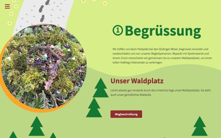
Waldspielgruppe - Düdingen: Time to Play
Waldspielgruppe Düdingen is a weekly playgroup in Düdingen, Switzerland, for children of the ages three to five, where the children go to the forest to explore nature together with other children. Seeing as they are a playgroup for kids that takes place in the forest, Waldspielgruppe Dudingen’s theme of a playful forest landscape filled with trees and flowers is a perfect fit.
The illustrated hints of the Swiss landscape of pine trees and mountains are dispersed throughout the background. We also can’t help but notice the motif of a trail that descends down the page from top to bottom, visualizing the concept of scrolling vertically down the page to see what content lies in store. Just as the playgroups take place entirely in the forest, so too, the design of the website is fully contained inside a forest theme, each section surrounded by flowers, trees, and so on.
But that’s not all in terms of experience, as the footsteps that weave throughout the site from top to bottom represent the experience a child will have when joining the playground, walking around and exploring. The grass illustration in the footer, made possible by adding a Shape Divider, gives a last and final touch of green cheerfulness, and the visitor ends his browsing experience on the forest ‘floor’, once he’s seen everything that’s planted and crawling within his environment.
Design & Development: Ivo Baeriswyl
Theme: Hello
Plugins: Piotnet Addons For Elementor, Imagify, WP Rocket, WP Sync DB, WP Sync Media Files, Yoast SEO
08
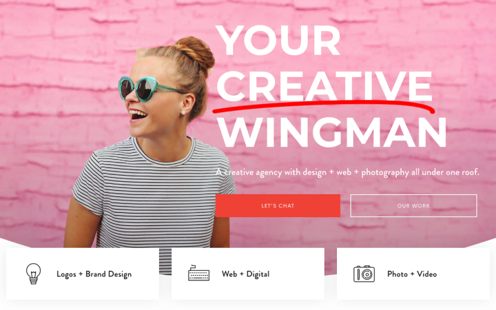
Finn and Gray: Thinking Pink
Finn & Gray is a creative design studio based in Minnesota, USA that focuses on “creating memorable brand identities, fresh web design, and striking photography”, as shared with us by Amanda Nagy, a Co-founder of Finn & Gray.
This motif of animated icons is prevalent throughout the homepage, in the row below the hero section of three icon boxes, each one representing a service that Finn & Gray provides, with an animated SVG icon that loads and unloads when hovered over. By using the animated headline widget in the hero section, the red-orange underline allows the primary button below (‘Let’s Chat’) blend in well with the surrounding pink and white elements in the hero section.
Lastly, the About Us page is yet another digital signature of Finn & Gray’s creativity, with the gradient text color for one word alone within their short paragraph description whose other letters are solid white. Applying the red-pink gradient to the words ‘Connect’ and ‘Converts’ is surely no coincidence, as those are their two keywords for what their mission statement is all about: creating a relationship with customers, to form a connection that leads to conversion.
Design & Development: Amanda Nagy
Theme: Billey
Plugins: Breeze, Classic Editor, Elfsight Instagram Feed CC, Google Analytics for WordPress by MonsterInsights, Insight Core, Slider Revolution, Super Forms – Drag & Drop Form Builder, Super Forms – Mailchimp add-on, UpdraftPlus – Backup/Restore, Yoast SEO
07
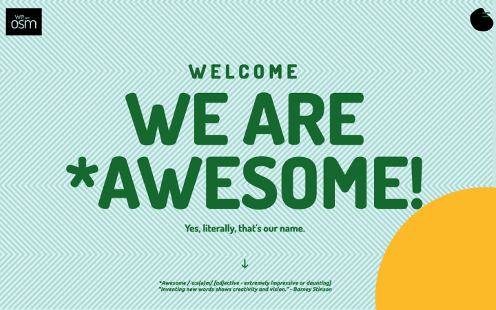
OSM: Visualizing Awesome
OSM is an international software development company in Belgrade, Serbia that provides development, design, IT support, and maintenance services for clients. Jovan Lakic, Senior Graphic Designer at OSM, shared with us that they used Elementor for their new website design which is part of their new rebranding.
Using Elementor, OSM shared that they “built a new platform for our content from scratch.” This included structural changes to the website, and a unique color scheme where each of their services on the Services page is characterized by its own color and pattern.
OSM found a truly creative way to take the Gallery widget to the next level. Using the multiple gallery mode to enable interactive filtering presents the gallery content as a vast, comprehensive portfolio with many work samples.
Once we proceed to the row of three columns where each box represents a different service-type, the information hierarchy is well laid out and thought through. Each H2 is sized consistently, and so too the other sections of text. The customized bullet points make each list item super legible, and the variety of border colors and the background inside each one make each column easy to focus on even among the others.
Design & Development: Jovan Lakic
Theme: Hello
Plugins: Element pack, Extras for Elementor, Jet Engine, Tricks, Tabs and Elements, PowerPack Elements, Premium Addons for Elementor, Advanced Custom Fields PRO, WPML. Yoast SEO, WP Rocket. Custom Login Page Customizer, Simple Custom CSS and JS, Duplicate Page
06
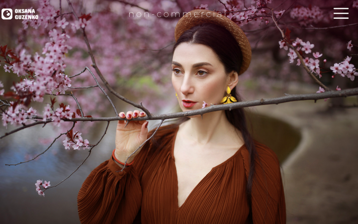
Guzimage.com is the photography website of Oksana Guzenko, a professional Russian photographer and videographer based in Vienna, Austria. Oksana has become a prominent family photographer in Vienna, with her area of expertise being photographs of “people and their unique and beautiful stories”, as shared by Pavel Guzenko, who designed and developed her Elementor site. As a designer, Pavel expressed his appreciation for Elementor, particularly for its flexibility and nice features, and continuous releases of new features.
One personal favorite of ours is the design of the navigation menu. The navigation sidebar we see here, which is, by the way, only visible on the pages that aren’t the homepage, is actually an Elementor Popup. The popup’s expanded view is basically somewhat of a miniature version of the homepage sections’ thumbnail videos, but in static image format.
Drawing this parallel between your homepage and your navigation menu can really enhance user experience. This way, your navigation menu is reminding the visitor about the many pages available to him in your homepage, so that he maintains interest in your site content and proceeds to click through to your other pages. How’s that for lowering your bounce rate?
Design & Development: Pavel Guzenko
Theme: Astra
Plugins: Autoptimize, Cookie Notice, Google Analytics for WordPress by MonsterInsights, LoftLoader, Official Facebook Pixel, Smash Balloon Instagram Feed, UpdraftPlus – Backup/Restore, User Profile Picture, Yoast SEO
05
AVIAJA DANCE: Visual Simplicity
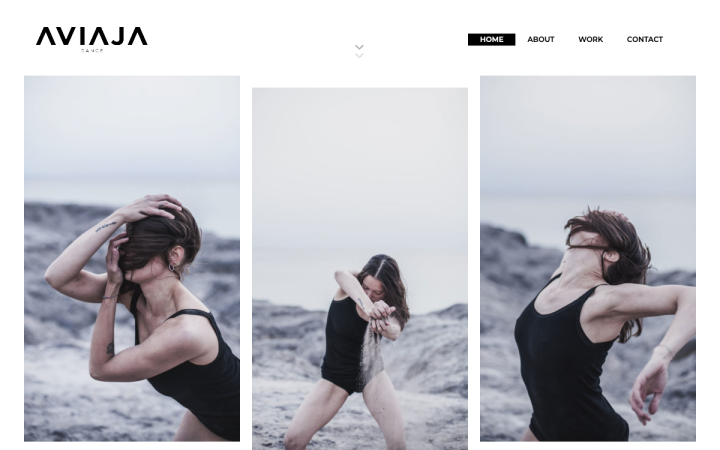
AVIAJA Dance is a young contemporary dance company founded and led by Sarah Aviaja Hammeken, based in Copenhagen, Denmark.
What makes AVIAJA unique as a dance company is that their usage for visual art is not exclusive to designing their website. Their dance performances aim at “captivating its audience through visually stunning stage art with strong morals and a clear message, questioning society in both a local and global context.” The design and development of AVIAJA’s website was done by Ena Kurtagic Granulo, who shared with us that AVIAJA’s brand identity is centered around their logo, “using the letter A in different ways and with different purposes: as a graphic element, icon, arrow, button etc.”
One of the most unique details that we noticed in AVIAJA’s site are the customized effects added to the navigation menu. If you pay close attention to what happens when you hover over any of the navigation menu items, the item text becomes white and gets highlighted in black, but the page you are currently on still remains highlighted.
Another profoundly impressive theme that runs through the entire homepage is the multiple ways in which the logo’s icon is used. In various sizes and directions, the A from the AVIAJA DANCE logo is used as the page’s hero image, as navigation buttons under text paragraphs, and as decorational design elements throughout the page that move as you scroll through their position. This scrolling effect of the rotating A corresponds well with the video clips of Sarah Avaja Hammeken dancing in a wide open space, parallel to the width of the page.
This is all bearing in mind that the A icon from the AVIAJA logo is the initial of Sarah’s name, so the logo and the branding really are an organic extension of her fundamental identity.
Design & Development: Ena Granulo
Theme: Hello
Plugins: Smush, Rank Math Seo, Ithemes Security, Wp-Optimize, WPS Hide Login, Complianz
04
Jason Blackeye: Mountains of Creativity
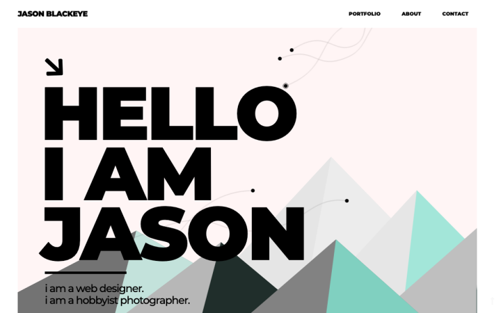
Jason Blackeye, a Content, Graphic and Web Designer based in Greece, shared his experience with us about how he uses the Lottie widget in his personal portfolio site:“I was familiar with Lottie animations long before Elementor Pro added it as a feature. I used to add them with HTML inside my design, but it was not always so perfect. Now with the widget, everything now seems perfect. I have put four Lottie Animations inside my personal website and have added hundreds more to my clients’ sites and it is all running so smoothly. My next stop with Lottie is to design my own animation”
The curved lines extending throughout the hero section give each visitor the same impression upon their arrival: this is the portfolio site of a modern, trendy web designer who knows how to work with special effects. From a geometric standpoint, the rounded curves are a good counterbalance with the bold, capitalized letters of Roboto font, with its geometric, mechanical style.
The rotation effect (as part of a motion effect) used on the ‘WORK’ section, triggered by user scrolling makes his UI screenshot just that much more engaging. Beside his UI screenshot, where Jason lists the different tools and skills he used for this project, the fade in animation effect added to each progress bar creates a sense of success and achievement, not to mention engagement.
Design & Development: Jason Mavrommatis
Theme: Hello
Plugins: Activity Log, Advanced Custom Fields PRO, All-in-One WP Migration All-in-One WP Migration FTP Extension, Code Snippets, Flying Page, Google Analytics for WordPress by MonsterInsights, Google Authenticator, JetElements For Elementor, JetMenu, JetReviews For Elementor, JetTabs For Elementor, JetTricks, Official Facebook Pixel, WP Mail, SMTP, Yoast SEO Premium
03
Four Pillars Studio: Scrolling Reimagined
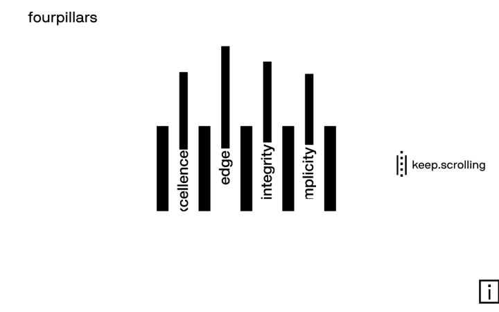
Fourpillars is a design agency based in Athens, Greece. It’s safe to say that fourpillars’s website takes scrolling effects to new heights.
Starting from the top, as you begin scrolling downward, the four vertical words that represent their brand messaging start to descend, revealing the complete word as initially you can only see the beginning of each one and not the full words. The user journey of the site is dominated by the morphing illustrations formed by the four lines and five squares that continuously jumble around to form new illustrations.
Next off, as you keep scrolling down, the logo morphs into the four words that were at the top center when the page initially loaded. Not all at once, of course, as the word keeps changing as you scroll down. This is possibly one of the most creative usage of scrolling effects that we’ve ever encountered.
Did you notice that once you arrive at the star shape, and the illustration splits into two sideways ‘T’s with a square in the middle, you find yourself inside a game similar to knock-hockey? This is yet again another type of animation and scrolling experience that we’d definitely call one of a kind. We love the playfulness and interactivity that it adds.
Design & Development: Ioannis Fetanis, Lefteris Eleftheriades, Spiros Xenos
Theme: Hello
Plugins: MouseWheel Smooth Scroll, Page scroll to id, Safe SVG, Tumult Hype Animations
02
Studio by Instinct: Welcome to Animation
Instinct Studio is a design studio that specializes in design and social media management services. The studio was founded as part of an initiative by the Instinct School of Visual Arts, considering themselves to be a technology-driven studio. Instinct Studio’s site designer, Abhilash Shrivastava, shared that the look he was going for when designing the site was clean and simple blog layout, which is definitely prevalent as you scroll down the homepage.
The studio uses Elementor Pro which allows them to embrace Elementor’s latest new feature: the Lottie widget, which Abhilash shared that he “used it to its fullest potential” when designing the site.
There are many unique design elements within Instinct Studio’s site. The visitor is welcomed by a fast-paced video background, set to 100% width with position set to ‘absolute’. The next two sections on the page have a sophisticated way of combining two ways of presenting Lottie animations:
- Hover Effects
The vector graphics in each of the four icon boxes look static at first, but once you hover over any one of the four, a rounded border with shadow effects appears, and the icons are set to ‘play on hover’. This is a fine way to use Lottie animations without making your page have too much movement at first glance.
2. Looped Animation
What really caught our eye with the next two-columned section that has a Lottie animation on the left and a Contact Us form on the right is just how original the SVG animation is. It’s almost completely black and white with two shades of dark red, but the looped detail of the steam rising from the cup, in parallel to the dipping of the tea bag, demonstrates such a high level of design skill and creativity.
Design & Development: Abhilash Shrivastava
Theme: Billey
Plugins: WooCommerce, Hide my WP, Jetpack, Mailchip for WooCommerce, QuForms
01
Sunday Studio: Every Detail Counts
This bold and beautiful website was built by Sunday Studio, a branding and design studio based in Manila, Philippines. Sunday Studio provides core services such as branding, design, digital and web, as well as content development. Their mission statement as a studio is to “create brand experiences that people can resonate with and root for”.
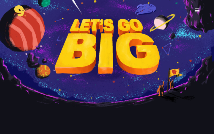
What caught our eye about Sunday Studio’s website was the scrolling effects on their homepage, as well as their overall color scheme. They really took the traditional and versatile Hello theme and transformed it into a lively, loud and dominant appearance with cutting-edge scrolling effects. If you notice, hovering over the homepage background, a detailed, 3D illustration of outer space, causes the planet visuals to move around. The adjusted angle of the hero text gives the visitor a sense that the website is directed upwards, towards the open-ended, deep blue sky. There is definitely a tone of soaring and flying upwards to discover things you’ve never seen before.
Scrolling down the homepage tells a story, as each ecosystem that is illustrated has subtle animations, triggered by the user’s scrolling activity. What’s more is the experience of the colors transitioning between ecosystems. The midnight blue gradually morphs into black, which morphs into dark pink, then orange, and so forth. Essentially, the vertical journey down the homepage tells a visual story of many different elements flying in the sky: parachutists, hot air balloons, butterflies, frogs and swimmers, fish, gold diggers, and so on.
At the very bottom of the page, the looping animation of the gold digger’s headlight sliding up and down to illuminate the goldmine is a profoundly unique, impressive animation that really takes the cake.
Design & Development: Sunday Studio
Theme: Hello
Plugins: ACF, CPT UI, Gravity Forms, Yoast SEO, W3 Cache, Wordfence, WP Smush
Think your Elementor-based website or landing page should be featured in our next Top 10 Websites column? Give it a shot!
