Table of Contents
Web creators and business owners alike know how crucial it is to solidify their brand identity, with the ultimate goal of building a presence that resonates with website visitors and clients alike. Brand guidelines are certainly the ticket to consistent, powerful branding, and there’s no better place to look for inspiration than at breathtaking brand style guides done by design experts themselves.
What Is a Brand Style Guide?
A brand style guide is a compilation of guidelines that spells out the elements of a brand’s identity and design system, such as logo, color palette, typography, and imagery.
The role of a brand style guide is to serve as a reference for designers, writers, and content creators alike for how to represent the brand in the design assets and content they create. While different brands have unique and individualistic ways of how they craft their style guide, their goal is uniform: to ensure brand consistency and clarify what they stand for.
In this post, we’ll explore seven prime examples of brand style guides across a variety of disciplines, all of which inspire us as web creators in our ongoing mission to improve our own brand identity when designing websites, visual assets, and brand content at large.
Style Guide Template
Need a starting point? Our Style Guide Template will get you started in no time; it includes examples of how to use:
- Logos
- Fonts
- Colors
- Buttons
- Icons
1. Skyscanner
Skyscanner’s brand style guide struck our attention for a bunch of reasons. For starters, it’s always inviting when a brand opens the forum with brand transparency, as Skyscanner does by stating the idea and theme behind their rebranding process in their style guide homepage’s hero text, which reads “A new look and a bolder outlook”.
Layers of Logo Design
From our perspective, one of our most favorite things about Skyscanner’s brand style guide is the way they illustrate their brand personality, by specifying the thought process behind their brand assets. For example, exhibiting the formation of their logo design and how it combines four illustrations, each one symbolizing a different brand value, and how they morphed these four graphics into one cohesive illustration.
This logo design process as depicted by Skyscanner can actually be considered a case study in the outcome of the brainstorming and rounds of iterations that make up the process of designing a brand’s logo from scratch.
A best practice in logo design is to draw sketches of various images that illustrate and symbolize what your brand represents and eventually to produce a final logo that combines these different ideas. If you look closely, you can see that the semi-circle in both the “Optimism” and “Ideas” images is combined with a derivative of the downward “Destinations” arrow. Given the circular nature of Skyscanner’s new symbol, the “Sustainability” globe is also incorporated into their finalized symbol.
Color Palettes With Character
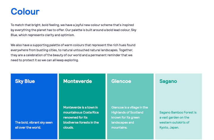
What’s truly unique about the way Skyscanner compiles their color palette is that they take the atypical route. Instead of showing a color swatch of each color with their respective HEX and RGB values, Skyscanner shows the name of each color as well as a short description or definition of what that color represents to them as a brand.
By doing this, Skyscanner’s color palette becomes more than just a technical index that represents their brand’s visual identity; it goes one step further, and shares how each of their color choices relates to their brand identity and personality.
We also noticed that each color swatch actually represents a country which people can travel to (ideally using Skyscanner to plan their itinerary), and that the primary brand color of Sky Blue encapsulates the concept of worldwide travel that knows no boundaries.
2. Mozilla Firefox
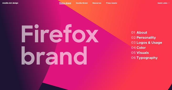
Among its many strengths, what was particularly impressive to us about Firefox’s style guide is how effectively it communicates Firefox’s brand personality. In essence, this visual representation of Firefox’s brand personality in their style guide is living proof to the very voice and tone and brand identity that the guide’s content describes and visualizes. We see this correlation as prevalent in several branding elements, such as the color palette, voice and tone, visuals, etc.
Brand Personality: Bold and Beautiful
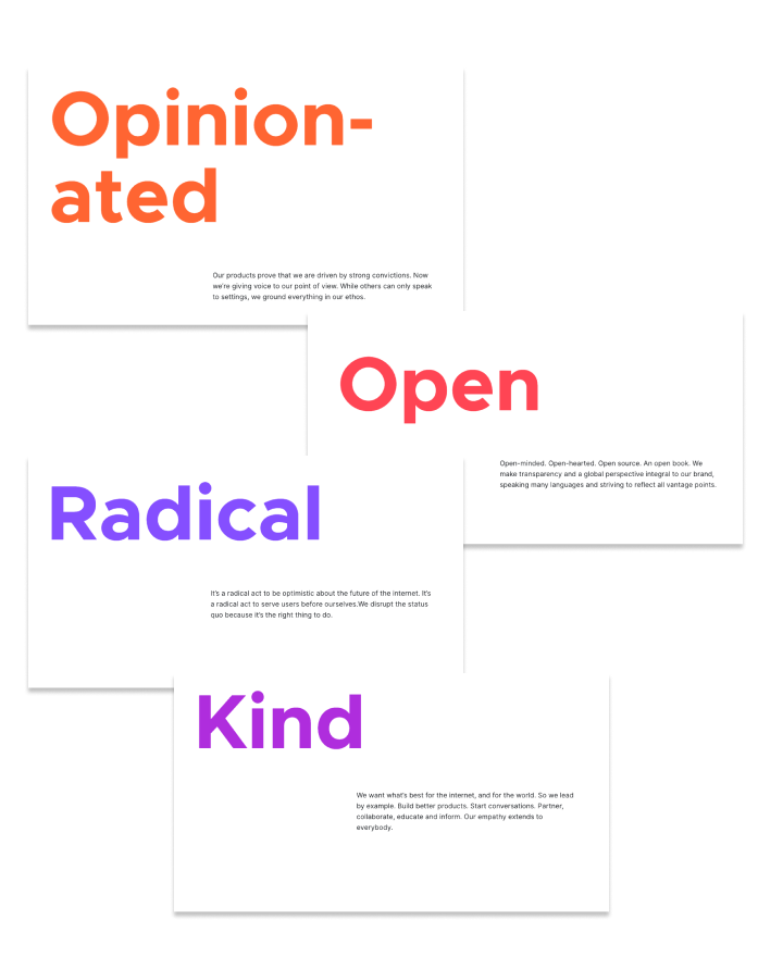
Firefox spells out the characteristics of their brand personality loudly and clearly, with the bold confidence that they account for themselves as a brand. They’re opinionated and they know it, and are proud of their openness, radicalness, and are confident about their kindness.
But it’s not only the words that they use or the large font size that they use to make these bold statements. The brand colors which Firefox uses speak for themselves. Their analogous color palette of deep purple, dark pink, bright orange and bright red are visual expressions of the very words that Firefox spells out in their Personality section.
This is where color psychology comes into play. As they accounted for themselves, red is bold and attention-grabbing, orange represents creativity and adventure, purple is royal and extravagant and pink is loving and playful. These color choices definitely match up with the descriptive words that Firefox uses to characterize their brand personality.
Voice and Tone: Transparency Is Key
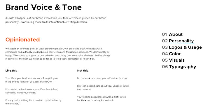
Firefox’s voice and tone is merely an extension of their brand personality, which is, if you think about it, true for human personalities as well. For as individual people, our voice and tone is a verbal expression of our existential personalities.
They’ve also chosen a super creative way to exemplify what their tone of voice is like in relation to what it is not like. On the whole, what’s interesting is that they approach the brand voice section of their style guide as a way to qualify the brand personality that they’ve reflected upon earlier in the guidelines.
3. Fisher-Price
The legendary brand of Fisher-Price has certainly needed to rethink their brand strategy and style guide since…way before brand style guides existed. Dating back to 1930, Fisher-Price’s mission statement has always been to create toys that “appeal to the imagination, and that do something new and surprising and funny.”
Over the past 90 years, Fisher-Price has had to repeatedly recreate and recalibrate their brand strategy according to rapidly changing market trends and audience interests. But somehow, they’ve managed to maintain loyalty to their original brand values, despite the stark differences between generations of children and their parents or caretakers buying them their treasured toys.
Brand Voice: “Let’s Be Kids”
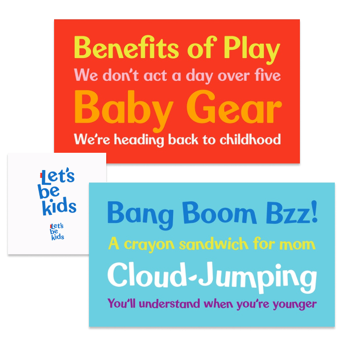
Fisher-Price communicates their brand values with both wording and graphics that evoke our inner-child, with their bright, jovial brand colors and playful, care-free choice of words. It’s clear that their brand, as well as their brand voice, are rooted in the value of play and the opportune, once-in-a-lifetime experience of being a kid.
We see a categorical difference between the red graphic and the blue graphic. The declarative and descriptive sentences that they use to share what they’re about, “We don’t act a day over five” and “We’re heading back to childhood”, create a personal connection between them as a brand and us as the ones experiencing that brand.
The blue graphic is all about imagination, and sensational experiences that invite us to unleash our creativity and go soaring: “Bang Boom Bzz” and “Cloud-Jumping”, for example, that resonate with children who are looking to surround themselves in a world of imaginative play where they create a self-made environment of unlimited fun and laughter.
Typography: Never Stop Playing
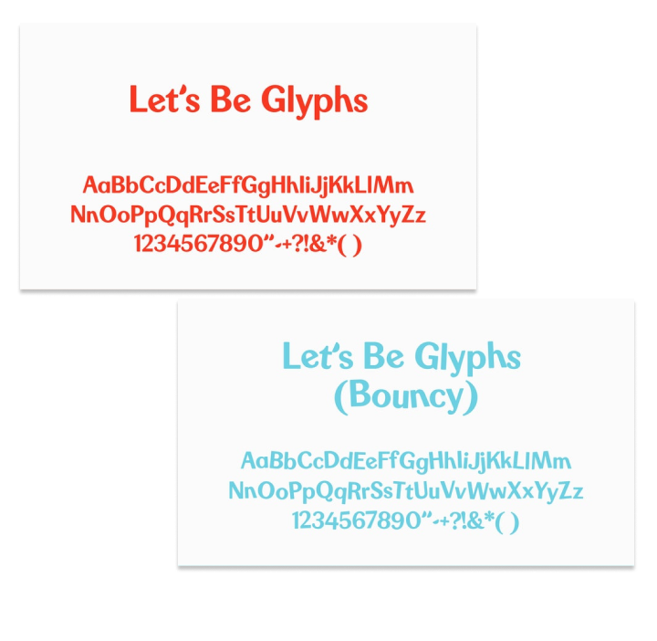
We’ve seldom come across a choice of typography, whether it’s a custom brand typeface or not, that has the two variations as created by Fisher-Price: a regular version and a “bouncy” version. Fisher-Price created their own typeface which they named “Let’s Be Glyphs”, sticking to their characteristic language of “Let’s Be Kids”, an inclusive way of saying “come and play”.
The brand’s choice to create a “bouncy” variation of their typeface attests to their creativity of how to communicate with children, so it’s no wonder that they’ve been one of the world’s most popular and successful toy manufacturers for 90 years.
4. Waze
As we mentioned earlier, brand transparency is truly a virtue when it comes to a product’s branding and community building. The choice to be transparent about your brand decisions and design thinking builds user trust, brand confidence, and a positive rapport with both existing and prospective users. We especially appreciate the way Waze has shared their rebranding process with us, as we at Elementor are soon embarking on a comprehensive company rebranding. Stay tuned.
Rebranding: “Block by Block”

In their brand guidelines, Waze shares their rebranding process step-by-step, where they elaborate how they’ve “refreshed their brand identity” into a new phenomenon:
“A universal system that enhances the platform’s collaborative spirit and provides a better experience on the road. The identity updates the iconic Wazer symbol, introduces a set of new “Moods” that help users more authentically express themselves within the app and streamlines the platform’s signature use of illustration. The system introduces a colorful visual language called “Block by Block” that is inspired by the modular design of the city grid, roads and streets.”
Given that as a product, Waze is a crowdsourced community where drivers help drivers find their way around the world, it makes perfect sense that their brand language and collective design elements are centered around the theme of navigation, and building structure with an exclusive block-like (or you can also call it grid-based) design.
Iconography: Goodbye Flat, Hello Filled Outline
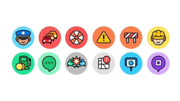
While we do indeed love both icon styles, meaning Waze’s previously used flat icons, as well as their new filled outline icons, they shared that the filled outline style is more aligned with their new brand identity.
From a UX perspective, using filled outline icons in place of filled-in icons has actually proved to positively impact task performance. With outline icons, it is easier for users to recognize and select icons when they are outlined rather than filled.
From a branding perspective, Waze shared that “the simple shift of all of them now having black strokes makes them a more cohesive set and they now look much better integrated with the Wazer icon.”
5. WeWork
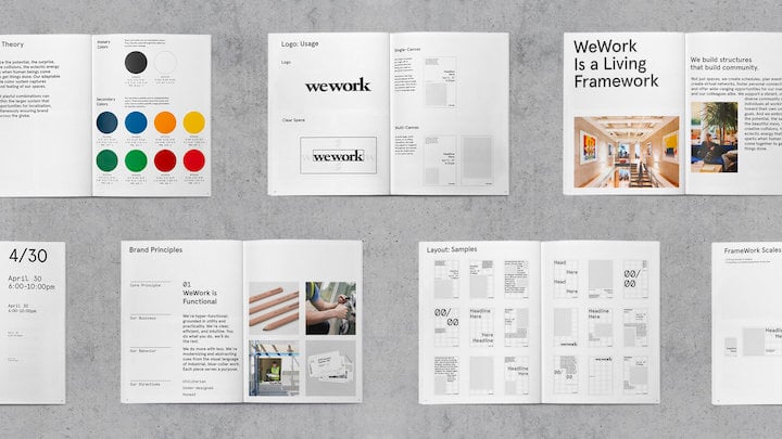
The essence of WeWork as a “product” is physical gatherings and social interactions that take place within a physical space that the company builds for their users. In this regard, it makes perfect sense that their branding, be it their style, their brand values, or their design language, is a robust, cohesive set of principles that can be applied to architecture, community ethos, and of course, visual design principles.
If you’ve been to one or more WeWork locations around the world, even though their locations across the globe amount to a whopping 848, the interior design style that’s used in every WeWork is actually incredibly uniform, all following a similar layout and design style.
Different to your usual brand that may either be consumer packaged goods or a digital brand such as Waze, WeWork has mastered their need to be a powerful, remarkably consistent brand. This is no small feat, as there are so, so many areas that their branding needs to cover: arts and letters, marketing materials, digital assets, architecture and interior design, brand values and personality, and so much more.
Design System: Consistency Is Key
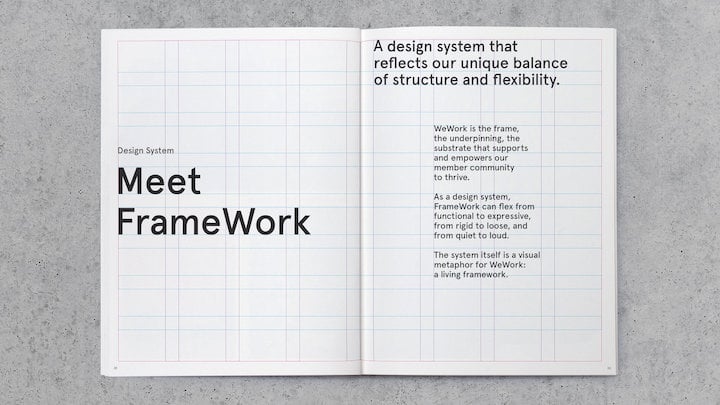
The value that any brand can find in creating their own design system is, as we see it, indisputable. It makes perfect sense that a company such as WeWork would see creating a design language of their own as a strong incentive to their success.
In terms of visual design, WeWorks brand assets and design elements also follow this principle of balancing structure and flexibility. While their primary brand colors are black and white, as you scroll through their style guide, you’ll come across almost every color in the rainbow.
Their visual assets, be them digital, paper, and so on, abide by a meticulously structured layout which dictates column width, margins, and information architecture. They call their layout guidelines “Snap-to-fit”, characterizing it with how its “layout and hierarchy can be restructured nimbly and efficiently. WeWork represents the frame, the underpinning, the substrate that supports and empowers the content, members and communities to thrive.”
Brand Values: People All Over the World

Bearing in mind that WeWork locations are found all over the world, the people that fill up their coworking spaces all speak different languages and dialects. Nonetheless, their locations are remarkably consistent with each other, despite being in different cities, countries and continents that would in theory find it a challenge to identify commonalities with one another and share a common language.
The tightrope that exists between crafting a brand, both physical and visual, that people of all cultures and walks of life are drawn to, is thinner and narrower than we can imagine. Nonetheless, WeWork, identifies and embodies values that resonate with a wide spectrum of humans that only gets wider by the day. It is precisely the investment in carving out well-defined brand values that allows an international company such as this to thrive without borders.
6. Copper
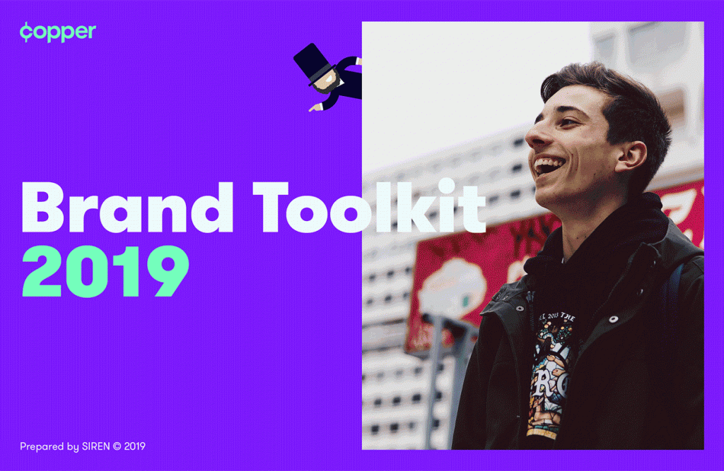
Copper is unique as a brand in that it caters to a highly-defined target audience: teenagers who are learning to make financial decisions. Copper’s product is a mobile app and a debit card that lets teenagers receive money from other people, whether family or people they do work for, and they can also transfer money to friends, etc. Their value proposition is to lay “the path to financial freedom being rooted in a solid education.”
Target Audience: Finding the Right Mindset
Copper’s mission statement is to bridge the gap between young teenagers and adults who need the knowledge and experience to make responsible financial decisions. It is therefore very logical to understand that their brand identity (in this instance, represented by their brand name and their logo), is a visual fusion of multiple concepts: the traditional copper penny coin, the history of Abraham Lincoln, one that teenagers will have learned about in their American History classes, transformed into a modern, upbeat illustration with a bright purple surrounding and a friendly avatar.
The goal of the brand, as we see, is to help teenagers make that transition from what they learn (either in the classroom, or by informal educational tools such as the Copper app), and executing it in the here and now, in a setting and style that suits their lifestyle.
Taking a historical figure such as Abraham Lincoln, whose picture is hammered into every American penny, and adapting the man on the coin into a trendy, modern-day avatar is a spot-on way to connect to Copper’s narrowly defined target audience. This shows us that while smaller target audiences may indeed be challenging, since you’re narrowing your pool of potential customers, when you have a precise approach that can really resonate with that audience, you’re bound to be in good shape.
Illustrations: Maximum Engagement
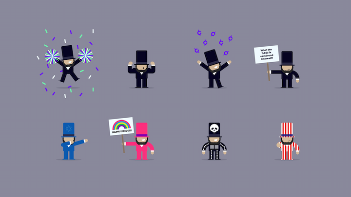
What Copper calls their “Abe illustrations” is what we consider to be a way to maximize the potential of your brand’s imagery and illustrations. Advancing past their graphical adaptation of Abraham Lincoln’s picture, Copper creates eight additional avatars that represent Lincoln doing a variety of activities.
This extends Copper’s brand identity to take their engagement one step further, and integrate the Abraham Lincoln imagery into different processes and user journeys within the app. The parallel between the mature, adult-like skill of financial management and engaging, youthful avatars represents exactly what the app users’ experience should be: transitioning from youth to adulthood in an educational, positive framework.
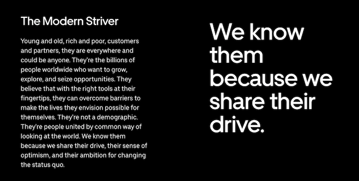
7. Uber
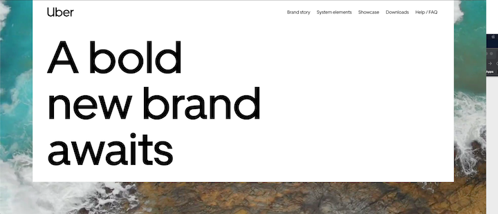
Uber, the world-famous ride-hailing brand, finds multiple ways to set their style guide, especially their brand story apart from the crowd. In their section called “System Elements”, for example, they dedicate a lot of their discussion to their spacing and layout specifications, as well as to photography composition. In general, Uber goes into great depth about the design principles they’ve created and follow when creating and using their visual assets.
Brand Statement: What We’re All About
A brand statement is a written mission statement about what your company was built to create and achieve, what your vision is, and what challenges you aim to solve. When reading your brand statement, people will understand what makes you unique and how your personality will affect the experience you create for them.
You can think of a brand statement the same way you would think about marketing your product. What we mean by this is just as a product’s website contains a short heading (usually an h1 in the hero section of its homepage), stating the value proposition and added value of its product, the same method can be applied to crafting your brand statement.
Essentially, you’re portraying your brand as a product in and of itself.
Value Proposition: Our North Star
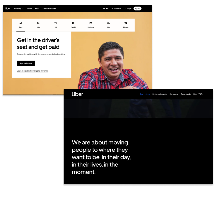
If you compare the two h1 headings on both the Uber homepage and the Uber brand story homepage, both sentences are stating the added value that the user will experience, both from the brand perspective and from the service (product) experience, respectively. This is precisely the kind of information that we as a brand built for web creators and designers believe in communicating in a brand style guide.
At the end of the day, your value proposition is your north star, and every component of your brand and your mindset looks to it for guidance. This is true for a brand as a product, as well as a style guide as a product.
When communicating your value proposition, you want users to understand what your brand’s goals are in terms of what you’re executing. When crafting your style guide, the primary medium for communicating who you are, you want users to internalize what your identity is about and how you want to be perceived.
8. Instagram
As an icon in the world of technology, Instagram’s brand style guide is nothing short of perfection. With their use of the glyph , Instagram has been able to convey a bold and exciting story, through the lens of their minimalistic, monochromatic logo.
Since Instagram’s launch in 2010, they have done a tremendous job, adapting their creative profile to an ever changing global audience. Now one of the top five worldwide social media, Instagram has been successfully conveying a consistent tone of voice, focusing on allowing its users to continue to capture and share the world’s moments through their own personal lenses.
9. Spotify
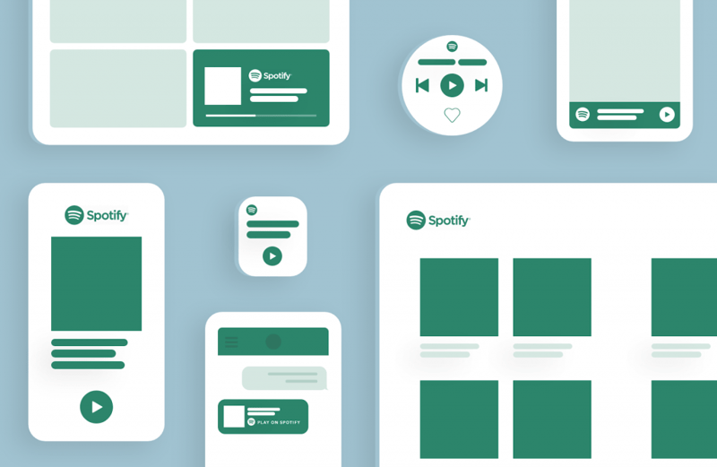
Spotify, one of the leading platforms in music streaming, has consistently maintained a clean aesthetic. From its inception in 2006, throughout its meteoric rise, Spotify has made tremendous use of various shades of green to convey a connotation of status and superiority within the music streaming industry.
10. Netflix
Netflix has always utilized its logo as a way to establish dominance within the video streaming industry. A brand that pushed out the likes of Blockbuster over the 2010s, and established itself as the dominant player in video streaming, Netflix has become an iconic household name, on par with the likes of Google and Apple.
When it comes to their use of bold primary colors like red, and all caps logo, Netflix has been unflinching in their effort to create a brand known for unparalleled service at an unbeatable value.
11. Apple
Apple’s brand style guide is nothing short of an extension of the connotation we all attribute to this long-standing, and highly demanded consumer electronics brand. From the original iPod to the newest iPhone, Apple has successfully created possibly the most popular monochromatic logo of all time.
One of the most well-known brands in the world, Apple has maintained its iconic brand style for decades and this shines through within their brand style guide. Their iconic apple logo has been a shining beacon for the brand, which has provided some of the most sought-after products in the world.
12. Medium
The Medium logo and name are important expressions of their overall brand identity and have been carefully designed and constructed to achieve visual harmony. Originally created as a virtual publishing platform, Medium’s mission is to provide readers with the ability to find undiscovered voices and share their writing on any topic.
Their brand style guide is a true reflection of how they view media, and the position they play in providing a platform that offers freedom of expression. Their style guide is of course a reflection of this and demonstrates a clear, clean, and simplistic format that almost seems as if it’s giving a nod to the origins of printed text.
13. Airbnb
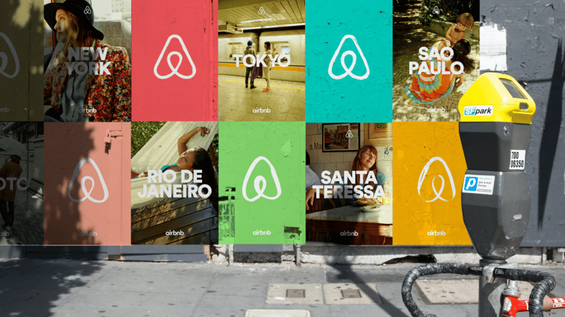
A brand built on providing the world with comfort and a feeling of home regardless of where they end up, Airbnb has become a disruptor in the world of travel with an innovative accommodation model.
With a business model like this, you would expect their use of color, texture, and design to match, and that’s exactly what we see. Airbnb has made use of a wide range of design elements to express their unique voice, and it’s something that’s clearly prevalent throughout their style guide.
14. Slack

Designed to be the only business networking and engagement application you’ll need, Slack has defined its unique voice as the ultimate business tool in a clear manner through its brand style guide.
With their smooth curves and frequent use of bright colors, they have brought a pop of excitement into what has typically been a monochromatic, lackluster industry.
15. New York Transit Authority
Possibly one of the most influential and under-appreciated style guides in history, dating as far back as the early 1950s, the New York Transit Authority has created an iconic masterpiece, providing a guide to a major part of what makes New York, well…New York.
If you’re looking for a more nostalgic guide that will transport you back to New York, “Fuhgettaboutit” because this is it! Created as a manual to describe the design and construction for the iconic NYC subway signs, which are still seen and used today, this style guide above all, provides a beautiful and more importantly, a priceless piece of design history.
16. Zendesk
Zendesk, a company built on providing best-in-class customer support software, has put a fun spin on what some refer to as a dull industry. Their brand identity is truly unique and is an element of the company that is truly pronounced and expressed within their brand style guide.
A clear example of this can be seen through Zendesk’s use of shapes which they refer to as “Relationshapes”. Each “Relationshape” is made of two simple shapes and is used to reflect a different functionality or feature of the platform.

Zendesk claims that having each mark be made of two simple shapes represents “two people. They can do anything together: Talk, walk, fight, agree, annoy, support, love, and that each relationship is as unique as each product.”
17. Skype
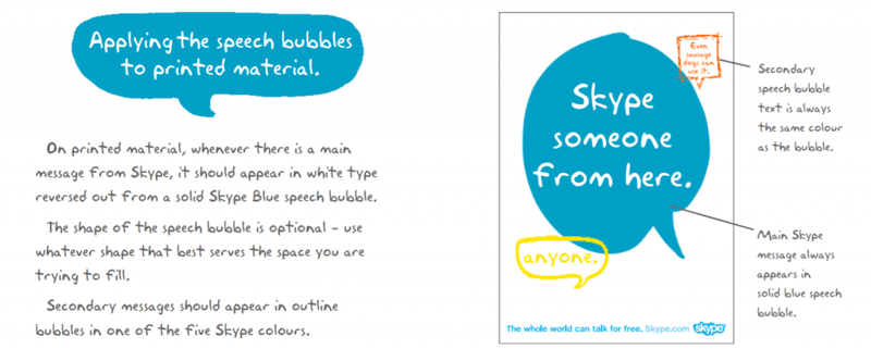
Skype is a telecommunications application focused on providing its users with video, chat, and voice calls between computers, tablets, mobile devices, and more. It offers a sort of unexpected yet refreshing approach to conveying its brand.
Laid out as a back and forth conversation in a comic strip format, Skype has used their core services of enhancing communication, as a jumping-off point for the overall style of their brand guide.
18. Fender
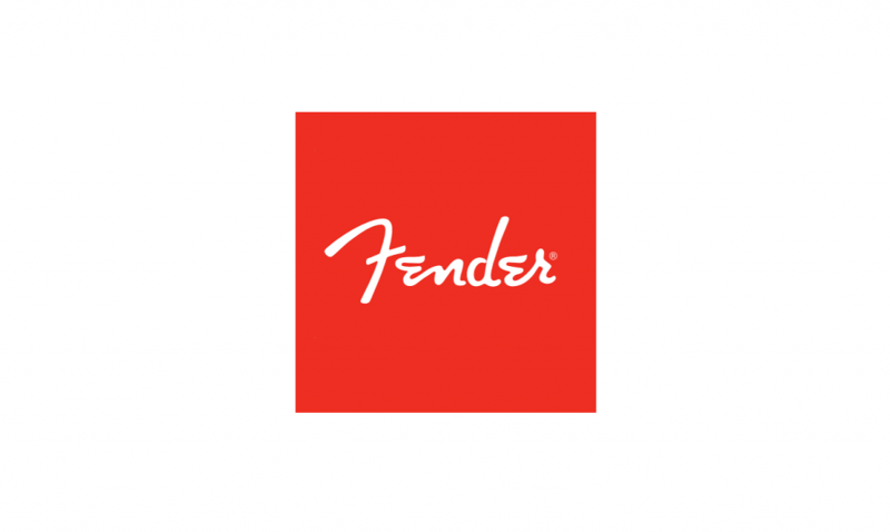
As bold and expressive as its clientele, Fender’s rich history of providing the world with the highest quality in musical products for the last 75+ years comes to life with its expressive and eye-catching brand style guide.
Their expressive logo, also known as the “Spaghetti logo”, is their iconic signature, and has put its mark on the music industry. Their use of bright red, and white colors help to represent the bold, powerful qualities of their brand.
19. ESPN
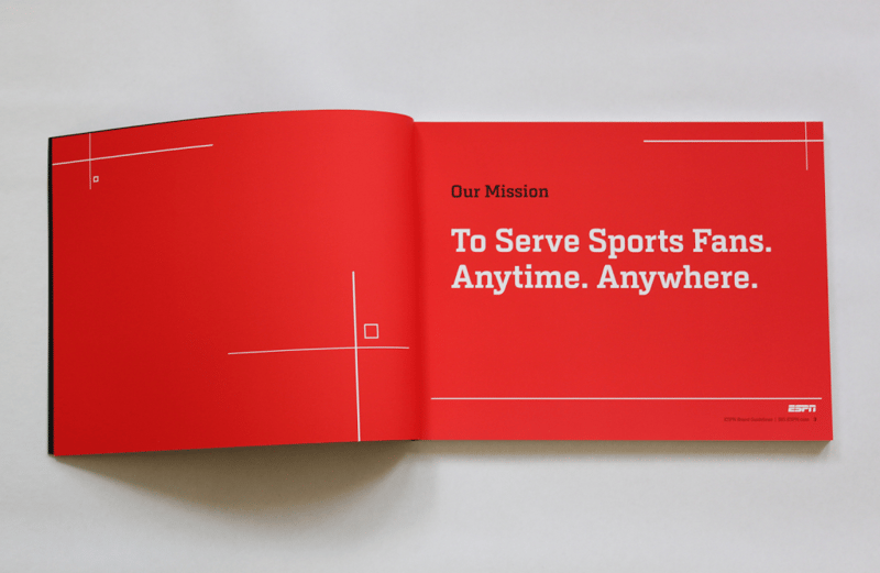
As an industry staple, ESPN has played a major role in the proliferation and adoption of all things sports. Their guide, simple and straightforward in nature, pays homage to their rich history and contributions to the global world of sports, news, print, and broadcasting.
Their brand style guide helps to provide a visual representation of the brand, and is broken up between both historical content and rules as to how to properly utilize their branding; all outlined in a sort of architectural blueprint theme.
Show Us Who You Are
Now that you have an in-depth understanding of what an up to par brand style guide looks like and includes, it’s a great time to start solidifying your brand identity by creating your own style guide. Once your website has a cohesive visual identity that is consistent throughout your site, your presence as a brand will have a much more powerful resonance.
Once you finish compiling your style guide, we’d love to see what you come up with.
Looking for fresh content?
By entering your email, you agree to receive Elementor emails, including marketing emails,
and agree to our Terms & Conditions and Privacy Policy.


