Table of Contents
It only takes a fraction of a second for visitors to form an opinion about a website. This first impression largely depends on the site’s design; striking design is far more memorable. One of the most effective ways of creating unique design is by breaking the grid.
Web designers often hear that the grid is a designer’s best friend. That’s true — the grid helps define the structure of a page. At the same time, the grid can limit creativity. In an attempt to make the layout more visually appealing, designers break the grid by using absolute positioning for elements.
For a long time, absolute positioning for elements required coding skills. Designers had to define custom CSS styles for elements that would have absolute positioning. With Elementor v2.5 this is no longer the case. Elementor introduced flexible layout — a set of advanced position capabilities that make it much easier (and faster) to create custom layouts.
In this article, I want to show how to use absolute positioning and review five layouts that use this technique to create visually compelling experiences.
Absolute Positioning in Elementor
Elementor brings web designers the magic of position absolute. The great thing about this feature is that you don’t dive into any code to create it. As an Elementor user, you can select any widget, go to Advanced, select ‘Custom Positioning’ and choose ‘Position: Absolute.’ After that, you will be able to drag the widget to any location on the page, regardless of the grid.
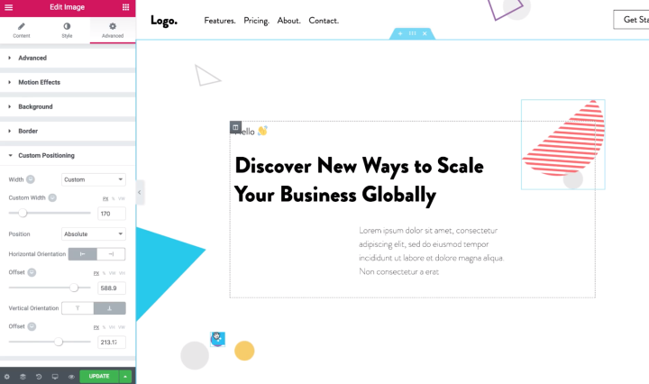
If you’re an experienced web designer, you may wonder “How does it work for responsive design?” It’s a well-known fact that absolutely positioning breaks a responsive design — if you use absolute positioning on an item and don’t adjust it for various screen sizes, you’ll end up with a situation where your item goes off the canvas. A wrongly positioned object can either not display on some screens (usually, on mobile), or it can increase the total canvas area (meaning the page will overflow the viewport, and the visitor will need to scroll through tons of whitespace).
The Elementor team is familiar with this problem and solves it by allowing designers to set a separate custom position for mobile, tablet, and desktop devices. It’s possible to use percentage, VH, VW or pixel units to position your element. They also added an Overflow Hidden control, which condenses all of the section widgets inside it and removes any unwanted scrolls.
Now let’s see how you can use absolute positioning to create a unique design:
1. The Power of Imagery
They say that an image says more than a thousand words and that’s true. Imagery is a powerful tool in a designer’s toolkit. The right imagery can give users a clear idea of what the site is all about, even before they read any text on the page.
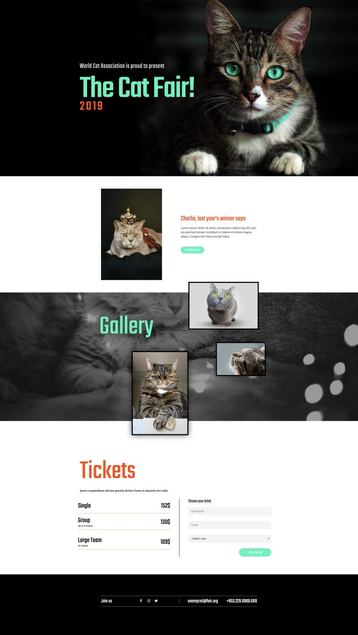
Take a look at The Cat Fair! layout. The Gallery section of this layout features a few photos of cats distributed unusually. This design decision creates visual interest and directs the visitor’s attention to the Tickets. As a result, the imagery both portrays context and adds to the user’s delight.
2. Badges
Badges are often used in product design to demonstrate attributes that the product or service has. Badges are so popular because they reduce the time required for users to understand the message.
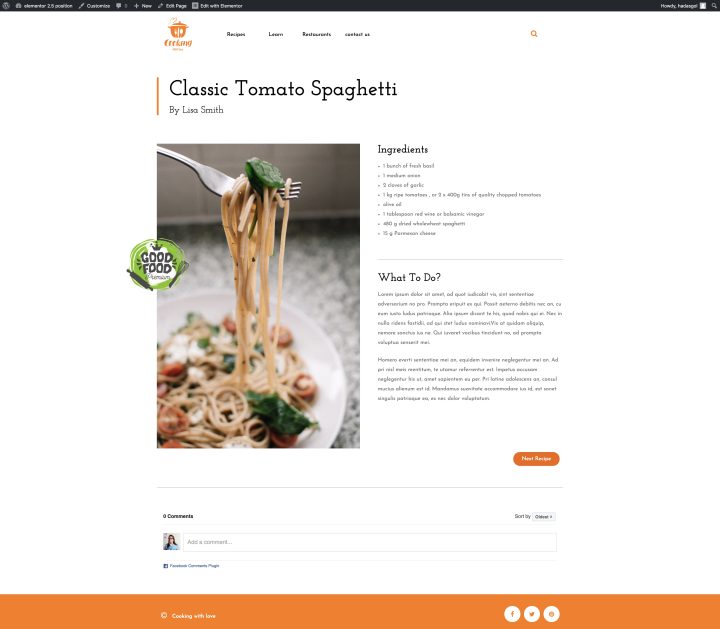
In the following example, designers chose to place the badge ‘Good Food’ on top of the image. This badge paired with the image gives users the idea of the level of quality even before they read the text on the right.
3. One Image on Top of the Other
How can you combine two separate images in one perfect scene? The answer is simple — you need to open your favorite graphics editor and merge the photos. With Elementor you can follow a much more relaxed approach.
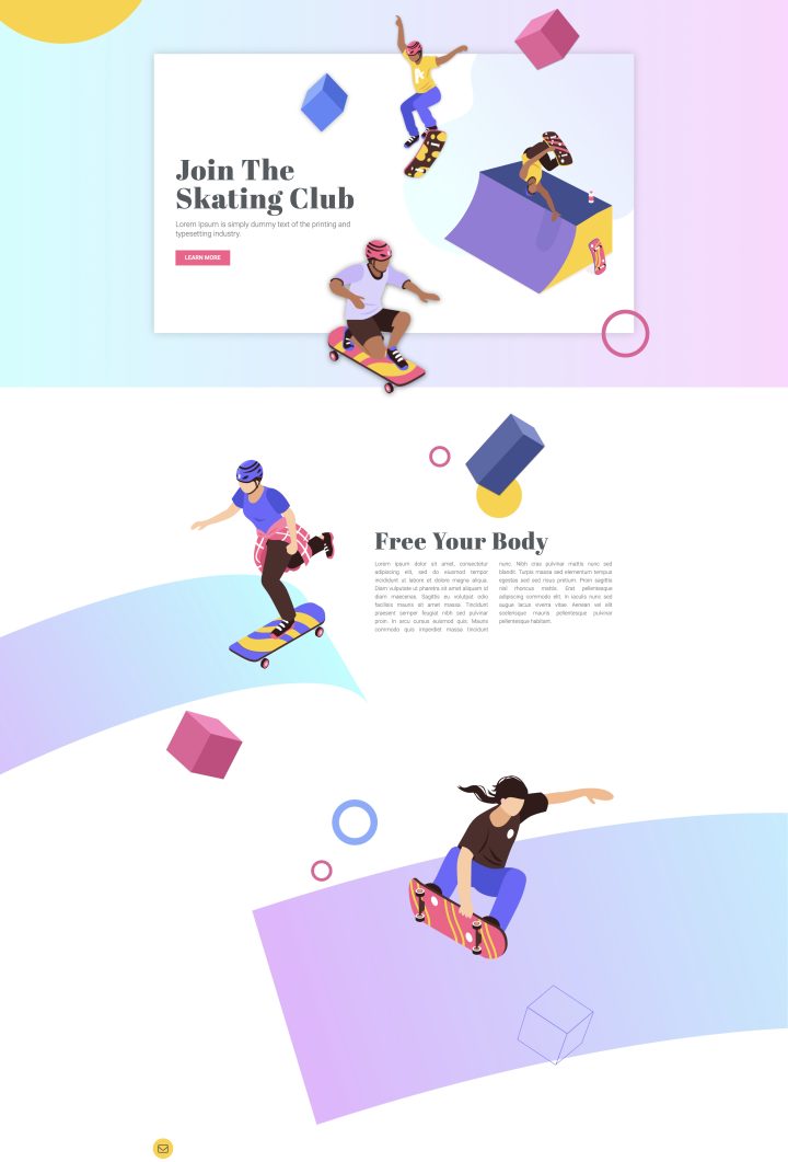
The illustrations of a skater, a ramp and a small bottle on top of the ramp you see below are not one single image. Actually, it’s a composition of three image widgets – the ramp is used as a background, while the bottle and the skater were placed on top of it.
4. Using Color as a Functional Element
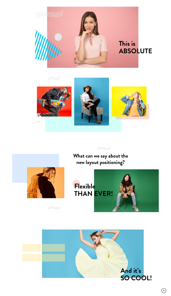
Color is a powerful tool in a designer’s toolkit. Many designers use color to create real aesthetics. However, it’s also possible to use color as a functional element – to grab or direct a user’s attention. Sometimes, designers use colors to tell a story.
In the following example, designers use vibrant colors to create an emotional bond with users. Colors draw visitors into the design and make them scroll for more. If you decide to follow a similar approach, it’s recommended to use colors from the Material Design palette.
5. The Power of Minimalism
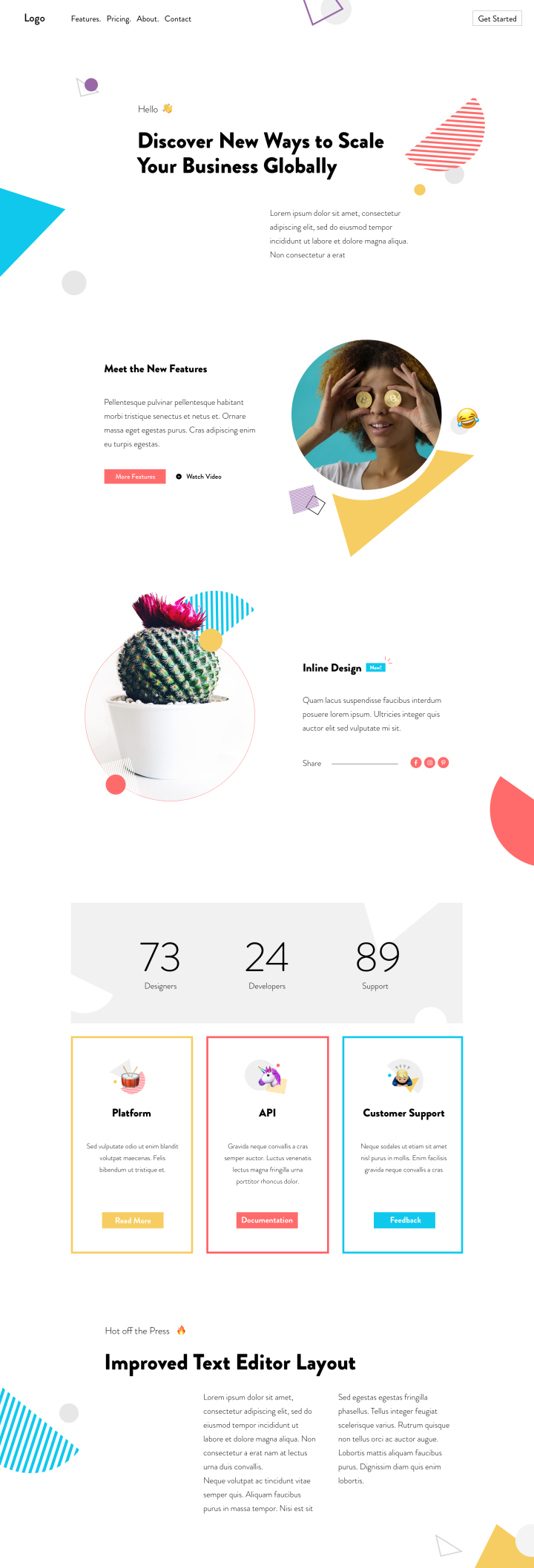
It’s a fairly common misconception, that to create a genuinely remarkable design, you have to put a lot of different elements on a page. The real power of designers lies in the ability to achieve more with less.
Check out the following example. This landing page features only the key message, which is located at the center of the screen; simple geometric shapes are distributed around the message slightly chaotically yet balanced. The artistic quality of the background makes a good impression on visitors, increasing engagement.
Conclusion
Elementor v2.5 gives designers a new superpower — absolute positioning. And this power offers much more creative freedom. But with great power comes great responsibility. As designers, our goal is to create not only beautiful but also usable designs.
That’s why the Elementor team mentions that ‘Taking widgets outside of the grid by applying position absolute has its risks since the element is no longer tied to the rest of the page structure.’ Use absolute positioning sparingly and always test how your design looks and works on different screen sizes, using Elementor’s built-in preview feature.
Looking for fresh content?
By entering your email, you agree to receive Elementor emails, including marketing emails,
and agree to our Terms & Conditions and Privacy Policy.
