Table of Contents
The relationship between user experience and website form design is an unbreakable force: a successful website form relies on a polished user experience. But how can we, as web creators, identify whether or not our website form is user-friendly? What criteria should we look to implement when building an enjoyable website form that’s easy to submit?
Understanding the impact of our website form design is not only a matter of measuring its lead generation or client onboarding successes. The most basic ingredient for a successful website form couldn’t be more straightforward: the user’s decision to complete its call to action is facilitated through a comfortable, coherent decision-making process.
But which form elements will simplify this process? How should you structure the form’s layout? How will your styling choices affect the final outcome? And lastly, what is the most impactful way for web creators to leverage their skill set and craft a form that delights visitors? This is precisely what you’ll learn in this post.
How To Know If Your Website Form Is User-Friendly
Designing an engaging website form with an attractive user interface is only half the battle. After a form lures in your user with its good looks, the user experience dictates its success. Once you identify your form’s conversion goals, how can you know whether the form you create can make those goals happen? What needs to go into the planning and design process?
How High Is the Form’s Interaction Cost?
When our goal as web creators is to build a user-friendly website form, the question we need to keep asking ourselves is: “How much effort am I asking of the user?”. The reason behind this question is simple: the more effort involved, the less usable the form. A form with sub-par usability is unlikely to deliver the results you’re looking for.
This element of usability is what UX experts at Nielsen Norman Group call interaction cost:
“The sum of efforts — mental and physical — that the users must deploy in interaction with a site in order to reach their goals.”
Our goal when designing a web form is always to reduce the interaction cost as much as possible. According to UXPin’s Marketing Director, Chris Stryjewski, one of the ways to do that is to ‘ensure consistency across all the UI components used in forms’. This is made possible by refining the UX to the best of our abilities: minimizing the number of actions and behaviors required (reading, scrolling, clicking, typing, information hunting, cognitive load, attention switches, and so on.)
But does minimizing the number of user behaviors jeopardize the amount of information you’ll obtain from those users? It doesn’t have to — as we will now discuss.
Table of Contents
Key UX and UI Considerations for Website Forms
What are the most important UX and UI considerations when building any website form? There are so many design choices to be made, how can we know what will work best for our users? Let’s break it down and simplify the design process.
#1 Visual Layouts and Design
Well-integrated website forms will feel like an intuitive component of your website UI and a natural step in your user flow. Forms that align with your website’s visual design are not only easy to notice within your site layout, but are also a seamless extension of your branding and design motif. Your website visitor should be able to find your form easily and see it as fully consistent with your brand and visual language.
Between footer forms, scroll-triggered popups, and so on, you have plentiful choices for each forms’ design and how users will encounter them. You can make these decisions based on a number of things: the sizing of your elements, your user journey, your website imagery, the goal of the popup, your voice and tone, and more.
Directly Inside the Page

Sometimes the simplest way to draw users’ attention to your website form is to place its fields directly inside your page, or even within your hero content. As we strive for as few form fields as possible (we will soon discuss this in detail), sign-up forms with one field only, as we see in creative agency Facet’s site, can cover all your form completion needs. This is especially true for email signup forms, which can be limited to one form field alone.
Footer Form
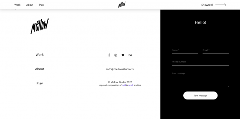
Many web creators choose to insert form fields (this could be a single field or many fields) inside their footer. Athens-based motion and sound studio Mellow uses a tall, spacious footer that provides space for many navigation elements: nav menu items, social media handles, and a complete contact form.
Designing a large footer gives you an opportune, comfortable space for a clear, engaging form. By nature, your footer appears on every page of your site, and its form gives visitors as many opportunities as possible to contact you — without your content seeming aggressive or salesy.
Popup Form
Popup forms can help your design quality and user experience in a number of ways.
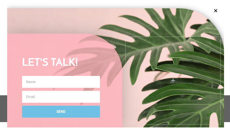
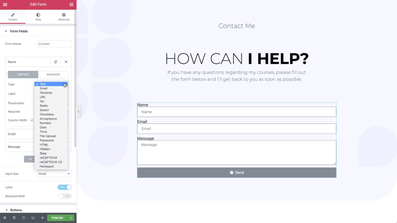
The essential goal of website popups, as shown in this Elementor popup template from the Elementor Template Library, is to make sure the visitor doesn’t miss any important information or action items. Whether triggered by scrolling, timing, clicking, or more, popups can remind users of the steps you’d like them to take before leaving your site. What’s more, is that popups give you the option to add more content to your website without affecting its design.
Form Styling and Design
Branding and marketing agency Markit achieves visual continuity between their website’s brand identity and its submission forms. The seamless navigation from the homepage to the signup and login forms becomes a holistic user journey, with identical illustration imagery and typography styles between every page and form.
This design continuity is crucial to the success of every website form: visitors need to experience your brand and design scheme from the moment your website loads, to the second their form submission is confirmed.
#2 Form Structure
The structure of your form doesn’t only mean the components inside it. There are plenty of choices and guidelines for the form’s format and structural layout, too.
With the goal of simplifying the user flow in mind, you can divide your form into one question per screen, letting users focus on the individual question rather than a collection of questions simultaneously. If you’re working with one screen only, you can use a single-column layout to strengthen the interface’s visual harmony.
One Question per Screen
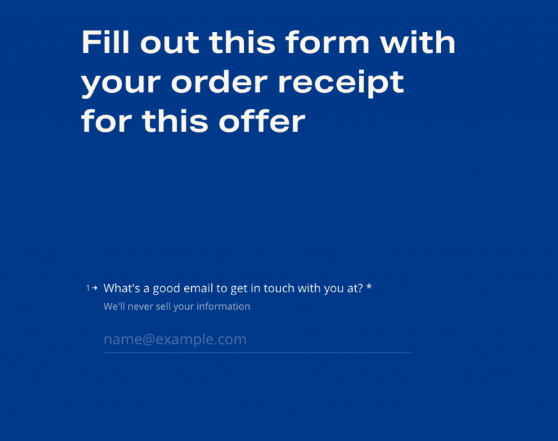
This form field is taken from fastthisway.com, which features David Asprey’s New York Times bestselling book, “Fast This Way”. This submission form at the end of the site’s homepage requires uploading and submitting a book purchase receipt in order to receive a 20% off coupon for buying enzyme supplements.
If your visitor isn’t in the frame of mind to take numerous submission steps (share personal information, upload an image, share feedback, etc.), he may lose patience to complete the form. Dedicating one screen per question is a helpful way to prevent this scenario. Seeing one question at a time lets users focus solely on the question or step in front of them without getting distracted by other questions that precede or follow.
Even though you’re asking your user to submit a range of information and types of content, you alleviate this process by fostering a “one step at a time” environment.
Single-Column Layout

Lead conversion experts swear by single-column layouts. These forms look much easier to complete, reassuring users that it won’t take long to do so. This is what we see in the Elementor landing page template shown above, which gives prospective clients a quick, easy way to get a free consultation with a financial expert.
Multiple columns of form fields can disrupt vertical momentum — forcing visitors to visually reorient themselves between each question. The same applies to field alignment (and the respective field labels), which should always be left-aligned so that the users’ eye movement stays stick-straight.
Single-column forms also foster mobile responsiveness. Adapting your form fields to a small, vertical apparatus becomes easier when all you need to do is reduce the size of a vertical element without changing its layout.
Keep in mind that there are exceptions to every rule. NN/g specifies in their web form design best practices that “short and/or logically related fields can be presented in the same row.”
#3 Form Questions and Prompts
What’s the best way to make sure that your visitors understand exactly what you’re asking of them and why you’re doing so? Building a web form whose question structure and sequence make sense is no easy feat. Putting yourself in your user’s “shoes” and trying to understand his logic helps you see things from his point of view.
Your goal is to engage each person that encounters your website form, inform them of its purpose, and clarify the benefit of completing it
The Order of Form Questions
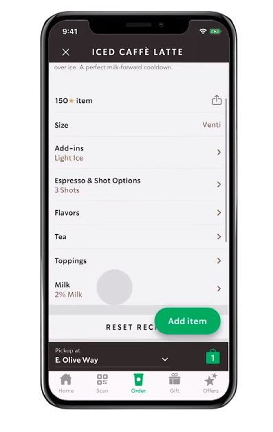
Bear in mind that a website form mirrors a human conversation. The order and format of its questions should be logical and intuitive to every user. This drink customization menu in the Starbucks mobile app orders the customization options according to logic, based on how general or unique the specification is.
Size choice, for example, is relevant for any drink, and therefore the most common, which is why it’s the first question. The same goes for add-ins, which can also be requested for any drink, followed by how many espresso shots, which is applicable to any coffee drink. If you’re wondering why “Milk” is last, it is actually the least likely to be customized, since 2% milk is the store’s recommended and therefore default selection.
Form Field Wording
When you’re choosing the wording and user flow for your form fields, headings, sub-headings, descriptions, etc. — the word “habit” should be at the forefront of your thought process. Every visitor should revert to automatic, habitual behavior when filling out his personal details. He shouldn’t even need to think about it, he should be able to gloss over your wording and form fields and know exactly what to do without giving it much thought.
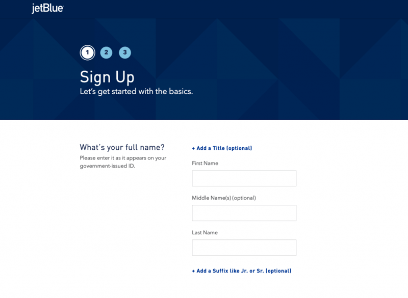
The more conventional your form terminology, the better — it’s not a time to reinvent the wheel. JetBlue balances conventional wording with a unique tone of voice, combining classic terminologies with friendly, conversational headings and subheadings that create a rapport with prospective passengers.
A Sense of Urgency
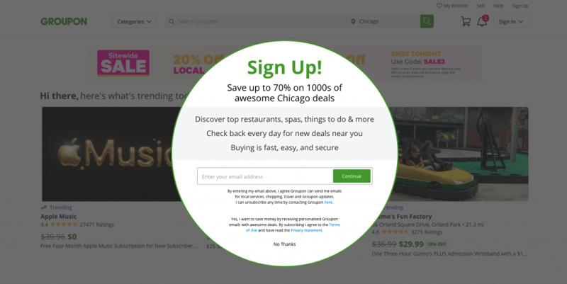
A sense of urgency can inspire site visitors to take action and respond to your questions. This is actually much easier to make happen than it sounds. Power words (like “save” and “easy” in the Groupon website popup above) spark incentive and help grab user attention in a natural way. This is especially true for your CTA button text, which you can style and dramatize even further with brightly colored button backgrounds and other effects.
#4 Form Elements
Cognitive load is the holy grail of website usability, and potentially one of the most (if not the most) crucial factors that guide your form’s content, layout, and structure. The fewer demands you put on the user’s brain and thought processes, the higher the likelihood that he fills it out. But how do we achieve this formidable challenge?
Number of Form Fields
A minimal number of form fields helps prevent overwhelming your visitors. An easy way to achieve this is to work backward from the answers you’re looking for. This way, you can identify the must-have data you really need to reach your goal — and refine the questions based on that.
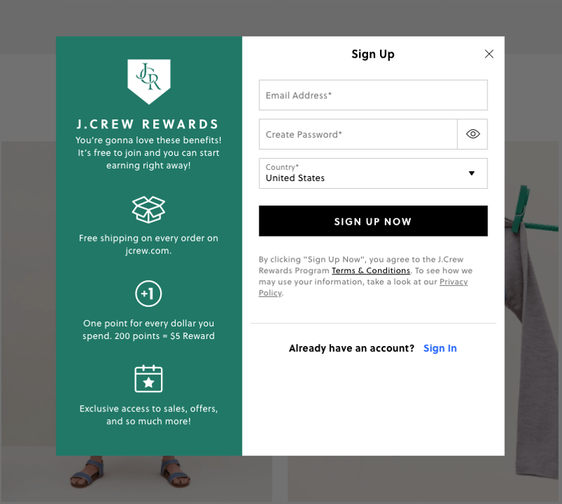
J.Crew’s reward program signup form is a great example of how to limit the number of form fields without compromising the information you need. How so?
- The form merges two fields into one by asking for the user’s first name only. There’s not necessarily a need to ask for both.
- There’s no password confirmation field. Another case of combining two fields into one.
- The T&C consent is automatically agreed upon by submitting the form. No need for a checkbox field to confirm.
This form could have easily included five fields, but instead, they narrowed it down to three. Not to mention that the “Already have an account? Sign In” text would be much lower down and more difficult to read.
Types of Form Fields
Limiting the required user activity (especially the need to type) is an ideal starting point towards a user-friendly form. Your choices are endless: checkboxes, radio buttons, or others — easily replace simple text fields with simpler form fields. This streamlines multiple questions into one field and simultaneously replaces the need to type with simple clicking.
What if, for example, instead of having three fields for three respective selection choices, you could consolidate these answers into one field with a “Select” field that shows a dropdown menu of the three (or more) options? A single design choice can reap your three-fold reward: fewer form fields, less typing activity, and even a reduced number of columns.
Field Labels
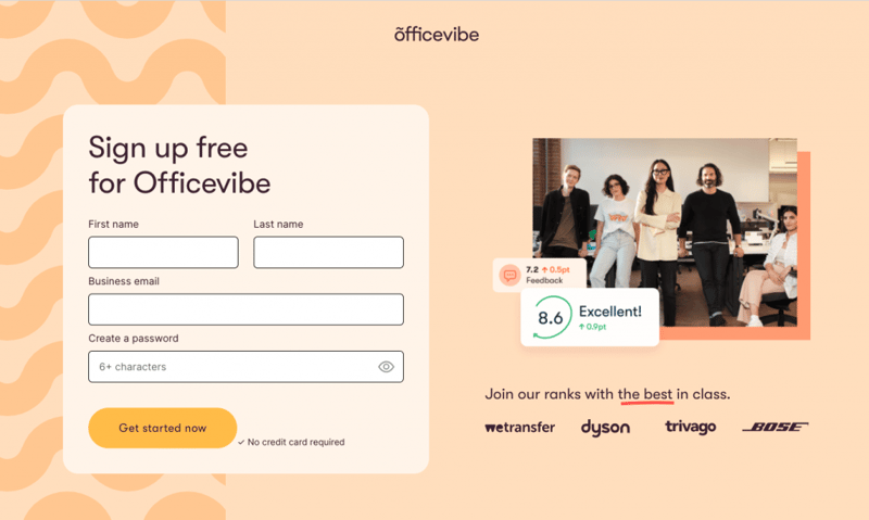
Every input field in your form should be given a field label that informs users of what to write or select. Users also appreciate when you specify which fields are mandatory and which are optional, so that they can skip the relevant fields if they’re short on time.
Some tips you can infer from Officevibe’s sign-up form — these will perfect your field labels and your overall form UI:
- Align every label to the top left, above its field.
- All labels should be equidistant from their respective input fields.
- Use asterisks for required fields rather than adding the words “required” or “optional” to its label.
CTA Buttons
Belgian design agency WEPIC integrates many best practices for a killer CTA submission button in their Elementor-built site. The brightly colored CTA is correctly given the exact same width as every form field, a must-do styling choice for any website form. Not only is the button bold and brightly colored, but its background and text colors change on hover, and it uses an attractive icon after its action word.
WEPIC’s button design is also a prime example of how to optimize your form using the insight of Fitt’s law, the web design principle that points out how largely sized buttons can reduce the time it takes a user to click on it.
#5 Submission Guidance and Confirmation
It’s somewhat easy to underestimate the importance of a fully filled-out website form. Minimizing the number of questions and fields is only half the battle. You can include concrete design elements that encourage users to complete your entire form: progress indicators, visual cues, success or error messages, etc. These components help solidify your users’ understanding of how to complete your form and whether or not they’ve done so successfully.
Progress Indicators
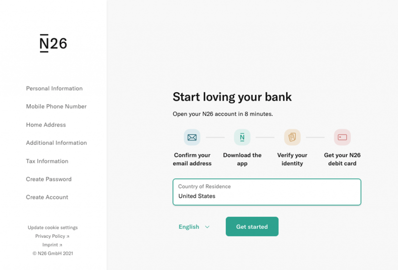
There’s nothing more user-friendly than a form that tells users exactly what the submission process involves. European mobile banking company N26 tells its prospective clients exactly what the account creation process entails and how long it takes to complete it. Using icons and short descriptions, the breadcrumbs style timeline communicates how straightforward the signup flow is and how simple it is to benefit from the N26 product.
The task of opening a bank account (whether at a brick and mortar financial institution or at an online bank) can be time-consuming and tedious. When visitors are told that they can open a debit account in eight minutes, they’re bound to consider the option.
Visual Cues

One of the most logical (and not to mention trendiest) ways to make sure your form is visible is to create a directional cue that explicitly indicates where to look. The uniqueness in Crazy Egg’s input form is that it incorporates the directional cue into the illustration itself: the man’s finger is pointing to the input field. Other common cue techniques for drawing user attention are hand-drawn arrow illustrations, animated buttons, or scrolling indicators.
Success Messages
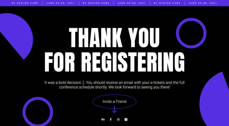
Users always appreciate a confirmation that their decision to register for an event or subscribe to a mailing list was done successfully. When you take this validation and fortify it with an appreciative “thank you” (as done in the Elementor landing page template above), the form’s user experience comes full circle and ends on an up note.
Error Messages
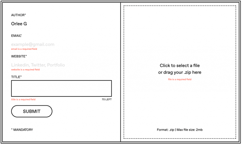
Error messages inside a form make help users to make sure they’re able to submit it. Brief, yet informative messages will also guarantee that the submitted form includes every data element you’re looking to obtain.
This dynamic process is executed nicely by Isolation.is, a digital postcard archive where designers can propose and submit their design work. Error messages which inform the designers of insufficient submission content can be particularly helpful and effective for this type of complex form, which specifies one type of file, a limited word count for the title, and social media network URLs.
Be Prepared to Build
You now have a wealth of insight that can guide your website form-building from start to finish. Once you’ve solidified your strategy and the goal of your website form, you can be 100% ready to decide which information you’re looking to elicit and the best possible way to make this happen.
Stay tuned for our upcoming article about inspirational website form examples to supercharge your future form design processes.
Looking for fresh content?
By entering your email, you agree to receive Elementor emails, including marketing emails,
and agree to our Terms & Conditions and Privacy Policy.


