
Table of Contents
Web forms don’t have the best reputation. Very often they are inaccessible and difficult to use, with awkward live validation and plenty of error messages. Then there are poorly-optimized drop-down menus, tiny checkboxes, fields with copy-paste disabled, and more.
Although it can take some effort to make the right choices when building forms, the benefits are worth it. This is why we worked with Vitaly Friedman to create a webinar on form design best practices. Vitaly has been a freelance designer for six years and is the co-founder of Smashing Magazine — one of the most prominent web development and design publishers currently active. As the current Editor-in-Chief of Smashing Magazine, Vitaly is an expert when it comes to User Experience (UX) and design.
In this article, we’ll summarize the main points and key takeaways from Vitaly’s presentation, and share some insights from our Q&A session with him. Let’s get to it!
4 Key Form Design Best Practices
We often see the same boring form designs used too often. Many commonly-used elements also suffer from performance issues and can be frustrating for your visitors to use.
In order to provide a better experience, it can help to look into new and different ways of designing your forms. Let’s take a look at four tips Vitaly recommends for doing just that.
1. Understand How Your Users Perceive Web Forms and Inputs
To begin, it’s important to understand that forms matter. From search and filtering to newsletters and authentications, they’re indispensable aspects of most customer interactions:
This makes it vital that you understand how to design the best experiences for your users. For instance, you’ll want to pay attention to the mental models customers already have regarding forms and inputs.
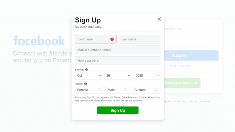
For example, when it comes to names, some people aren’t used to the notion of splitting them into first, middle, and last names. Then there are individuals who don’t even have middle or last names.
Therefore, having multiple “name” fields that must be filled out can be confusing or frustrating. This is why it can be smart to use fields for ‘full names’ instead. The same often applies to addresses, credit cards, and other data inputs.
You’ll also want to learn about and avoid common user frustrations, as this can help you understand whether or not a form will be easy to understand and use. Some of these frustrations include:
- Unexpected content shifts or page reloads
- Confusing country selector drop-down menus
- Inputs that are fully cleared if an error occurs
- The need to retype inputs (such as by confirming email addresses and passwords)
Instead of offering obstacles, your forms should be accessible and friendly. Here are some characteristics that users appreciate:
- A fast, accessible experience
- Large and legible text
- Clear focus and active states
- Predictable tabbing
- A form that’s quick to complete
To optimize your forms, you can test them out and track key metrics, such as completion time and bounce rate. This can let you know what’s working and what might need to be improved. Most importantly, you’ll want to prioritize speed, accessibility, and usability.
2. Find the Right Timing for Required Actions
Next, you want to find the right times to ask users to complete certain actions, such as verifying their email addresses. In this case, you’re interested in when the user cares the most about the correctness of the address. For example, during a checkout process, customers may pay more attention when reviewing details they’ve previously entered, in order to avoid misplaced items or lost email receipts.
This also applies to passwords, which you can even provide incentives for. Let’s say that a user has almost completed a checkout using a guest account:
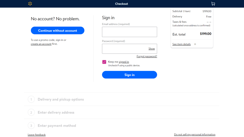
You might ask them to create an account by entering a password, offering a 10 percent discount if they do so. At this point, the only thing standing in the way of completing the checkout process is that password, so the user may be more likely to sign up.
As we mentioned earlier, your form should also be designed to maximize completion speed, so users feel like they are cruising through it rather than being slowed down. One of the most important first steps you can take when optimizing your form is to enable autofill, which can reduce completion times by at least 30 percent.
3. Define Input Boundaries
Once you know what your form’s goals are, you’ll want to define “input boundaries” in order to avoid ambiguity. This typically involves measuring your form and its fields based on certain metrics, which can help you determine how difficult or complicated it will be to complete.
For instance, here are some typical issues that often show up in a checkout form:
- Complex inputs
- Confusing layout
- Poor support for autofill
- Sudden, unannounced changes
In addition, PCI compliance may require that your users type in their credit card details multiple times when they’re reviewing entered information. You can address this potential source of frustration by avoiding page refreshes and storing data locally.
It’s also important to walk through your form’s input fields and review them. For example, for detail such as company name, you can consider the following:
- Whether or not it should be mandatory
- If it should include adaptive placeholders, such as when a B2B company uses different country placeholders based on each customer’s location
- If prefilling is need and is working
- What the maximum and minimum allowed length for responses should be
You’ll also want to consider offering a “smart autocomplete” option – providing suggestions based on what the user is typing in. Additionally, it’s a good idea to think strategically about when to show a drop-down menu, such as when the user starts typing or on input focus.
4. Consider How To Optimize Your Form’s Layout
Finally, you’ll want to think carefully about how to lay out your form. For example, when you have multiple fields, you’ll need to decide whether to create a multi-column layout or use one long page.
In most cases, having one set of items per page tends to work well. For example, most checkout processes ask for personal details in the first step and then move onto billing and shipping information. This type of multi-step form works because users find it easier to use, it performs well on mobile devices, and it’s better at handling errors, branches, loops, and so on.
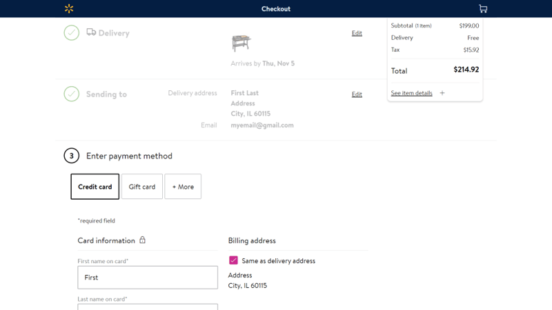
Ideally, you don’t want to display more than six or seven input fields at a time on each page, as too many elements can increase the perceived complexity of the form. Another option is to use the accordion-style form that you can find on sites like Walmart.com:
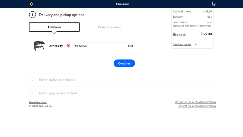
An accordion form typically works like this: When you start typing, the second and any further steps are collapsed until you reach them. When each step is completed, it becomes a summary highlighting the important information you’ve entered:
Even if you’re forced to include all your input fields on the same page, you can still space them out or organize them into columns to avoid overwhelming the user.
Q&A: Insights From Vitaly Friedman on Building Effective Forms
Before we wrap up, here are some highlights from our Q&A session with Vitaly Friedman.
Q: What Are the Best Ways To Secure Your Forms Against Bots?
Friedman has a checklist addressing this issue, which offers a ten-point strategy you can apply. Some tips include using the Akismet plugin to block spam, and asking random questions (such as “What color is the sun?”) that would be easy for humans to answer but challenging for bots.
Instead of using CAPTCHAs, you might also use the “honeypot technique”, which involves creating an invisible field. It’s not visible to users, but it is to bots, which will typically fill it with random data. So if the field stays empty, the form was probably completed by a human user.
You might also use a keyboard-accessible slider, and ask users to move it to a certain position. Time traps can also work. That strategy involves introducing time delays when someone attempts to log in or leave a comment multiple times. When faced with these delays, bots are likely to simply move on.
Q: How Much of a Problem Is Form Abandonment?
Form abandonment is common, but this is an issue that can be mitigated. For example, many sites will ask for email addresses before presenting the full form, as insurance in case of abandonment. This technique enables you to send a reminder later on, to encourage those users to complete the process.
However, it can be dangerous to enforce logins before forms can be completed. If a user types in an email address while trying to sign up to complete a checkout process, but that address already exists in your database, they’ll have to spend time trying to recover their password in order to log in. This can cause high form abandonment rates and negatively impact your revenue.
Q: Chatbots vs. Forms for Lead Capture — Which Is Better?
Friedman has seen an enormous drop in submissions when he’s used chatbots. However, it’s important to note that chatbots and forms have slightly different purposes. You’ll need to decide which one is right for you, based on your goals.
Although a conversational interface can work well for customer support, it can be much slower when it comes to signing visitors up. If someone using your chatbot has reached a point where they’ve found a product they need or like, the next step should be to drive them to a form where they can sign up or just submit their email address.
Build Effective Forms
Vitaly’s presentation helped us understand how to build effective forms that are performant, usable, and accessible. For more content like this, you can read articles and access books over at Smashing Magazine. You can also join front end and User Experience (UX) online workshops and conferences via Smashing Conference.
Do you have any questions about designing more effective forms? Let us know in the comments section below!
Looking for fresh content?
By entering your email, you agree to receive Elementor emails, including marketing emails,
and agree to our Terms & Conditions and Privacy Policy.


