Table of Contents
After celebrating our 5th birthday, we are ready to get back on track with our monthly showcase. In case you missed it, be sure to check our beautiful birthday infographic.
This month we bring you ten new beautifully designed websites, featuring the works of individual designers and agencies (one of which appears twice in this showcase alone!). From crêpes to animation studios and corporate websites — there are no limits to what you can design with Elementor.
Discover how different color schemes highlight important messages and tell a story. Learn how to use the right typography to elicit the right emotions from your users. Explore the use of shapes, and how they can complement each other to create coherence, and realize how animation can be a great tool for immersion.
10
MediaLuv: Tranforming Messages Into Animations
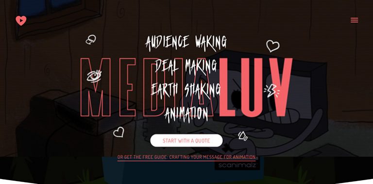
MediaLuv is an animation studio that transforms messages into animated videos. It was founded by Ryan Maloney in 2009 and according to the company’s story, the name was an accident. In a state of sleepless delusion, when he was asked about it, Ryan mumbled to put “MediaLuv,” at the end of a video. This accident, however, didn’t stop him from fully embracing the name and focusing the website on its message.
For any animation studio, it’s important to showcase its work. This particular company wanted to also showcase its playfulness and funkiness, and no part of the website embodies this idea better than its homepage. It includes cartoonish emojis that set a playful tone, a pinkish color, which relates the idea of love, gentle animation throughout the page, and text written in a gothic-like display font that is associated with funky music. The title uses a clever combination of an outline font and bold letters, to create a nice visual contrast.
There’s also a heart-shaped button that stands out and directs to a video, to provide more information about the company and its services. This is an emerging trend, as we’ll see further down the lineup.
Behind the title, there’s a background overlay in the form of a heavily shaded animation. It serves a triple purpose. First, it showcases what the company is about — animation. Secondly, the dark shading makes the title stand out. Lastly, it serves to reinforce one of the company’s core values — “Look beneath the surface!”
Theme: Hello
Plugins: Ultimate Addons for Elementor
Design & Development: Made By Proxy
09
Royi’s Crêperie: A Delicious Website To Whet Your Appetite
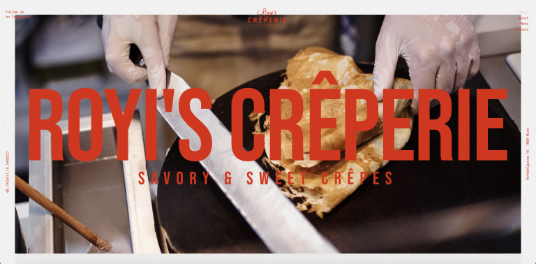
Every day is pastry day at Royi’s Crêperie, owned by Israeli pastry chef Royi Shwartz and located in Vienna. Royi declared his mission to “create the best crêpes in the world” — and fulfilled it by establishing his zero-waste kitchen that uses both innovative and old-fashioned techniques to create delicious crêpes.
Lead generation is one of the website’s key objectives, which is what makes the typography choices and color schemes (among other details) the perfect fit. Choosing your dessert is usually an on-demand, gut-instinct type of a decision, which is why choosing bright red large text sizes is the perfect way to start. After all, color theory dictates that red “evokes a sense of passion, happiness, and heat.” Who wouldn’t be happy to eat a fresh, warm crêpe?
If you scroll down to the bottom of the page, you’ll see a fine example of how to use the new Mask Option — not just for an image element or shape, but for an embedded Google Map. To top it off, the Image Hotspot feature is used when you hover over the map, giving a taste of interactive sweetness to build up your appetite.
Theme: Hello
Plugins: The Plus Addons
Design & Development: Jovan Lakic & Stefan Kokovic
08
Daniele & Chiara: A Creative “Save the Date” Website
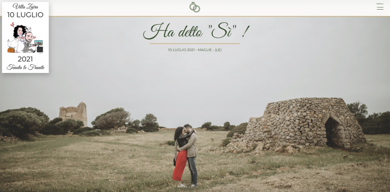
Daniele Colonna is an Italian newlywed bride who decided to build a “Save the Date” website for her and fiancée Chiara Filoni for their recent July 2021 wedding. The website provided wedding guests and invitees with a resource to see the couple’s gift list, find out the time and place of the event, RSVP, learn about the venue, and watch detailed, professional videos about the couple, their relationship history, and their passion to get married.
Wedding websites are a popular website creation use-case among Elementor users, as they leverage the opportunity to create a convenient online forum to not only inform their guests about wedding details but also to infuse their excitement into a visual content masterpiece.
Daniele designates a significant amount of website content to feature the wedding venue of her dreams, Villa Zaira in Maglie — a destination city known for its landscapes, history, artistic legacy. The earthy color choices of evergreen and golden beige account for these very characteristics — and are a prime example of how to implement your branding through your website colors.
The interactivity created by motion effects like “Scale”, combined with the embedded YouTube videos transform the wedding from a routine, life-cycle milestone into a vibrant event that guests should wait for eagerly, and expect to be dazzled by a breathtaking venue, a romantic atmosphere, and a happy couple waiting to greet them.
Theme: Hello
Plugins: Dynamic Content for Elementor, JetTricks, Elementor Custom Skin
Design & Development: Daniele Colonna
07
Hadera Paper: An Eco-Friendly Approach to Paper Manufacturing
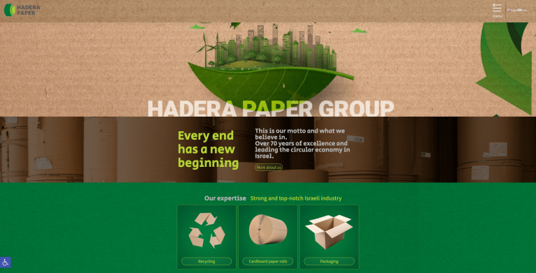
Hadera Paper is the largest paper mill in Israel that manufactures paper and paper products — producing over 430K tons of paper per year. Hadera Paper Group’s unique business model runs as a circular economy: once they collect paper waste, it’s recycled through new paper production and corrugation.
Hadera Paper’s web creation goals are built around their objective to gain brand exposure for their business — targeting both the general public and company investors alike. The most relevant Elementor features used to accomplish these goals include:
- Global Styling
- Mouse Tracking
- Image Box
- Ken Burns Effect
The website’s familiar, environmentalism-themed color palette of shades of green and brown is solidified by its consistency throughout the website. Thanks to Global Styling, Hadera Paper’s visual impact is strong, resonating with visitors as a robust, household Israeli company that makes the world a better place.
Theme: Hello
Plugins: Premium Addons PRO, Elementor Timeline Widget Addon
Design & Development: OX Advertising LTD & Miki Zamir
06
LivCor: Balancing Seriousness and Fun
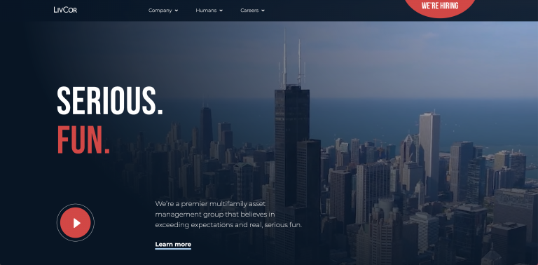
LivCor is a premier multi-family asset management group that owns and operates properties in prime locations. They also have a strong message — “people first, community always.” According to their info, they put a lot of focus on making good work and making a difference. They are inspired by the healthy communities they cultivate and this message is well shown on their website which was designed by Solid Digital.
The designers chose to show both sides of the coin — a serious business on the one side and a passionate, caring business on the other. This is done through the implementation of the red color, which is associated with passion and love, in strategic locations. Right at the offset, the words “serious” and “fun” are colored white and red respectively to create separation, and to set the tone.
The air of seriousness is maintained with a classic, corporate design, reinforced by elements like a corporate video background overlay, the use of white sans serif fonts, and a clean footer.
The fun and passionate part, on the other hand, is maintained through the implementation of the red color and photos related to the community. Some buttons (including the trendy video button at the beginning) are circular and give the impression of a ball — suggesting the idea of fun, but also, perhaps, their connection to volunteer work and donations to children.
Further down the page, there are monochromic images that are meant to add a little drama and emphasize the importance of donations and volunteer work. The images are outlined by two lines — white and red, sending the message that through hard work (white) and love (red), great fits can be achieved.
Theme: Hello
Plugins: JetElements, JetBlocks, JetTabs (Crocoblock)
Design & Development: Solid Digital
05
yFitnessLab: An Attractive Way To Engage in Sports
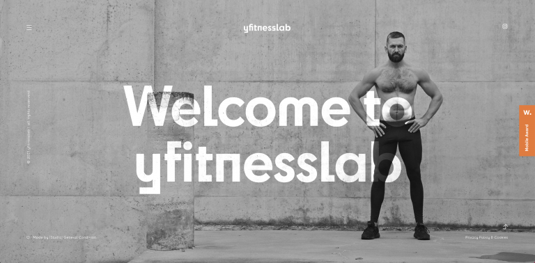
yFitnessLab is a fitness training and physiotherapy business run by Dejan Cvetkovic, a Serbian physiotherapist, and speed fitness EMS instructor. Dejan’s website was designed and developed by Jovan Lakic — who appears a second time in this showcase! Seeking a website that would improve lead generation and brand exposure, Dejan’s target audience is “people of all age groups looking for rehabilitation and prevention treatments with professional medical assistance.”
Thanks to features like Global Styling and Custom Fonts, Jovan is able to benefit from a highly unique, yet entirely consistent design system. This includes its unique typography choice of Cy — a highly unusual sans-serif Adobe font. Additionally, there’s a constant background TV static animation that creates a subtle, but powerful effect. Jovan shared that a large focus of his website design process involved styling the backgrounds — by using gradient backgrounds and background overlays to create a larger-than-life parallax scrolling masterpiece.
Theme: Hello
Plugins: Element Pack
Design & Development: Jovan Lakic
04
The Scotsman Group: Prestigious Scottish Experience
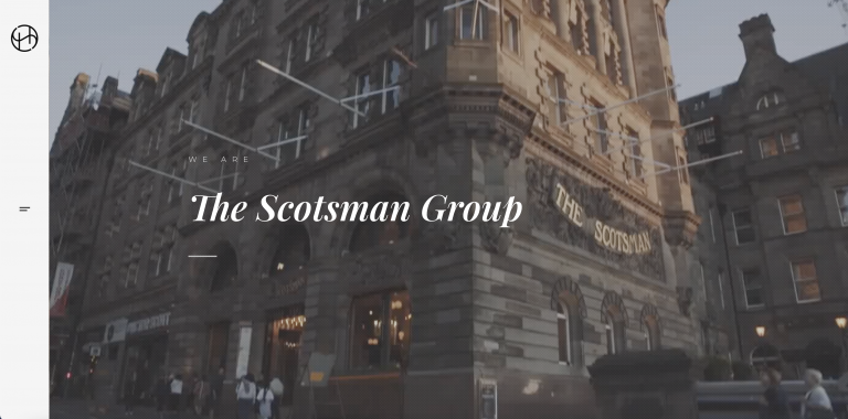
The Scotsman group is a collection of privately owned and operated businesses that focus on delivering customer experience. Their portfolio includes everything from fine dining restaurants to state of art nightclubs and cinemas. Their focus on customer experience is clearly defined by the high-end venues they offer.
The very first impression you get from the homepage is cleanliness and prestige. This is brought forward through the white background, the thin, cursive serif font, and the hero video that shows elegant hotels, restaurants, alcohol, and in general, the high life. The white color creates a sense of elegance and esthetics.
There’s a nice composition of images and text. The images are an important part of the messaging throughout the website as they, better than anything else, are capable of portraying the sense of prestige, and to maximize the effect — the company clearly invested in their quality. There’s also a Gaelic symbol that appears through the website, emphasizing the Scottish roots of the business.
Additionally, elements like the lovely and well-used sidebar menu and the “top” button that appears when you scroll down, further complement the design while providing navigational order.
Theme: Borgholm
Plugins: Slider Revolution
Design & Development: Chris Campbell
03
The Shift Clinic: Growth Conveyed Through Design
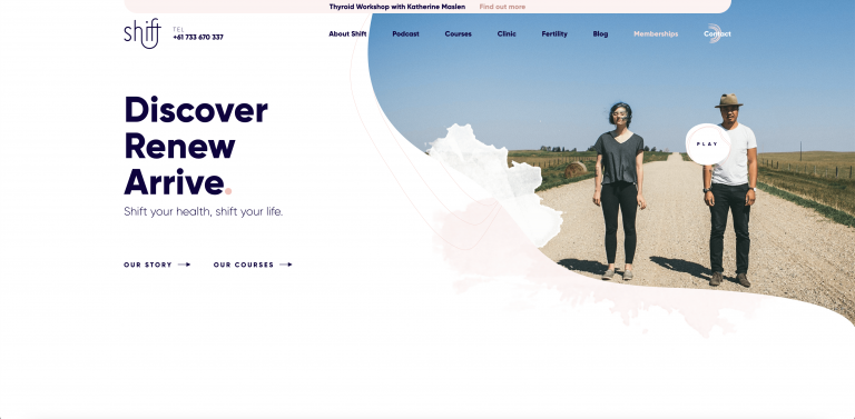
The Shift Clinic is a health and wellness service. Founded by Katherine Maslen, the Shift Clinics provide natural health care and help thousands of patients worldwide with natural health memberships, courses, and content. The colors of the website are very soft. The use of white and light-peachy colors elicits calmness and comfort.
Before going further, it is important to note the play button. As seen in the other sites, this has become a trend — of creating a video to enforce the message of the business and placing it in the first section of the homepage.
The hero image sets the atmosphere of nature, and perhaps the focus on the self. When you start scrolling down, you’ll notice animated, curly arrows that lead you down the page, encouraging you to navigate further down the story. This is a great example of scrollytelling and to further enforce the scrollytelling, there’s a soft parallax effect that creates a sense of immersion. Throughout the scrollytelling there are clear calls to action, divided by colors (pink and purple).
There are quite a few pages to the website, and throughout it, there are elements that look hand-drawn, doodles of sorts, that make the website look more personal. There’s also a recurring motif through the website. Through the lines and arrows and the liquid smudges, the website creates a sense of flow, or motion, or perhaps, a shift – which is directly related to their message and logo.
Theme: Genesis
Plugins: Gravity Forms
Design & Development: Five by Five
02
M01N: Boosting User Experience With Animations
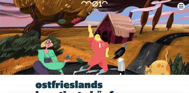
M01n is a German digital agency that specializes in many different areas of design: websites of all sizes including e-commerce sites, apps, print design, photograph optimization, illustrations, watercolor, 3D graphics, and more. With its heavy, sans-serif typeface (a font family by the name of “Upgrade”, and an analogous color scheme, M01N’s consistent design scheme is cohesive yet varied all in one.
The Lottie animations scattered throughout the site add depth and interactivity to the otherwise flat design scheme. We were particularly blown away by the “Work Samples” page, whose page layout and clearly carved fonts make scanning through the images and texts super smooth. All in all, when an agency has a wide range of services and media types that they need to display together on a single website, M01N does a fine job of tying it all together in a way that feels right.
Theme: Hello
Plugins: Essential Addons Elementor, WP Googlemaps, Make column Clickable Elementor
Design & Development: Deike Brüdigam, Söntke Campen & Jann-Hendrik Tjards
01
Frankentoon: A Colorful Marketplace for Designers
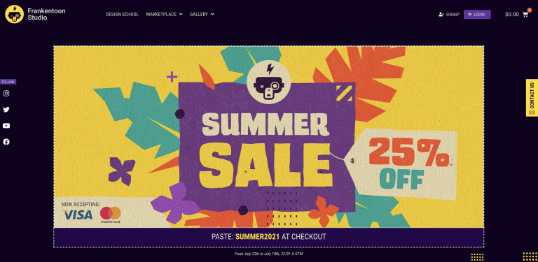
Frankentoon is an El Salvador-based illustration and character design studio run by Enrique Figueroa. Specializing in creating “digital arsenals” for independent digital artists (brush packs, graphics, educational materials, templates, and more).
Enrique shared with us that his key website goals for Frankentoon are brand exposure that attracts new customers, community-building, and online marketplace purchasing (WooCommerce site). Some of Frankentoon’s niche design courses include “Character Design”, where students learn to get into the headset of game designers from the ‘80s and ‘90s and emulate NES-style video game graphics.
Enrique uses a variety of Elementor widgets to best present his visual content and digital art. These include (to name a few):
These widgets are a particularly good fit for Enrique’s illustration design niche — as they give him the ability to prioritize the presentation and navigation options for his illustrations and images.
The Posts Widget, especially, is the perfect option for introducing visitors to Frankentoon online courses — intricately detailed image thumbnails with a clear title and a tag specifying each course’s relevant software.
Not to be missed are also the sharp applications of trendy design motifs: flat design, original illustrations, bright colors, and large font sizing. For those looking to emphasize the visual techniques used in their artwork, profound inspiration can be found throughout the Frankentoon website.
Theme: Hello
Plugins: WooCommerce, Jet Plugins for Elementor
Design & Development: Enrique Figueroa
Looking for fresh content?
By entering your email, you agree to receive Elementor emails, including marketing emails,
and agree to our Terms & Conditions and Privacy Policy.


