
Table of Contents
Adding a layer of playful interaction to your website can be an effective way to catch visitors’ interest and encourage them to stick around. However, keeping interactivity consistent across desktop, mobile, and tablet devices can be a challenge.
Fortunately, adding responsive image hotspots to your site can help you spark your audience’s imagination. Also, because hotspots are mobile-responsive, you can use them to provide a five-star, interactive experience across all platforms.
In this article, we’ll introduce you to image hotspots and discuss the benefits of using them. Then we’ll show you how to add hotspots to your images and ensure that they remain perfectly positioned on desktop and mobile devices. Let’s get started!
Table of Contents
- An Introduction To Image Hotspots (and Why You Might Want To Use Them)
- How To Create Responsive Image Hotspots With Elementor (in 5 Steps)
- Step 1: Assemble Your Elementor Widgets
- Step 2: Adding Content To Your Flip Box Widget
- Step 3: Stylizing Your Flip Box Widget
- Step 4: Position and Size Your Hotspot
- Step 5: Make Your Hotspot Mobile-Responsive
An Introduction To Image Hotspots (and Why You Might Want To Use Them)
A picture may be worth a thousand words, but it’s not always possible to communicate everything you want to say in a single image. However, image hotspots offer an effective, user-friendly way to provide additional context for your images.
Hotspots are interactive pins that are displayed on a specific area of an image. To engage with a hotspot, you can either hover over it or give it a click. When you do, a popup will appear which may contain a headline, text, image, buttons, or even a video:
Hotspots can make your images more interesting and encourage visitors to interact and stay longer on your website. They also enable visitors to access more content without having to navigate to a new page, which can help minimize loading times.
You can even add links and buttons to your hotspots to further drive visitor engagement. Collectively, hotspots can have a positive impact on the User Experience (UX) and your conversion rates.
How To Create Responsive Image Hotspots With Elementor (in 5 Steps)
Adding responsive hotspots to your images can be a fun way to catch a visitor’s interest and encourage them to engage with your content. With this in mind, let’s look at how you can create them in five simple steps using Elementor.
Step 1: Assemble Your Elementor Widgets
We’ll create our responsive hotspot using our Flip Box widget. As the name suggests, this is a box that flips when you hover over it. To start, add the image that you want to be annotated with hotspots using the Elementor Image widget:

If you plan to have this effect displayed on mobile, the best practice would be to use an image with portrait orientation, otherwise, an image on landscape may be too small when it’s viewed on mobile.
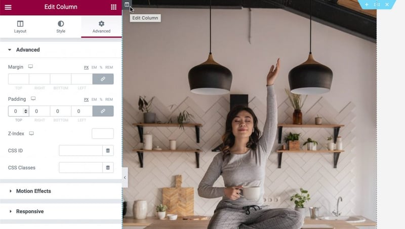
Once you are done, make sure that the column takes up the full width and height of your image. You can remove the default padding by entering the column’s settings. Hover your cursor over the column and click the grey icon that appears at the top left. In the advanced tab, set the padding to 0 like this:
Next, you can drag a Flip Box widget into the same column as your Image widget. You’ll notice that the Flip Box widget has two sides. The green side is the front, which will be displayed by default. We’ll make this side transparent, apart from an icon, which we will communicate as an interactive hotspot:

If you hover over this widget, it will flip to a purple side. This is the side where we’ll create our hotspot’s content:
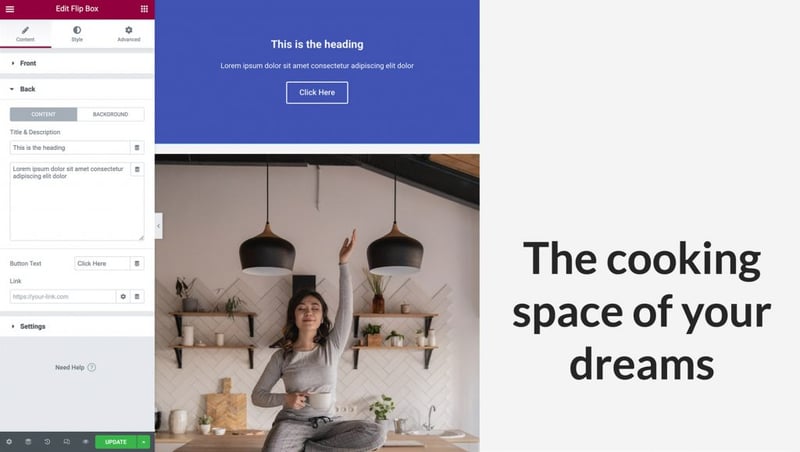
You can populate the hotspot side with a heading, description, and a button. The latter is great for annotating your images with engaging Calls To Action (CTA).
Step 2: Adding Content To Your Flip Box Widget
Now, we’ll add an icon to our Flip Box widget. The icon will serve as a pin, signaling to visitors that there’s more content for them to uncover.
To start, you can click to select your Flip Box widget. In the Elementor Panel, select Icon. You can then choose the icon that you want to use in your hotspot:
Next, we need to remove all other content from the Flip Box widget’s default side. In the Elementor Panel, go ahead and delete all of the text in the Title & Description fields:

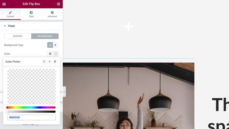
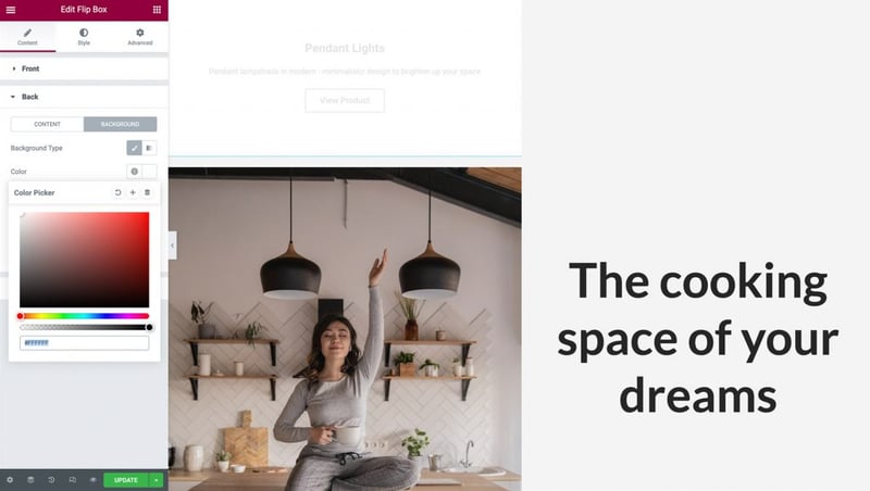
The front of your Flip Box widget should now be completely blank, except for an icon. Finally, we need to remove the widget’s background by selecting Background. Then you can launch the color picker by selecting Color. Next, grab the transparency slider and drag it all the way to the left, so your widget turns completely see-through:
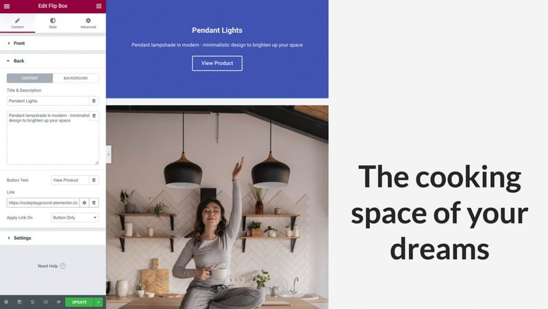
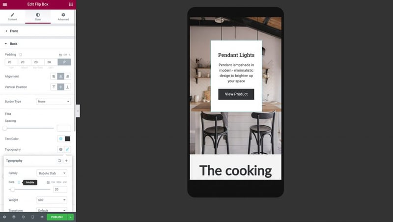
Next, we’ll add the content that will display whenever a visitor interacts with your hotspot. Expand the Back tab and add your title and description:

By default, the Flip Box widget features a button. You can delete this button by removing its text. Alternatively, you can create a CTA by customizing the placeholder button label and adding your own URL. You can also select whether this link is applied directly on the button or on the entire side of the flip-box:
Next, you can choose a background color for your hotspot’s popup. In the Elementor Panel, select Background > Background: Classic. To launch the picker, click on Color, and then make your selection. Alternatively, you have the option to use an image or a gradient color but in our example, we will select a white background:
After choosing your background, you may need to change your text color. It’s time to head to the next step.
Step 3: Stylizing Your Flip Box Widget
Since we finished populating our Flip-Box widget with content, the time to stylize it has come. Navigate to the Style tab. Here you will find a variety of options to customize your icon according to your design needs.
It is important to know that the easiest way to position an icon and keep it responsive on all devices is by aligning it at the top left. In the Alignment select Left, and in Vertical Position select Top. We will also remove any extra padding by setting it to zero:
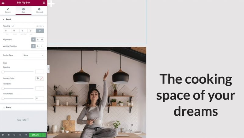
Play around with the other options to change the color of your icon, its size, and rotation, and once you are done click on the Back tab to expand it.
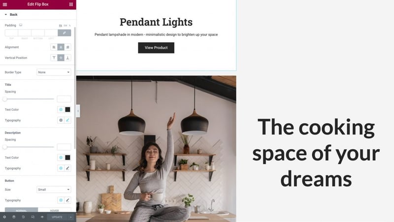
Just like in the Front side of the Flip-box here we can change the Alignment, Vertical Position, and change the Padding as well. In this example, we will leave them as they are set by default.
Next, change the font style, size, and color to make it clear and visible for the visitors, and don’t forget to edit your button!
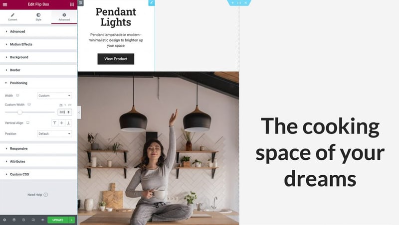
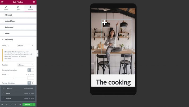
Step 4: Position and Size Your Hotspot
When it comes to image hotspots, positioning and sizing are everything. To perfect where your hotspot appears on the page, click on the Advanced tab. Then you can click to expand the Positioning section:
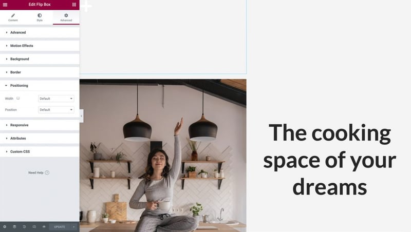
Next, open the Width drop-down menu and choose Custom. You can specify exactly how large your hotspot should be, or use responsive units like percentages and viewport width. You can even leave it by default to take the full horizontal space according to your design. Hover your cursor over the Flip-box widget to make sure your content on the other side is looking good.
Then set the Position drop-down menu to Absolute positioning. This will remove your Flip-box widget from the flow of widgets on your page, removing its physical height from the column, and making it easier to position above your image:
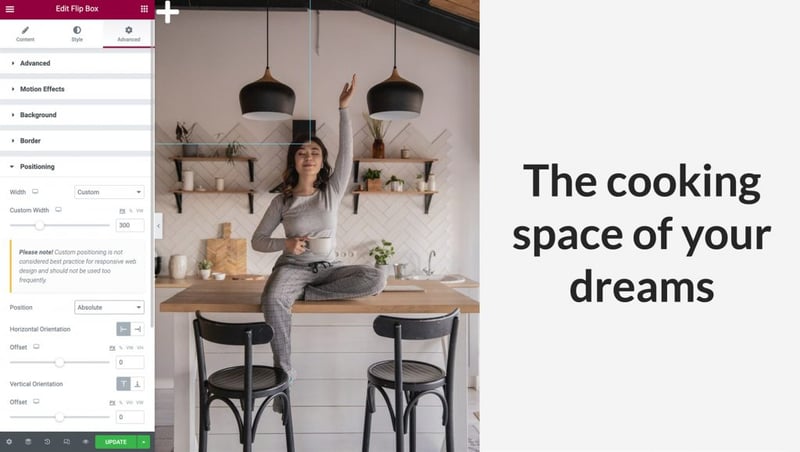
To make your image hotspot responsive, you’ll want to ensure that the Column, the Image, and the Flip Box widgets all resize simultaneously while maintaining the same aspect ratio.
The first step is to use percentages instead of pixels for your offsets. This ensures that your Flip Box widget is positioned relative to the column’s changing width and height on different screen sizes.
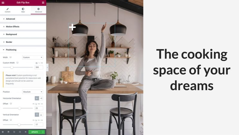
In the Elementor Panel, you can select the percentage option for both the Horizontal Orientation and Vertical Orientation. Then you can maneuver your hotspot into position using the two sliders or simply dragging it around with your cursor:
Lastly, go back to the Content’s tab, and click on the Settings to expand it. Here, you can control the widget’s height and select a Flip Effect animation that will play whenever someone interacts with your hotspot.
For this example, we will leave the height as default and then open the Flip Effect drop-down menu. You can preview an animation by selecting it from the menu and hovering over your Flip Box widget:
Play around with different Flip Effects, in combination with your content’s position that we saw back in Step 3, and create beautiful animations that will engage your visitors.
Step 5: Make Your Hotspot Mobile-Responsive
The number of smartphone users has surpassed three billion. Therefore, if you’re going to connect with the widest possible audience, it’s vital that all parts of your website are mobile-friendly.
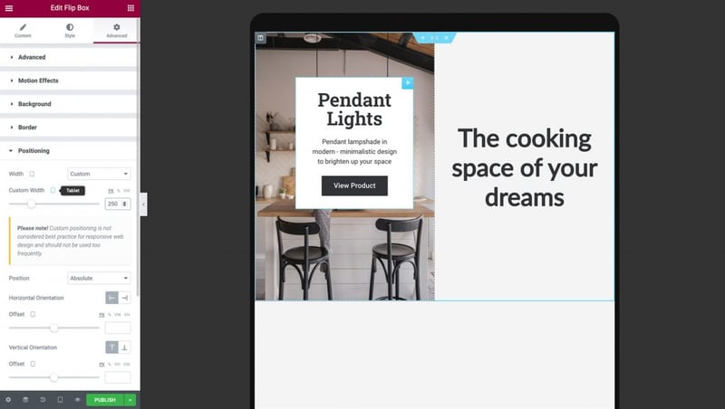
Once you’re happy with how your hotspot displays and functions in Elementor’s default Desktop view, it’s important to test the UX on different devices. You can use Elementor’s built-in Responsive Mode to preview how your layout will render across non-desktop devices. To access this mode, select the Responsive Mode icon at the bottom of the Elementor Panel and click Tablet:
The image, column, and hotspot should resize automatically for the smaller screens. Since we used responsive units to position our Flip-Box, it aligns perfectly in this viewport.
If you feel that you need to make changes in your Flip-Box’s content and position, you can adjust its settings by repeating the previous steps. When you make a change on different Viewports, make sure that the Viewport Icon is next to the option you alter, otherwise, your changes will affect all the viewports:
After verifying that your image hotspot displays correctly on tablet devices, it’s time to test how it renders on mobile phones by selecting Responsive Mode > Mobile.
When you switch to mobile mode, the Column, Image, and Hotspot should resize automatically for the smaller screen.
It’s important to view both sides of your Flip-box widget and make sure that your text is displayed correctly. You might need to tweak the back of your hotspot’s padding, width, height, and font size according to your design needs:
After making these changes, your hotspot is ready! You can be confident that your responsive image hotspot will look and function correctly, regardless of whether the visitor is using a smartphone, tablet, or desktop computer.
Now you can go ahead and duplicate your widget to create more hotspots. Switch back to Desktop View and Right-click on the Flip-box widget, then click duplicate.
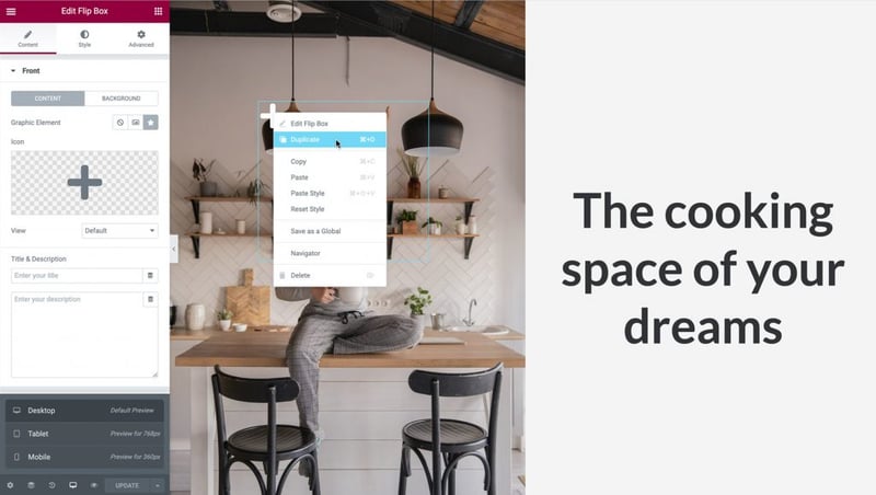
Position the hotspots just like we did in Step 5 by going to Advanced > Positioning > and set the Offset of the Horizontal Orientation and Vertical Orientation accordingly. Make sure you leave enough space between them so they won’t overlap:
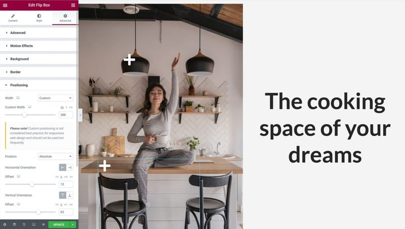
Change your new Hotspot’s information by navigating to the Content’s tab and click Back to expand it, just like we did in Step 2. Since we duplicated the widget, the responsive options we applied before will be automatically copied, but double-check that everything works correctly on Tablet and Mobile Viewports too.
Once you are done, your image hotspots are ready to grab the visitor’s attention!
Drive Conversions and Engagement With Interactive Hotspots
When designing your website, it’s smart to look for opportunities to engage and delight your visitors. Image hotspots can be a valuable addition to your web development toolbox. These interactive elements let you provide users with easy access to the information they need in an innovative way.
As we discussed in this article, you can use Elementor’s Image and Flip Box widgets to create a hotspot. You can also use our Responsive Mode to control exactly how the hotspot displays and functions across desktop, smartphone, and tablet devices.
Do you have any questions about how to create mobile-responsive image hotspots using Elementor? Let us know in the comments section below!
Looking for fresh content?
By entering your email, you agree to receive Elementor emails, including marketing emails,
and agree to our Terms & Conditions and Privacy Policy.


