Table of Contents
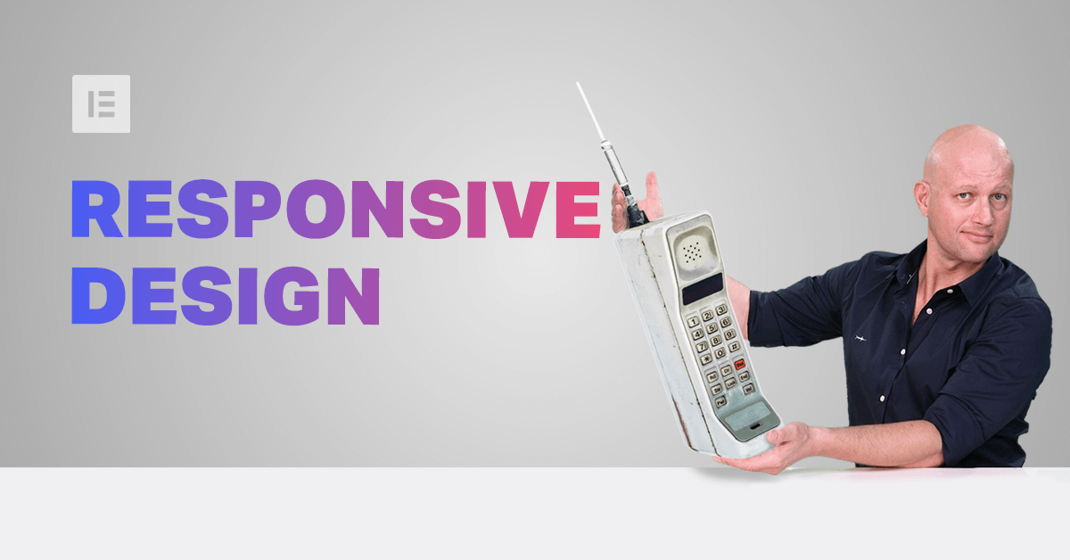
No device can be ignored.
This is now an axiom; an unwritten law that none of us, regardless of profession, career or field of expertise, can afford to be trivial about.
And yet, we find ourselves at the dawn of the 21st century’s 3rd decade still constantly solving problems with responsivity from one device to another.
Lack of standardization of formats and screen sizes, code and platform updates, technological innovations and advancements, all belong on a long list of reasons why something in our design works wonderfully on our desktop screens, but appears as an absolute mess on a mobile device.
We could ask how we correct or repair a fault in our designs until we’re blue in the face, only to face a similar situation with our next design.
Why? Because we’ve been addressing the problem from the wrong angle.
Solutions to design-specific responsive problems are what some would call a band-aid fix, a temporary solution. It’s as though the correct response to the red warning light suddenly appearing on your car’s dashboard, is to fix the red light.
Responsive design begins and ends with correct planning.
Importance of Planning in Responsive Design
In this business, no one in their right mind would set off on a project without a plan, a draft or sketch.
But having a plan is hardly the same as planning. Pam Didner, the passionate digital marketing guru, explains that “planning is an active way of discussing the goals, objectives, strategies, and tasks that we need to accomplish.” Plans, on the other hand, are merely the documentation of a planning process.
Planning keeps you aware and focused on a multitude of aspects that would otherwise be neglected. It’s what generates and nurtures the kind of experience that draws your attention to those little details that will materialize as major complications further down the pipeline.

Things to Address and Examine in Planning:
The following is a list of some of the issues that Hadas Golzaker and Ziv Geurts, two of our professional designers, address during their planning phase.
- Shifts in proportions and layouts
Whenever defining proportions of things like size, padding, and negative space, etc., always set your values in one of 2 measurements:- EM a measurement equal to the computed font-size of that element’s parent.
- Percent (%).
Screen-size will probably not be standardized anytime soon, if at all. Which is why need as much control as we can get on the sizing and proportionality of our graphic textual elements. Pixels are (comparatively) too accurate a measurement.
- Font sizes are important, especially if you are measuring in EM and all the other visual elements will be relative to its size.
- Buttons should be thumb-sized and placed in an area on the mobile screen that can be easily reached with your thumb (when holding the device in one hand).
- Remember what works and what doesn’t work. Things like hover effects and video autoplay don’t work on mobile.
- White/negative space is more important when designing for mobile. Don’t clutter your screen; think streamlined and spacious.
- Page load speed is far more important for mobile users, who are less patient. Avoid using heavy files and too many plugins.
- A/B testing on mobile is very important.
- Less content is better for mobile. Commuters do enjoy long engaging articles, but generally speaking, the majority of users will be happier when you make your point sooner rather than later.
- Think of you audience. If your main audience is aged 15-32 years old or younger, you may want to focus on the Mobile UI design first as this will be the lead design and the more relevant to your users.
- Knowing your audience, and your product is one thing, but there is so much of planning that rides on knowing your tools.
Know Your Tools
Knowing your tools helps you identify possible solutions, and how to better organize the way that you work. Knowing which stages are dependent on others, in order to create a corresponding hierarchy, is exactly what you want to establish an efficient workflow.
Proficiency of this sort is gained through experience but gained far quicker through the experience of others.
Watching a tutorial or reading a blog post, whether at work or during your commute (like yours truly) is a great way to know your tools and proficient in their flexibility. Every time I find myself brushing up on new features or just watching how someone created something inspiring, I find myself off on my own daydream, imagining how I could use these ideas in my own work — and I highly doubt that I’m alone on this. This is all part of that focus that develops through the process of correct planning.
We’re going to kick start this by going over some solutions that users and ourselves use, in the hope that this will solve your current problems and inspire your future designs.
Positioning Elements for Mobile Responsive View
When it comes to positioning sections for mobile responsive view correctly, we suggest avoiding setting values in pixels.
In the example below, we have our a section using 200 pixels of padding set either side of the text widget inside it. This works very well when viewing on desktop, but not nearly as well when tested in responsive mode for mobile view.


Instead, we rely on either one of two solutions way back in our planning stages.
Setting values in percent (%) or in EM keeps them relative to the overall screen size. Thanks to the responsive mode, we were able to conclude that we should set the padding to 17% either side of the text widget, in our next example, so that we get similar positioning in both desktop and mobile view.


Another option is to control the section itself. This can be done in the Elementor editor, using the layout and advanced tabs. In the example below, we set the maximum width of the section, in the layout tab, to 750 pixels. Now, whatever we put in this boxed section will be constrained to the limit we set.


It’s solutions such as these that eliminate the need to add any additional CSS code, responsive customization.
Responsive Design: A Horizontal Approach
Traditionally, web design is a vertical process, which is why many designers prefer to complete the design of the entire page for a single device before, trying to make the same design work as well on the next device.
An easier way to go about this is to design our views horizontally, one section at a time, across all our devices as we go along.
Once we have made sure that section looking the way we want it to in desktop, tablet, and mobile views, we can move on to the next.
Where possible, duplicate sections, columns or widgets, and update the relevant content; re-use them as foundations to build the other similar elements on the page.

In the example above, we have a landing page for a therapist’s website that we built horizontally, making sure an element such as a column and its contents, worked wonderfully across all devices, before continuing. This is also a great example of saving time by duplicating assets that work responsively.
Change / Position Background Image
Certain background images, like that of the example below, may look great in the desktop view. However, it doesn’t take much experience to see how it wouldn’t work well when viewing the site on a mobile screen.
Here the designer solved the problem by choosing a different background image, to appear only in the mobile view of the site.


Replacing an image with one that works better with your mobile design is easily done in the Elementor editor. Clicking on the section, select the Style tab, then click on the device icon for the background image, and selecting the Mobile view.
Whatever we now select as an image (by clicking on the image box to access our media library) will only appear as the background image when viewing on mobile devices.
The same goes for all of the background settings in this category. Clicking on the device icon, then selecting the Mobile, in effect, tells the editor that whatever you set (positioning/centering etc.), remain unique and dedicated to only appear when viewed on the specified device.
This is not only true for images.
Create Alternative Section
As promised, we are only too happy to share our experience and insight with our community, who will no doubt be familiar with our next example. Well within the top area of our home page, we needed to come up with a solution to the 3-column text section.

Rather than having this appear as 3 boring rows of text in mobile view, we decided to create an alternative section, with the text inside a slider widget.
Using the same principle we mentioned earlier, we hide the slider section on desktop view and do the same to hide the regular text section from mobile view. This is done by entering the Advanced tab, in the editor for the section, and under Responsive, we turned on/off the section’s visibility on the relevant device.

Many designers get stuck on the notion that everything must be exactly the same on all views. Please allow us to save countless hours of frustration, by admitting that it doesn’t have to. Get creative, and explore alternative ways to display your content on mobile.
Popups
Popups are an obvious challenge in mobile view, but only so long as somehow trapped in thinking that popups have to look and act the same way they do in desktop view.
In the example below, we’ve taken the basic elements of our desktop popup, and create an alternate popup, better suited to a mobile screen, that will appear as a strip running across my site. Not only will we define it as a sticky area, but also to only appear on Mobile devices. We do this by assigning this alternate popup template, and once it is published, and we’ll enter the Publishing Settings, select Advanced Rules, and in the Show on Device options, we’ll assign this popup to only appear on Mobile.


When it comes to design for mobile, think mobile. Some elements need to look completely different to achieve the same goal.
Content and Micro Copy
While there are certain content issues, such as length and number of paragraphs, they’re more related to layout than the actual phrasing of your written material.
We do, however, need to consider the kind of content that is fashionably become known as micro-copy.

In our next example, we notice a desktop view containing a button that reads “Download Now”, something that would make no sense were it to appear in mobile view.
We could duplicate the text widget, add something more mobile-appropriate, like “Get it now” and only show this text widget in mobile view.
Similarly, we could create a big “Call me” button and have that appear only on mobile devices.
Again, this, like most examples, is something that could be avoided back in the planning. What works on desktop view, doesn’t necessarily work on mobile, and vise versa.
Conclusion
Investing time in planning will undoubtedly save time and resources throughout the rest of your project.
Correct planning means simultaneously reviewing and figuring out who your audience is, what devices will carry the lead design. Consider the elements that will be more problematic in responsive design. What could go wrong? How would you fix it? What tools would you use?
Don’t forget to sharpen your axe and get to know the tools that you use — use Elementor’s functionality. Use the responsive mode, and the tools to your advantage.
Looking for fresh content?
By entering your email, you agree to receive Elementor emails, including marketing emails,
and agree to our Terms & Conditions and Privacy Policy.


