Designing magazines and blogs, in general, can be a tricky business when it comes to information architecture. There is an endless amount of content, many different text sizes, a lot of typography to work with, cover images to take into account, and of course, user experience. As it is, the world of creating a WordPress blog, as well as magazine websites, or even blogs with a magazine layout, requires a never-ending skillset, from mastering information hierarchy and readability to making sure that each magazine page and blog post is fully responsive, and so much more.
Ultimately, the best way to learn the tricks of the trade is to see real-life examples of how web creators sit down with their “pen and paper” and figure out a way to map out all of their news content and articles into a website layout and design that suits that content best. These challenges are true for online magazines and blogs of all verticals, languages, styles, and so on, which is exactly what our hand-picked list of sites represents.
10
Dropout: Popups Gone Unique
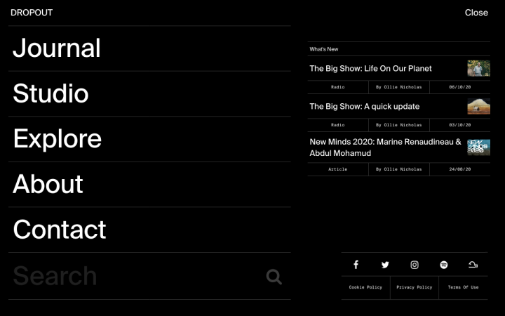
Dropout is an online magazine whose mission statement is “to change the way we view and approach the world’s problems through creativity…to create conversations and build solutions.” The website consists of two main sections: the “Journal” and the “Studio.” The Studio showcases original work created by DROPOUT creatives, where each contributor shares their processes of project creation. The Journal showcases all interactive DROPOUT content: articles, interviews, radio shows and much more.
Inside the Journal homepage, we noticed many unique design traits, many of which we have never encountered before. Once you click on “Menu” in the top right corner, the menu screen opens into a lightbox popup window. On top of this unique choice of menu structure, the lightbox itself is divided into two columns, which are well differentiated from one another, mainly because of the difference in font (size and font weight) used in each column.
We also took a liking to the archive page listed under the “Article” category, with it’s unique list of articles and the spreadsheet-style listing of each article’s key info, such as article-type, author, date, and cover image. Given that the essence of Dropout’s raisons d’être lies in the ideals of creativity and unique art, it makes perfect sense that even the most granular elements of the website, such as the menu lists and archive pages, bear a unique presence that leaves an impression on every website visitor.
Design & Development: Tom McGrath
Theme: OceanWP Child
Plugins: Advanced Custom Fields Pro, Anywhere Elementor Pro, Jet Plugins
09
When I Shop: Believing in Blog Posts
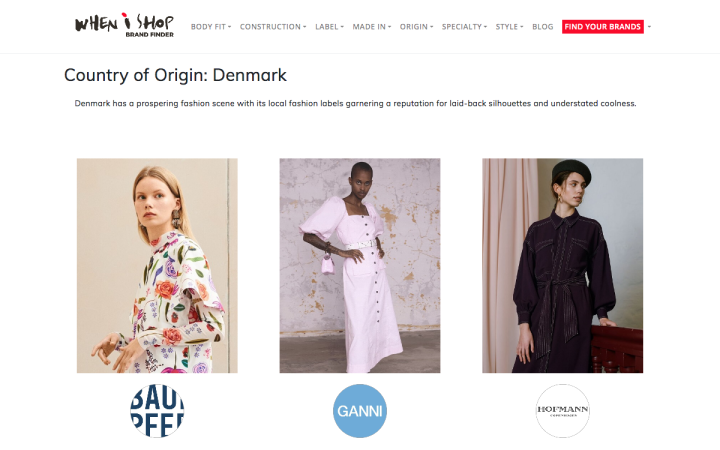
When I Shop is a shopping app, known as a “brand discovery tool”, that was built to help shoppers find unique fashion brands of interest in one convenient place. The site uses a magazine layout to showcase the brands and fashion items that they promote. Naturally, When I Shop’s blog is a crucial component of their website, as the very essence of their product and presence is to be inspirational to shoppers and a respected fashion authority. This can explain why the blog archive section is the first one introduced to the visitor after the hero section on the homepage.
This archive section is where we encounter a top-notch example of how to use the Posts widget to entice readers to continue onward and read your blog posts. There is so much clarity enabled by how the website uses this widget: The close-up, detailed featured image for each post, the heavily-weighted Monteserrat font used for each post title, coupled with the post excerpt written in the less well-known Muli font. These typography choices maximize the potential of the post widget and illustrate how to prioritize the promotion of your blog in an understated, artistic way.
Design & Development: Suzanne Barker
Theme: Hello Elementor
Plugins: Yoast SEO Premium, Social Warfare – Pro, Wordfence Security, Autoptimize, SG Optimizer
08
MountainBIKER.es: Website Navigation Matters
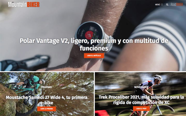
MountainBIKER is a Barcelona-based online magazine that shares news about the mountain biking industry, such as new products on the market, and informative articles about the sport of mountain biking, for example nutrition, physical preparation, and so on. The magazine also features a newsletter which distributes presentations, tests, news, and reports.
In terms of usability, the online magazine leverages the Table of Contents widget and uses it inside their article page which discusses a new product that they tested, an e-bike. The article is a comprehensive review of the product, containing detailed information about the bike’s various components (such as the bike’s battery, engine, as well as the geometric specifications of each component). A table of contents is particularly useful for an article like this, allowing readers to navigate the article comfortably without missing a section that may interest them.
Another design detail which indicates well thought-out usability is the color choice of orange used for many of the call to action buttons, which also corresponds well with the colors used in the logo. Going back to color psychology, orange represents happiness, enthusiasm, and motivation — which are certainly very relevant sentiments to the realm of mountain biking and adventurous sports.
Design & Development: Jose Verdu Mula
Theme: Hello Elementor
Plugins: JetEngine, JetBlog, JetBlocks and JetElements for dynamic content and dynamic posts; Rank Math for SEO; Web Express for serving WebP images; CAOS, OMGF, Perfmatters and WP-Rocket for performance.
07
Uncoated: Mastering Modern Art
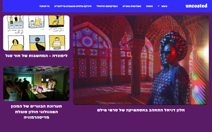
Uncoated is an Israeli online magazine for designers, that defines themselves as “an extreme magazine aimed at sharing and publicizing fascinating pieces of art and their artists, questioning the boundaries between design, art, animation, and illustration.” Uncoated was started by Tal Solomon Vardy and Haim Shushan, two web and UX designers from Israel.
Tal’s professional and artistic style is very prevalent in the website’s design, with the bright blue header, deep purple background, and heavily bolded font used for the image captions. A particularly clever detail on the homepage is how seamlessly the newsletter subscription form is integrated above the footer. The form is also especially minimalist, with only one form field (that’s all that’s needed in this case), and a discreet call to action button that has no border, until you hover over it and the blue background appears. Another nice touch is the use of emojis both in the form field and in the “send” button, which gives a simple but sweet ending to scrolling down the homepage.
Design & Development: Tal Solomon Vardy
Theme: Beans
Plugins: Google Analytics Dashboard for WP, MailChimp for WordPress, Official Facebook Pixel, Yoast SEO, Duplicate Post.
06
Venchas: Filtered and Clear
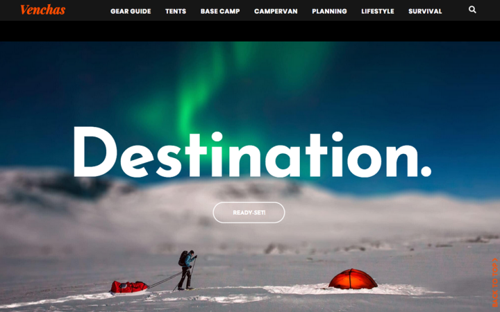
Venchas.com is a camping blog that covers and discusses various camping-related topics, such as gear guides, how-tos, guidance for certain camping-related topics and activities, camping insights, etc. All in all, Venchas is a plentiful resource for anybody (either beginner or seasoned) interested in camping and hiking. The unique font choice of Josefin Sans, a geometric, vintage-style Google Font, adds a pristine, sophisticated yet informal style throughout the entire site, and demonstrates a nice usage of how to use a white on black color scheme. It goes without saying that the vivid, clear photography of candid images of people camping as well as scenic nature, add a motif of authenticity and nature.
Clicking on one of the blog’s topics pages, such as survival, leads you to an archive page of blog posts pertaining to that category. When hovering over each post’s image thumbnail, we encounter a classy way of balancing uniformity with artistic detail, by using CSS Filter Effects, directly inside the Elementor Editor. In this case, the use of the filter effects allows each image to be in black and white when it’s static, yet when hovered over, it turns into a color image. Not only does this increase the engagement factor as readers are browsing through the archive page, but it accentuates each image’s beauty and uniqueness. Between interesting activities, creatures of nature, and so on, each camping-related image deserves to be viewed in all its glory.
Design & Development: Jimmy Eastwood
Theme: Hello Elementor
Plugins: Blackhole for Bad Bots, Elementor Blocks for Gutenberg, Make Column Clickable Elementor, SEOPress Pro, ShortPixel AI, ShortPixel, Simple History, Sticky Header Effects for Elementor, Style Kits for Elementor
05
ISAAC T CHURCH: Beautiful Backgrounds
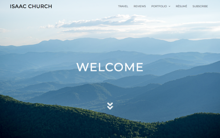
Isaac Church’s blog is his personal travel blog that documents his travels and experiences around the world, especially around the USA. Isaac shared with us that in terms of content, the goal of his blog is to be a fun side project – publication where his family memories are recorded, even if he doesn’t necessarily grow a large reader base. The informality of the blog gives it a naturally relaxing reading experience, but what’s most captivating to us is the hero section’s background image that takes up the full height of the screen. This vantage point transports the visitor to a mountain top setting – where we can see the mountain landscape as if we are at the top of the cliff ourselves.
Another wise design decision that Isaac makes is his choice of color scheme, which simply consists of a steel grey, white, dark green that appears to be black, and other subtle colors that blend right in to his scenic pictures from his travels. This allows his photography work, as well as the content of the images themselves, to stand out and appear center stage, emphasizing the beauty of his travel destinations and his skill of captivating them on camera.
Design & Development: Isaac Church
Theme: Hello Elementor
Plugins: Advanced Custom Fields, Cloudflare, Elementor Google Map Extended, Flexible Elementor Panel, Flexible SSL for CloudFlare, Keybase.io Verification, OoohBoi Steroids for Elementor, Real Media Library, Simple Page Ordering, UpdraftPlus – Backup/Restore, Wordfence Login Security, Wordfence Security, WP Fastest Cache, WP Mail SMTP, Yoast SEO.
04
Grubhub Blog: Quick Fixes Are Easy
Grubhub is a Chicago-based, American food ordering and delivery platform that connects diners/customers with local restaurants. Founded in 2004 in Chicago, Illinois, the company had 19.9 million active users as of 2019, with 115,000 associated restaurants across 3,200 cities and all 50 U.S states. In June 2020, European food delivery service “Just Eat Takeaway” announced an agreement to buy Grubhub for $7.3 billion in stock.
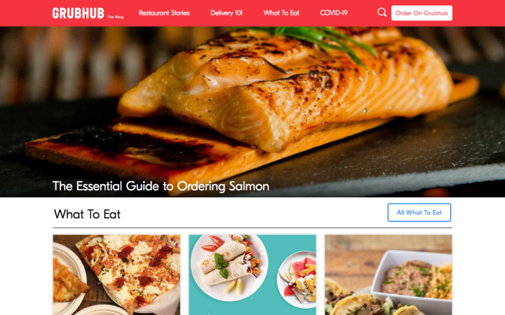
Grubhub’s blog provides various restaurant and culinary-related resources, such as the year’s most popular dishes, “restaurant stories”, quizzes, FAQs, ordering guides, and so on. All in all, the blog serves as a fun, informal resource that increases the community-feeling among diners and their favorite restaurants, beyond the physical network that allows them to order food online.
One unique feature of the Grubhub blog is that in its main menu, there is a COVID-19 page. Logically, this page was created relatively recently, as a new addition to Grubhub blog. Naturally, the COVID-19 page fits right into the rest of the site, which shows how simple it is to add an additional page to an Elementor site. The page itself features advanced yet subtle design details, such as a full-width video background, modern, upbeat iconography, and a multi-colored color scheme. Another noteworthy detail is the blog’s use of a custom font by the name of GS (both light and bold). Adding a custom font to your website can be a great way to make your unique style known, even in the most understated way.
Design & Development: Grubhub
Theme: TheCrave
Plugins: Google Analytics, Tealium, Google Tag Manager, reCaptcha, Yoast SEO, Twemoji, Font Awesome, Babel
03
The Side Blogger: The Power of Words
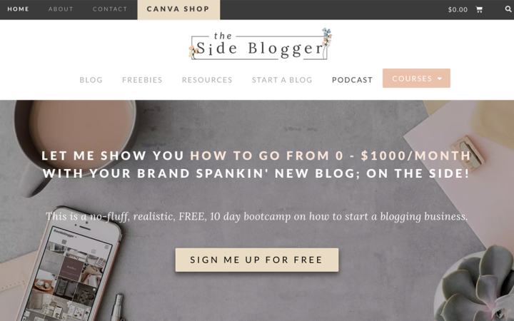
The Side Blogger by Maliha is a blog by a side-blogger, for other bloggers, that provides educational resources for blogging and Canva-related tips and techniques. On the blog’s About page, Maliha defines the goal of her blog: “how to start your side hustle as a blogger, how to grow your business from zero to 1K per month…learn everything you need to know about creating your own successful side-blogging business…”. Maliha’s blog is one that can serve as a core resource for web creators, as it can serve as a comprehensive guide for understanding how blogging can grow your business and finally, how to create that successful blog and see that growth happen.
On the whole, the design of The Side Blogger leverages many subtle design techniques that give it a classy feel, all the while maintaining a unique identity. The website’s blog itself boasts interesting usage of how to use typography to influence information architecture. This is true not only for the text editor widget’s drop cap option, but also for the content of the blog article itself, regarding the heading of each paragraph. Instead of creating traditional sub-headings for each segment of the article, Maliha chose an interesting “language” for each sub-heading: a declarative sentence that introduces the main point/storyline of each paragraph. This content writing style is profoundly unique, and definitely an out-of-the-box idea that we want to keep in mind for our own future writing projects.
Design & Development: Maliha Mannan
Theme: Astra
Plugins: WP Rocket, Optimole, Yoast, Essential Addons for Elementor, WooCommerce, Advanced Editor Tools
02
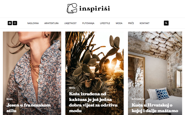
Inspirisi: Interactions of Interest
Inspirisi is a web magazine that offers a vast amount of fashion, architecture, lifestyle, travel and art stories to its readers. The homepage welcomes its visitors with a simple but sleek sticky header, and finds a way to include its many magazine categories without creating a menu that overcrowds the screen. Following the header we find a beautifully-composed carousel widget, which creates a dynamic interaction between the website’s content and its users.
Another design detail to be admired is how well-crafted the contact page form proves to be, directly implementing a fundamental principle in web design: Fitt’s law. This UX law states that the size (and distance) of a target element an interface’s user experience, specifically the time it takes for a user to click on that element. Logically, the longer it takes, the less likely the website visitor may be to click on it. We noticed the relevance of this principle when we realized the width of the send button on the contact page, which, despite only containing one short word, is as wide as each input form on the page. The send button couldn’t possibly be easier to click on.
Design & Development: Studio 081
Theme: Custom
Plugins: Dynamic Content for Elementor, Yoast SEO, Google Analytics Dashboard Plugin for WordPress
01
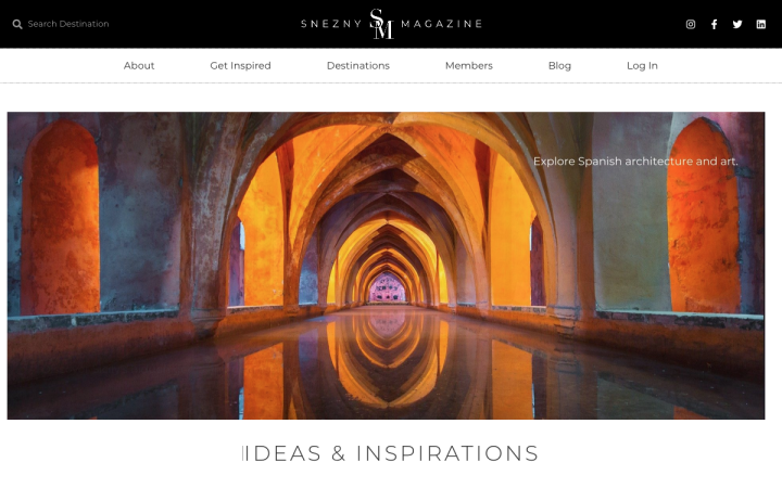
Snezny: Images Come To Life
Snezny is a travel lifestyle magazine that showcases luxurious and remote hotels. The website was founded by hospitality professional Arthur Snezko, who also designed and developed the site. What characterizes the website, as written on its About page, is that it “takes into account how hotels are able to put together a story and a character that forms a journey which will give every guest the utmost memorable experience.”
We can’t help but notice how classy and picturesque the website’s design and content truly are. Towards the bottom of the homepage, we encountered the Instagram photo galleries, which incorporates several design techniques that come together to form a truly remarkable display. The masonry-style image gallery is introduced to the visitor through lazy load, which, by the way, is a very helpful tactic for optimizing the speed and performance of your site. The choice of photographs for the Instagram gallery is clearly well thought out, as each image conveys the beauty and tranquility you experience when you travel to the destination. The clear blue skies, the picture-perfect swimming pools, and freshly cut grass give every website visitor the inkling and incentive to learn more about their travel options.
Design & Development: Arthur Snezko
Theme: Ocean WP
Plugins: Add Categories to Pages, GDPR Cookie Consent, Header and Footer Scripts, My Custom Functions, Search Exclude, Ultimate Member, Site Kit by Google, Yoast SEO, WPS Hide Login
Think your Elementor-based website or landing page should be featured in our next Top 10 Websites column? Give it a shot!
