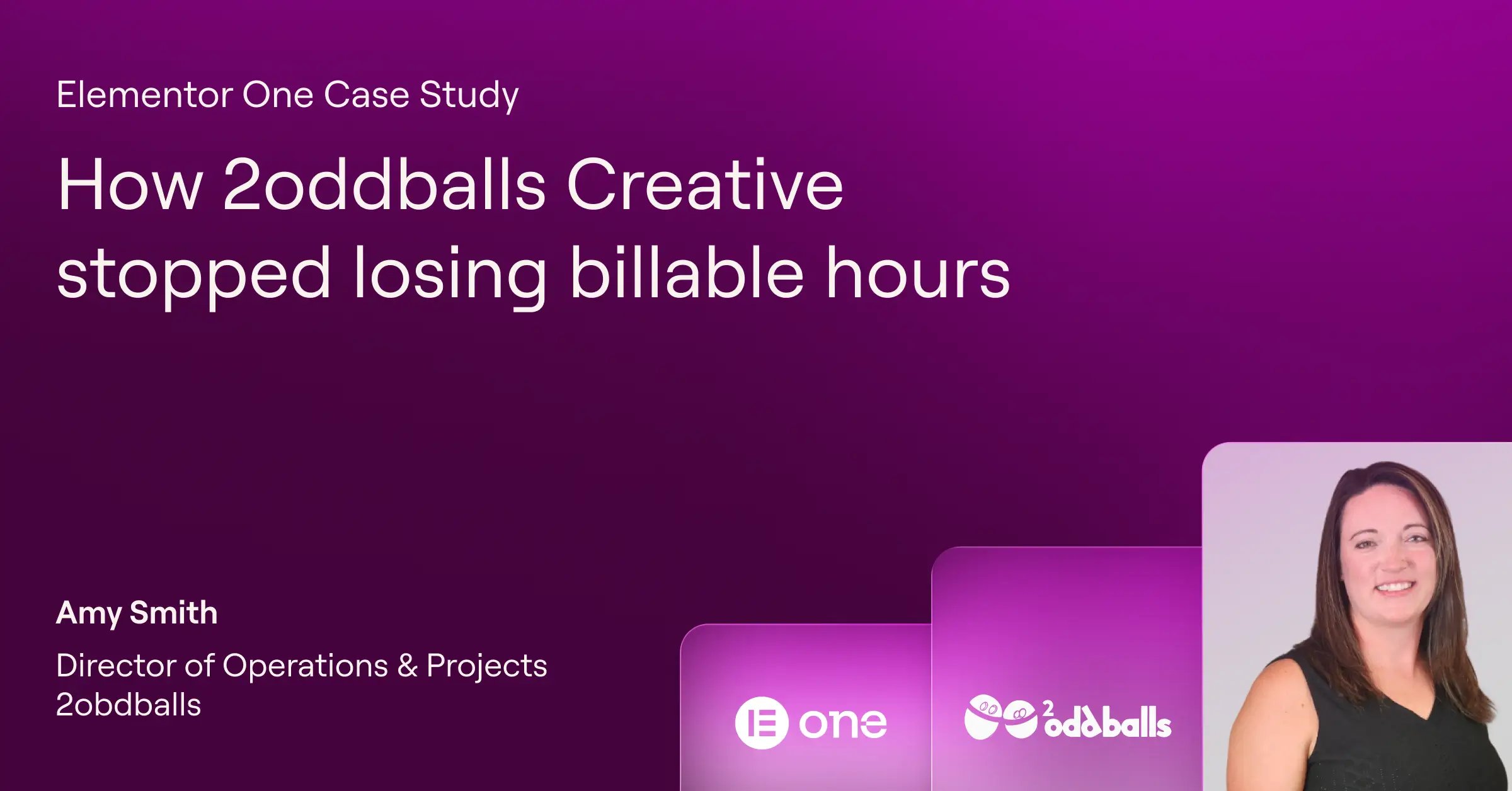
Agency maintenance work rarely makes it onto an invoice. Here's how 2oddballs Creative stopped absorbing those hidden costs and started protecting its margins instead....
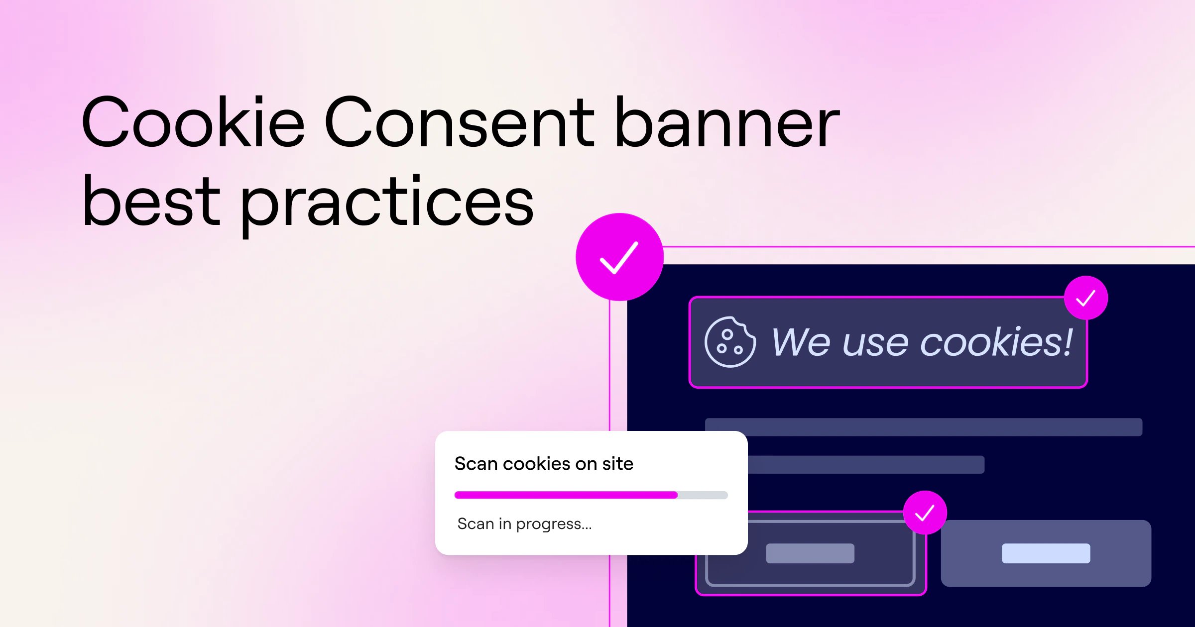
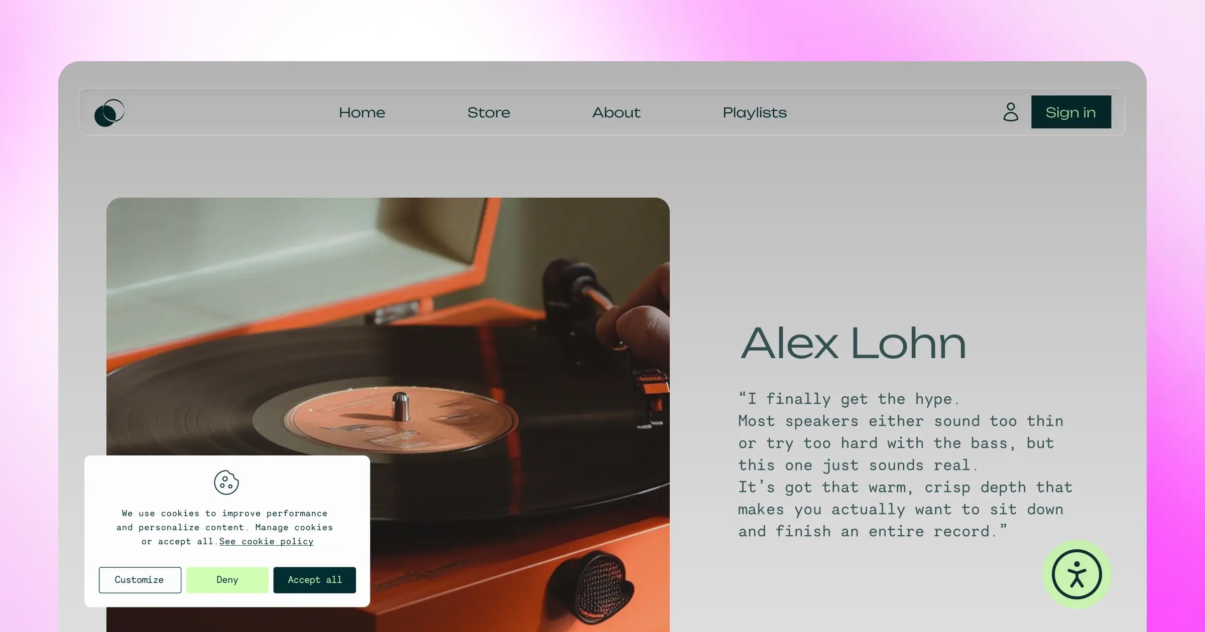
Learn how to design cookie consent banners that lift opt-in rates while building trust. Practical UX, copy, accessibility, and placement guidance for 2026....
Privacy regulations are tightening. Accessibility laws are expanding. Here's how to handle both without turning your business into a compliance project....
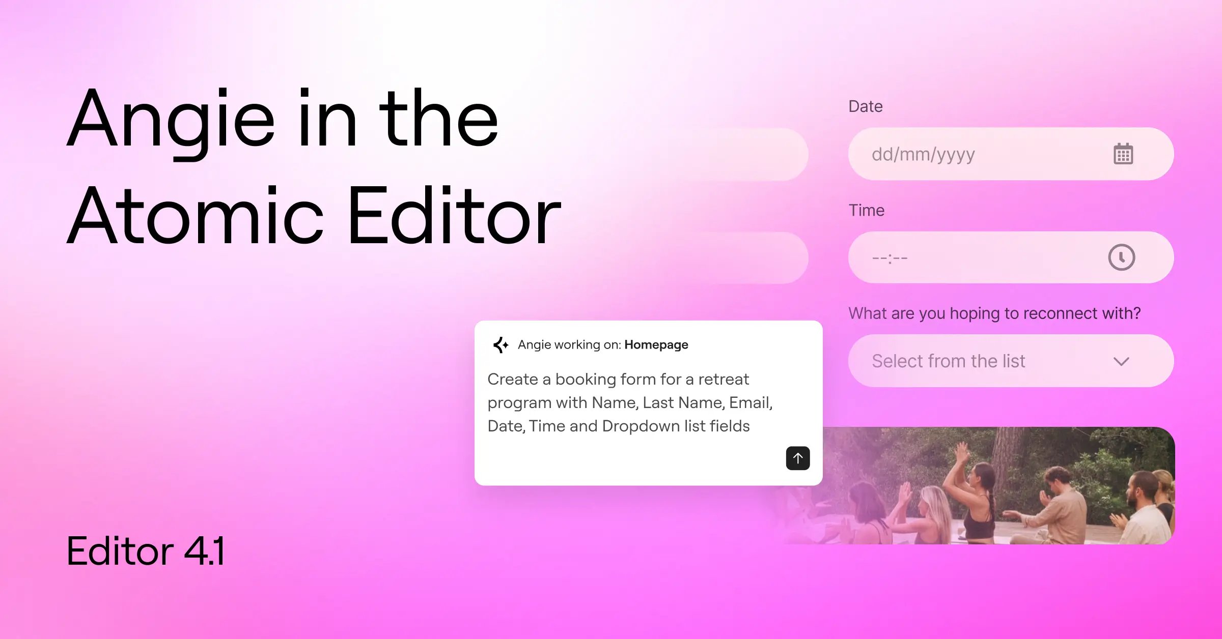
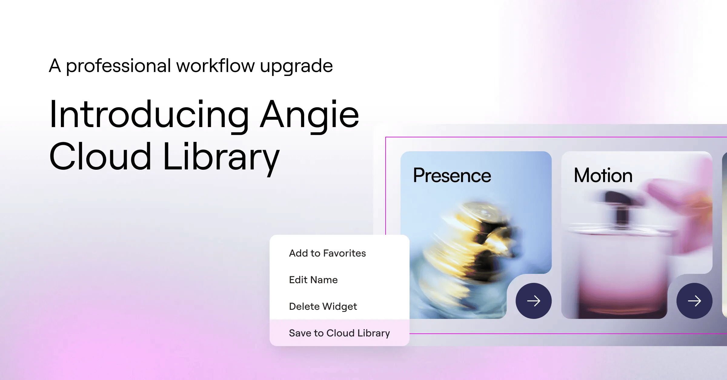
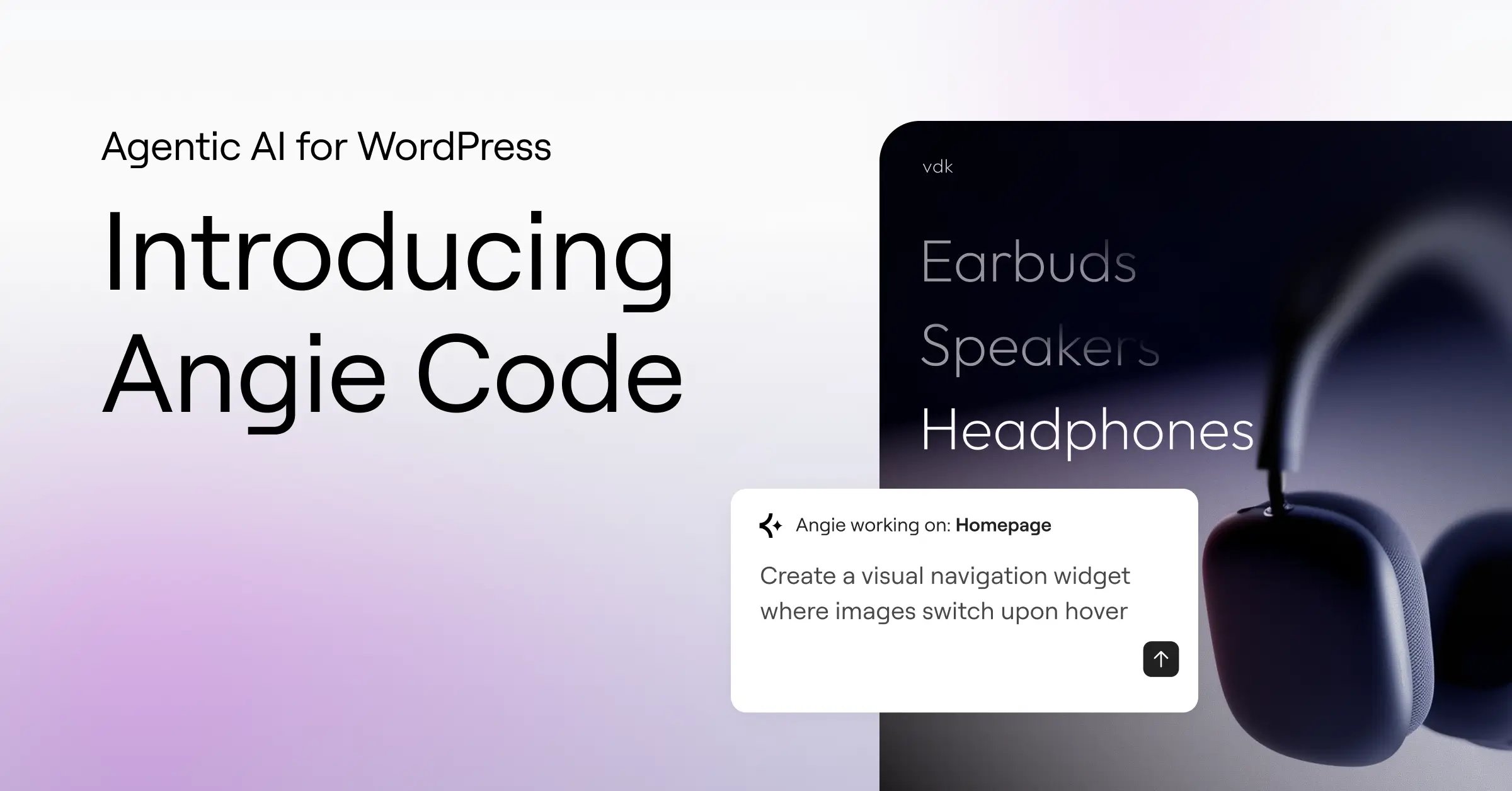
Angie now generates Forms, Variables, and Classes directly inside your Atomic system. Fully editable, fully reusable, never locked outside your site. Here's what's...
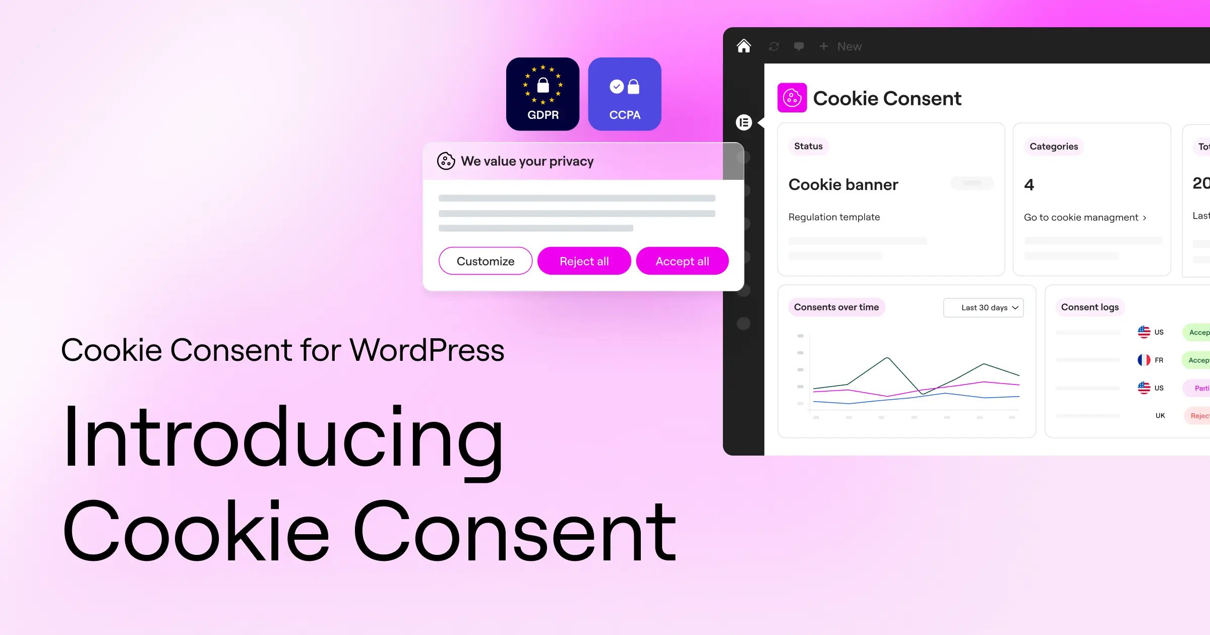
Take the guesswork out of privacy requirements with Elementor’s Cookie Consent. Set up GDPR and CCPA-ready banners, scan and categorize cookies, block non-essential...
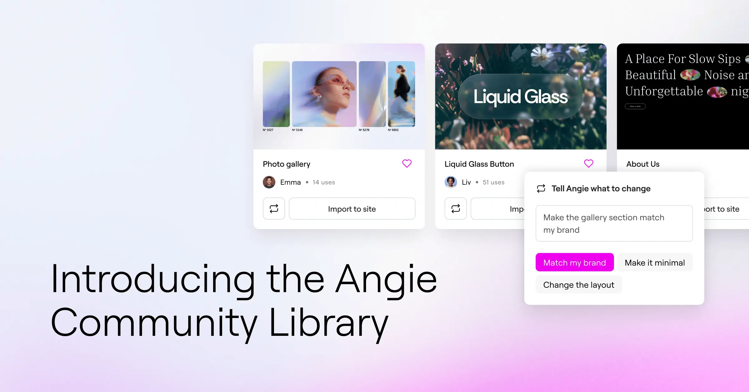
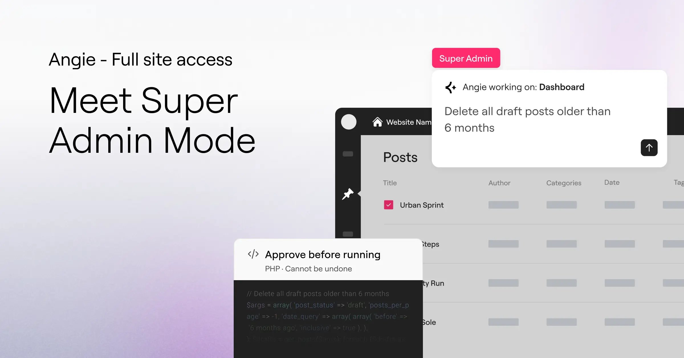
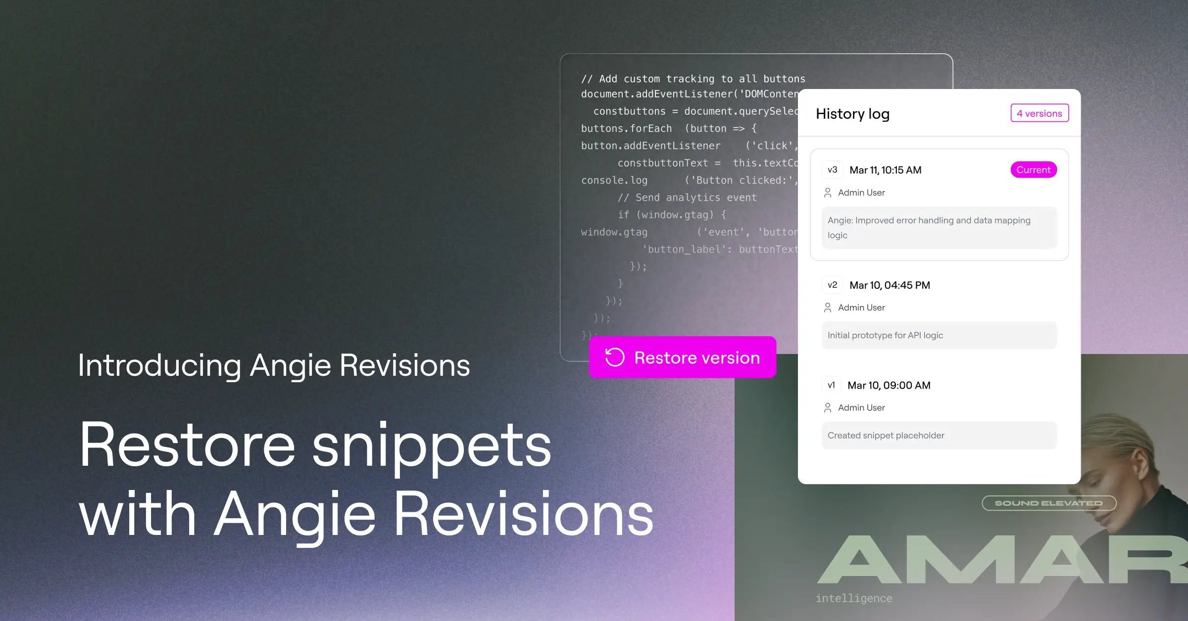
Angie’s Super Admin Mode revolutionizes the way you approach site management at an unprecedented scale. With its understanding of your site, Super Admin...
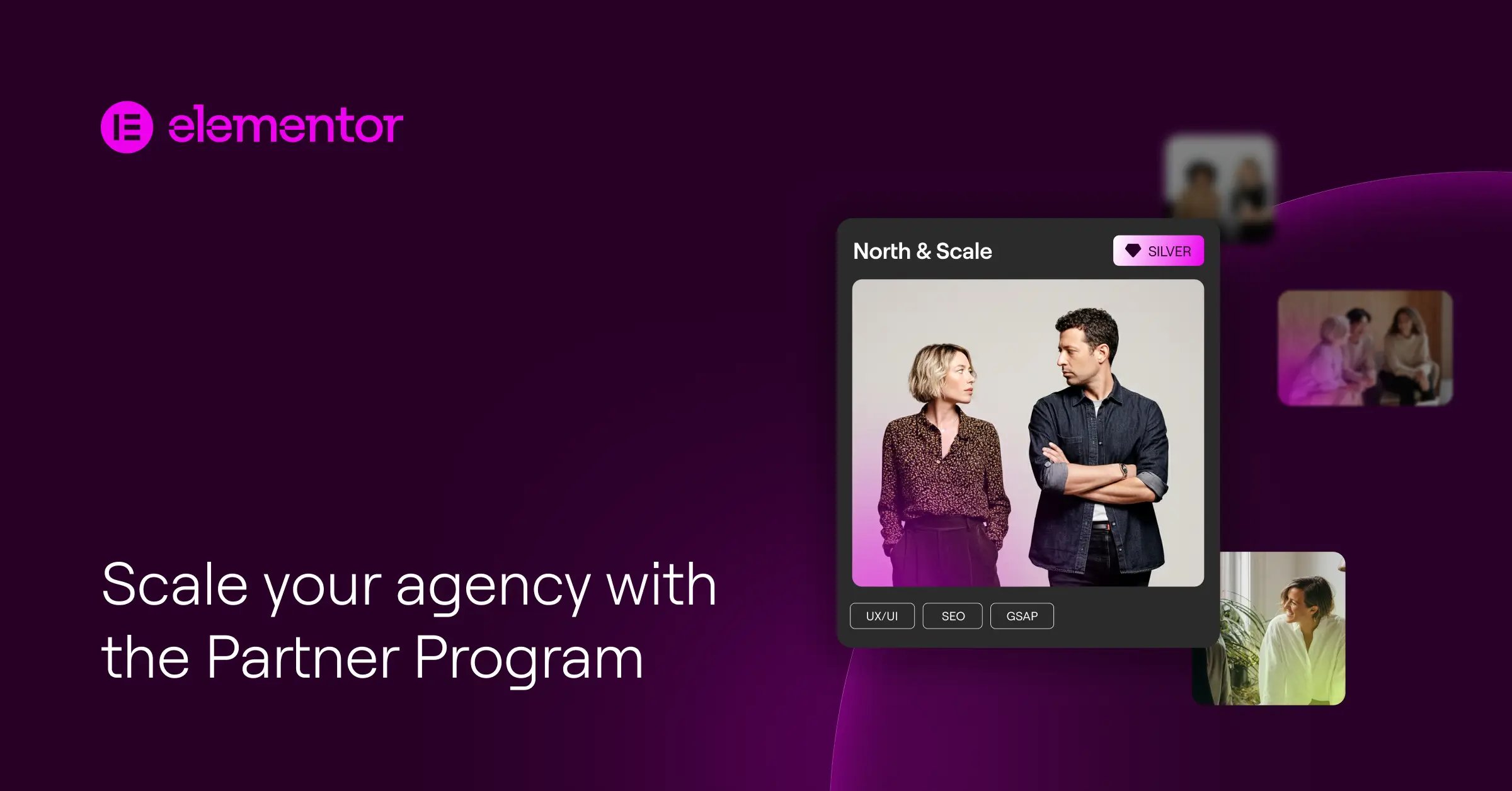
Discover how the Elementor Partner Program helps agencies move from one-off projects to long-term partnerships, generate recurring revenue, and scale their business with...
Discover the trends shaping modern websites, from AI-powered experiences and scalable design systems to immersive storytelling, personalization, accessibility, and performance-first creativity. Explore 11...
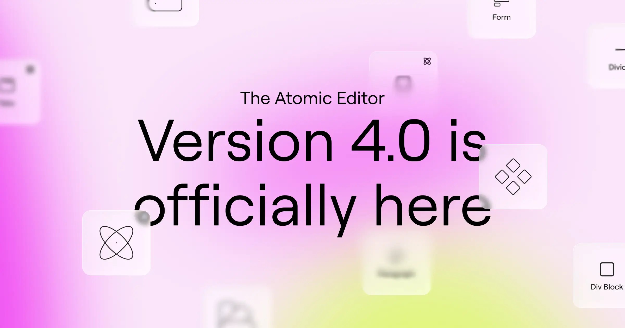
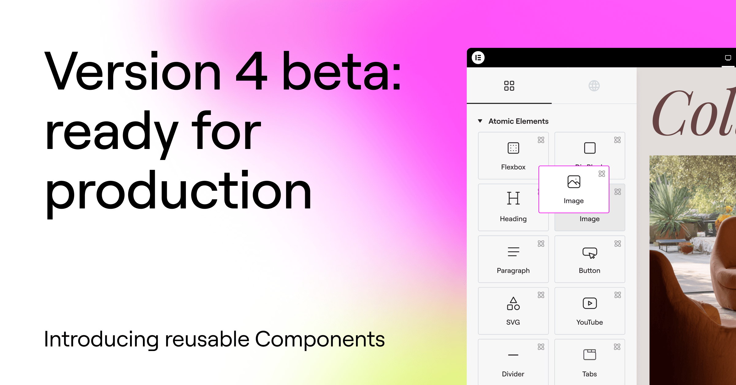
Version 4 introduces a new foundation with reusable Variables, Classes and Components, improved performance, a unified styling system, and fully responsive style controls,...
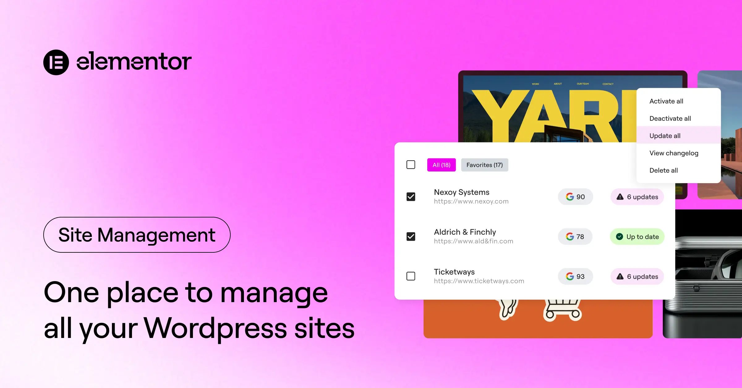
Manage all your WordPress sites from one place. Monitor performance, run updates, detect security risks, and optimize your sites with a centralized dashboard....