About the author: Steven Kiridis, Web Designer and Educator @ Elementor
Steven loves creating interactive and playful websites that promote user-friendly journeys. When he is not performing CSS experiments in his mad lab, he enjoys playing the piano, doing gymnastics, and traveling.
Designing a landing page can often feel like a tricky mix of art and science. You want the page to represent the brand in both graphics and text, while also moving visitors farther along the sales funnel. It can be a tricky balance to strike.
Fortunately, there are some guidelines you can follow to help you design the strongest landing page possible. Using this framework while keeping your clients’ aesthetics in mind can solidify your reputation as someone who produces effective results.
In this article, we’ll give you a crash course on the anatomy of a landing page. Then we’ll share eight best practices for how to design a landing page that converts successfully. Finally, we’ll explore some common mistakes and how you can avoid them. Let’s go!
Table Of Contents
- An Introduction to Landing Pages (and Why You Might Want To Create One)
- The Anatomy of a Landing Page
- Above the Fold Elements
- Content
- Conversion Elements
- Footer
- Designing an Effective Landing Page — 8 Best Practices
- 1. Keep Your Landing Page Simple
- 2. Show Your Customers That You Can Be Trusted
- 3. Write Concise Headlines
- 4. Optimize Your CTAs
- 5. Make Your Landing Page Engaging
- 6. Build Forms With User Experience (UX) in Mind
- 7. Be Sure To Use Contrasting Colors
- 8. Use Legible Fonts
- Common Landing Page Mistakes (and How To Avoid Them)
- Low-Resolution Images
- Cold Outreach Messages
- Broken CTAs
- Non-Scannable Copy
Grow Your Sales
- Incredibly Fast Store
- Sales Optimization
- Enterprise-Grade Security
- 24/7 Expert Service

- Incredibly Fast Store
- Sales Optimization
- Enterprise-Grade Security
- 24/7 Expert Service
- Prompt your Code & Add Custom Code, HTML, or CSS with ease
- Generate or edit with AI for Tailored Images
- Use Copilot for predictive stylized container layouts

- Prompt your Code & Add Custom Code, HTML, or CSS with ease
- Generate or edit with AI for Tailored Images
- Use Copilot for predictive stylized container layouts
- Craft or Translate Content at Lightning Speed
Top-Performing Website
- Super-Fast Websites
- Enterprise-Grade Security
- Any Site, Every Business
- 24/7 Expert Service

Top-Performing Website
- Super-Fast Websites
- Enterprise-Grade Security
- Any Site, Every Business
- 24/7 Expert Service
- Drag & Drop Website Builder, No Code Required
- Over 100 Widgets, for Every Purpose
- Professional Design Features for Pixel Perfect Design
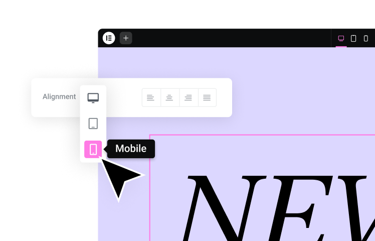
- Drag & Drop Website Builder, No Code Required
- Over 100 Widgets, for Every Purpose
- Professional Design Features for Pixel Perfect Design
- Marketing & eCommerce Features to Increase Conversion
- Ensure Reliable Email Delivery for Your Website
- Simple Setup, No SMTP Configuration Needed
- Centralized Email Insights for Better Tracking
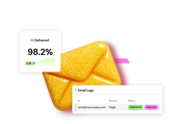
- Ensure Reliable Email Delivery for Your Website
- Simple Setup, No SMTP Configuration Needed
- Centralized Email Insights for Better Tracking

- Ensure Reliable Email Delivery for Your Website
- Simple Setup, No SMTP Configuration Needed
- Centralized Email Insights for Better Tracking
An Introduction to Landing Pages (and Why You Might Want To Create One)
The typical website consists of a wide range of different pages that have various goals and content types. In contrast, landing pages are designed with a clear focus or goal, and almost always have a singular Call To Action (CTA).
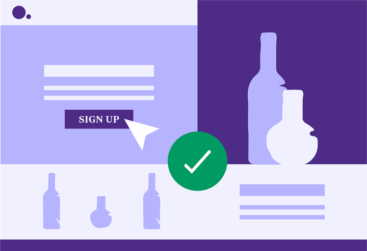
You can create a wide range of different landing pages. For example, you might be raising awareness for an upcoming event, or sharing information about a new product. However, landing pages are most commonly used to drive conversions in marketing and advertising campaigns, including email and Pay Per Click (PPC) campaigns.
Instead of directing visitors to a general page on your website, you can take them to a landing page that’s customized specifically for a particular campaign. This page will encourage the visitor to convert by guiding them towards a single, compelling CTA. By creating an effective marketing landing page, you can help drive conversions and ultimately create a more successful campaign.
Unlike most web pages, landing pages often actively discourage exploration in an attempt to push visitors towards the CTA. This is why so many landing pages hide the website’s regular menu, or remove links from the header and footer areas.
Your landing page CTAs can either be focused on lead generation or encouraging click-throughs. Lead generation is the process of attracting someone who has demonstrated an interest in your products or services, and starting them down the sales funnel.
Lead generation CTAs often involve the prospect sharing their contact information with your company. At that point, the prospect is considered a qualified lead. A lead generation CTA might encourage visitors to book a free consultation with your engineers, or sign up to your mailing list.
The goal of a click-through campaign is to encourage visitors to engage with your CTA. A click-through landing page might prompt the customer to visit a product page for more information. This type of campaign may also culminate in the visitor sharing their contact information, but the next step is usually getting them to view another part of your website.
The Anatomy of a Landing Page
Before we discuss how to design a landing page, let’s look at the different components it will likely contain.
Above the Fold Elements
The portion of your page that’s visible to a user without scrolling or clicking is considered ‘above the fold’. Since it’s the first content a visitor sees, you’ll want to take advantage of this valuable real estate.
In the following example from Miro, you don’t have to scroll to understand what the business offers and reach out:
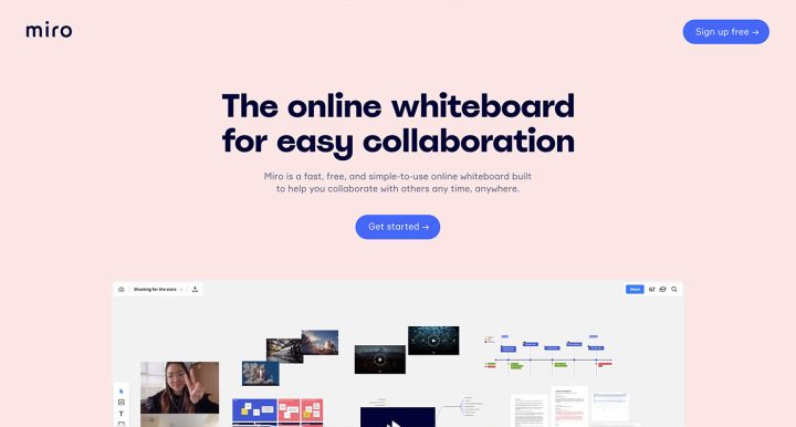
You’ll often find that the ‘hero section’ is placed above the fold. A hero section is typically a large banner image at the top of the page, although it isn’t limited to static images. You can use animations, sliders, or even just eye-catching typography.
For example, Airbnb provides information specific to your location in this element:
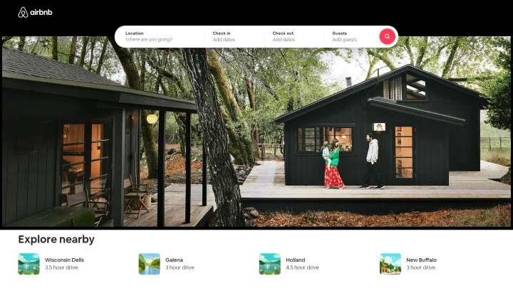
Whatever you choose to include above the fold should demonstrate a strong sense of what your landing page is offering. Then you can provide more detailed information in the page’s ‘below the fold’ content.
Content
Your content likely makes up the majority of your landing page. Content is used to speak to your audience and persuade them to take action on your offer.
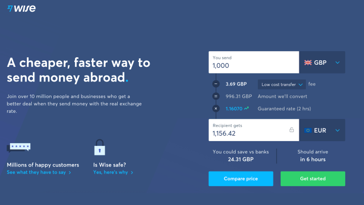
You can include descriptions of your product or service’s features and benefits, as well as pricing and other information. Wise’s landing page provides a calculator that you can use to work out how much money you’ll save by using this service:
While the content may be text-heavy, remember that you can include other media as well. You have plenty of freedom regarding what to include in your content, but there are a few elements you won’t want to leave out.
For example, you’ll probably want to mention your Unique Selling Point (USP):
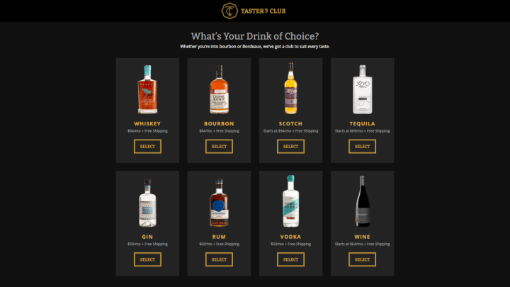
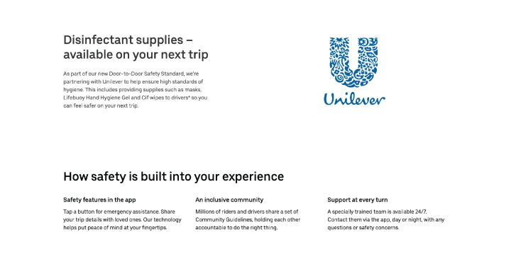
This is where you can show off a bit and let your audience know why your offering is superior to the competitors. Unilever promotes guidelines and commitment to safety:
Social proof is another helpful type of content that can build credibility and trust. This social content can take several forms, including positive reviews from customers or press coverage from respected publications in your niche.
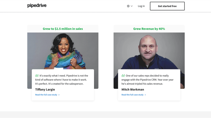
For example, Pipedrive displays statistics as well as user reviews:
If you’re just starting out, you may not have much in the way of social proof yet. Don’t be afraid to ask for feedback from users, so you can start building out this part of your landing page as soon as possible.
Conversion Elements
Conversion elements play an essential role in turning visitors into customers. The type of conversion you’re aiming for will depend on the purpose of your landing page.
If you have an e-commerce site, you’re likely hoping to sell a product. However, if you want your landing page to build your email list, a successful conversion could be a newsletter signup.
Regardless of the type of conversion you’re after, strong Calls to Action (CTAs) can help you accomplish your goal. A CTA is your opportunity to ask the visitor to perform a specific action.
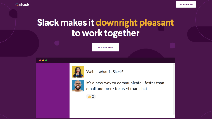
If you’re trying to build an email list, your CTA could be a button asking users to “Sign Up Now”. You can also make your buttons more appealing by using words such as “free”, as Slack does here:
While this may sound simple, you’ll likely spend a lot of time tweaking your CTAs. In addition to enticing copy, you’ll also want to carefully consider placement and colors.
Footer
Many people overlook the footer, but it plays a very important role in conversions. You can include additional information and lead generation forms for newsletter signups or even social media links like in the example we see below.

Design a footer specifically for your landing page, and limit menu links that navigate the users away from it. Having no distractions, visitors are more likely to complete the CTA successfully.
Designing an Effective Landing Page — 8 Best Practices
Now that you understand the importance of the various elements, you can use them to build an effective landing page. Below are eight best practices to consider along the way.
1. Keep Your Landing Page Simple
Minimalism can be effective when it comes to web design. A simple design can help to set off your images and CTAs, as seen on Pocket’s landing page:
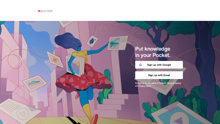
You don’t need to be a design expert to create a minimalist landing page. However, there are a few principles to keep in mind.
First, try to include plenty of white space. This can encourage users to focus on the critical parts of your page, without feeling overwhelmed by a lot of input.
You may also want to understand flat design, in order to keep your landing page minimal but still functional. Flat design uses safe, simple typography, grid-based layouts, and an intuitive interface.
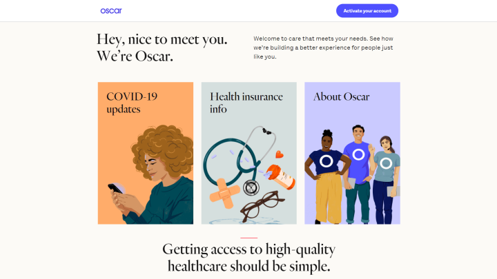
However, it is possible to oversimplify your design to the point that it’s difficult to use. To avoid that, you can make your interactive elements stand out a bit by adding some shading.
Oscar’s landing page is a beautiful example of this principle in action:
Symmetry is another important aspect of minimalist design. It’s pleasing to the eye and can help guide your users where you want them to go. Using Elementor’s Navigator can enable you to maintain symmetry throughout your landing page.
2. Show Your Customers That You Can Be Trusted
To earn potential customers’ confidence, you might want to include trust signals on your landing page. While it’s no surprise that most shoppers check online reviews before purchasing, other elements can also help to earn trust.
Online shopping has become commonplace, but people are still typically guarded when purchasing from an unfamiliar business. You may want to display the logos of payment processors you accept, such as PayPal, so shoppers know their information is protected.
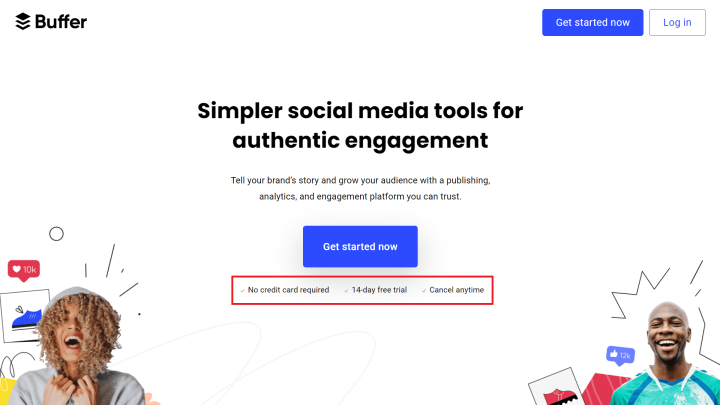
If you offer a money-back guarantee, you might want to include this in a prominent place on your landing page, as Buffer does:
Earning trust is an important area where social proof comes into play. You might gather screenshots of positive discussions about your offerings to include in your landing page copy.
To easily add reviews from Yelp and Google, you can try Ultimate Addons for Elementor. The Business Reviews feature pulls content directly from these platforms and adds it to your site.
3. Write Concise Headlines
The web values concise writing, mainly because people tend to skim web pages rather than read them deeply. Keeping your headlines brief and to the point can help users find the information they’re most interested in.
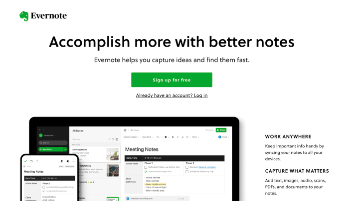
Clear headlines also can summarize and emphasize key benefits, as demonstrated by Evernote:
In addition to your headlines, you may want to keep the rest of your content equally scannable. One way to do this is by using frequent subheadings and keeping your paragraphs short.
Writing powerful headlines takes some practice. If you’re stuck, you can use a headline template to get started.
4. Optimize Your CTAs
CTAs are a combination of design and copy, so there’s plenty of room for creativity and experimentation. These are a crucial part of your sales process, as they’re used to ask your audience to act.
When writing the copy for your CTAs, try to be as specific as possible. Your users are more likely to take action if they know what you’re asking them to do.
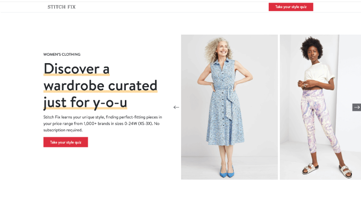
Stitch Fix invites new customers to take a style quiz:
Also, it’s smart to be mindful of where you place your CTAs. If your landing page is long, you’ll want to include them throughout your content, so one will always be conveniently located when a user decides to take action.
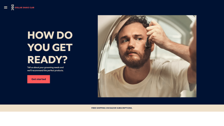
You may want to have a CTA above the fold, as Dollar Shave Club does:
With so many possibilities involved in CTA design, you probably won’t get it perfect on your first try. You may want to perform A/B testing to guide you as you iterate on your landing page CTAs.
5. Make Your Landing Page Engaging
If your landing page is primarily text, there’s a chance that users’ attention will drift as they scan. To avoid this, there are a few strategies you can use to keep your landing page as engaging as possible.
One way to keep viewers scrolling through your offer is to include animation. You might use this to draw attention to your main points or keep it subtle with a parallax effect. If you’re concerned about the amount of text you need to explain your offer, you might want to opt for a video-only landing page.
When it comes to navigation on your landing page, you may also want to include few or no links that navigate away. These links can be the privacy policy, terms and conditions or even the main link from your logo. It is quite common, especially for campaigns, to see the main menu removed from the landing page. This promotes engagement and helps minimise distractions for your potential customers.
6. Build Forms With User Experience (UX) in Mind
User Experience (UX) covers all aspects of a user’s interaction with a website. It’s a vital web design component, as visitors who are frustrated or confused by your page will likely leave.
While you can apply UX principles to your landing page, you may want to be especially mindful of your forms. Forms are important for meeting many types of conversion goals, so you’ll want to make filling yours out as frictionless as possible.
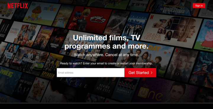
Start by keeping your form simple and asking only for the information you need. For example, Netflix only requires an email to get started:
You can also keep the required fields to a minimum. This enables users to include more information if they wish, without forcing them into it.
7. Be Sure To Use Contrasting Colors
Using contrasting colors not only keeps your landing page visually interesting; it’s also an essential part of accessibility. This can be challenging when you include text over an image.
Therefore, you might use a background image overlay, as Growth Tools does:
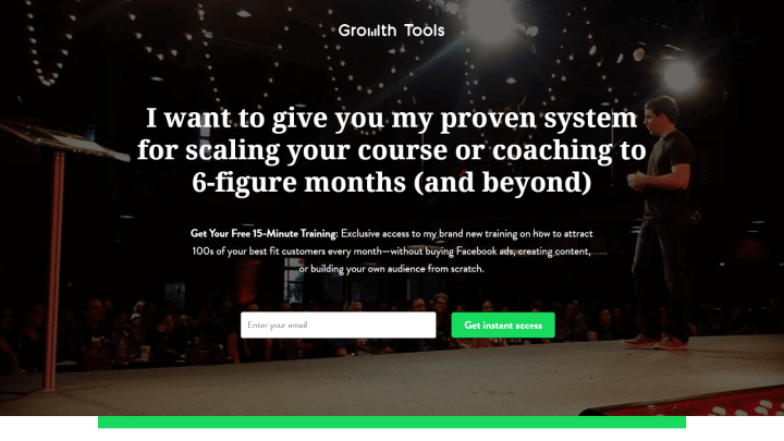
To ensure that there’s enough contrast between your colors, try viewing your landing page in grayscale. You can use Elementor’s filter effects for an easy way to do this.
8. Use Legible Fonts
Typography is critical on the web. Along with poor contrast, font size is a common complaint among users. Therefore, you’ll want to pay attention to the fonts you include in your content, as well as your CTAs.
When choosing fonts, we recommend keeping the following tips in mind:
- Limit the number of different fonts you use across your site and landing page.
- Choose a font that can accommodate different screen sizes.
- Increase the white space between letters to improve the readability of your content.
- Remember that serif fonts work well for large chunks of text.
You can even use customized fonts with Elementor, so your landing page will be legible but still on-brand.
Common Landing Page Mistakes (and How To Avoid Them)
While every landing page is a bit different, there are some common mistakes that you’ll want to be aware of so you don’t make them yourself.
Low-Resolution Images
If you’re using a minimalist design for your landing page, your images will likely garner a lot of attention, so they need to look as crisp as possible. For this reason, it’s important to ensure that you’re using high-quality images and to use image software such as Adobe Photoshop or GIMP where appropriate.
However, large image files can negatively affect your WordPress site’s performance. This can be disastrous for your conversion rates. Walmart experienced sharp drop in conversion rates when its page load times ballooned from one to four seconds, so it’s important to strike a balance between high-resolution images and performance. Here, it may help to use tools to optimize your images without sacrificing quality.
You might also compress your images using the TinyPNG website or WordPress plugin. TinyPNG selectively decreases the number of colors within your image. This can reduce the size and boost your landing page’s performance, without impacting the image’s quality:
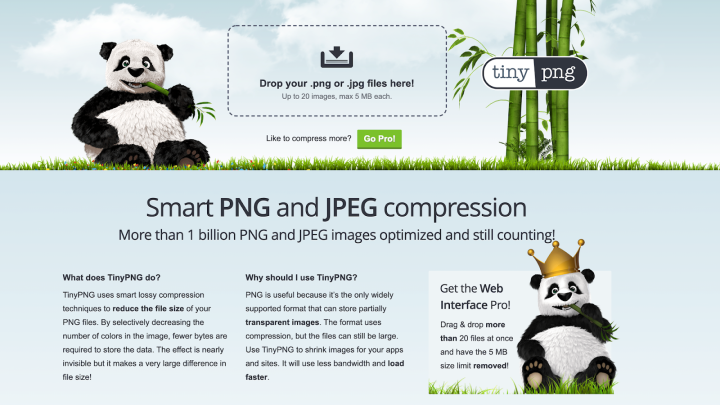
There are also plenty of additional steps you can take to boost your landing page’s performance, including Content Delivery Networks (CDNs) and caching. As an added bonus these techniques will improve the performance of your entire website, and not just your landing pages.
Cold Outreach Messages
The language on a landing page can showcase a brand’s personality. If messaging is cold or flat, it won’t do much to entice customers. Try to keep language friendly and engaging, as Constant Contact does:
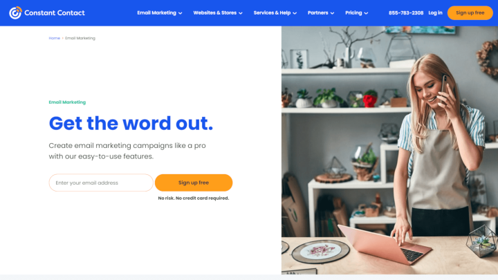
Constant Contact’s CTA as seen here is quite inviting, mentioning that there’s no risk or credit card required. The page also emphasizes that the product is easy to use.
Broken CTAs
If a CTA isn’t functioning correctly, you’ll likely miss out on leads. Even a well-designed CTA won’t be much use if it doesn’t work correctly.
When you’re setting up your CTAs, there are a few issues to look out for. If you’re offering a lead magnet, you’ll want to be sure the download works properly. If the offer arrives via email, be sure your site is sending email reliably. A customer not receiving a promised reward will likely end up with a poor impression of your business.
Also, it’s important to ensure that contact form entries route to the right person. This is especially important if you’re designing a landing page for a client, and won’t be receiving these notifications yourself.
Finally, be sure any CTA buttons are clickable and work as expected. A button that users can’t click on is confusing and can hurt the site’s UX.
The best way to ensure that your CTAs are working is to test them yourself. You may want to make a list of all the CTAs you’ve included on the landing page, so you don’t overlook any during testing.
Non-Scannable Copy
Since people tend to skim content on the internet, you’ll want to make your copy as inviting as possible. Large chunks of text can be an eyesore and may prevent users from receiving your message.
Blue Apron does an excellent job of laying out copy so that it’s easy to scan:
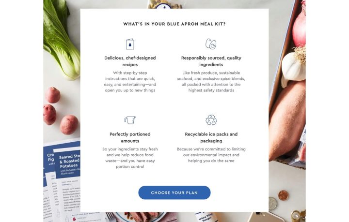
To keep text scannable, try to keep your sentences and paragraphs relatively short. You can also use frequent headings and subheadings to break up the text further. Finally, remember that bulleted lists attract the eye and are easier to read.
Time To Build Your Landing Page
Designing a landing page that’s simple, engaging, and converts is no small feat. With so many discrete sections and potential mistakes, it’s easy to become overwhelmed by the task. However, by focusing on one piece at a time, you’ll likely find it’s not as difficult as it may first appear.
Many of the landing page best practices we’ve covered emphasize clarity and ease of use. Ultimately, a simple design, concise content, and legible fonts can help lay the foundation for a successful page.
What do you think makes an effective landing page? Share your thoughts with us in the comments section below!
Looking for fresh content?
By entering your email, you agree to receive Elementor emails, including marketing emails,
and agree to our Terms & Conditions and Privacy Policy.
