Table of Contents
Since its creation, the face of the web has undergone many changes. What essentially started as a Wild West of design in the 1990s and early 2000s eventually made way for simpler, cleaner, and more predictable websites.
Then, smartphones entered the fray and huge changes were needed. Consequently, there’s been a seismic shift that apps, and eventually websites underwent thanks to Google’s design system and language — Material Design.
Originally introduced in 2014, this grid-based design system got adopted, spread like wildfire, and then took on a new life.
But what is it, really?
In this article, we are going to discuss Material Design, show you some examples of websites that use Material Design today, and provide you with resources to help you use Material Design in your own design and development of websites. So, let’s get started.
Table of Contents
What Is Material Design?
Material Design is a design system that was developed by Google in 2014. The entire design system, its design language, and all its documentation now live at material.io:
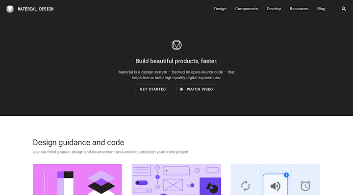
Like other design systems, Material Design includes the following:
An explanation of the driving principles behind the design system:
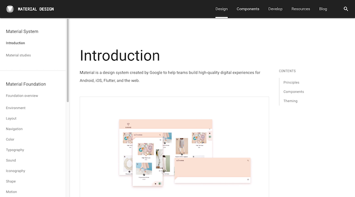
Guidelines for using the new design language and creating products with it:
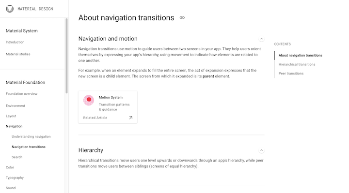
Reusable components that enable designers to easily create Material UIs:
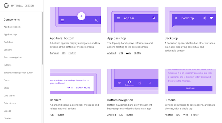
But Material Design is much more comprehensive than most design systems. That’s because it wasn’t built for just one brand or project.
Code-named “Quantum Paper”, Material Design was released as a design language that Android designers could use to create better apps through good design. Google also used Material Design to overhaul the design of its apps.
The overall goal of Material Design was to enable designers to quickly build apps that were responsive, usable, and scalable.
In 2014, the release of Material Design made huge waves across the design community — not just for Android development, but for iOS apps and websites as well.
Why Was Material Design Created?
To understand how Material Design came to be, we have to look at what came before it.
Skeuomorphism
It was around 2010 when skeuomorphism rose to prominence. This was a style of design that made UI elements look like the actual objects they were based on. We saw this a lot when it came to website backgrounds and icons.
This is a screenshot from the Apple homepage in 2012:
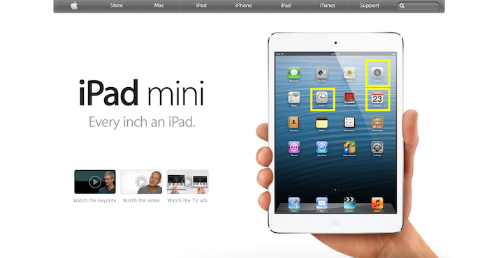
Many of the app icons you see on the iPad are skeuomorphic. For example, look at the ones highlighted in yellow:
- The Camera app’s icon resembles the lens of a camera.
- The Clock app’s icon looks like an old analog wall clock.
- The Calendar app’s icon looks like a flippable calendar card.
Skeuomorph UIs ended up proving to be too distracting because of their lifelike qualities. What’s more, the realistic attributes of the design weren’t used for any reason other than to be trendy.
Flat Design
The subsequent design trend, flat design, aimed to strip away the excess and superficialism of its predecessor.
Here’s how those previously skeuomorphic icons look on an iOS device in 2020:
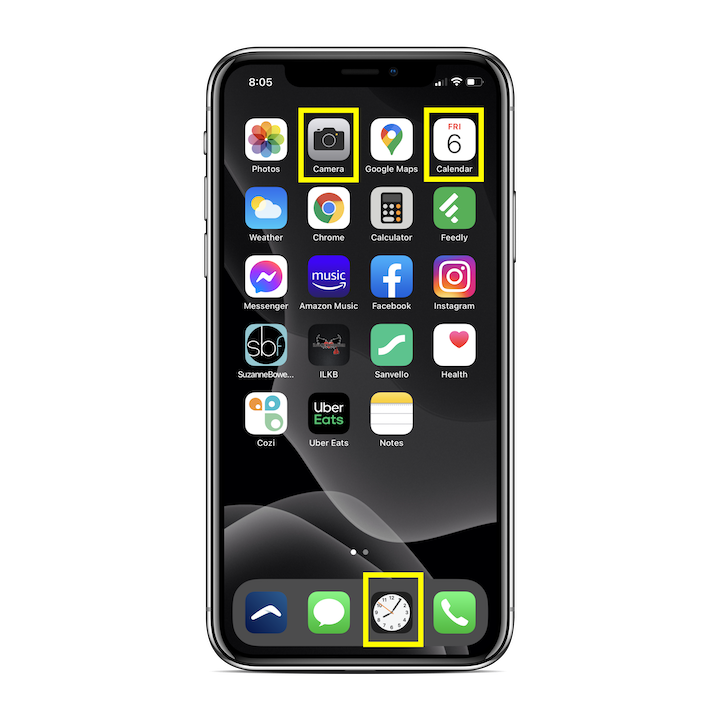
These icons (as well as the icons for many long-standing apps) have become flat and had most of the realistic qualities taken out of them.
While flat design continues to persist to this day — since minimalism and good, clean design will never go out of fashion — there was a major flaw that needed fixing.
As Nielsen Norman Group explains:
“[Flat design] often leads to click uncertainty and decreased user efficiency. When designers flatten the UI, they tend to remove many signifiers that normally tell users where to click.”
Material Design
Material Design was inspired by the physical world. But this wasn’t an attempt to bring design back to the skeuomorphic days. It’s a metaphor (which we’ll look shortly at when we explore its principles).
Really, what Material Design did was move away from designing completely flat UIs to designing surfaces that were inspired by paper and ink. Think of it like this:
When looked at head-on, a sheet of paper appears flat and two-dimensional. However, in the real world, that’s not actually how it behaves.
Paper exists in three dimensions. Sheets of paper create shadows, seams, and folds and can be cut and resized for our needs — something that Google aimed to recreate in the digital space with Material Design.
This example from the Material Design website is one of Material’s trademark styles:
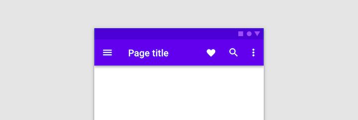
Notice the shadow that sits under the otherwise flat top app bar.
So, Material Design still uses flat elements. However, those elements sit on various planes and can behave like paper and other objects in the real world, giving digital experiences a more lifelike “feel”.
This enables an app’s or website’s users to more naturally respond to the UI as they understand how to touch and move around objects just as they would in the physical environment.
Matias Duarte, the Vice President of Design at Google, explained why this was an important change to bring to the web:
“Unlike real paper, our digital material can expand and reform intelligently. Material has physical surfaces and edges. Seams and shadows provide meaning about what you can touch.”
Going back to that point from the NNG, Material Design fixes the issue stemming from a lack of depth and other key signifiers in flat design.
It brought other more meaningful changes to design, too.
What Are the Core Principles of Material Design?
Material Design is about more than just adding layers or shadows to design. It’s a super-comprehensive resource that sets the rules for a new design language.
Similar to how we have basic principles we need to follow in web design, Material Design has three principles of its own:
Principle #1: Material Is a Metaphor
Think of Material Design as the digitization of the physical world.
So, rather than ask visitors and users to enter a digital experience that feels unnatural to them, Material Design applies the basic principles of our physical environment to apps and websites.
Take, for instance, the idea of cause-and-effect. When someone does a certain action, they expect a predictable outcome.
Take a look at this side-by-side comparison in Material Design’s Interaction explainer:
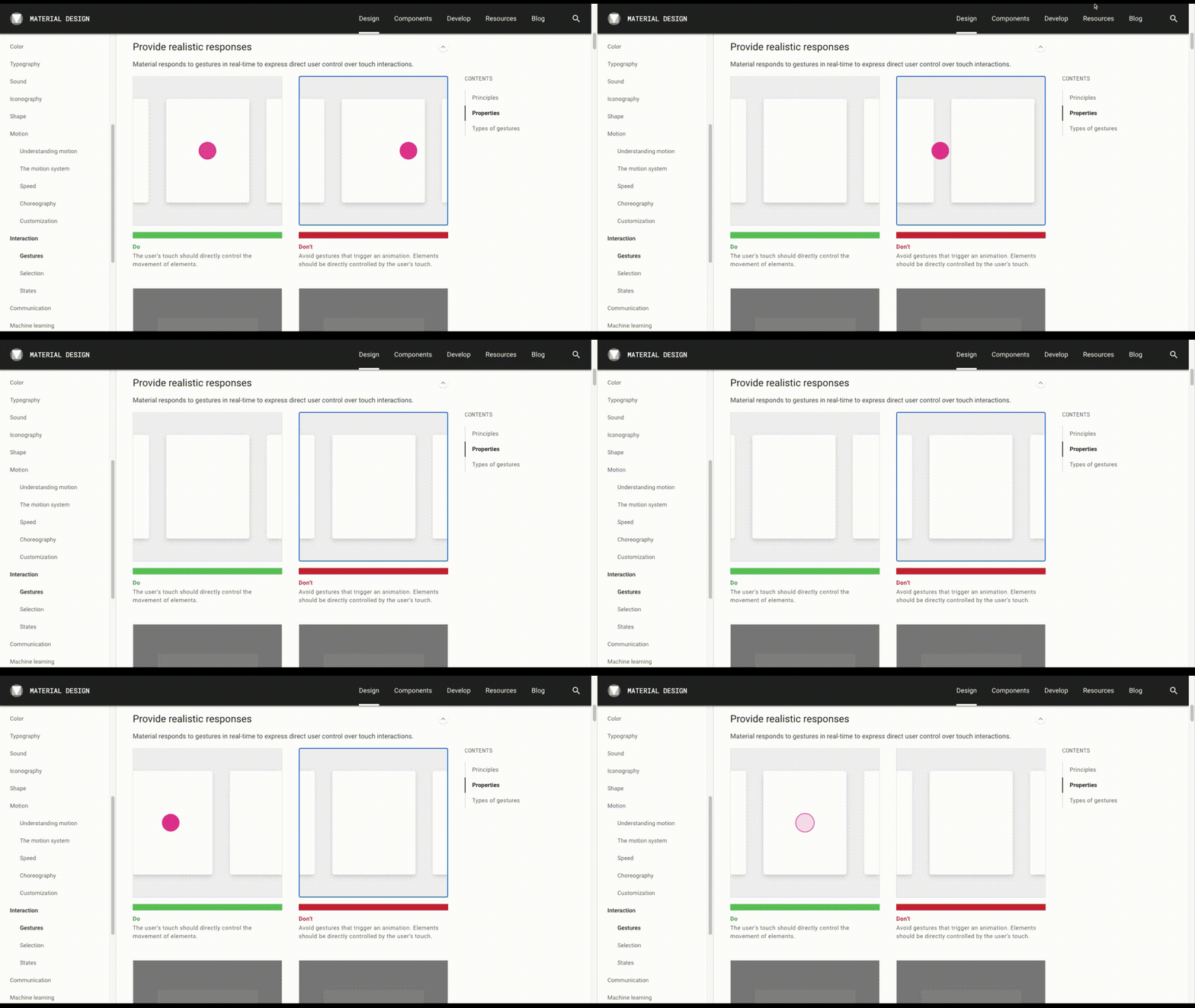
Both interfaces have a horizontal scroller.
The one on the left only moves as the user clicks and drags the content. This is how it works in the real world.
The one on the right, however, has a click-activated scrolling animation. Our real-world objects don’t move this way.
By imbuing UIs with these kinds of physical properties, users can rely on their intuition and natural actions to engage with websites and apps.
Principle #2: Bold, Graphic, Intentional
Look at this example from the Material Foundation section on Web Typography:
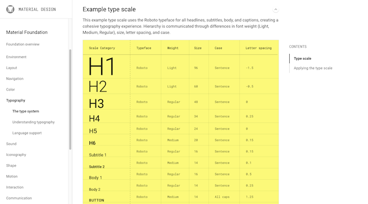
All of Material Foundation is this comprehensive. Each section breaks down how the component works and why it needs to work that way. Essentially, there’s meaning and logic behind every design choice.
This was a significant change in design at the time. No longer was it about designing something because someone liked how it looked or because it followed a certain trend.
This system clearly broke down which UI elements were vital and had to be accounted for:
- Layout (with an emphasis on responsive grids and hierarchy)
- Navigation
- Color
- Typography & Web Fonts
- Sound (this mainly pertains to apps)
- Iconography
- Shape
- Motion
- Interaction
- Communication (including images, writing, and data visualization)
Material Design also explained how exactly (and why) to design them a certain way to create a user-first experience.
Now, it’s clear why “intentional” was part of this principle. But what about “bold” and “graphic”?
In the beginning, Material Design heavily focused on grid-based design, clear typographic hierarchy, bold color palettes, and meaningful animation (among other things).
To give you an idea of what this looked like, this is a tool called Material Design Color Palette Generator:
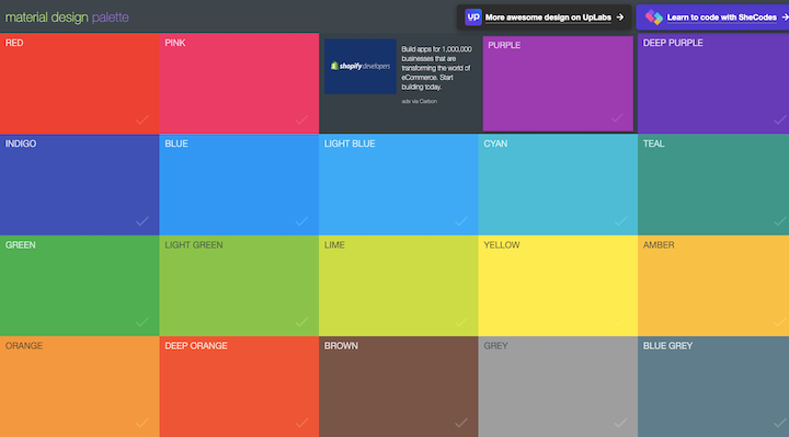
Notice how bright these colors are? Material Design pushed for stronger, bolder color palettes in order to create more contrast and depth in the UI.
Principle #3: Motion Provides Meaning
Motion design doesn’t have anything to do with animation for the sake of animation. Like with everything else with Material Design, it’s meant to make the design more intentional and the user experience more intuitive.
There are three reasons when Material Design called for (subtle) motion in design:
- To be informative and let users know where and when the action was available.
- To help focus and guide users to the most important parts of the page.
- To be expressive and add a little personality and joy to the interface.
Elements as small as icons can be animated:
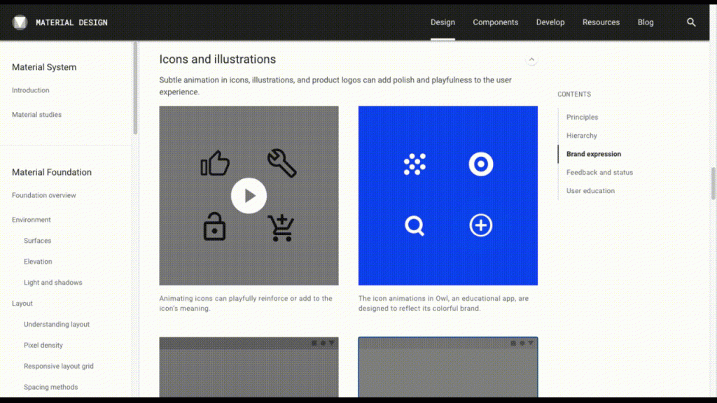
Entire interstitials can be animated, too. For instance, while users wait for a new screen to open.
It really all depends on if motion is needed to inform, focus, or express at that point along the user journey.
How Do Web Designers Use Material Design Today?
Like its predecessors, Material Design ended up having a pretty big flaw that needed fixing.
It was too black-and-white. Literally, everything had been spelled out for designers, so it was like “This is how you do good design. Follow my lead.”
To be clear, there’s nothing wrong with working from a template or components. The problem with Material Design, though, was that everyone was working from the same design system and rules.
A design system is meant to be built for a brand so that its unique visual style can be developed, consistently applied, and maintained. But when a design system becomes available to the public at large — with the intention of making it fast and pain-free to build an app or website — everyone’s going to jump on board.
And, so, websites and apps all began to look the same way as a result.
Material Design 2.0 To the Rescue
In response to backlash from the design community (and indirectly from users who couldn’t tell apps and websites apart any longer), Google unofficially released Material Design 2.0 in 2018.
As for what Material Design looks like today, much of the original system is intact. There have been some updates to Material Design for modernity’s sake.
For example, there’s now a greater emphasis on white space, the usage of bottom navigation bars, and the inclusion of colorful icon sets. Oh, and dark mode is now available.
In addition, there’s a big emphasis on web accessibility and internationalization.
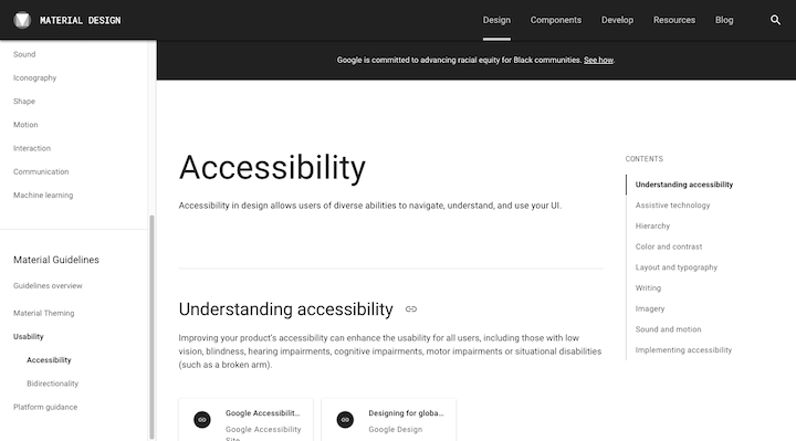
So, Material Design is definitely changing its guidelines along with the times.
These days, Material Design 2.0 is best used as a toolkit.
Sure, the design system and guidelines are still there, but there are now tons of resources that enable designers to take whatever piece of the system they find useful and then adapt it for their own purposes.
The Material Toolkit
Thanks to the Material Design revamp, the design system is no longer responsible for restricting creativity and individualism on the web.
The Resources section is a big part of the reason why:
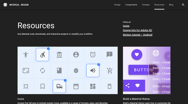
Designers have access to starters kits and tools like:
- Icon sets
- Google Fonts
- Design kits for Adobe, Sketch, and Figma
- Material Design templates
They’ll also find design customizer tools here that allow them to adhere to design best practices while putting their own creative branded spin on the UI:
- Color
- Shape
- Typography
Designers also have access to a new tool that empowers them to build their own Material theme:
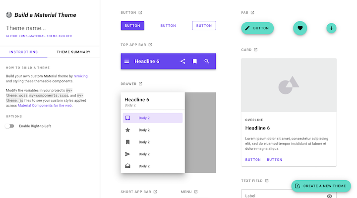
As you can see, there’s a far greater emphasis on designers developing custom UIs as opposed to just sticking to the colors, fonts, layouts, and so on that Google originally designed for Android apps.
This is what allows Material Design to persist today.
Examples of Material Design
Truth be told, Material Design isn’t as easy to recognize in web design these days for a number of reasons.
For one, it was always a more obvious approach when it’s done in mobile or web apps. This is Reply, a Material Study (basically, a fake case study), provided on the material.io website:
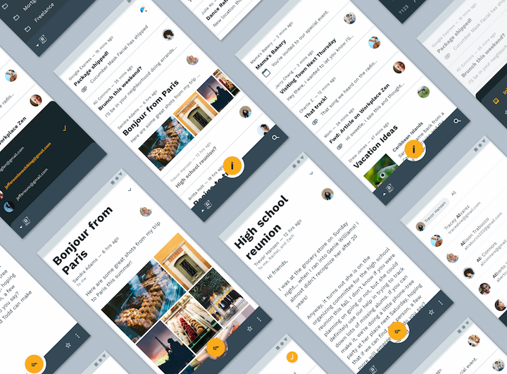
You can tell in a split-second that this is Material Design.
Then, there’s the fact that Material Design 2.0 has allowed web designers to do more customizing, so the adherence to Material Design best practices is something you have to really be looking for to notice it.
So, let’s have a look at some websites that, today, make use of the good parts of Material Design:
Elementor
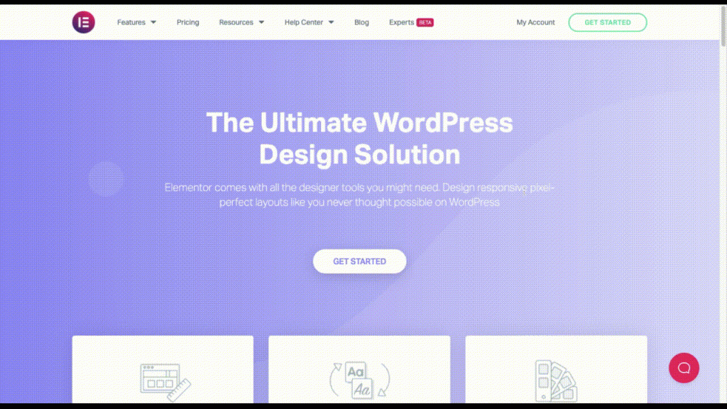
If you hadn’t noticed, the Elementor website is based on many of those good design principles that Material Design gave us:
- The most important buttons on the page are designed to look like clickable elements and transform to provide confirmation to visitors that “Yes, you should click here.”
- Other notable components (like the Layout, Typography, and Colors boxes) are placed on a higher layer so that visitors take notice of them before moving on.
- The animation is realistic, so visitors only see graphics that move in an expected way. They’re still eye-catching, but they won’t distract from the rest of the content.
Think With Google
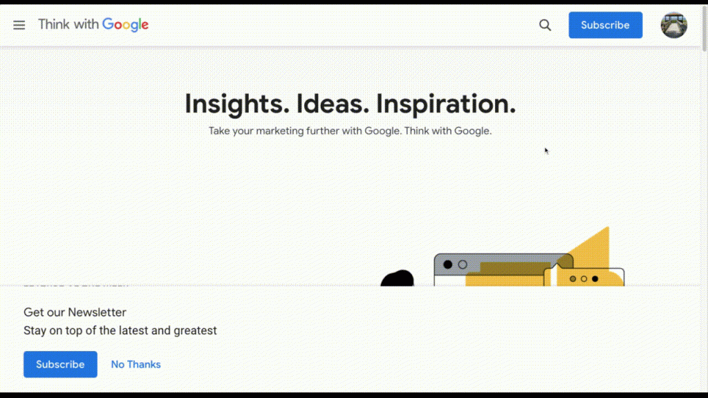
It’s no surprise that a Google-run website is among the examples here. There are a number of elements that Think with Google makes use of from its design system:
- Grid-based design for an even, predictable flow of content.
- Shadows that create contrast between layers and help visitors identify different parts of the page to engage with.
- Minimal design with bright color contrasts to draw attention to calls-to-action.
Glue Lock
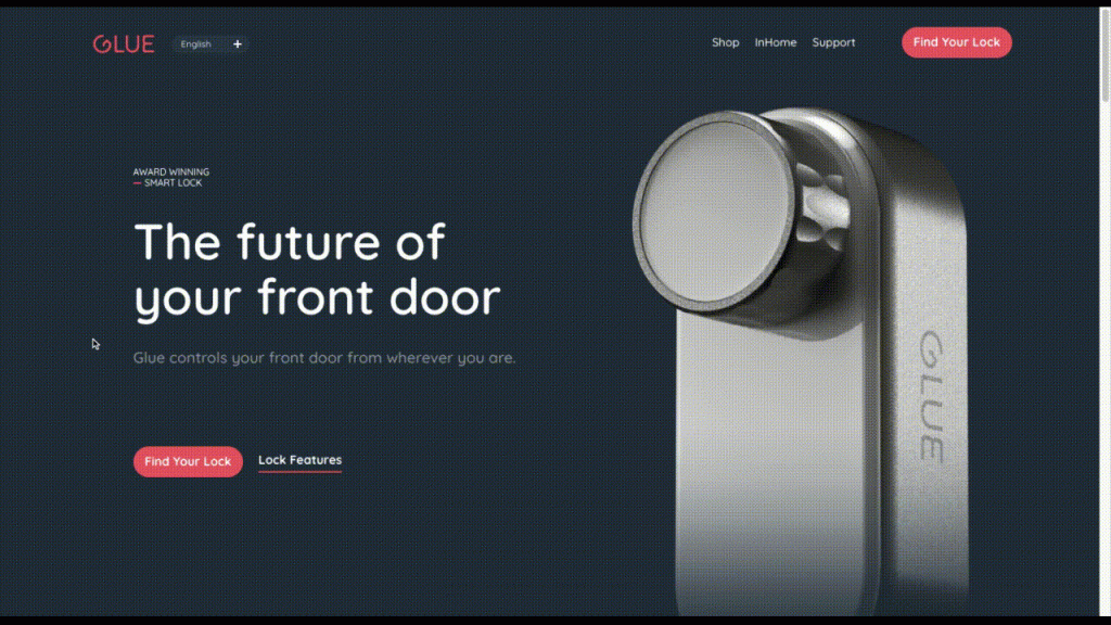
Glue Lock is a great example of how to apply a super modern and personal touch to Material Design:
- The buttons are boldly colored as well as hover-animated, ensuring that visitors know where to click.
- The dark theme still adheres to the principles of minimalism, using a bright white font and red button styling to offset the dark background.
- There’s a clear hierarchy and organization of text on this page, with headers in much larger type than the body text.
Mockplus
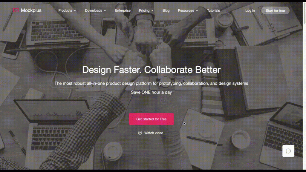
Mockplus is another website that takes the basic principles of usability from Material Design and gives them a custom touch:
- The use of the bright brand pink amongst the otherwise subdued color palette helps quickly guide visitors to points of interest on the page.
- Shading behind important elements (like the mockup examples and testimonials) pulls important layers to the front of the visitors’ visual field.
- There is no animation on this page that takes place without the visitors’ direct engagement with certain components, allowing them to control where their focus goes.
Hotels.com
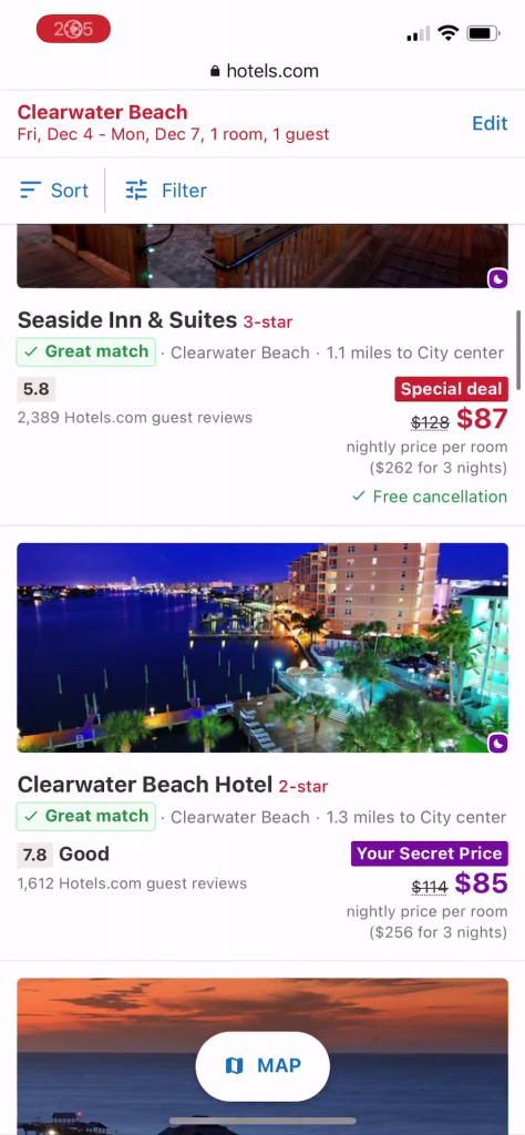
Although the desktop website for Hotels.com doesn’t adhere exactly to Material Design principles, its mobile site does:
- There are clear dividing lines between each component on the search results page, making it easy for visitors to view hotel matches one at a time.
- The transition from List view to Map view shows off how Material Design helps web designers create more mobile-friendly experiences for visitors.
- The buttons in Map view for “See More Properties”, “List” and the zoom buttons are easy to distinguish because they’re placed on a layer above the map.
The Pros and Cons of Material Design
Okay, so we’ve already touched a lot on the pros and cons of Material Design. But let’s sum up the good and the bad and then fill in some of the missing pieces, so we have it all in one place:
The Pros of Material Design:
- Web designers at all stages benefit from Material Design, whether it’s the foundation they base all their work around or a trustworthy resource they turn to from time to time.
- It provides a comprehensive overview of each of the key components and behaviors of a UI, what their value is in design, and how to use them.
- Because of its start as a design system for Android apps, it’s a mobile-responsive approach to design and is responsible for further pushing websites in that direction.
- It’s a user-first approach to design that’s solved many of the flaws of its design predecessors where usability, legibility, and accessibility were an issue.
- It forces designers to look beyond aesthetics and to design as something more intentional. As a result, interfaces become more intuitive and the user experience improves.
- Google provides extensive documentation and support for developers and designers wanting to get more out of Material Design.
- The design system is much more flexible and empowering these days so that designers can take what’s good from Material Design and really make it their own.
The Cons of Material Design:
- When adhered to too strictly, websites (and apps) are at risk of looking like one another.
- Some designers may feel like Material Design greatly discourages any freedom or creativity in design because it spells everything out for them.
- There are some who may be too intimidated to even try using Material Design (or even any of its premade components) because of the emphasis on coding.
- The design system was originally aimed at app designers, so there are some parts of it that aren’t really relevant to web design. And if a designer can’t make use of an entire system, the resulting interface may feel as though it’s missing something.
- Some of the design guidelines (like colorful interfaces, extensive use of icons, and animations) can create issues for website speed.
Resources for Learning How To Implement Material Design
If you’re excited about using Material Design in your design work, your next step is to bookmark the following resources:
- Material.io: This is the official guide to Material Design and has everything you need to get started, including pre-designed components, brand imagery generators, and more.
- Material Design documentation, video tutorials, and blog content: When you’re ready for some hands-on practice, turn to Google’s educational materials on Material Design.
- Global Systems How-to: Once you get the hang of Material Design, you’ll want an easy way to apply your universal styles to your Elementor website. This page will show you how.
If you’re a developer wanting to learn more about the coding side of Material Design, you’ll want to hold onto these resources:
- Material Design for the Web: If you’re a developer wanting to learn how to use Material Design for websites, this resource will teach you how to build Material components and develop your own theme.
- The Polymer Project: Use and repurpose these Chrome-developed Material Design components in your website projects.
- Material-UI: Create your own Material-inspired design system or website with these Material Design React libraries.
Material Design UI Kit
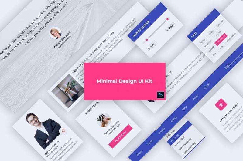
UI Kits can be a valuable design tool when working with flat design and Envato has some great examples for inspiration, like this one from DigitalHeaps:
Use Material Design To Make Your Website More User Friendly and Accessible
While Material Design isn’t a flawless design system by any means, history has shown us that it successfully served its original purpose. It brought better design practices to the web and started moving everyone in the direction of highly usable, responsive design.
Now that we’ve had time to get to know it, web designers can use it to suit their own purposes:
- To inspire design systems of their own.
- To borrow premade components or themes that can later be customized for the job.
- To adhere to a modern set of design principles that ensure that the user’s experience always comes first.
Just keep in mind that the goal in Material Design is not to paint-by-numbers. That’s what designers and developers did in the early days of Material Design and it backfired.
Instead, use Material Design’s example to create a more intuitive experience for your visitors — one where they can predict what each element on the page does and how it’ll react when they engage with it. The less uncertainty there is, the more confidently they’ll be able to convert.
Looking for fresh content?
By entering your email, you agree to receive Elementor emails, including marketing emails,
and agree to our Terms & Conditions and Privacy Policy.
