Website trends are constantly evolving, changing and reemerging, and the best way to learn about them is through existing websites built by web creators. This month, we’ve explored some of the trendiest and cutting-edge websites created by our worldwide user community. As we wrap up the summer season of 2020, we’ve hand-picked ten Elementor websites that represent an especially diverse list of countries from around the world, all of which made a lasting impression on us as web creators. Web design trends may come and go, but quality web design is a constant force that gets stronger and stronger over time.
Some trends we discuss include: mixed media that combines vector graphics and real photographs into one visual, or animated logos and emblems in the shape of a circle whose curved text rotates around the logo in a continuous, circular motion. We also came across popular color schemes, which include black and white themes done creatively, as well as a combined color scheme of black, white and sunflower yellow. We’re constantly keeping our eyes peeled for the latest web design trends that will transform our websites into up-to-date, jaw-dropping masterpieces, and we’re excited to share some of our best findings in this post.
OSK Luzz: Color Combinations That Work
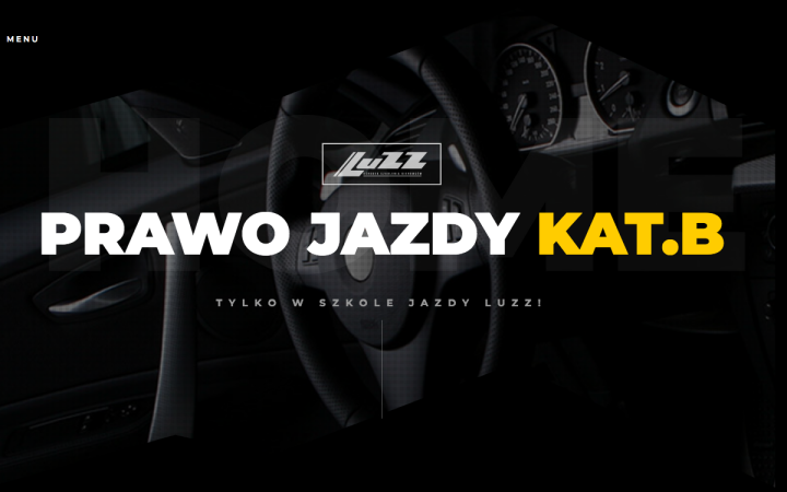
OSK Luzz is a driving school based in Mińsk Mazowiecki (near Warsaw), Poland that specializes in passenger cars – their motto is to “work with the client” rather than “work for the client”. OSK Luzz’s website was built by Agnieszka Przysowa, a freelance graphic designer from Mińsk Mazowiecki who specializes in brand visual identity, originating in logos, brand books, brochures, etc. and has gradually expanded her skill set to web design.
OSK Luzz’s site uses a unique, cutting-edge color scheme consisting of black, white and a mustard-yellow. We’ve recently noticed a recurring trend of many websites using this variation of yellow and combining it with black and white. This color combination is actually mentioned in the context of interior design, as a bold, sophisticated combination that can look great together. It also works well for user experience, as the black background with the white and yellow text create a strong contrast, yet the yellow is not too bright so that the words become hard to read and overwhelming.
One design detail that we found to be truly unique in OSK Luzz’s website is the use of a variety of shape dividers on the homepage. The sticky header includes what’s known in Elementor as a “pyramids” shape divider, which creates a dynamic variety as you scroll down the page. Because the divider is sticky, the page has a unique feel as well as a consistent scrolling experience, and is then followed by a pyramid-shaped yellow shape divider later on in the page (appearing in two locations). Once the sticky header divider and the yellow dividers intersect, their corners and lines line up exactly, and eventually merge into one.
Design & Development: Agnieszka Przysowa
Theme: Hello Elementor
Plugins: Elementor Addon Elements, ElementsKit Lite, Essential Addons for Elementor, LoginPress, MouseWheel Smooth Scroll, PowerPack Lite for Elementor, Unlimited Elements for Elementor, UpdraftPlus, Yoast SEO
MICAELA: Creative By Hand
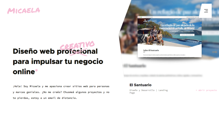
This portfolio website belongs to Micaela Echeverria, an Argentinian Front End Developer who works remotely for a Spain-based design agency. Micaela shared with us that for this particular website, she was able to use Elementor to play around with and try different animations in a quick and easy way.
Micaela’s website nails the art of font combinations by pairing three very different fonts that still come together in a harmonious, visually-pleasing presentation. The headings are in the traditional Roboto, followed by the body texts which are in Source Code Pro, and finally, the font which is used for the logo as well as for the “correction” text above: Permanent Marker. The combination of these three fonts represent another use-case of mixed media: handwritten, manual typewriting, and digital type fonts. This creative combination initiates an interesting conversation with the website visitor, grabbing their attention with an artistic yet subtle lettering.
One of several contributors to the website menu’s unusual style is the various hover effects added to the nav menu items, taking full advantage of the nav menu widget’s capabilities. In this case, Micaela used the underline pointer animations option, yet added a unique twist to it with a squiggle-shaped underline that matches the handwriting element introduced to us on the homepage. The overall website design shows us how much the small things can matter, such as small hand-drawn illustrations on the top of the blog archive page, and the animated “beating” heart in the center of the footer.
Design & Development: Micaela Echeverría
Theme: Mica (Custom)
Plugins:
Code Snippets, Essential Add-ons for Elementor, Essential Add-ons for Elementor Pro, Gmail SMTP, iThemes Security,
JetElements For Elementor, JetEngine, Rank Math SEO, UpdraftPlus – Backup/Restore
Shannon & Michael: Romantic Storytelling
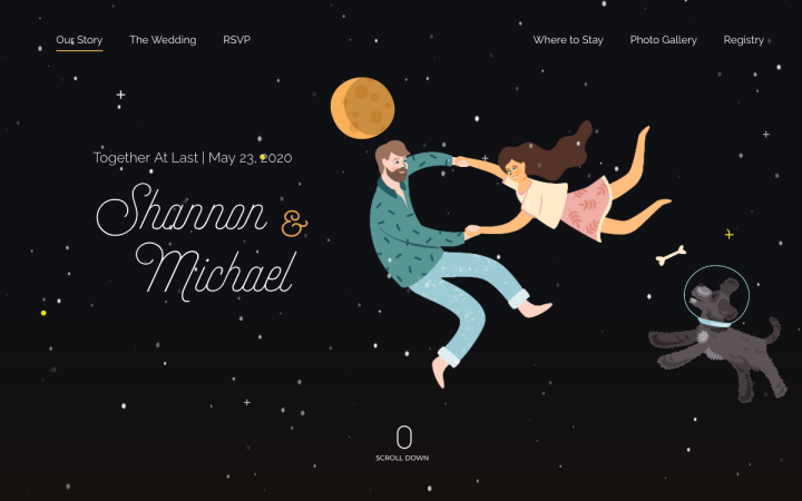
This wedding website was built by Michael Earley for his own wedding, and he himself is a web designer and creative director for New Tricks Web Design, a small web design agency in Atlanta, Georgia. Because of COVID-19, Michael and his fiancée were limited to a short guest list and ended up having a small wedding on Zoom in their backyard. At first, Michael used the opportunity to use his professional web design skills and create a wedding website to give guests all the information they would need to make it to the wedding. Although the final outcome was that guests weren’t able to attend the wedding, Michael shared that him and Shannon were still “very happy to have the website as a reminder to the event we planned and a good time capsule into our life as we were celebrating our engagement.”
There are many design details and special effects that impress us as we browse through this wedding website. Upon loading, the mouse tracking effects that allow the illustrations to move around in circular motions according to the movement of the cursor create an interactive, playful atmosphere. As you progress down the page, additional motion effects are used such as scrolling effects that let the clouds slide to the margins of the page as you scroll down. The entire website finds a way to strike a unique balance between real, vivid imagery of the couple yet doing so exclusively through illustrations rather than real photographs.
Design & Development: Michael Earley
Theme: Astra Pro
Plugins: Elementor Contact Form DB, Google Analytics Dashboard for WP (GADWP), Mapplic, Premium Addons For Elementor, Premium Add-ons PRO, Ultimate Addons for Elementor
FERDU: Sophisticated Branding
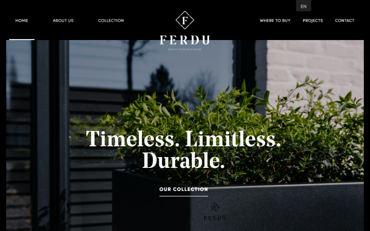
Ferdu is a Belgian brand founded in 2019 by Benoit Borgonjon, a young entrepreneur who develops and sells design planters made of corten steel and powder-coated, galvanized steel. The name “Ferdu” comes from “fer” which represents that the planters contain iron, and “du”, which represents their durability and their long service life and resistance to frost. Ferdu’s website was built by Doppia Vu, a Belgium-based advertising agency that “puts creative communication with a clear marketing vision first, specializing in corporate branding, with a focus on bringing specific messages to the right audience.”
Given that communication is a key value for Doppia Vu, it makes perfect sense that they’ve chosen an elegant, attractive sans-serif typography (“Noe Display” to be exact), to verbalize their brand messaging and values. One key section of the website which caught our attention is the FAQ page, where the content is presented using the accordion widget. Given that the goal of an FAQ page is to make your brand and product accessible to your website visitors, the clear, user-friendly design of the accordion content achieves what the page is built to accomplish.
Design & Development: Axel Wille
Theme: Hello
Plugins: Duplicate Post, Rank Math, JetWidgets, Really Simple SSL, Smush, TranslatePress
PAPEL: It’s Fun to Shop
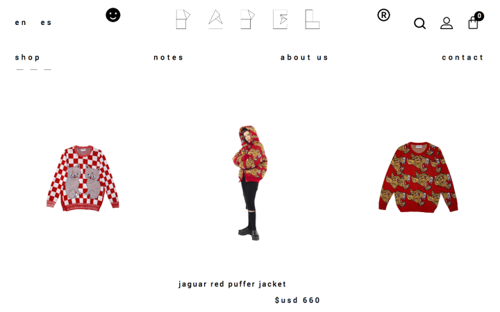
PAPEL is a knitwear concept brand based in Colombia that blends fashion and the unique vision of its owner and designer Laura Acevedo’s artistic universe. The brand defines their mission statement as “an invitation to embellish your life through what can be captured in a blank paper knit. Papel offers maximum differentiation in everyday life by the “neat but fun” concept. Papel’s website was designed by Droomtech, a Colombian web and e-commerce design and development company that serves clients throughout LATAM and the U.S.
Co-founder of Droomtech Daniel Saieh shared with us some of the challenges in the design process for Papel’s website, which he explained as the need to “correctly present the brand’s look in the website without losing an easy and direct shopping experience for the users.” The solution to this challenge, he explains, was to create a minimal design with animations and blank spaces, which reflects a mixture of the fun and practicality of a website that’s fun to shop at. This was made possible, he explains, by adding some “hidden” animations throughout the website, such as hover effects to smiley faces, and the paper airplane in the contact page.
We were remarkably impressed by the paper airplane effect, which is an example of how to use the Lottie widget. The way that PAPEL’s site uses the Lottie widget is exactly what the feature is intended for: to add an engaging and fun flair to illustrations throughout the site. Given that one of the goals of PAPEL’s website is to encourage visitors to take action, whether through purchases or contacting the company, an exciting yet sophisticated animation is a great tactic to accomplish this.
Design & Development: Droomtech
Theme: GeneratePress Child
Plugins: GP Premium, Limit Login Attempts Reloaded, Mailchimp for Woocommerce, Really Simple SSL, Woocommerce, WooCommerce PayPal Checkout Gateway, WooCommerce PayU Latam Payment Gateway, Yoast SEO
Pandanes: A Refreshing Revolution
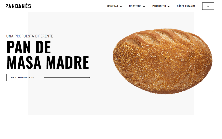
Pandanes is an Argentina-based artisanal bread company who uses their website as an online store as well as an informational site. Their products can also be found at food stores. Their goal as a company is to “revolutionize the concept of bread in Argentina…to make it stop being a simple accompaniment to turn it into a rich healthy, nutritious food.” The Pandenas site was created by an Argentina-based design studio run by Juan Eloy Hernández. Juan shared with us some of the design principles and goals that went into the design strategy, including customer-focused navigation, photography choices that create a balance between image and text, and an overall harmonious, simple and dynamic site.
There are many features that characterize Pandanes’s website as a unique, modern e-commerce site. The black and white color scheme and generous use of white space makes the text extremely readable and user-friendly, as well as the perfectly aligned, evenly spaced columns that appear as you scroll down the homepage.
In the “Our Bread” section, we noticed that what appears to be a masonry layout image gallery is actually three individual columns: one containing a body of text and the call to action widget, and two with just the call to action widget. We particularly enjoyed how the choice of photographs for each button represents one cohesive story, as each image represents a sequence of the breadmaking process.
Design & Development: Juan Eloy Hernández
Theme: Hello
Plugins: CartFlows, Woolementor, Woocommerce, Ele Custom Skin, Rank Math SEO, Autoptimize
Typegoodness: Education in Typography
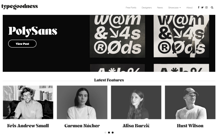
Typegoodness is a showcase website that was built by Frederik Samuel to serve as a “resource of inspiration and finding anything related to type.” Frederik Samuel is a Dutch Design professional who works with big brand names such as adidas and Unilever to create their user experience, branding and design content and campaigns. In its purpose alone, typegoodness is a unique entity in that it focuses exclusively on the discipline of typography and how it’s used by both digital and print designers.
The website provides a variety of resource-types, including blog articles, free fonts for download, a showcase of designers and Q&As with them, where they discuss how they relate to typography in design work. Given that typography is such an essential building block of web design, a resource such as typegoodness fills a niche created by a topic that there’s certainly a lot to say (and write) about. It goes without saying that the various fonts and typography pairings used throughout the site are unique, unusual, and eye-catching, each one in their own right.
In terms of its design, typegoodness introduces us to a method of using the Sidebar widget that we’ve rarely come across: a page footer that consists of four sidebars (each in a respective column), each one featuring different posts on the website. This is what’s known as a sticky sidebar, which is generally navigation menus at the top of websites. However, this out-of-the-box usage of the sidebar widget to structure website posts and their image thumbnails shows us that there are always ways to pioneer a new use-case for any Elementor widget.
Design & Development: Frederik Samuel
Theme: Custom
Plugins: Facebook, MediaElements.js, Google Analytics, Font Awesome
Ordo: Embracing the Unique and the Unusual
Ordo is a UK-based finance app that provides a disruptive, FCA-authorized service that aims to make it easier and faster for businesses to request, make and receive payments, ultimately making customer relationships more profitable.”
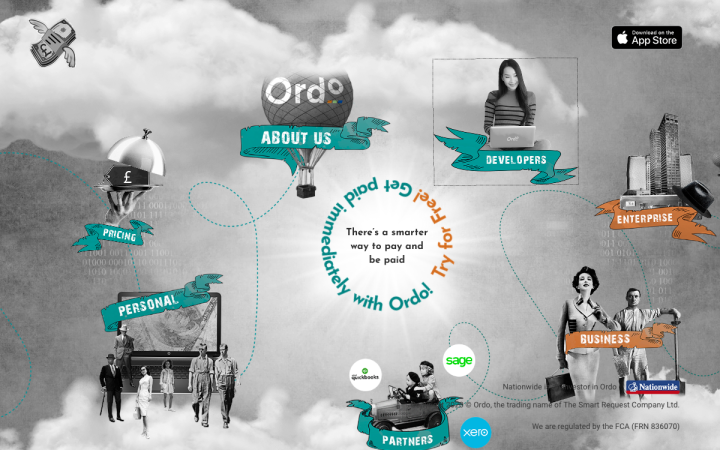
One of many features that let Ordo’s website shine among its “peers” is its usage of what’s known as the “Mixed Media” effect that appears throughout the homepage, created by the visuals which combine a real photograph image with vector illustrations placed as layers either on top, behind or beside them. Ordo takes this mixed media effect one step further by adding a mouse tracking effect that lets some of the vector illustrations move around while the photograph image stays in place. The opposite effect is also found on the site, where the mouse tracking causes the real images to move and the vector illustrations to stay in place. All in all, the homepage serves as a prime example of the Custom CSS capabilities that can be done directly inside Elementor.
Another defining characteristic of Ordo’s homepage is the trendy usage of a rotating logo or emblem, which is composed of a curved or circular text around a circular design. Given that the rotating curved text is at the epicenter of the homepage, verbalizing the fine-tuned added value of the product, we can infer that the rotating text trend is a great, subtle way to accentuate messages and action items that deserve extra attention and consideration.
Design & Development: Karen Sardaryan, Billie Argent
Theme: Astra
Plugins: Extras for Elementor, Yoast SEO, iThemes Security Pro, UpdraftPlus
ABATTOIR VÉGÉTAL: Exciting to Be Vegan
ABATTOIR VÉGÉTAL is a vegan bistro located in Paris, France. ABATTOIR VÉGÉTAL’s was designed by BLACKT, is a design and development agency who strives to “bring quality and reliability back to the industry.” The agency’s co-founder, Camila Masetti, explained the process of building the online store website in light of COVID-19:
“We had a challenge to make the whole website in one week. Because of COVID restrictions in France, Abattoir Vegetal needed the website ready asap to be able to sell its food using Click&Collect method. We started by designing the whole website in Illustrator. Choosing a theme that could be fully customizable and that used Elementor. Once the client validated the overall design. we created the website in WordPress and all animations were done directly in WordPress.”
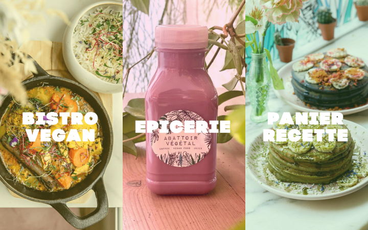
Representing the unique cuisine of vegan dining, there is an abundance of design choices and features that set their website apart from your average restaurant or grocery store site. These details include the vegetable and fruit-related cursor icons, the heading font choice of Code Pro Black, the bright, playful background overlays of the hero images, the use of emojis to draw attention to a rotating notification heading, or simply the entrance animations added to the various images along the page, there is a lot to admire as your browse ABATTOIR VÉGÉTAL’s site.
The way ABATTOIR VÉGÉTAL’s designer (Camila Lopes Masetti) approached the design of their interactive grocery menu caught our attention immediately. This image-based menu was created using the Portfolio widget, and using a filter bar to give prospective shoppers to focus on the menu category they’re interested in browsing through. The vibrant colors of each dish come together to illustrate a tempting, exciting menu that will excite users about their food shopping experience.
Once you click on any of the image thumbnails, you arrive at a Single Product page built by the WooCommerce plugin’s Single Product Template, showcasing the food item in detail and providing all there is to know about the product.
Design & Development: Camila Lopes Masetti
Theme: Jupiter X
Plugins: Advanced Custom Fields, MyFonts WordPress, Duplicate Page, Facebook for WooCommerce, Jetpack, JetSmartFilters, JetTabs for Elementor, Jupiter X Core, Loco Translate, Mouse Cursor Customizer, Raven, WooCommerce, WooCommerce Local Pickup Plus, WooCommerce Services, WooCommerce Smart Coupons, WooCommerce Stripe Gateway, WunderWP, All-in-One WP Migration, Customizer Export/Import
DJANGO: Emojis Gone Wild
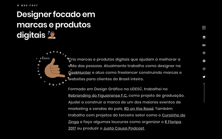
Diangelo Santos is a Brazilian branding and digital designer who works both as a freelancer and at GeekHunter, a job marketplace for programmers and developers. Diangelo’s website taps into many website trends, many of which we’ve discussed earlier in this post, such as white on black color schemes, an emblem that consists of a rotating circular text around a logo, and the use of emojis. Using plentiful quantities of creative juices, Diangelo introduces us to ways to incorporate these trends and apply them to many of Elementor’s most popular widgets.
For example, the hero text of the homepage is written using the Animated Headline widget’s typing effect, to make the heading look as though it’s being typed in live format. Adding the fixed hand emoji at the end of the sentence creates an added effect as if the hand is pulling the words along the page. Further down the page where the different portfolio projects are available to be clicked on, we come across a unique way to take a section and fill it with a background of an animated, vividly colorful image that slides up on hover. Simultaneously, the black layer on top of it with 100% opacity masks each image from being seen until you hover over the section. Until then, the list of projects just looks like simple white text on a black background, with no differentiation between them except for their individual headings and subtitles.
Lastly, a different emoji is placed at the end of the h2, making the text personable and upbeat, which is definitely the type of rapport that any designer will want to create between himself and his prospective clients.
Design & Development: Diangelo Santos
Theme: Ocean WP
Plugins: Google Analytics, Hotjar, Twemoji
