This guide covers the best practices and real-world examples of successful e-commerce website design. We’ll explore UX/UI design, captivating homepages and product pages, mobile optimization, and more.
Whether you’re a seasoned pro or just starting, this guide will help you elevate your online store. We’ll also highlight how Elementor, the most powerful website builder and hosting platform, can be your key to e-commerce excellence.
Get ready to transform your e-commerce website into a thriving online marketplace.
Foundations of Successful Ecommerce Design
The bedrock of any high-performing e-commerce website is a solid foundation of design principles that prioritize the user experience (UX) and user interface (UI). These elements work in tandem to create a seamless, enjoyable shopping journey for your customers, ultimately leading to increased conversions and brand loyalty.
User Experience (UX) Design: The Path to Customer Satisfaction
UX design encompasses the overall experience a user has while interacting with your website. It’s about creating a website that is not only visually appealing but also intuitive, efficient, and enjoyable to use.
Here are some key UX design principles to consider:
- Intuitive Navigation: Your website’s navigation should be clear, concise, and easy to understand. Users should be able to find what they’re looking for quickly and easily, whether it’s a specific product, information about your company, or customer support. Consider using a mega menu, like the one offered by Elementor, to organize your products and categories in a visually appealing and user-friendly way.
- Clear User Flows: Guide users through a logical path from browsing to purchasing. This means ensuring that the steps involved in the buying process are straightforward to follow. Use clear calls to action, intuitive forms, and concise instructions to minimize confusion and frustration.
- Mobile-First Design: In today’s mobile-centric world, it’s crucial to prioritize the mobile experience. A mobile-first design approach ensures that your website looks and functions seamlessly on smaller screens. Responsive design, which adapts the layout and content of your website to different screen sizes, is essential for providing a consistent experience across devices. Elementor’s responsive editor makes it easy to create websites that look great on any device.
- Fast Loading Times: Website speed is a critical factor in UX. Slow-loading pages can lead to high bounce rates and lost sales. Optimize your website’s performance by compressing images, leveraging browser caching, and minimizing HTTP requests. Consider using a content delivery network (CDN) to distribute your website’s content across multiple servers for faster loading times. If you’re using WordPress, Elementor Hosting’s serverless architecture on Google Cloud Platform C2 Servers, coupled with Cloudflare Enterprise CDN, can significantly enhance your website’s speed and performance.
- Accessibility: Make your website accessible to all users, including those with disabilities. This means following web accessibility guidelines, such as providing alternative text for images, using sufficient color contrast, and ensuring keyboard navigation is possible.

User Interface (UI) Design: The Art of Visual Appeal
UI design focuses on the visual elements of your website, such as the layout, typography, color scheme, and imagery. A well-designed UI not only enhances the aesthetics of your website but also contributes to the overall user experience.
Visual Branding: Your website should reflect your brand’s unique identity and personality. This includes using consistent colors, fonts, and imagery that align with your brand guidelines. A strong visual identity helps build brand recognition and trust among your customers. Elementor’s theme builder gives you complete control over your website’s look and feel, allowing you to create a design that perfectly matches your brand.
Clear Calls to Action: Guide users towards desired actions, such as adding items to their cart or completing a purchase. Use contrasting colors, persuasive language, and strategically placed buttons to make your calls to action stand out.
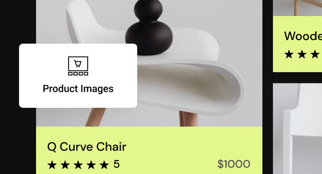
High-Quality Product Images: Invest in professional product photography to showcase your products in the best possible light. Use high-resolution images that are well-lit and accurately represent the product’s features and colors. Consider using a variety of image types, such as product shots, lifestyle images, and even 360-degree views. Elementor’s Image Optimizer can help ensure your images are optimized for web performance without sacrificing quality.
Engaging Product Descriptions: Craft compelling product descriptions that highlight the benefits and unique selling points of your products. Use clear, concise language that is easy to understand. Incorporate relevant keywords to improve your website’s search engine visibility.
Trust-Building Elements: Display customer reviews, testimonials, and ratings prominently on your website. These social proof signals can significantly influence a customer’s purchase. Also, consider adding trust badges, such as security seals or certifications, to assure customers that their information is safe and secure.
Homepage Design That Converts
Your homepage serves as the virtual storefront of your e-commerce business. It’s the first impression many potential customers will have of your brand, so it needs to be both visually captivating and functionally effective. A well-designed homepage can significantly impact your conversion rate, turning casual browsers into paying customers.
Above the Fold: Making a Powerful First Impression
The “above the fold” area refers to the portion of your homepage that’s immediately visible without scrolling. It’s prime real estate for capturing attention and conveying your brand’s essence. Here’s how to make the most of it:
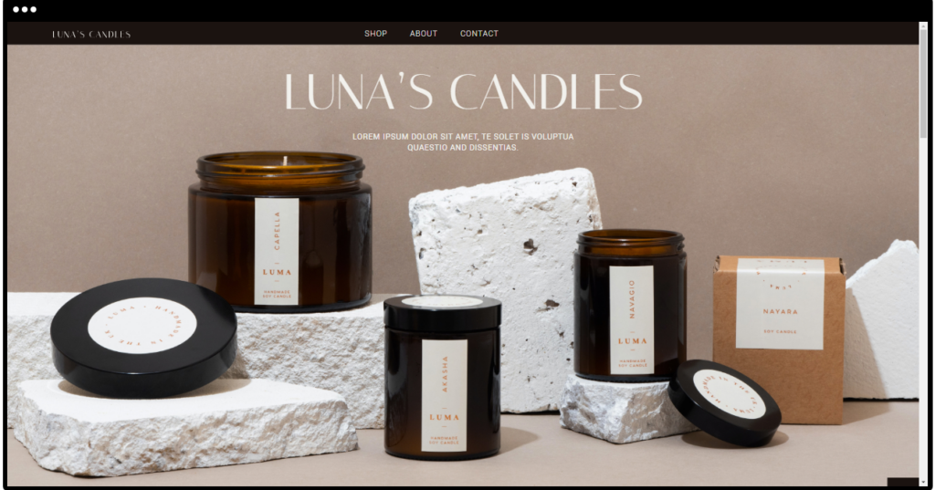
- Compelling Hero Section: The hero section is typically a large banner image or video that dominates the top of your homepage. It should be visually stunning, instantly communicating your brand’s personality and showcasing your most compelling products or offers. The hero section should also include a clear and concise headline that grabs attention and entices users to learn more.
- Clear Navigation and Search Functionality: Your navigation menu should be easily accessible and intuitively organized, allowing users to find the products or categories they’re interested in quickly. Consider using a mega menu, such as the one available in Elementor, to create a visually appealing and informative navigation experience. A prominent search bar, ideally with autocomplete and filtering options, is also essential for helping users find what they’re looking for.
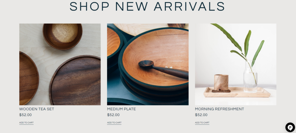
- Featured Products or Promotions: In the above-the-fold area, highlight your best-selling products, new arrivals, or special promotions. This can be done through eye-catching product images, concise descriptions, and clear calls to action. This not only showcases your most appealing offerings but also encourages users to explore your store further.
Below the Fold: Building Trust and Engagement
While the above-the-fold area is crucial for capturing attention, the below-the-fold content is where you build trust, provide more information, and ultimately drive conversions. Here’s what to focus on:
- Storytelling Through Brand Narrative or Customer Testimonials: Share your brand’s story or highlight customer testimonials to connect with your audience on a deeper level. This can help establish an emotional connection and build trust in your brand.
- Showcase of Product Categories or Collections: Display your product categories or curated collections in a visually appealing way. This can help users discover new products and navigate your store more easily. Use high-quality images, enticing descriptions, and clear calls to action to encourage exploration.
- Social Proof Elements: Display customer reviews, ratings, awards, media mentions, or any other forms of social proof that demonstrate the quality and popularity of your products or services.
- Newsletter Signup or Lead Generation Form: Capture email addresses from interested visitors by offering a newsletter signup form or a lead magnet, such as a discount code or exclusive content. This allows you to build an email list for future marketing efforts.

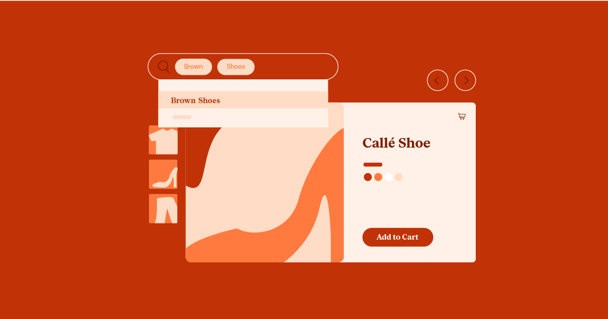
Product Page Optimization: Your Virtual Sales Floor
Product pages are the heart and soul of your e-commerce website. They’re where customers make their purchasing decisions, so it’s crucial to optimize these pages for maximum conversion potential. A well-designed product page not only showcases your products in the best possible light but also provides all the necessary information and incentives to encourage a purchase.
High-Quality Product Images: Showcasing Your Merchandise
Your product images are the first thing customers will see, and they play a significant role in influencing their perception of your products. Invest in high-quality product photography that accurately represents your merchandise.
- Multiple Angles and Zoom Options: Provide multiple images of your products from different angles. This allows customers to get a comprehensive view of the item. Include zoom functionality so that customers can examine details and textures closely.
- Lifestyle Shots and Product Videos: In addition to standard product shots, consider using lifestyle images and product videos. Lifestyle images show your products in context, helping customers visualize how they would use or wear them. Product videos can more engagingly demonstrate the product’s functionality and features. If you’re using Elementor, you can easily embed videos directly into your product pages.
Compelling Product Descriptions: Persuading with Words
While images are essential, consider the power of well-crafted product descriptions. Your descriptions should inform and persuade customers to buy.
- Clear, Concise, and Benefit-Oriented: Use clear, concise language that is easy to understand. Focus on the benefits of your product rather than just listing its features. Explain how your product solves a problem or improves the customer’s life.
- SEO Optimization: Incorporate relevant keywords into your product descriptions to improve your website’s search engine visibility. This will help potential customers find your products when they search for related terms online. However, avoid keyword stuffing, which can negatively impact readability and user experience.

Clear Call to Action: Guiding Users Towards Conversion
The call to action (CTA) is the element on your product page that prompts users to take the desired action, typically adding the product to their cart and proceeding to checkout. A clear and compelling CTA is essential for driving conversions.
- Prominent Placement: Ensure your CTA button is prominently displayed and easily visible on the page. Place it above the fold so users don’t have to scroll to find it.
- Contrasting Colors and Compelling Language: Use contrasting colors to make your CTA button stand out from the rest of the page. Employ persuasive language that encourages users to click, such as “Add to Cart,” “Buy Now,” or “Shop Now.”
- Sense of Urgency: To create a sense of urgency, add phrases like “Limited Time Offer” or “Only a Few Left in Stock” to your CTA button. This can nudge hesitant shoppers to take action.
Customer Reviews and Ratings: Building Social Proof
Customer reviews and ratings are powerful forms of social proof that can significantly influence a customer’s decision to purchase. Display them prominently on your product pages.
- Displaying Reviews: Showcase a selection of reviews directly on the product page, including both positive and negative feedback. This demonstrates transparency and builds trust with potential customers.
- Star Ratings: Include an average star rating based on customer reviews. This provides a quick visual indicator of the product’s overall quality and popularity.
- Responding to Reviews: Engage with customers by responding to their reviews, both positive and negative. This shows that you value their feedback and are committed to providing excellent customer service.
Streamlining the Checkout Process
The checkout process is the final hurdle between a customer’s intent to purchase and a successful transaction. A complicated or cumbersome checkout process can lead to cart abandonment, where customers leave your website without completing their purchase. Streamlining this process is crucial for maximizing your conversion rate and boosting sales.
Guest Checkout Option: Removing Barriers to Purchase
Not all customers want to create an account before making a purchase. Offering a guest checkout option allows users to complete their transactions without having to register, reducing friction and increasing the likelihood of conversion.
While registered users can benefit from features like saved addresses and order history, guest checkout caters to those who prioritize a quick and hassle-free shopping experience. Make the guest checkout option clearly visible and easily accessible during the checkout process.
Multiple Payment Options: Catering to Diverse Preferences
Customers have different preferences when it comes to payment methods. Some prefer credit or debit cards, while others may prefer digital wallets, bank transfers, or even cryptocurrency. Offering a variety of payment options caters to a wider audience and can increase the chances of a successful transaction.
Consider integrating popular payment gateways like PayPal, Stripe, Apple Pay, and Google Pay into your e-commerce website. This will not only provide convenience for your customers but also add a layer of trust and security to the checkout process.
Clear Shipping Information: Transparency Builds Trust
Transparent shipping information is essential for building trust with your customers. Clearly display shipping costs, estimated delivery times, and any available shipping options (e.g., standard, expedited, international) upfront.
Unexpected shipping costs are a common reason for cart abandonment. By being transparent about shipping fees, you set clear expectations and avoid surprises that could deter customers from completing their purchases.
Order Summary and Confirmation: Sealing the Deal
The order summary and confirmation page is the final step in the checkout process. It’s where customers review their order details, confirm their shipping information, and enter their payment information. This page should be clear, concise, and reassuring.
- Order Details: Provide a detailed breakdown of the customer’s order, including the product names, quantities, prices, and any applicable taxes or discounts. This transparency helps avoid confusion and builds trust.
- Shipping Information: Display the customer’s selected shipping address and method. Allow them to edit this information if necessary.
- Payment Information: Offer a secure and user-friendly payment form. Clearly display any applicable security badges to reassure customers that their payment information is safe.
- Order Confirmation: Once the order is placed, provide a clear order confirmation message with an order number. This will give customers peace of mind and allow them to reference their orders if needed.
By optimizing your checkout process, you can reduce cart abandonment rates and ensure that more customers complete their purchases. A smooth and efficient checkout experience can leave a positive, lasting impression, encouraging repeat business and customer loyalty.
Site Navigation and Search: Guiding the Customer Journey
Intuitive site navigation and a robust search function are essential for guiding customers through your e-commerce website. These tools help users find the products they’re looking for quickly and easily, enhancing their overall shopping experience.
Intuitive Navigation Menus: The Roadmap to Discovery
Your website’s navigation menu is like a roadmap, guiding users through your product catalog and other essential pages. It should be logically organized and easy to understand, regardless of the user’s familiarity with your brand.
- Logical Hierarchy: Organize your products and categories in a hierarchical structure that makes sense to your customers. Group related items together and use clear labels that accurately reflect the content of each category.
- Clear Categorization: If you have a large number of products, consider using subcategories or filters to help users narrow down their search. This can be particularly useful for clothing stores, where users might want to filter by size, color, or style.
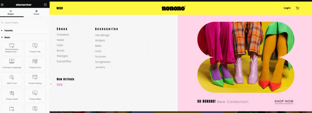
- Mega Menus (Optional): For websites with extensive product catalogs, mega menus can be a helpful way to display a large number of categories and subcategories in a visually organized manner. Elementor’s mega menu feature allows you to create customized mega menus with images, icons, and even videos.
Powerful Search Functionality: A Quick Path to Products
A well-functioning search bar is a must-have for any e-commerce website. It allows users to bypass the navigation menu and directly search for specific products or keywords.
- Prominent Placement: Place the search bar in a prominent location, such as the top of your homepage or header. This makes it easily accessible for users who know exactly what they’re looking for.
- Filtering and Sorting Options: Enhance the search experience by providing filtering and sorting options. This allows users to refine their search results by price, brand, category, or other relevant criteria.
- Autocomplete and Suggestions: Implement autocomplete functionality to suggest relevant products or keywords as the user types. This can save time and effort for users who may need to learn the exact product name or spelling.
Breadcrumb Navigation: Enhancing User Orientation
Breadcrumb navigation is a secondary navigation scheme that displays the user’s current location within the website’s hierarchy. It typically appears as a horizontal trail of links at the top of a page, showing the path the user has taken to reach that page.
- Improved User Experience: Breadcrumbs help users understand their location within your website, making it easier for them to navigate back to previous pages or higher-level categories. This is particularly useful for e-commerce websites with complex navigation structures.
- Reduced Bounce Rates: Breadcrumbs can help reduce bounce rates by providing a clear path back to previous pages, as users are less likely to feel lost or confused.
- SEO Benefits: Breadcrumbs can also benefit your website’s SEO by providing search engines with additional context about its structure. This can help improve your website’s visibility in search results.
Incorporating intuitive navigation menus, a powerful search function, and breadcrumb navigation into your e-commerce website design will significantly enhance the user experience. By making it easier for customers to find what they’re looking for, you’ll increase their engagement with your site and ultimately drive more sales.
Mobile Optimization and Responsive Design: Reaching Customers on the Go
Mobile optimization and responsive design are no longer optional for e-commerce websites; they’re essential. With the majority of online traffic now coming from mobile devices, your website must provide a seamless and enjoyable experience on smartphones and tablets. This involves not only adapting your website’s layout to different screen sizes but also optimizing its performance and functionality for mobile users.
Importance of Mobile-First Design: Prioritizing the Mobile Experience
Mobile-first design is an approach to web design that prioritizes the mobile experience over the desktop experience. This means designing your website primarily for mobile devices and then scaling it up for larger screens. This approach is crucial because it ensures that your website is optimized for the majority of your users.
A mobile-friendly website is not only more user-friendly but also benefits your search engine rankings. Google and other search engines prioritize mobile-friendly websites in their search results, so having a responsive design is essential for maximizing your website’s visibility.
Responsive Design Best Practices: Adapting to Every Screen
Responsive design is a web development approach that ensures your website adapts seamlessly to different screen sizes and devices. This means your site should look and function just as well on a smartphone as it does on a desktop computer. Implementing responsive design is crucial for providing a consistent and enjoyable user experience across all devices.
- Fluid Grids and Flexible Layouts: Instead of using fixed pixel widths for your website’s layout, use fluid grids and relative units (like percentages) to create a flexible structure that adjusts to different screen sizes. This ensures that your content flows naturally and doesn’t get cut off or distorted on smaller screens.
- Flexible Images and Videos: Use responsive image and video techniques to ensure that visual content scales appropriately on different devices. This can involve using CSS to resize images or using a responsive video embed code that adjusts the video player size based on the screen dimensions.
- Touch-Friendly Elements: Make sure your website’s interactive elements, such as buttons and links, are large enough and spaced far enough apart to be easily tapped with a finger. Avoid using hover effects, as these don’t work on touchscreens.
- Optimized Typography: Choose fonts that are legible on both small and large screens. Adjust font sizes and line heights as needed to ensure readability on different devices.
- Streamlined Content: Mobile users typically have shorter attention spans than desktop users. Keep your content concise and focused, highlighting the most important information. Use short paragraphs, bullet points, and headings to make your content easy to scan.
Elementor’s Responsive Editor: A Powerful Tool for Mobile Optimization
Elementor’s responsive editor makes it incredibly easy to create mobile-optimized designs. It allows you to preview and edit your website’s layout on different screen sizes, ensuring that everything looks perfect on every device. With Elementor, you can customize the styling and content of your website for different breakpoints, such as desktop, tablet, and mobile. This level of control allows you to create a truly tailored mobile experience.
By prioritizing mobile optimization and responsive design, you can ensure that your e-commerce website reaches the widest possible audience and provides a seamless shopping experience for all users, regardless of their device.
Leveraging Elementor for E-commerce Success
In the ever-competitive world of e-commerce, having the right tools can make all the difference. Elementor, a leading website builder and hosting platform, offers a comprehensive suite of features designed to empower you to create stunning, high-performing e-commerce websites that drive conversions and boost sales. Let’s delve into how Elementor can be your ultimate ally in achieving e-commerce success.
Overview of Elementor’s Features: Your E-commerce Arsenal
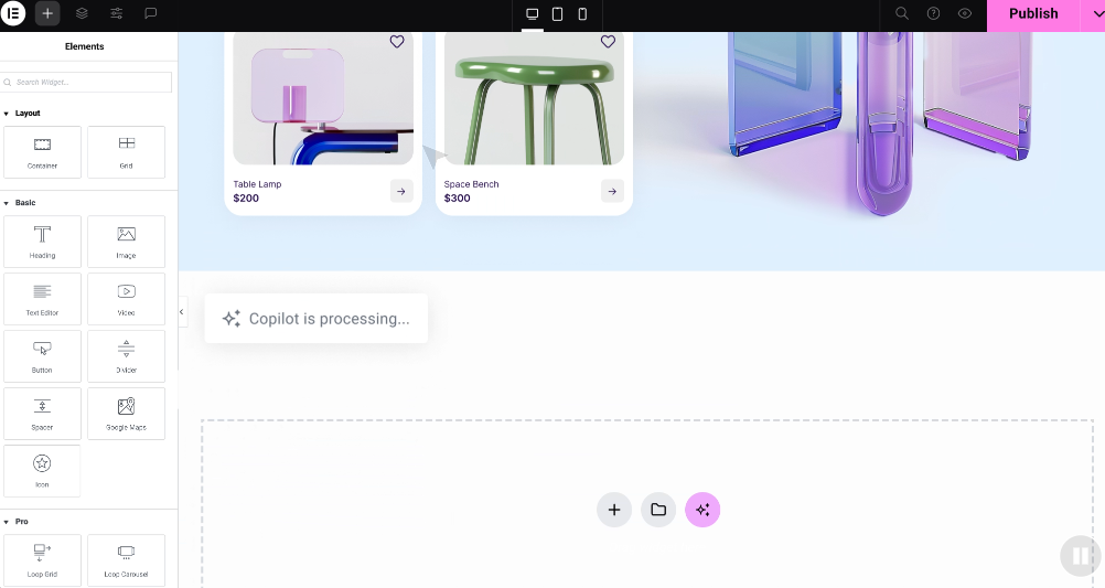
- Drag-and-Drop Interface: Elementor’s intuitive drag-and-drop interface makes it incredibly easy to design and customize your website, even if you have no coding experience. You can simply drag and drop elements onto your pages, rearrange them as needed, and see the changes in real time. This visual approach to web design saves you time and effort, allowing you to focus on creating a website that truly reflects your brand.
- Extensive Template Library: Elementor offers a vast library of professionally designed templates and website kits that you can use as a starting point for your e-commerce website. These templates are fully customizable, allowing you to tailor them to your specific needs and preferences. Whether you’re looking for a minimalist design or a bold and colorful one, Elementor has a template that’s perfect for you.
- Powerful Theme Builder: Elementor’s Theme Builder gives you complete control over your website’s look and feel. You can design custom headers, footers, product pages, archive pages, and more. This allows you to create a cohesive brand identity across your entire website, ensuring a consistent and professional user experience.
- WooCommerce Integration: Elementor seamlessly integrates with WooCommerce, the most popular e-commerce plugin for WordPress. This integration allows you to design custom product pages, shopping carts, checkout pages, and other essential e-commerce elements. You can also use Elementor to create upsell and cross-sell offers, add product recommendations, and customize your email notifications.
- Elementor AI: Harness the power of artificial intelligence with Elementor AI. Generate text, translate content, and write code with ease.
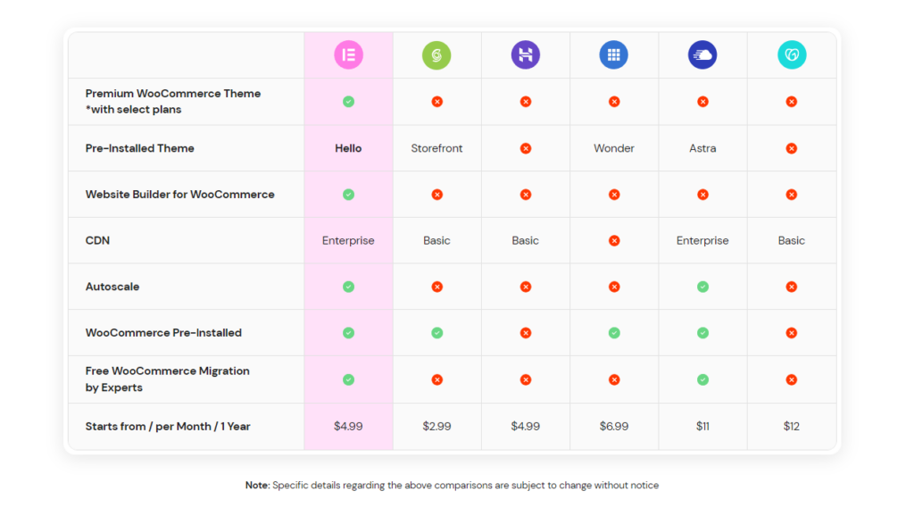
Elementor Hosting: Speed, Security, and Simplicity
When it comes to e-commerce, speed and security are non-negotiable. Slow-loading websites frustrate customers and lead to lost sales, while security vulnerabilities can put your business and customer data at risk. This is where Elementor Hosting shines.
- Optimized for WordPress and Elementor: Elementor Hosting is specifically designed to work seamlessly with WordPress and Elementor. This means your website will be optimized for speed and performance right out of the box. You won’t have to worry about complex server configurations or technical optimizations.
- High-Performance Cloud Hosting: Elementor Hosting utilizes Google Cloud Platform’s C2 servers, which are known for their exceptional speed and reliability. This ensures that your website can handle traffic spikes and deliver a smooth shopping experience even during peak periods. The serverless architecture of Elementor Hosting also allows for automatic scaling so your website can grow with your business.
- Built-in Security and CDN: Elementor Hosting includes a comprehensive suite of security features, such as a web application firewall (WAF), DDoS protection, and malware scanning. Additionally, it comes with a built-in Cloudflare Enterprise CDN, which not only speeds up your website but also provides an additional layer of security by filtering out malicious traffic.
- Intuitive Management Panel: Elementor Hosting’s management panel provides a user-friendly interface for managing your website, domains, and hosting account. You can easily access all the essential tools and settings in one place, making it simple to manage your e-commerce business.
- Value-Added Features: Elementor Hosting includes a range of value-added features, such as pre-installed WordPress and Elementor Pro, premium CDN by Cloudflare, and premium SSL. This comprehensive package provides everything you need to launch and manage a successful e-commerce website.
Conclusion
Your e-commerce website is your most valuable asset. By investing in thoughtful design and best practices, you can create a website that not only looks amazing but also drives traffic, boosts conversions and fosters lasting customer relationships.
We’ve explored the key elements of e-commerce success, from UX/UI design to homepage and product page optimization, mobile responsiveness, streamlined checkouts, intuitive navigation, and powerful search.
Elementor, with its intuitive interface, templates, and WooCommerce integration, empowers you to effortlessly create and manage a high-performing e-commerce website.
Remember, e-commerce design is about tailoring your website to your brand, products, and target audience. Understand your customers’ needs and preferences, and implement the best practices from this guide. E-commerce design is an ongoing process. Continuously test, iterate, and refine your website to keep it fresh and engaging and stay up-to-date with trends and technologies.


