It’s easy to take website buttons for granted. After all, every web page has them — from simple calls-to-action like “Learn More” to more pressing ones like “Get 75% Off Today”. So it’s not like visitors don’t know what CTA buttons do or how to use them.
But take the example of a PlayStation controller. Users will eventually rely on muscle memory to perform their most common actions and they won’t even have to think about what they’re doing. It’ll just become second nature.
What happens, though, when they go to someone’s house and they have an Xbox? The layouts of the controllers are more or less the same, but some of the buttons and sticks are positioned, sized, and designed differently. If they’ve never used an Xbox controller before, it might put them at a disadvantage while gaming, which can lead to frustration and disappointment.
This is just as applicable to button design on physical objects as it is for button design on websites.
The only thing is, people usually have to get used to bad physical button design because they’ve already purchased and committed to the gaming system, TV, or smartphone it’s a part of. On websites, bad button design won’t be viewed as a minor annoyance until they relearn how to find and use your buttons. Instead, they’ll leave and go to a site that isn’t difficult or confusing to use.
So, that’s what we want to look at today: How to design call-to-action buttons that are attractive, usable and increase your website’s click-through and conversion rates. The post will also be chock full of examples of CTA buttons that inspire action.
Table of Contents
What Is a Call-to-Action Button?
Call-to-action (CTA) buttons are buttons on a website that include a command or invitation for users to guide them toward taking a desired action on your website. CTAs are typically used on landing pages to encourage users to convert
While a CTA can be written as text, the more common way of designing the call-to-action is as a button.
The IKEA home page, for instance, includes both types of CTA design:
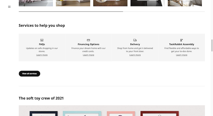
“Learn more” is a common call-to-action on a website. However, this particular page has it designed as a simple hyperlink.
“View all services”, on the other hand, is encapsulated by a rounded black button shape. This is the more typical approach to CTA design.
That said, buttons come in all sorts of shapes, sizes, and styles. For example, this is what the “Add to Cart” button looks like on the Home Depot product pages:
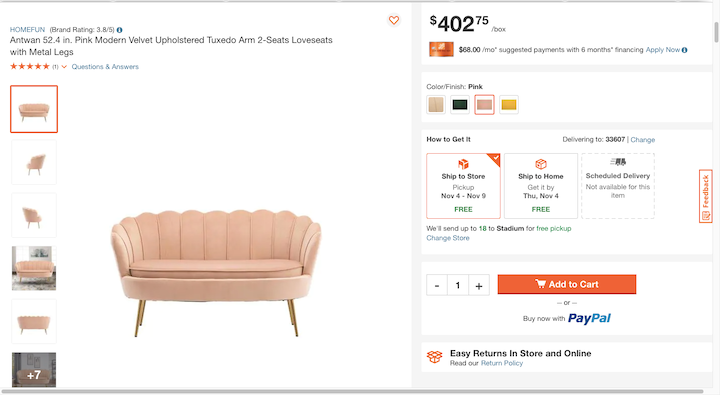
Home Depot’s button is a bright orange color, has a shopping cart icon before the words “Add to Cart” and comes with a rectangular and beveled shape.
What Do You Use CTA Buttons For?
Websites, in general, have lots of hyperlinks — from the very top of the page in the navigation all the way down to the footer. Informational links don’t require a special design.
It’s those important next steps on your website that need to be highlighted. For instance:
- Keep Reading
- Enroll Today
- Buy Now
- Add to Cart
- Start Your Free Trial
- Watch Now
- Subscribe and Get 5% Off
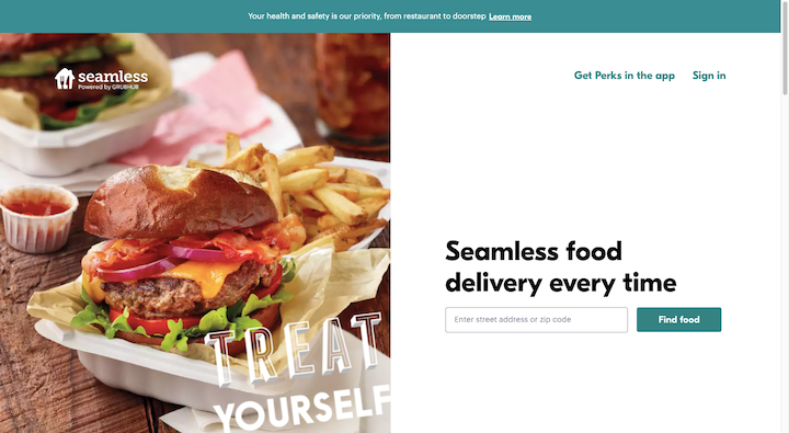
CTAs also belong at the end of website forms — contact forms, search forms, checkout, etc. Like this “Find food” example from Seamless:
CTA buttons appear on every page of a website. While the hope and expectation is that visitors will click through these buttons, we can’t focus on the action alone. Designing a button to look clickable isn’t going to make more visitors click on it.
In order to compel visitors to take action, we have to understand what drives them to do so and then design buttons that help them accomplish their goals. As such, CTA buttons should serve one of these purposes:
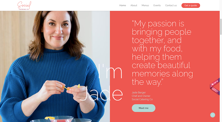
Education: Provide more context or information about points briefly touched upon on the page.
Like the “Meet me” button on Social Catering Co‘s home page:
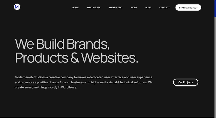
Guidance: Tell visitors what to do next and how to get there.
On the Modernaweb Studio website, for instance, there is always a call-to-action button at the top of the page directing visitors to the next page or step:
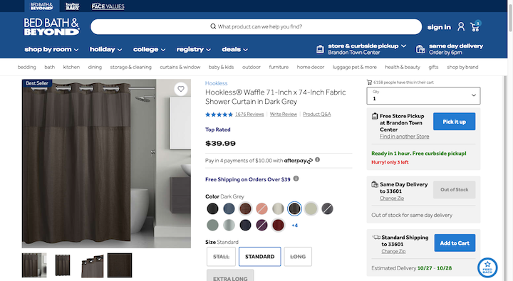
Support: Give visitors options if they’re split on what to do next, like adding a product to the cart or saving it for later.
This is especially relevant for companies with brick-and-mortar locations like Bed Bath & Beyond that want to offer customers multiple checkout options:
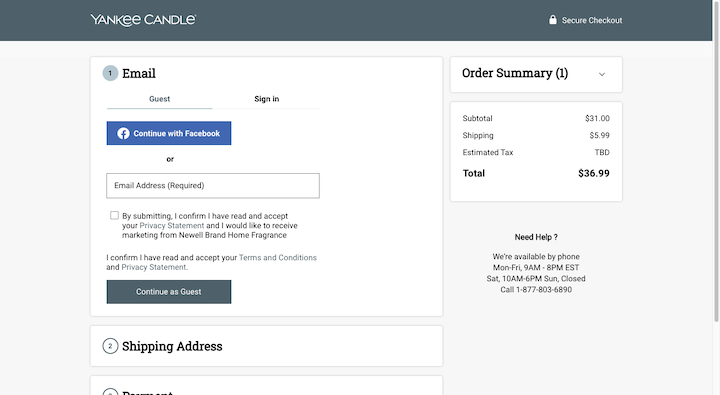
Convert: Give visitors a quick route to conversion when they’re ready.
Yankee Candle, for instance, uses the same CTA design on every page of its checkout process — from “Add to Bag” all the way to “Checkout”:
19 Best Practices for Designing High-converting CTAs + Examples
There’s more to CTA button design than just color and size, though those matter, too. While there’s no secret formula for designing the perfect CTA button, there are certain rules you need to follow if you want to design buttons that capture visitors’ attention and inspire them to take action.
Let’s take a look at the 19 best practices that will help you design effective calls-to-action:
1. Pick a Primary Call-to-Action
Think about how much we’re able to do on the web—
Read articles and connect to friends and buy stuff and subscribe and watch videos and check emails and on and on it goes… This is why so many people suffer from decision fatigue today. It doesn’t just make the decision-maker feel poorly either. It can negatively impact the decision-making process.
According to Medical News Today:
“The psychological effects of decision fatigue can vary, potentially leading to difficulty making the right decisions, impulse buying or other avoidance behaviors.”
As such, a call-to-action is most effective when it’s the only decision (or one of maybe a small handful of decisions) you’re asking visitors to make.
While each page on your site can offer up other links and buttons, you should only have one primary CTA. Like Basecamp does here:
The big yellow “Give Basecamp a Try” button is the primary call-to-action. It’s the only element on the page designed this way, too, which makes it easy for visitors to figure out what they need to do next.
2. Use a Strong, Memorable Color
There was a time when the biggest debate surrounding CTA button design came down to whether you should make them red or green. HubSpot for, instance, dedicated an entire post to A/B testing these two colors:
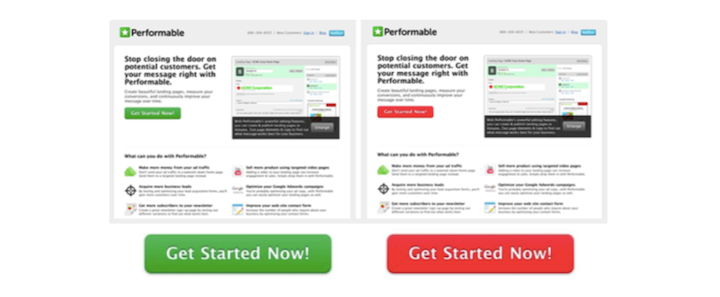
While color still plays an important part in optimizing CTA buttons for clicks and conversions, it’s not as simple as red-or-green.
You have to consider a number of factors:
- Branding
- Color harmony
- Color contrast
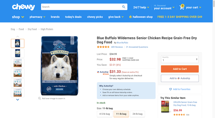
Chewy‘s “Add to Cart” is a good example of how to choose a color that contrasts well with its surroundings while still looking good amongst the site’s branded elements.
While color psychology can be useful when designing buttons, it’s not an exact science — especially since the Internet allows even the tiniest of businesses to go global. Colors mean different things to different people and in different cultures, so color psychology isn’t always the best path. Color theory is a more valuable tool.
3. Choose a Simple Serif or Sans Serif Font
You’re not going to have a lot of room for creativity when it comes to font choice for buttons. You need visitors to be able to quickly read what’s on them, so they can feel confident taking action.
As for which web fonts are the most legible, stick to plain-looking serifs and sans serifs with distinctive characters. Scentbird, for example, uses Proxima Nova:
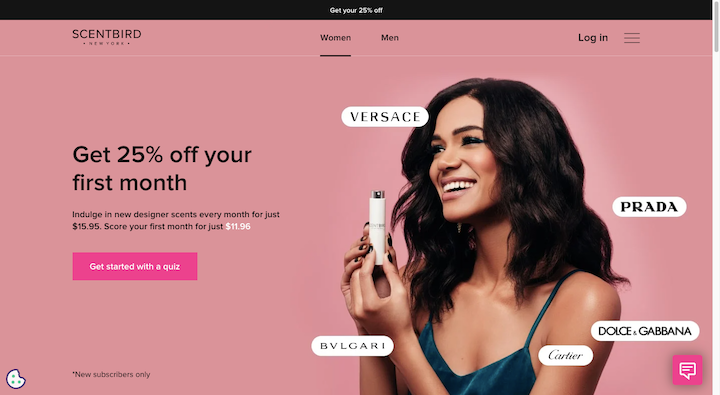
It’s not a very exciting sans serif font, but it’s clean, easy to read and matches the surrounding text. It also allows the design and message of the button to make a greater impact as they’re not being overshadowed by the typography.
4. The Text Should Be Slightly Bigger Than the Surrounding Body Text
Your button design should be what draws visitors’ eyes to it, not its obnoxiously large size. That said, you still have to consider the hierarchy of size when designing CTA buttons.
Take the Netflix landing page:
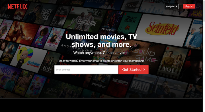
Visitors are naturally going to be drawn to the larger bits of text first — because larger text signifies greater importance.
What this design suggests is that the H1 “Unlimited movies, TV shows, and more” in a heavier 27-pixel font is the most important thing to look at. The second most important is the big white “Email address” field and red “Get Started >” button.
You can use a combination of font size and weight to help direct visitors’ eyes through your content and to get them to the CTA much more quickly, too.
It’s up to you how much emphasis to place on your CTA button. For primary CTAs, they should be closer in size to your H1 and H2 than to the body text. For secondary and tertiary CTAs, though, they can be smaller so long as they remain legible and clickable.
5. Provide Ample Space Around the Letters and the Button
White space gives your most important design elements room to breathe, which, in turn, helps visitors more easily find and focus on them. And around text, in particular, white space can help improve legibility as well as clickability.
That’s why space needs to be factored in when designing CTA buttons. They’re important elements that move visitors from one page or step to another. They can’t get lost in the shuffle or be difficult to read or use.
Let’s look at the promotional landing page for Muse‘s upcoming (virtual) world tour:
The hero image design is quite the spectacle. If the designer had placed a CTA button there, it would’ve been difficult to find.
As visitors scroll down the page, though, the design fades away and opens up into a ton of white space. And this eventually takes them to the bottom of the page where they find two calls-to-action to “WATCH LIVE EVENT” or “ENTER WEBSITE”.
The space surrounding the CTAs is good as it makes them easy to find, easy to distinguish from one another, and easy to click on the right CTA without error.
6. Keep It in Line With Modern Design Trends
When designing CTA buttons, they need to fit the brand’s style and they need to align with the design trends of today.
For example, neomorphism is slowly gaining in popularity. However, you don’t want to use a neomorphic button design if the rest of your site and branding is flat. In that case, it would be better to give your button a flat design, but make use of a design trend like gradients within it.
If something like gradients or other color trends don’t make sense for your design, take Het Blok‘s lead and add an eye-catching micro animation to the button:
Micro animations will always be in style when it comes to button design as they improve their usability.
7. Choose Solid Over Outline Button Designs
Every few years or so, it becomes trendy to give buttons a transparent outline design. These types of buttons are also referred to as “ghost” buttons.
The biggest problem with this trend is that research has proven time and time again that outline buttons have lower click-through rates and higher error rates than solid buttons. While they may look more minimal or elegant, they’re just not as user-friendly.
So, when you design your primary CTA buttons, always go for a solid (filled) button design. Then, if you need to add secondary or tertiary buttons to the page, make them ghost buttons if you want to de-emphasize them.
This design tactic can also be useful if you want to place a number of CTAs side-by-side and show visitors which option is best, just as America’s Test Kitchen does here:
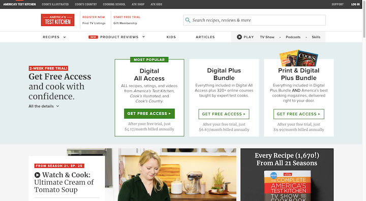
Visitors’ eyes will naturally go to the “Get Free Access” button that’s filled in and placed first in the sequence. Even if it didn’t say “Most Popular” at the top, I’d be willing to bet this subscription would get more clicks and purchases simply because the ghost design suggests the others aren’t as valuable.
8. Give It a “Clickable” Design
There’s one thing you need visitors to do when they see a button: Click it. So, it has to look like it’s clickable when surrounded by non-clickable elements.
The simplest way to do this is to give it the rectangular or ovular shape that people have come to associate with buttons.
If it fits with your branding, you may want to do more to make your buttons stick out. For example, the Jumpin hero image button does two things to let visitors know it’s clickable:
The first is that it looks like it’s casting off a light around its corners. The second is that it expands in size when the user hovers over it.
Other ways to make a button appear clickable is to add a shadow to the background or to give it a beveled edge.
By designing your buttons this way, you’ll reduce click errors and help visitors more quickly find and use your calls-to-action.
9. Create a Button Design Specifically for Mobile Users
What works well for desktop and laptop users isn’t always the case for smartphone users. And we’re not just talking about the size or color of the CTA button.
Take, for instance, the Eventbrite “Tickets” button on desktop:
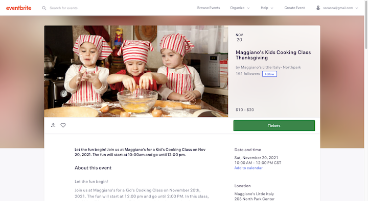
It’s placed on the right side of the page, directly below the basic details of the event. It’s similar to the design we see and have come to expect from ecommerce product pages.
On mobile, that kind of design doesn’t make sense. While the designer should retain as much of the look of the button as possible, its placement and functionality should be tailored to the mobile experience.
That’s exactly what Eventbrite’s designers have done:

The green “Tickets” button first appears below the main details of the event on the mobile page. As the user scrolls, it sticks to the bottom of the page so that it’s always present.
10. Include a CTA Above the Fold on Certain Key Pages
While every page on your site should have a call-to-action, it’s not always essential to present it to your visitors first thing. Internal pages for Services or About are informational. Visitors go to those pages to learn more, so give them a chance to read before you invite them to “Contact Us” or “Explore Our Work”.
There are some pages, though, where the CTA should be front-and-center:
- Home pages
- Landing pages
- Product pages
23andMe‘s product page is a nice example of this:
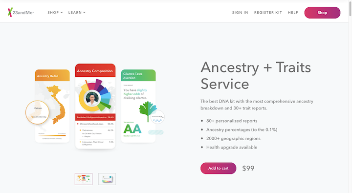
With a design like this, visitors get a high-level overview of the product and instantly know what the next step is: Add to cart. They can take their time perusing the page and figure out if the product is right for them. Then, when they’re ready, they’ll remember where to find the CTA button to convert.
By placing it at the top of the page within a distraction-free design, conversion becomes quick and painless.
11. Place Buttons in Your Visitors’ Paths
When designing a website for the user journey, you have to think about more than just how they get from one page to the next. You also have to consider how they’re going to get from the top of the page to the bottom — and where they’re going to stop along the way.
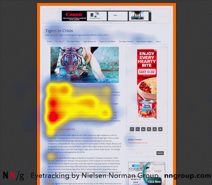
Research from NNG reveals that there are numerous ways in which people scan text with their eyes. The F-pattern, for instance, is one of the most common reading patterns:
By anticipating where your visitors’ eyes will go on the page, you can place your buttons in their pathway.
These eye-tracking studies also suggest that there are certain elements that draw more attention from users than others — like headers and images. If you can design your CTA buttons the right way, then it won’t matter too much if they deviate slightly from the beaten path.
The Casper website makes use of both of these eye-tracking principles:
The majority of CTAs on this page is close to the left edge of the page — where the majority of visitors’ eyes focus. But we also see a number of CTA buttons placed further out on the page. They all happen to be encased within an eye-catching image, which is something we know will grab visitors’ attention. So, even if they aren’t placed on the natural path, visitors are still likely to encounter them.
12. Don’t Make Your Buttons Compete for Attention
This best practice has to do with distractions. Or, rather, a lack thereof so that visitors can’t help but be drawn to your CTAs.
When you look at the home page of the Merrill Lynch website, what’s the first thing you notice?
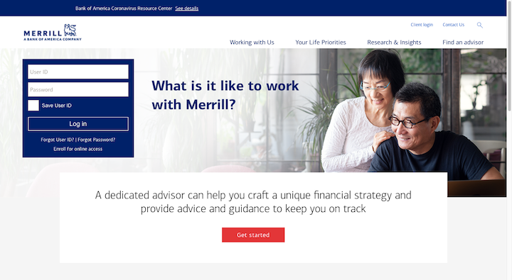
If you’re not a Merrill Lynch customer and this is your first time here, then the bright red “Get started” button is likely where your eyes are drawn.
Part of the reason for this is the color of the button and the ample white space around it. But the surrounding design is also partially responsible.
The dark blue brand color is a safe and stable color and one that’s not likely to take attention away from the red button. The image in the center of the page is also a safe choice. If you had an image of people partying and throwing cash in the air, that might hog some of the attention. However, this stock photo doesn’t do that at all. If anything, it makes way for the CTA.
13. Create a Hover State
We’ve seen some examples already of buttons with hover state transformations. There’s a good reason for that.
For flat buttons, a hover-triggered micro animation provides instant confirmation that yes, you can engage with this element. For non-flat buttons, the animation can add a small element of surprise to visitors when they least expect it.
Just like button design itself, there are a variety of ways in which you can animate a button in its hover state:
- Change the color
- Change the text
- Change the style of the text
- Add or remove an icon
- Change the shape or size of the button
This is an article on the Delish website promoting the best canned cocktails:
Some of the cocktails on this list come with a CTA button, pointing readers to a link on Drizly. When the reader hovers over the button, it changes color from black to teal (on a slight delay) and the text goes from plain to tilted.
There are so many ways to transform your button design. Just make sure it fits with the rest of your branding.
14. The Click-Through Result Should Be 100% Clear
The words that go inside the button are just as important as the design of it.
The first rule to keep in mind when choosing button text is that it needs to be crystal-clear what comes next. A button that says “Click Here” isn’t going to help increase clicks.
A button that reads “Schedule a Test Drive” like the one on the MINI USA homepage will increase clicks:
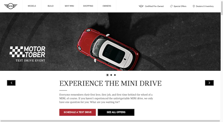
Anyone who sees that red button knows exactly what they’ll find on the next page: A scheduling form.
Just keep in mind that the expectation needs to match the reality. So any button that says “Schedule”, should direct visitors to a page where they can schedule online. If it tries to open their device’s Facetime or phone app, that could lead to an increase in bounce rate, which in turn can hurt the site’s ability to rank.
Bottom line: Make sure the command or invitation accurately describes what comes next.
15. Include Action Words in Your Buttons
Another good rule of thumb for button text is to include words that inspire action.
One way to do this is to start your button text with a verb. Instead of a button that reads:
“Ebook Download”
Make it say:
“Download Your Ebook”
It’s a stronger turn of phrase and actually sounds like a call-to-action instead of just another link for them to click.
Another way to inspire action is to make the call-to-action feel more personal. You don’t necessarily need to infuse it with a bunch of emotionally charged words.
Take, for example, this notification bar on The Bump website:
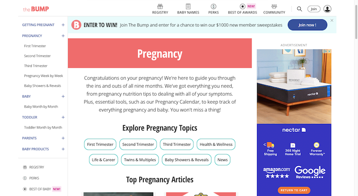
Until a visitor dismisses it, it’s the first thing they see on any page.
“Join now” in and of itself isn’t a unique call-to-action. The usage of the exclamation mark, on the other hand, makes it so.
In copywriting, we don’t typically use punctuation at the end of headers and other short strings of text, like buttons. One reason is that every character counts and we don’t have a lot of space to waste. But it’s also because punctuation has taken on a not-so-positive connotation for some people.
When you take into account the target audience for a website like The Bump, plus the context in which it appears, the exclamation point makes sense. Parents and parents-to-be come to this site to get information on pregnancy and raising kids. It’s an exciting thing, but also quite overwhelming at times. The call to “join” The Bump community — of people going through the exact same thing! — is a reason to get excited.
16. Use Words That Make Sense Within the Context of the Page
There are exceptions to the two best practices above — not for primary CTAs, but certainly for secondary and tertiary ones. It all depends on the context provided around the button.
Let’s look at this example on the Tuft & Needle home page:
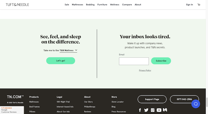
The top areas of the home page make calls to “Shop Now”. That makes sense up there. But down here closer to the footer, we don’t need that kind of button text.
Look at the CTA on the left. All it says is “Let’s go!”. On its own, it makes little sense. But visitors who read the text above, know that the button will “Take me to the” target page.
So don’t feel like you need to always write action-packed button copy if the surrounding text takes care of calling visitors to action.
17. Don’t Stress About the Number of Words in the Button
There generally aren’t any rules when it comes to how many words your button needs in order to increase clicks. It really just depends on the purpose of the button as well as the context.
For example, the most common CTAs we use are short and sweet:
- Contact Us
- Add to Bag
- Subscribe
We don’t need to provide more info around or within the buttons because there’s no mystery about what happens next. But for completely custom calls-to-action, you might find that a longer button is needed.
The Sumo blog, for example, recently published a post about conducting a social media audit. Within the post is this lengthy CTA:
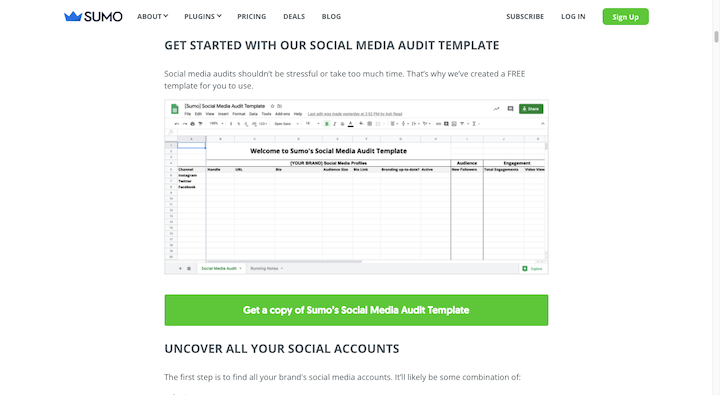
It reads: “Get a copy of Sumo’s Social Media Audit Template”.
While this kind of CTA could have been added to the post as a regular hyperlink, the big green button makes it much easier to spot. And the lengthier explanation within the button ensures that visitors know what they’ll find on the other side of it.
One thing to keep in mind is what more text does to the button’s size. If you have to reduce the font size to make it fit all on one line, then perhaps it’s too long.
18. Pay Attention to Directionality
When you design a web page, you know that visitors will automatically move a certain way across and down it. You also know that if you design the page a certain way, you can actively move their eyes in the direction you want them to go.
Your buttons can do this as well.
On the Visit Music City website, we see a number of ways this has been put into action:
The first is a right-facing arrowhead with the word “Next” beneath it.
We also see that the “Learn More” text CTAs have right-facing arrows. However, when someone hovers over them, the arrowheads point further right.
Then there’s the red CTA button. From the outside, the design of the button doesn’t seem to have any directionality to it. But when you hover over it, it turns from bright red to dark red, with the color change starting on the left and moving right.
These directional cues help create a website that feels more active like it’s constantly in motion and moving you along with it.
19. Use Inactive State Designs on Your Forms
Rather than keep your buttons active if they’re contingent on a form being filled out properly, create an inactive state for your buttons.
Minted shows us one way to handle it:
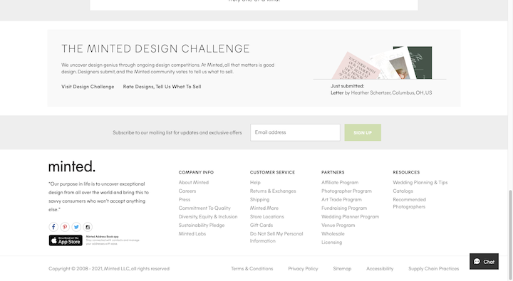
The subscription form at the bottom of the page has a faded “Sign Up” button. It won’t light up green until an email address has been provided.
VSP has another way of handling this:
Visitors can’t click on “See Plans” or “Learn More” until they provide an answer in the form. When they do, the inactive button turns blue, and they can proceed with submitting their request.
This kind of CTA button design forces visitors to slow down just a little bit, which means fewer error messages and frustration they have to deal with.
How to A/B Test Your CTA
The CTA button is an important element that drives visitors from different parts of your site to others — and ideally all the way to conversion. The only way to ensure that it’s maximized for clicks and conversions for your specific audience is to test variations of it.
Here are some basic steps to follow when you A/B test your button design:
Step 1: Create Your Hypothesis
Every test must start with a hypothesis.
Even if your page and button are getting clicks, do you believe there’s something holding people back? If so, why?
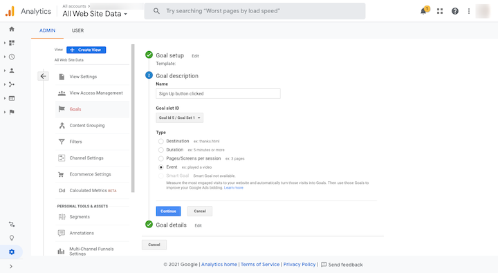
You can use Google Analytics and heat mapping tools like Hotjar to form your hypothesis.
With Google Analytics, you’ll need to set up goals so you can track the clicks on individual buttons. Once you’ve isolated the button’s activity, segment the users and figure out if there are certain people not converting.
Hotjar will help you visualize what’s happening with your buttons with heatmaps and session recordings:
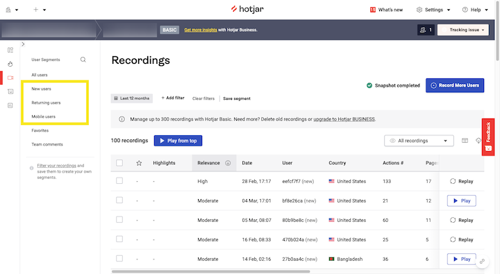
You won’t have the ability to segment as much as you can with Google, but the data can still be useful.
Step 2: Choose One Element To Test
Once you have an idea of what might improve your click-through rates, choose one element to test. For example:
- Color
- Font type
- Font size
- Icon or no icon
- Border or no border
- Button size
- Button placement
- Hover state design
- Copy
By testing one element at a time, you’ll be able to refine your button’s design bit by bit and get it as close to perfect as possible. There also won’t be doubt post-test as to which of the design changes improved or worsened your conversion rate.
Step 3: Make Sure Your CTA Button Is in an Easy-To-Edit Format
This might not seem like a big deal, but you’re going to be conducting a lot of A/B tests on your CTA buttons. So you’ll want them to be created in a format that’s easy to modify — and that gives you the flexibility to test out any variation you want.
Elementor’s Call-to-Action Widget is a good solution for this if you want to create a block with a CTA button inside it. You can also use the Button widget to place a button within your design or copy.
Step 4: Set Up and Run Your A/B Test
We have an entire guide dedicated to A/B testing. In it, we’ll give you a couple of different tools you can use to A/B test your designs both inside and outside of WordPress.
You’ll get a breakdown of the steps for both options. For Google Optimize:
- Create your original variant
- Add Google Analytics and Google Optimize to your website
- Set up an A/B test in Google Optimize
For Elementor and the Split Test for Elementor plugin:
- Create a new test
- Set up test in Elementor
- View test results
By the way, if you’re trying not to adopt too many external tools to build and manage your website, Elementor offers the total design and marketing package — and not just when it comes to A/B testing.
Step 5: Monitor the Results of Your A/B Test and Update Your Button
Before you run your test, set an end date and/or sampling size you want to stop at. Without a definitive endpoint, your A/B test won’t give you accurate results.
Check your average web page traffic as well as the current click-through rates (CTR) for that button during the timeframe you’ve chosen. For example:
Timeframe: 4 weeks (December 1 – December 31)
Average traffic volume: 3,000 visitors
Average CTR: 3% (90 visitors)
Your test’s goal should be for that same timeframe, and you should aim to have roughly that many visitors tested during that time. 50% will see your original button design, and 50% will see your variant.
When the test concludes, you can start examining the results.
You’ll compare the Number of Conversions and Conversion Rate for your variant against the original design. The hope is that the variant outperforms the original design, thus proving your hypothesis that it was a more effective design for the user. It’s okay if that doesn’t happen. It’s a valuable lesson learned either way.
That said, a higher conversion rate alone doesn’t mean that the variant is a winner. There needs to be a significant difference between the numbers. This is one of the reasons why you need a large sampling of visitors.
Let’s say this is our A/B test:
| # Visitors | # Conversions | Conversion Rate | |
| Original | 50 | 5 | 10% |
| Variant | 50 | 7 | 14% |
With a conversion rate four percentage points higher, the variant seems to be the clear winner. But when you look more closely at the data, a difference of 2 conversions in a pool of 50 visitors isn’t all that meaningful.
This A/B test, on the other hand, would give you a clear winner in terms of button design:
| # Visitors | # Conversions | Conversion Rate | |
| Original | 5000 | 500 | 10% |
| Variant | 5000 | 700 | 14% |
So, pay close attention to the context of your results. If you don’t, you could end up implementing a new CTA button design that hurts your page’s CTR and conversion rate.
Conclusion
CTA buttons may be some of the smaller elements on your website, but they can easily lead to big frustration on the part of your user if they’re hard to find or use. That frustration can lower your click-through and conversion rates and increase your bounce rates, too.
If you want to minimize the risk and maximize the benefits you get from your CTA buttons, make sure every inch of them is designed well. And then tweak that design until you find the perfect combination of elements — from the button color to the copy — for your target audience.Call-to-action (CTA) buttons


