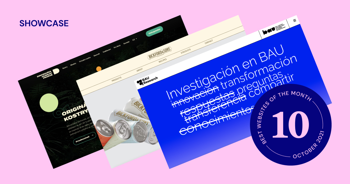
Joining us this month are a Silicon Valley consultancy, a Dutch advertising agency, an eco-friendly coffee cup UK startup, a unique portfolio website, a luxury beverage manufacturer from Down Under, a medical aesthetics academy longing to put your best face forward, a special university research initiative, a flawless pool cover manufacturer, a Jurassic themed adventure museum, and two insanely different web marketing agencies.
There’s a Lottie to study this month with plenty of scroll and mouse motion effects, clear mask shapes, impeccable uses of blends, gorgeous photo and video assets, textual masterpieces paired with masterful copywriting, custom fonts and icons, as well as both minimalistic and bold design styles, plus much more.
Ready to go on a website adventure?
10
CanCan
by Something Familiar
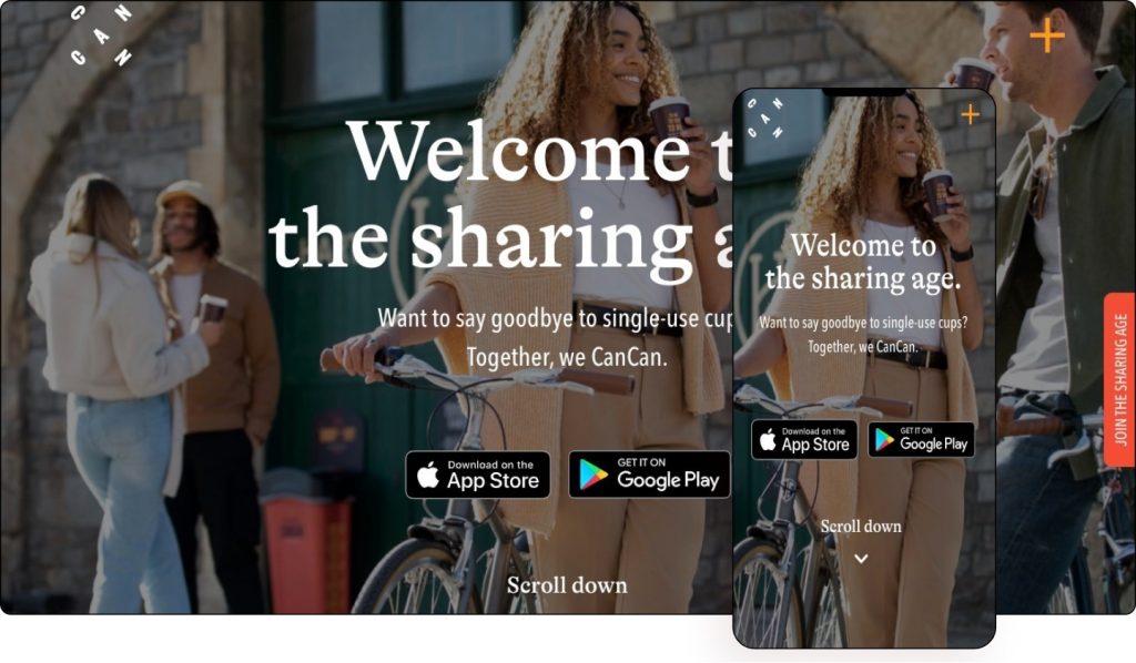
CanCan is a free, low-energy, reusable cup system built to eliminate single-use disposables. Their app and smart products allow them to follow the lifecycle of a cup, accurately tracking the positive impact they are making on the world. Having reimagined how businesses reuse food and drink containers, through sharing low-value items, they help hospitality and retail businesses reduce waste while being more cost-effective and convenient.
The first thing that strikes most people is CanCan’s creative logo followed by the website’s bright color combination which gives it a fun vibe.
In fact, the same colors are used in the visible images, blending both the color scheme and the photography together. Along with its line illustrations, it makes the entire user experience fun and interesting.
Hovering over the orange sticky button beside the scroll bar changes its color. Clicking on it opens up a subscription form. Likewise clicking the plus-shaped menu icon opens a set of menu options laid out on an orange-colored asymmetrical background.
Pairing serif headlines with sans-serif text, the UK’s company’s website is a great example of best-practice typography, clearly outlining its environmental vision in its effort to generate leads.
Branding & Design: Hello Agency & Something Familiar
Development: Something Familiar
Theme: Hello
Plugins: Local Google Analytics for WordPress, SG Cachepress, Yoast SEO
09
2kwadraat Advertising Agency
by Khalid Karmoudi
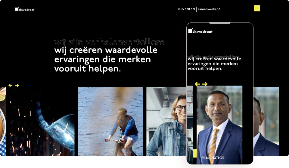
2kwadraat Advertising Agency believes every brand has a story that needs to be heard, seen, and felt. Digging deep and searching for their clients’ right to exist is their mission. Based in the Netherlands, their goal is to make fans of their clients’ brands by telling their stories.
This Dutch company’s slogan is, “We help brands move forward”. This is equally true of its website which uses bright-colored arrow motifs symbolizing progress.
The website’s use of Lottie animations such as the animated hamburger icon is a delight to the eyes. Impossible to miss due to its high contrast black on yellow color scheme, it implies the user should act now.
Making use of special hover effects and mouse tracking effects, the menu is anything but static. Likewise, the scrolling animations on images give the impression that the company is constantly evolving.
What is also evident is the investment in portrait photography of the company’s team members, which adds an air of professionalism and sophistication through its black and white color scheme.
The sharp contrast of black and yellow color palettes brings navigation menus and buttons out from the background and evokes formality blended with creativity. Acting as a lead generation funnel as well as a brand exposure tool, the website hits both points.
Design & Development: Khalid Karmoudi
Theme: Hello
Plugins: WP Smushit, Jet Elements, Jet Blocks Master, Jet Tricks
08
TruSource Group
by Marea Giles, Michael Waters & Studio 678
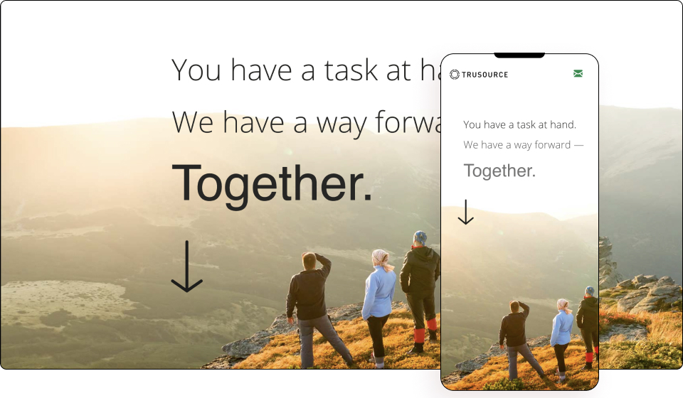
TruSource Group is a Senior Management Consulting Firm based in the Bay Area of California, serving many organizations ranging from Fortune 100 to companies with 100 employees. They specialize in leveraging internal client resources and processes to deliver lasting results and are proven partners, collaborators, and communicators at all levels within an organization.
This one-page features plenty of high-definition cinematic videos embedded into a minimalist design using mask shapes. The videos contribute heavily to the page’s flow by creating a fluid user experience.
The pauses between sections are smoothly divided sections with large typography paired with copy, and littered with marketing savvy second-person references, giving it a personal feel. By strategically leaving white space, it allows the user to “breathe” while scrolling.
The designer’s efforts are visible everywhere from scrolling motion effects to parallax design motifs and Lottie widgets. With a clear focus on brand exposure, the Silicon Valley company’s messaging is beautifully captured in a delicate thin font only serving to reinforce its technologically advanced vibe.
Design: Hilary Zaid and Marea Giles
Development: Michael Waters / Studio 678
Theme: GeneratePress
Plugins: GP Premium, Preloader Plus, The Plus Addons for Elementor
07
WebAndMe
by Maria Wiedner
Maria Wiedner believes your website should speak for you. Your website should attract your desired customers because you deserve a website that will make you cheer! She believes self-employed people can change and achieve a lot with their small projects. So, she helps self-employed women create shiny websites.
If you’re looking for some out-of-the-box inspiration, this web designer’s minimalist website targeting self-employed women is one to add to your list.
The website knows its audience, evidenced by empowering copy that creates enthusiasm and trust in the designer. Using her own collage of photos, illustrations, and other zine elements, Maria showcases her creative spark all over her website at times utilizing Lottie widgets, and at other times using scrolling and mouse motion effects. She presents images of herself in various scenarios such as doodling as well as unassumingly standing facing the camera.
The lack of a grid gives a feeling of ordered chaos which speaks to entrepreneurs looking for an artistic touch of originality. Similarly, the yellow text against a grey background melds together feelings of sophistication with innovation in order to resonate with self-employed women.
Built for lead generation, brand exposure, and blogging, Maria’s website is a fine example of sharing your message while showcasing your portfolio.
Design & Development: Maria Wiedner
Theme: Hello
Plugins: Premium Addons for Elementor
06
Skild Aesthetics Academy
by Passionates
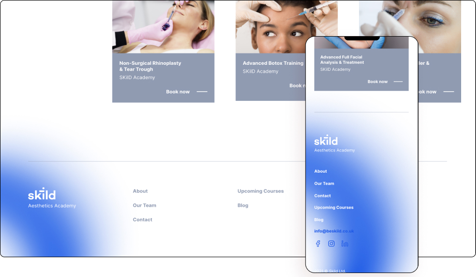
Skild is a learning and training academy for healthcare professionals working in medical aesthetics. The company was founded to raise the standards of education and clinical practice by working with the leading experts in aesthetic medicine. Recognizing the limitations of single-day training, Skild has a training academy that perfectly combines theory, practice, and community for continued learning.
To emphasize the company’s area of expertise, the website employs a modern minimalist design. This puts the user experience first, allowing ease of navigation and course booking.
Animated geometric figures and Lottie widgets accentuate the most important details by drawing users’ attention to them as they scroll. Subtle blend modes against a backdrop of generous whitespace give the website a high-end feel. In fact, the use of special geometric shapes is prominent on all pages of the site, as well as in the logo. The use of gradients is also very trendy and puts this site at the forefront.
The website’s booking forms use WooCommerce’s booking plugin which enables the company to create a custom product template on the frontend while keeping a familiar interface on the backend, letting clinicians manage their courses smoothly.
The use of bright font colors set against a white background enables the message to be read clearly. Seemingly so, the website uses a single sans-serif font throughout its websites for both headlines and smaller texts. In fact, the design language is very tight and uniform, giving it a sense of authority while also projecting the professionalism of the company behind the website.
Aimed at healthcare professionals looking to become experts in aesthetic medicine, the website’s clean modern interface is built for growing this niche professional network as well as book training courses.
Design & Development: Passionates Digital Agency
Theme: Astra
Plugins: Jet Engine, WooCommerce, WooCommerce Bookings.
05
Aquadeck
by Pollet Group
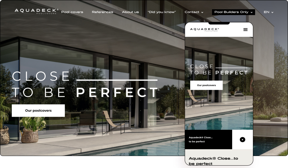
Aquadeck produces top-quality slatted pool covers with care and craftsmanship. Driven by intensive knowledge and years of experience, their engineers look for the best and most attractive materials, develop the smartest designs, and use the safest components. Innovation never stops for them as they believe products can always be even better, smarter, or more attractive.
Based in Budel in the Netherlands, the company’s motto is “Close…to be perfect” which is clearly evident in its hero section. In fact, there have clearly been great resources invested in both photography and videography, given the high quality of visuals on display.
This is a fine example of a design that helps make a bland, albeit niche, topic into an interesting and visually appealing website. The design elevates the entire experience using spectacular visuals, alongside modern and contemporary layouts and fonts.
There is a clear intention for the website’s color to come from its photos, videos, and animated illustrations. The background is predominantly black and white, with delicate beige touches, that fix the focus on the quality of the product.
Breaking away from modern convention, the website uses sans-serif fonts right across its website with titles simply bolded and sized bigger.
Visiting the pool covers section allows users to drag arrows left or right and see in real-time swimming pools opened or closed, either partially or completely. Clickable attribute boxes similarly offer detailed information about products.
Line drawings of a world map can be seen on several pages such as the contact page, keeping things moving, so to speak. Clever scroll motion effects everywhere add some action to the tranquil serenity of the images.
A website that is well made and executed perfectly. This is another excellent example of how good design can affect the perception of a product and the company behind it. This is a website that fits its product as “closer to perfect” indeed.
Design & Development: Pollet Group
Theme: Hello
Plugins: Happy Elementor Addons Pro, Jet Elements, Jet Engine, WP Rocket
04
BAU Research
by Adria Paz
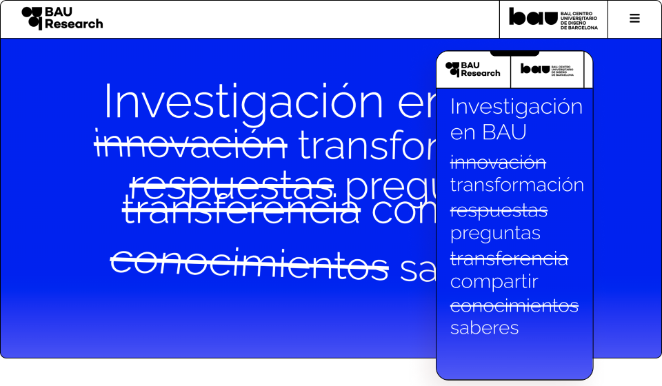
BAU is a design university located in Barcelona and affiliated with the Universitat de Vic – Universitat Central de Catalunya, which provides official studies in design within the European Higher Education Area. BAU Research was born from the conviction that research is an inventive practice that can be developed with creativity and rigor. They share practices and ideas with the will to produce new meanings, new imaginaries, fairer markets, and more sustainable lives.
Blue is the color of competency, and what better use of the color than for a research department’s hero section. Scrolling spells out their unique message in thin sans-serif text.
The hero section includes a combination of different effects — scrolling, mouse tracking, and sticky widgets, and smart copy, particularly with the strikethrough text “eliminating” conventional thinking.
The website employs a modern and minimalist layout, and large typography. It utilizes a floating menu in an unusual way — scrolling down causes the menu to disappear and leaves the page completely clean while scrolling up makes it immediately reappear.
A series of blend modes is used as it shifts into its main message of inclusive fashion. A video background is soon seen before it shifts again into a high-definition photograph.
Clicking the hamburger menu paints the entire screen blue so the overlaid white text is clearly visible. Again the use of blue builds a sense of trust, peace, and loyalty.
The Catalonian university’s research website rather cleverly displays an email newsletter signup across its footers, maximizing its real estate for easy lead collection before visitors bid “adéu”.
Design & Development: Adria Paz
Theme: Hello
Plugins: Sticky Header Effects for Elementor, ele Custom Skin Pro, WP Smushit, Complianz gdpr, WP Data Access, WP Menu Icons, Sitepress multilingual cms, Yoast SEO, W3 Total Cache
See Live Website
03
Bickford and Sons
by Frame Creative and Sid Puri
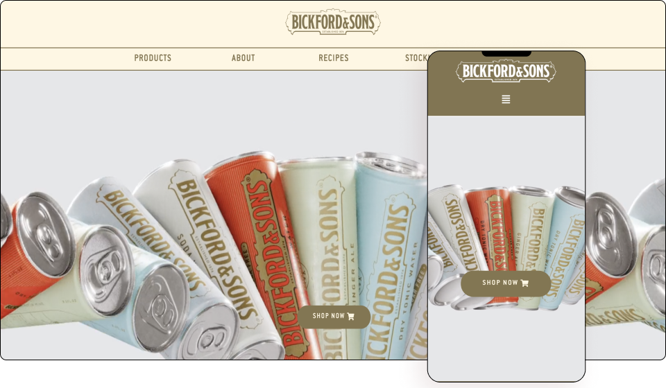
Bickford and Sons are intent on creating a reliable and emotional connection with their audience. They have set out to earn their place as a modern classic brand by leveraging history through their 140-year-old brand story and projecting authenticity via a 2021 revamped brand presentation. They achieve this by combining natural ingredients, a legacy of hand-crafted methods, and recipes to deliver authentic, exceptional flavors — all created with their customers’ spirits in mind.
Following their refreshed design this year, the South Australian beverage manufacturer went all-in on its brand new website. From the get-go, we are introduced to its iconic cans flowing side-to-side in its hero section to side as a gorgeous looped high-definition video.
The result is a calm colored background with pockets of vibrant colors from the brand’s iconic cans that are pleasing to the eyes. Shape dividers cleanly showcase the company’s products, while its minimalist design evokes a very luxurious chic vibe. There is a nice use of transparent scrolling effects.
Using both a series of various colorful backgrounds which match each respective product and the added combination of overlayed images creates the impression you can just reach out and grab yourself a drink.
The website’s use of large bold uppercase typography gives it a modern look and feel. This is a brand that knows its young audience and speaks directly to them by visually building excitement around its product.
Design: Frame Creative
Development: Sid Puri
Theme: Astra
Plugins: Store Locator
See Live Website
02
Dinosauria Museum Prague
by Robin Stenczel & Amazual Media
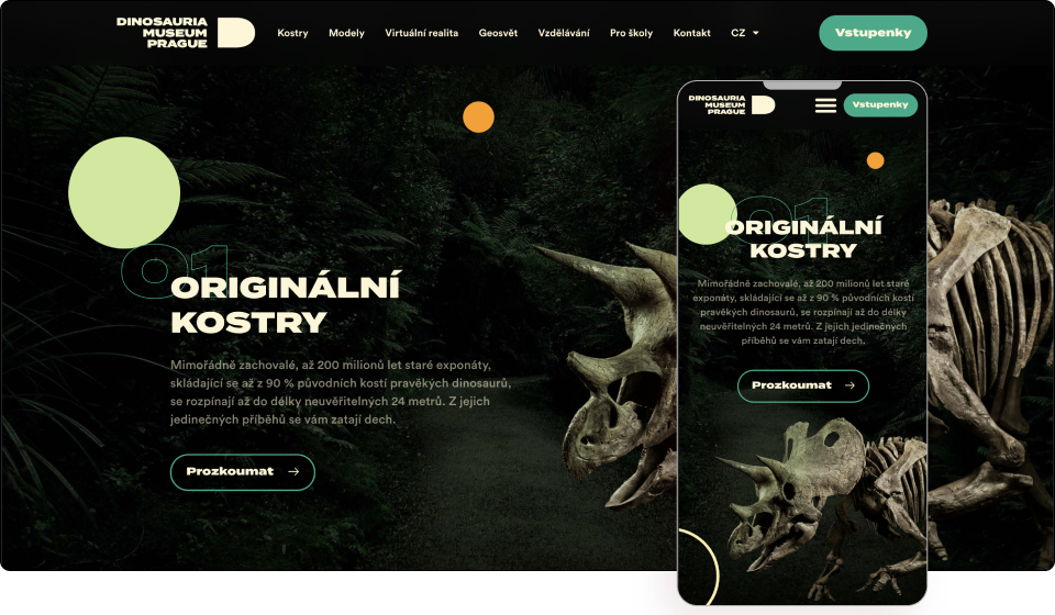
Dinosauria Museum Prague is a unique world that breaks down ideas about a museum. They let visitors experience an unprecedented adventure in the face of dinosaurs inside a modern interactive world. Visitors will discover the largest private collection of authentic dinosaur skeletons, models that are so lifelike they will send shivers down their spine, long with the very latest technology for their entertainment and education.
The hero section itself is enough to inspire website visitors into becoming real-life visitors. Using a series of motion effects, custom fonts, and colorful icons, visitors are given an experience of going through time itself into the age of dinosaurs.
The website opens with a spectacular video that introduces visitors to the world of dinosaurs and creates a feeling of depth as if peeling back layer after layer. The circles in the video are also visible on the website page and simulate something from another and spectacular world lost in time.
Using beautiful high-quality images of dinosaurs, a combination of scrolling effects on design elements, figures, and vegetation, creates a fully interactive experience. The sticky viewport also reveals layer after layer of the story of the museum and the diverse activities available.
The black canvas creates a mysterious atmosphere, while the neon colors pop forward. In fact, various pages use dark high-definition videos, zoomed-in carousel images, and mask shapes which all come together to create a subtle mystique.
The website uses custom-built icons highlighting each of its key attributes. It also uses a skeleton white color for its text along with forest green buttons and outlines which respectively pay subtle homage to the fossils of the present and the living creatures of the past.
Hover animations and overlay icons as well as Lottie widgets can also be seen on various parts of the website. In fact, there’s a lot happening yet it never feels overwhelming. It instead creates excitement and builds anticipation — exactly what you would want museum visitors to feel.
The Czech Republic is renowned for its myriad attractions, and now Dinosauria Museum Prague has put yet another hotspot on the famous pebbled streets of Prague’s illustrious map.
Design: Robin Stenczel
Development: Amazual Media
Theme: Hello
Plugins: HappyAddons, The SEO framework, Polylang
See Live Website
01
Digital Strawberry
by Shyam Singh
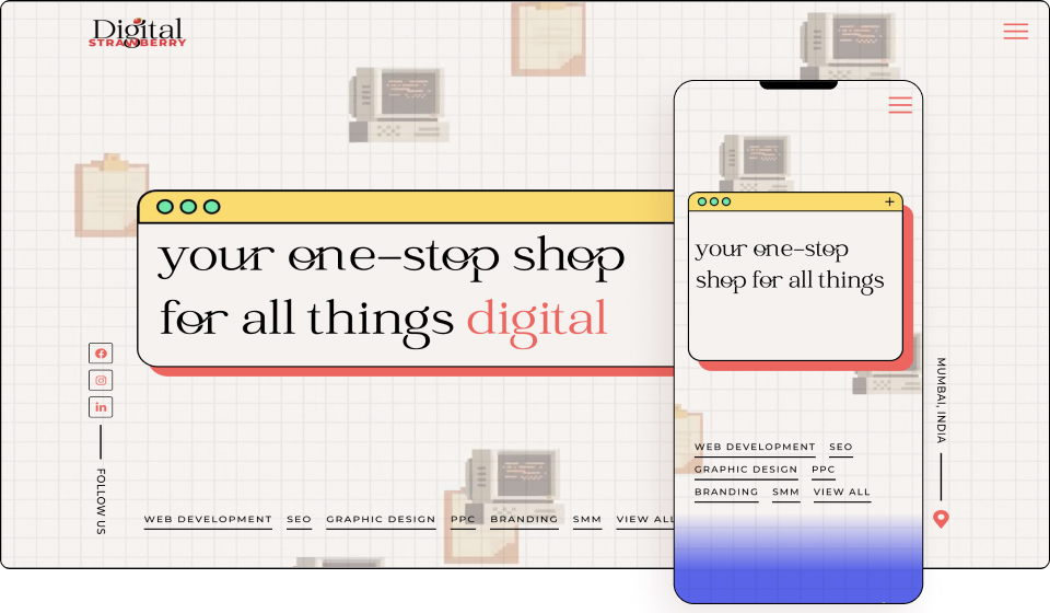
Digital Strawberry provides end-to-end digital marketing services. From developing websites that match the vision of clients’ business to graphic designing interactive creatives that’ll help connect with their clients’ audience, Digital Strawberry does it all!
“PRESS START” is how visitors are greeted in a retro neon-colored pixel-styled text that evokes feelings of nostalgia. The graph paper hero section with moving old-school desktop computer screens as well as animated animations, illustrations, and bulletin boards will certainly get your attention and take you back to the classic PC game era.
The website also cleverly combines serif with sans-serif — a font display for classic titles, and a modern font for body text. There are also components that are enclosed within frames that simulate a browser or video player.
The company shows off its key benefits by rotating one word in an otherwise static sentence. It’s a nice use of rotating red-colored text. Rather unconventionally, the menu is placed at the base of the hero section, making it impossible to ignore.
Scrolling down, we are greeted with several pixelated pop-culture figures and icons from Pokémon to Hello Kitty. The graph paper acts as the canvas with blends of blue, white, yellow, and purple dividing each section. This is a fantastic example of a website employing both scrolling and mouse motion effects to create an action-packed look and feel. Furthermore, large type and bright colored design motifs add vibrancy and genuine personality.
The website uses relatable design language, exceptionally creative gifs, fun illustrations, and animations that we haven’t really seen before. Great examples of this are the pop-up and website menu. The loading hearts from the Legend of Zelda is a nice shoutout to gamers as is the cat video to fans of internet pop culture. Even the flip phone animation on the contact page is a nice touch.
Using background images, overlays, and images, along with custom fonts, means the creators really left no pixel unturned here. The website colors convey fun, experience, and even a sense of optimism. This iconic website will give you digital strawberry feels forever!
Design & Development: Shyam Singh
Theme: Hello
Plugins: Jet engine, Maz loader, Rank Math.
See Live Website


