Design trends are often influenced by cultural changes that happen around the world. This year, we experienced remarkably dramatic changes in the digital design sphere. COVID-19 has put us in quarantine, pushing us to delve deeper into the digital world, and changing the way we live our lives. The remote, stay-at-home reality we’ve been faced with has challenged designers to recreate real-life experiences and make them available digitally.
Web creators have risen to the occasion by exploring multiple avenues of visual communication that can generate increased levels of engagement. This includes novelty typography art, unusual color schemes, 3D product simulations for online shoppers, to name a few.
In these 12 examples, you will find individual trends that each accommodate separate industries and user personas. It’s key to remember that implementing these styles isn’t merely an aesthetic decision. It is essentially a balancing act between quality and quantity. This means that applying as many trends as possible to one website will not achieve our web creation goals. Deciding which specific trend suits our business goals, however, is what will positively impact our audiences and their course of action.
Table of Contents
Find the Perfect Resources for Web Design Inspiration
Typography Design Trends
1. Elegant Serif Fonts
The old belief of using sans serif fonts as the go-to font style for web design has been changing with the times. Indeed, sans serif fonts have always been loved by web designers for their sleek legibility and simple structure.
Fast forward to 2021: screen sizes and resolutions are larger and clearer than they once were. Contrary to their “outdated” predecessors, such as CRT monitors of the 1980s, the screens we now design for are more inviting to decorated, heavier serif fonts. Larger screens, for example, enable serif fonts to appear less cluttered and more readable — thanks to increased space around the words. Likewise, the higher resolution makes the heavier or more illustrious letters look clearer.
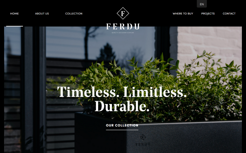
There are actually specific serif font families that designers have come to love, where we’ve noticed a pronounced preference for “elegant”-style fonts. Examples of such include the well-known font families Georgia or Times (both found in Google Fonts). Less well-known fonts have also become popular — such as Portrait or Noe Display.
As we see in the example above, ferdu.be (who by the way, was a winner for our August 2020 Showcase), uses Noe Display for their hero text, which is without a doubt highly legible and clear upon its dark background. There is a plentiful amount of space around the text so that each letter is clearly carved and distinguishable.
2. Playful Typography Effects and Animations
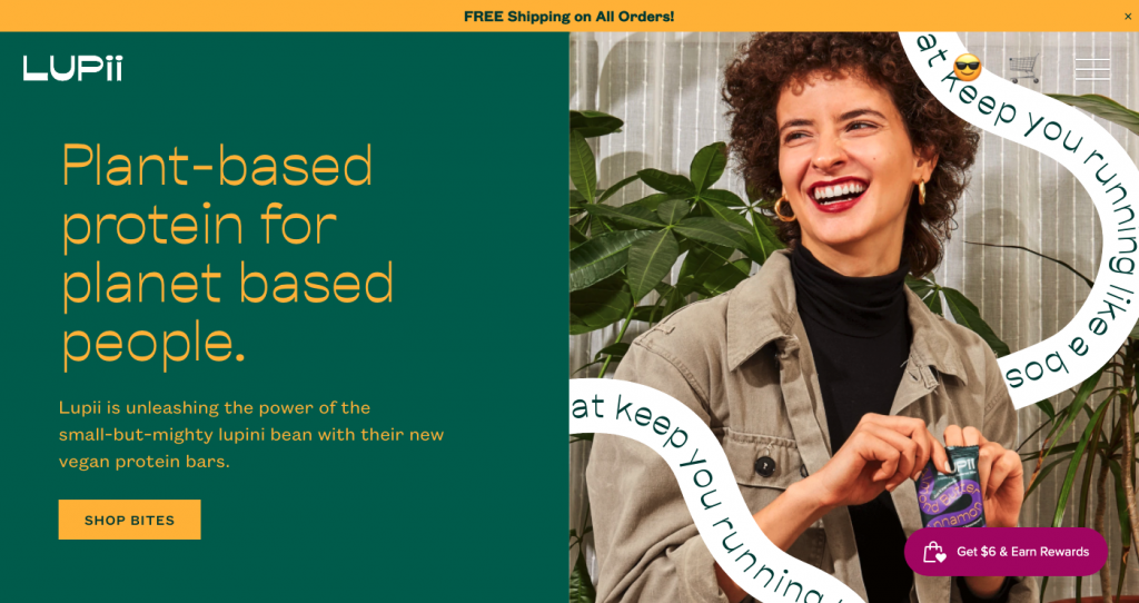
Protein bar company Lupii features animated typographic elements that use a sentence or collection of words for decorative purposes. This creative design trend differs to type-related techniques we’re used to seeing, such as creating a custom font or using clever font pairing.
An animated string of words will often be structured as a particular shape, contrary to the standard horizontal, left-to-right sentence format. Ultimately, the element’s role will always be for decorative purposes and not solely as a text to be read. Designers will typically use this technique to convey a branding or marketing objective, creating a desired vibe or visual theme.
Lupii combines the traditional with the unconventional. On the left side, you’ll find the product’s value proposition as an H1, a short description, and a call to action button. On the right, there’s an animated swirl composed of words, elaborating on the product’s added value in a more informal, customer-centric tone of voice.
3. Use of Emojis
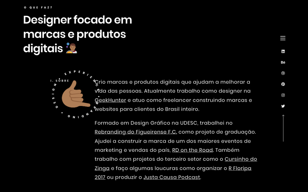
Another August 2020 showcase winner, Diangelo Santos is a Brazilian branding and digital designer who works both as a freelancer and at GeekHunter, a job marketplace for programmers and developers.
It’s no news to us that worldwide communication has embraced digital interaction. Whether 5,000 miles apart or 5 meters apart within one house, people are constantly interacting through their keyboards. This includes emails, messaging applications, group forums, and so on. Things have grown far beyond words — alphanumeric characters accompanied by playful emojis in written text elements are now an integral part of our digital lexicon.
The rising popularity of emojis has made its way to the web designer’s toolbox, too. Web creators have taken to the playful, endearing language of emojis, using them as part of their website content itself. Leveraging these illustrated gestures is now an effective, simple way to illustrate brand sentiment and non-verbal messaging in a language familiar to users of all backgrounds. Communicating with target audiences of all languages and dialects thrives on this technique — your brand voice can now be heard in a visual, non-verbal way.
30 Valuable Web Design Statistics for 2021
Color Design Trends
4. Light Colors
Using light colors in web and interface design represents one of the biggest differences between print and web design. The quality and visibility of light colors often get compromised when used in print design — losing their richness and appearing as more opaque and turbid.
Light colors have the opposite effect on-screen, and may even be preferred over dark, bolder colors. The screen’s sharpness and clarity can actually cause such colors to be overbearing and even stressful for the human eye to look at. Designers have now embraced the advantage of using light colors in order to avoid the latter. In fact, the added value of using light colors in web design extends beyond the visitor’s visual experience — light colors are also conducive to user engagement.
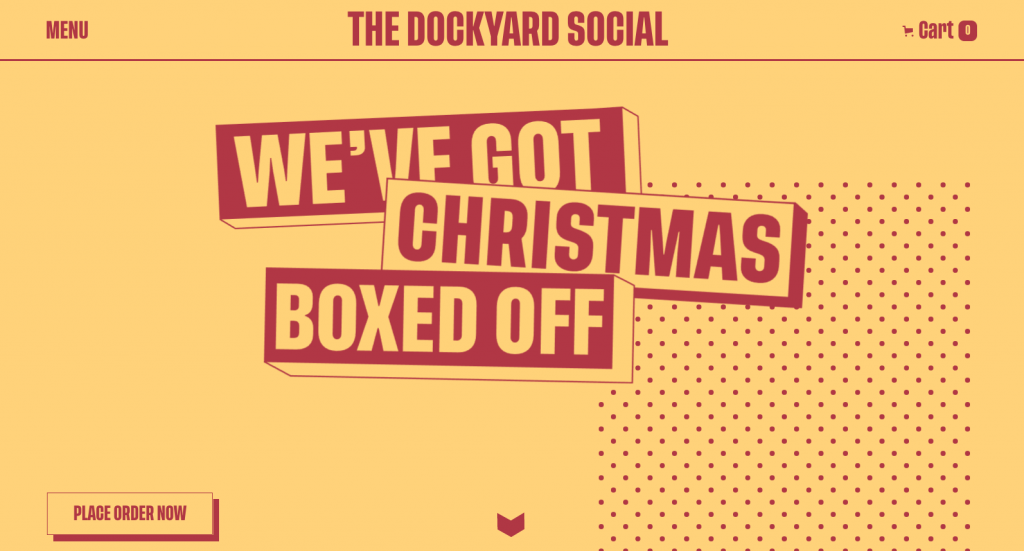
The soothing effect of light colors often encourages users to stay on the page for longer, enjoying the color palette’s tranquility and warmth. On Dockyard Social’s homepage, the pale mustard-like yellow and faded maroon-like red resemble a faded sunset, creating an ambiance of calming peace of mind.
5. Negative Colors
At the other end of the color spectrum — lies a color trend of an entirely different nature. More and more designers have been gravitating towards using very bold colors, with a concerted emphasis on primary colors: red, blue and yellow. This often involves multiple deeply contrasting primary color combinations, akin to comics-like themes and 90’s-style motifs. It goes without saying that these types of color palettes often target younger audiences, accentuating an upbeat, exciting vibe.
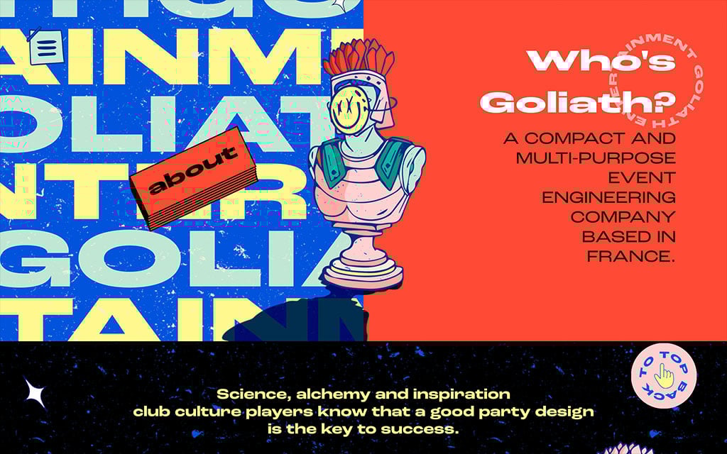
The color scheme we see on Goliath Entertainment’s site is a sharply represents their design content — old-school computers from the 90s, rotary telephones, boomboxes, and other iconic items that the 90s generation will identify with on the spot.
Images & Illustrations
6. Black & White Illustrations With Textures
Once upon a time in the journalism industry, printing in color was not an option. To add artistic effects to their content, newspapers would feature black and white, hand-drawn designs created by cartoonists. This unique, cartoon-inspired style compensated for the lack of colored visuals and imagery.
Cartoonists also began using black, texture-based illustrations to supplement the large amount of text that a newspaper or similar publication is bound to include. The virtuosity of these graphical elements is how they balance out textual articles by alleviating the reader’s cognitive load with simple, engaging imagery.
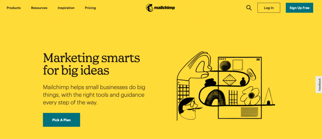
All that being said, texture-based illustrations are now created digitally, which inevitably causes them to look slightly different to their hand-drawn predecessors. This subtle change has minor design implications, such as a more uniform shade of black, and more precise symmetry and alignment. Mailchimp’s homepage illustrates this dichotomy, as their hero image style differs slightly to the three-column section with three black digital illustrations.
Whether identical to the original style of texture-based illustrations or not, it’s exciting to see this design trend reappear in 2021 and conquer the digital design world.
7. Black Outline
The motif of black illustrations that web designers have come to love (mentioned above), has also become popular in other formats: black outlines around different elements throughout their website. These black lines and borders can vary in thicknesses — often used as page dividers, specifically as grid boxes of numerous sizes.
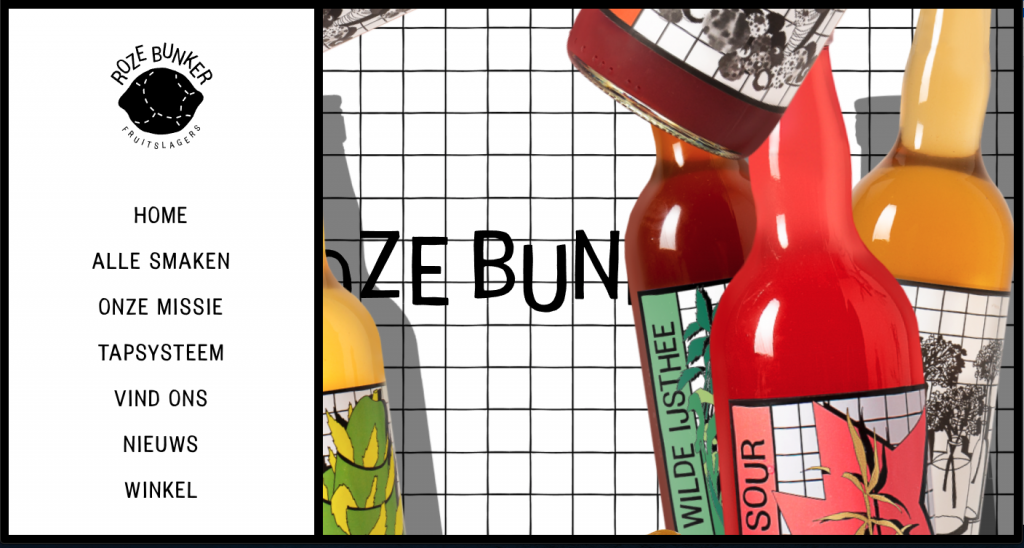
What we also love about this up-and-coming design trend is how its design elements often combine these black lines and illustrations with real photographed images, as seen in Roze Bunker’s design scheme. These images tend to be an entire photograph or a cutout. Either way, the black borders and accents have a powerful impact on user engagement. Thanks to this captivating type of visual, website visitors almost always notice these images immediately — devoting their full attention to the messaging and experiences that the designer seeks to relay.
8. Simple Shapes
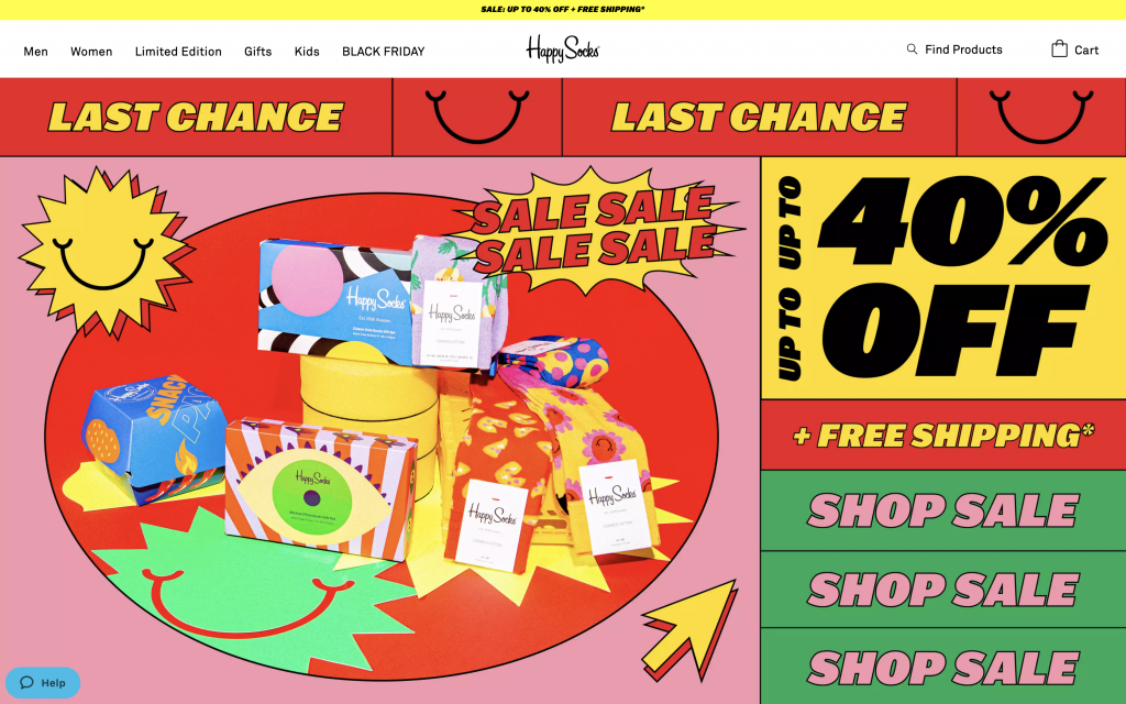
The artistic style of the 90s era has also made its comeback in web design trends — this time in the form of simple shape motifs integrated throughout design schemes. These simplistic, two-dimensional shape illustrations boast one shade of color and no depth or texture. You can see examples of these shape styles on the Happy Socks website, which uses two-dimensional design on their product packaging and throughout the actual site.
These basic shapes may also have text written on them and are often reminiscent of stickers-design from the 80s or 90s. These shapes may also be used as buttons (either static or animated), or as a sticker that informs us about a limited-time promotion. No matter what these stickers look like or entail, their common goal is to draw the attention of the website visitor.
9. Creative and Atypical Product Photos
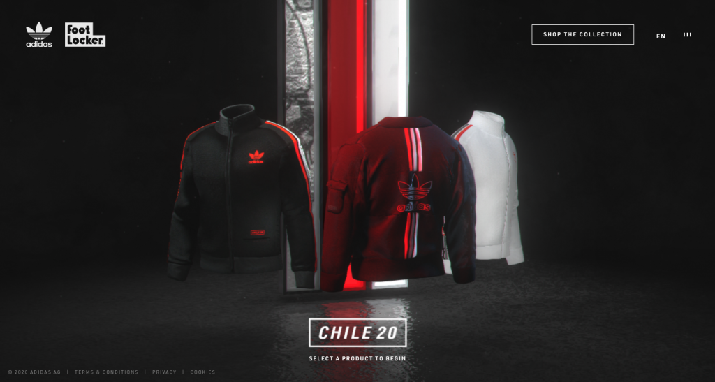
To those less comfortable with online shopping, this next trend is for you. The biggest challenge in buying products online is not knowing what they look like in real life. Many e-commerce stores have started using 3D simulations to provide a visual solution for this very caveat. What we expect to see in 2021 is even further-enhanced 3D visualization techniques, with detailed intricacies and extremely high resolutions.
These 3D simulated visuals created by Adidas depict two of the biggest limitations of only seeing an item of clothing online. Their imagery allows online shoppers to get a better understanding of the jacket’s fabric texture, and what it looks like from all angles. These are the exact types of details online shoppers are looking for.
10. Collage Art
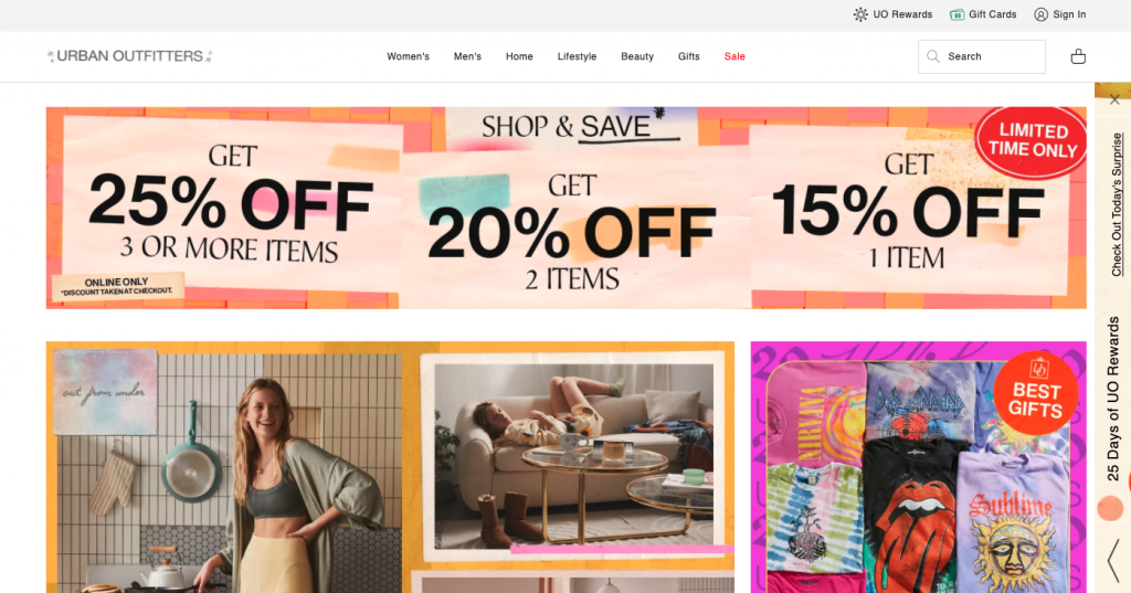
The concept of a collage in the arts industry originates back to 1914, primarily in France — during a time where cubism, an early-20th-century art movement, was widely popular. Collage art concept frequent numerous media-types, such as newspaper, magazine, posters, yet are rare to come by in digital media.
Collage art creations have recently made their comeback through social media. A go-to format for Stories and news feed content, collages have also made their way into the field of web design. A website’s collage will most often embody a full-width visual, a precise cut-out of an image (usually a photograph) — all integrated with a mix of solid color graphics and patterned illustrations.
In Urban Outfitters’s “BEST GIFTS” image card, the collage-like assortment of t-shirts assures online shoppers that this store sells a wide range of styles, increasing the likelihood that they’ll find products suited to their personal style.
11. Seamless Surrealism
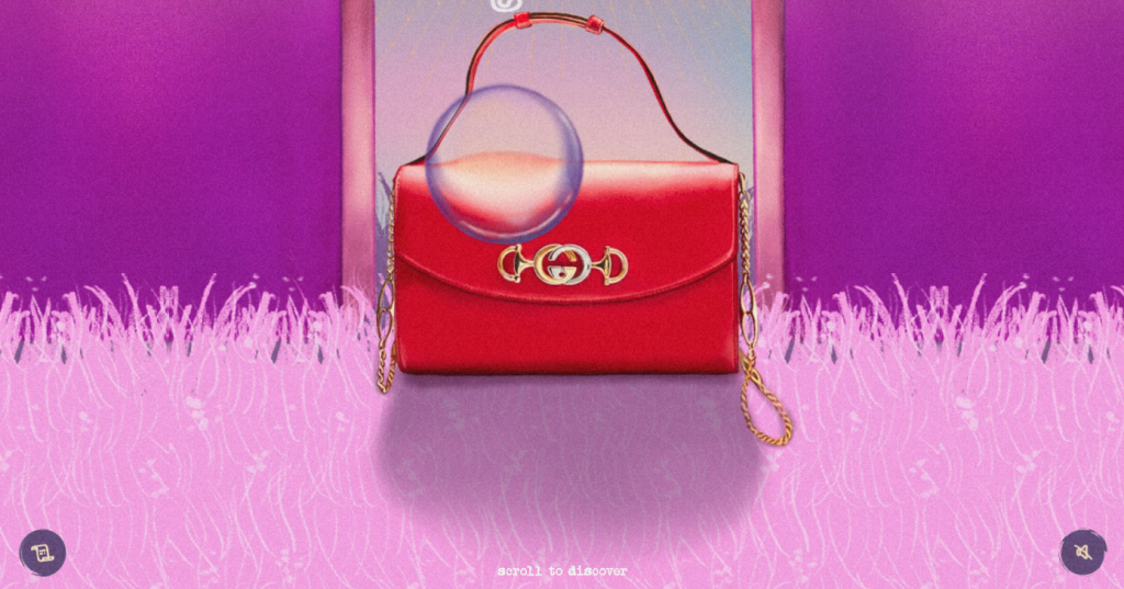
Many designers have taken the collage art trend even further, designing their websites in a surrealist style. This technique is characterized by how it positions elements upon counterintuitive, unusual backgrounds. Gucci’s example places each handbag on a unique, image-based background. Shoppers can then see each item in an entirely different light. Suddenly, there’s an added layer of each handbag’s look and feel and its fashionable vibe.
Surrealism in web design also involves flamboyant colors and textures that present the abstract, artistic mind of the creator. Over time, more and more e-commerce websites are using this trend to present their products in a novel, emotional way.
12. Hover Gallery Menu
Last but not least, website menus, one of the interface’s most fundamental elements — has been the epicenter of several design trends. Taking a spin on the traditional menu structure, this is what we call a “half hover gallery, half navigation menu”. It looks like a regular, standard menu at face value, but then once hovered upon, images appear, revealing a sneak peek of the content we’ll see in the next step.
This engaging experience can go even further (as you’ll see with CHIVICHIVI): each separate menu item you hover over (almost always) displays a different image, indicating the rich, varied experiences that await on each page we encounter.
Let’s Be Trendsetters
The new year brings new opportunities to embrace these design trends and attract visitors by standing out among our competitive landscape. We must carefully consider how to integrate these individual trends with their own relevant use-case — according to our brand’s design language and audience interests. Keep in mind that the 12 trends we’ve listed here are only a taste of what lies ahead. There is so much more to see and do.
If you notice great examples of the trends we’ve listed above, or if you have another trend you suggest we look out for, please share in the comments!


