Table of Contents
It’s high time that we pushed buttons beyond our basic understanding of what they are, what they can do, and what they should look like.
Buttons are one of those seemingly simple elements on a webpage that are so inherent of its structure and design, we might be taking them for granted.
I say ‘seemingly’ because a well placed, well designed button is one that draws us to interact with it, so subtly, that we never even stop to think how someone is deliberately luring us to do so.
What Are Buttons?
In the real world of the twenty-first century, buttons are veritably intrinsic to our daily day-to-day routine. Wherever we go, whatever we do, we’ll find buttons to turn appliances ON or OFF, or to activate and deactivate the functions of that appliance.
Naturally, this functionality was adopted by the engineers behind the very first computers. Some of you may remember, way back in the early days of personal computers, we would hit the RETURN or ENTER key to acknowledge that we indeed wanted our system to run our commands.
Later, in the initial days of the Internet, once web pages had begun appearing, we used hyperlinks.
Then when the infrastructure and hardware expanded enough to allow us to use images, we would include an illustration that we would click or tap on, to activate that command; practically imitating the functionality of physical buttons in the real world.
Types of Digital Buttons and When to Use them
The Text Button
The earliest, and some might say, the most primitive form of digital button is the Text button. Visually, a text button is nothing more than a length of text, from word to a short sentence. It resembles and functions in much the same way as hyperlink.
This style of button can appear anywhere on the page. We see it as the familiar “Read More…” button we’re used to seeing at the end of a paragraph or a block of content.
Although they’re probably more common in headers and footers as buttons of a site menu.
In fact there are several do’s and don’ts that we learnt in our Masterclass on designing menus that also apply to buttons.
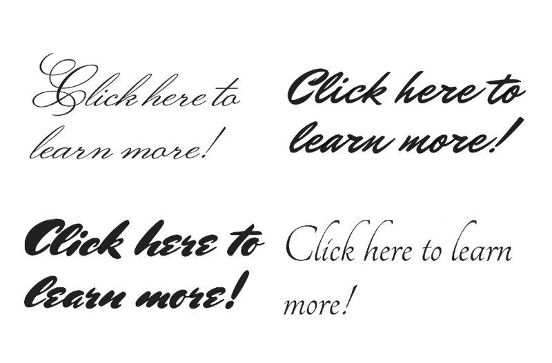
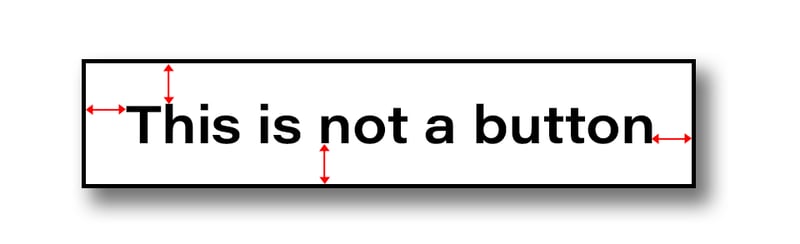
Regardless of what style of button you are designing, the text must be readable. As a rule of thumb, keep the text of the button the same size or larger than the body or paragraph text.
Also try to avoid convoluted fonts, such as cursive and hand-written fonts that are difficult for non-native English speakers to recognize.
Beyond recognizing the text of a button, it’s also important to make sure that our buttons signify, to the user, that they are something to be clicked or tapped on. I know that this might seem rhetorical to many of us, but making sure that an element is overtly perceived as clickable is not as obvious to all web-builders out there.
In the evolution of the digital button, the next stage opened up many ways to do this button.
Of course, I’m referring to Image or Icon buttons.
The Image or Icon Button
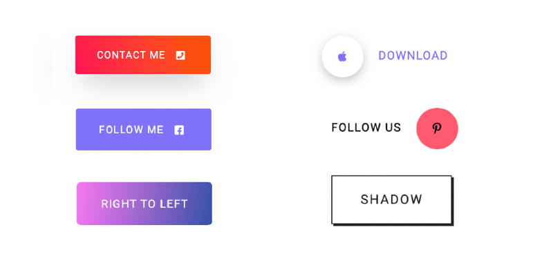
This is a button that includes a graphic attribute that sets it apart from the other elements on a page.
We can do this by using a block of contrasting color, that not only contrasts the environment surrounding the button, but also creates an internal contrast with the text, image or icon inside the button element.
You may recall that we used this style of button to trigger a popup with a menu in the Travel & Tour template kit.
Combining an icon and a modicum of text is usually enough to imply that this element was designed to be clicked. Nonetheless, adding digital graphic effects, such as drop shadows, bevels (inner shadows), box shadows, gradients, etc. are welcomed solutions too.
Beyond making the buttons stand out, these effects are used to make the button appear more realistic. A design trend that was popularised by Apple years ago. For most designers this trend is known as Skeuomorphism.
Skeuomorphism/Neomorphism
Skeuomorphism is when we deliberately design a virtual element to look very much like its counterpart in reality. Doing this triggers familiarity among the users making it easier for them to understand the user interface and hence more likely to react and click or tap on the buttons.
Over the past few weeks there’s been lots of buzz to suggest that skeuomorphism is making a comeback, some are calling this new brand of realism, Neomorphism. Personally, I think that it’s still too early to say. But I am very excited to see where adventurous designers take this idea.
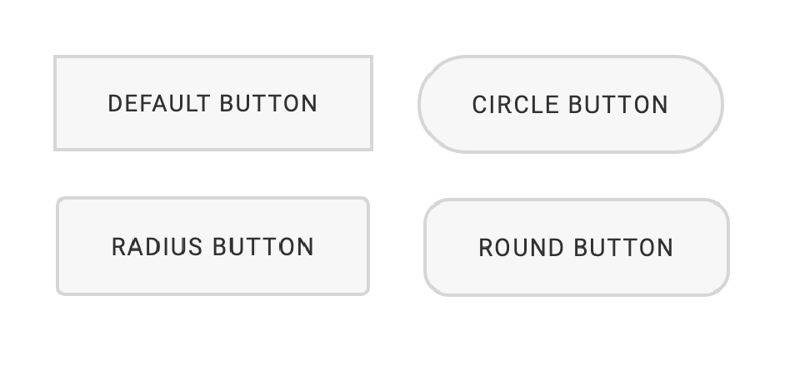
Keeping Your Buttons in a Good Shape
You may have noticed that, so far, all of the buttons we’re looking at are either circular, squared, or rounded squares and oblongs. We’d be hard pressed to find buttons in complex, non-symmetrical shapes. An octagon or pentagram might look great, but chances are that few people besides yourself will recognise it as a button.
You may recall the trouble Microsoft had in 2007 when they used the Office logo as a button and most people assumed that it was there to look pretty and had no function at all. The button, affectionately known as the pizza button, was in fact supposed to give us access to the software’s fundamental functions such as new document, save, settings etc.
Button Size and Spacing
If in our simple-shaped button, we’re combining icons and text we want to make sure that the icon is placed logically with regards to the action that we want the user to perform.
For example, on a button that takes us to the next page, we want an arrow icon to appear after the text. As if to say “click here and then THIS will occur”.
If we’re designing a button to assist users in returning to the top of the page, the upward-pointing arrow should appear above the text.
Whether you’re using text, icons, or both, the last thing we want to do is cram our content into the buttons surface.
Some suggest leaving a border of 25 pixels surrounding the button’s label.
But I find that a great rule of thumb, is to leave clear space around the content of the button at the height and width of a character or icon that we’re using. As for the size of an icon placed alongside text, again, keeping the icon the same size as the text or a little larger, is the way to go.
As for the size of the button itself, I suppose the toughest decisions are for mobile screens. This is especially true if our design process or workflow is Mobile First. Once we’ve figured out the size of our button for responsive view, we can scale it of for desktop
There are recommendations from the industry giants: Apple suggests that for mobile designs, main buttons, or call-to-action buttons, should be at least 44 x 44 pixels. Microsoft recommends using slightly smaller buttons, of 34 x 26 pixels.
What Is the Perfect Position for a Button?
The position of a button is also very important.
Tradition and standard design place buttons within the areas that are easy to scan with our eyes: main blocks of content, along the margins or the corners.
Remember that we need to make the user interaction enjoyable, and a lot of that boils down to ease of navigation, that needs to be simple and intuitive. The user’s eyes should follow the path we’ve laid out in our design without getting distracted.
We should also establish a visual hierarchy for the user to understand what parts are more important, and skip over the rest.
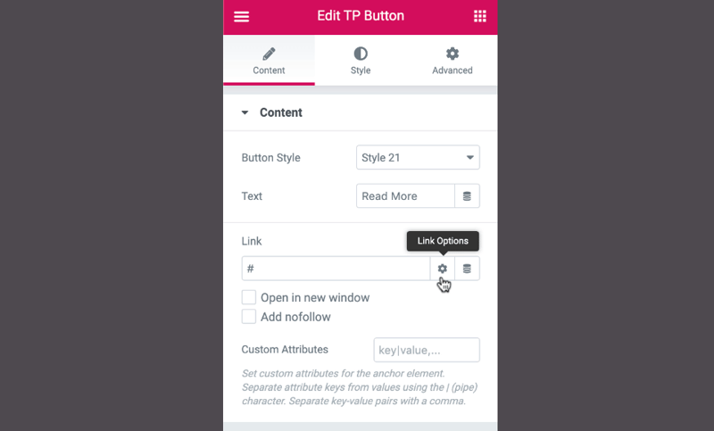
If our button’s action takes the user to another page, if we have a Paypal button that sends the user to a Paypal login page,for example, we might want to consider whether or not we want this to open this in a new and separate tab. Of course, this depends on the predicted behavior of our target audience and how long this process will take before they return to our page. We don’t want them away for too long.
We can determine this with all our buttons in Elementor, by going to the button’s content settings and next to the link box, we’ll click on the settings or cog icon, that will bring up options to open the link in a new window and or add no-follow to this action.
When Should a Button Steal Focus? When Should a Button Be Subtle?
We can all agree that not all buttons should be so obvious that they dominate the focus of a page.
And this brings us to another aspect we should consider whenever we design buttons: its purpose and importance.
If we’re designing a landing page, for example, our page will be constructed so to draw users to a focal point, where we’ll place a Call-To-Action. Today we tend to represent our Call-To-Action, or CTA as a button, so that we get that confirmation from the user that we spoke of earlier. In this case the button is of high importance, so it should stand out as something special, as the main attraction, to entice the curious or interested user to interact with it.
The Floating Action Button (FAB)
A great style of button that designers often employ for this purpose is the Floating Action Button.
These are buttons that, as defined by Google, as buttons that are intended to perform the primary, or most common, action on a screen. This could be an action on the current screen, or an action taking us to a new screen. Typically they appear as a circular shape floating, with an icon at its center, above all the content of a page, over one of the sides or in one of the corners of the page. There are three types of FAB: regular, mini, and extended, which provides an additional selection of popular options on the app.
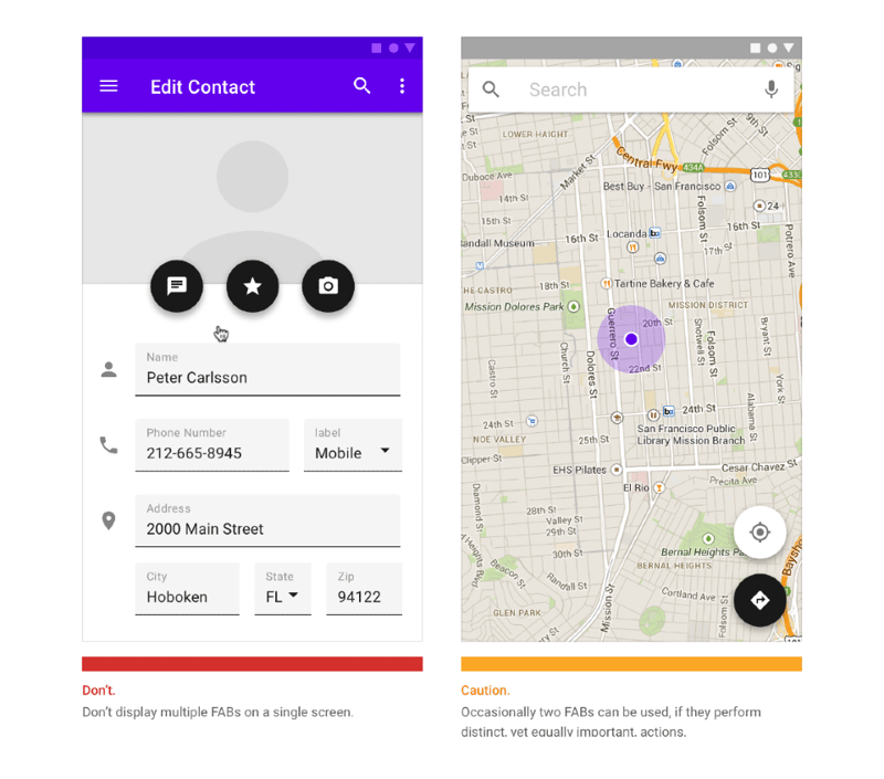
These are very common in responsive design, as they convey their purpose instantly and are very easy to see and tap, on a mobile screen.
The sooner a user recognizes an element as a button, the sooner they understand how to navigate the page and and interact with it. The lack of clarity, in this sense, will leave an impatient user frustrated enough to leave the page altogether.
A popular and simple graphic trick we can employ to avoid this is by adding animation or hover effects, changing color, font or text. Perhaps hovering triggers the button to shake or jiggle. These help to highlight the fact that there is something different about the element. Inviting curious users to click on it and find out what happens when we click on it. Further animation effects help to assure the user that the button has indeed been pushed and that the resulting action, if not immediate is at least in progress.
If, for example, we’re designing an About page, or a Blog Post page, our goal will be exactly the opposite. We’ll want to keep users on the page to take in the content.
So in cases such as these, a big flashy button drawing all the attention and focus is the last thing that we need. Instead we’ll use buttons with a subtle design, so that they don’t stand out against the background too much, because it is of secondary importance.
A style of button that we could use to achieve this would be the Ghost button.
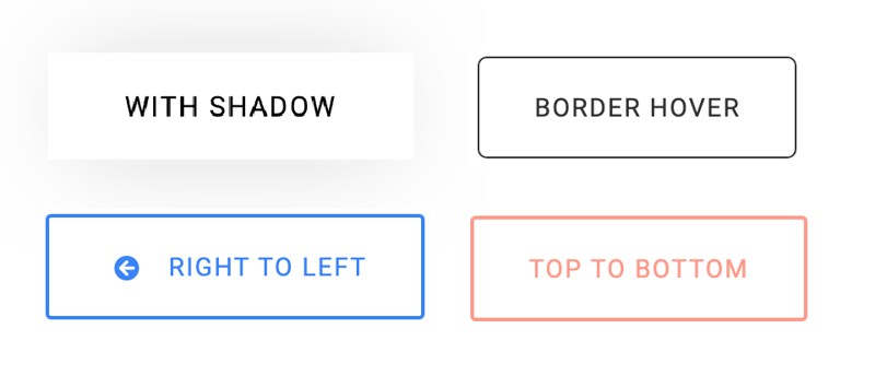
The Outline or Ghost Button
This is basically a text button with little or no background and an outline around it. They are elegantly subtle, and as such, they tell the user that they’re not the primary activity of the page. These are buttons that we use when we want users to be aware of, in the back of their mind, throughout their experience. They could be buttons to take the user back to the top of the page, for instance.
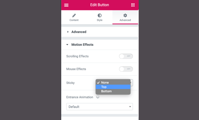
In Elementor we can very easily make them sticky elements, sticky buttons that follow the user down the page as they browse through the content. This way they’ll always be right there on the screen, ready to be used, like a chatbot button.
Service vs. Sales: How to Prioritize Buttons in Our Designs
Buttons can cater to many types of purpose, all of which we could classify into two groups: Service that includes help buttons, login buttons, chatbot buttons, even cookie notifications and in some cases download buttons.
Then we have the sales category where we’ll find social share buttons, subscription buttons, buy, add to cart etc.
Just hearing those titles, we can already get an idea of the level of importance associated with each one.
And it’s this way of thinking that we need to utilize when we sit down to design pages and the buttons that we’ll be including.
If we’re already speaking of buttons in plural…
How Many Buttons Should We Use Per Page?
Most professionals try to limit the number of attention hogging buttons to one but no more than two per page.
Of course you can add several more buttons of a subtle design, as needed, but you don’t want to have too many. This tends to confuse and overwhelm some users.
Remember that we’re designing web pages and don’t want them to look like the control panel of a passenger jet or the sound console of a big name recording studio.
If you absolutely need to use a large amount of buttons, if let’s say we need to make a registration or order form with many binary queries or yes/no questions; we can use toggle or switch buttons.
These are very straightforward and easy to use, and equally easy to add in Elementor.
So yes, both the design of the button is as important as its functionality. Equally important, if not more so, is how the design of our button complements and corresponds with the overall design of the page.
Where to Find a Great Resource for Buttons
Yes, every element we place on our pages should remain consistent and loyal to our design theme or idea.
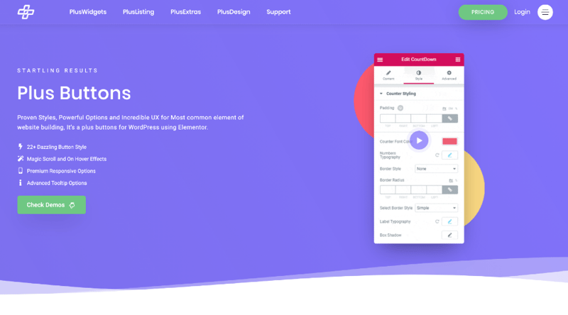
To ensure that we can always create the perfect buttons for our page, we’d like to share a site that is an Aladdin’s cave of designs for buttons, all of which work perfectly with Elementor.
“The Plus” is a treasure trove where we can find all the types of buttons that we just discussed.
Some with shading, some with gradients, many also include animation and hover effects and here we can also see a lovely example of a skeuomorphic button, mimicking a realistic button.
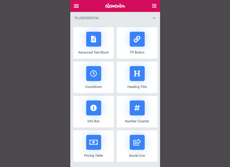
The Plus plugin is installed through the WordPress dashboard, the same as we would any other plugin, then activated.
Then, when we open a page to edit with Elementor, and we go to the widget library in the left hand panel, we’ll find a series of dropdown lists of all of the Plus widgets that are available. Obviously, some are only available to Plus Premium users. But whether or not you want to get the pro version depends on what you need for each individual site.
Bringing It All Home
This week, we reviewed buttons, beginning with the basics, understanding what they are, what they do, why we need them. Then we went beyond and looked at various designs, and styles and how they affect the users that we are trying to bring to our sites.
More importantly, we went through a lot of great rules of thumb, do’s and don’ts and told you about The Pluss, a fantastic resource for button designs that work perfectly will anything that we create with Elementor.
In fact, this masterclass, we’ve gone over everything we could possibly need to create the kind of buttons that the late Steve Jobs would refer to as buttons that look so good you’ll want to lick them”.
As always, if you have any further advice, tips or insight that could help other users with their designs, please share it in the comments below. If you’d like to share examples of buttons that you’ve designed or that have inspired you, this is the place.
If you have any criticisms, we are equally interested in your thoughts. After all, our goal is to be the best at helping others excel at their craft.
Looking for fresh content?
By entering your email, you agree to receive Elementor emails, including marketing emails,
and agree to our Terms & Conditions and Privacy Policy.


