Table of Contents
Color gradients aren’t new to web design. Remember skeuomorphism? We used gradients back then to give digital objects a 3D look.
But as minimal and flat design took over the web in the 2010s, we saw gradients fall more and more by the wayside. It wasn’t because they were outdated, it’s just that designers didn’t have much use for them with the current web design trends.
It could be argued that Instagram’s logo redesign in 2016 gave web design gradients a new lease on life. Once everyone saw what Instagram could do with color, it wasn’t long before we started to see gradients popping up everywhere.
Now here we are in 2021 and gradients are still alive and well. If you’re curious about how to use them or just want a major dose of inspiration, keep reading.
Table Of Contents
What Is A Gradient?
A gradient is a gradual transition from one color to another. It allows designers to create almost a new color.
Gradients make objects stand out by adding a new dimension and realism to a design. Simply put, gradients add depth to an image.
We can also refer to gradients as color maps since the color scheme varies along the gradient as opposed to solid colors which only have one HEX code.
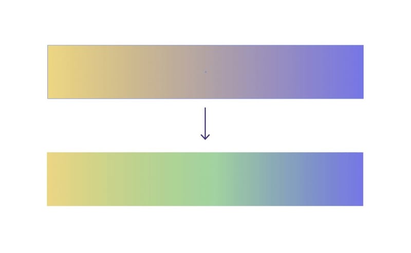
This is an example of a linear or axial gradient:

This kind of gradient starts with two colors on opposite ends of the element. In this case, it’s a lighter blue in the top-left corner and a darker blue in the bottom-right. The color smoothly transitions between the two.
This is an example of a radial gradient:

This kind of gradient also begins with two colors. However, the lighter green starts in the center of the graphic and radiates outwards until it becomes the darker green.
We’ve seen color gradients get used in everything. From products and packaging like Zara’s line of perfumes:
To hair color trends like the ones we’ve seen on celebrities the last few years. Celebs like Cardi B, Sarah Michelle Gellar, and Kylie Jenner have all experimented with gradients:

The digital space is no stranger to the takeover of gradients either. App designers have been playing around with gradients for a while now. Back in 2016, Instagram surprised everyone with its gradient redesign and now look at the state of our most popular products:
Color gradients are a popular web design trend today and can be applied to a variety of elements on a website. For example:
- Logos
- Header elements
- Backgrounds
- Typography
- Icons
- Photos
- Buttons
As we go through the rest of this post, we’ll look at numerous examples from brands that demonstrate some of the awesome things you can do with web design gradients.
Why Use Gradients In Web Design
In recent years, there’s been a resurgence in color gradients in web design. Similar to why Material Design and Flat Design 2.0 became popular, color gradients offer us a way to add more texture, depth, and excitement to a web page that’s otherwise flat and lifeless.
There are other reasons why we use gradients on websites:
To Create New Color Schemes
The general rule when choosing a color palette for a website is to select no more than two or three colors for it. But rather than use one color at a time, color gradients allow you to design with numerous colors at once.
Take this example from Spotify:
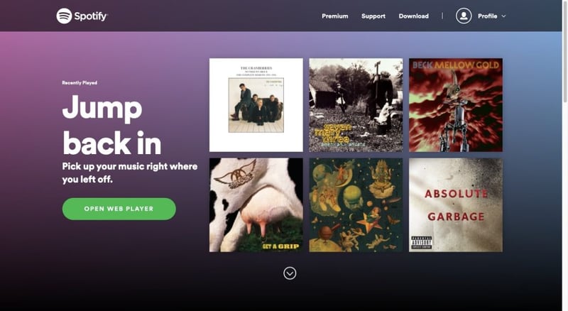
Rather than use a solid purple, blue or black background for the hero section, the designer uses a gradient effect to blend them all.
This isn’t the only place Spotify uses gradients. Spotify’s Loud & Clear report is chock full of gradient backgrounds and animations:
This color palette choice brings a lot of life and fun to the Spotify brand wherever users and artists encounter it online.
To Captivate Visitors
The look of a color gradient in and of itself can be quite captivating, even if the colors are subdued and the transition subtle. That said, gradients don’t have to be static.
Just look to the Stripe website for an example of color gradients in motion:
There are a lot of colors in play here and, yet, it doesn’t feel overdone. Instead, the almost lava-like way in which they blend into one another creates an effect that’s impossible to miss.
To Help Visitors Focus Their Attention
There are many ways in which you can grab a visitor’s attention with web design. Color gradients happen to be very useful in this regard.
Take this example from Pepsi:
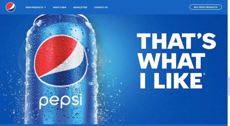
Many areas of this home page contain solid shades of blue. But when visitors reach this point on the page, the radial gradient should force them to stop. It’s not because of the gradient itself, but more because of the spotlight effect it creates around the Pepsi can.
Linear gradients can also be used to direct attention. Typically, they’re laid out directionally to help the visitors’ eyes move the right way on the page.
Sketch does this throughout its home page. Take this gradient-filled shape in the hero section:
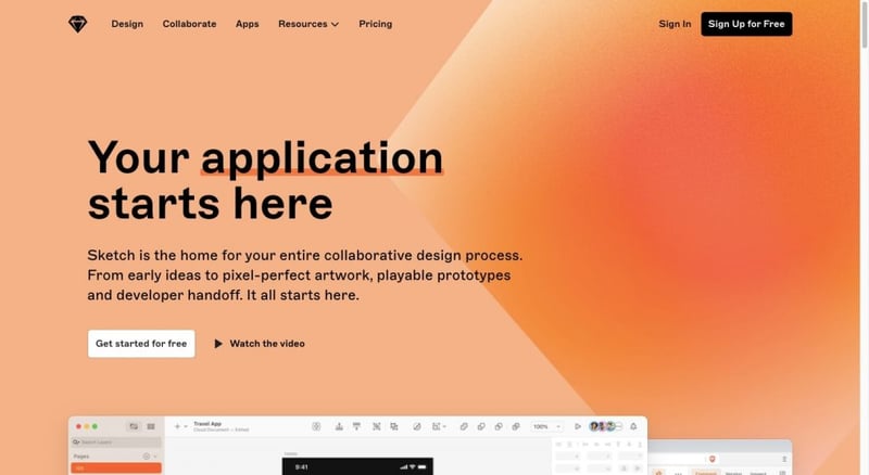
The lighter edges of the gradient are bound to get more attention than the darker interior. As visitors’ eyes move towards the lighter edges, the right-facing arrowhead will further point them towards the site’s introduction.
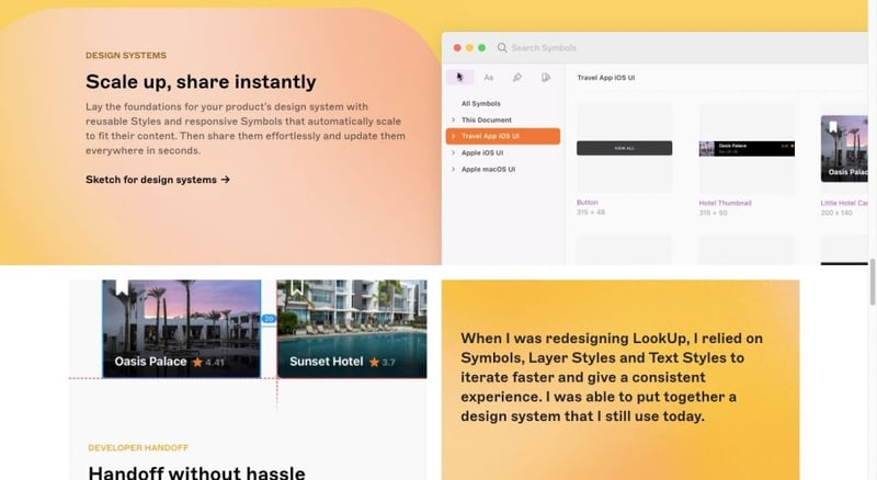
You also see the gradients lower down on the page. Again, the lighter areas of the blocks help users’ eyes focus on the messages within them.
To Make the Design More Memorable
Do you remember when Instagram redesigned its logo? It was a huge deal and had everyone talking about it (for both good and bad reasons), like Matt Knorr on Medium.
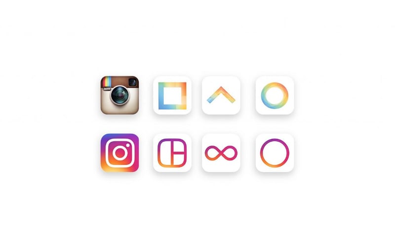
It might not have been the best choice usability-wise, but it left a memorable impression on its users and this gradient design is one it’s retained to this day.
Amdocs is another brand that’s gone the way of gradient branding:
Amdocs’s gradient menu indicators, buttons and hover effects stand out in stark contrast against the dark background of the website. They also appear over larger swaths, as opposed to Instagram whose branding mostly appears as teeny-tiny details within the app and usually against a white or grey backdrop.
What’s more, key parts of the text use a gradient color palette. This helps Amdocs accomplish two goals. The first is to make its typography more memorable. The second is to emphasize their brand messaging.
How To Create Gradients in Web Design
There are three common ways to create gradients for a website:
Option 1: Use CSS3
If you’re comfortable coding styles into your WordPress website, you can add gradients that way. The code snippet will look something like this:
					background: rgb(238,174,202);
background: radial-gradient(circle, rgba(238,174,202,1) 0%, rgba(148,187,233,1) 100%);
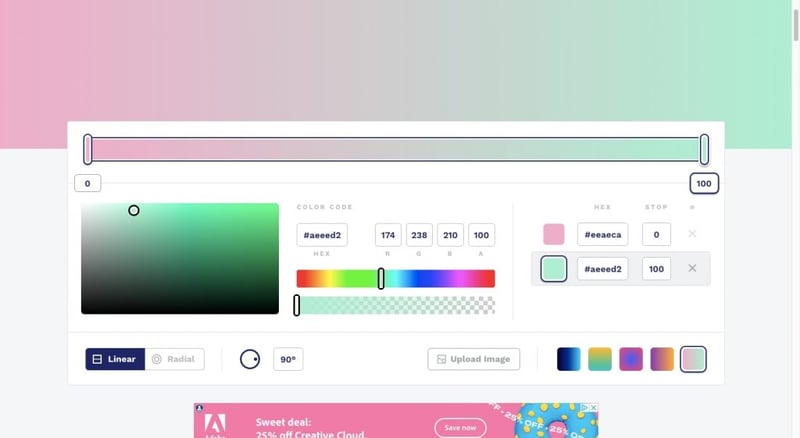
Don’t worry if you’re not used to writing CSS from scratch. You can use CSS Gradient to create your gradients:
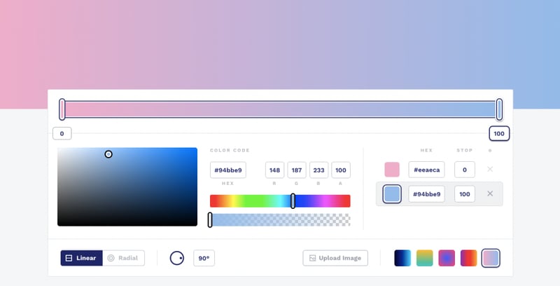
With this tool, you can:
- Add or remove colors
- Set where they start and stop
- Increase or subdue the intensity
- Set the gradient to linear or radial
- Change the degree of the rotation
When you’re done configuring the settings, scroll to the bottom and grab the CSS.
If you want to simplify this even further, you can use ColorSpace’s 3-color gradient generator instead:
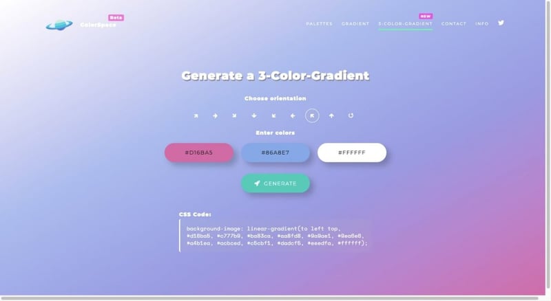
Simply choose the three colors you want to use, set the orientation and then click “Generate”. Your CSS codes will appear below.
Option 2: Use Pre-made Gradients
If you’d rather not come up with your own gradients, you can always get pre-made gradients online.
uiGradients is a good choice if you want help coming up with gradient color schemes based on the primary color you’re working with:
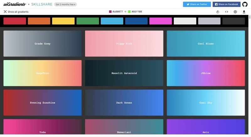
You can then grab the CSS of the gradient you like or save it as a JPG if you want to use it as a background on your site.
Another option is WebGradients.com:
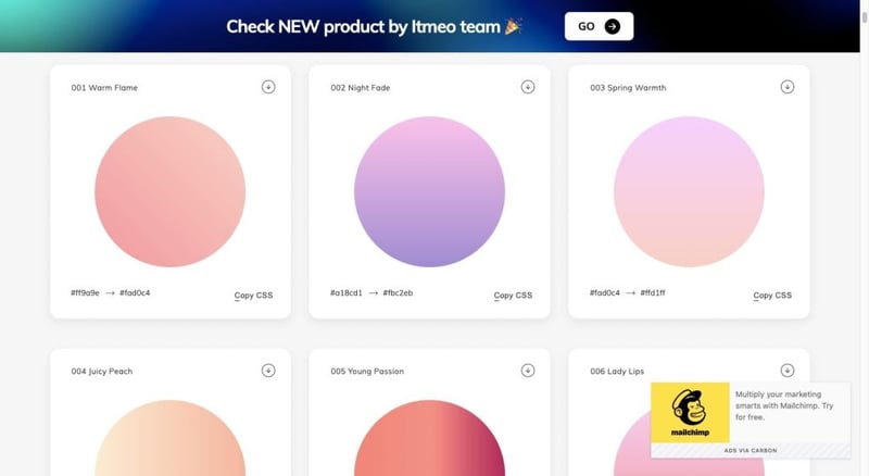
You can save these gradients as a CSS snippet, a PNG or you can download the entire pack of 180 gradients for Sketch or Photoshop (if that’s where you’re doing your designing).
Grabient is another free tool that comes with loads of pre-made color gradients. However, you have a bit more control over how your gradient turns out:
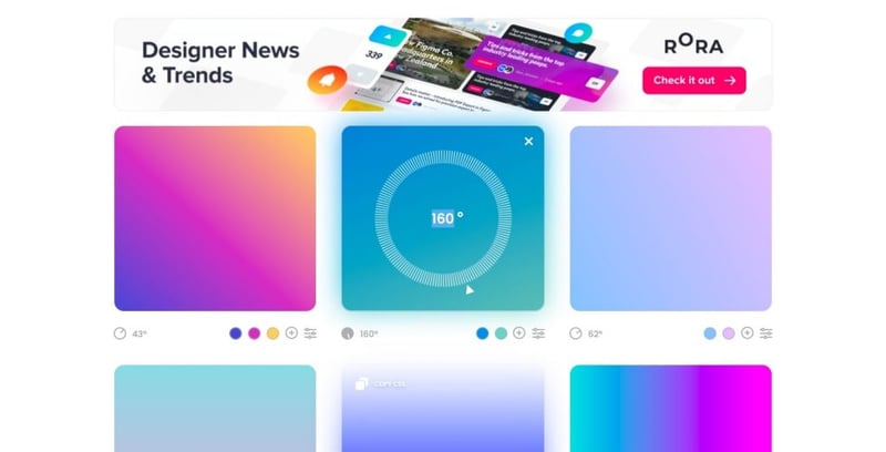
You can change the rotation of the gradient, add or remove colors and customize the color percentages.
Option 3: Create Gradients in Elementor
If you’d prefer to do the work inside of WordPress, you can easily do this with Elementor.
For starters, you can easily set color gradients as the background:
You can also add filter effects to your images and videos with Elementor. You have complete control over how your gradients look from the Style panel:
It’s not just the bigger components of your website that you can add gradients to. You can also add gradients to smaller elements like buttons:
Color gradients are guaranteed to attract attention wherever they’re used, so it makes a ton of sense to use them when designing your call-to-action.
Gradient Design Tips
Just like a website’s color palette, you should put a lot of thought into your color gradients. Here are some tips to keep in mind:
1. Add a Third Color to Your Gradients To Avoid a Greyish Middle
If you want to design an attractive gradient, you’ll need more than two colors for it:
- One for one <side-or-corner>
- One for the <linear-color-stop>
- One for the other <side-or-corner>
If you don’t set a midway <linear-color-stop>, there’s a chance the gradient won’t transition as smoothly and you’ll end up with a greyish color in between them. Like this:
By setting a color value between the two <side-or-corner> values, you can prevent that from happening. Here’s one way to fix it:
If you do want to create a vibrant swatch of color, the third color value is an easy fix to that problem. If you’d prefer to keep the gradient more subtle, try to find color values that are similar to one another.
2. Pick a Primary Color That Sends the Right Signals
Just because you’re creating a unique color effect with a gradient doesn’t mean that color theory can get thrown out the window. Make sure you choose a primary color that sets the right mood and conveys the right emotions.
3. Allow for Color Contrast, but Not Conflict
There’s a big difference between colors that contrast with one another and those that just don’t work well together.
Use Canva’s color wheel tool to explore viable options:
Set your primary color in the first field. Then use the color combination generator to explore color pairings for your gradient.
4. Always Know Where Your Light Source Is
Even if your gradient comes out looking more surreal than natural, you need to design it with a light source in mind. The direction the light source comes from will dictate what kind of gradient you use (linear vs. radial) and how bright the lighter end of the gradient should be.
For example, the EMBA for Eurasia page has a distinct light source coming from the right side:
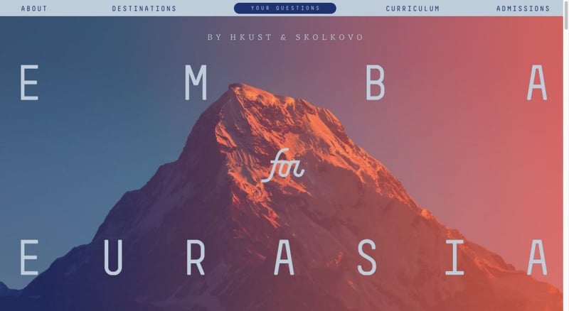
This gradient design looks like the sort of gradients we’d see as the sun rises or sets against a beautiful landscape.
You can also use the directionality of the gradient to move visitors more efficiently through the page and to the most important parts of it — which should be where the lighter end is.
The Orson website has an interesting example of this:
The animated gradient orb does a couple of things here. The first is that it really highlights the main message of “Building Trust”. The second is that the lighter areas paired with the animation make this site feel energized, and should compel visitors to move onwards to see what else is in store for them.
You can also use the design principle of visual hierarchy to alter the amount of light versus dark along the gradient to indirectly show visitors where to focus their attention.
5. Be Careful About Banding
Bandings are lines that appear within color gradients. So, rather than see a smooth transition from one color to the next, visitors will see a subtle delineation between the color values.
Here’s an example:
This happens when there aren’t enough color values to fill in the gradient completely. There are a number of reasons why this happens.
For starters, the bit depth of the image may be too low. It’s also something that’s more common with large images. That’s because big images create too much distance between the two colors to smoothly cover the space between them. And if there’s a huge contrast between your colors, you’re more likely to see it as well.
If you’re struggling with banding, use your image editing software to try and smooth out those bands with noise and dither settings. Or you may just need to experiment with other colors.
Here’s what happens when the above gradient uses more analogous colors throughout:
Most of the banding is gone from this color swatch now. It might not be the most vibrant of palettes, but it doesn’t make the gradient look as artificial anymore.
Let’s look at a real-world example of how to do this. This one is from the UR Bureau and it demonstrates how you can make a gradient look vibrant without going to extremes with color pairings:
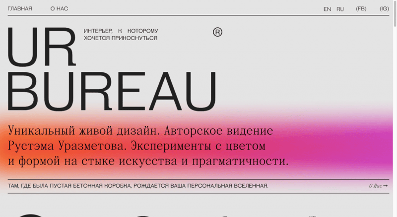
Keep in mind that this isn’t a hard-and-fast rule to follow. There are plenty of web designers who use extreme gradients without running into the issue of banding. Oftentimes blurring is used and the gradients take on a more bokeh-style look.
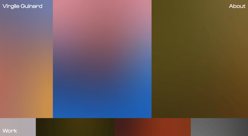
Here’s one such example from Virgile Guinard:
And another from graphic designer Jemima:
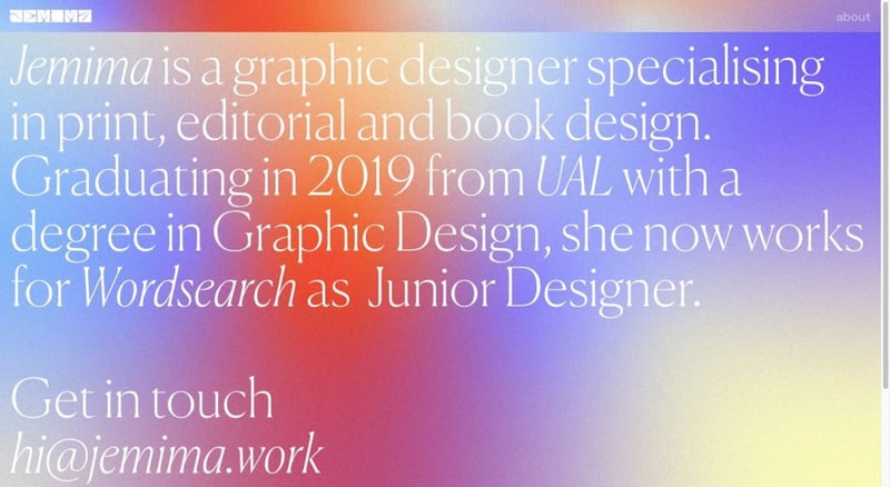
It’s a design choice that we’re starting to see more of on creatives’ websites. So long as they don’t compromise the look of the artists’ portfolios, these rule-breaking choices can work really well.
Zeus Jones is a creative agency that has opted for boundary-pushing gradients. This animated background only appears at the top of the homepage:
The rest of the site uses stark, solid background colors to ensure that the work and messaging remain distraction-free.
6. Examples of Stunning Web Design Gradients
There are so many ways in which designers are putting gradients to work on the web today. Let’s take a look at some of the most popular trends:
1. Soft, Subtle Gradients
The Recess home page has a number of gradients, but the one to focus on comes about halfway down the page. The blue sky background slowly transitions to pink. When visitors scroll down the page to read the content and look at the graphics, they might not even notice the transition until the background has transitioned to a much darker pink.
Gucci Beauty is another beautiful example of soft gradients in action:
This one, however, doesn’t require visitors to scroll to experience the eye candy. The rotating background of soft gradients lives above the fold.
2. Multicolor Gradient Backgrounds
The KIKK Festival always has an outlandish website to promote its annual conference. This one is a good example of how to play with numerous colors in a singular gradient without making it feel overwhelming. Spread out over the entire length of the home page, the colors transition slowly from one to the other.
Mood-Enhancing Gradient Effects
Air Ocean Cargo is a really interesting example. Its messaging is similar to Recess’s in that it wants visitors to “Relax”. However, its use of gradients is vastly different.
In this case, we see a radial gradient move along to the uplifting and catchy beat of the music playing on the site. It will change color if the visitor changes the song from the top-right controller. Then when the visitor puts the music on hold, the gradient becomes a soft halo shape.
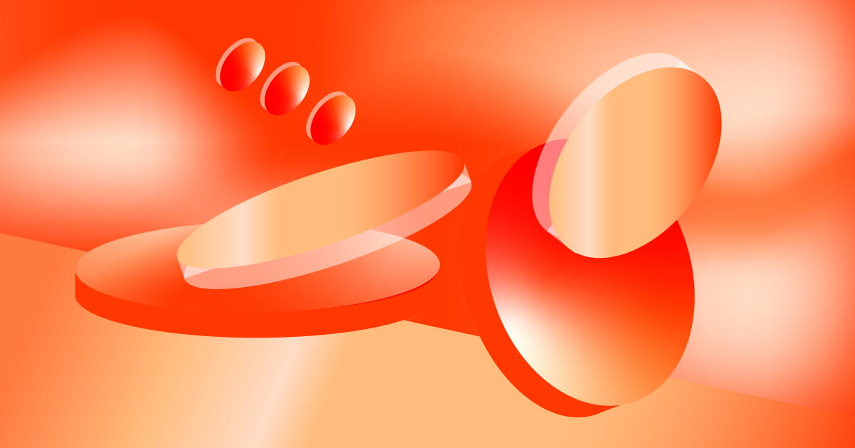
3. 3D Gradients
Julie Bonnemoy’s freelance design portfolio has a lava lamp-like effect as its hero graphic. The 3D blobs float around the section, occasionally revealing Julie’s welcome message to visitors. The iridescent gradient design is certainly captivating and it makes you wonder what other kinds of spectacles her portfolio has in store for you.
The Adova Group is on a mission to help people relax (in this case it’s to help them sleep better). It’s a trend worth noting if you’re designing a site for a brand with a similar mission. There’s clearly a correlation between the idea of relaxation and the look and feel of gradients:
Even if you’re designing a website for someone not in the health and wellness space, you can still draw inspiration from this surreal 3D landscape. Check out what happens to the orb at the end of this GIF. The gradient design gives the now-data visualization element a 3D appearance. That alone is a cool concept that can be applied to a variety of websites.
4. Gradients on Website Images
It’s not always easy finding the perfect raw photo for a website. Luckily, we have plenty of tools that make it easy to adjust the color of our images or add filters to them so they convey the exact look and vibe we need them to.
When choosing color filters, consider applying a gradient filter as Adobe does here:
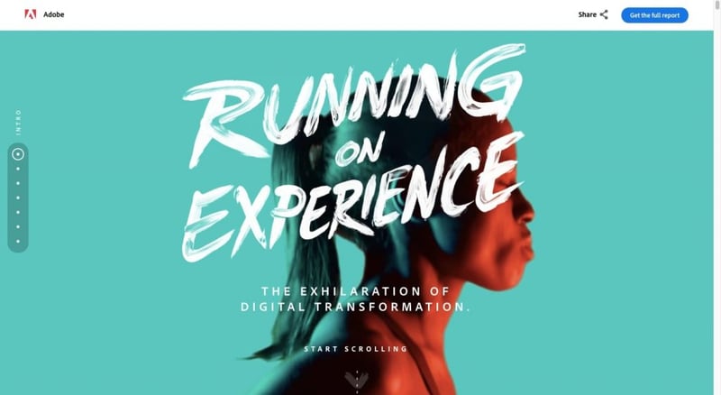
The Running on Experience landing page has a number of image gradient filters like this one. Here’s another example:
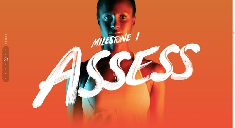
These image gradients are interesting because they’re not the typical blending of one color to another. It’s only the subject of the photo that’s bathed in a gradient filter.
Because this report is all about transformation, the gradient filter works almost as a symbolic representation of the transformation the subject is going under. It’s not until the last image where we see her completely free of any filter or gradients.
Another way to experiment with gradients on images is to use a single color filter and fade it out. It essentially turns the filter’s transparent and opaque sides into two different colors.
5. CTA Button Gradients
The JLo Beauty website is full of iridescent shine, from its background graphics to its product photos. The buttons are no different in terms of style, but they are in terms of how they react to the visitors’ touch:
When someone hovers over any of the “Add to Bag” buttons, the gradient color comes to life for just a second.
You don’t need to make the entire button design a gradient if you don’t want to. Croma, for instance, uses gradients strategically through its site. One use for them is as a hover-triggered button animation:
As the user hovers over each of the clickable boxes or buttons, a gradient border appears. This same kind of hover confirmation effect would be useful in the navigation.
6. Images with Natural Gradients
Gradients are naturally occurring in our world. Just look to the sky or the ocean for them. When selecting images for your site, consider integrating their own gradients into your design as Honest Tea has done here. It creates a really unique effect that’s sure to catch many visitors off guard (in a good way).
Use Gradients To Create an Exciting Experience
If you’re looking for a fun and unique way to bring your clients’ websites to life, color gradients may be the web design trend to try this year. Not only do they make otherwise flat and solid colors more vibrant and exciting to look at, but they’re useful for focusing attention and improving engagement.
Looking for fresh content?
By entering your email, you agree to receive Elementor emails, including marketing emails,
and agree to our Terms & Conditions and Privacy Policy.


