Table of Contents
Creating striking visuals to captivate your visitors is something every web designer strives to accomplish. Various techniques can help designers achieve this goal. However, some approaches work better than others. When it comes to engaging visitors, nothing beats imagery — photos, images, illustrations, and videos can draw visitors faster than any other type of content. It’s a known fact that the human brain processes visuals 60,000 times faster than it processes text. And the brain is also more accustomed to processing images — ninety percent of the information sent to the brain is visual.
To make a strong visual impression on visitors, designers need to select not only the right images, but also to spice them up with the right visual effects. You can create a unique vibe by applying a filter or a blend mode effect to the imagery. And what’s particularly great about effects is that you can use them with existing images. In this article, I’ll show you all the glory of blend modes and filters.
The Concept of Filters and Blend Modes
Filters
CSS Filter Effects let you apply graphic effects like blur or color shifting to images. Elementor provides a list of settings that allow designers to create unique CSS filters.
Below you can see what happens if we play with various settings.
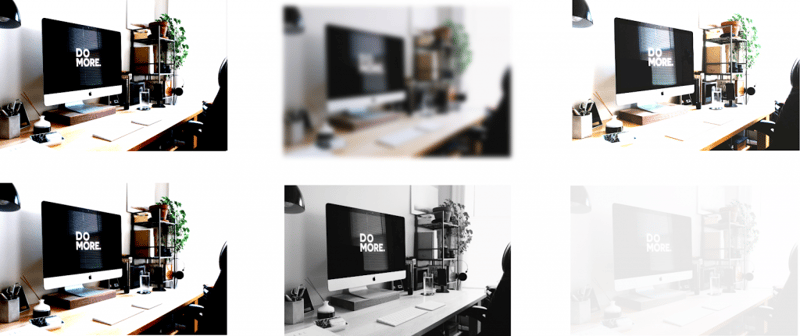
First row: Normal, Blur (blur=10), brightness (brightness=200). Second row: contrast (contrast=200), saturation (saturation=0), opacity (opacity=0,1). Original image: Carl Heyerdahl
Blending Modes
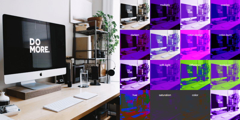
Blend modes are one of the most frequently used effects in print and graphic design. Anyone who has ever worked with Photoshop or Illustrator is well familiar with this cool trick. By blending modes, you can define how two elements are combined.
There are 16 blending modes recommended by the W3C. Each mode uses a specific formula to mix the colors of the source and the destination. For example, Darken Blend Mode layers two pixels on top of each other and renders the darker of the two pixels. You can try this interactive demo to explore different blending modes.
But even with a definition for each mode, it can be hard (if not impossible) to predict the results of applying these modes to an image. Choosing a suitable blend mode is a process of trial and error. If you’re an Instagram user, you probably know how hard it is to find the right effect from the list of available options. Sometimes you need to explore every single option, applying them one after the other until you get the desired effect.
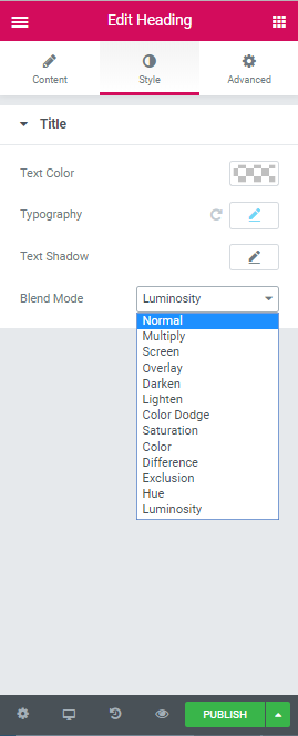
Elementor offers 13 blend modes: Normal (this is the default and has zero blend), Multiply, Screen, Overlay, Darken, Lighten, Color Dodge, Saturation, Color, Difference, Exclusion, Hue, and Luminosity. All of them are available in the Style section.
Three Filters and Seven Blend Modes to Spice up Your Images
Charles Eames once said “The details are not the details. They make the design.”
It’s true that after interacting with a product, people often remember some specific detail about that product. It might be a unique color combination, a delightfully animated effect or a neat logo. Great designers know that by focusing on details, it’s possible to create a truly memorable experience.
Filters and blend modes help designers give your project personality. Experiment with some of the techniques below to revitalize ordinary images.
1. Grayscale
Grayscale is one of the most commonly used filters. As the name suggests, this filter converts the image to grayscale by removing color from the picture. It’s relatively easy to apply this filter using Elementor. All you need to do is to set the Saturation property to zero (which is available in the CSS Style section), and you’ll get a completely black & white image.
There are a few tricks designers use when working with a grayscale filter. First, it’s possible to create a strong visual accent on a specific element using a black & white background image and an object colored with a vibrant hue. In the following example, all eyes are on the site’s headline.
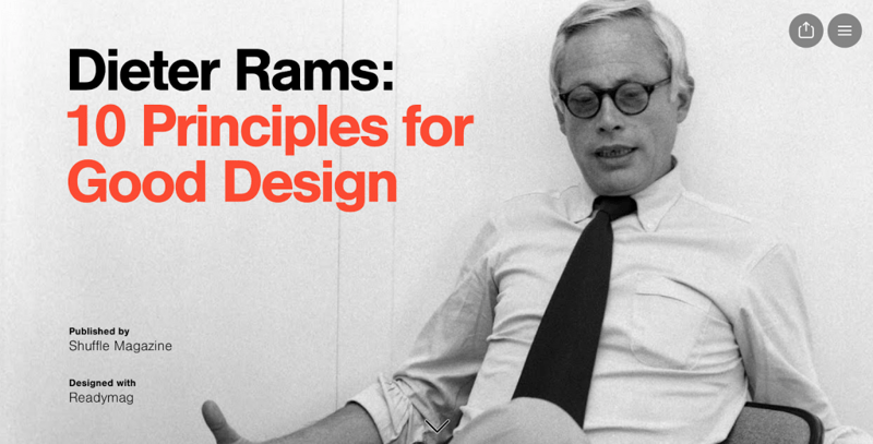
Readymag uses a bright color to direct user’s attention towards the headline ‘10 Principles for Good Design.’
This technique can be applied for landing pages used to promote products.
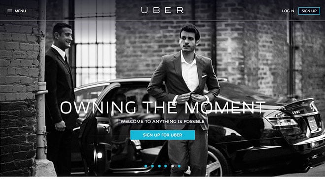
Uber uses color to direct user’s attention towards the call to action button ‘Sign Up For Uber’
Second, try pairing a grayscale filter with an animated effect. For instance, make a black & white image change its color on hover. The animated feedback that appears on mouse hover helps the user communicate with the interface. This subtle detail lets users know that some objects are interactive, increasing user engagement. Here is a quick video that shows how to apply this effect in Elementor.
2. Blur
This filter simply applies a Gaussian type blur effect to an image. Blurred imagery directs attention to other parts of the design. In the example below, blur helps focus users on the company’s description.

Digitalux creates a context for their message using a blurred image of people working in an office.
Images aren’t the only visuals you can blur. One recent trend for designers is to apply a blur to a video instead of to still images. This creates more interesting visual effects such as the one below.
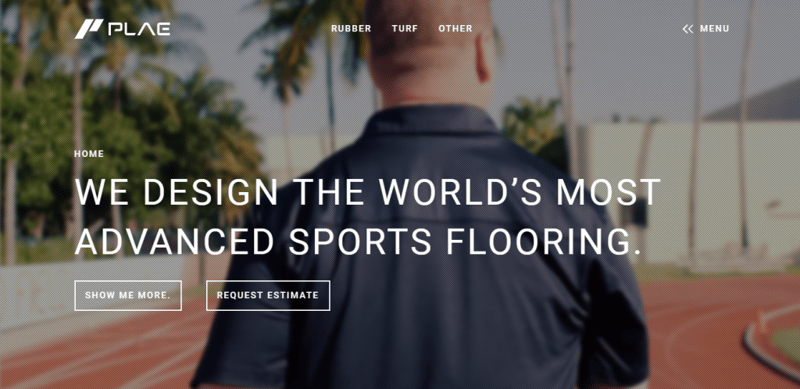
PLAE uses blurred video to demonstrate what they do.
3. Opacity
The opacity filter allows designers to play with the opacity/transparency of an image. Using opacity, designers can disguise a picture or a video that they don’t want at the forefront of their design. By doing that, designers focus visitor’s attention on other content, such as text or graphics objects.
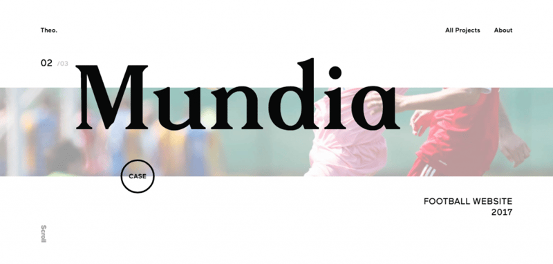
Theo Rosel plays with the opacity to bring focus to the words on the screen. The image plays a supportive role — it creates a context for the project.
Now, let’s talk about blending!
4. Sepia
Vintage design is a hot trend now. A lot of websites use elements of vintage styles. A vintage look can be artificially created using old-fashioned looking elements — vintage typography, old artifacts (such as photos from previous centuries), and sepia color — a reddish-brown color.
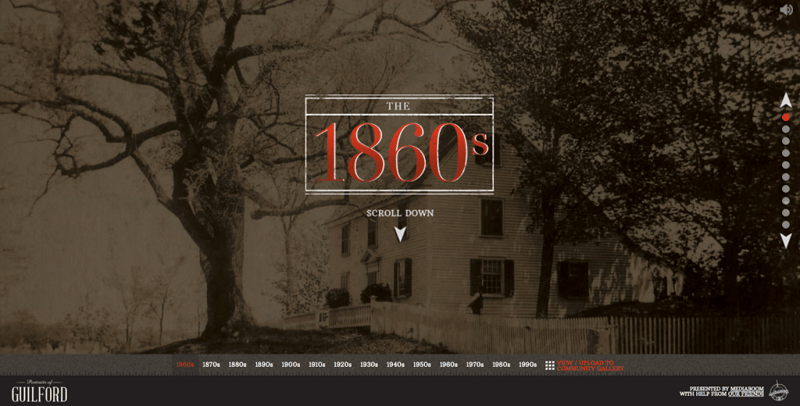
Portraits of Guilford uses a sepia effect to stir feelings of old times and history.
5. Color Overlays With Minimal Transparency
A dark background with light text is a classic combination. The reason so many designers use a dark overlay is simple — a dark background amps up the contrast and makes it easier to include text and other elements on top of images. It also makes the image a little less prominent. This can be good for cases when an image lacks a certain spark.
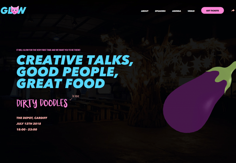
It Will Glow uses a dark background to maintain readability and put intense focus on other visual objects.
The most common challenge with dark overlays is that the final design might look too heavy. While this may be true if you use black or dark gray backgrounds, it won’t be the case with other colors. Don’t get stuck in the trap that dark means black or gray. Remember that a dark overlay can be any color, such as dark green or dark red. Check out the dark navy blue used by Naval Ship Building College in the example below. Dark blue serves two roles — it both improves readability and helps deliver the message.

Naval Ship Building College uses dark color to maintain readability.
6. Gradient
A gradient is the gradual blending from one color to another. Not that long ago using gradients in web design was a terrible idea. Things change. After years of flat and ultra minimalism, the gradient has made a comeback. Gradients became popular because they help designers introduce depth to designs. Nowadays, we see this effect on many websites. Web designers use gradients to create bold statements and channel user emotions.
The great thing about gradients is that this technique is easy to apply —adding a gradient to an image can be as simple as picking two or three colors and then selecting a shape for the gradient. Gradients, in terms of shape, can be directional (left/right or up/down) or radial (color variations emanate from a single point in a circular fashion). Gradients enable designers to create novel color combinations that come across as unique, modern, and refreshing.
As a tool, use gradients in a variety of ways. Try applying a gradient to pair brand colors.
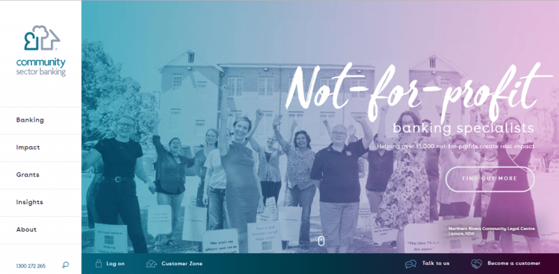
Community Sector Banking uses a gradient to emphasize brand colors.
A gradient can help designers guide the visitor’s eye. When your eye is drawn to one area of color (usually, to the lightest), the change between hues and light & dark areas shifts your focus across the screen toward darker spaces.
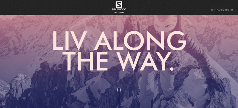
Salomon uses lighter and darker areas of the image to move the eye from a starting point (top of the page) to the main content which is available below the fold.
While the preceding examples have shown ways to use gradients for larger images such as hero images, it’s also possible to use gradients for smaller elements (such as thumbnail images).
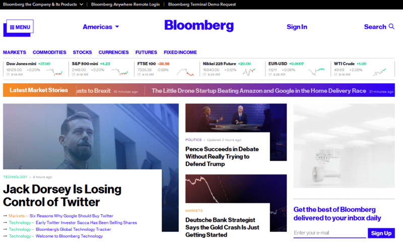
Bloomberg uses gradients for featured images.
If you plan to use gradients in your design, you need to remember two simple rules:
- Don’t choose colors randomly. Look at a color wheel and select colors that are close to each other (analogous colors). It helps you create a smoother color transition.
Don’t sacrifice readability. Some gradients can be too light and cause readability issues (especially white text). Pay attention to color combinations and contrast. Test readability on different responsive breakpoints.
7. Duotone
As the name suggests, a duotone is made up of two colors — it could be two shades of the same color or two contrasting colors. This technique was popular in printing for a long time but has made a resurgence. Spotify popularized duotones, and nowadays dozens of websites use this technique.
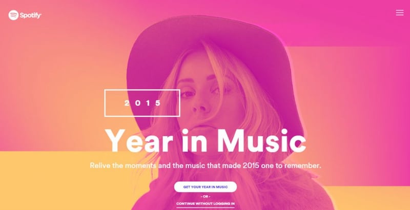
Spotify uses duotone to make regular artist photos attention-grabbing.
Duotone can be used in a variety of ways. Many websites apply a duotone effect like a brightly-colored overlay on top of an image.
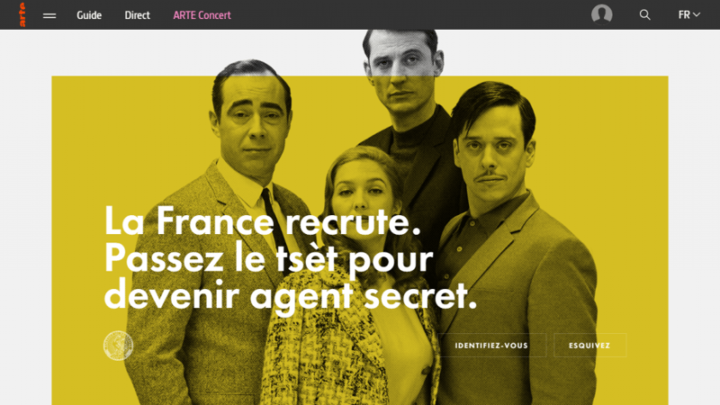
Tset Arte features a brightly-colored overlay on top of an image.
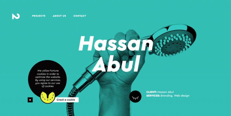
North2 assigns a different duotone effect for each project.
Duotones can also create an emotional connection with visitors. A duotone effect paired with video allows the University of Essex to create a sense of energy, joy, and happiness.
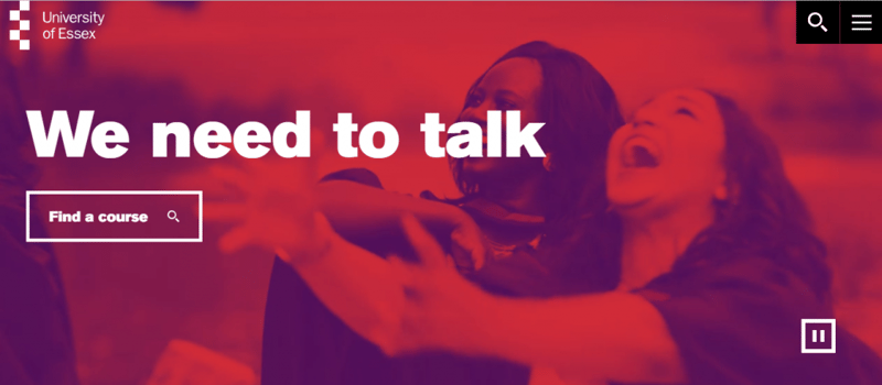
University of Essex uses video to create a sense of what it feels like to study at the university.
8. Geometric Shapes
Geometric shapes are fashionable in web design now. This technique was popularised by Google’s Material Design which uses dozens of different shapes. The technique centers around interesting shapes and layers that combine to create stunning visuals.
The great thing about using geometric layering is that it’s very adaptable — it works with pretty much any type of content. There are many ways to incorporate geometric shapes into a design project. Designers can use geometric shapes for purely aesthetic purposes, e.g., to create an unusual background pattern, like this one below.
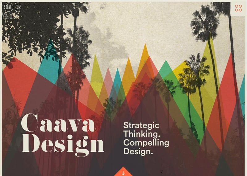
Caava Design uses cool geometry to create a strong visual impression for visitors.
Alternatively, for strictly functional purposes, like providing directional emphasis. For example, it’s possible to position angles so that they point to the content you want users to see. Notice how the Alan Turing Institute uses geometric shapes to direct the user to the most valuable content — it’s mission statement and Call to Action button.
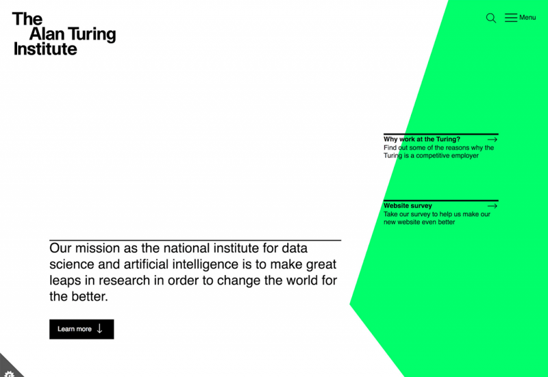
The Alan Turing Institute website uses simple shapes to direct visitors into specific content — mission statement.
Using geometric shapes lets you easily create a focal point for your users. Designers can apply a simple but very effective trick — any unusual shape draws attention. Check how Alchemy.digital uses circle shapes to spotlight an image.
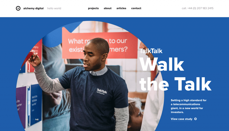
Alchemy.digital uses a circle for content that should be viewed first.
9. Split Screen
One screen divided in two. Nowadays a lot of websites use design patterns that include two vertical panels placed side by side. This technique is especially practical when you have two equally important things to promote. Each side features a piece of content (a photo, a text block, or an illustration) that is used to deliver the key message. This type of layout is also mobile responsive — when it comes to smaller screens, the panels can be stacked.
Most split screen designs feature symmetrical 50% / 50% designs with two equally essential options. When you give equal importance to both options, you allow the user to choose swiftly whatever option interests them. A split screen puts users in control, enabling them to decide how they want to interact with the content.
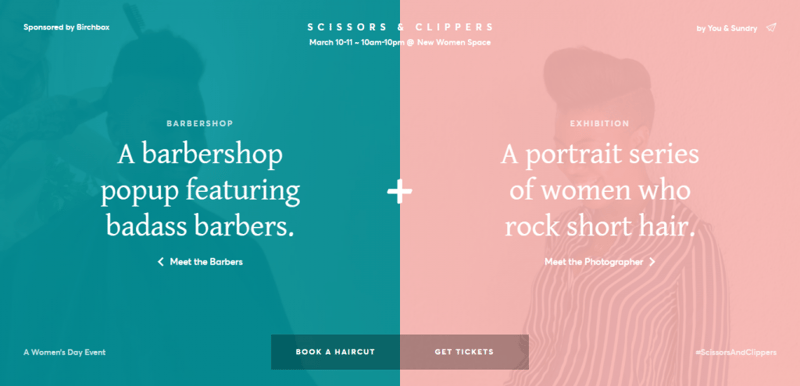
Scissors and Clippers poses a question to visitors: do they want to book a haircut or get a ticket. Both questions carry equal weight, and one is no more important than the other.
A symmetrical split screen is an excellent design format, but it has one issue — it might look dull (especially when a lot of websites use this format). Designers who don’t want to get stuck with a yin and yang format experiment with more interesting visual patterns, such as asymmetrical layouts. While asymmetrical layouts look fresh and unexpected, they introduce a few challenges. One of the most significant issues is that it might be challenging to create a connection between slides. Color can be a tool that helps create a visual flow between “screens.” It can be a brand color or hue with high contrast.
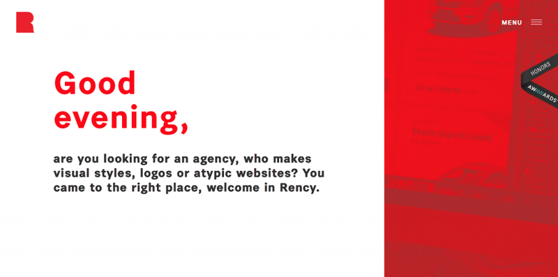
Rency duplicates a distinct color to establish visual flow from one “screen” to the other.
Diagonal split screens is another interesting technique to create unusual design. This simple change to the aesthetics (while following the same idea of dual-content design elements) can be really attention-grabbing.

Ghafari uses a diagonal split screen to create visual interest.
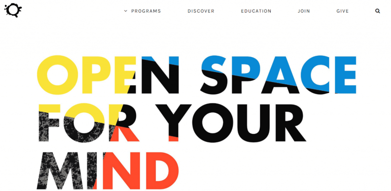
10. Image-Filled Typography
There is no doubt, an excellent image is eye-candy that can draw users to a design. But sometimes the right words are what designers need to deliver their message. The technique of image-filled typography (or ‘hollow lettering’) allows designers to achieve this goal. The text acts as a transparent stencil for the image underneath it.
The key to making the most of this design technique is to refine the message — the core phrase needs to be simple and say something meaningful to the user. Designers should strive to tell users what value a product/service delivers and why it’s important to them. In the example below, the color adds visual interest, while space draws your eye to the text.
KANEKO uses vibrant colors and makes the most of the space.
It’s possible to create a more engaging experience by adding interactivity. Pairing a layered effect with interactivity is an excellent way to engage visitors. The motion that happens in the background creates a sense of dynamism while focussing the entire user attention on the message.
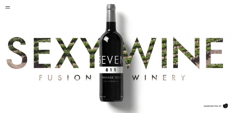
Fusion Winery creates a dynamic experience using a background video of a vineyard in the lettering.
Last but not least, this effect can be used not only for text but also for graphic objects such as logos Belly Q uses a still photo as the background and cuts out its signature “Q.”
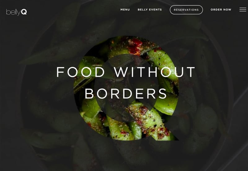
Belly Q creates a focal point for visitors so they’ll know the name and brand of the site they are viewing.
When it comes to filled lettering, there are a few things to remember when selecting the underneath image. Since visitors don’t see a complete image, the human brain tends to fill in the blanks of the image. Thus, it is essential to make the image inside the letters discernible. It’s better to avoid using human faces or other complex objects. Try to use more abstract objects such as textile patterns.
Combine Different Effects!
The great thing about the techniques mentioned above is that they can also be combined. When creating a unique look for your site, you can apply different techniques simultaneously. Check out the home page of NYC Pride below. A colored overlay, a split screen, and gradients used together create a truly unique and memorable look.
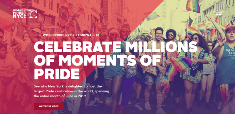
NYC Pride 2019 uses a few different visual styles to create a truly memorable experience.
Conclusion
Filter and blend modes enable you to produce a broader spectrum of designs. But when it comes to using blend modes and filters, the golden rule is: try one out, if at first, you don’t succeed, try out another. You need to experiment, explore different approaches to find a design that you and your visitors will enjoy. Elementor helps you design independently — letting you apply any of these effects without using a graphics editor. Create compelling visual impressions in just seconds!
Looking for fresh content?
By entering your email, you agree to receive Elementor emails, including marketing emails,
and agree to our Terms & Conditions and Privacy Policy.


