It’s time for the very first Elementor Showcase of 2021. This month’s winners hail from all corners of the earth, representing regions such as South America, Australia, Central and Western Europe, and more. Their home countries may be scattered around the globe, but the talented web creators behind these websites share many common design skills and styles. These capabilities include a strong understanding of a solid brand identity, crystal clear navigation schemes, breathtaking image galleries, and many more.
The variety of industries represented by our winners is unique, to say the least: from travel inspiration websites, design agencies, to creative portfolios. Finally, this entire showcase is dominated by the inspirational creativity of web creators, who never fail to introduce us to innovative methods that leverage Elementor features.
10
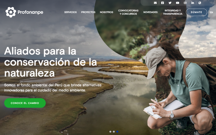
Profonanpe: Innovative Environmental Change
Profonanpe is a Peru-based organization committed to caring for the planet, providing resource management advice for improving the environment. Profonanpe needed a platform that shows their value proposition in an agile and natural way. To do this, digital marketing agency Manya.pe designed a website that helps Profonanpe’s users understand the association’s work and target audience: organizations and institutions concerned about the welfare of the planet.
The engaging widgets and styling effects used in the website draw in the visitors’ interest in the organization. The design combines shape dividers and a background slideshow to create a diverse collection of detailed images that prevents overwhelming the user. Our global environment is comprised of so many climates, species, and detailed imagery, which is why the assorted collection of succinctly visualized nature conveys the essence of what the organization cherishes most.
Theme: Manya
Plugins: Contact Form 7 – Conditional Fields, Contact Form 7, Jetpack – WP Security, Backup, Speed, & Growth, WooCommerce, Redirection for Contact Form 7
Design & Development: Manya.pe
09
Summitfit: Adventures That Empower
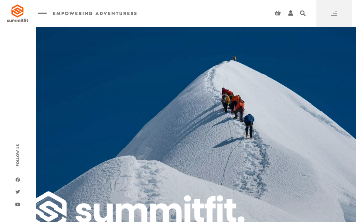
Summitfit is a small, UK-based team of travel and adventure enthusiasts who guide, train, and prepare passionate travelers for trekking and summit expeditions. Summitfit leads and coordinates micro-tourism trips to mountain ranges, and runs skills courses throughout the year. Their site also runs an online store selling adventure equipment.
Summitfit’s site uses the Icon Box Widget with custom icons to solidify the organization’s coherent orange branding. The brand’s business value is particularly unique and niche to its audience, and is further highlighted by Summitfit’s cohesive, clearly defined brand identity. This coherency is also present in the site’s choice of brand imagery, as each photograph depicts a crisp, detailed snapshot of travelers and trekkers in the heart of their adventures.
Theme: Hello
Plugins: WooCommerce, Custom Fields PRO, Custom Post Type UI, Dynamic Fields for Elementor, Make Column Clickable Elementor
Design & Development: Jack Williams
08
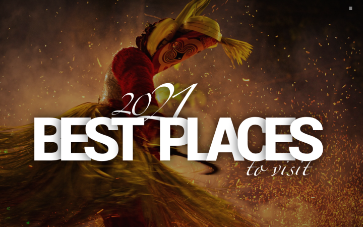
Lost Tribe Travel: Meaningful Travel Experiences
Lost Tribe Travel is a UK-based travel content platform dedicated to inspiring meaningful travel experiences and outdoor adventures. Each experience and hospitality partner is handpicked and vetted for quality by the team’s travelers and local experts. The website was created by Lost Tribe Agency, a digital marketing agency specializing in the travel and tourism industry, web design, Google Ads, branding, and PPC.
One key objective of the website’s design scheme is to “create complete, informative and visually striking content to help travelers find valuable information and tried and tested recommendations.” For starters, the website’s full-screen popup menu achieves the goal of simplifying the website navigation scheme.
Another inspiring design technique featured on Lost Tribe Travel’s website is the use of 3D lettering for the hero text on each page. The coupling of three-dimensional letters with a one-dimensional, darkened photograph generates a pronounced, visually-pleasing contrast between the two elements. The stark, bold presence of the capitalized white letters also provides a sense of continuity throughout the background slideshow of images.
Theme: Jupiter X
Plugins: A3 Lazy Load, Advanced Ads, Advanced Custom Fields, Antispam Bee, Duplicate Page, Element Pack, Google Analytics for WordPress by MonsterInsights, Jupiter X Core, LiteSpeed Cache, reSmush.it, UpdraftPlus Backup/Restore, Yoast SEO
Design & Development: Marc Vaz — Lost Tribe Agency
07
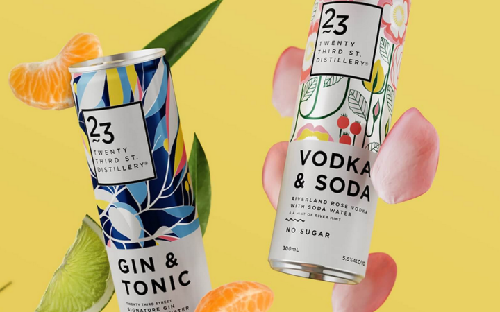
23rd Street Distillery: Great Spirits & Creativity
23rd Street Distillery is a vodka and whiskey distillery based in Renmark, South Australia. They run an elaborate visitor center where visitors can admire the copper-stills, partake in a tour, blend their own bespoke Gin, age their own Whisky, learn how to mix cocktails, and more. The website design is geared towards a similar concept: a vibrant, experiential view of the distillery’s features, creations, uniqueness, and artistic flair.
The design vibe directs the visitors’ focus on the bottle labels that boast bright colors and intricate illustrations. Many of the pages are built with a simple, yet engaging two-column grid layout. This structure complements the page content nicely, on the “Functions” page, for example. The large photographs paralleled with the short, highly legible texts creates a “smooth sailing” experience for the user that draws his interest in the venue and in what the distillery has to offer.
Theme: Astra
Plugins: Age Gate, Contact Form 7, Smash Balloon Instagram Feed
Design & Development: FRAME, Sid Puri
06
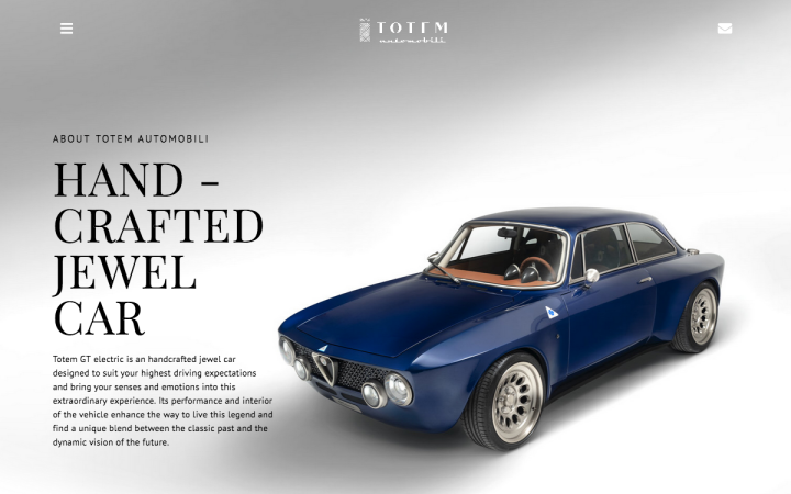
Totem Automobil: Experiencing Luxury in Motion
Totem Automobili is an Italian start-up founded by Riccardo Quaggio, an automotive designer whose who has excelled at recreating classic Italian cars while making them electric. The website was built to promote the new Totem GT Electric, the use of engaging photographs to visualize the brand’s handcrafted luxury vehicle, as well as its core values, such as craftsmanship, luxury, design, and sportiness.
The design thinking applied to the website was to create a “refined and elegant design to communicate all the characteristics of the four-wheeled jewel in the best possible way”. The brand’s dedication to automobiles that transport passengers using swift motion and velocity is visualized through the array of animated site content. This comes to play, for example, in the homepage with the blue car image’s fade-in motion effect.
The concepts of movement and progression don’t stop there. The homepage uses the Call to Action Widget with zoom-in hover effects to create an added layer of movement and exploration. Finally, the high-quality video that follows below the CTA section takes this detailed presentation one step further, giving the viewer an even more in-depth perspective of the luxury cars.
Theme: Hello
Plugins: Element Pack Lite – Addon for Elementor, ElementsKit Lite, Essential Addons for Elementor, MP3 Music Player by Sonaar, Sticky Header Effects for Elementor
Design & Development: Claudia Bot — Tide Design
05
COVID Photo Diaries: A Pandemic in Pictures
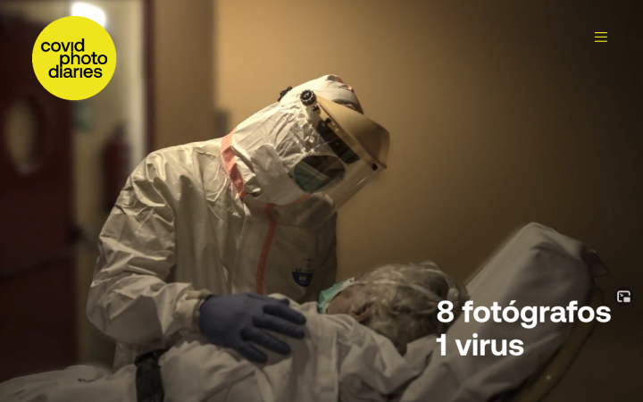
Covid Photo Diaries is a website of eight Spain-based photojournalists who have personally documented the pandemic through images and texts. Questions these journalists have sought to answer and portray in photographs are: “What happened in the hospitals?”, “How was life in confinement?”, “What is this new daily life made of?”, among others.
The website uses a bold, yet balanced black and yellow color scheme for several design accents, such as navigation items, its logo, hidden popup content that appears upon image hover, and more. Color psychology defines black as a representation of drama, which the website uses to visualize the intensity of the pandemic of the past year. In contrast, yellow represents creativity and warmth, which the website materializes through its photo documentaries of patients’ and medical professionals’ personal stories. The empathy and care given to those who have suffered and taken ill are sprinkles of hope scattered through the dark, dramatic pandemic experience.
The description popup and its yellow background that appear when images are hovered over integrates the photographs with the overall website’s color scheme. The yellow’s bright sense of urgency encourages the visitor to understand the meaning behind each picture by reading the description, rather than quickly glancing at the thumbnail images.
Theme: OceanWP
Plugins: Piotnet Addons For Elementor
Design & Development: Jordi Carot
04
Cosmin Mirza: Immersive Sound Design
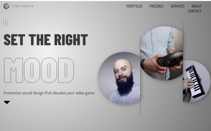
This is the portfolio website of Cosmin Mizra, a professional sound design freelancer. Cosmin’s modern website showcases his sound design skills, projects and music, and sound portfolio. The website was created by Camilia Filip and her team at Chamilyon Agency, a Romania-based digital marketing agency that designs Elementor-built websites.
The use of Flipbox Widget on the portfolio page is a strategic way to combine the visual detail of a video game interface along with a short description of the game’s plot. Welcoming the website visitor with a visual preview of each game’s experience, you’re able to get a rich taste of every game, building up excitement for reading about it and learning more about what you’ll play.
Cosmin’s out of the box, quirky personal branding is hinted at within the most minute design elements of the site. The favicon and small logo, for example, show a monochrome alien, along with the choice of wording for the website copy — set an informal, positive dialogue between website owner and visitor.
Theme: Hello
Plugins: Advanced Custom Fields, Autooptimize, Custom Post Type UI, MP3 Music Player by Sonaar Pro, OoohBoi Steroids for Elementor, Popup Trigger URL for Elementor Pro, WP Super Cache, Yoast SEO
Design & Development: Camelia Filip — Chamilyon Agency
03
Utmon Paris: Navigating Through Finesse
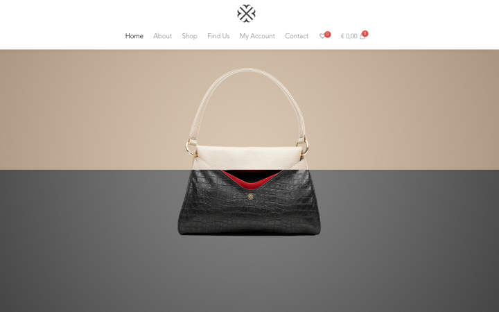
Utmon Paris is a leather bag brand based in Paris, France. Their merchandise is designed for “Parisian women – women who work a great deal, go out often, enjoy each breath, and always look incredibly nonchalant and elegant at the same time.” The bags are manufactured in Germany, with the goal of producing the highest quality and level of craftsmanship.
Utmon Paris’s site leverages the mega menu navigation technique in all its glory. This choice of menu structure is highly conducive to displaying the unique look of each product. By hovering over the “Shop” menu item, viewers see more than just the product range name: they see real images of each product model.
The creation of their online store places high emphasis on the shopping user experience, which is evident, for example, in its homepage content. The choice of a parallax background is made possible by using “fixed” for the background-attachment property. This accentuates the finite details of each leather bag and shows the wide variety of their product collection.
Theme: Hello
Plugins: The Plus Addons, WooCommerce
Design & Development: Shahzad Khan
02
Brandingo: Brand-Made Animations
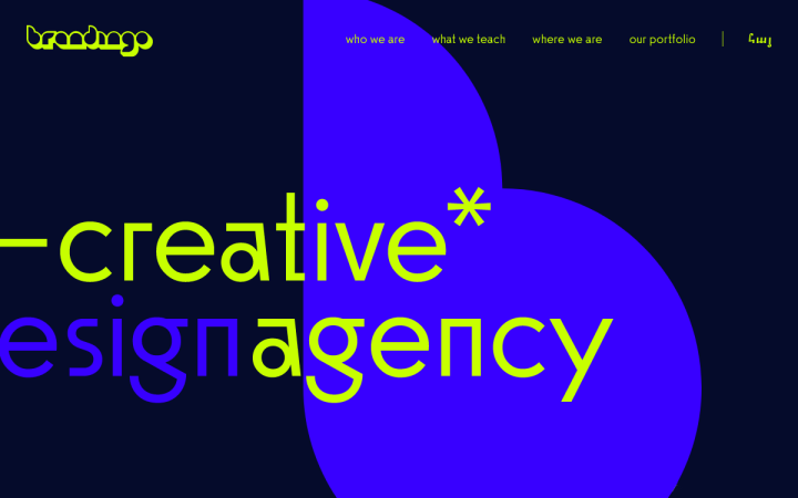
Brandingo is a design agency and school based in Yerevan, Armenia. The Brandingo website was built to “showcase the agency’s talent and knowledge in design, illustration, UI/UX and branding to potential clients and students.” Brandingo’s design school offers a web and UX design career boot camp, where aspiring and existing designers grow their web design skills.
Brandingo’s website utilizes Lottie Animations Widget, scrolling effects, and motion effects to provide a unique, interactive experience. The scrolling effects and Lottie widget content are seamlessly integrated, as scrolling down the homepage triggers the movement of the animated vector illustrations. This phenomenon is prevalent throughout the entire homepage vertical navigation, finished off by a submission form at the end that is an interactive Lottie animation itself.
Theme: Astra
Plugins: Polylang
Design & Development: Digital Hero Group
01
General Condition: An Award-Winning Studio Portfolio
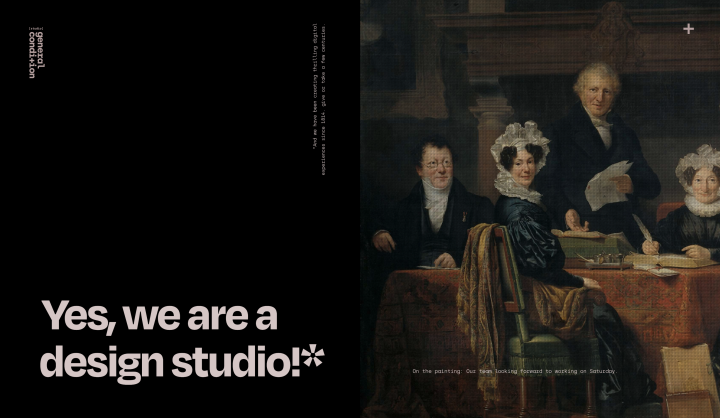
General Condition is a design studio based in Belgrade, Serbia, specializing in brands, identities, art direction, and website design and development. The multidisciplinary team is spread throughout the world, focusing together on creating visual solutions and creative concepts — based on the research and testing they perform to identify client needs.
The studio shared with us that the current version of their site is their third portfolio website redesign in the last five years. The existing design of their site is based on an 18th-century art scheme, boasting a unique visual identity that includes a black and pink color palette as well as exciting typography choices from OH no Type Foundry and atipo foundry. The encompassing website structure and layout are based on museum catalogs and pamphlets.
On the site’s Work page, the horizontal scrolling and lazy load used for their gallery mirror the experience of strolling through art museum galleries. The lazy load technique is also used on their Moodboard page, as the masonry grid of “portrait view” images load simultaneously with a synchronized “fade-in” entrance animation. Building a mood board page to showcase your studio’s work is a design choice that we haven’t come across many times, but it is certainly an inspirational technique worth remembering for future portfolio website building.
Theme: Hello
Plugins: Premium Addons for Elementor, The Plus Addons for Elementor
Design & Development: Jovan Lakic
Think your Elementor-based website or landing page should be featured in our next Top 10 Websites column? Give it a shot!
