Table of Contents
- Table of Contents
- What is Web Typography?
-
- 1. Think About How You Want To Portray Your Brand
- 2. Decide Between Serif or Sans Serif
- 3. See if Your Fonts Pair Well Together
- 4. Be Mindful of Font Size, Font Weight, and Line Length
- 5. Respect the Role of Visual Hierarchy
- 6. Invest in a Design System
- 7. Get To Know CSS Stylesheets
- 8. Stay up To Date With Typography Usage Standards
- Ready, Set, Type
Although its strong significance may often be overlooked, typography plays a fundamental role in web creation — this means branding, visual design, user experience, user interface, content strategy … the whole entourage. But before we begin, what is web typography and why is it important? In this article, we will cover everything you need to know about typography as a web creator. We’re talking concepts, principles, terminologies, guidelines on choosing the best fonts, and of course, action items.
Before we embark on understanding the ins and outs of typography for web design, an important topic to cover is why typography is so important. Ultimately, when people visit a website to read its text, they’re looking to find out information about you — and we know that words matter.
As web creators, we can definitely appreciate that presentation is of equal value to a website’s content. Just as a website’s visual design, interactive features, and overall functionality determine the quality of a website, the same is true for its typography.
After reading this article, you’ll be equipped and empowered to implement your knowledge and understanding of the essence of web typography and how it can make or break any and every website.
Table of Contents
- What is Web Typography?
- The Challenges of Web Typography
- The Key Elements of Web Typography
- Understanding Generic Font Families
- The Difference Between a Font Family and a Font
- Why Text Formatting Matters
- The Components of Text Readability
- How to Choose the Perfect Font for Your Website
- 1. Think About How You Want To Portray Your Brand
- 2. Decide Between Serif or Sans Serif
- 3. See if Your Fonts Pair Well Together
- 4. Be Mindful of Font Size, Font Weight, and Line Length
- 5. Respect the Role of Visual Hierarchy
- 6. Invest in a Design System
- 7. Get To Know CSS Stylesheets
- 8. Stay up To Date With Typography Usage Standards
- Ready, Set, Type
What is Web Typography?
Web typography is the art and technique of arranging type on a website. It’s not only about the design or composition of the letters and characters and their arrangement. Of course, it’s about those things — but it’s also about communication, visual identity, brand persona, usability, and much more.
Grow Your Sales
- Incredibly Fast Store
- Sales Optimization
- Enterprise-Grade Security
- 24/7 Expert Service

- Incredibly Fast Store
- Sales Optimization
- Enterprise-Grade Security
- 24/7 Expert Service

- Prompt your Code & Add Custom Code, HTML, or CSS with ease
- Generate or edit with AI for Tailored Images
- Use Copilot for predictive stylized container layouts

- Prompt your Code & Add Custom Code, HTML, or CSS with ease
- Generate or edit with AI for Tailored Images
- Use Copilot for predictive stylized container layouts
- Craft or Translate Content at Lightning Speed
Top-Performing Website
- Super-Fast Websites
- Enterprise-Grade Security
- Any Site, Every Business
- 24/7 Expert Service

Top-Performing Website
- Super-Fast Websites
- Enterprise-Grade Security
- Any Site, Every Business
- 24/7 Expert Service
- Drag & Drop Website Builder, No Code Required
- Over 100 Widgets, for Every Purpose
- Professional Design Features for Pixel Perfect Design
- Drag & Drop Website Builder, No Code Required
- Over 100 Widgets, for Every Purpose
- Professional Design Features for Pixel Perfect Design
- Marketing & eCommerce Features to Increase Conversion
- Ensure Reliable Email Delivery for Your Website
- Simple Setup, No SMTP Configuration Needed
- Centralized Email Insights for Better Tracking

- Ensure Reliable Email Delivery for Your Website
- Simple Setup, No SMTP Configuration Needed
- Centralized Email Insights for Better Tracking

- Ensure Reliable Email Delivery for Your Website
- Simple Setup, No SMTP Configuration Needed
- Centralized Email Insights for Better Tracking
The Challenges of Web Typography
Understanding Screen Reading vs. Print Reading

At first, you may think that there isn’t much of a difference between reading from a screen and reading from paper. After all, they’re both visual processing experiences where you consume information by reading letters of the alphabet upon a background. But, think again. The differences between print design vs web design and their respective reading experiences are indeed plentiful.
Logically, the most fundamental difference between print design and web design is that print is a physical, tangible object with fixed, static content. Alternatively, on-screen content is dynamic, constantly changing, as the screen is an adaptive medium.
This means that each piece of paper has a definitive, constant size that doesn’t change, and we know in advance what that paper size is. When designing content for a screen (whether imagery, accents or textual elements), we are designing for a range of what can be — such as different resolutions, sizes, and devices). But that’s a topic in and of itself, which we will discuss shortly.
From a behavioral perspective, when we read digitally, we do more scanning and jumping around. This could be because we’re looking for keywords — in order to get as much information as possible in the shortest amount of time. In terms of speed, studies performed by Nielsen Norman Group have even found that people read 25% slower when reading from a screen compared to when reading from paper.
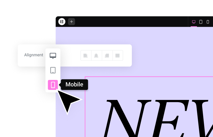
Accommodating Different Screen Sizes
As web creators, the moment we hear the words “different screen sizes”, many of us will often immediately think of responsive design. And when we say responsive design, we don’t just mean websites that look great on both desktop and mobile sites. It’s more than that — since as of March 2018, Google announced its “mobile-first indexing” initiative. In practice, this means that the Google search engine predominantly uses the mobile version of the content for indexing and ranking. So, even if your site targets desktop use-cases, it’s still just as important for it to be mobile-friendly, at least if you want it to stay on Google’s good side.
So, how does this connect to typography?
It means that your designs, including your text’s (be it titles, headings, paragraphs, button texts, etc.) typography — all need to look good on mobile. In terms of our design process, it makes things a little bit more complex. You have a smaller screen to work with, but not necessarily less text. Often, this will mean that you’ll need to craft a typography scheme that is flexible in that it can accommodate multiple screen sizes. This priority can trickle down to font color, typeface, font weight, font size, and many other design choices.
Once you have a deeper understanding of these individual typography components (as well as how they fit together in the web design process), you’ll be able to apply your knowledge to designing a flexible layout that includes responsive typography choices.
And don’t forget the relationship between typography and user experience. The need for responsive typography often stems from the need to consider the website visitor’s circumstances of how and where he will be viewing the text on your website.
Considering Screen Resolution

In its most general terms, screen resolution refers to the number of pixels a screen contains horizontally and vertically, such as 1024×768. In other words, the number of dots a screen shows per inch. In practice, (and make sure to jot this down for future reference) — the resolution size (aka the measurement of the maximum number of pixels) that a screen’s resolution can hold is 1024px horizontally and 768px vertically.
Regarding how resolution sizing affects what we actually see on the screen: lower resolutions display elements in a larger size on the screen in order to keep the display as sharp as possible — yet this means that less of the page will fit on the screen. In turn, higher-resolution monitors will be able to display more of the website page, such as the entire fold plus a little below the fold — but also causing the elements on the page to look smaller albeit sharper.
In the context of typography, when we say that a designer needs to consider screen resolution and choose the font size based on resolution, this means choosing the optical weight (how human eyes perceive the size and significance of an object) to make sure that the typeface definitely works as intended with every screen size and resolution.
As we said, increasing screen resolution increases the number of pixels per inch. In the case of typography, font sizes are a fixed number of pixels – therefore, the higher the resolution, the smaller the font will look, as the font pixels take up less space. Ultimately, the amount of space the text takes up on the screen is a response to the screen’s resolution. And this is where the discussion of responsive typography comes into play.
Sticking to Responsive Text
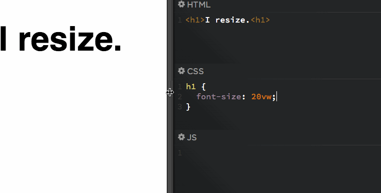
Responsive text itself is the design principle that texts on a web page should be easily readable on a variety of devices and screen sizes. Creating responsive typography doesn’t only mean choosing a text that changes in size among different screens. It’s also about readability, which requires a relationship between text and its surrounding elements — wherein the size of each element is determined in relation to its surrounding elements.
Designers and developers will often program the site’s type size to be determined by the screen size itself, which is a common method used in CSS stylesheets. Another CSS-related method is to use the font measurement units of rem and em. We will address both of these topics later, too. Ultimately, responsive text is sized in relation to surrounding factors, which means you’ll be creating font-size constraints based on things like screen size, viewport, breakpoints, and rem and em sizing units.
Assuring Accuracy Through Monitor Calibration
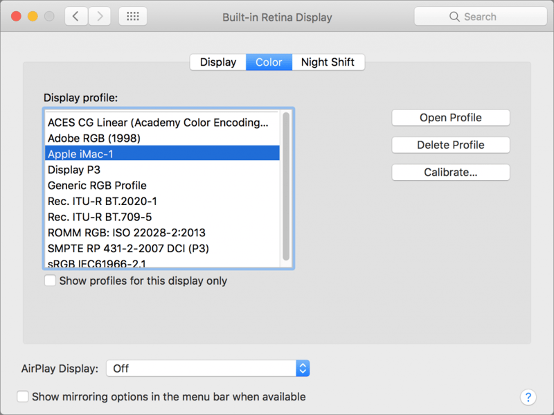
When we say calibration, what we’re referring to is calibrating your monitor so that it displays color and contrast completely accurately. By doing this, your work (as a designer or even as a photographer) will be viewed by website visitors exactly as you intended it to look when designing it.
The main reason that monitor calibration is crucial when crafting your website typography is that both the font color and the contrast between the text and the background can be affected. The last thing you want is for there to be a poor contrast between your font color and its background. When it comes to readability, if the human eye struggles to make the distinction between the text and its background, they may quickly give up on reading that text and therefore give up on your website and/or its content much sooner than you would have hoped.
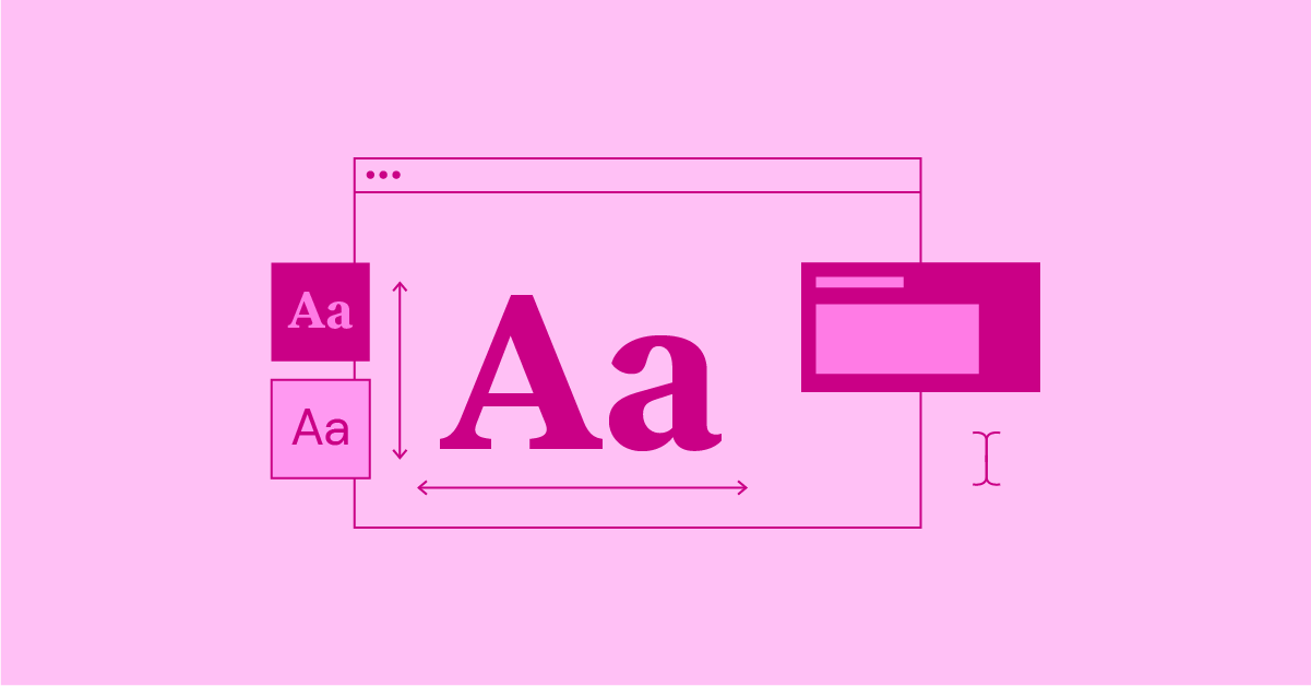
The Key Elements of Web Typography
Now that we’ve gotten to know some of the challenges of web typography, the next stage is to explore the different concepts and definitions that typography as a subject entails. By understanding this terminology in better detail, we will be one step closer to mastering typographic skills and applying them to our design work.
Understanding Generic Font Families
As we start to grasp the significance of typography in web design, one of the first design terms to understand and master is: generic font families. The typefaces and fonts we choose from each time we style the text on our websites can each be categorized under one of two major styles: serif, sans-serif, or cursive. Now let’s understand this classification and how to know the style and font family of any given typeface.
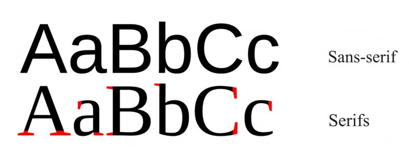
Serif
In its most technical sense, serif font families have decorative strokes or tails (some call them feet or tails) that finish off the end of a letter stem. These strokes can vary in weight, making some areas of a letter thicker or thinner than others. As a collective style category, serif typefaces are widely known to be smooth, rounded, and decorative — commonly used for lengthy bodies of text, such as books, newspapers, many magazines, etc. This is largely because serif typefaces are easily readable when written in small body copy sizes.
Some of the most known Serif font families include:
- Times New Roman
- Georgia
- Palatino
- Garamond
- Playfair Display
As you may have already noticed, brands and professional businesses often use serifs for their logo (and website) when they want to appear more reputable, established, formal, etc. Examples of these business-types can be law practices, media publications, insurance companies, medical offices, and the liking.
Sans Serif
Sans serif typefaces are those that don’t have extending features (serifs) at the end of their strokes. This description actually originates in the French language, meaning sans (without) serif. These typefaces tend to have a more uniform thickness throughout the different parts of each letter, and are used to convey minimalist design, modernity and most of all, sheer simplicity.
Going back to our discussion of the differences between screen reading and print reading, it’s important to take note that serif fonts are more popular for computer screens – such as websites, blogs, software, etc. Within those use-cases, sans serif fonts are used for display use, such as headings, subtitles, button texts, etc., rather than for body texts.
Some of the most widely used sans serif typefaces include:
- Avenir
- Roboto
- Open Sans
- Source Sans Pro
- Lato
- Montserrat
- Proxima Nova
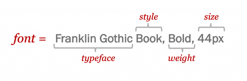
The Difference Between a Font Family and a Font

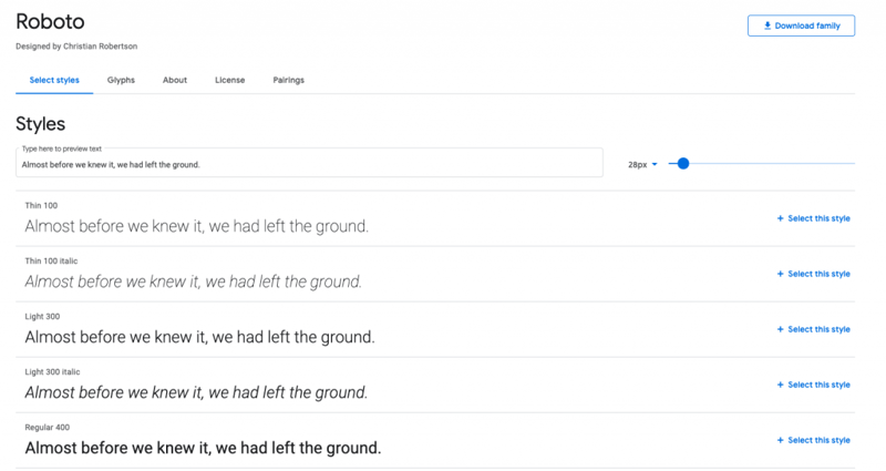
The term typeface can also be referred to as a font family: a set of characters (letters of the alphabet) with the same design — of varying sizes and weight. Typefaces shouldn’t be confused with fonts, as a font is a graphical representation of the typeface’s text character. In essence, a typeface is a family of related fonts (hence the term “font family”), while fonts refer to the weights, widths, and styles that are each a variation of that typeface.
To put it in more concrete terms, here’s an example:
Roboto is the name of a font family, which is a range of typefaces of the same style, and each of those variations are considered individual fonts. Based on these nuances, we can now understand that Roboto Thin and Roboto Bold are actually not the same font — they are two separate fonts, but are part of the same (Roboto) font family.
Why Text Formatting Matters
Most of us are well familiar with the classic options for formatting text in order to highlight important concepts within a document, such as: italicized text, bold text, underlined text, etc. In typography, using text formatting to emphasize certain words is effectively using these styling options to highlight the chosen words – relative to the other words in the text body. Text formatting allows readers to easily differentiate between types of emphases that they’d like to place on a given word or sentence.
In practice, underlined and bolded words or phrases are often used throughout a work to emphasize specifically defined terms, sections, chapter headings, subheads, table entries, etc. Italics are typically used to indicate the titles of creative works – like books, magazine articles, and movies. Standardizing these uses across a website or content guidelines adds clarity and cleanliness to the page.
The Components of Text Readability
“A solid typography structure which guides the user and delivers the content and main message in the best way”
— Omri A, Elementor Typographer
Omri’s words of wisdom accounts for exactly where the roles of text alignment, spacing, line length and height, semantic HTML come into play. But are these details really so crucial for good typography design? The answer is yes.
Text Alignment
The way you decide to align your text (left, right, justified or centered) can have a direct impact on your content’s readability and its visual hierarchy, which is why this is a design choice that requires a diligent thought process. Typography in design, as described by the tubik blog in their discussion of how to make your user interface readable, is “the art of balancing aesthetic text with the ability to read it quickly.” The virtue of text alignment, in this case, is all about readability: it anchors readers so that they know where each line will start and have an easier and quicker time reading text and spending time on page and on your site in general.
Letter Spacing
Letter-spacing, also known as “tracking”, is the adjustment of horizontal white space between letters in a word or in a block of text. When adjusting letter-spacing, we are affecting the visual density of a word, phrase or paragraph – choosing to either make the words appear more compact (reducing the white space) or to give the words a more “airy” appearance (increasing white space). Designers will often increase white space between letters in order to improve the readability of the text.
Line Spacing
Line spacing is the term used to define the vertical space between two lines of text. Similar to text alignment and letter spacing, line spacing can be a strong determinant of how readable a text is (or isn’t). When line spacing is set in a way that makes a text readable, what this essentially means is that the reader’s eye has an easy time passing from one line of text to the next.
The general rule of thumb is that line spacing that falls within the range of 130%-150% is ideal for readability, with 140% being “the most quoted sweet spot”. Anything below 100% is considered to be unreadable, as this percentage means letters on adjacent lines can touch. Logically, the decision for how big or small a text’s line spacing should be is subjective to several factors: typeface, font size, font style, etc.
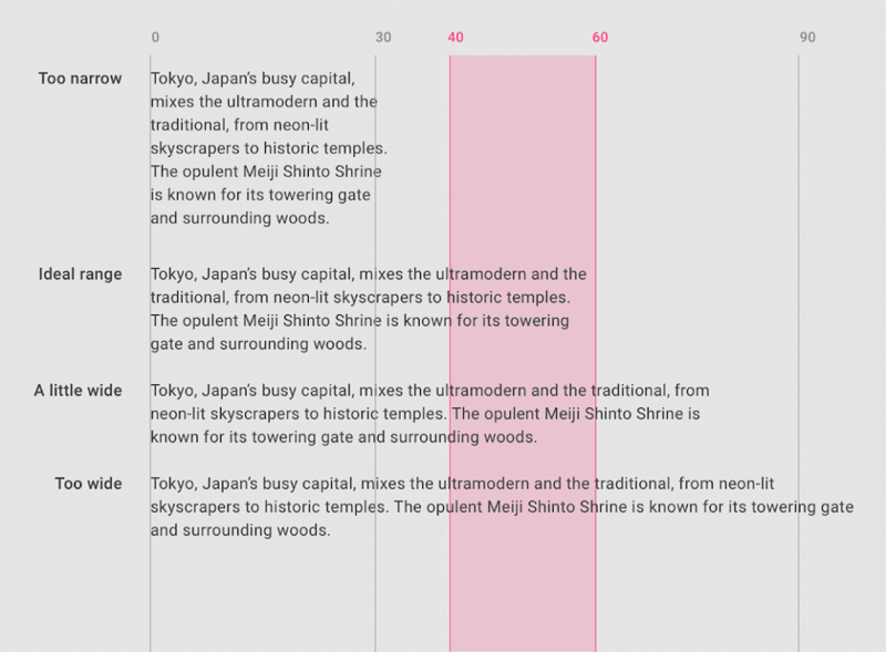
Line Length
Line length is all about finding the “right” amount of characters on each line so that your text is as readable as can be — in other words, legibility. When a line’s length is too wide, you can risk the reader having a hard time focusing on the text, since it’s difficult to discern where the line begins and ends. On the other hand, lines that are too short can break the reader’s rhythm, which means their eye has to travel back and forth too many times. To avoid a situation of “too long” or “too short”, the recommended line length is between 45-85 characters per line.
How to Choose the Perfect Font for Your Website
Deciding what the most appropriate fonts are for your website is dependent on several factors, rather than just a matter of “I like this one best”.
As web creators, it’s crucial for us to consider the following factors when selecting our font of choice for any web content, and for websites in general:
1. Think About How You Want To Portray Your Brand
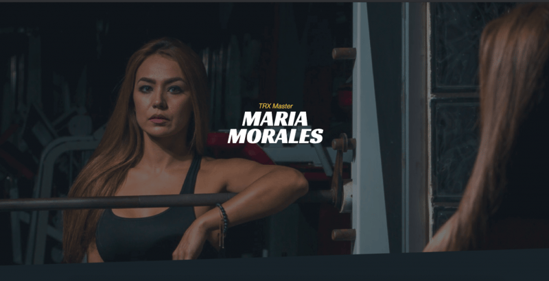
A brand’s typography is actually one of the strongest informants of what the brand is all about – in terms of character, differentiation, and so on. Ultimately, your brand voice is being verbalized and visualized by arts and letters. In the example above of a personal trainer’s website, the chosen font, Racing Sans One is a heavily-weighted, sans serif typeface with very little contrast within each letter. The text is bold and dominant, which correlates well to a personal trainer’s fitness and intensive workout-related speciality and persona – conveying a sense of strength, power, and robustness.
Action Item:
Think carefully about your brand personality. What type of associations, values and adjectives do you want people to think of when seeing your website and brand assets?
2. Decide Between Serif or Sans Serif
Choosing between serif or sans serif fonts is like choosing between vanilla and chocolate — it’s a fundamental decision which impacts your entire typography scheme. It’s the most basic and foundational selection process that you can make about your website fonts. When explaining when to use serifs, the Adobe blog specifies that serif fonts are mainly associated with “authoritative, professional brands … a little bit more old-timey.” This is what makes serif fonts such a go-to choice for websites like news sites, bookstores, universities, and the liking.
Sans serifs, on the other hand, are known to be the modern choice, associated with “cutting-edge design, commerce, and modernism’s attempt to break with the past”.
Action Item:
Take a look at other websites in your industry or business vertical, and see which they most commonly use: serif or sans? This can give you an idea of what’s most fashionable among your niche, and which typeface would make most sense to your observers.
3. See if Your Fonts Pair Well Together
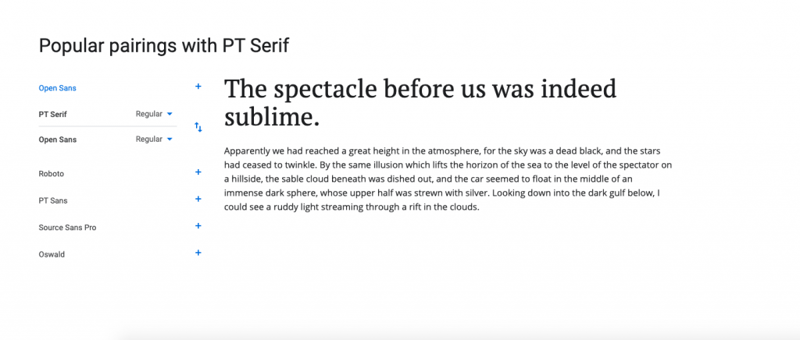
The virtue of good font pairing is that it can elevate regular letters to a creation of artwork. And it’s even more than that: pairing two different fonts, each one with its own style and uniqueness, can amplify the brand messaging you’re striving to convey. Brand personalities are multi-faceted. So, by using two distinct fonts (and there are definitely plenty of web font choices), each with its own character and style, you’re illustrating the unique, dynamic experience that your brand represents.
Action Item:
Test several font pairs to see which one you like best. It’s recommended to decide on a primary font first and then explore options for a secondary font, and choose your favorite pair. Expert tip: try not to exceed more than three fonts total!
4. Be Mindful of Font Size, Font Weight, and Line Length
You can think of legibility as the “north star” of your typography decision-making. As we discussed earlier, details such as a font’s size and weight, as well as the line-length and line-spacing that you use in a text element — all work together as a balancing act in order to produce (what should be) an easily scannable and readable body of text.
Action Item:
The “ideal” line length for optimum readability in web typography is known to range between 45 to 85 characters.
If you find yourself struggling to keep your text within this range, explore different combinations of font size and weights, to see how they impact one another. A font size of 18px might exceed 85 characters on one line, but if you give the font a slightly smaller size or a slightly lighter weight, things could work out in your favor.
5. Respect the Role of Visual Hierarchy
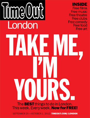
Typographic visual hierarchy is actually an age-old concept, preceding website design for decades. We can see how true this is by looking at the media industry — and even more specifically, magazines.
This TimeOut London magazine cover is geared towards tourists looking to explore and discover London. Logically, the magazine’s most basic intention is for people to see it, glance at it, and take it along with them. All that matters is that readers take it, the rest (the stories, the subject matter, and truthfully, all the magazine content) is secondary – the publishers just want it to be in human hands.
In terms of actionability, the “take me, i’m yours” statement is the most important, so it’s therefore the largest and heaviest text on the page. It’s huge, centered, tall, heavy, sans-serif, no frills … it’s dying to be noticed. Not to mention that the contrast of white on bright red is a great way for a text to declare itself as “first to be seen”.
Action Item:
Get into the headset of your website visitors and readers – which words do you want them to notice first, or even immediately? And more so, what is the most sophisticated, visually-pleasing format to communicate those words in?
6. Invest in a Design System
At Elementor, we define design systems as “the single source of truth that forms the base around which a team designs a website.” Using a design system allows web creators (whether as a team or as a solo web creator) to design and edit both new and existing websites in a quick, efficient way — shortening your workflow and ultimately, the time it takes you to get your website up and running.
Adding your website’s or brand’s typography system to your design system guarantees that every text element on your website will be consistent with the others, providing for a professional, organized and comprehensive website interface.
Action Item:
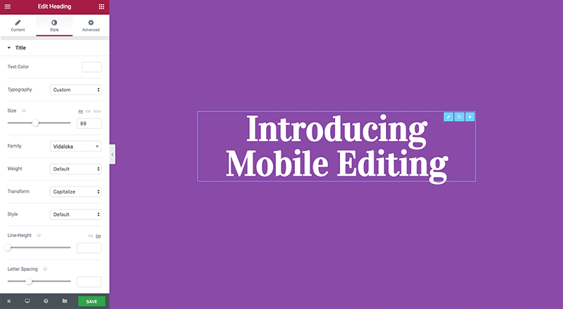
Make your life easier by using our new Global Fonts feature, which allows you to configure all of your site typography settings globally – Font Family, Font Size & Scale, Font Weight, Font Transform, Font Style, Font Decoration, Line Height, Letter Spacing and Responsive Settings.
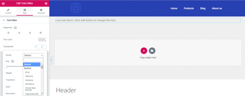
7. Get To Know CSS Stylesheets
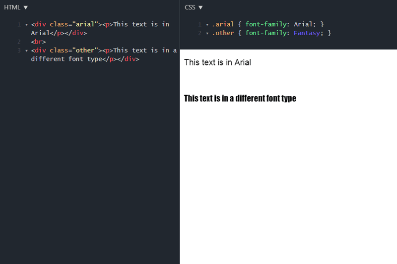
One of the most recommended practices in perfecting and polishing your website typography is making use of CSS stylesheets. The CSS properties used to style text are fundamentals in web typography: font styles and text layout styles. True, there are many ways to set your font styles and text layout styles (among other styling options) by using simpler methods, but CSS stylesheets do indeed have an advantage over those simpler methods — stylesheets provide better control over the exact visual style of your website typography, such as headers, paragraphs, lists, and so on.
When we say better control, we mean that CSS stylesheets make it more likely for your design to appear exactly the way you intended it to — and won’t be affected by constraints like device compatibility and screen size, browser compatibility, fonts available on a device, and similar factors. Ultimately, CSS stylesheets save you a lot of work, because they control the layout of multiple web pages all at once. This means that using a stylesheet means you can change the look of an entire website by changing one file alone.
How’s that for time efficiency?
Action Item:
Make use of the Custom CSS tab inside the Elementor Editor widgets. This can be an easy, non-complicated way to use the benefits of CSS stylesheets without adding an extensive coding process to your workflow.
8. Stay up To Date With Typography Usage Standards
As we emphasized earlier, readability, legibility, and the overall reading experience (think: user experience) are the “north star” of typography choices. This is one reason why font sizing plays a huge role in both web design and user experience. What’s more is that people like what they’re used to — if readers are used to reading H1s and body texts in a common size, this is what they’ll expect to see on your website too. These are among the many reasons we suggest following conventional font sizes for your website.
Of course, there’s room for flexibility (even if only a small amount), and website trends are constantly evolving. It’s worth keeping tabs on how font sizing conventions are changing over time.
Action Item:
Stick to conventional font sizes when deciding how big or small your text elements should be.
As much as web creators thrive on creativity, the step of choosing font sizes isn’t a time to reinvent the wheel.
Ready, Set, Type
You’re officially ready to embrace the world of typography. The font choices are endless, and so too the way you can work with them. Hopefully, the concepts and action items we provided will make your design workflow just that much easier when you sit down to create your typography scheme.
Remember that readability and legibility come before anything else, but don’t neglect the importance of keeping your font and its messaging aligned with your brand and the personality you want to convey.
We look forward to seeing what you can come up with!
Looking for fresh content?
By entering your email, you agree to receive Elementor emails, including marketing emails,
and agree to our Terms & Conditions and Privacy Policy.
