New insights
Popular topics
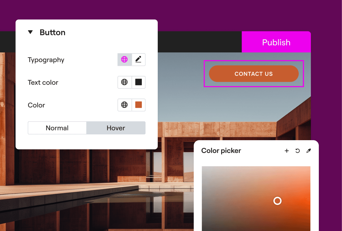
Elementor Editor
Master the visual builder, widgets, and global settings to create your dream site.
Elementor Host
Manage your infrastructure, connect custom domains, and handle backups with ease.

Elementor One
Streamline your workflow with AI tools, image optimization, and unified credits.